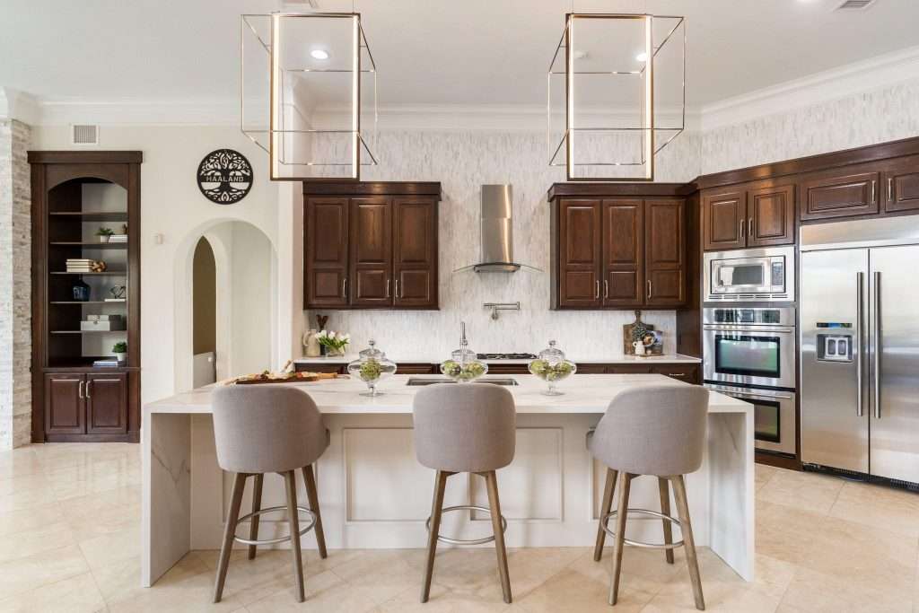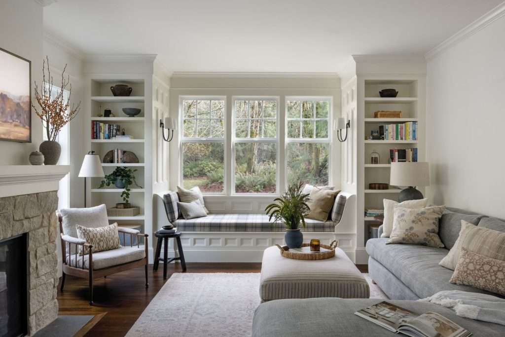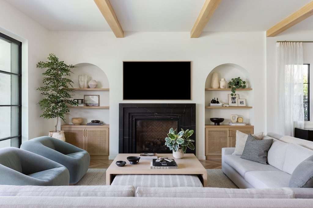
Kitchen Lighting Ideas for Texas Homes With Better Glow, Function, and Evening Comfort

Kitchen lighting ideas tend to look gorgeous on Pinterest at 2 p.m., when the sun’s pouring through every window and the room practically lights itself. But come 7 p.m., when you’re actually pulling something out of the oven and trying to chop onions on a counter that’s somehow in shadow, the picture changes. 

The pretty pendant over the island isn’t doing what you hoped. The recessed cans are leaving weird dark patches. And nobody warned you that the dimmer switch you splurged on would buzz like a confused mosquito. 

Honey, it’s not your eyes. It’s that your kitchen was probably wired to look fine, not to actually work after dark. Stick with me, and we’ll fix the part nobody talks about until they’re standing in their finished kitchen wondering why it still feels off.

Why Your Kitchen Feels Off Even With All the Lights On
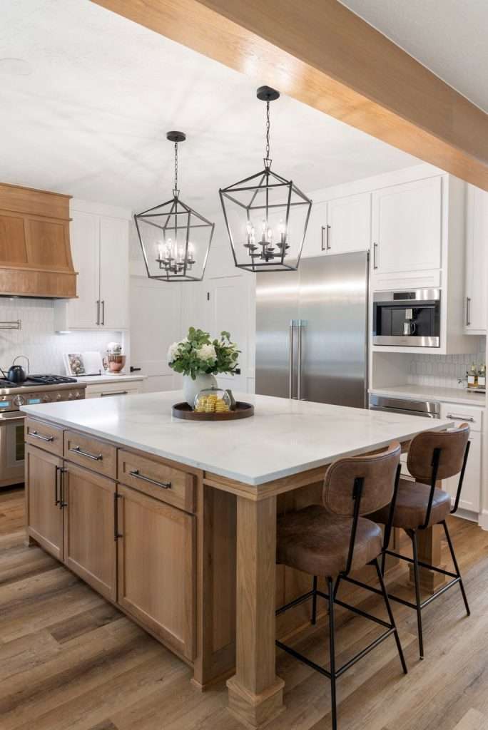
Most kitchens that feel “off” in the evening have one thing in common: they’re trying to do every job with a single layer of light. One ceiling fixture, or a row of recessed cans down the middle of the room, and that’s it. That setup might be enough to find the fridge, but it’s nowhere near enough to actually cook, host, or clean up without squinting.

The reason is simple. Overhead light from the center of a room casts your own shadow onto the counters in front of you. Stand at the sink or the stove and your body blocks the light from reaching the surface you’re working on. The brighter that overhead fixture is, the harsher the shadow gets. You end up with glare on the floor and dimness right where the knife is. Lighting upgrades sit alongside countertops and cabinets as the most common kitchen remodel categories, with both recessed and under-cabinet fixtures chosen by roughly 70% of renovating homeowners according to Houzz’s 2026 U.S. Kitchen Trends Study. The pattern is clear: nobody who remodels a kitchen skips lighting on purpose. They just rarely plan it well.

You see the same pattern in newer Texas builder kitchens almost without exception. Big open layout, gorgeous natural light during the day, then one fan-light combo or four can lights bolted to the ceiling and called done. It’s a layout problem, not a brightness problem, and you can’t fix it by swapping bulbs.

The kitchens that actually feel right after dark are the ones where light is doing different jobs from different directions. That’s the whole game. The rest of this article walks through why some rooms feel off once the sun goes down, and how to make yours feel right at every hour.

The Three Layers Every Working Kitchen Needs
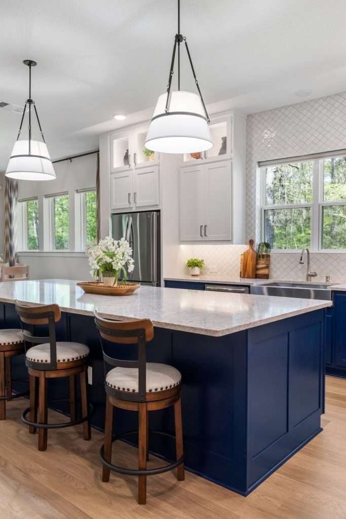
Every kitchen that works at night runs on three layers of light: ambient, task, and accent. The American Lighting Association treats this as the foundation of any residential lighting plan, and there’s a reason designers across every style category land on the same framework. Each layer does a different job, and when one’s missing, the room feels wrong even if you can’t say why.

Here’s what each layer is actually for, in plain terms:

  • Ambient lighting is the base coat. This is your overall room fill, the light that lets you walk in and see everything at a comfortable level. Recessed cans, flush mounts, semi-flush fixtures, even a chandelier in a big open space. It’s the layer that keeps the room from feeling cave-like. But it’s also the layer most kitchens over-rely on, which is exactly why they fail.
  • Task lighting is the working coat. This is light aimed directly at the surfaces where you do things: the counter, the cooktop, the sink, the island. Under-cabinet strips, pendant lights over an island, a directional puck over the sink. Task light has to come from in front of you or above the work surface, never from behind your shoulder, or you’re back to shadow problems.
  • Accent lighting is the mood coat. Toe-kick lights along the cabinet base. In-cabinet lighting behind glass-front uppers. A small picture light over open shelving, or an LED strip washing the wall above the cabinets. Accent layers add depth and soften the room at night. They also give your kitchen that warm, lived-in glow you’ve probably noticed in magazine shots without being able to name what’s making it work.

When all three layers are running and you can dim them independently, the same kitchen can feel bright and energetic at breakfast. By 8 p.m., it can feel soft and hosting-ready, all without changing a single fixture. This same layered approach shows up in our home lighting basics guide and applies in just about every room of the house. The kitchen is just where missing a layer hurts the most.

If you’re planning a kitchen update and your contractor’s electrical plan only shows one circuit and a row of cans, push back. At Design on a Dime Interiors in Conroe, we plan all three layers on separate switches before a single wire goes in the wall. Re-doing it later costs ten times what doing it right costs the first time.

Where Texas Builder Kitchens Usually Get It Wrong

Most builder kitchens in our part of Texas were designed for the daytime listing photo, not for the family that ends up living in the house. The result is a predictable set of mistakes. They show up in home after home across Conroe, The Woodlands, Cypress, and pretty much every master-planned subdivision in Montgomery County.

Here’s what we see most often, in order of how much it ruins the room:

  • Recessed cans clustered in the middle of the ceiling. The most common pattern is four to six cans in a tight square or rectangle right above the floor space, nowhere near the perimeter counters. That puts every bit of overhead light behind you when you’re working at the counter, which is exactly where you don’t want it. Cans should be over the counters, not over your head.
  • No under-cabinet lighting at all. This one’s almost universal in builder homes. The uppers cast a hard shadow across the back of every counter. So even with the recessed cans on, the surface where you’re actually chopping is the darkest spot in the room. Under-cabinet light is the single biggest functional upgrade you can make to a kitchen. It’s also usually the first thing builders skip to save sixty bucks per linear foot.
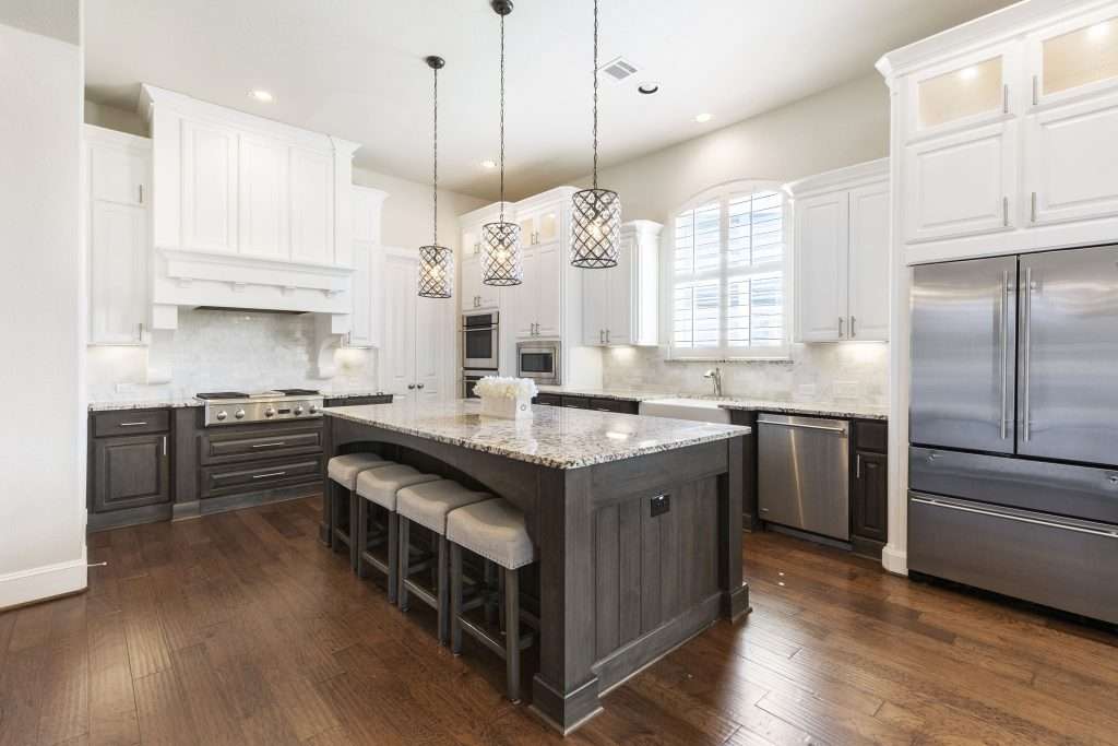
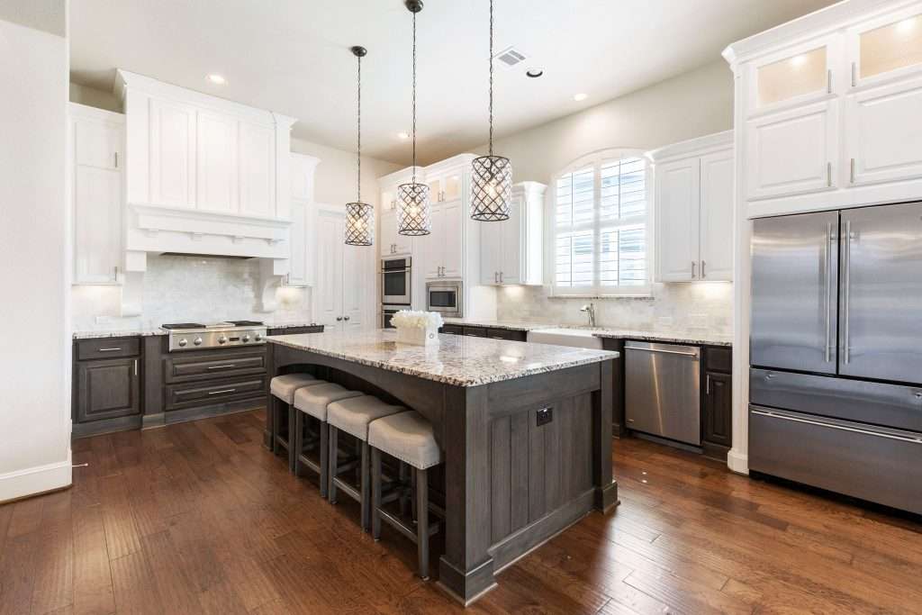
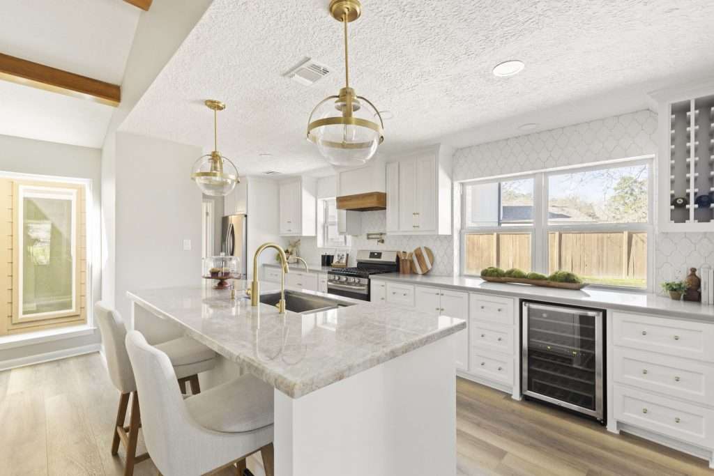
  • Pendants hung at random heights over the island. The published guideline from kitchen and bath designers is that pendant bottoms should sit roughly 30 to 36 inches above the island countertop for most ceiling heights. Builder pendants tend to come in too high and too small. That means they’re not lighting the island. They’re decorating the ceiling. The NKBA kitchen planning guidelines treat pendant placement as part of the workspace plan, not the decor plan, and that’s the right way to think about it.
  • One fan-light combo asked to do everything. In smaller Texas kitchens or galley layouts, the entire lighting plan is sometimes a single ceiling fan with a builder-grade light kit. The fixture has to handle ambient, task, and any mood lighting all at once. It can’t, and the room feels flat at every hour because of it.
  • Everything wired to one switch. Even kitchens with multiple fixtures often have all of them wired to a single circuit. That makes it all-or-nothing. You can’t dim the cans independently of the pendants, and you definitely can’t run accent lighting without flooding the whole room. Switch zoning is half of what makes a layered plan actually function.

The good news is that almost all of this is fixable, and most of it without moving a wall. We help families across The Woodlands re-plan lighting during kitchen remodels. A good chunk of the work is just fixing what the original builder plan got wrong.

Layout-Specific Lighting That Actually Works
Source: Sunday House

Lighting plans aren’t one-size-fits-all, and the layout of your kitchen drives the placement more than the style of your fixtures does. The same set of fixtures, hung the same way, can work beautifully in one floor plan and feel completely wrong in another. Here’s how to think about it by layout type.

Galley Kitchens

Galley kitchens are narrow, with counters running down two parallel walls. They’re common in older Houston homes and starter properties around Conroe and Spring. The wrong instinct here is a single row of recessed cans down the middle of the hallway, which puts your shadow on whichever counter you’re working at.

The fix is two things: under-cabinet lighting on both runs, plus recessed cans positioned over each counter, not in the center walkway. If the kitchen is long enough, two flush mounts spaced evenly will outperform a row of cans. They spread light wider and bounce more of it off the cabinet faces.

L-Shaped Kitchens

L-shapes are the dominant layout in newer-build subdivisions, especially anything from the last twenty years. The corner is always the dark spot. Most builder plans put the cans where they’re easiest to wire, not where the work is happening. The corner counter ends up in deep shadow.

The plan that works: under-cabinet lighting along the entire L. Recessed cans positioned over the counters, not the floor. One decorative fixture, usually a flush mount or a small chandelier, centered in the room or over a small breakfast nook if there is one. If there’s a peninsula instead of a full island, treat it like a small island with one or two pendants.

U-Shaped and Open-Concept Island Kitchens

This is the dominant Texas builder layout, especially in Cypress, Katy, and the master-planned communities along Lake Conroe. Open kitchen, big island, eight-to-ten-foot ceilings, and the whole room flowing into the family area.

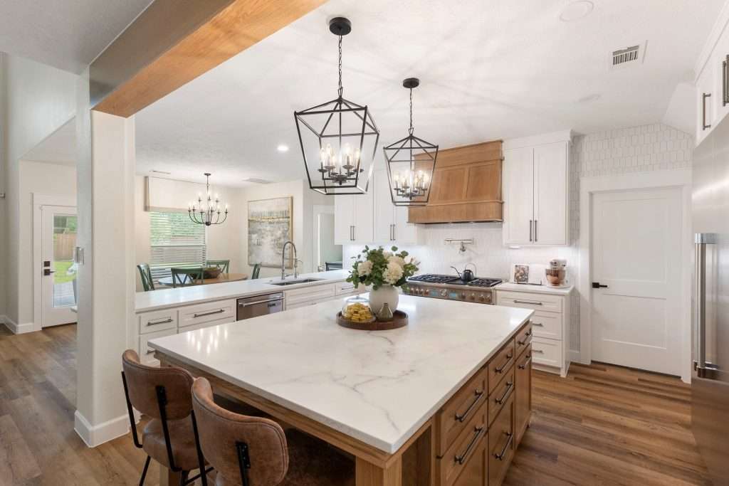
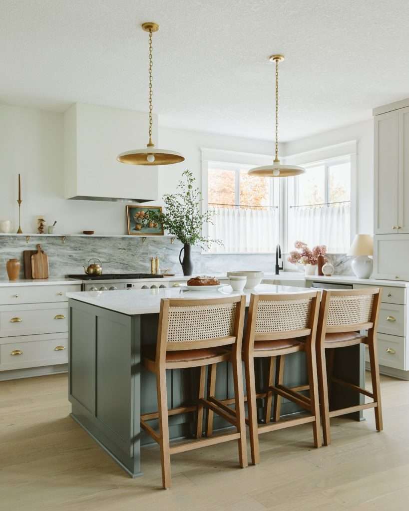
Island kitchens need pendants. Two or three, depending on island length. Size them so the combined width of all the pendants together equals roughly half to two-thirds the length of the island. Smaller pendants in a row look fussy. One enormous pendant over a long island looks lonely. Get the scale right and the room reads professional immediately.

You’ll also want recessed cans over the perimeter counters, under-cabinet lighting on every run, and ideally a separate decorative fixture if you have a breakfast area. Five circuits is not too many for a kitchen this size. Three is the bare minimum.

Our Magnolia kitchen transformation project is a good example of how this comes together in a real home. The original plan had two cans and a fan-light combo. The finished kitchen runs four perimeter cans, two island pendants, full under-cabinet runs, and toe-kick accent strips. Every layer is on its own dimmer.

If you’re remodeling a kitchen in Spring or anywhere in the surrounding area, this is the layout-and-lighting conversation we have in every initial walkthrough. The lighting plan has to be set before the cabinet boxes go in. Most of the wiring lives in or above the cabinets.

Bulb Color, Dimmers, and the Stuff Nobody Tells You
Source: BB Meyer Design

Once you’ve got the layers and the layout figured out, the next thing that ruins kitchens is the technical stuff. Nobody walks you through it at the lighting store. Color temperature, color rendering, dimmer compatibility. This is where good plans go sideways at the last minute.

Here’s what actually matters:

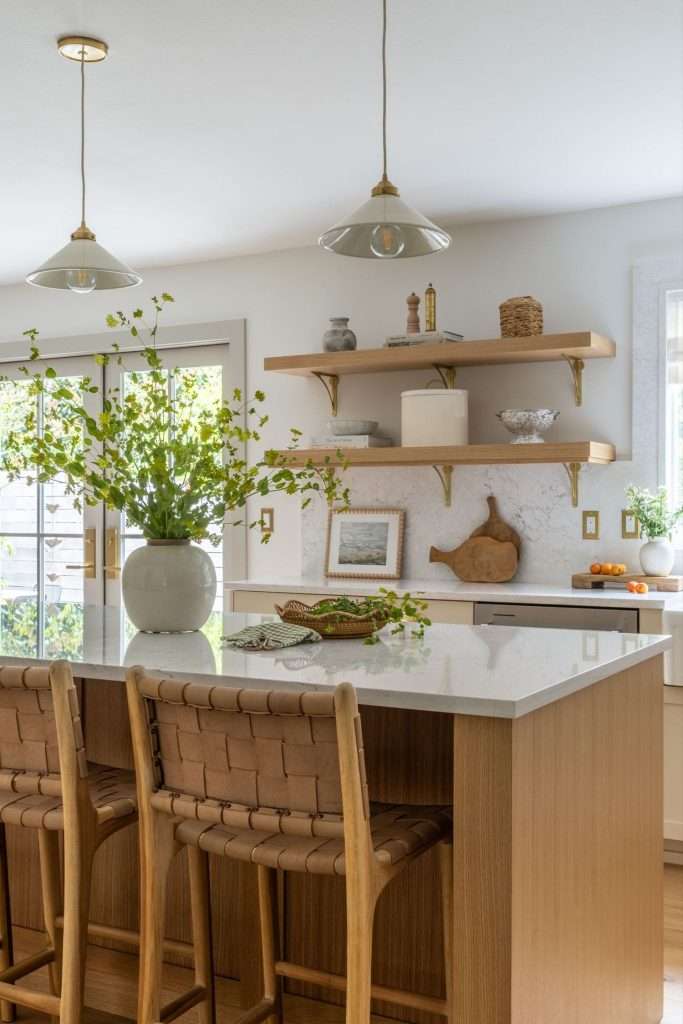
  • Color temperature is the warmth or coolness of the light, measured in Kelvins. Lower numbers are warmer, higher numbers are cooler. The U.S. Department of Energy breaks the standard ranges into soft white at 2700K to 3000K, bright white around 3500K to 4100K, and daylight at 5000K and above. For kitchens, my standard recommendation is 2700K to 3000K across every fixture. It’s the warm, golden tone that makes wood cabinets look like wood and skin tones look healthy. Anything above 3500K starts feeling like a hospital break room. Anything above 4000K and you can stop pretending it’s a home.
  • Color rendering index (CRI) tells you how accurately a bulb shows the colors of the things it lights. Sunlight is 100. Cheap LED bulbs can run as low as 70. That’s why food sometimes looks weird and washed out under them. Look for bulbs at 90 CRI or higher, especially for any fixture that’s lighting food or skin. The CRI number is usually printed on the bulb packaging in small type, and the ENERGY STAR LED guidance page is a quick reference for what to verify on the label. If CRI isn’t listed at all, that’s a sign to put it back.
  • Dimmer compatibility is the silent kitchen killer. Modern LED bulbs need LED-rated dimmers to work right. The wrong combination causes flickering, buzzing, or the bulb refusing to dim past about 30 percent before just shutting off. Every fixture in your kitchen should be on a dimmer, and the dimmer needs to be matched to the bulb. The bulb manufacturer’s website usually publishes a compatibility list. It’s worth ten minutes of cross-checking before installation day.
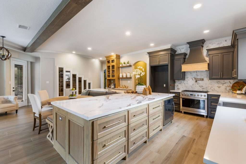
  • Cabinet color affects how much light you actually need. White and light cream cabinets bounce light around the room and make a kitchen feel brighter at lower lumen counts. Dark navy, black, or deep walnut cabinets absorb light. The same plan that worked in a white kitchen will feel dim in a dark one. If you’re going dark, plan for roughly 30 percent more total lumens than you’d use in a light kitchen. Lean heavier on under-cabinet and accent layers to compensate. Our guide on what to know before updating your kitchen cabinets gets into this interaction in more detail.
  • Switch zoning is a planning decision, not a fixture decision. Each layer of light should be on its own switch and its own dimmer. Recessed cans on one. Pendants on another. Under-cabinet on a third. Accent on a fourth. Sounds like overkill until you’ve lived with it for a week, at which point you’ll never want a kitchen wired any other way again.

Sugar, this is the layer of decision-making where most homeowners get tired and tell the electrician to just do whatever’s standard. Don’t do that. The bulbs and dimmers cost almost nothing relative to the cabinet and counter budget. They’re the difference between a kitchen that feels right and one that doesn’t. The way the light reads at night sets the whole tone, just like the finishes trio that makes kitchens look updated sets the daytime tone.

Pulling It Together Without Overspending
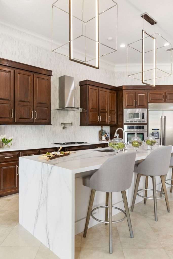
A great kitchen lighting plan doesn’t have to cost a fortune, but it does have to spend the budget in the right places. The mistake I see most often is homeowners blowing the lighting budget on one statement pendant and skipping every functional layer underneath it. The pendant looks great in photos. The room still feels wrong because the actual work surfaces are dark.

Here’s where to put your money, in priority order:

  • Spend real money on under-cabinet lighting. Hardwired LED strips with a high CRI, on their own dimmer, are the single biggest functional upgrade in a kitchen. Budget roughly 8 to 15 dollars per linear foot for the strips themselves, plus electrician time for hardwiring. Battery-powered puck lights are a tempting shortcut. They fail within a year and look like an afterthought.
  • Spend on the right pendants over the island. Two or three good pendants in the right scale will outperform six bad ones. A high CRI, good dimmer compatibility, and a finish that suits the room matter more than brand or fixture trend. Budget anywhere from 150 to 600 dollars per pendant for solid mid-range fixtures.
  • Save on recessed cans. Standard 4-inch or 6-inch LED recessed lights from a major lighting brand are perfectly fine. There’s almost no functional difference between the budget version and the high-end version once you’re looking at high-CRI LED. Save the money for the layers above.
  • Skip most “smart” lighting features unless you’ll actually use them. App-controlled bulbs, color-changing strips, voice-activated everything. These are nice add-ons. They’re often the first thing people stop using after the novelty wears off. If you genuinely want a programmable scene-setter for the kitchen, get one good system and skip the rest.
  • Don’t skip dimmers anywhere. Dimmers cost between 15 and 50 dollars each, and every single fixture needs one. The kitchen that can shift from morning-bright to evening-soft on the same wiring is the kitchen that actually gets used at every hour.

If you’re trying to figure out where lighting fits inside a bigger kitchen budget, our Texas kitchen remodel cost calculator walks through the full project breakdown, including electrical and lighting line items. It’s the fastest way to see what a complete plan looks like at your scope, your finishes, and your zip code, before you sign anything with a contractor. Worth a few minutes before any kitchen meeting.

For homeowners in Montgomery and the surrounding area, kitchen lighting almost always gets planned alongside cabinets, counters, and electrical. All four touch each other. Trying to add a real lighting plan after the cabinets are installed is possible, but it’s the most expensive way to do it. Plan the light first, then the boxes go in around the wiring.

Frequently Asked Questions

Should kitchen pendants line up with the cabinet edges or the island edges?

Pendants align with the island, not the cabinets. Center each pendant over the island so the bottom of the fixture sits roughly 30 to 36 inches above the countertop. Space them so the cluster reads as visually balanced from across the room. The cabinet edges are irrelevant to pendant placement. Pendants are lighting and decorating the island, not the perimeter run.

Are recessed lights enough on their own in a kitchen?

Recessed lights alone are almost never enough. They handle ambient lighting, but they can’t handle task lighting. Anyone standing at the counter blocks the light from reaching the surface. A kitchen with only recessed cans will feel dim during real work no matter how many cans you add. Layered lighting (recessed plus under-cabinet plus pendants or decorative fixtures) is the standard for a reason.

Why does my kitchen lighting look fine during the day but harsh at night?

Daylight enters from windows at multiple angles, so it fills the room evenly and softens everything. Artificial overhead lighting comes from one direction only. That creates harsh shadows on counters and on faces. The fix is adding light from other angles, which is what task and accent layers do. A single source of overhead light will always feel harsh at night, regardless of brightness.

What’s the right number of pendants over a kitchen island?

For most island lengths in Texas builder homes, two or three pendants is right. Aim for a combined pendant width that equals roughly half to two-thirds the length of the island. A six-foot island typically takes two larger pendants. A nine-foot island typically takes three medium pendants. One enormous pendant over a long island can also work, but only when the fixture is genuinely scaled to the space.

Does cabinet color change how much lighting I need?

Yes, significantly. Light-colored cabinets reflect ambient light back into the room. You can get away with fewer lumens overall. Dark cabinets absorb light, so the same fixture plan will feel noticeably dimmer. Plan for roughly 30 percent more total lumens in dark-cabinet kitchens. Rely more heavily on under-cabinet and accent layers to keep work surfaces properly lit. Buyers in the Greater Houston market often request dark, moody kitchens, so this is a common adjustment we make in remodels across Conroe and The Woodlands

Light Is What Makes a Kitchen Feel Like Home

Look, baby, you can put the prettiest cabinets in the prettiest finish in the prettiest layout. If the lighting is wrong, the room will still feel off every single night you live in it. Light is what your kitchen actually feels like after the sun goes down. Get it right and the room will earn its keep at every hour, from coffee at 6 a.m. to leftovers at 10 p.m.

The kitchens that feel finished are the ones where you stop noticing the lighting altogether. The room just feels good and you can’t quite say why. That’s the layered plan doing its job behind the scenes.

Sometimes it’s a small adjustment. Add an under-cabinet run, swap a few bulbs to the right Kelvin, put the pendants on a dimmer. Other times it’s a bigger conversation, especially if the original wiring is fighting against you.

That’s where having a designer in the room before the electrician shows up changes the whole project.

Design on a Dime Interiors plans kitchens for families across Montgomery County and Greater Houston with the lighting figured out from day one. The finished room feels right at every hour, not just in the photos.

If you’re thinking about a kitchen update and want the lighting plan worked out before the wires go in the walls, reach out to our team today.
Why Your Texas Kitchen Feels Dark (And the Lighting Fix That Changes Everything)

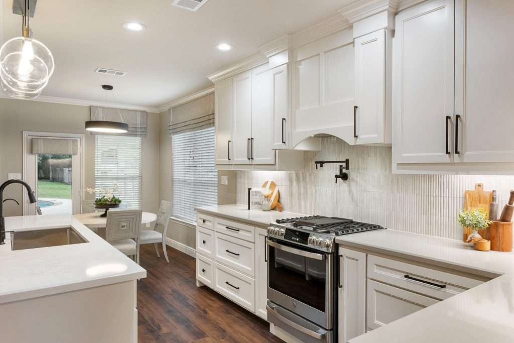
Kitchen lighting ideas are everywhere, but most of them skip the part where your kitchen actually starts to feel like it works. You’ve probably updated your counters, swapped the cabinet hardware, maybe even repainted. And the kitchen looks better.

But something still feels off, especially at night. The overhead light does its job in a flat, clinical kind of way, and those shadows across the counter while you’re chopping? Still there. Still driving you a little baffling every single time you cook.

The truth is, most kitchens in our area are built with one overhead fixture and a handful of recessed cans, and that’s it. It’s not your fault the kitchen feels dim, honey. It’s a builder-grade lighting plan that was never designed to make your kitchen feel like home.

It was designed to pass inspection and move on. The good news is that fixing it doesn’t require tearing anything out. It requires a strategy. And I’m about to walk you through exactly how it works.

Why Builder Lighting Leaves Texas Kitchens Feeling Flat

Why Builder Lighting Leaves Texas Kitchens Feeling Flat

Most Texas homes built in the last twenty years came out of the ground with the same lighting setup: a ceiling fixture in the center of the kitchen, a few recessed cans positioned more or less symmetrically across the ceiling, and maybe a light over the sink. The result looks fine on a listing photo taken with a wide-angle lens. In real life, it creates two problems.

First, overhead-only lighting casts shadows directly onto your work surface. Think about where the light is coming from when you’re standing at the counter chopping vegetables. It’s behind you, or directly above you.

Either way, your own body is blocking the light from reaching the place where you’re actually working. This isn’t a design flaw you notice when you’re glancing around the kitchen. You feel it every single time you reach for a knife.

Second, flat, uniform light makes a room feel smaller and less interesting. When every surface in the kitchen is lit to roughly the same intensity, there’s no depth, no warmth, no reason your eye knows where to land.

The spaces that feel expensive and inviting, the ones that stop you in your tracks when you walk in, almost always use light at multiple heights and with multiple purposes. That’s not a coincidence.

The National Kitchen and Bath Association has been studying lighting in residential kitchens for decades, and their research consistently points to the same conclusion: kitchens need layered light to function well and feel good. One source at the ceiling, however bright, doesn’t cut it.

The Three-Layer System That Makes Kitchen Lighting Actually Work

The Three-Layer System That Makes Kitchen Lighting Actually Work

Here’s the framework every well-lit kitchen is built on, and it’s simpler than it sounds once you see the names for what they describe.

Ambient light is your base layer. It’s the general illumination that lets you navigate the space, see into the refrigerator, and move around safely. Recessed cans, ceiling-mounted fixtures, and track lighting all serve this function. In most Texas kitchens, this layer already exists. The problem is it’s been expected to do everything on its own.

Task light is the focused, close-range illumination directly over your work surfaces. Under-cabinet lighting is the gold standard here because it puts the light source between your eyes and the counter, eliminating the body-shadow problem entirely. According to the Illuminating Engineering Society, kitchen work surfaces perform best with 200 to 500 lumens per linear foot from under-cabinet fixtures, depending on whether you’re prepping food or just want a warm ambient glow in the evening.

Accent light is the layer most homeowners skip entirely, and it’s the one that makes a kitchen feel designed rather than just functional. Cabinet lighting inside glass-front uppers, toe-kick strips along the base of your cabinetry, and pendants over an island all fall into this category. This layer adds depth, draws the eye, and gives your kitchen a completely different personality at 7pm than it has at noon.

Most builders only deliver the first layer. A well-designed kitchen uses all three, and the layers work together in a way that no single one of them can replicate on its own.

What Kitchen Lighting Actually Costs in a Texas Remodel

What Kitchen Lighting Actually Costs in a Texas Remodel

When you’re planning a kitchen remodel or a targeted lighting upgrade, it helps to know what you’re actually buying. Here’s how the layers break down in real terms.

Recessed lighting upgrades: If your existing cans are old halogen fixtures, swapping them for LED trim kits is one of the highest-return moves you can make. Expect to spend $75 to $150 per fixture installed, depending on whether new wiring is needed. A typical kitchen in a 2,500-square-foot home in Conroe or Spring might have six to eight cans. Replacing all of them with properly positioned, dimmable LED fixtures runs $500 to $1,200 total, depending on the electrician’s day rate in Montgomery County.

Under-cabinet task lighting: LED strip lights have become the go-to for under-cabinet applications because they provide even, continuous illumination without the hot spots that puck lights create. A professionally installed under-cabinet system for a medium-sized kitchen typically runs $800 to $2,000, including wiring to a dedicated switch. If you’re doing a full kitchen remodel, this is the time to wire it properly so the switch lives where you’d actually want it, not wherever was convenient during rough-in.

Pendant lighting over an island or peninsula: This is where the accent layer gets to do its best work. Pendants are also where homeowners most often over- or under-spend. A single statement pendant that anchors a kitchen island runs anywhere from $200 to $1,500 for the fixture, plus installation.

Two or three smaller pendants spread across a longer island is a completely different budget and a completely different look. For sizing: pendants should hang approximately 30 to 36 inches above the countertop surface, or 66 to 72 inches from the floor in kitchens with standard 9-foot ceilings.

Dimmer switches: Often overlooked, almost never optional. A kitchen where every light layer can be controlled independently on a dimmer is a fundamentally different kitchen than one where everything is on a single switch. Budget $25 to $75 per switch for quality dimmers compatible with LED fixtures. This is one of the best dollars-per-impact investments in the entire kitchen.

If you want a clear picture of what your full kitchen remodel budget should include across all these line items, the Texas Kitchen Remodel Cost Calculator breaks it down by scope, size, and location across Greater Houston.

Color Temperature: The Decision Most Homeowners Get Wrong

KITCHEN LIGHTING

Color temperature is the thing I see homeowners get wrong more consistently than almost anything else in a kitchen refresh. You pick a fixture you love, you install it, and the light looks wrong somehow. Off. Too cold, too yellow, or strangely mismatched with the fixture on the other side of the room. Here’s why that happens.

Color temperature is measured in Kelvin (K), and the number tells you whether the light leans warm or cool. 2700K to 3000K is warm white, similar to an incandescent bulb, and it makes wood tones, cream cabinets, and natural stone look beautiful. 3500K to 4000K is a cleaner, cooler white that suits modern kitchens with white or gray cabinetry, stainless appliances, and polished quartz.

The most common mistake is mixing color temperatures across different fixtures in the same kitchen. Your under-cabinet strips at 2700K paired with recessed cans at 4000K will make the kitchen feel slightly incoherent, even if you can’t immediately name why.

The light just looks “off.” The rule is simple: keep all task lighting at the same Kelvin value, and stay consistent across ambient fixtures too. If your pendants are 3000K, your cans should be 3000K.

For most Texas kitchens, 2700K to 3000K is the right call. Our homes tend to have warm-toned finishes, wood elements, and natural stone or quartz that reads beautifully under warm light. The big, open builder layouts common in neighborhoods like The Woodlands, Katy, and Cypress get a lot of natural light during the day, and a warm artificial light in the evening balances that shift naturally without feeling jarring.

One more spec worth knowing: CRI, or Color Rendering Index, measures how accurately a light source shows the true colors of objects under it. A CRI of 90 or above is the target for kitchens. Below 80 and your food, your finishes, and your paint colors will all look subtly wrong under artificial light, in a way that’s hard to diagnose if you don’t know to look for it.

Where Recessed Cans Go Wrong (And How to Fix Placement Without Starting Over)

MODERN KITCHEN LIGHTING

If your recessed cans were installed during construction, they were almost certainly positioned by a framing crew following a basic lighting plan, not a designer. That means they landed in whatever open ceiling space was available between structural members, not necessarily over the surfaces where light was actually needed.

The single most common recessed lighting mistake in Texas builder homes is cans positioned too far back from the counter edge, up in the center of the ceiling. When you stand at your counter, the light is hitting the tops of your shoulders instead of the work surface in front of you. The NKBA recommends that recessed lighting used for task purposes be positioned 24 inches out from the wall, placing the beam directly at the counter edge rather than casting it across your back.

If your existing cans are in the wrong place, the fix isn’t always a full electrical project. Sometimes repointing the trim direction on an adjustable can moves the beam enough to matter. Under-cabinet lighting, as described above, solves the problem entirely because it creates a task light source that doesn’t rely on ceiling position at all.

For new construction or full remodels, here’s the spacing rule that holds up across most kitchen configurations: position recessed cans approximately 2 feet from the wall running parallel to the counter, and space them 4 feet apart along that line.

This creates consistent coverage without pools of light and shadow between fixtures. In the open-plan layouts that are standard across most master-planned communities in Greater Houston, where the kitchen flows directly into the dining and living areas, this spacing logic also helps define the kitchen zone visually without a wall or partition doing the work.

If you’re tackling a kitchen remodel and want the lighting done right from the start, working with a designer who maps the lighting plan before the electrician touches a wire makes a significant difference. The Design on a Dime Interiors kitchen remodeling team plans the full light layering strategy as part of the design package, so you’re not retrofitting fixes after everything is already installed.

The Fixtures That Read as Finished vs. the Ones That Date Your Kitchen

The Fixtures That Read as Finished vs. the Ones That Date Your Kitchen

Fixture selection is where lighting crosses from function into style, and it’s also where I see homeowners second-guess themselves the most. Here’s the honest version: the fixture matters less than the placement strategy. A well-positioned basic pendant will always outperform a beautiful fixture installed in the wrong location. But since you’re choosing both, here’s what to actually think about.

Finish consistency is more important than fixture matching. You don’t need all your lighting fixtures to be from the same collection or the same style family. You do need them to share a metal finish, or at least finishes that are warm-toned together or cool-toned together.

Brushed brass, matte black, and aged bronze are all warm finishes. Polished chrome and brushed nickel lean cool. Mixing a warm and a cool finish in the same kitchen, without intention, is one of those “almost right” decisions that reads as unfinished without the homeowner being able to pinpoint why.

Pendants over an island should relate to the island’s scale. A single small pendant centered over a 7-foot island looks abandoned. Two or three pendants spaced evenly along the run, sized proportionally to the fixture’s head diameter relative to the island’s width, look designed.

The rule of thumb: pendant diameter in inches should be roughly one-third of the island’s width in feet, converted. A 6-foot island works with pendants around 24 inches in diameter, or smaller pendants hung in a trio.

Recessed can trim matters more than people think. Standard builder-grade trim is a flat white baffle ring. Swapping to a black baffle, a brushed brass ring, or an adjustable gimbal trim in a finish that ties to your other hardware is a detail that photographs well, reads well in person, and costs almost nothing relative to the impact. It’s the kind of move a designer notices immediately, and it costs $15 to $40 per fixture.

For homeowners in Spring,Cypress, and The Woodlands who are updating kitchens before listing or simply making the space work better for how they actually live, these fixture decisions are the kind of thing a consultation catches before money gets spent on the wrong thing.

Frequently Asked Questions About Kitchen Lighting

Does under-cabinet lighting need to be hardwired, or can I use plug-in strips?

Both work, but hardwired is almost always the right answer for a kitchen remodel. Plug-in strips require a visible cord running to an outlet, which compromises the look and creates a hazard near a prep surface. Hardwired under-cabinet systems connect to a dedicated switch, sit flush and cord-free against the cabinet bottom, and behave like permanent fixtures rather than an afterthought. If you’re already opening walls for a remodel, hardwiring adds minimal cost and delivers a result that looks intentional. Retrofit plug-in strips make sense for renters or situations where no remodel is planned.

How do I know if my recessed lighting is bright enough for cooking?

The IES standard for kitchen task areas is approximately 30 to 50 footcandles at the counter surface, which translates to roughly 300 to 500 lumens per square foot across your primary prep zones. A practical test: stand at your counter during your normal cooking hour and try to read a recipe card lying flat on the surface. If you’re straining or squinting, the task lighting is insufficient. Overhead cans alone rarely meet this threshold without under-cabinet reinforcement, particularly in kitchens with darker countertops that absorb rather than reflect light.

Do kitchen pendant lights need to be on a separate switch from the recessed lighting?

Not strictly required by code, but yes, from a design standpoint. Putting pendants and recessed cans on separate dimmer switches gives you genuine lighting flexibility: bright and even for cooking, dimmed cans with warmer pendants for dinner, or full ambient for entertaining. Buyers in the Greater Houston market increasingly expect this level of lighting control in updated kitchens, and a two-switch or three-switch lighting setup costs very little to rough in during a remodel compared to adding it after the drywall is closed.

What’s the best lighting upgrade for a kitchen that isn’t being fully remodeled?

Under-cabinet task lighting delivers the highest impact-per-dollar of any kitchen lighting update because it directly fixes the most common complaint (shadows on the work surface) without touching anything structural. If you’re not opening walls or replacing cabinetry, a hardwired under-cabinet LED system added by an electrician runs $800 to $1,500 for a typical kitchen and transforms how the space feels and functions at night. Adding dimmer switches to existing overhead fixtures is the next most impactful update and costs under $200 in most cases.

Does kitchen lighting affect how countertops and cabinet colors look?

Absolutely, and this is one of the most overlooked parts of selecting finishes. Warm-toned light (2700K to 3000K) will make warm whites, creams, wood tones, and natural stone look their best. Cool-toned light (3500K to 4000K and above) suits white, gray, and contemporary finishes, but will make warm-toned cabinets look muddy and yellow. Color Rendering Index (CRI) compounds this effect: a CRI below 80 distorts all finishes under it, which is why showroom lighting rarely tells you what your selections will look like in your actual home. Always evaluate countertop and cabinet samples under lighting that matches what you’re installing.

When the Light Finally Matches the Kitchen You’ve Been Picturing

Fixing your kitchen lighting isn’t about buying more fixtures. It’s about understanding that one overhead source was never enough, and knowing which three layers you need to replace it with. Ambient light sets the foundation. Task light eliminates the shadows that make cooking harder than it needs to be. Accent light gives the kitchen depth, warmth, and a personality that flat builder lighting never could.

Most of the time, the kitchens we walk into that feel off, not bad, just not quite right, are missing one or two of these layers. The fix isn’t dramatic. It’s deliberate.

If you’re in Montgomery County or anywhere across Greater Houston and you’re trying to figure out whether your kitchen needs a lighting fix, a cabinet update, or a full remodel to get the result you’ve been picturing, the Design on a Dime Interiors team is happy to take a look and tell you honestly what will move the needle. That’s what we’re here for.

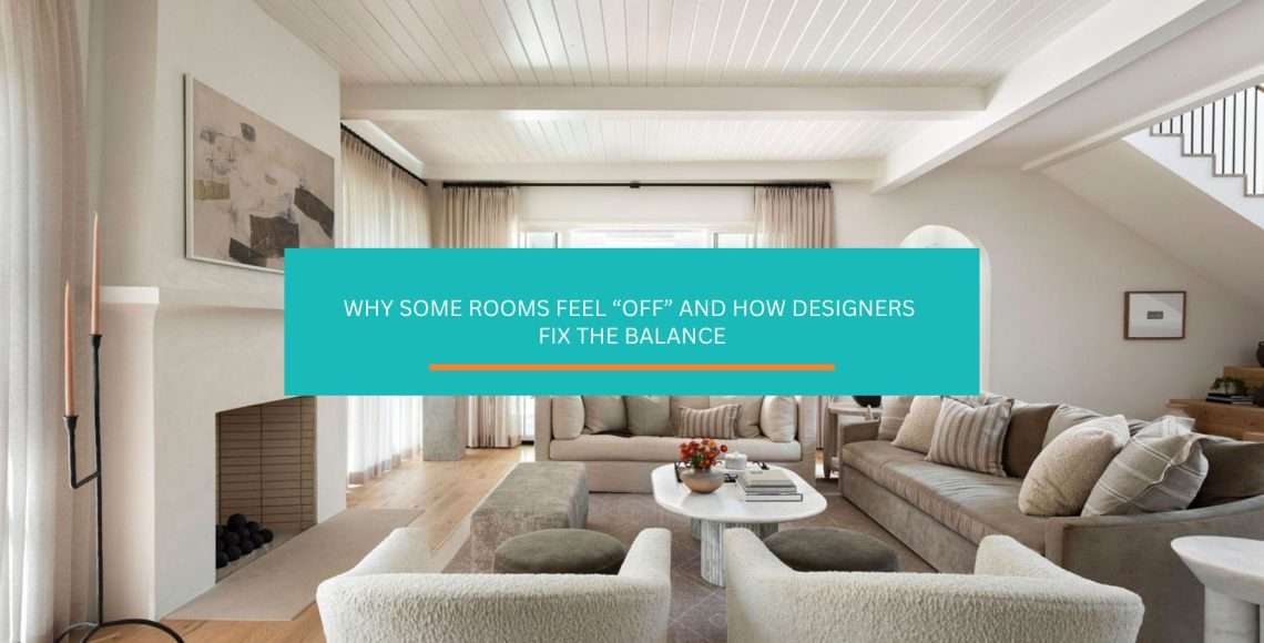
Why Some Rooms Feel “Off” and How Designers Fix the Balance

If you’re wondering why some rooms feel “off,” the answer is not bad taste or broken design rules. It is your brain picking up on that imbalance before you ever find the words for it. 

You walk in, pause to look around, and something just does not settle. The room feels awkward, heavy, or oddly unfinished, even if everything in it seems perfect.

Designers are trained to read those signals instantly. They pick up what your eyes are tripping over, where the space feels tense, and why it’s not giving you that easy and relaxed vibe it should. But once you figure out what’s throwing things off, the fix feels a lot more doable. 

Keep reading, darlin’, because this is where that vague discomfort finally starts to make sense.

The Real Reason Behind a Room Feeling “Off”

marble fireplace

Bottom line up front, sugar: 

Visual weight is what makes some pieces in your room quietly support the space, while others demand all the attention. How that weight is spread out is what affects whether a space feels calm and comfortable or a little uneasy.

Once you understand visual weight, you stop guessing and start making intentional choices. 

Bigger furniture, darker colors, bold patterns, and thicker textures naturally feel heavier to the eye. A deep charcoal sofa, a chunky bookcase, and a busy rug will always carry more presence than pale walls, slim furniture legs, glass, and open materials. 

That doesn’t make those heavier elements wrong, hun, but it does mean they need balance.

Lighter elements do a lot of quiet work in the room. Soft wall colors, lighter ceilings, and open finishes help the space feel more breathable and relaxed. Even vertical choices matter. When the eye is encouraged to travel up through tall furniture, art placement, and subtle contrasts, the space feels more evenly grounded. 

I mean, who wants a room that feels bottom-heavy, anyway?

Texture and placement play a role, too. 

A few objects grouped tightly together pull attention much faster than those same items spread out across the room. When everything visually crowds one side, your eyes keep snapping back there, and your brain never quite gets to rest

Designers pay close attention to this because our minds are wired to prefer balance. Studies consistently show that cluttered, visually overloaded spaces increase stress and mental fatigue, even when we cannot quite explain why.

This is where the psychology of space comes in: 

Balanced rooms feel easier to be in because the eyes move through them without effort. Nothing is yelling for attention, and, at the same time, nothing feels forgotten. When visual weight is evenly distributed, the room feels settled, welcoming, and naturally comfortable. 

It’s the kind of space where you exhale without realizing it.

If reading this made you look around your room and think, “Well… that explains a lot,” you’re not alone. At Design on a Dime, we help clients move from guesswork to clarity by identifying where visual weight might be working against their space and reshaping it so the room finally feels easy to be in.

The Three Types of Balance Designers Rely On

bright modern living room
Source: The Residency Bureau

Think of balance as your shortcut to a room that feels settled instead of slightly off. Designers rely on three main types of balance to get there, and once you recognize them, you start seeing why certain spaces feel so good and others never quite land.

Here’s the thing, sugar:

Balance matters because our brains crave order, even when we love personality and creativity. 

When the visual weight in a space feels evenly distributed, everything feels calmer, more comfortable, and easier to live in. But when it’s not? 

Your eyes keep searching for a place to rest.

  • Symmetrical balance is the most familiar. It is the classic twin look; I’m talkin’ matching lamps on both sides of the bed or identical chairs flanking a fireplace. This type of balance feels orderly and reassuring, which is why it works great in bedrooms, living rooms, and rooms meant for rest. That symmetry tells your brain everything is under control.
  • Asymmetrical balance is where things get more interesting. Instead of matching pieces, you use different items that still carry similar visual weight. Think a sofa balanced by two lighter chairs, or a tall floor lamp offset by layered artwork. The pieces might not be the same, but the space still feels stable. This approach feels modern, relaxed, and intentional when done well. It’s also where many rooms go wrong when the visual weight isn’t carefully considered.
  • Radial balance pulls everything toward one central point. Imagine a round dining table with chairs arranged evenly around it, or a seating area underneath a chandelier. This kind of balance creates a strong sense of connection and flow, especially in social spaces where people naturally gather.

You might not even realize it, but layout plays a major role in how comfortable a space feels. That reaction is not accidental. When balance is working, the space feels calm, curated, and complete without trying too hard.

Once you understand which type of balance a room is leaning toward, the fixes become much clearer. You are no longer decorating blindly. You’re choosing twins, contrasts, or centered layouts on purpose, and the intention behind those choices is what makes a space finally feel right.

Once you can spot which type of balance a room is leaning toward, decorating stops feeling random. This is the lens Design on a Dime relies on to help you make confident decisions that feel cohesive, even when mixing styles, eras, and furniture you already love.

Visual Weight Mistakes That Make a Room Feel Wrong

living room interior
Source: Kellie Eserts Interiors

You know the feelin’. You walk into a room, and nothing is technically wrong, but something just doesn’t sit right. 

In most cases, that reaction comes down to visual weight and scale working against each other.

  • Visual weight is the perceived heaviness of what you see, and your eye is incredibly quick to pick up on it when it’s uneven. Think too many dark colors on one wall, a massive sectional paired with a coffee table that feels like it wandered in by mistake, or a handful of small decor pieces scattered around with nothing substantial to ground them. When the weight is concentrated in only one area or mismatched in size, your brain reads it as “imbalance” before you even have the words for it.
  • Scale and proportion make that imbalance louder. Furniture that’s too large overwhelms the room and shrinks the space around it, and furniture that is too small makes the room feel underfurnished and awkward, like it never quite grew into itself. When pieces are scaled correctly to the space and the people using them, movement feels easier, and the space instantly calms down.

Color and texture play into this more than most people realize. When all the bold colors or heavy textures live on one side of the room, your eye keeps getting pulled there. The same thing happens when the lights are uneven or when one area feels crowded while another feels empty. 

A room needs moments to breathe, honey, and negative space is just as important as what fills it.

If your room feels off, it’s not being dramatic. It is responding to mixed signals. The good news? Once you learn to spot these weight and scale issues, fixing them becomes much more straightforward.

If any of these mistakes sounded familiar, that doesn’t mean your room is beyond saving. It usually means the space needs a second set of trained eyes to spot what is quietly throwing things off. Design on a Dime specializes in fine-tuning scale, layout, and visual flow, without starting from scratch.

How Designers Fix the Balance

Once you can see what’s throwing a room off, the fix is rarely complicated. It’s mainly about giving the eye a place to land, spreading visual weight with intention, and letting your space breathe rather than crowding every inch. 

And darlin’, that’s where rooms stop feeling accidental and start feeling composed. 

You can check out our Jennifer Heights Project for a real-life example of these principles in action.

Create a Focal Point That Grounds the Room

Create a Focal Point That Grounds the Room
Source: Megan Glenn Architecture

When a space feels underwhelming and scattered, it’s often because nothing is clearly in charge. A strong focal point acts like the anchor of the room. It quietly tells your eye where to go first and helps everything else fall into place.

Your focal point might already be there. A fireplace, a large window, a statement light fixture, or a piece of art with presence can all do the job. The key? 

Choosing one and letting it take the lead. 

When everything tries to be important, nothing actually is.

Once you have that anchor, furniture and decor should support it instead of competing with it. 

Sofas face it. Rugs and seating relate to it. Even lights work in its favor, drawing attention where you want it instead of letting the room feel aimless. 

In bedrooms, the bed usually does all the heavy lifting. In living rooms, it might be the fireplace or the view. Either way, once the focal point is clear, the room starts to feel intentional, not accidental.

Now, a quick gut check helps here. 

What do you notice within the first few seconds of walking in? 

That first impression tells you exactly where your anchor is, or whether the room still needs one.

Balance Visual Weight With Color, Texture, and Scale

bold texture living room decor
Source: Freestone & Smith

This is where many rooms quietly lose their footing. 

You see, honey, visual weight is not just about size. Color, pattern, texture, and height all carry weight, too, and designers use them like tools

The goal? 

Make sure no single area feels overloaded.

Dark colors and bold patterns feel heavier than light, quiet ones. Rich textures, like velvet, leather, and heavy wood, pull more attention than smooth and airy finishes. But if all of that weight gathers on one side of the room, the space starts to feel lopsided, even if you can’t really explain why.

Instead of stacking them all in one corner, designers spread them throughout the room.

Accent colors show up in more than one place. Patterns are repeated enough to feel cohesive. Repetition creates rhythm, and rhythm creates calm.

Scale matters here, too. A large sofa needs chairs that can hold their own. Small pieces of art floating over a king bed will always feel lost. Remember: 

Designers rely on proportion, not instinct.

Let Negative Space and Sightlines Do Their Job

Negative Space interior
Source: Design State

One of the biggest differences between a designer room and a crowded one is what gets left out. 

Negative space is not wasted space, and you should stop treating it as such. Because dear, it’s what gives the room rhythm and relief.

Pay close attention to sightlines. From the doorway, from the sofa, from the kitchen pass-through. 

Clear paths and open views let your eyes travel through the room without bumping into obstacles, which helps the space feel calmer and more spacious, even when it’s not particularly large.

Furniture height plays into that balance. Lower pieces can stretch a tight room and keep windows feeling open. Taller pieces, on the other hand, help ground rooms with higher ceilings. 

Mixing heights keeps the space from feeling flat, but remember: 

Too much of one height could actually make the room feel boxed in.

A balanced space usually includes at least one area that stays intentionally quiet. A blank wall. An open corner. A clear path to a window or focal point. 

That pause is what allows everything else to shine.

This is the part where many folks stall, not because the ideas are hard, but because it is tough to see your own space clearly. Design on a Dime helps translate these principles into real-life layouts that will work for how you live, so your home feels composed, comfortable, and fully settled.

Frequently Asked Questions

How do I know if my room needs professional help or just a small adjustment?

If moving a few pieces around and editing decor improves things quickly, you’re likely close. But if a space still feels unsettled, even after several tries, a professional eye could spot what you might be missing.

Can a room feel off even if everything matches?

Yes, it certainly can. Remember that matching does not guarantee balance. Spaces might still feel flat and “heavy” when scale, spacing, and visual flow are working against the layout.

Does ceiling height affect how balanced a room feels?

Yes, ceiling height does affect how balanced a room feels. Low ceilings often need lighter, lower furniture, while higher ceilings benefit from taller elements that visually ground the space.

Is it possible to overcorrect balance and make a room feel stiff?

Yes, it absolutely is. Overcorrecting (think too much symmetry or too many rules) can drain personality out of the room. Balance should always feel natural, not forced.

What is the biggest mistake people make when trying to fix a room themselves?

The biggest mistake people make is adding more instead of editing what’s already there. Most rooms feel better once all the unnecessary pieces are simply removed or repositioned, not necessarily replaced.

When a Room Finally Clicks

That uneasy feeling you get in a room is not random, honey, and it’s not a personal failure, either. 

It’s simply your space asking for a little clarity. 

See, when a space is balanced, it stops demanding attention and starts supporting your life. It feels easier to move through, easier to relax in, and easier to love.

If you’ve adjusted, edited, and shifted things around, and the room still won’t settle and “click,” that is often the moment where a trained eye makes all the difference. At Design on a Dime, we help homeowners spot what is quietly working against their space and guide it back into balance without starting from scratch. 

If you are ready for that sense of ease, you can reach out to our team. Sometimes, all a room needs is the right nudge to fall into place.

Statement Lighting

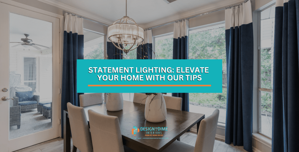
Statement Lighting: Elevate Your Space With Stunning & Practical Solutions

Statement lighting and pendant fixtures transform spaces as functional elements and striking design focal points. 

The right lighting can dramatically elevate a room’s ambiance, adding depth and character that complements existing decor. 

When selecting lighting, it’s essential to consider color temperature; warmer tones can create a cozy atmosphere, while cooler tones offer a more modern feel. Additionally, layering different light sources allows for versatility in mood and function throughout the day.

Viewing lighting as an integral part of interior design rather than merely a practical necessity, homeowners can unlock the potential of their spaces

Ready to shed some light on your design choices? Let’s illuminate your space with stunning statement lighting ideas that will brighten your home and your mood!

Why Statement Lighting Matters in Modern Interiors

statement lightning matters in modern interiors

Statement lighting is the shining star of your home when creating a cohesive and stylish interior. Bold lighting pieces and ideas, such as oversized pendants or elegant chandeliers, illuminate your space and serve as conversation starters that reflect your style. Imagine entering an entryway graced by a stunning antique brass chandelier—it’s sure to light up the room and spark interest from every guest!

These striking light fixtures can define a room’s tone and enhance its design in remarkable ways. For instance, a sleek LED pendant light can bring a modern flair to a traditional space, while a vintage-inspired pendant light fixture can add warmth and character.

LEDs (light-emitting diodes) are the most energy-efficient lighting option. They use only 10 watts to produce the same light output as a 60-watt incandescent bulb, which wastes about 90% of its energy as heat.

In contrast, LEDs convert 80-90% of their energy into light.

The right choice of lighting can transform the atmosphere, turning an ordinary room into an extraordinary one. 

Moreover, statement lighting adds layers of interest that keep the eye engaged. For example, a cluster of colorful pendants can create a playful vibe in a dining area.

At the same time, an oversized fixture above a kitchen island in a small kitchen becomes a focal point that draws attention and admiration. Something you should think about!

Don’t underestimate the power of a well-placed light bulbit can illuminate your space and style!

By mixing different materials and designs, you can create a dynamic interplay of elements that enhances the overall aesthetic of your home.

Types of Statement Lighting: From Chandeliers to Sculptural Lamps

types of statement lightning

Statement lighting enhances your interior design, offering unique impacts through various styles.

Here’s a breakdown of popular types of statement light fixtures that can elevate your space:

1. Chandeliers

Chandeliers bring grand elegance to any room, perfect for dining areas or entryways. As captivating statement light fixtures, they serve as stunning mood lighting ideas that can dramatically enhance the overall ambiance.

2. Pendant Lights

Ideal for kitchen islands and dining spaces, this 2024 kitchen trend is at its peak. Kitchen island pendant lights create a cozy atmosphere while providing targeted illumination.

They come in various designs, from sleek modern styles to rustic charm.

Ready to cook up your dream kitchen? Let our Dream Team whisk you into a world of stylish functionality and lighting ideas! Get started on your kitchen remodel journeybecause your perfect kitchen is just a few design ideas away!

3. Wall Sconces

Wall sconces add dimension and warmth to any room. They are perfect for hallways or as accent lighting beside mirrors. They can complement other light sources and create layered lighting effects.

4. Sculptural Floor Lamps

These artistic pieces not only provide light but also serve as striking decor elements. Sculptural floor lamps embody modern minimalism and can fit seamlessly into contemporary spaces.

Choosing the Right Light Fixture for Every Room

statement lightning for every room

Selecting the perfect light fixture can dramatically enhance both functionality and aesthetics in your home.

Here’s a room-by-room guide to help you illuminate your spaces with style.

Dining Room: Chandeliers

Chandeliers are the quintessential statement light fixture for dining rooms, adding grand elegance and a touch of sophistication.

They provide general lighting and a warm atmosphere for family gatherings or dinner parties. Opt for a design that complements your decor—a classic crystal chandelier or a modern linear pendant that hovers above your dining table.

Remember, the right light bulb can enhance the effect, so consider dimmable options to set the mood.

Kitchen: Pendant Lights

kitchen pendant lights - a perfect statement lighting

Statement pendant lights illuminate workspaces like kitchen islands or breakfast bars in kitchens the best.

A glass pendant can add a sleek, modern touch while providing focused task lighting where it is most needed. Consider hanging multiple pendants in a row or choosing an oversized design that draws the eye for maximum impact. 

Using a dimmer switch can also enhance versatility. It allows you to adjust the brightness according to the occasion: a cozy dinner or a lively gathering.

The height of your hanging lamp should be carefully considered—generally, aim for 28 to 35 inches above counters to avoid obstruction while maximizing light output.

Hallway: Wall Sconces

Wall sconces are perfect for hallways, offering style and functional lighting without wasting valuable floor space.

They can provide soft ambient light, enhancing safety while adding character to otherwise dull corridors.

Choose sconces that align with your home’s aesthetic—whether sleek and modern or vintage-inspired—to create a cohesive look throughout your home.

Living Room/Bedroom: Statement Lamps

Table lamps and sculptural floor lamps can serve as lighting sources and decorative elements in living rooms and bedrooms.

A bold hanging or sculptural floor lamp can be a conversation starter while providing essential light for reading or relaxing. 

Look for designs that reflect your style to make a statement truly.

Ready to brighten up your space? Contact Design on a Dime Interiors today, and let us help you find the perfect lighting solutions!

Material and Finish: Matching Lighting to Your Decor

matching lightning with decor

Selecting the right materials and finishes for your lighting fixtures can enhance your decor and create a cohesive look. 

Here’s a guide to popular finishes and materials, along with tips on matching lighting to furniture and overall design style.

Popular Finishes

  1. Brass: This timeless finish adds warmth and sophistication to any space. A brass pendant or statement chandelier can be a striking focal point in a dining room or entryway, elevating the overall aesthetic effortlessly.
  2. Chrome: Chrome is an excellent choice for a sleek, modern touch. It reflects light beautifully, making it perfect for contemporary spaces. Consider using chrome fixtures in areas where you want to emphasize modern lighting.
  3. Matte Black: This finish offers a bold contrast that works well in various industrial and farmhouse settings. Matte finishes provide a refined look that complements both minimalist and eclectic designs.

Materials That Shine

  • Glass: Light fixtures featuring glass elements, such as glass globes or dome pendants, can soften the light and add an airy feel to your space. They are versatile enough to fit into both modern and traditional decor.
  • Metal: Metal fixtures are durable and can introduce texture to your design. Pairing different metals within the same room can create visual interest while maintaining cohesion.
  • Natural Fibers: Incorporating materials like rattan or bamboo in your lighting choices adds warmth and an organic touch, perfect for creating a cozy atmosphere.

Ready to transform your space into a stunning reflection of your style?

Schedule a consultation with Design on a Dime Interiors today! Our expert team is here to help you illuminate your home with the perfect lighting solutions tailored to your needs. Don’t wait—let’s turn your design dreams into reality!

Tips for Installing and Maintaining Pendant and Statement Lights

Installing and maintaining statement lighting ensures your fixtures look great and function effectively. 

Here are some practical tips to help you with your home decor lighting journey.

Installation Tips

  1. Hanging Height: When installing hanging lights, such as a globe pendant or modern pendant, it’s crucial to hang them at the correct height. For kitchen islands, aim for a height of 28 to 36 inches above the countertop to provide adequate illumination without obstructing views. In dining areas, hang pendants about 30 to 36 inches above the table to create a warm, inviting atmosphere.
  2. Secure Mounting: Ensure that all fixtures are securely mounted to prevent accidents. Use appropriate anchors and follow manufacturer instructions for installation, especially for heavier fixtures like chandeliers or larger pendants.

Choosing the Right Bulbs

Selecting the right bulbs can enhance both energy efficiency and ambiance. Consider using integrated LED bulbs for their longevity and lower energy consumption. They provide excellent illumination while reducing your overall home lighting costs.

LED Color Temperature

When choosing LED light bulbs, color temperature is crucial. 

If you’re wondering which one is the best match for your home, here are a couple of tips:

  • 2700K: This one showcases a warm, inviting glow that’s perfect for living rooms and bedrooms, where this kind of atmosphere is usually desired.
  • 3000 – 3500K: With a soft, white light, this temperature color works beautifully for kitchens and bathrooms where clarity is the number 1 priority.
  • 4000 – 5000K: Often referred to as a cool daylight color, this choice goes well with garage spaces or any other workplaces in your home.

Pro tip: Choosing a color temperature can decide how your space feels—so choose wisely!

Maintenance Tips

  1. Regular Cleaning: Establish a routine to keep your fixtures looking their best. Dust can accumulate on wall lights and hanging fixtures, so gently wipe them down with a soft cloth. For glass elements, use a glass cleaner to maintain clarity.
  2. Preserving Finishes: Be cautious when cleaning products if your lighting includes handcrafted elements or unique finishes. Avoid abrasive cleaners that can damage surfaces; use mild soap and water for maintenance.

If you’re following these tips for installing and maintaining your statement lighting, you can ensure that your fixtures not only meet your lighting needs but also remain beautiful additions to your home decor for years to come.

Light Up Your Style With The Best  Light Statement Ideas

Lighting home projects can dramatically change a room’s mood and functionality, reflecting your unique personality and style.

Don’t be afraid to experiment with different fixtures hanging above your dining table or kitchen island—these statement-making pieces can serve as stunning focal points that elevate your decor.

Consider incorporating light modern designs that blend seamlessly with your existing aesthetic while adding a touch of chic sophistication.

Explore various styles, from elegant chandeliers to sleek pendant lights, and pay attention to the lumen output to ensure you achieve the desired ambiance.

Finding the perfect statement piece can bring your vision to life and create an inviting atmosphere reflecting your identity.

So go ahead—let your creativity shine and transform your space with the magic of lighting. Contact Design on a Dime Interiors today for expert advice tailored to your lighting needs!

Home Lighting: 3 Easy Steps To Do Your Own Lighting Design

Lighting is one of the essential and irreplaceable components when you’re doing your interior design. A good lighting design will not only elevate the ambiance and the look of your house but will also support your day-to-day activity and make your home feels more comfortable. So, why is lighting design so important? What’s its influence on your house’s interior design? And how to do a good lighting design on your own? Let’s talk about them in this article.

The Importance of Lighting Design

Lighting design is everything in interior design because it plays a massive role in how someone sees and experiences a space. Different lighting will give a different ambiance to your house’s geometry, mood, and emotions.

No matter how amazingly designed your house is, how distinctive the texture you use, or how beautiful the color of your house is, without a suitable lighting design, the essence of your interior design will become nothing.

So, how do you achieve a good lighting design?

How To Design Your Own Home Lighting

There are many ways you can utilize lighting to enhance the ambiance of your house, but if you’re new to this, you can easily follow these three steps to make your lighting design truly shines.

  1. Understand The Characteristic Of Light Source

Each type of lighting has a characteristic that can lighten your house or dull the looks of your house. You must focus on three characteristics: temperature, beam angle, and lumens.

Temperature

The first one that you need to focus on is temperature. Color temperature is a way to explain the warmth or the coolness of the light bulb. The temperature of the light is measured in Kelvin. Light up to 3000K is called warm light, up to 4000k is called natural light, and beyond that is called cool light. 

Different color temperatures can be used to fit different activities in your house. Warm light gives a cozy, calm, and intimate atmosphere, perfect for the bedroom and family room. Natural light is best for the kitchen, bedroom, or living room because the light is best for a working space. In comparison, the cool light is best for offices, hospitals, malls, and other commercial uses.

Beam Angle

The beam angle is the angle at which the light lights the space. To highlight an object in your house, such as an art piece or a photo, it’s best to use a narrow-angle light. In contrast, a wide angle is usually used to light a wide area or room.

Lumens

Lumens are how much light is visible to human eyes from the light source. The higher the lumen lighting, the higher the intensity of the light will be. The activity will determine the level of the lumen in the lighting you will do in that space.

  1. Make Layers

A good lighting design is about layers. Layers can create contrast, accentuate an object or an element, and emphasize the texture of your house. 

Ambient Lighting

First, you need to pick ambient lighting for your house. The main lighting in your house will allow you to see your room clearly and make a specific tone in your room. You can pick from one up to three main ambient lighting for a particular room.

You can use a ceiling light, wall lamp, floor lamp, hanging lamps, or combinations of all of them.

Accent Lighting

The second one is to pick accent lighting, which aims to highlight a specific detail or object in your room. You can highlight a painting, photograph, art piece, or even a plant. The accent light will determine the “main theme” of the room and will tell the viewers what’s the thing that you highlight in your room.

Task Lighting

Task lighting, as the name suggests, is the light used for a specific task in your house, whether it’s a downlight in the kitchen, soft light behind the TV table to accompany your movie ni, or even a study lamp for your kids.

  1. Get Creative

Okay, now that you’ve understood the basics of what kind of lighting options are out there, what’s the difference between each bulb, and what kind of lighting you need to plan in your room, you can get creative on doing your own lighting design. 

Don’t be too strict with the rules that many designers make. Instead, get creative and see how the combinations between different lighting types could give your house a unique ambiance. It’s your house, after all. As long as it serves the purpose of light and you’re happy with your lighting design, it’s already a win 

Conclusions

Doing your lighting design is not easy, but it can be fun. Choosing and planning your home lighting is best because you can choose your house’s tone and atmosphere the way you like it. Whether you want it to emphasize specific points in your house or to be customizable for every specific activity, the choice is yours.

But, if you don’t have the time to design your home lighting, don’t have the connections of where to buy the right light for your house, and don’t know where to start, rest assured, we got you covered. You can always consult with our team to design your house. With our 15+ years of experience, you will surely have the perfect interior design you’ve always dreamt of.

Contact us to schedule your consultation!