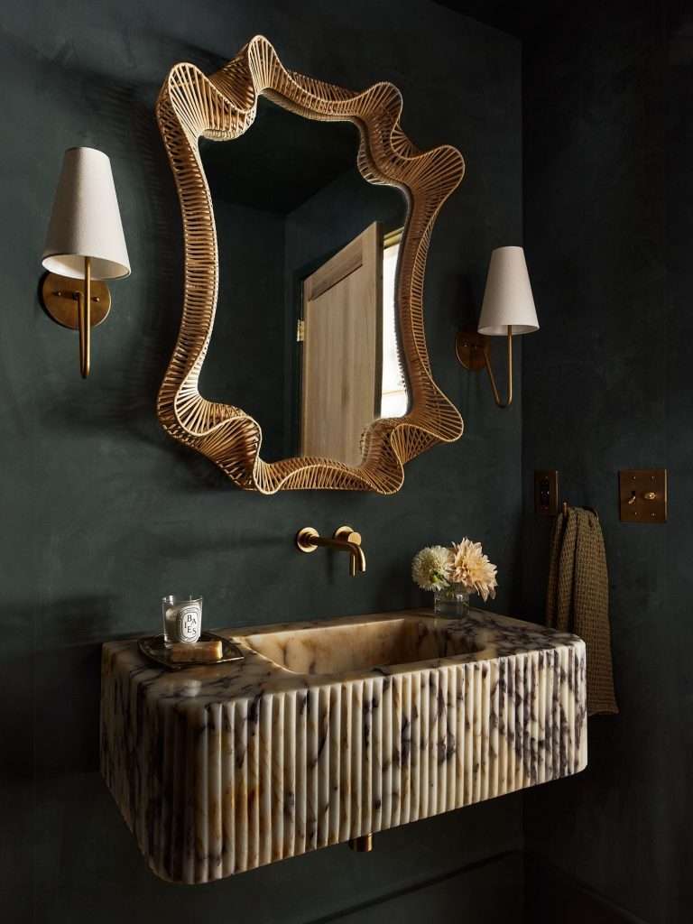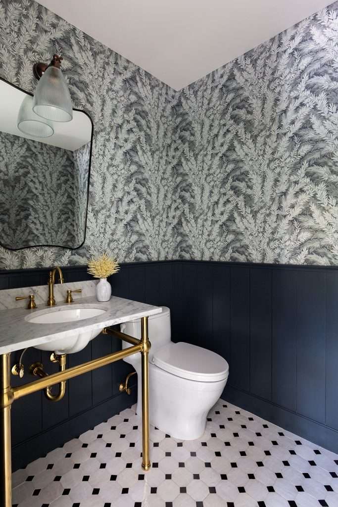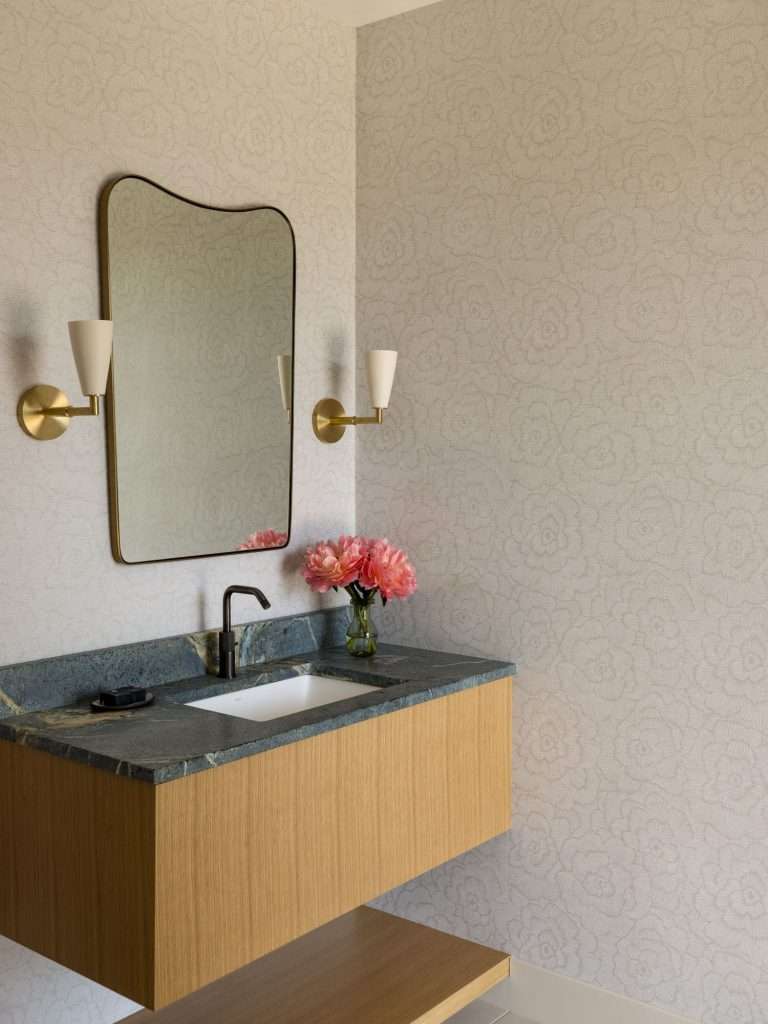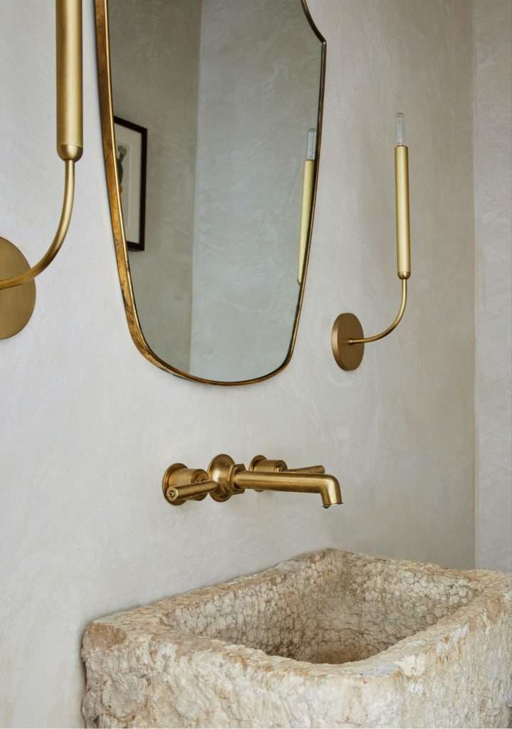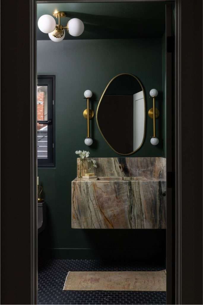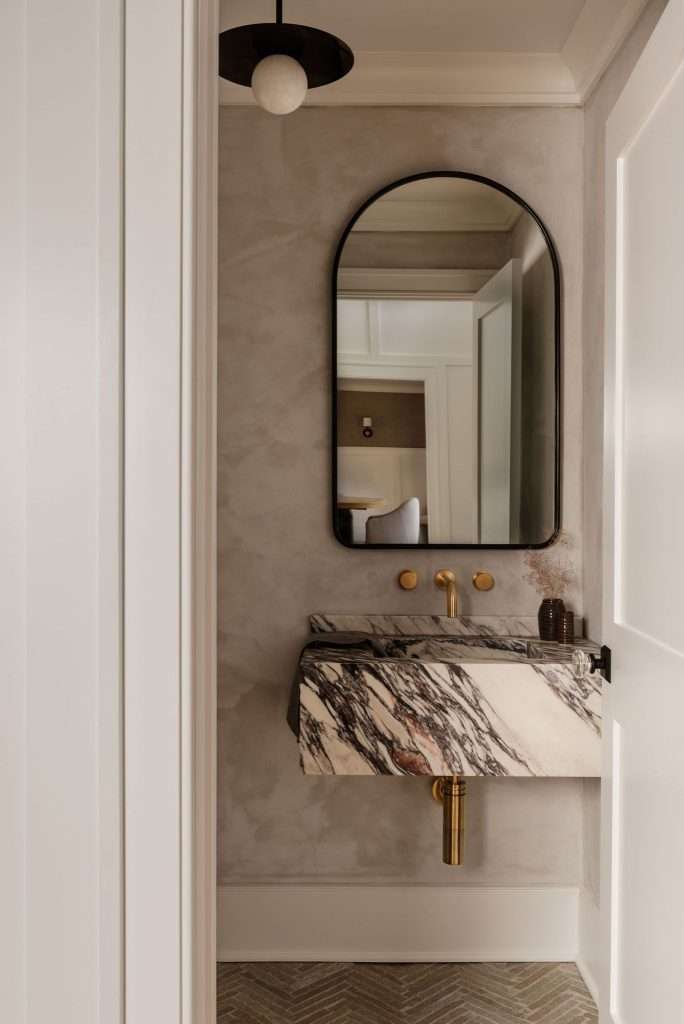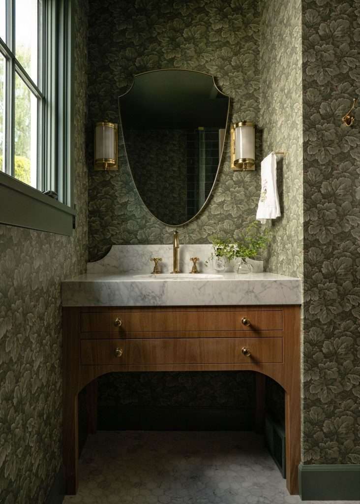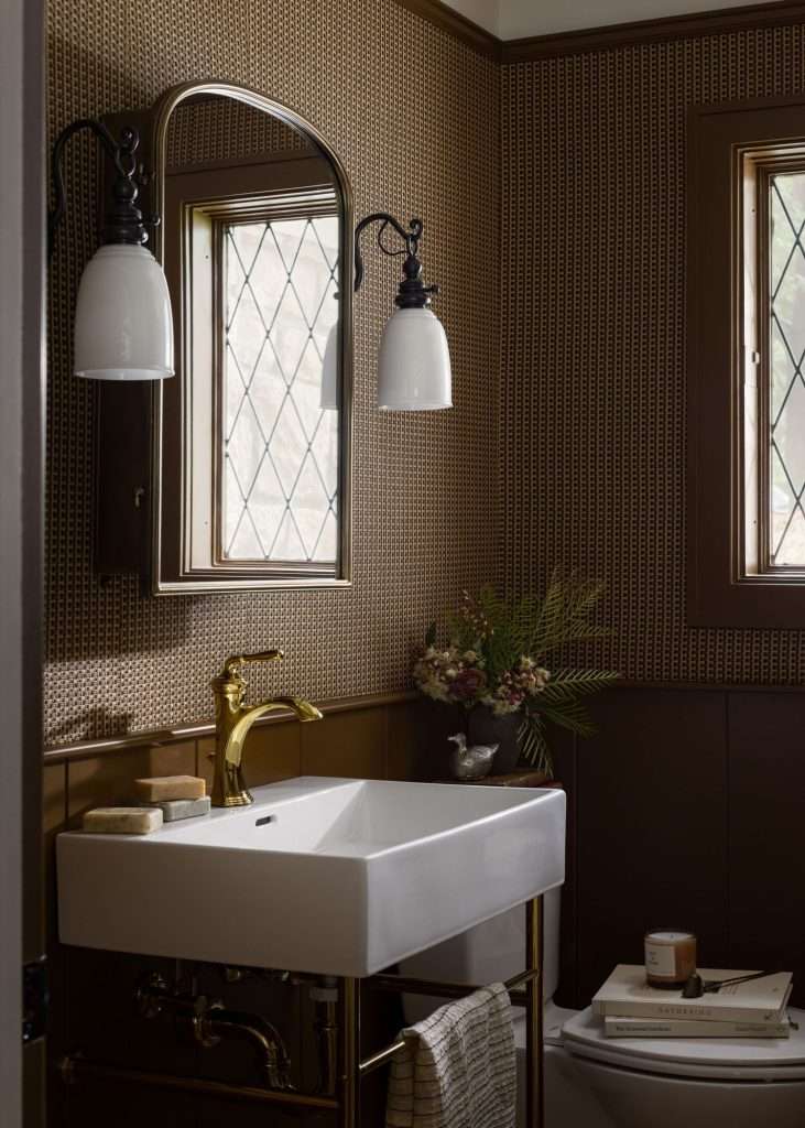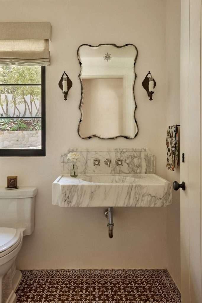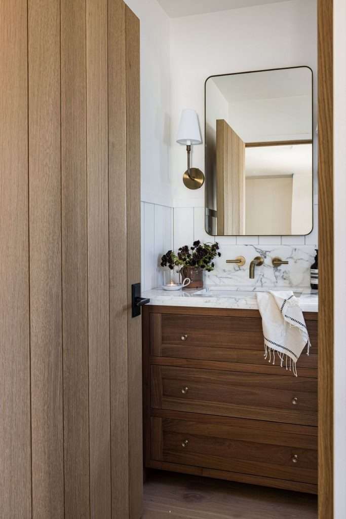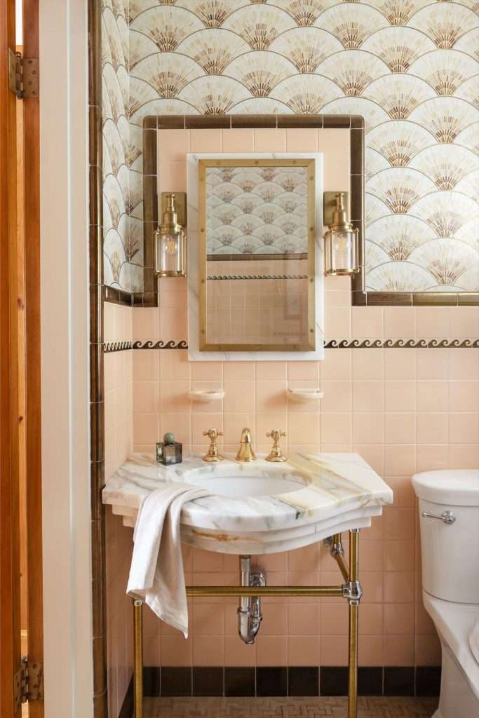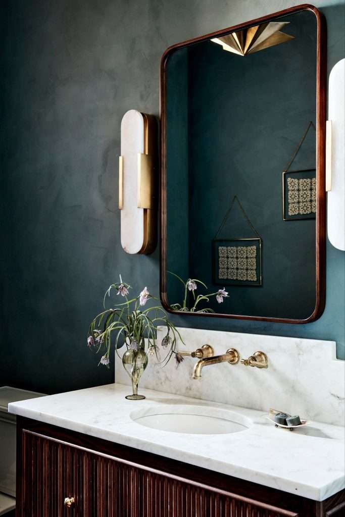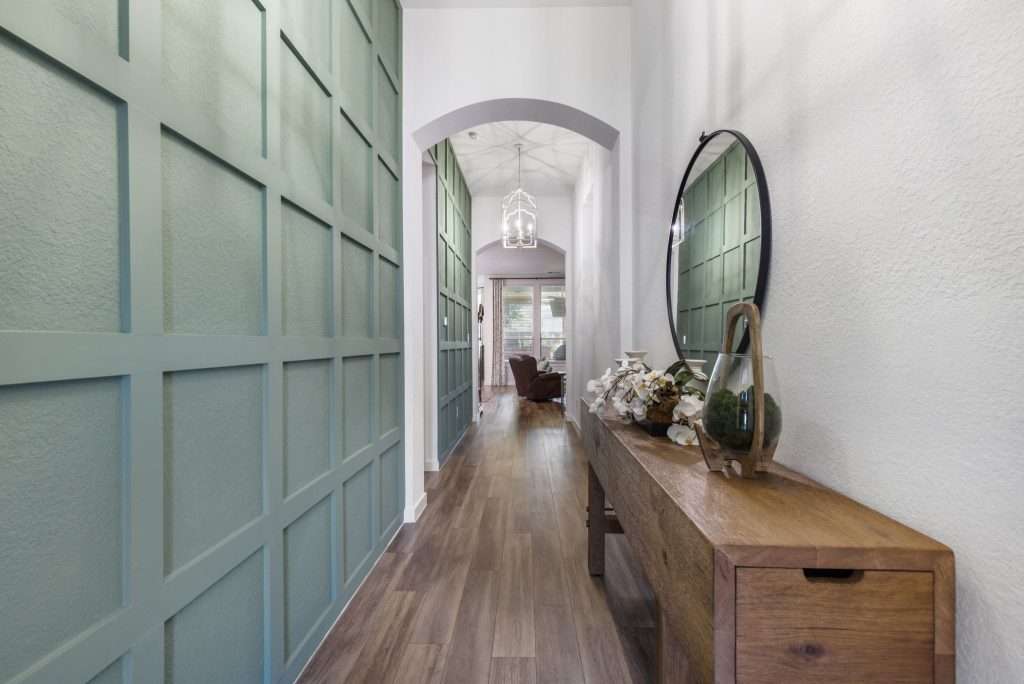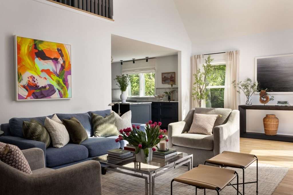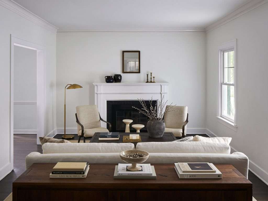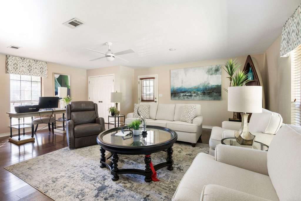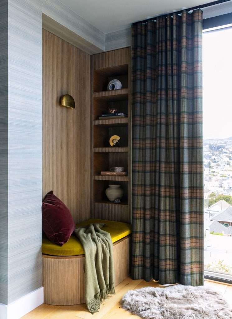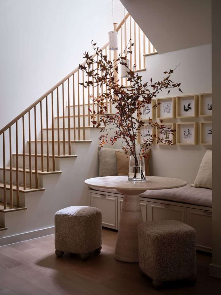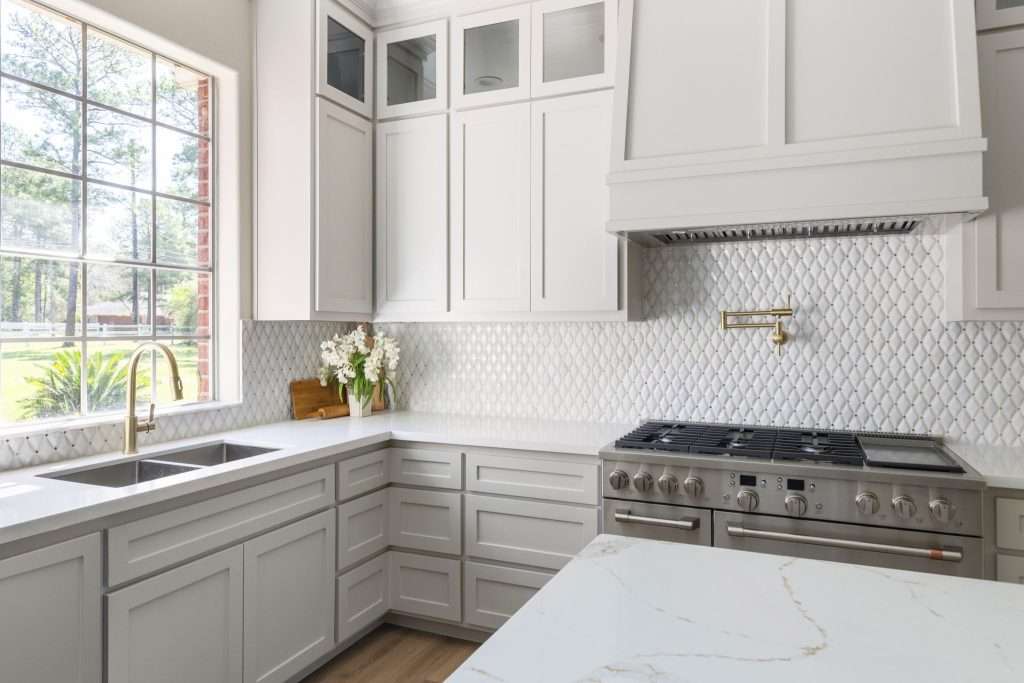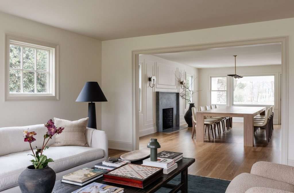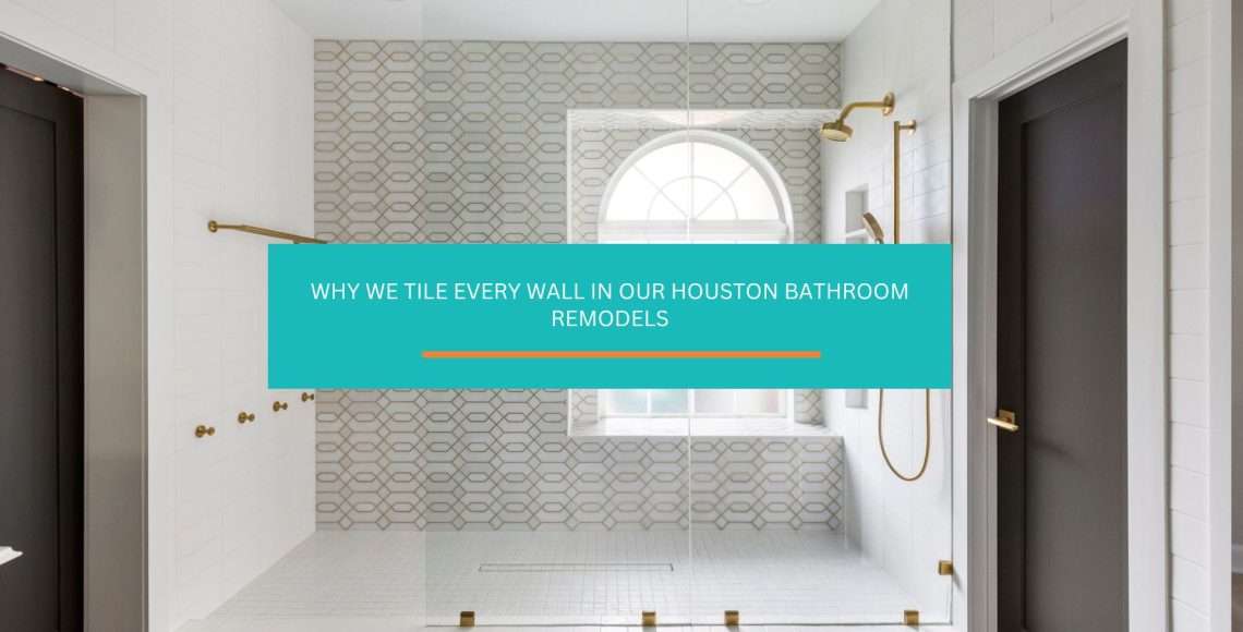
Why We Tile Every Wall in Our Houston Bathroom Remodels

The wet bathroom is the design move that gets the loudest pushback in our presentation visits, and the strongest love letter once it’s done. You tell a Conroe homeowner you want to tile every wall in her primary bathroom, floor to ceiling, four walls round. Her face stops cooperating for about six seconds. “You want to tile every single wall?” she asks. Yes, ma’am, I do.

And here’s why, darling: in our part of Texas, where humidity runs the show year-round and the steam coming off a hot shower has its own attitude, paint loses. Tile doesn’t. Stick around for a minute, because this surprise tactic shows up in nearly every Greater Houston bathroom remodel we wrap. The reason is simpler than it sounds.

When Bathroom Paint Becomes a Houston Maintenance Problem

Bathroom paint in Houston has one job and a hundred reasons to quit. Steam, humidity, splash, and condensation all add up against it. The kind of August week where the air feels like a warm towel breaks down even the best paint film inside two or three years. The peeling shows up first near the ceiling above the shower, then around the tub surround, then on the wall behind the toilet where condensation pools overnight.

You don’t notice it for a while. Then you do. And once you see the bubble, you can’t unsee it.

Houston’s average relative humidity sits well above the national average year-round, which is a different climate problem from anything a paint manufacturer’s lab in Ohio is testing against. The same paint that lasts ten years on a kitchen wall in dry Denver might give you four years over a Conroe master bathtub. Then it starts asking for a touch-up. That’s how homeowners end up stuck in the paint maintenance cycle. Every two or three years the bathroom needs primer, cleanup, and a fresh coat just to look presentable again.

The fix most people reach for is a better paint. The fix we reach for is no paint at all. If your bathroom keeps fighting you for upkeep, our take on why a bathroom feels cold, dingy, or draining lays out where that felt experience usually comes from.

The Surprise Move: Tile Every Single Wall, Floor to Ceiling
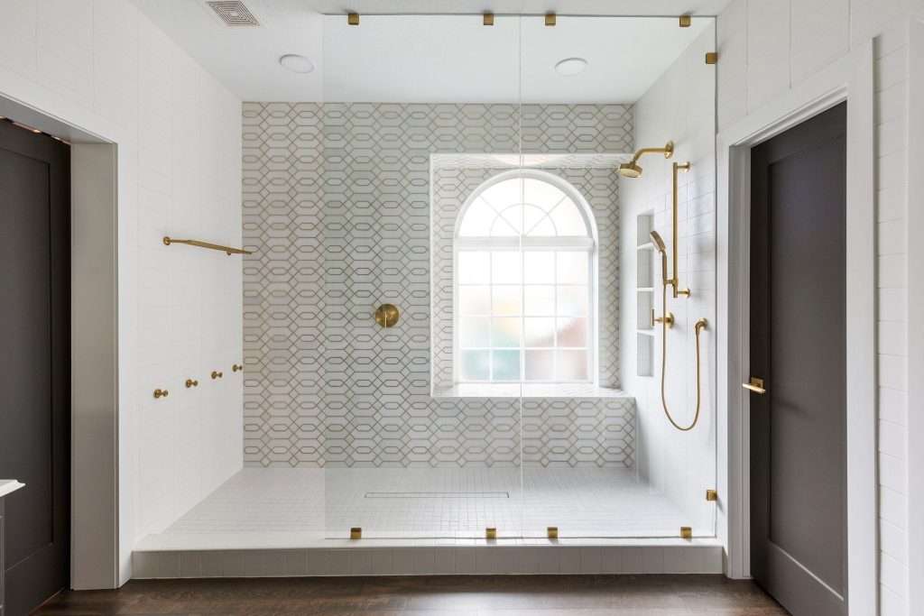
wet bathroom

A wet bathroom is a bathroom where every wall surface, top to bottom, is tile. Not just the shower walls. Not just a wainscot strip. Every wall. Floor to ceiling. Four walls round.

The pushback in the presentation room is real, baby. Clients hear “tile every wall” and picture a hospital. What we’re actually describing is closer to a Continental hotel bathroom or a well-done spa: a room where the water-resistant surface is the room, not a feature inside it. The National Kitchen and Bath Association tracks wet rooms as a growing residential category, and the reason is the same in every market. The maintenance math gets simpler the more tile you put on the walls.

Here’s what changes when you make the switch:

  • No paint to maintain ever again. The touch-up cycle ends. The ceiling line stays crisp. The wall above the tub doesn’t develop a slow mildew bloom. You wash the walls when you wash the floor. That’s it.
  • The shower stops being a separate room. When the wall material is continuous, you can run a linear drain and a curbless shower without that visual fault line where the tile ends and the paint begins.
  • The whole room reads calmer. Visual breaks read as visual noise. One material on all four walls reads as one quiet decision instead of five small ones.

We use this approach across nearly every primary bathroom we touch in Conroe. The homeowner stops calling us back two years later asking why the paint above the shower is peeling.

White Tile as the Clean Ground That Lets One Accent Wall Read as Art
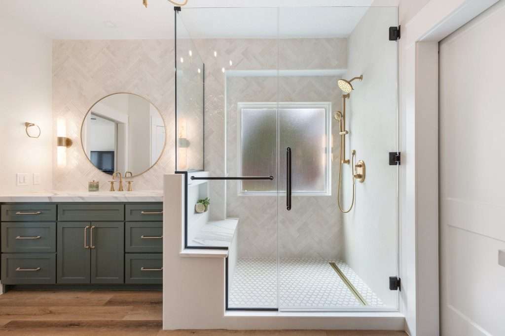
white tiles bathroom

The aesthetic move that makes the wet bathroom work is using a quiet field tile on three walls so the fourth wall can do all the talking.

We pick a classic white field tile as the ground in almost every primary bath. Subway-style, large-format, or a hand-glazed white square if the home leans more transitional. White tile reads as a clean ground that doesn’t fight the rest of the room. It also doesn’t date. The trends move on; white stays. A bathroom we tiled in white five years ago looks the same way today.

What carries the personality is the accent wall.

We pick one wall and let it be the moment. Sometimes that’s the wall behind a freestanding tub. Sometimes it’s the shower wall facing the entry door, so you see the accent the second you walk in. Sometimes it’s the wall behind the floating vanity. The choice depends on how the room opens and where the eye lands first.

The accent itself can be:

  • A bookmarked stone slab. If we’re using marble or quartzite on the wall, we order bookmarked pairs so the veins continue across the seam. The slabs get cut next to each other in the quarry block, then folded open like a book. The vein pattern mirrors. Most fabricators will source bookmarked pairs if you ask for them by name, sugar, so ask.
  • A larger-format porcelain panel. Porcelain panels run up to roughly 60 inches by 120 inches, which means an entire accent wall with one or two seams instead of fifteen. The grout joints disappear. The wall reads almost like a single piece of stone.
  • A textured tile in the same color family as the field. When you want quiet drama, a ribbed or fluted white tile on the accent wall works beautifully. A smooth white tile on the rest of the room gives you texture without color. The vanity choice plays into this layering decision, which is why choosing the right bathroom vanity deserves its own attention.

When we plan accent walls in our Woodlands bathroom remodels, the conversation is about which wall earns the attention, not how many statement moments the room can hold. One. Just the one.

What Else to Spec While the Walls Are Already Open
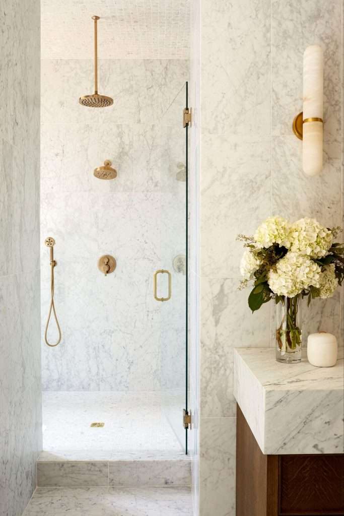
bathroom design
Source: Mister and Mrs. Sharp

A bathroom remodel opens the walls. That window stays open for two or three days before the substrate goes on. Honey, that window is worth more than people realize.

While the walls are open, we spec four things that pay off years later:

  • Wall blocking for future grab bars. Blocking is framing material installed between studs in the locations where a grab bar, handrail, or assist bar might mount someday. The blocking sits inside the wall, invisible after the tile goes up. If the family decides to stay in the home long-term and needs a handheld rail in the shower or a grab bar by the toilet, the support is already there. No demo. No re-tile. The AARP HomeFit Guide and the National Association of Home Builders’ Aging-in-Place specialist program both flag wall blocking as the highest-impact future-proofing spec in a bathroom. It costs almost nothing during construction and is brutal to retrofit later.
  • Plumbing rough-ins for fixtures you might want later. If you’ve ever thought about adding a bidet, a handheld shower wand, a second vanity faucet, or a future heated towel rail, the time to run the supply line is now. The valve doesn’t have to be installed. The line just has to be stubbed and capped behind the wall.
  • Electrical for future seating, heated floors, or vanity additions. A circuit run while the wall is open costs a fraction of what running one through a finished wall costs. Heated floor cable, an outlet inside a vanity drawer, a future sconce location: the wire goes in now and waits.
  • Bookmarked stone before fabrication. If any natural stone is going into the room, the Tile Council of North America’s installation handbook is clear on one thing. Multi-slab applications need vein matching planned at the design stage, not at the install stage. We order the slabs together, mark them at the warehouse, and direct the fabricator to cut them in matched pairs.

Our crew runs this as a coordinated week. Manny, our carpenter, lays the blocking. Edward, our plumber, runs the rough-ins. Carlos, our tile guy, sets the substrate and waterproofs the wet surfaces with a continuous waterproofing membrane system like Schluter or an equivalent install. All three work the same week. If you’re planning a primary bathroom in Spring, this is the window where smart specs get locked in for almost nothing, and skipped specs become expensive later.

The Tile Choices That Actually Hold Up in Houston Bathrooms
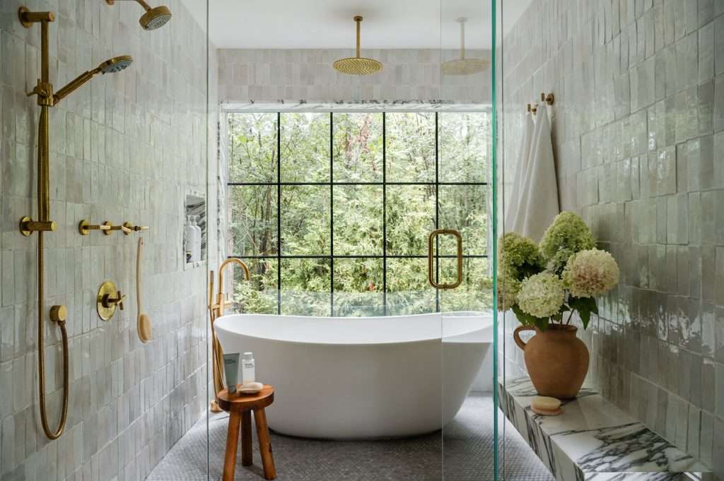
wall to wall bathroom tiles
Source: Dew Design Co.

Not every tile lasts in our climate. Some tile that looks beautiful in a Phoenix showroom or a Charleston listing photo doesn’t survive what Houston does to a bathroom. The choices that hold up here come from materials engineering, not Pinterest.

  • Porcelain field tile rated for floor use. Porcelain absorbs less water than ceramic by a meaningful margin, which matters in a wet bathroom because the floor is part of the wash zone. Look for tile with a Porcelain Tile Certification Agency certification when in doubt, and check that the wear rating is suitable for floor traffic.
  • Large-format tile to reduce grout lines. The grout, not the tile, is where bathrooms fail. Larger tile means less grout, which means less surface area for mold, staining, and water penetration. A 12×24 or larger format on the floor and walls makes a real cleaning difference five years in.
  • Epoxy or high-performance cement grout in wet zones. Standard sanded grout is fine in dry areas, but the shower walls and floor benefit from a higher-spec grout that doesn’t absorb water. The cost difference is small. The maintenance difference is significant.
  • Continuous waterproofing membrane behind the tile. This is the spec most homeowners don’t see and the spec that matters most. The membrane goes between the substrate and the tile, sealing the entire wet area as one continuous waterproof envelope. The Tile Council of North America’s reference standards call this a foundational requirement for shower installations, and in a wet bathroom it should extend across the whole room.

For floors, our standard play is porcelain wall-to-wall in the wet bathroom, sometimes paired with luxury vinyl tile in the adjacent dressing area. The LVT-and-tile combination is a regional staple because Greater Houston flooding events made water-tolerant flooring the norm, not a luxury. The same tile we install in a Conroe master bathroom would crack in a New York winter, hun, which is the whole point: local materials engineering, not regional style preference. Our broader take on tile choices for bathroom floors is the companion piece if you want to go deeper on that side.

Before you commit to a wet bathroom layout, the realistic budget question matters. We built a Houston bathroom remodel cost calculator drawn from hundreds of completed Montgomery County projects. It lets you pressure-test what a full-tile primary bathroom actually runs in this market, with real numbers and not guesses. It’s free, takes about three minutes, and gives you a range to plan against before the first piece of tile gets ordered.

The 10-Year Test for Why Wet Bathrooms Age Without the Touch-Up Cycle
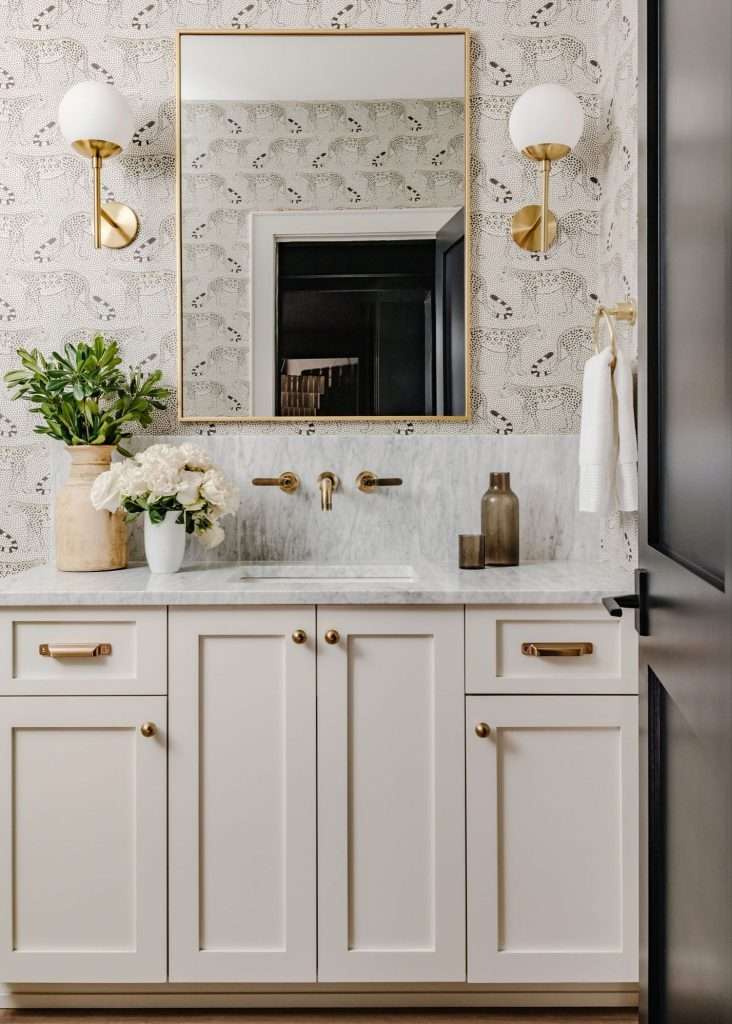
Why Wet Bathrooms Age Without the Touch-Up Cycle
Source: Ro House Studio

Honey, here’s the math nobody runs before they remodel.

A painted bathroom in a Houston primary suite needs a fresh coat roughly every three years to stay presentable. Call it a long weekend of work and the recurring decision-fatigue tax of noticing the ceiling needs attention again every time you walk in. Over ten years, that’s three or four full repaints, accumulated downtime, and a steady drip of maintenance you didn’t sign up for the first time.

A wet bathroom does none of that. The tile we set in a client’s primary bath five years ago looks the way it looked the week we set the last piece. No yellowing near the shower. No bubble above the tub. No black creep along the grout we sealed properly the first time. The room aged the way good design should age: invisibly.

The accent wall is the one piece that carries trend exposure, and that’s a feature, not a bug. If the bookmarked marble or the textured porcelain reads dated to you in twelve years, that’s one wall to swap. The other three stay. The bones of the room stay. And that is what we mean when we say a bathroom should outlive its trends. Most of our completed work in Montgomery County is sitting in homes where the original tile is still doing its job and the family is still in the house.

We documented a primary bathroom remodel that uses much of this approach in one of our published bathroom case studies if you want to see how the full execution lands.

Frequently Asked Questions About Wet Bathrooms

Does an all-tile bathroom feel cold?

It can if you only use tile. The fix is in the warm finishes. We bring warmth back through the vanity wood, soft sconce lighting, brushed metals instead of polished chrome, and textiles like a heavy bath mat and a window treatment. Tile is the ground, not the whole room. The right vanity and the right lighting layered against a quiet tile ground gives you a room that feels grounded, not clinical.

Is a wet bathroom harder to clean than a painted one?

It’s easier, especially in the Greater Houston market. Painted bathroom walls in this climate develop mildew along the ceiling line and behind the toilet that needs scrubbing and eventually painting over. Tile gets wiped down with the same product you use on the floor, and the surface doesn’t fail. The grout is the one area that needs attention, which is why we spec epoxy or high-performance grout in the wet zones. Maintenance becomes routine cleaning instead of recurring repair.

Can the look change in ten years without re-tiling the whole bathroom?

The white field tile on three walls is designed to stay neutral on purpose. If the room needs a refresh down the road, the accent wall can be re-tiled as a standalone project. The vanity can be swapped, the mirror can change, the lighting can update, and the hardware can rotate. The three quiet walls hold the room together while everything else moves around them. That’s the design strategy, not a limitation.

Will mixing tile materials in one bathroom look busy?

Only if you mix more than two. The discipline is one moment, not three. Pick one field tile and stay with it on three walls. Pick one accent material and let that be the room’s personality. The vanity counter can echo the accent or sit quietly in a neutral stone. When clients want to add a third material on the floor or the ceiling, we usually pull them back. One material doing the heavy lifting and one material doing the storytelling is the layering rule that keeps a wet bathroom from feeling like a sample board.

The Bathroom That Quits Asking You for Maintenance

You came in here suspicious of an idea that sounded like overkill, baby. Now you’ve sat with the math: less paint, less mildew, less touch-up weekend, less wondering what the ceiling above the shower is doing.

That’s the wet bathroom. It’s the surprise tactic that sounds like more work and turns out to be less. The white walls stay white. The accent wall does the talking. The blocking and the rough-ins quietly handle the next chapter of your life. And the room you wake up in for the next ten years stops asking you for anything.

Sometimes a bathroom remodel is a paint refresh and a new vanity. Sometimes the whole approach needs rethinking from the studs out.

If you’re somewhere in the middle, working through what’s worth doing now versus what can wait, that’s a good conversation to have before the demo crew shows up.

Design on a Dime Interiors has been planning, building, and finishing primary bathrooms across Montgomery County and Greater Houston for fifteen-plus years. When you’re ready to talk through what a wet bathroom would look like in your home, reach out to our team. We’ll start with a real conversation about what your bathroom is actually asking for.
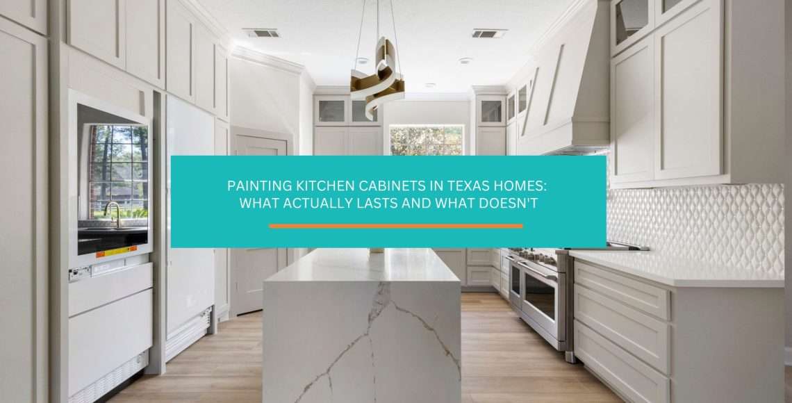
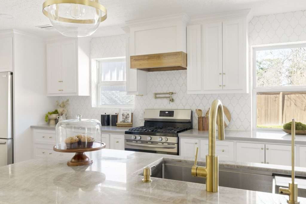
Painting Kitchen Cabinets in Texas Homes: What Actually Lasts and What Doesn’t

Painting kitchen cabinets in your Texas home sounds like the deal of the century. A $58 gallon of paint, a free YouTube tutorial, a quiet Saturday afternoon, and suddenly your dated oak looks like a magazine spread. The result almost always looks great too. For about six months. Then the doors near the dishwasher start to peel. The drawer fronts develop nicks where keys land. The white you fell in love with turns slightly yellow above the stove. The Pinterest version skipped some details, sugar. The kind of details that decide whether your paint job lasts six months or six years. Here’s the honest version, with no sales pitch, and a clear answer on when painting is genuinely the smart call.

Why Most Painted Cabinets Don’t Hold Up in Texas Kitchens

Kitchens are the worst paint environment in any house. Heat from the stove. Steam from the sink. Grease in the air. Daily handling on every surface. Add Texas humidity and the cure conditions get tougher. Without proper prep and the right product, the paint fails predictably.

Where the Paint Fails First

The places paint fails first are the places you use most. Drawer fronts near the silverware. Door edges around handles. Anything near the stove. Each of those takes daily wear that wall paint never sees. Cabinet paint has to act more like furniture finish than like wall paint. Most homeowners start with the wrong product and end with the wrong result.

What Texas Humidity Adds to the Mix

Humidity slows cure time. A finish that needs 16 hours between coats in a dry climate might need 24 in the Greater Houston market. Sherwin-Williams notes on its Emerald Urethane Trim Enamel data sheet that drying and recoat times are temperature, humidity, and film-thickness dependent. Skip that recoat window and the paint looks fine for a week. Then it starts showing soft spots that scratch with a fingernail. The room temperature also matters. Cabinets painted in a garage in July behave differently than the same paint applied in an air-conditioned space.

The Substrate Underneath

The other half of the failure is what’s under the paint. Texas builder cabinets often mix solid wood face frames with thermofoil or laminate-wrapped MDF doors. Paint adheres beautifully to one of those and terribly to the others. Most homeowners can’t tell the difference until the finish starts lifting at the edges. By then the cure has already failed.

When Painting Your Cabinets Actually Makes Sense

When Painting Your Cabinets Actually Makes Sense

Painting kitchen cabinets is the right call in three specific situations. The boxes need to be solid wood, structurally sound, and in good shape. The current color or finish needs to be the problem, not the layout or condition. And the budget needs to be one where full replacement isn’t on the table this year. Match all three, and a quality paint job is one of the highest-impact updates per dollar spent.

Here’s when it works.

  • Solid wood cabinet boxes and doors in good structural condition. If your cabinets are real wood (oak, maple, cherry, alder), the substrate cooperates with paint. The boxes also need to be level, square, and free of water damage to qualify as a good candidate. Wood takes primer and finish coats predictably. Hinges, drawer slides, and hardware can be replaced separately if they’re tired. The cabinets you have already are often better quality than the entry-level new ones you’d buy to replace them.
  • An outdated color or finish on otherwise quality cabinetry. Maple cabinets from 2005 in honey oak stain. White cabinets with the yellowing varnish overcoat. Cherry cabinets that read too red for current preferences. If the cabinets themselves work and only the color is dating the kitchen, paint is the right tool. According to the National Association of Home Builders’ research on buyer preferences, white kitchen cabinets are the most preferred cabinet color among recent and prospective home buyers. That makes a neutral repaint a strong ROI move. For help picking the actual color, our piece on kitchen paint colors walks through the tones that hold up well in Texas light.
  • A pre-sale ROI play when replacement isn’t in the budget. Selling your home in the next 6 to 12 months and trying to maximize what buyers see? Painting quality cabinets can return more per dollar than almost any other update. The math favors paint heavily when full replacement would cost five figures and the goal is curb appeal, not a personal forever kitchen.

Before you commit to painting, run the numbers on what other parts of the project might cost. Our Texas kitchen remodel cost calculator gives you a fast read on where painted cabinets fit into a broader budget. Pricing breaks down by scope, so you can see whether paint alone gets you where you want to go or whether a fuller remodel makes more sense.

Our custom cabinets team in Conroe walks homeowners through the paint-versus-replace decision as part of any kitchen project. The answer depends entirely on what you’re starting with.

When You Shouldn’t Paint (and What to Do Instead)

When You Shouldn't Paint (and What to Do Instead)

Painting cabinets is a bad call in two specific situations. The first is when the cabinet doors or boxes are made from materials that won’t bond properly to paint. The second is when the underlying problem isn’t color, but structure or layout. Painting doesn’t fix either, and the money is better spent elsewhere.

The two cases where painting fails before it starts:

  • Thermofoil, laminate, or particleboard cabinet doors. Thermofoil is a thin vinyl film heat-pressed onto an MDF substrate. It looks like painted wood but behaves nothing like it. Paint doesn’t bond to the vinyl surface without special bonding primer, and even with proper prep the film itself often delaminates from the MDF underneath. Laminate cabinets have the same problem. The finish you’re painting over wasn’t designed to hold another finish. You can sometimes make it work for a short while, but it’s not a permanent fix.
  • Cabinets with structural problems painting can’t address. Sagging shelves. Doors that don’t close flush. Water-damaged bases under the sink. A layout that hasn’t worked for ten years. If the bones of the kitchen are the issue, paint is lipstick on a problem that needs surgery. According to Angi’s 2026 cost data on cabinet refacing and replacement, the average cabinet lifespan runs 20 to 50 years. Cabinets past 20 years with visible damage are stronger candidates for replacement than refresh. Our piece on what to know before updating your kitchen cabinets covers the structural assessment before any paint or refresh decision.

What to do instead when paint isn’t the right answer:

  • Cabinet refacing. New doors and drawer fronts attached to your existing boxes, with veneer wrapping the exposed frame faces. Costs roughly 30 to 50 percent less than replacement. Works only if your boxes are solid.
  • Cabinet door replacement only. If just a few doors are damaged or you want a fresh style, doors can be replaced individually while you keep everything else. Cheaper than full refacing and dramatically faster.
  • Selective replacement plus layout changes. When the layout doesn’t work and the cabinets are aging, the smart play is often to bite the bullet and replace. You get to fix the work triangle, add the storage you’ve been missing, and start from scratch on the finish that will last decades.

The honest reframe: most kitchens that “need a paint job” actually need either a 5-hour refresh (hardware, paint, lighting) or a full remodel. Falling in the murky middle usually means painting is the wrong tool. Our custom cabinets team in The Woodlands helps homeowners figure out which side of that line their kitchen lands on, before anyone opens a paint can.

For broader context on when a kitchen overhaul makes more sense than a refresh, our piece on when a kitchen remodel makes sense is worth your time. It covers the decision framework in detail.

The Prep Work That Decides Whether It Lasts 6 Months or 6 Years

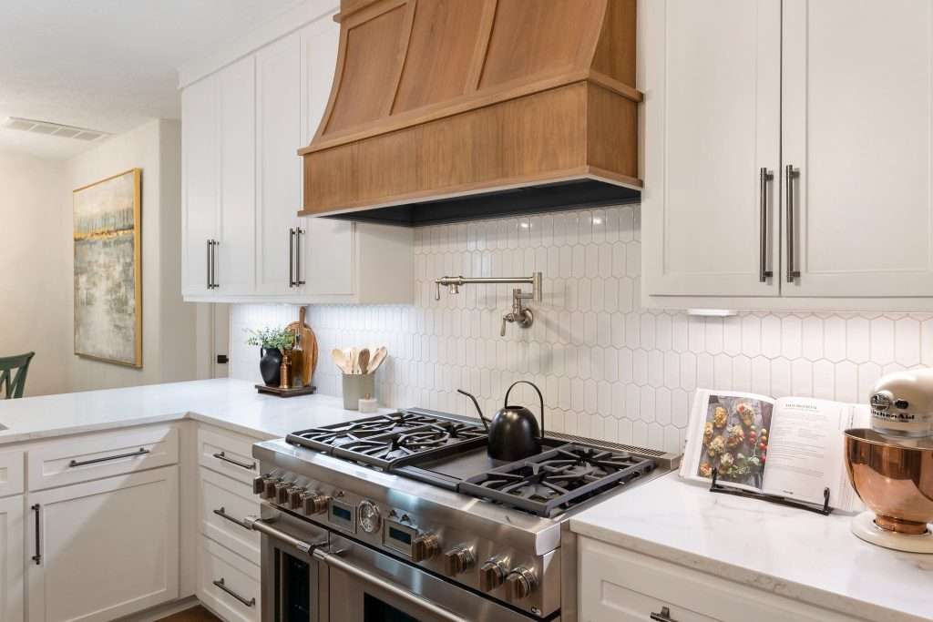
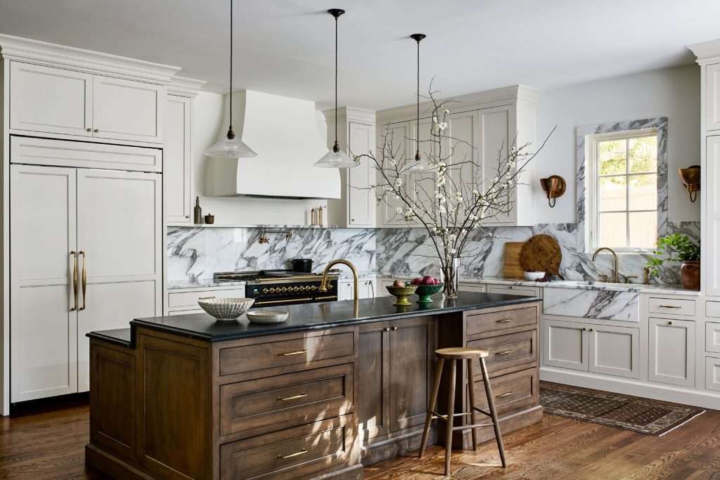
white kitchen cabinets

The single biggest predictor of how long painted cabinets hold up is the prep work. Not the paint brand. Not the technique. The prep. A professional spending eight hours on prep for every two hours of painting isn’t being slow, baby. They’re protecting the only thing that makes the finish stick. Skip any of these steps and the result fails on a predictable timeline.

The non-negotiable prep sequence:

  • Degreasing. Kitchen cabinet surfaces hold years of accumulated cooking oils, even on the doors that look clean. Wipe every surface with a degreaser like TSP or a dedicated cabinet cleaner. Then wipe again with clean water. Then let it dry completely. Skipping this step means the primer doesn’t bond, and nothing else matters after that.
  • Deglossing or sanding. The factory finish on cabinets is designed to repel water and stains, which means it repels paint too. Sand every surface with 220-grit sandpaper to create a mechanical bond for the primer. A liquid deglosser can substitute for light sanding on some finishes, but sanding is the safer bet. Wipe down with a tack cloth after sanding. Dust is the enemy of a smooth finish.
  • Primer selection matched to the substrate. Wood gets a different primer than MDF gets a different primer than laminate. Benjamin Moore’s Advance technical data sheet recommends a waterborne alkyd primer for wood and MDF, but a high-hiding all-purpose primer for laminate (Formica). Use the wrong primer and the topcoat fails regardless of how perfect the painting technique is.
  • Dry time, dust control, and a clean workspace. Cabinets need to cure in a clean, dust-free environment with stable temperature and humidity. Most cabinet paints require 14 to 28 days for full cure to develop hardness. That doesn’t mean you can’t use the kitchen for a month. It does mean the cabinets stay vulnerable to dings and damage until full hardness develops. A garage in August in Houston is the wrong place to cure cabinet paint.

The prep work isn’t glamorous. It also isn’t optional. Our custom cabinets work in Spring treats prep as the actual job, with the spray finish being the visible payoff at the end.

Our post on the finishes trio that makes kitchens look updated is worth a read for that broader context. It walks through how cabinet color, countertop, and hardware work together.

What Separates DIY Cabinet Painting From a Professional Spray Finish

What Separates DIY Cabinet Painting From a Professional Spray Finish

The visible difference between DIY brushed cabinets and a professional spray finish comes down to four things: equipment, paint chemistry, environment, and technique. Each one matters. Together they explain why a quality professional job lasts five times longer than a careful DIY job using the same paint can.

What the pros bring that homeowners typically can’t:

  • HVLP sprayer with the right tip and pressure. High-volume low-pressure sprayers atomize the paint into a fine mist that lands as a smooth, level film. Brush or roller marks are eliminated entirely. Most DIY sprayers can deliver acceptable results, but the dialing-in of tip size, paint thinning, and overlap pattern takes practice. The first 10 cabinets a sprayer paints look different from the next 100.
  • Conversion varnish or commercial cabinet coatings. Many professional cabinet shops use conversion varnish, a catalyzed two-part finish. It cures to a hardness much closer to factory finishes than what’s available off the shelf at a hardware store. Standard cabinet paints like Benjamin Moore Advance are excellent for DIY-grade results. The commercial finishes used by professional shops are a different category of durability entirely.
  • A controlled spray environment. Pros typically remove doors and drawer fronts and spray them flat in a dust-controlled space with stable temperature and humidity. Boxes get sprayed in place with the rest of the kitchen masked off. Dust is the enemy of a smooth finish, and a controlled environment is what separates a glassy factory result from one with embedded particles.
  • Cure time and ventilation discipline. Professional shops won’t return cabinets to service until the finish has cured properly. They also manage the air quality during application. The U.S. Environmental Protection Agency notes that indoor VOC concentrations can be up to ten times higher than outdoor levels. Freshly painted spaces spike well above that during application and cure. A pro plans ventilation accordingly. A homeowner painting on a Saturday usually doesn’t.

The honest summary: a DIY paint job can absolutely look good. The gap shows up over time. A good DIY job lasts 2 to 4 years before touch-ups become necessary. A quality professional job lasts 10 to 15. The difference shows up most in the cabinets you actually use, not in the upper cabinets nobody touches.

For homeowners weighing the math, our custom cabinets team in Magnolia handles cabinet refinishing as part of broader kitchen work. Often it’s one piece of a project that addresses several updates at once. The Magnolia kitchen transformation project shows what a full-scope kitchen update looks like when cabinet refinishing is part of the plan rather than the whole plan.

For more on the cost side of these decisions, take a look at our piece on the cost of renovating a kitchen in Texas. It walks through how the cabinet decision affects the broader remodel budget.

Frequently Asked Questions

What kind of paint should I use on kitchen cabinets?

Use a paint formulated specifically for cabinets and trim, not wall paint. Waterborne alkyd paints (like Benjamin Moore Advance) and urethane acrylic cabinet coatings (like INSL-X Cabinet Coat) are the most accessible high-quality options for DIY work. They cure to a harder, more washable finish than standard latex wall paint. Choose a satin or semi-gloss sheen, because flat and matte paints don’t hold up to cleaning. Pair the paint with the right primer for your cabinet substrate (wood, MDF, or laminate) and the right sheen for how you use the kitchen.

Do I really need to sand cabinets before painting them?

Yes. Sanding (or chemical deglossing) is the step that creates a mechanical bond between the existing finish and the new primer. Without that bond, the primer sits on top of the factory finish and pulls off the first time something catches the edge. A 220-grit scuff sand on every surface, followed by tack-cloth dust removal, is the minimum. The “no-sand” primers on the market can work in narrow cases, but they’re not a reliable shortcut for the average kitchen.

How long does a painted cabinet finish actually last?

A quality DIY paint job using cabinet-specific paint with proper prep lasts 2 to 4 years before touch-ups become necessary. The most-used doors and drawers need the most attention. A professional spray finish with commercial coatings lasts 10 to 15 years under normal kitchen use. Both numbers assume the underlying cabinet boxes are solid. Painting cabinets that are already failing structurally doesn’t extend their life. It just delays the inevitable.

Why does professional cabinet painting in Greater Houston cost so much more than DIY?

Most of what you’re paying for in professional cabinet painting is the prep work and the controlled environment, not the paint itself. A pro can spend 60 to 80 percent of the project time on degreasing, sanding, priming, dust control, and cure management. The visible spray finish is the smallest part of the timeline. You’re also paying for commercial-grade coatings that don’t sell at consumer outlets and equipment most homeowners don’t own. Across the Greater Houston market, a professional kitchen cabinet repaint typically runs several times the cost of the DIY materials alone. The finish lasts five times longer, though.

When “It’s Just Paint” Stops Being True

A great kitchen update isn’t about cutting corners on the parts that show. It’s about being honest with yourself about which kind of project you actually have. Paint is the right answer when the bones are solid and only the color is dating the room. Paint is the wrong answer when the layout doesn’t work, the cabinets are aging out, or the substrate won’t accept a new finish. The cabinets in your kitchen will tell you which one you have, if you look closely before the paint can opens.

If you’re weighing a cabinet refresh, refacing, or full replacement across Montgomery County or anywhere in Greater Houston, we’d love to talk through your options. Every kitchen and every budget is different. Start a conversation with us, darling, and let’s get you a kitchen that holds up to the life you actually live in it.

Living Room Design Ideas That Actually Work for Homes That Get Lived In

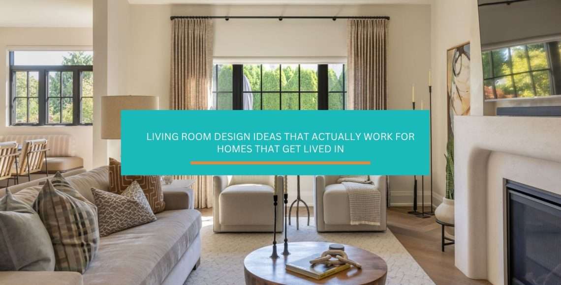
Living room design ideas are everywhere, and yet so many living rooms still feel like they’re missing something. You’ve got the sofa, the rug, maybe a gallery wall that looked perfect on a mood board. The pieces are fine. The room isn’t. That gap between “I like everything in here” and “I love this room” is more common than you’d think, and it almost never comes down to budget. It comes down to how everything in the room is working together. Or not, as the case may be. We see this with families across Greater Houston every single week, and the answer is almost always the same. Stick around, darling, because we’re about to walk through exactly why living rooms fall flat and what the design ideas are that actually fix it.

Why Most Living Rooms Feel Off Even When Nothing Is Actually Wrong

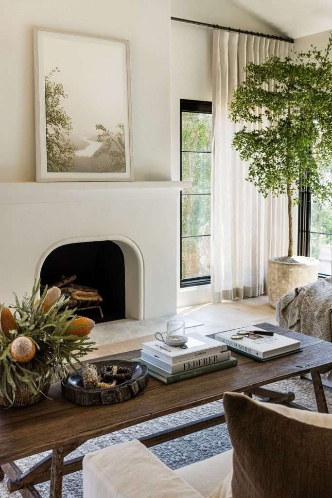
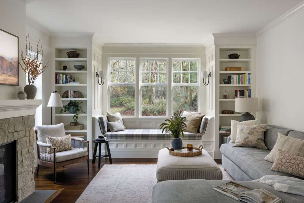
living room furniture layout
Source: LTW Design

The most common cause of a living room that feels wrong is furniture pushed against the walls. It’s the instinct almost everyone follows when arranging a room for the first time. Push the sofa back, move the chairs to the sides, leave the center open. It feels logical. The result looks and feels like a waiting area.

When furniture lines every wall, the room loses a focal point. Your eye doesn’t know where to settle. Conversation becomes uncomfortable because seating is spread too far apart to feel intimate. And the open center, which should be the heart of the space, becomes empty floor nobody knows what to do with.

But furniture placement is usually just the most visible symptom. Three other problems almost always run alongside it.

The scale mismatch. The sofa looks right in the store and wrong in the room. The rug barely covers the floor beneath the coffee table. The ceiling fixture is technically in the right spot but seems to have nothing to do with anything below it. When pieces aren’t proportionally matched to the room they’re in, the space feels permanently unresolved, regardless of how good the individual pieces are.

The single-light trap. One overhead fixture is not a lighting plan. It produces flat, even illumination that falls from the ceiling and makes a room feel functional at best, institutional at worst. Most living rooms have exactly one light source and wonder why evenings feel wrong.

Missing layers. A room that has all its furniture and still feels empty is missing depth. Textiles, variation in height, mixed materials, plants, objects at different scales. These are the things that make a space feel like people actually live in it, rather than just store their furniture there.

None of these problems require starting over. They require understanding what’s driving them and then making targeted decisions about layout, scale, light, and layering. That’s what the rest of this is about.

Living Room Layout Rules That Keep People Comfortable and Conversations Going

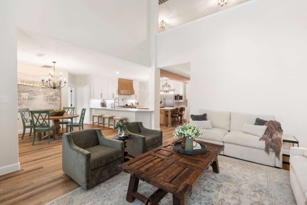
living room open space design
Source: Blair Burton Interiors

The foundation of a living room that feels right is a layout built around two things: how people move through the space and how people sit and talk in it. Get both of those right and the room starts feeling intentional before you’ve changed a single piece of decor.

Traffic flow comes first. The NKBA planning guidelines recommend at least 36 inches for primary walkways through a room. Secondary paths, like the gap between the sofa and coffee table, can work at 18 to 24 inches. When pathways are narrower, people unconsciously register the room as crowded, even when it isn’t.

In our part of Texas, the NAHB’s 2023 design trends report confirms what we see in homes here every week: the majority of home buyers prefer an open-kitchen-family-room layout. The kitchen flows into the dining area, the dining area flows into the living room, and suddenly there’s a lot of square footage with no natural division. Those big, open builder layouts are great for how families actually live here: Sunday dinners, football Sundays, kids moving between rooms. But they need internal structure. That structure comes from how you place the furniture, not from walls.

Floating furniture into the room is the move. Pull the sofa away from the wall, even just 12 to 18 inches. Group seating so pieces face each other. A comfortable conversation grouping keeps seating within about 8 feet of each other. Beyond that, people start to feel like they’re in different rooms.

  • Anchor with your dominant piece. For most living rooms, that’s the sofa. Place it so it faces the room’s primary focal point, whether that’s a fireplace, a TV wall, or a strong architectural feature, and build the arrangement from there. Families in Conroe with those newer open-plan layouts often find the sofa’s orientation is what finally makes the space click.
  • Protect the main traffic path. The route from the front of the house to the back shouldn’t require weaving between chairs and tables. If people are navigating furniture to cross the room, the layout is working against you.
  • Let seating breathe. A sofa or chair placed hard against a wall feels compressed. Pull it forward even slightly and the room gains air and visual depth on all sides.

Scale and Proportion: The Invisible Force Holding Your Room Back

Scale and Proportion: The Invisible Force Holding Your Room Back
Source: Interior Design: Sprague Interiors

Scale is the design principle that gets skipped most often and creates the most visible problems. A room where the proportions are off feels wrong at a gut level even when you can’t name the reason.

The area rug is the single most common scale mistake in a living room. Most people buy a rug that fits under the coffee table and stop there. The result: a small island floating in the middle of a large floor, with the seating grouping around it looking disconnected and unanchored. The correct approach is to size the rug so that all major seating pieces have their front legs sitting on it. The rug becomes the visual floor for the entire grouping, and the whole arrangement reads as intentional rather than assembled. A rug that’s too small actually makes the room feel smaller, not larger.

The ASID Universal Principles of Interior Design identifies scale and proportion as foundational principles in residential design, and the principle shows up everywhere: the relationship between sofa and coffee table height, between curtain length and ceiling height, between light fixture diameter and the room’s square footage. When these relationships are off, the room tells on itself.

A few calibration points worth keeping in mind:

  • Coffee table sizing. It should run roughly two-thirds the length of your sofa. Any shorter and it looks like an afterthought. Any wider and it starts to dominate.
  • Curtain height. Curtains hung at the window frame make a room feel lower and the windows feel smaller. Hung close to the ceiling, they draw the eye up, make the ceiling read as higher, and make the windows feel more generous. This one change can shift the perceived size of a room more than almost anything else.
  • Sofa profile versus ceiling height. A low-profile contemporary sofa in a room with ten-foot ceilings can look like furniture that wandered in from the wrong house. Taller-backed pieces or accent chairs with visual height help close that vertical gap.
  • Light fixture sizing. A useful guide for overhead fixtures: add the room’s length and width in feet, and that number in inches is a reasonable starting diameter for a chandelier or flush-mount fixture. Clients in The Woodlands often discover this single adjustment makes their ceiling fixture feel like it actually belongs in the room.

When these proportional relationships start lining up across a room, something shifts. The space starts to feel like it was designed rather than assembled.

How to Layer a Living Room So It Feels Like Home, Not a Floor Display

How to Layer a Living Room So It Feels Like Home,
Source: Susana Goss Studio

A room that has all its furniture and still feels empty is missing layers. Layering is what takes a room from “correctly furnished” to “actually warm,” honey. It’s the process of building depth through textiles, variation in height, mixed materials, and the kind of finishing details that signal real people live here.

There are four layers every living room needs, and they work in sequence.

  • The anchor layer. Your sofa, primary chairs, coffee table. The foundational pieces that set the scale and define the grouping. Everything else builds from here.
  • The textile layer. Throw pillows, blankets, area rugs, window treatments. Textiles soften hard surfaces, add color depth, and are the most flexible layer to change seasonally or when you want a refresh. A good drapery choice, hung high and wide, doesn’t just cover windows. It frames them, softens the whole room, and manages how much of that Texas brightness and afternoon heat comes pouring through the glass. We go deeper on texture layering in our guide to adding depth and interest to your spaces, which pairs well with this section.
  • The accent layer. Lamps, plants, art, decorative objects, side tables. These add personality and variation in height. The goal is visual rhythm: your eye should travel around the room and find something interesting at different levels. A tall plant in one corner, a low stack of books on the coffee table, a piece of art at eye level, a lamp throwing warm light at shoulder height. The finishing touches and accessories guide is the natural follow-on read once you’ve sorted the anchor and textile layers.
  • The finishing layer. Books, candles, objects on shelves or a console table. The things that say people actually live here. This layer is most effective when it’s edited. A few intentional finishing details land harder than a surface covered in random ones.

Flooring is part of this layering conversation, too. In homes where the living room gets real daily use, especially through football season and the holidays when the house fills up, the floor takes a beating. The living room flooring guide covers which materials hold up best under that kind of traffic while still contributing to the room’s warmth, and our flooring team in Katy can help match the right option to how your family actually uses the space.

Lighting Your Living Room Like Someone Who Designed It on Purpose

living room lighting

If your living room feels warm and inviting during the day and oddly flat after dark, the problem is almost always the lighting. Specifically, the absence of layered light.

A single overhead fixture, however attractive, produces light that falls straight down from the ceiling. It eliminates shadow, flattens surfaces, and makes a room feel like a space for tasks rather than a space for settling into. The IES Recommended Practice for Residential Lighting outlines a layered approach: ambient light for overall illumination, task light for focused activities, and accent light for depth and visual emphasis. In practice, for a living room, this means:

  • Ambient light from a ceiling fixture or recessed lights, ideally on a dimmer
  • Task lighting beside seating: a floor lamp next to a reading chair, a table lamp within reach on an end table
  • Accent lighting to draw attention to art, architectural features, or shelving

Two lamps at opposite ends of a seating grouping, honey, is one of the highest-return changes you can make in a living room. They bring the light source down from the ceiling to human height, create warmth in the room’s corners, and make the whole arrangement feel cozier and more considered without a single structural change. The mood lighting guide on the blog walks through how to build this out room by room, which is worth reading alongside this section.

Texas homes tend to get a generous amount of natural light through those big builder windows, which is a genuine gift for most of the year. In summer, though, managing solar heat gain and glare while preserving brightness becomes the actual challenge. The U.S. Department of Energy notes that properly chosen window treatments can meaningfully reduce heat gain in homes with south- and west-facing windows, which describes most of the newer construction in this area. Drapes that hang high and full solve both problems at once, and the drapery team in Spring handles exactly this kind of decision regularly for clients navigating that balance.

FAQ: Living Room Design Ideas

Why does my living room feel smaller than it actually is?

A living room reads as smaller than its square footage when furniture is pushed against the walls, the area rug is undersized for the seating grouping, or a single overhead light source is creating flat, even illumination with no depth. Floating furniture into the room, sizing the rug so the front legs of all major seating sit on it, and adding floor and table lamps at human height will typically make a space feel both larger and more inviting.

What’s the most important design decision in a living room?

Layout. Color, furniture quality, accessories, and layering all build on top of how the foundational pieces are arranged. A well-planned layout with modest furniture routinely feels better than a poorly planned layout with expensive pieces. If only one thing in a living room gets careful attention, it should be the floor plan.

How do I make a large open-plan living room feel cozier?

Define the seating zone with an area rug large enough that the front legs of all main seating pieces rest on it. Choose furniture proportioned to hold the space rather than float in it. Add light at multiple heights, not just from the ceiling. Use textiles and plants to soften corners and edges. Buyers in the Greater Houston market respond consistently to living rooms that feel warm and human-scaled rather than impressively large and hard to inhabit.

How do I know if my living room furniture is the wrong scale?

If the sofa looks small in the room, the rug appears to be floating in the middle of the floor, or the ceiling fixture seems visually disconnected from everything below it, scale is the issue. A few reference points: the coffee table should run two-thirds the length of the sofa, the rug should extend under the front legs of all seating, and curtains should hang close to the ceiling, not at the window frame.

Your Living Room Is Closer to Right Than You Think

Most living rooms aren’t broken. They’re missing the right kind of focused attention. A furniture arrangement pulled away from the walls, a rug one size larger than you think you need, a pair of lamps added to the corners, curtains hung at ceiling height instead of window height. These are not expensive or complicated changes. They’re the kind of changes that make you walk into the room on a Tuesday evening and realize you actually want to be in there.

If you’d rather work through it with someone who does this every day, that’s exactly what the Design on a Dime team is here for. We work with families across Montgomery County and Greater Houston to take living rooms from “fine” to exactly what they were always supposed to be. Get started here whenever you’re ready.
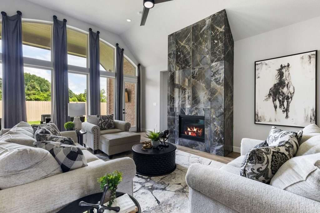
How Texas Couples Blend Two Design Styles in One Home Without Calling It a Draw

You sat down together with a blank board and the best of intentions. One of you was pinning clean lines, matte black fixtures, and furniture that looks like it belongs in a design magazine. The other was pinning cozy shiplap walls, warm wood tones, and a sectional big enough for the whole family to pile onto on a Sunday afternoon. Now you’re several months into owning your home and every room is still beige because you can’t seem to agree on a single thing.

That tension around blending two design styles is so real, darling, and you are far from alone in it. Most couples walk into this problem thinking it’s about one person winning and one person giving something up. It’s not. When it’s handled right, working with two distinct styles produces a home that’s more layered and more personal than any single-style space ever could be. You just have to know which rules to follow and which ones to ignore completely. Let’s get into it.

Why Two Design Styles So Often Produce One Very Awkward Room

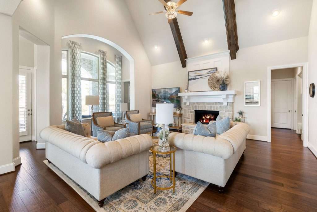
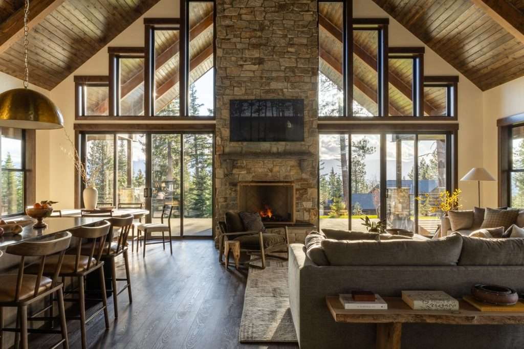
rustic living room design
Source: Kallan Interiors

When two styles share a room and it doesn’t work, the reason is almost always the same. There’s no shared anchor. Both styles are competing for dominance at the same volume, and the room ends up looking like two different homes borrowed each other’s furniture. Nobody wins, and the space feels unsettled even when every individual piece is perfectly nice on its own.

The American Society of Interior Designers identifies visual cohesion as one of the foundational elements of a well-designed space. Cohesion doesn’t mean matching. It means every element in the room is in conversation with the others. When two styles speak simultaneously at full volume, neither one registers as intentional.

Here’s what usually goes wrong in rooms where a blend misfires:

  • No shared scale. A chunky farmhouse dining table paired with slender contemporary chairs doesn’t read as blended. It reads as unfinished. Scale needs to be consistent even when styles differ significantly.
  • Competing focal points. If one style anchors itself in a statement shiplap feature wall and the other anchors itself in a sleek fireplace surround, the room ends up with two centers of gravity and neither one wins.
  • No neutral connective tissue. Without a shared color, material, or finish threading through the room, there’s nothing telling the eye that these pieces belong together.

None of these are hard problems to solve. But you have to name them before you can fix them.

How to Find the Thread That Ties Two Different Styles Together

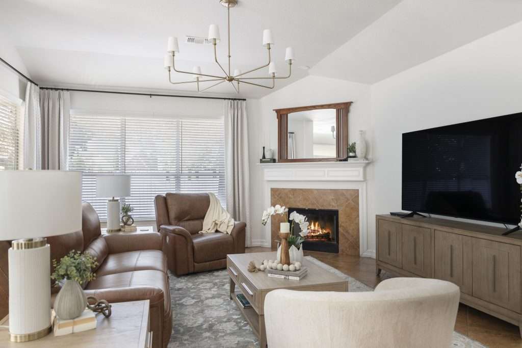
different styles living room

Before anyone buys a single piece of furniture or commits to a paint color, the two of you need to find what your styles actually share. This is almost always easier than it sounds, because even very different aesthetics tend to agree on at least a few things.

Start with tone, not style labels. Pull samples from each person’s inspiration and set them side by side. Look past the farmhouse versus contemporary categories and ask what both collections actually have in common. Warm or cool? Light or moody? Airy or grounded? Nine times out of ten, there’s a tonal overlap even when the styles look nothing alike on the surface.

From that shared tone, you build your neutral foundation. This shows up in the big fixed elements: flooring, wall color, and the largest upholstered pieces. These stay in the shared zone. The personality of each style then lives in the layered elements, such as textiles, art, accessories, and accent furniture. Think of the foundation as the grammar both styles agree to speak. What gets said on top of that foundation can be entirely your own. For more on how texture works as a bridging element, that post is a solid starting point.

When our team works with couples across Conroe and Spring, this tonal exercise is almost always the first conversation we walk through. Two people who thought they disagreed on everything usually discover they’re about three decisions apart, honey.

The 70/30 Rule That Keeps a Blended Home from Looking Indecisive

The 70/30 Interior Design Rule
Source: Pure Salt Design Studio

One of the most useful frameworks in this kind of work is the 70/30 ratio, and it’s not complicated. One style carries roughly 70 percent of the room. The other comes in at about 30 percent. The 30 percent is not decoration. It’s punctuation.

The reason this works is that it resolves the dominance question without erasing either person. The room has a clear primary identity, so it reads as designed rather than assembled. But the 30 percent brings enough of the second style that both people feel genuinely represented. A clean contemporary living room with warm wood accents and a single oversized linen throw looks intentional. That same room split 50/50 between two styles looks like a standoff.

Architectural Digest has written about this dynamic repeatedly: the most successful blends almost always have one dominant aesthetic that the secondary elements respond to. The secondary style doesn’t compete with the primary. It completes it.

Decide together which style carries the room, then give the other style its strongest expression in the accent layer. Trust me, sugar, it’s a much shorter conversation than the one you’ve been having. Here’s how that plays out in practice:

  • In a contemporary-dominant living room, the farmhouse influence shows up in a reclaimed wood coffee table, textured throw pillows, and gallery wall frames with warm wood tones. Everything else follows the contemporary lead.
  • In a farmhouse-dominant kitchen, contemporary elements sharpen the space with sleek cabinet hardware, a clean-lined pendant, and a simple stone countertop without heavy veining.
  • In a shared bedroom, the dominant style is established by the bed frame and wall color. The secondary style enters through bedding, nightstands, and artwork without disrupting the room’s primary identity.

Families settling into their homes across The Woodlands often tell us this ratio conversation is the one that finally broke the decorating paralysis. It gives both people something specific to hold onto instead of an endless negotiation over every individual piece.

The Surfaces That Do the Peacemaking in a Blended Home

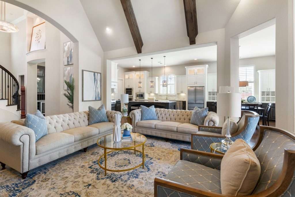
open space living room

Floors, walls, and lighting are the connective tissue of a blended home. Get these three right and almost everything else becomes easier to resolve. Get them wrong and even a careful 70/30 split can still feel fragmented.

Flooring is the single most important bridge element in any home. It runs through every room and every style transition without interruption. A consistent flooring material through the main living areas creates visual continuity that quietly signals cohesion, even when the furniture and finishes around it are doing different things. You can read more about how flooring choices affect the feel of a room before you make any final material decisions. In our part of Texas, where builder floor plans run the kitchen straight into the living room with nothing in between, this matters more than it does in older homes with defined doorways. Everything is visible at once, so consistency at floor level carries a lot of weight.

Wall color works the same way. A shared, neutral-warm wall color throughout the main living areas gives both styles something to rest against. Neither style fights the wall for attention. Both get to express themselves against a background that doesn’t belong to either of them exclusively.

Lighting is the element most couples underestimate. Layering your light sources (ambient, task, and accent) softens the transition between styles in a way that overhead lighting alone never can. A warm-toned lamp on a side table closes the gap between a contemporary sofa and a rustic wood console faster than a coat of paint will.

If you’re choosing new flooring as part of a broader home blend or remodel, our team helps families across Katy and surrounding areas work through material selection as part of a full design plan, so the floor supports every decision that follows it.

How to Give Each Style Its Own Territory Without Dividing the House

traditional design living room

Once the shared foundation is in place, the most satisfying approach to a full-home blend is giving each style a room or a zone where it actually gets to lead. Not a room where it shows up for equal airtime. A room where it breathes.

This is where your floor plan becomes an asset. In the large open builder layouts common throughout Montgomery County and Greater Houston, the living and dining areas typically function as one zone. The kitchen is another. The primary bedroom is another. Dedicated rooms like a home office, a guest bedroom, or a den are natural candidates for one style to lead without any negotiation required.

One person’s style leads in the primary bedroom. The other leads in the home office or the reading room. Shared spaces follow the 70/30 ratio. The result is a home where both people feel genuinely at home in multiple rooms, not just tolerated in all of them.

The National Association of Home Builders consistently reports that a home’s interior cohesion is one of the factors buyers respond to most strongly during showings. Cohesion doesn’t require sameness. It requires a clear logic, and giving each style its own territory while keeping the connective surfaces consistent is exactly that kind of logic in action.

We’ve worked through this kind of territorial planning with couples in Humble and across the Houston suburbs whose homes were fully furnished but felt like two people living in parallel instead of together, baby. You can see the kind of transformation that kind of intentional planning makes possible in our Heather Project. The fix, almost every time, starts with getting clear on who leads where.

Frequently Asked Questions About Blending Two Design Styles

Can you blend more than two styles in one home?

Yes, and many beautifully designed homes do exactly that. The key is still establishing a dominant aesthetic and keeping a consistent tonal palette across all the fixed surfaces. When more than two styles are in play, the neutral foundation has to work harder. The more styles present, the more intentional the connective tissue needs to be. A transitional style often functions as a built-in bridge in these situations because it borrows from both traditional and contemporary design and creates natural middle ground for additional style elements to land without clashing.

What’s the most common mistake couples make when blending styles?

Starting with furniture before settling the foundation. Sofas, chairs, and dining tables are the most visible style signals, so couples tend to argue about those first. But flooring, wall color, and architectural details are the elements that determine whether any furniture choice will feel cohesive or chaotic. Get the foundation right first and the furniture decisions tend to feel significantly less contentious. Buyers across the Greater Houston market who approach it in this order consistently describe the whole process as more collaborative and less draining.

Does one style always have to take up more of the home than the other?

Not in terms of square footage, but one style does need to carry the public-facing rooms. The main living areas are where the home’s identity registers most strongly, both for the people who live there and for anyone who visits. The more private rooms, including bedrooms, a home office, or a hobby room, are where the second style can lead more fully without creating any visual tension in the shared spaces. Think of it as each person having a room that’s fully theirs, while the shared rooms follow a negotiated logic you both agreed on.

What if one person’s style is very bold and the other’s is very minimal?

Bold and minimal can work beautifully together because they have a natural counterpoint relationship. The key is keeping the bold elements in the accent layer rather than the foundation. Minimal should carry the room’s bones. Bold then enters through a single statement piece, a feature wall, or a curated collection of accessories. If bold tries to carry the foundation and minimal lives only in the accents, the space reads as chaotic with a few quiet corners. Flip that ratio and it reads as curated and confident. The power of color in creating that bold-meets-minimal balance is worth understanding before you commit to any wall color decisions.

How long does it typically take to blend two styles into one cohesive home?

It depends on scope. For a single main living area with no structural changes, a clear design plan can usually be executed within four to eight weeks from concept to installation, accounting for furniture ordering and delivery. Whole-home blends that involve new flooring, remodeling work, or custom cabinetry typically run ten to sixteen weeks. The design phase, where the actual blend logic gets decided, is often where the most time is spent. Getting that foundation right before anything is ordered saves a significant amount of time, money, and frustration on the back end.

Two Styles, One Home, One Space That Finally Feels Like Both of You

When you walk into a home that’s been thoughtfully blended, you don’t think “oh, two people with different tastes live here.” You think “this feels personal.” That is the goal, and it’s absolutely reachable even when it feels right now like you and your partner couldn’t be further apart on the design spectrum.

The work isn’t in picking one style and surrendering the other. It’s in finding the foundation you both agree on, assigning a clear logic to how your styles share space, and giving both points of view room to breathe without stepping on each other. Do that, and the result is almost always better than what either of you would have chosen alone.

If you’re ready to stop making decisions by avoidance and start seeing what your home could actually look like, our team works with couples and families across Montgomery County and the Greater Houston area every day. Get in touch with us and let’s figure out where to start.

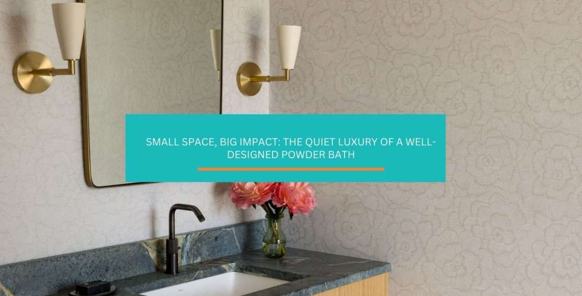
Small Space, Big Impact: The Quiet Luxury of a Well-Designed Powder Bath

You know that quiet luxury of a well-designed powder bath? Oh, honey, it can leave one of the biggest impressions, even if it’s one of the smallest rooms in your home. 

Guests notice the moment they step inside. 

The lighting feels warm, the mirror reflects just right, and somehow the whole space feels polished without trying too hard. 

That quiet elegance isn’t about square footage and expensive materials, darling. It comes from thoughtful choices that make the room feel balanced, welcoming, and just a little bit special. 

The beauty of a powder room is that even small details can shape the entire experience. And when those elements come together, the result is… well, your home’s biggest design flex.

Stick around, because the devil’s definitely hiding in these delicious details.

Why the Vanity Wall Sets the Tone for a Well-Designed Powder Bath

If you think about it, the vanity wall is the first thing folks notice when they walk in. It’s a natural focal point. The mirror, the sink, the faucet, and the lighting all live in here, so the design choices you make in this one area quietly shape the whole experience of the room.

That’s why this is one of the best places to start. When the vanity wall feels balanced and layered, the rest of the powder bath tends to fall into place.

Mirrors That Anchor the Room

powder room mirror
Source: Life of Plenty

Look, hun, I know you’ve been obsessing over finding the perfect vanity, scrolling through Pinterest boards at midnight, comparing cabinet finishes like your life depends on it.

But here’s the thing: 

The mirror is actually doing all the heavy lifting in that powder room.

Your vanity just sits there looking pretty. But your mirror? 

It’s actively transforming proportions, amplifying natural light, and creating that “wow” moment your guests remember.

That gorgeous frame above your sink is working overtime in the role of the room’s visual anchor, setting the entire aesthetic tone while bouncing light around like nobody’s business.

Of course, shape matters.

A tall mirror can stretch the room vertically and make the ceiling feel higher; a wide one can visually widen the wall and soften proportions. Framed mirrors can add presence, while thinner metal frames keep things light and modern.

When a Console Sink Works Better Than a Vanity

Console Sink
Source: Ling Interiors

Okay, hear me out:

Sometimes, the smartest choice is to skip the vanity altogether.

Console sinks and pedestal sinks are especially helpful in tighter powder rooms where every inch matters. Because they expose the floor beneath them, they create a sense of openness that a full cabinet cannot always provide.

And that extra breathing room? 

It can make a small powder bath feel noticeably larger.

Storage is the tradeoff here, of course, but in a powder room, that’s rarely a problem. Guests usually need nothing more than soap, hand towels, and maybe a small tray for essentials.

The Design on a Dime Interiors team usually begins powder bath remodels right here, helping you choose mirrors, fixtures, and layouts that’ll make even the smallest spaces feel intentional and beautifully finished.

The Designer’s Scale Trick for Making Small Powder Rooms Feel Bigger

Small powder rooms don’t have the luxury of extra square footage. But you know what’s wild? The size of your tiles, the height of your vanity, and even your paint color can literally trick your brain into seeing more square footage than you actually have.

The trick is simple once you see it, really. 

I’m about to blow your mind with a few sneaky design moves that’ll make your tiny powder room feel like it doubled in size overnight.

Large Format Tile for a Seamless Look

Large-format tile can work wonders in a compact powder bath.

Because the tiles cover more surface area, there are fewer grout lines breaking up the floor or wall. That uninterrupted surface helps the eye travel across the room without stopping, which creates the impression of a larger space.

That’s why most designers reach for tiles in sizes ranging from 12 x 24 inches or larger. When paired with grout that closely matches the tile color, they offer a streamlined look that eliminates visual breaks.

Another plus? 

Fewer grout lines mean less scrubbing and zero mildew nightmares ‘cause there are fewer places for dirt or moisture to collect. You can thank me later, sugar.

Floating Vanities That Create Breathing Room

floating vanity
Source: Interior Occupations

When your powder bath feels like a phone booth with plumbing, suspending the vanity off the floor creates an instant spaciousness that’ll make you do a double-take.

Here’s the magic: 

When tile flows underneath that cabinet, your eye keeps traveling instead of stopping at a solid base. That continuous surface? Sugar, that’s pure visual trickery that makes your tiny powder room feel like it doubled in size overnight.

It’s simple, but trust me, it works every time.

And again, day-to-day upkeep gets a lot easier. Sweeping and mopping around the base takes seconds, which means no more toe-kick grime and mystery dust bunnies hiding in corners.

Lighting That Makes Guests Look Good (and the Room Look Expensive)

You could have the fanciest powder room fixtures money can buy, but if the lights cast shadows that make guests look like extras in a horror movie, honey, you’ve already lost the battle.

Now, for the good news:

The secret to a flattering glow isn’t some designer mystery. It’s all about positioning your fixtures right for a soft, balanced light that feels warm and welcoming, while still being bright enough for everyday use.

Mirror-Level Lights That Flatter Every Face

Mirror-Level Lights Powder Room
Source: And Studio Interiors

Everyone deserves to look fabulous when they catch their reflection in the powder bath, darling, and that’s exactly where mirror-level task lighting swoops in to save the day. 

The easiest way to achieve that?

You need the right brightness aimed at precisely the right spots, honey.

Fixtures placed on either side of the mirror provide the most flattering results. They spread light across the face from both directions, which helps reduce shadows under the eyes, nose, and chin.

I usually place wall sconces about 60 to 66 inches from the floor. This height allows the light to hit the face at a comfortable level while keeping the glow soft and balanced.

Another option is a backlit mirror or an integrated LED mirror. You skip additional fixtures while delivering that shadow-free illumination. It’s a win-win, hun.

Layered Lighting for a Warm Glow

Layered Lighting for a Warm Glow
Source: Design for Living

A single ceiling light rarely does your powder bath any favors. It brightens the room, sure, but it also tends to create harsh shadows and flat lighting.

Layered lighting can solve that problem, transforming a basic powder bath into a space where your guests actually want to linger.

So, instead of relying on a single fixture, combine a few light sources that work together. Each one plays a different role: 

Task lighting illuminates the mirror area, while ambient lighting fills the room with a soft overall glow.

Dimmers make an even bigger difference. They allow the lighting to adjust throughout the day, keeping the room bright and practical, with the option to dial down the brightness level when needed.

Trust me, when the lights are balanced, the entire bathroom feels warmer and more dimensional. Just look at our Sarah Project, and you’ll see what I mean.

Decorative Fixtures That Double as Jewelry

Decorative Fixtures Powder Bathroom
Source: Colette Interiors

Powder rooms are one of the few places in the home where lighting can lean a little dramatic. Because the space is small, even a modest fixture can feel special.

This is where a decorative pendant, sculptural sconce, or small chandelier can shine.

You can think of these pieces as jewelry for the room. 

They draw the eye upward, add a little personality, and give the powder bath a moment of visual interest. In many cases, they also help make your ceiling feel taller by pulling attention toward the upper part of the space.

Of course, the key is balance. 

A decorative fixture should complement the mirror and sink area rather than compete with them.

During your bathroom remodel, Design on a Dime Interiors carefully plans fixture placement, layering, and light temperature, so the room feels warm, flattering, and inviting every time the switch flips on.

Wall Treatments That Turn a Powder Room Into a Jewel Box

Powder rooms are one of the few spaces in your home where you can take design risks and have fun with them. Why? 

Well, honey, since the room is small, bold choices feel intentional instead of overwhelming.

Your walls have their own starring role to play here.

I often treat powder baths like little jewel boxes. Rich color, textures, and patterns on the wall can instantly transform the space from simple to striking.

Wallpaper That Brings Personality to the Room

wallpaper powder room
Source: Jessica Nelson Design

Wallpaper is one of the easiest ways to add character to a powder bath, hun. And since the space is pretty small, even a dramatic pattern can feel balanced rather than busy.

So, yes, now’s your chance to go all out.

A softer botanical print, for example, can bring a sense of calm and elegance. A bold geometric pattern, on the other hand, can add energy and modern style. Textured wallpapers, like grasscloth or linen, bring a subtle depth that catches the light beautifully.

The trick? 

Choosing a pattern that complements the other finishes in the room. 

If the mirror frame or faucet carries warm metal tones, look for wallpaper with similar warmth in the palette, ‘cause when everything speaks the same visual language, things feel polished, not pieced together.

Another design trick I love is combining wallpaper with wainscoting or painted paneling. The lower half of a wall stays calm and structured, while the wallpaper above adds interest and personality.

Paneling and Millwork for Architectural Depth

Paneling and Millwork in the Powder Room
Source: Cicada Company

If wallpaper brings personality, paneling brings structure.

Millwork details, such as wainscoting, board and batten, or simple wall panel molding, can give a powder room that tailored, built-in look most folks associate with high-end homes.

Even subtle trim work adds dimension. 

Light and shadow move across the panels throughout the day, which gives the walls quiet depth that paint alone can’t really create.

And the best part about paneling? It works with almost any style. 

It can feel classic, modern, or even somewhere in between; it all comes down to the trim profile and paint you choose.

And that, honey, is how your powder bath becomes a small room with a big sense of presence.

Design on a Dime’s team uses these wall treatments to transform a compact powder bath into a standout space that still feels connected to the rest of the home.

Metal Finishes That Bring Warmth Without Taking Over the Room

Metal Finishes That Bring Warmth Without Taking Over the Room
Source: Platner Studio

Metal finishes might seem like a small detail in a powder bath, but they quietly influence the entire mood of the space. Your faucet, cabinet hardware, mirror frame, and lights all introduce touches of metal that catch the light and add contrast.

When those finishes feel balanced and intentional, the room looks layered. But add too many competing metals, though, and the space can get busy, fast.

Mixing Metals Without Creating Visual Chaos

You know those Pinterest boards where the bath looks like it stepped straight out of a designer showroom, featuring four different metal finishes that somehow work together?

Yeah, that’s a trap.

You can mix finishes in your powder bath, as long as you do so with restraint.

For starters, stick to two finishes maximum. I recommend choosing one primary metal that appears on the most prominent fixtures, including the faucet and cabinet hardware. A second finish can then act as a supporting accent on your lighting, mirror frames, or accessories.

That way, you keep things cohesive while still introducing contrast.

On that note, contrast tends to work better than near matches. 

Polished chrome loves antique brass. They’re practically high-contrast besties. But polished chrome next to satin nickel? That’s just awkward confusion.

Placement Rules That Keep Everything Cohesive

Once you choose your finishes, placement becomes just as important as the metals themselves. I’d even say it’s your secret weapon for creating that “looks expensive, doesn’t look crazy” vibe.

A good rule of thumb is to repeat each finish at least twice in the room. 

Repetition helps the eye move naturally around the space and prevents any one piece from looking out of place.

For example, if brass appears on the faucet, it can also show up in the mirror frame or light fixture. If matte black enters the design through a sconce, repeating it in a towel ring or cabinet pull can help the room feel balanced. 

Think balance, darling, not chaos.

A Powder Bath That Feels Connected to the Rest of the Home

A Powder Bath That Feels Connected to the Rest of the Home
Source: Pure Salt Design Studio

Your powder bath shouldn’t feel like it got teleported in from a completely different house. We’re not going for a separate little world tucked off in the hallway here. We’re going for something that feels connected to the rest of the home.

And trust me, darling, creating that smooth visual handoff between your powder room and adjacent living spaces is way easier than you think.

Guests might not stop to analyze why the room feels so polished, but they’re gonna notice that everything works together.

  • Sightlines That Set the First Impression

Many powder baths sit just off a hallway, foyer, or living space, which means the doorway typically frames the space before anyone even steps inside. So, you want to pay close attention to that first glimpse. If your powder bath door opens toward a hallway, the mirror wall or a statement wallpaper might be the first thing visible from the outside. Picking a focal point that looks intentional from that angle helps the space feel welcoming right away.

  • Materials That Carry the Design Story Forward

One of the easiest ways to connect a powder bath to nearby spaces is through material continuity. The idea is simple, really. Repeat a few key materials from the surrounding areas, so the transition between rooms feels smooth. If your home features warm wood flooring in the hallway, the powder bath might echo that warmth through wood accents or cabinetry. If natural stone or marble appears in the kitchen, similar tones can show up in the powder room tile. You get the idea, hun.

  • Repeating Finishes for a Cohesive Look

Finishes are another quiet way to tie the room into the larger design. The metal used for lighting or faucets in your powder bath can echo the finishes found in nearby spaces. For example, if brushed brass hardware appears in the kitchen or entryway, carry those same tones into the powder bath to create a subtle connection. Colors can work the same way. Of course, none of these choices need to match perfectly. The goal is simply to repeat a few familiar elements so the room feels related to the rest of the home.

When that connection is handled with care, the powder bath stops feeling like an afterthought. It becomes a natural extension of your home’s design, right down to the smallest details.

Where to Save and Where to Splurge During Renovations

powder room tiles
Source: Kathleen Boss Design

Now that you’ve got your powder bath looking like it actually belongs in your house, let’s talk about where to drop your dollars and where to hold back, because darling, not every single element in that tiny room is gonna deserve your entire paycheck.

My advice is to focus your budget on the features people notice first. Then, you save money on the pieces that quietly do their job in the background.

Here’s your game plan:

  • Where a Splurge Makes the Biggest Impact

Start with the elements that create the strongest visual impression. The mirror, the lighting, and the faucet, for example, generally sit at eye level, catching the light and drawing attention the moment someone walks into the room. Investing in quality here can elevate the entire space. And because powder baths are small, these upgrades often cost less than they would in a larger bathroom. That makes them a smart place to introduce a little luxury.

  • Where It Makes Sense to Save

Other elements can stay simple without sacrificing style. Standard toilets, for example, perform just as well as any higher-end model. A clean, well-designed fixture will blend right into the background once the rest of the room comes together. Tile is another area where thoughtful choices could keep your budget in check. Instead of covering every single wall with expensive materials, simply create a focal point; think a stunning tile floor or a small tiled accent area. Oh, and don’t forget about paint and wallpaper; they can deliver a big visual impact for a relatively modest investment.

That said, be sure to leave a little room in your budget for the unexpected.

Renovations sometimes uncover surprises once the walls and floors are opened up. Setting aside a small contingency allows the project to move forward, even if something unexpected does appear.

A successful powder bath remodel often comes down to knowing where design investments will have the biggest visual impact. That balance is something Design on a Dime Interiors can help you navigate.

Finishing Touches That Make It Look Professionally Designed

dark blue tile bathroom
Source: CWG Design

Let me tell you what really separates the “meh” powder baths from the “magazine-worthy” ones: 

It’s all in those carefully chosen details, sugar!

These little things have the power to turn a functional room into a place that feels polished and cared for. When people step inside, they’ll notice the atmosphere right away, even if they can’t quite explain why it feels so put-together.

A few thoughtful layers can bring warmth, personality, and a little bit of everyday luxury to the space:

  • A Simple Tray That Keeps the Vanity Neat

Vanity surfaces can start to feel a bit cluttered if every item sits on its own. A small tray solves that problem, sugar. Grouping hand soap, lotion, or a small decorative object on a tray instantly makes the arrangement feel intentional. It keeps the counter all tidy while creating a tiny focal point beside the sink. It’s a win-win. Be sure to choose a tray that complements the room’s finishes, though. For example, think marble trays with brass fixtures, or a wood or lacquer tray to soften a more modern powder bath.

  • Artwork That Adds Personality

Artwork brings life to a powder bath in a way few other elements can. Because this space is small, even a single framed piece can have a strong presence. A landscape, abstract painting, or even a black-and-white photograph can introduce color and character without overwhelming the room.

  • A Fresh, Welcoming Scent

Scent is one of those quiet little details that folks usually notice the moment they walk in. A candle, reed diffuser, or small room spray can help the space feel clean and inviting. On that note, choose light floral notes, fresh citrus, or soft woodsy scents; these tend to work well in bathrooms because they feel light and refreshing. The best part? The container itself can also double as décor.

These finishing touches might be small, but trust me, hun, they’re often what guests remember most about the room.

Frequently Asked Questions

What size mirror works best in a small powder room?

In many cases, larger mirrors work better in a small powder room. A mirror that spans most of your vanity width or extends higher on the wall reflects more light and makes the room feel more open.

You should refresh your powder room’s design every 5 to 7 years to stay current with new trends, although timeless materials, including natural stone and quality fixtures, can extend that timeline considerably while keeping it stylish.

Is it okay to use dark tile in a small powder bath?

Yes, it absolutely is. In fact, darker tile can add depth and drama, especially when paired with good lighting and reflective elements, such as mirrors or warm metal finishes.

What type of lighting temperature works best in a powder room?

Most designers recommend warm white lighting between 2700K and 3000K for powder rooms. This range creates a soft, flattering glow that feels comfortable while still providing enough brightness.

A Small Room That Leaves a Lasting Impression

Listen up, darling:

Your powder bath might only take up a few square feet of your home, but it carries a surprising amount of design influence. It’s often the one room every guest sees, and it has a way of setting the tone for how the rest of the house feels.

When the lighting feels warm, the materials flow with the surrounding spaces, and all the finishing touches feel like they were picked out with care, that little room can carry quite a bit of confidence. 

And no, it doesn’t need to be oversized or overdone to make an impression.

If you’re thinking about refreshing a powder bath or planning a renovation, Design on a Dime Interiors can help you create a space that feels polished, personal, and connected to the rest of the home.


Get in touch with our team today. Your powder room’s waiting for its glow-up!

Why Good Design Feels Effortless: Your Guide to a Home That Truly Works

Want to know why good design feels effortless?

Well, darlin’, it’s because it does the thinking for you. 

Proportion keeps spaces calm instead of chaotic, so your sofa isn’t swallowing the room, and the counters aren’t drowning in clutter. Everything you need is exactly where your hand reaches. Nothing calls attention to itself, yet everything seems to work together.
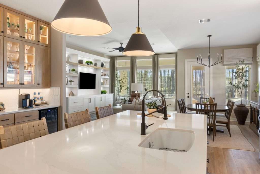
Simply put, you glide, not grind, through your day. 

If you’ve ever walked into a home and immediately felt at ease, there’s a reason for it, hun. Let’s talk about what’s really going on behind the scenes.

When Design Fades Into the Background, and Life Gets Easier

living room layout tips

When design really works, it practically disappears, and your life just gets easier without you even noticing why.

You move through your morning routine without thinking twice. Coffee is right where your hand expects it. Your bag is easy to grab on the way out. Nothing snags your sleeve or slows you down. That kind of ease isn’t luck. 

It’s thoughtful design doing its job.

And don’t worry, darlin’, effortless design doesn’t mean boring or stripped down. It means your home feels predictable in the best way. 

Things are where they make sense. Spaces flow naturally from one to the next. Your body knows where to go before your brain has to catch up. 

That’s where the real magic happens:

Your mind finally gets a break.

When rooms are laid out with intention, your brain stops working overtime. You aren’t constantly adjusting, navigating around obstacles, and mentally rearranging the space just to function in it. 

Visual noise fades. Decision fatigue eases up. Daily tasks feel lighter.

Simply put, honey, good design creates a rhythm you can settle into.

Your home quietly runs things while you get to focus on living.

Proportion as The Math Behind Calm, Usable Spaces

traditional living room design

Proportion is the quiet math that keeps your space from feeling like a funhouse, and it is the secret reason some spaces instantly relax you while others… well, make your eyes twitch

When the proportion is right, you can relax. 

Furniture relates to the room instead of fighting it. Colors feel balanced instead of busy. Trim, lighting, and decor feel intentional, not random. Nothing is shouting for attention, and nothing feels forgotten.

Now, good proportion isn’t about rules for the sake of rules, honey. It’s about scale and balance.

A sofa that fits your living room instead of swallowing it. Artwork that feels anchored, not like it’s floating or squeezed in. Ceiling height, wall space, and furniture size are all working together; that space feels steady and grounded.

Here are a few tools you can rely on to create visual balance without overcomplicating things:

  • Golden ratio

Used to guide overall room layouts and major furniture groupings, so that nothing feels cramped or oversized.

  • 60–30–10 color balance

Helps colors feel layered and cohesive rather than scattered or overwhelming.

  • Two-thirds sizing rule

Keeps your furniture and decor scaled appropriately to the wall or space they sit within.

When proportions are handled well, a room feels settled. You don’t walk in and think about what’s wrong. You just feel at ease; your eyes know where to land, and your body senses that the space makes sense.

And that’s exactly what effortless design is supposed to do.

Design on a Dime leans on proportion ‘cause it sets the tone for everything else. When scale and spacing are handled well, a room doesn’t need constant tweaking. It already feels complete.

Intuitive Placement for a Home That Anticipates Your Next Move

open space interior

Two words can change how your whole home feels: 

Intuitive placement.

Design your home so that every reach feels natural and every room instantly just makes sense. That’s the goal, sugar. 

When a space is designed around how you naturally move, everything feels easier. Your hand reaches without thinking. Your body flows through the room without hesitation. You do what you came to do without stopping to adjust, search, or work around the space.

That ease is anything but accidental. 

It comes from paying close attention to actual habits, like where you stand when you make coffee, where you drop your bag when you walk in the door, and how you curl up when you read or unwind at the end of a long day.

That’s the thing, honey: 

Homes feel intuitive when design follows people, not the other way around.

When placement is thoughtful, your brain doesn’t have to stay on alert. You’re not scanning the space and mentally rerouting yourself. You move through your home with a sense of confidence that things are where they should be.

In real-life terms, this means coffee mugs near the coffee maker, not across the kitchen. It means the trash is where you stand while prepping, not tucked into a far corner. It means the reading lamp lives where you settle in, not where it happened to fit during construction.

When rooms are shaped around real movements and real routines, your space feels natural from day one. No learning curve required.

You’re not thinking about the design. You’re just living in it.

Simple, smart, zero drama. Design on a Dime makes those placements work hard.

Invisible Planning and Removing Daily Friction

marble fireplace

Invisible planning is what makes your home feel calm, capable, and quietly smart. It’s the reason you walk through a space and think, “Of course this works,” without stopping to figure out why.

You feel it when a space responds naturally to your day. Hallways stay clear instead of becoming obstacle courses. Doorways open the way you expect them to. Rooms transition smoothly, without interrupting your momentum.

This kind of planning happens long before furniture is placed or finishes are selected, though. It starts with understanding how people move, pause, turn, and gather. 

When those patterns are respected, your home stops asking for constant adjustments.

You see, honey, daily friction shows up in small ways: 

Tight walkways that force awkward sidesteps. Doors that run into each other instead of cooperating. Light switches that never seem to be where your hand reaches first. 

None of these things feel dramatic on their own, but together? 

They wear you down, baby.

Thoughtful design quietly removes those stress points. Circulation paths are wide enough to breathe. Door swings are coordinated instead of competing. Storage is planned so that everyday things are easy to grab.

You get the idea.

Of course, lighting plays a role here, too. Not as a feature, though, but as support. Rooms feel comfortable because light shows up where tasks happen, and softens where rest is meant to happen. You’re not left to search for switches or work around shadows. 

The space simply keeps up with you. That’s the whole point, sugar.

When friction is designed out of a home, life inside it feels lighter. You move through your day with fewer interruptions, fewer irritations, and far less mental clutter. That ease is what makes the space feel finished, even when nothing about it is loud.

For Design on a Dime, the goal isn’t to impress you with clever solutions. It’s to remove the need for those “solutions” altogether by focusing on how your home will function day after day.

The Long-Term Ripple Effects of Effortless Design

neutral living room design

Once a space is designed to quietly work for you instead of against you, the ripple effects begin piling up like reward points on a favorite credit card. 

Maintenance becomes simpler. Spaces stay orderly without constant effort. You spend less time adjusting, fixing, and working around design decisions that never quite worked in the first place. Suddenly, your body isn’t begging for the couch by 3 p.m.

Those little moments of frustration start to disappear. You stop asking, “Why doesn’t this work?” because it does. 

The layout still makes sense. Storage still fits your habits. Rooms still feel comfortable instead of cramped or awkward. Your house grows familiar in the best way, not worn out.

Plus, effortless design helps your home age gracefully. 

Thoughtful layouts adapt as your needs change, whether that means busier households, quieter seasons, or shifts in how rooms are used. 

Instead of fighting the space, you adjust within it, and it adjusts right back.

There’s an emotional payoff, too. Living in a home that works well reduces daily stress you might not even realize you’ve been carrying. Energy goes toward living, not managing your surroundings. The space feels dependable, steady, and easy to be in.

That’s the real return on effortless design: 

It’s not about trends and quick wins. It’s about creating a home that continues to support you long after the excitement of a renovation fades.

Ready to feel those dividends? Design on a Dime is here to help you plan your next project.

How Design on a Dime Applies Design Know-How to Your Home

bright open space living room

Effortless design starts with understanding how people actually live. That’s why Design on a Dime Interiors approaches each project with something I like to call design intelligence

Thoughtful planning that respects real budgets, real routines, and the way your home should function long after the work is done.

Every project begins with listening. Photos, measurements, and daily habits are all studied together, so that decisions are made with purpose instead of guesswork. This early clarity helps us shape a clear plan that supports flow, comfort, and long-term usability from the start.

In simple terms, that’s how we make sure that every square foot earns its keep.

Design intelligence shows up in the details that never feel flashy, too. Rooms are scaled to fit your home, not overwhelm it. Spaces are planned to adapt as your needs change. Transitions between rooms are all smoothed out, so the house feels cohesive instead of pieced together over time.

Clear documentation plays an important role here. Precise drawings and coordinated plans help everyone work from the same vision, which eliminates mid-project changes and keeps the process more predictable and, dare I say, even enjoyable for you. 

When expectations are clear, the finished space feels intentional instead of reactive.

Lighting, layout, and material choices are selected to support comfort and ease without calling attention to themselves. The result? 

A home that feels balanced, practical, and easy to live in day after day.

The Jennifer Heights Project is a perfect example of that.

You’ll get comfort, flow, and style that continues to make sense long after the excitement of the project has passed. That’s backed by Design on a Dime’s comprehensive full-service model, including everything from design to installation.

Frequently Asked Questions

Is effortless design the same thing as minimalism?

No, it’s not. Effortless design focuses on how the space works, not how little is in it. That is to say, a home can feel effortless and still be layered, warm, and personal.

Will effortless design still hold up as my lifestyle changes?

Yes, it will. In fact, that’s one of its biggest strengths of effortless design. Homes designed with adaptability in mind tend to adjust more easily as your routines, household size, and needs evolve.

Is effortless design more about aesthetics or function?

It’s actually about how those two work together. Your space can only feel effortless when it looks good and functions well at the same time.

How do you balance kids’ clutter with a calm, low-friction home design?

You’ll balance kids’ clutter by creating kid-friendly zones, limiting toys in rotation, and teaching them about the importance of tidying from an early age. Low-friction home design is all about having a good system in place. 

Can good design still feel effortless in small apartments or studio spaces?

Yes, it can. When you use multifunctional furniture, define zones, and choose cohesive palettes that make rooms feel larger, your studio apartment supports you, not fights you. 

Where Ease Becomes the Point

When the home truly works, it stays out of your way. It supports your routines, adapts as life changes, and gives you room to breathe without asking for constant attention. 

That kind of ease isn’t flashy, honey, but it’s deeply felt, especially over time. 

It’s less about perfection and more about trust. 

Trust that your space will keep up with you. Trust that it won’t create extra work or quiet frustrations. Trust that it will continue to feel right long after the decisions are made.

If you’re ready for a home that feels settled, intuitive, and thoughtfully planned, Design on a Dime Interiors helps turn that feeling into something tangible.

Just get in touch with our team, and we’ll handle the rest. 

Design Flow: How Small Layout Tweaks Can Change How You Feel at Home

Wondering how small layout tweaks can change how you feel at home? 

It’s more than a design idea. It’s something your body notices every single day. And I’ve got news for you:

Your home’s layout is low-key messing with your mood, babe.

Ever walk into a room and feel instantly calmer, or the opposite, a little on edge for no obvious reason? 

That reaction usually has less to do with decor, and more to do with how the space moves, breathes, and supports you. The good news? 

You do not need a renovation to shift that energy. A few thoughtful changes can turn everyday spaces into places that feel easier, warmer, and more supportive. Stick with me, and you’ll see exactly how to pull that off.

The Emotional Blueprint of Your Home

small layout

Yes, sugar, your home does have an emotional blueprint.

Hear me out: 

Your home is quietly affecting your mood, stress levels, and focus every single day, whether you’re aware of it or not. Long before those color palettes and decor styles come into play, your brain is reacting to how the space is laid out. 

That’s why I call it your home’s emotional blueprint. 

It’s gently training your nervous system through movement, sightlines, light, and balance.

Spaces with gentler transitions, fewer sharp visual stops, and more intentional pathways tend to feel safer and easier to settle into. Research backs it up, by the way:

Environments with curved forms, natural textures, and reduced visual tension are processed by your brain as more calming and supportive. That sense of ease isn’t just emotional. It directly affects cognitive load, or, simply put, how hard your brain has to work just to exist in the space.

Balance matters just as much, hun. Houses that offer a clear mix of open, social areas, and smaller, more contained retreat spaces are associated with noticeably lower stress levels. When the layout allows you to shift between connection and quiet, your body responds with less tension.

Add nature to the mix, and it gets even better.

Even a few indoor plants in your favorite rooms can help reduce stress responses by around 12% and increase productivity.

All of this is why layout is never just about furniture placement. It is about how your home supports your nervous system, your routine, and your sense of comfort. When the foundation feels right, everything else has room to fall into place.

If your space looks fine, but still doesn’t feel quite right, that emotional blueprint is usually where the story begins. At Design on a Dime, we’re trained to read all those subtle signals and translate them into layouts that actually support how you live, not just how your home looks on paper.

Rethinking Pathways and Movement for a Home That Feels Good

hallway

The way you move through your house matters more than most folks realize. Every step, turn, and pause sends signals to your brain about whether the space feels calm, cramped, welcoming, or just a little bit off. 

When those pathways feel intuitive and open, your body relaxes without you even having to think about it. But when they feel tight or cluttered

Stress quietly creeps in.

Good flow is not about making everything wide open or perfectly symmetrical, though. It is about reducing friction in everyday movement. When your layout supports that natural circulation, your home stops asking your brain to work overtime. 

That’s where thoughtful pathways come in.

Clear Routes, Calmer Minds

Clear pathways are one of the key aspects of lowering daily stress levels at home. 

When you smooth out the corridors through your home, you smooth out your nerves right along with them, darling.

If you don’t trust me, you might trust environmental psychology. It shows that when circulation flows easily, the home’s emotional climate becomes calmer and more supportive, because the way space is organized shapes your cognitive and emotional state.

Think of every hallway or gap between furniture as a little stress test you walk through all day, hun. When those spaces feel tight, your body reacts, even if you can’t quite name why. Wider walkways reduce that boxed-in feeling and make movement easier and more natural. 

But once those paths shrink too much? Hello, stress hormones. Suddenly, that one chair sticking out or a pile of shoes near the door feels way more irritating than it should. Yes, we’ve all been there.

Plus, clear routes reduce mental fatigue and cognitive load throughout the day. Even small changes, such as pulling furniture a few inches back, choosing pieces with slimmer profiles, or using hidden storage, can make a huge difference. 

Edit ruthlessly, breathe easier. Your future self will absolutely thank you.

From Doorway to Destination

First impressions don’t stop at the front door, darlin’. The path from each doorway to where you’re headed sets the emotional tone for the room ahead. 

When that journey feels smooth and predictable, your body relaxes. When it feels awkward or interrupted? 

Tension follows you right in.

Clear visual cues really help here. Your eyes naturally want to know where to go next, and when the layout answers that question without effort, the whole space feels more welcoming. This is especially important in shared areas, where you have several destinations competing for attention.

Oh, and pay attention to those transitions, cause corners, thresholds, and changes in lighting can all affect how a space feels

When each turn feels intentional, your home supports you instead of making you feel ambushed. And that, honey, is the entire point of good design flow.

Clearing pathways sounds simple, but knowing what to move, where to shift it, and what to keep is where things get tricky. Design on a Dime can help you edit with intention. Let us make the difference between a temporary fix and lasting calm.

Sightlines and Focal Points That Bring Visual Calm

Before your brain processes color, texture, or style, it takes in one thing first: 

Where am I supposed to look? 

Sightlines and focal points answer that question for you. When they’re intentional, your home feels calmer and more put-together without trying too hard. When they’re not, even beautiful spaces feel visually loud.

This part of the layout is all about visual leadership. You’re guiding the eyes through the room instead of letting them bounce around competing details. 

We saw this firsthand in our Laura Project, where simply lightening heavy drapery, refining the layout, and editing visual clutter allowed the home’s existing pieces to finally breathe and feel serene again.

So, here’s how you can make small changes that instantly reduce visual clutter and mental fatigue.

Clean Sightlines Throughout

small living room
Source: Liz Curry Studio

Once you start paying attention to sightlines, you’ll realize your home’s been talking to your eyes the entire time. The question is whether it’s whispering or shouting.

Clear views help your brain relax. When your gaze can travel freely from one point to another, spaces feel brighter, larger, and more connected. 

There’s a simple way to assess this; just stand in each doorway and take note of what your eye hits first. If it crashes into cords, piles, or the back of a chair, all your brain really sees is friction. Clearing those visual roadblocks helps your eyes glide instead of stumbling:

  • Keep countertops and tables limited to what you use and truly love. 
  • Make sure windows aren’t blocked, so that natural light can travel into adjoining rooms. 
  • Use storage that hides the everyday mess instead of putting it on display. 

When sightlines are clean, your space feels easier to be in. No effort required.

Once you start seeing sightlines, you can’t unsee them. Still, it helps to have someone who knows exactly what to edit and what to leave alone. Design on a Dime can help you make a few visual shifts that change how an entire room feels.

Strategic Focal Points

Strategic Focal Points
Source: reDesign home

Think of a focal point as the “main character” of your space, giving your eyes one calm, confident place to land instead of ping-ponging around the clutter. 

And yes, every room needs one. Without it, your brain works overtime trying to take everything in at once.

A focal point can be architectural, like a fireplace or a large window, for example. However, it can also be purely decorative; think a bold piece of art, a statement mirror, or a styled console. The key is placement. 

Your focal point should sit along the main sightline from the doorway so it feels natural, not forced.

Mirrors work especially well when placed at the end of a visual path. They extend sightlines, bounce light, and create a sense of depth without adding clutter. Artwork placed at eye level, where your gaze naturally stops, has the same calming effect.

When the room knows what the main moment is, your brain can finally relax. And that sense of ease, hun, is why well-designed spaces feel welcoming the second you walk in.

When you guide what people see first, you shape how they feel next.

Zoning Spaces So Every Square Foot Works Harder

Zoning Spaces So Every Square Foot Works Harder

When your space tries to be everything all at once, work, rest, and family time can begin stepping on each other’s toes. That constant overlap creates stress you might not even notice is there until you feel drained for no clear reason. 

So, how about we bring order to that big blur of emails, Netflix, and snack breaks by giving each aspect of your day a clear place to land?

Now, to be clear, zoning isn’t about walls and major construction. It’s about signaling purpose ‘cause, hun, your brain feels more at ease when it knows where to focus, where to unwind, and where to connect. 

A workspace, for example, should feel separate from areas meant for rest. That “separation” could be as simple as positioning a desk away from high-traffic paths, or using a rug and task lighting to define a work zone. 

When your brain associates that area with focus, productivity goes up, and work stress is less likely to spill into the rest of your home.

Rest zones need the opposite treatment. Think softer lights, lower visual stimulation, and more contained layouts; elements that help the body fully power down. Bedrooms, reading corners, and quiet sitting areas should feel protected from noise and movement. 

When those cues are clear, relaxation comes more naturally.

Social zones thrive on openness and simple flow. Living rooms, dining areas, and kitchens benefit from a layout that encourages conversations and movement. No obstructions, no fuss. Seating that faces inward, clear pathways, and shared focal points help people connect without feeling crowded.

The beauty of zoning is that it works at any scale. You don’t need extra rooms or a larger footprint, as long as you make sure each zone knows its job and you have clear visual signals to support it.

Zoning is one of those layout strategies that looks simple, but behind the scenes, it takes careful planning to make sure work, rest, and connection all coexist without friction. That balance is exactly what Design on a Dime can help you create.

Finding the Right Balance Between Openness and Coziness

reading nook
Source: The Residency Bureau

You do not have to choose between a wide-open home and one that feels warm and inviting, darling. The sweet spot lives right in the middle. 

Homes that lean too open can feel echoey, exposed, and strangely uncomfortable. Spaces that are overly closed off, on the other hand, can feel tight and draining. 

Comfort comes from balance.

Don’t get me wrong, open layouts are wonderful for light, connection, and movement. They tend to make everyday life feel easier and help shared spaces feel social, rather than “segmented.” 

But when everything’s open all the time, your nervous system never fully gets a break. There’s nowhere to retreat, no visual pause, and no sense of containment.

That’s where cozy zones come in. 

Smaller, defined areas give your body permission to relax. Think a reading nook, a quiet corner for work, or a tucked-away sitting area; they create a feeling of safety and restoration. 

To put it simply, a balanced home supports real life

Most people want openness for everyday living and connection. But they also crave privacy when it’s time to rest, focus, and recharge. Creating a mix of shared, open areas and quieter zones helps your home flex with your daily rhythm instead of fighting it.

A few simple tweaks can help you find that balance: 

  • Use softer colors and natural textures in shared spaces to prevent visual overload. 
  • Add partial dividers, panels, or doors where noise travels too freely. 
  • Pay attention to how spaces feel at different times of day and adjust accordingly.

Frequently Asked Questions

How do I know if my home’s layout is actually the problem?

If the space looks fine but feels stressful, awkward, or tiring to be in, the layout is likely the culprit. Some of the common signs you should pay attention to are blocked walkways, no clear zones, and spaces that feel cluttered even when they’re tidy.

Is there a “right” layout, or does it depend on the person?

There’s no universally perfect layout. The best flow is one that supports how you live, move, and rest day to day. What feels calming for one household might feel restrictive for another. So, yes, it depends on the person.

What is the biggest layout mistake people make without realizing it?

The biggest layout mistake people make, often without realizing it, is trying to make one space serve too many purposes without clear visual cues. When everything happens everywhere, your brain never really gets to switch gears.

Should layout decisions come before decor and styling?

Yes, they should. Layout sets the foundation for how a space feels and functions, which is why it needs to come first. Plus, decor and styling make the biggest difference when the flow already makes sense.

When does it make sense to bring in a professional?

If you’ve tried rearranging and the space still feels off, it might be time to bring in a professional. Designers can spot flow issues you may be too close to see and come up with solutions that fit your lifestyle.

When Your Home Starts Working With You

Design flow isn’t about perfection or chasing whatever is trending this year, hun. It’s about paying attention to how your home supports you when real life is happening. When the space feels easier to move through, calmer to look at, and more intentional in how it’s used, your body notices right away.

Ready to make changes but feel unsure where to start? 

That’s where a trained eye can make all the difference. 

Design on a Dime’s team can help you spot those small layout shifts that bring meaningful change without unnecessary overwhelm. Sometimes, all it takes is someone seeing your space from a fresh angle.

When your space works with you instead of against you, everything feels lighter. And that is always worth investing in.

Get in touch with Design on a Dime today.

Backsplash Materials Showdown for Busy Texas Kitchens

This backsplash materials showdown for busy Texas kitchens is all about finding beauty that can take the heat. And I mean that quite literally, sugar: 

Between the sizzling pots and skillets, humidity that won’t quit, and a family that never stops moving, your backsplash works harder than you think. 

So, the right surface does more than just protect your walls. It helps your kitchen keep its shine, day after day. 

Whether you’re a “neat freak” or a “wipe it later” kind of cook, this guide breaks down which materials can stand up to Texas life with style, strength, and a whole lot of personality. Let’s get to it!

Materials That Bring Performance and Style to Texas Kitchens

When it comes to Texas kitchens, your backsplash has to do more than look pretty, sugar. It’s got to stand up to heat, humidity, and the daily hustle. From early-morning coffee steam to weekend barbecue splatter, the right material keeps its cool through it all. 

And whether you’re drawn to the classic charm of tile, the luxury of natural stone, or the shine of stainless steel, knowing how each one behaves under real-life Texas conditions makes all the difference. 

Let’s break down what holds up best when life (and the temperature) turns up.

Porcelain vs. Ceramic

backsplash ceramic tiles

When you are cooking several meals a day, wrangling kids, and hosting Sunday suppers, your backsplash takes a beating. 

Between stovetop heat, humidity, and sauce splatters, porcelain holds up like a champ. It’s fired hotter and denser than ceramic, which means it will absorb less than 0.5% water. Basically, it’s the cactus of the tile world. Moisture, steam, and grease just can’t find their way in or grow funky stuff.

Porcelain also resists chips and heat shocks, so stovetop splatter zones stay looking fresh, even during those sizzling fajita nights.

Ceramic, on the other hand, can soak up 3–7% of water, and that could spell trouble when Texas humidity and everyday messes meet. Over time, you may even see slight warping, fading, or even mildew if it’s not sealed and maintained. 

The bottom line? 

In the porcelain versus ceramic showdown, porcelain wins for durability, water resistance, and long-term looks in busy Texas kitchens.

Natural Stone vs. Engineered Surfaces

marble tiles for kitchen
Source: Storie Collective

Now, honey, this is where personality meets practicality

Natural stone, such as marble, granite, or quartzite, offers those stunning one-of-a-kind veins and textures that can make your kitchen feel rich and soulful. Engineered surfaces, like quartz, on the other hand, bring clean consistency and color control. 

So, ask yourself: 

Do you love the character of natural stone or the uniformity of engineered stone? Which look makes your heart skip?

When it comes to maintenance, engineered surfaces take the lead. They don’t really need sealing and can handle splashes and stains with little fuss. 

Natural stone, although gorgeous, demands regular sealing and gentle cleaners to keep it from etching or staining. That’s even more important in Texas humidity, where moisture can linger.

In the durability category, natural stone can take the heat without blinking, but engineered quartz wins the everyday battle against scratches, acids, and sticky hands. In fact, some lab tests even show engineered surfaces outperforming granite up to four times in strength. 

Just be mindful of direct sunlight; UV rays can fade engineered finishes over time.

So, to sum it up, for kitchens that see daily action and a lot of moisture, engineered surfaces deliver peace of mind. But if you’re after timeless luxury and don’t mind a little upkeep, natural stone still holds its crown.

Metal and Stainless Steel Alternatives

metal backsplash for kitchen
Source: Naked Kitchens

If your style leans industrial or contemporary, metal backsplashes are worth a second look. 

Stainless steel, brushed aluminum, or even copper sheets all bring reflective light, heat resistance, and a sleek finish that suits open Texas kitchens beautifully. They’re nonporous, too, which means no stains, no mold, and definitely no grout lines to scrub.

Plus, stainless steel backsplash laughs in the face of stovetop heat and is easily one of the most hygienic materials around.

The tradeoff? 

Fingerprints and smudges can be more noticeable, especially on polished finishes, but a quick wipe with a microfiber cloth and mild cleaner should keep them shining. 

In short, metal and stainless options blend easy cleaning with high style. They’re a bold, low-maintenance choice for busy home chefs who like their kitchens as hardworking as they are.

When every material in your kitchen tells a story of strength, style, and smart living, design choices matter. That is where thoughtful planning meets creative vision, something the Design on a Dime team brings to every kitchen remodel.

Design Considerations That Matter in Your Kitchen

A beautiful backsplash isn’t just about the material; it’s about how the whole story comes together. And in a Texas kitchen, where sunlight shifts by the hour and family life moves fast, every design choice has to work double duty

Practical and pretty

The right patterns, the right height, the right rhythm between your counters and cabinets can turn cleanup zones into statement moments. So, before you fall for a tile or slab, let’s talk through the details that make a backsplash feel intentional, polished, and made just for your home.

Aesthetic Consistency vs. Veining

backsplash options for the kitchen
Source: Amy Storm & Company

Even if you love a little drama, it helps to decide early where your heart leans, toward consistent color or bold, natural veining

Natural stone brings one-of-a-kind, mineral-born swirls that almost feel like lightning frozen in rock. No two slabs ever match, so your backsplash becomes an original, not something copied from a showroom wall. That uniqueness adds warmth and a sense of craftsmanship that only deepens over time.

If you prefer a calmer rhythm, engineered stone is your best friend. It brings predictable color and pattern from panel to panel, making that backsplash look seamless and sleek. You’ve also got a wider color menu, so you can nail that shade you’ve been eyeing. 

Plus, it’s built for busy living, resisting stains, scratches, and the wear of everyday cooking with virtually no maintenance.

Here’s how to choose with your heart (and a whole lot of confidence):

  • If you crave soulful, irregular drama, go natural.
  • If you love perfect alignment, go engineered.
  • If you’re after rare or fashion-forward colors, engineered wins.
  • If you want that heirloom character that never goes out of style, stone sings.

Color and Pattern Strategy

modern kitchen tile design

Your backsplash shouldn’t fight your cabinets or counters; it should join in on the conversation. The goal is harmony, baby. I’m talkin’ matching undertones, balancing pattern, and working with your lighting to create a space that feels intentional from morning coffee to midnight snacks.

Let’s start with undertones. 

Cool grays and stainless finishes pair beautifully with marble- and concrete-look tiles, while warmer woods and beiges lean toward cream or soft taupe. Now, if the counters are the star, you should echo one subtle hue from them in your backsplash tile. 

In low light, you need glossy or metallic finishes that can bounce brightness and open up the space, while sun-soaked Texas kitchens can handle matte textures that ground the look.

For a designer’s touch, think in moods:

  • Crave calm? Choose layered neutrals.
  • Want a little drama? Deep navy or emerald will bring elegance.
  • Need sparkle? Add copper, brass, or gold accents.
  • Love playful? Try patterned tiles.

We took this thoughtful approach in our Heather Project, where the backsplash needed to frame, not steal, the spotlight. It’s a perfect example of how a well-balanced backsplash can bring both beauty and purpose in a busy Texas kitchen.

And don’t overlook grout; it frames your tiles the way eyeliner shapes a face. Matching grout keeps things sleek and continuous, while a contrasting tone highlights pattern and texture. 

Backsplash Height, Outlets, and Other Layout Decisions

white kitchen tiles

You might think that the tile will steal the show, but it’s your backsplash layout that can make the difference between “nice” and “wow.” 

Height, edges, and outlet placement all work together to create that seamless, finished look.

In smaller Texas kitchens, go classic with a 3–4 inch backsplash that’ll keep costs low and line up neatly under the uppers. 

For more visual punch, try a full-height backsplash, running up to the underside of your upper cabinets, or even all the way to the ceiling, to create a custom, designer feel. These full-size options (typically between 15 and 18 inches, sometimes even 20–24 in open-plan spaces) show off tile patterns beautifully and make cleaning a breeze.

Also, think about where your backsplash starts and ends. You want to align the edges with cabinet bases or moldings; use bullnose or trim pieces for tidy finishes, and run the same materials behind your range for a continuous flow. 

Oh, and if you’ve got under-cabinet lighting, make sure the top line of your tile doesn’t compete visually with the fixtures.

As for outlets, don’t let them clutter your backsplash design. Plan cutouts carefully and ask your installer if any can be relocated lower or to the side. In coastal or humid parts of Texas, proper sealing around those openings keeps moisture where it belongs: out.

Pulling together cabinets, counters, and backsplash choices takes more than good taste. It takes an eye for balance. That’s the kind of harmony Design on a Dime builds into every kitchen we design, blending beauty and practicality so your space feels effortless.

Grout Choices That Resist Stains and Simplify Cleaning

modern kitchen tiles design

Stains, be gone. Honey, you’ll need grout that laughs at salsa splatters, sweet tea spills, and that mystery smear from taco night. What I’m sayin’ is, for Texas kitchens that stay busy year-round, grout choice can make or break your backsplash.

Epoxy grout is the powerhouse. It absorbs about 50 times less water than standard cement grout, keeps its color true, and resists oil, vinegar, and food coloring. That’s why it’s the go-to choice for modern kitchen remodels; it’s strong, low-maintenance, and still looks beautiful after years of cooking and cleaning.

Prefer something easier to install? No problem. Ready-to-use urethane grout comes pre-mixed, remains flexible to prevent cracking, and delivers consistent color without efflorescence. 

Both epoxy and urethane options skip the sealing routine and clean back to their original brightness, even with everyday disinfectants, which is perfect for humid Texas kitchens. Grease can’t win, darlin’, not today.

Choosing the right grout isn’t glamorous, but it’s the kind of detail that makes your kitchen shine year after year. Design on a Dime takes pride in those finishing touches; the small choices that make daily life easier and keep your kitchen photo-ready.

Maintenance and Upkeep Requirements for Long-Lasting Sparkle

Kitchen Maintenance and Upkeep Requirements

Let’s talk real life, sugar, or, should I say, the difference between what you wipe every night and what costs you later

Most tile backsplashes only need a quick soap-and-water swipe, but the finer details matter. Grout lines, stone, and high-shine finishes all have their quirks when it comes to fingerprints, sealing, and streaks.

You’ll want to pick the look you love and the maintenance bill you can live with.

Natural stone, for example, looks luxurious but it requires routine sealing to avoid stains in splash zones. Engineered quartz, porcelain, and metal panels, on the other hand, are easier; a damp cloth usually does the trick. 

If you choose wisely, maintenance won’t rule your weekends.

Daily Cleaning Tips

Even in the busiest Texas kitchen, a quick 60-second wipe-down can keep your backsplash looking new, if you match the cleaner to the material. 

  • Porcelain and ceramic: Use a damp cloth, no abrasives, and a bit of glass cleaner for water spots and shine.
  • Glass tile: Use a microfiber cloth and light vinegar-water mix for hard-water spots.
  • Stainless steel: Use warm soapy water, soft sponge, and always wipe with the grain; follow with a bit of glass cleaner if needed, then dry completely.
  • Natural stone: Use pH-neutral cleaner only and dry immediately after wiping.
  • Quartz: Use only a damp cloth; easy as pie.

In any case, the bigger the tile, the fewer grout lines you’ll have to clean. 

You can keep a small caddy nearby, with a spray bottle, microfiber cloth, and gentle cleaner. Quick swipes now can save you hours later.

Long-Term Upkeep Costs

Here’s the truth about backsplash maintenance over time: 

Tile looks affordable up front, but grout can be a needy roommate. Think sealing every 6 to 12 months and occasional professional cleanings. 

Grout refreshes and recoloring, for example, could run $150 to $400 every few years. Porcelain costs a bit more to install, but you can save on upkeep thanks to its dense, stain-resistant surface. 

Solid slabs, like granite, quartz, and marble, skip grout lines entirely, which cuts cleaning time dramatically. And although repairs are rare, keep in mind that they can be pricier. 

Overall, solid surfaces usually cost less to maintain than tile-and-grout systems. It’s the classic trade-off, hun: 

Pay a little more upfront or spend more time maintaining beauty down the road.

A long-lasting kitchen isn’t just built from quality materials. It’s shaped by smart design. That’s why Design on a Dime helps homeowners plan spaces that’ll stand up to busy Texas living while keeping their sparkle, day after day.

Frequently Asked Questions

What’s the average installed backsplash cost in Texas?

You’ll likely pay somewhere between $20 and $40 per square foot. The price might vary depending on the specific materials and patterns you choose, as well as other extras, like demolition and wall prep costs.

How long does a backsplash installation usually take?

After your first consultation, measurements and design approval typically take two to five days. Installation follows, with 24 hours for adhesive cure, 48 to 72 hours for grout, and a final sealing and cleanup to polish things off. That said, full-height slabs and intricate patterns may take a bit longer, usually four or five days. 

Can I install a backsplash myself to save money?

Yes, DIY can work for small areas and simple ceramic or peel-and-stick tiles. But for natural stone, heavy porcelain, or stainless steel, professional installation guarantees a clean, durable finish, which is crucial in Texas humidity.

Are there eco-friendly backsplash options that still stand up to Texas heat?

Yes, there absolutely are eco-friendly options. Recycled glass, salvaged stone, and reclaimed metal tiles all hold strong against heat and moisture while adding a sustainable touch. Some eco-resins even mimic marble without the sealing upkeep.

Can renters use removable backsplashes without damaging apartment walls?

Yes, renters have options, too. Peel-and-stick vinyl and lightweight magnetic panels can both be removed cleanly if they’re applied to smooth, dry walls. Remember to peel them off slowly at a 180-degree angle to avoid residue and keep that security deposit intact.

Backsplash Materials, Texas Style

When it comes to kitchens that never quit, hun, your backsplash deserves more than a quick pick from the tile aisle. 

It’s the detail that keeps the heart of your home looking fresh, even when daily life gets a little messy. And, believe me, darlin’, it will.

The team at Design on a Dime Interiors knows how to blend that down-home practicality with a designer’s polish, turning hardworking materials into showstopping backdrops. 

So, if your kitchen’s ready for a glow-up that works as hard as you do, reach out to Design on a Dime Interiors, and let’s make it happen. Because in Texas, beautiful should always mean built to last.

Entryway Drop Zones That Actually Keep the House Tidy

Entryway drop zones that actually keep the house tidy? Yes, sugar, it can be done. 

These “zones” might be small, but darling, they can change how your whole house feels. When your front door swings open, it shouldn’t greet you with a pile of shoes and a mystery jacket. Instead of letting chaos take over your hallway, how about we create a dedicated spot right by the door?

A well-planned drop zone brings calm to the chaos, catching bags, mail, and life’s little extras before they scatter. 

Whether your entry’s roomy or barely wide enough for a welcome mat, the right setup can keep it looking good. So, let’s talk about how to make your entryway feel like a breath of fresh air every time you walk in.

Map Your Drop Zone for Easy Flow

entryway drop zones

Every good drop zone starts with one thing, honey, and that’s placement. Before adding a single hook or basket, walk through your front door the same way you always do. 

Where do your hands get full? Where do shoes start coming off? 

That right there is your zone.

Mark that area right inside the main entrance, along the natural path your family takes toward the kitchen, stairs, or the living room. Keep at least 36 inches of walking space clear around door swings and corners, so you don’t end up dodging backpacks or bumping elbows at the threshold.

Once you’ve mapped the path, divide it into small, purposeful stops

A simple landing spot for keys or mail should sit within arm’s reach of the door. The shoe-off zone belongs close to the threshold to keep outside dirt from traveling deeper into the house. And if you’ve got the room, add a small bench or chair nearby. 

It’ll help everyone slow down long enough to shed the day’s clutter before heading in.

For narrow or awkward entries, keep your furniture light and low-profile, so the area still breathes. Even a single wall-mounted tray and slim bench can add a rhythm that works with your home’s traffic, not against it. 

Remember, the goal is easy flow

One motion from door to drop, without tripping over yesterday’s mess.

Every home has a unique rhythm, and the best entryway layouts honor that. Design on a Dime specializes in reading that rhythm, shaping spaces that flow naturally from the front door on.

Smart Bench Seating with Hidden Storage

entryway storage solutions
Source: Geri Designs

You need a soft landing spot (every home does), and the entry bench is it. It’s where shoes come off, bags take a breather, and you get a second to gather yourself before heading out again. A good bench isn’t just a seat, though. 

It’s your secret weapon for keeping the entry calm and clear.

Start with a sturdy, low-profile bench that fits the rhythm of your space. Lift the seat or pull a drawer, and that’s where the magic happens: 

Hidden compartments give every stray item, from shoes and scarves to that one, lonely glove that seems to be waiting for its twin, a place to go.

Oh, and trust me, hun, soft-close drawers make all the difference. That quiet glide feels like a small luxury, especially on busy mornings. 

You can add a few removable bins underneath, labeled by person or purpose, so each family member has a zone that’s all theirs. Plastic bins hold muddy boots like a champ; fabric baskets can keep hats, scarves, and tech cords tidy.

You’ll love the clean-up math, too:

When things start to pile up, just slide the bins out, wipe them down, and pop them back in.

If you like a polished look, go built-in. A custom bench with drawer fronts that echo your cabinetry ties the entry to the rest of your home and keeps the floor feeling open. Prefer flexibility? A freestanding version with modular inserts works just as well; perfect for renters or families who like to rearrange seasonally.

Top it with a cushioned seat for comfort, then finish the look with a soft throw or accent pillow. The goal is simple: 

A welcoming perch that hides the clutter and makes coming home feel like a deep exhale.

Hidden storage, tidy entry, happier mornings. Boom. Every day.

When storage blends right into the style, the whole entryway feels more intentional. And that’s the kind of balance Design on a Dime brings to small-space problem solving, making every inch beautiful and useful.

Shoe & Bag Control for Grab-and-Go Ease

modern entryway drop zones
Source: Heath Interiors

If there’s one zone that takes the daily hit, it’s where the shoes land. Without a plan, that pile by the door grows faster than weeds after a Texas rain. The key? 

Giving every pair and every bag a home that’s quick to reach and easy to reset.

Start with cubbies that make sense for your family. Open-front cubbies keep shoes visible and off the floor, while labeled sections stop that “Where are my sneakers?!” shuffle. A simple name tag or color code does wonders, especially for kids learning to put things away

You can keep everyday shoes front and center, and rotate seasonal pairs to higher or lower shelves when the weather changes.

Right beside that, add a couple of grab-and-go baskets for the daily rush. They’re perfect for sports gear, reusable grocery bags, or anything that travels in and out every morning.

Go with lightweight woven baskets or coated bins that wipe clean easily, and make sure they slide or lift without fuss. Get one for each family member to keep the space fair and functional; you’ll thank me later.

Now, if you’re working with limited square footage, stack storage vertically or use a slim cubby unit with adjustable dividers so boots and flats can share the same footprint. 

Oh, and add a low shoe tray near the threshold to catch dirt and drips before they spread. It’s the simplest way to keep the floors tidy and your mornings smoother.

The goal here isn’t perfection, darlin’. It’s a system that resets itself. 

When everything has a landing spot, your entry stays calm, your shoes stay found, and everyone gets out the door with a little less chaos.

Hooks, Mail & Tech Stations for Daily Essentials

Hooks, Mail & Tech Stations for Entryway
Source: LHF Interiors

The first few minutes after walking through the door could make or break your home’s order. That is why a smart wall setup, with all the right hooks, catchall trays, and charging spots, keeps the daily drop-off from turning into a pile-up.

You’ll need sturdy wall hooks right where traffic lands. Mount one row at adult height and another lower for little hands. It’s a small shift that prevents coats and backpacks from landing on chairs or the floor. Double hooks mean twice the storage without taking up more wall space, while compact two- or three-hook racks fit snugly in narrow halls.

When it comes to materials, choose something that matches your home’s mood: 

Sleek black aluminum for a modern vibe, brushed brass for a hint of polish, or warm wood tones if you like your entry to feel lived-in and cozy.

Now, if you’ve got mail, keys, and phones competing for the same counter, it’s time for a command station. 

A small catchall tray or wall-mounted organizer can give your everyday essentials a landing pad that looks intentional. 

You could even throw in a charging base with Qi wireless and USB ports, so your devices recharge right where you drop them. A weighted, non-slip tray will keep it all tidy; just look for something with a compact footprint that won’t clutter your surface.

When cords threaten your calm, hide them. Run cables through a wall grommet or disguise them inside a woven cord sleeve that blends in with your home decor. And if you’re the creative type, upcycle a ceramic bowl or thrifted pot into a charging dock. You’ll have a one-of-a-kind setup!

Honey, these little upgrades create the kind of entryway that greets you kindly and sends you out the door ready. It’s not only about keeping things tidy. 

It’s about keeping life flowing easy, one hook and one tray at a time.

Style & Space-Smart Solutions That Look Good and Fit Anywhere

Style & Space-Smart Solutions Entryway
Source: Jessica Nelson Design

Every inch of an entryway should pull its weight and make you smile every time you walk through the door. That’s where the right combination of texture, lighting, and furniture choices turns small-space stress into a welcome-home moment.

First, let’s talk about the backdrop

Shiplap and beadboard instantly add polish and purpose to plain walls, giving hooks and shelves a sturdy anchor. White boards brighten tight spots, while a pop of color, like sage green or navy, adds depth without closing things in. 

Love a little drama? Go with black shiplap and warm brass accents for a cozy, high-contrast look that feels modern yet timeless. Add a medium-tone wood bench or baskets to warm it up, and you’ve got charm that works all year long.

Next, let light and reflection open things up. 

A mirror opposite your door bounces sunlight through the space and doubles as your last-look checkpoint. If your entry runs small, go for a tall, narrow mirror to stretch the visual height. 

When it comes to lights, think bright and cozy. Flush-mounts or semi-flush fixtures fit snugly in low ceilings, while sconces at eye level wash walls with gentle glow. Look for bulbs around 2700K to keep things warm and welcoming, and don’t skip a dimmer; it’s the secret to soft evenings and bright mornings.

Last but not least, fit in function that doesn’t crowd. A floating bench paired with a slim wall cabinet turns it into a hard-working landing zone without hogging floor space.

See, honey? Beauty and practicality don’t have to live in separate rooms. They meet right inside your front door.

Whether your entry is a full foyer or just a few feet of wall, good design can make it feel intentional. Design on a Dime knows how to tailor every detail so form and function work hand in hand.

Kid-Friendly Zones, Pets, and Seasonal Swaps

Kid-Friendly Zones, Pets, and Seasonal Swaps for Entryway
Source: Blaine Moats

Now, darling, your entryway has to work as hard as your family does. Between school mornings, muddy paws, and shifting seasons, it’s the space that sees it all. The right setup keeps the chaos out of sight and life running smoothly.

For our Painters Ridge Project, we created a home that works as beautifully as it looks, made for a busy family whose days rarely slow down. Every corner blends practicality and polish, proving that great design can support real life without sacrificing style.

You can start with family lockers, because, sugar, one mini zone per person makes a world of difference. 

Give each locker a sturdy hook, a shelf, and a cubby for shoes or gear so that everything lands in the right place the moment it comes through that door. Adjustable shelves leave enough room for growing kids and changing needs, and a built-in bench lets little ones sit to tie their shoes without wobbling. 

In narrow halls, try slim vertical lockers with sliding doors to save space; in bigger entries, a ceiling-to-floor setup feels custom and keeps mornings calm. 

While you’re at it, throw in a strip of soft lighting underneath. It adds polish and makes those early starts a little easier.

Then bring in color coding to keep routines running smooth: 

Assign a color to each family member (think bright baskets, painted cubby edges, and colored hooks) and label everything clearly. 

For toddlers, even simple icons work like magic. Aim for cubbies about 15 inches deep and 30 inches high so little hands can reach stuff without stretching. The goal isn’t perfection; it’s independence. 

Kids can see, grab, and go, and you can sip your coffee in peace.

Now, don’t forget your fur babies. Pets need their own landing zone, too. A small console or wall shelf can hold leashes, treats, and lint rollers, while low baskets corral all their toys and outdoor gear. Oh, and add a washable mat for muddy paws

That way, everything from walk time to cleanup happens in one easy spot.

Finally, keep things flexible for the seasons. Removable bins and stackable boxes make swapping gear a five-minute task instead of a weekend project

When sandals go out, boots come in. Rotate hats, gloves, and umbrellas by season, and label the bins so everyone knows where to look. The trick is editing as you go; one quick reset at each season change, and clutter never gets the upper hand.

Families change, and the spaces we move through every day should change with them. Design on a Dime can help you design flexible drop zones that grow gracefully with each new season of life.

Frequently Asked Questions

What’s a realistic budget range for a functional entry drop zone?

It really depends on how much you want to do. Simple setups with hooks, baskets, and a small bench can cost $100–$300. If you’re getting built-in storage or modular pieces, that usually falls somewhere between $300–$1,500. But if you’re going full custom with cabinetry, lighting, and durable flooring, it could easily hit $6,000 or more. 

What if I don’t have a dedicated entryway?

If you don’t have a dedicated entryway, you can always use a corner, hallway, or even a back door wall. A slim console with baskets and a few wall hooks can create the same functionality without building anything in.

How many hooks or cubbies do I need per person?

That depends on several factors, including what you might store in them. But generally speaking, go with two to three hooks and one cubby or basket per person. That should give everyone space for coats, bags, and extras without crowding the wall.

How often should I reset or clean the drop zone?

You should do a quick tidy-up once a week. Empty the bins, shake out the rugs, and wipe all surfaces; you know the drill. Then, every season, you can take the time to swap out gear, so you’re only storing what’s in use.

Are there renter-friendly options that won’t damage walls or floors?

Yes, there absolutely are! You can get over-the-door racks, adhesive hooks, or removable strips that leave no marks. Freestanding benches, cubbies, baskets, and tension-shelf units all give storage without drilling. Even a rolling cart can serve as a landing zone, letting you enjoy a functional entryway with zero damage.

Make Your Entryway Work for You

A thoughtfully designed entryway sets the tone for the whole home. When your drop zones are organized, accessible, and tailored to your family’s rhythm, coming and going becomes effortless. 

And trust me, small changes can make a big impact here. 

Now, a little guidance can go a long way in creating a space that feels calm, welcoming, and totally under control. 

So, if you’d like expert help turning your entryway into a functional and stylish hub, the Design on a Dime team can create a plan that fits your home and lifestyle. A tidy, stress-free threshold is not just a dream. It can be your reality.

Ready to take control of your home’s busiest threshold? 

Reach out to Design on a Dime, and let’s make it happen!

8 Design Fixes for Awkward Corners That Never Get Used

Design fixes for awkward corners can turn those forgotten nooks into spaces that actually get used and loved. You know the ones I mean; that tiny wedge behind a sofa, the tight, little triangle near your stairs, or that shy kitchen gap nobody ever touches. 

Instead of letting these spots collect dust and stress, a little thought and creativity can make them work for you. 

Whether you’re craving cozy retreats, extra storage, or a touch of style, a few smart moves can transform those corners from frustrating to functional. 

Stick around, darling, and I’ll show you how to see those awkward angles differently, so every inch of your home feels intentional, inviting, and perfectly designed.

1. Cozy Corner Reading Nooks That Feel Like a Hug

corner reeding nook
Source: Douglas Friedman

Where do you curl up when a book gets good? Do you often find yourself half-tucked on the sofa, juggling a blanket, a mug, and a good plot twist? 

Let’s give that habit a home of its own with a corner reading nook that feels like a little retreat right inside your house.

Start with a comfortable chair that supports you in all the right places; something upholstered and inviting, or even a vintage piece with some character. A storage ottoman or small side table gives you space for your tea, books, and a soft throw when you’re done reading. 

Built-ins nearby can hide extra blankets and your growing stack of novels without cluttering up the corner.

That said, layering is what turns “nice” into “cozy.” Think plush pillows, tactile blankets, and a soft area rug that defines the space. You can even mix textures to bring depth and warmth. And if you’re working with a smaller footprint, floor cushions or a bean bag can make a low-profile nook that still feels special.

Color brings it all together. Robin egg blue or soft sage will calm the senses, while sunny yellow and coral give a cheerful, storybook glow. It’s up to you!

Before you know it, you’ll have a corner that hugs you every time you sit down; a little escape where every page feels like a vacation.

2. Compact Workstations That Make Corners Work for You

home workspace
Source: Far Studio

Focus loves boundaries, honey, and sometimes, all it takes is one underused corner to build them. That little nook you walk past every day? 

It could be the perfect area for a compact workstation that helps you tune out distractions and get things done.

Start with the right foundation: 

A slim desk that fits the angle without crowding it, combined with a comfortable, supportive chair that tells your back you mean business. Skip the dining table and the couch; those are for dinner and naps, honey, not spreadsheets and deadlines. 

Believe me, even the smallest workstation can lift your productivity when it’s set up with purpose.

Think visually, too. A darker wall color behind your desk can help the space feel grounded, while a simple task lamp keeps your focus where it should be. Hide tech cords with channels or clips to keep things neat, and if you can, mount your monitor to free up even more surface space.

My advice is to go ergonomic without going bulky. 

Add a small footrest, a sliding keyboard tray, and perhaps a petite filing pedestal that doubles as an extra perch. Oh, and remember that corkboard, felt panels, and fabric pinboards can soften sound and give you a spot to pin reminders or inspiration.

Before long, that forgotten corner won’t just look smart. It’ll make you feel smart every time you sit down to work.

3. Vertical Storage That Frees Up Floors

corner vertical storage
Source: Emily Finch Design

If your corners are collecting dust instead of doing their part, it’s time to make them work a little bit harder, sugar. And trust me, going vertical is one of the easiest ways to free up floor space and keep things airy and organized.

So, get yourself a tall shelving unit or built-in tower that reaches close to the ceiling. It can draw the eye upward and instantly make the whole room feel taller. A floor-to-ceiling design can give you more storage than standard bookcases. 

And that means a lot more room for baskets and books, without cluttering your floors.

If built-ins aren’t in the budget, don’t worry; slim corner bookcases are a clever alternative. They tuck right into 90-degree angles, often just 12 to 15 inches deep and up to six feet high, which means you gain a bit of added vertical storage without eating into your floor plan. 

You can find premium metal-and-wood designs that handle up to 200 pounds total and keep their shape for years. Cute and tough!

Once it’s up, style your shelves with a mix of books, baskets, and a few potted plants for texture. Keep the bottom shelves functional (think storage bins and lidded boxes) and let those higher shelves show off your style.

When you treat corners like mini skyscrapers for your stuff, you’ll find yourself walking through clearer and lighter rooms that still hold everything you need. That’s what Design on a Dime calls a win for space, spirit, and style, all at once.

4. Custom Furniture That Fits Every Quirk and Corner

under stairs nook
Source:  Jenna Barton Interiors

Ever stare at a tricky angle and think, “Now what am I supposed to do with that?” Well, that’s when custom design really shines, darlin’. 

All those odd wedges, sloped ceilings, and narrow nooks are waiting for a piece made to fit them perfectly, and we’re about to make it happen.

Built-ins are your best friend here. Consider a fitted bench under the stairs, a triangular cabinet for a tight kitchen corner, or floating shelves that follow the shape of that slanted wall. When every inch is measured and made just for your space, the result looks intentional and polished. 

And you know we’re not going for “improvised” here.

If you’re handy, use cardboard templates or scrap wood to trace those angles before cutting; it’s an easy trick for accuracy without any complex math. Oh, and don’t forget sturdy, slightly splayed legs if your floors aren’t perfectly level. You can thank me later.

Design-wise, less is more. A single custom piece that fits clean and snug will always feel calmer and more sophisticated than a cluster of small items trying to do the same job.

In the end, you’ll gain storage, seating, and a big dose of pride every time you look at that once-awkward space. Honestly, it’s amazing what a made-for-you piece can do when it meets a made-by-you home.

5. Kitchen Corner Cabinets That Finally Make Sense

kitchen corner cabinets

Now, we both know kitchen corners love to play hard to get. They will swallow pots, hide mixers, and turn every reach into a stretch. 

But with the right cabinet systems

Oh, honey, that corner can be your most efficient space yet.

I’m talking full-access swing-out units that bring everything right to you. When you open the door, trays glide out smoothly, giving you a clear view of every pot, lid, and spice jar. Adjustable shelves let you tailor the setup to your cookware, and soft-close hardware keeps the motion whisper-quiet. 

Of course, you want to go with sturdy, moisture-resistant materials like sealed plywood or powder-coated metal; something that can handle years of cooking.

For truly tricky blind corners, pull-out systems are a game-changer. 

You get more usable space, with each shelf typically holding a few dozen pounds. Plus, the non-slip finish keeps everything steady, even that heavy Dutch oven you only use once a year. 

If you’ve got a tall, narrow spot between appliances, consider a pull-out pantry. These slim towers can be as narrow as 10 inches yet hold up to 250 pounds, sliding out easily, so nothing gets lost in the shadows

With the right combination of swing-outs, pull-outs, and pantries, that once-awkward corner turns into the best part of your kitchen. It’s proof that good design doesn’t simply look pretty; it makes every meal a little easier to reach. And Design on a Dime can make it happen.

6. Lighting Strategies for Ambiance and Function

living room lighting
Source: Salt Design Co.

Corners can feel like wallflowers until you hit them with the right glow. The trick? 

Layer your light so it flatters the space and fits your lifestyle. 

Start with a slim floor lamp to cast that soft, welcoming glow. Then, add a swing-arm sconce or spotlight to sharpen focus where you need it. That mix brings both warmth and function, turning dim corners into cozy, usable spots.

Of course, lighting works best when it adapts to your mood. Try dimmers and smart bulbs so you can shift color temperature. Think 2700K for a warmer, relaxed evening feel or closer to 5000–6500K when you are reading, sewing, or getting creative. 

Studies show that thoughtful, layered lighting improves comfort and overall well-being and even helps with productivity, especially when you balance daylight with ambient and task lights.

Now, LEDs are your best friend here. They sip energy, tend to last for ages, and come in a range of styles. For a little touch of drama, hang a sculptural pendant or place a glowing floor orb that acts as both art and accent. It anchors the space, adds height, and gives your corner personality.

Lights played the starring role in our Rock Daisy Kitchen Transformation project, too, lifting what once felt shadowy and cramped into a bright, welcoming space.

If your lighting plan still feels off, that is your cue to call in the experts. A team like Design on a Dime that knows their way around color temperatures, beam angles, and mood-setting will make sure every corner in your home glows just right.

7. Nature-Forward Corners with Plants and Textures

Nature-Forward Corners with Plants and Textures
Source: Lucas Browning Design

Nothing breathes life into a quiet corner like a little greenery and texture, darling. Plants bring movement, color, and calm, while natural materials wrap the whole look in warmth. 

You can start simple, with a plant layer: 

A tall floor plant or wooden planter for height, a mid-sized beauty on a bench or stool, and a trailing vine on a ladder shelf to draw the eye upward. Hanging baskets or wall-mounted planters can fill blank space beautifully, giving you that lush, vertical garden feel.

Add a touch of serenity with a tabletop fountain or a small bamboo water feature. Those gentle sounds of flowing water have a way of softening the energy in a room, creating that spa-like calm you’ll love coming home to.

Then, play with textures that feel good and look even better. For instance, combine raw wood with smooth stone, weave in wicker or rattan for warmth, and scatter white pebbles or jute rugs for that fresh, grounded finish. 

Remember to keep the palette earthy (think greens, browns, creams, and soft grays) to let the plants take center stage.

If your space gets shifting light, roll a little “plant trolley” so your leafy friends can chase the sun throughout the day. It’s practical, pretty, and packed with charm. 

Trust me, hun, with a few thoughtful layers, this once-forgotten corner can bloom into a natural retreat right inside your home.

8. Decorative Corners With Art, Rails, and Sculptural Charm

 Decorative Corners With Art, Rails, and Sculptural Charm
Source: Oho Interiors

Corners don’t have to hide, sugar. They can steal the show with a little styling love. 

You can start by thinking vertically

For instance, you can stack art, lean frames, and play with shapes to give even the narrowest wall a little bit of personality. Picture rails make it easy to layer artwork and swap pieces without extra holes, letting you refresh the look whenever inspiration strikes. 

Hang a rail a few inches below the ceiling for polish, or float it higher in rooms with tall ceilings for drama; whatever works for you. 

You could also add slim shelves to hold small plants, a lamp, or cherished mementos, and suddenly your corner feels curated, intentional, and full of life.

Don’t stop at frames, though. 

Sculptural vignettes bring warmth, texture, and movement to the space. 

Anchor with a tall lamp, leafy plant, or standout vase, then layer in your books, bowls, and small objects in varying heights. Mix materials like bamboo, ceramics, moss, or glass, and play with curves and angles to guide the eye. 

And remember: 

Group items in threes for balance, and sprinkle in one quirky or unexpected piece to add some personality and charm. Small pedestals and trays can help “define” clusters and make items feel more purposefully placed

With a bit of layering, corners can go from overlooked spaces to statement spots that blend style, function, and a touch of wow.

Frequently Asked Questions

Can awkward corners affect the overall flow of a home?

Yes, underused and generally awkward corners can make the room feel smaller or unbalanced, and, as a result, affect the overall flow of your home. The good news is, you don’t need to knock down any walls; all it takes to fix this is thoughtful design.

How do I decide if a corner needs furniture or decor?

If you can’t decide, consider how you’ll use the room. If the corner feels empty but traffic still flows through it, decorative touches may work better. If it’s underused, though, functional furniture is ideal.

Is it worth consulting a designer for very small or awkward corners?

Yes, even small corners, especially awkward ones, could benefit from professional insight. Designers can suggest custom solutions that maximize style and functionality, improving the overall flow of your home.

Are there budget-friendly ways to improve awkward corners?

Yes, there absolutely are. Simple upgrades like a floor lamp, small shelving, or a plant arrangement can all make corners functional and inviting without requiring major renovation.

Make Every Corner Shine

Those overlooked corners in your home are full of untapped potential, friend. With a little vision, a little bit of guidance, and expert help, you can turn even the trickiest of nooks into functional, beautiful spaces that feel like they were always meant to be. 

At Design on a Dime, we specialize in custom solutions that bring out the personality and purpose in every inch of your home. 

Why settle for “just there” when your corners can wow? 

Reach out to Design on a Dime today and see how a thoughtful design touch can make your entire space feel brighter, smarter, and more inviting.

Contact us to schedule your consultation!