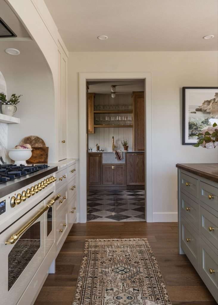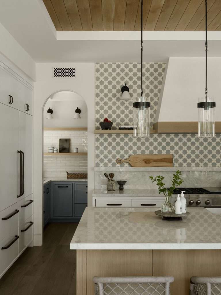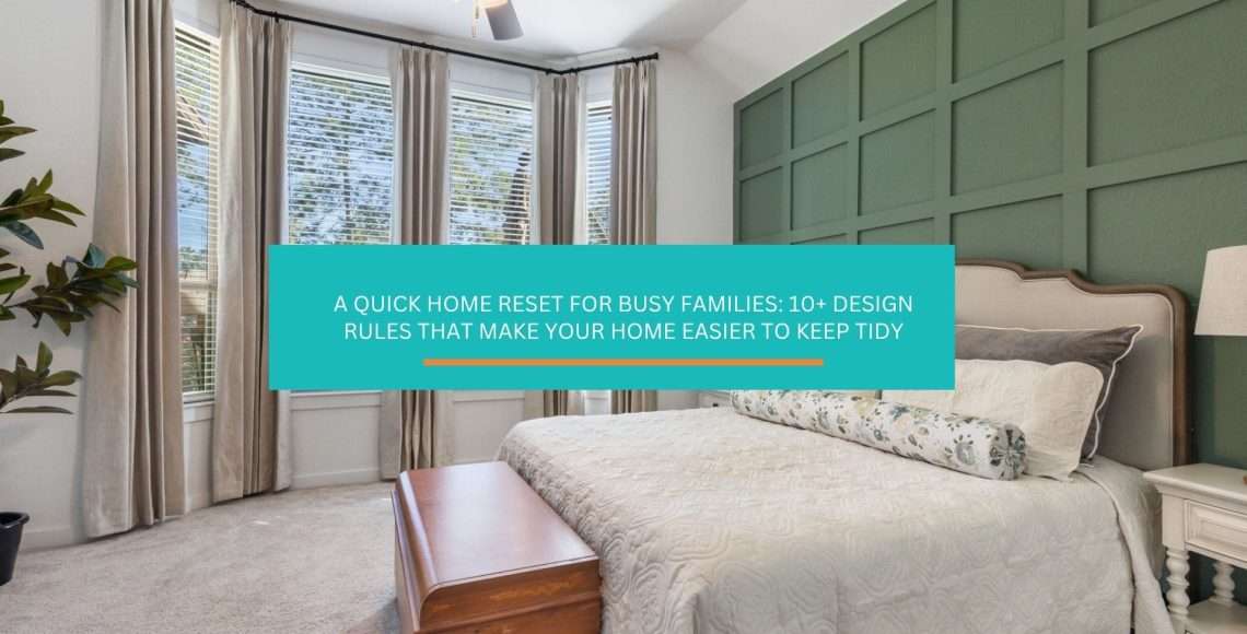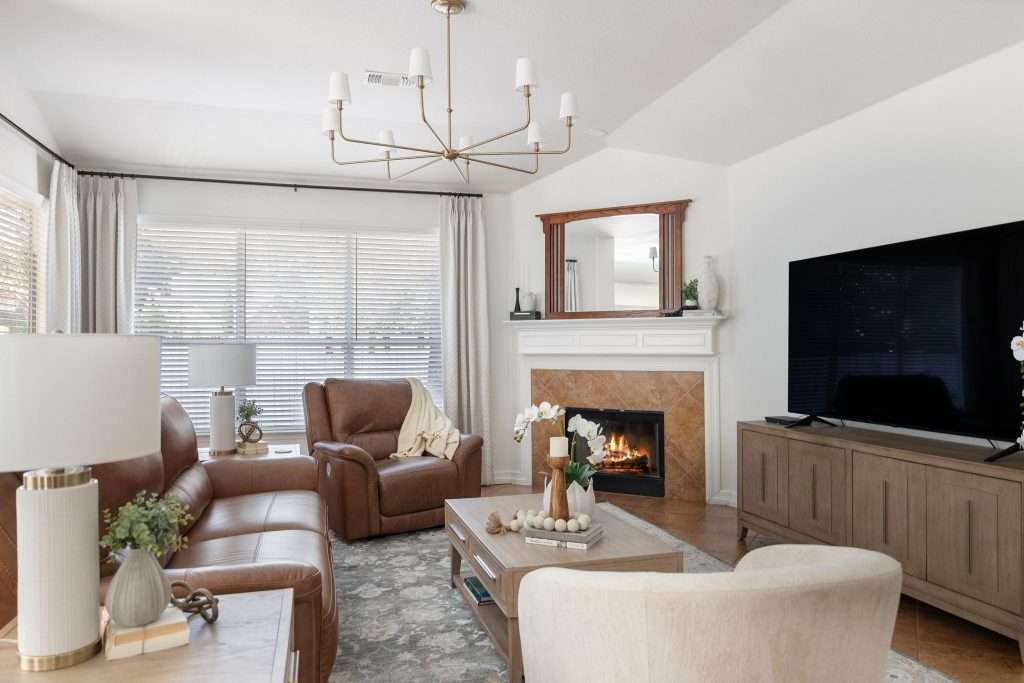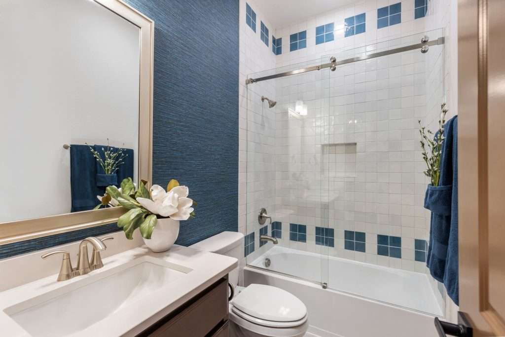
Where to Splurge and Where to Save in a Texas Remodel

Where to splurge and where to save in a remodel usually gets decided by accident, honey. And usually the wrong way. We see it constantly in kitchens across Conroe and The Woodlands.

Someone pours almost the whole budget into one showpiece: a marble slab running the full length of the island. Then there’s nothing left over, not even the 10 percent cushion every remodel needs for what the walls hide. The marble looks stunning in the showroom. A few months of coffee rings and lemon wedges later, it’s already carrying a faint stain. Marble is porous, and real life happens on it daily. That’s the trap.

Our fix is simple: marble where you’ll see it, something tougher where you’ll actually use it.

Spend Where You Touch It Every Day
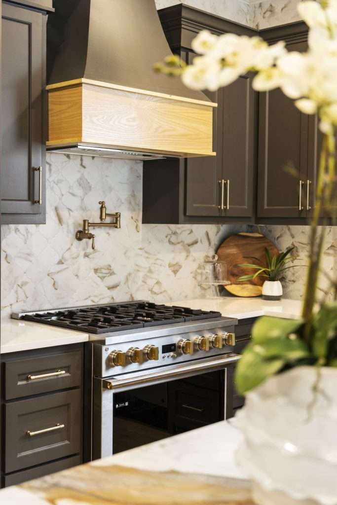
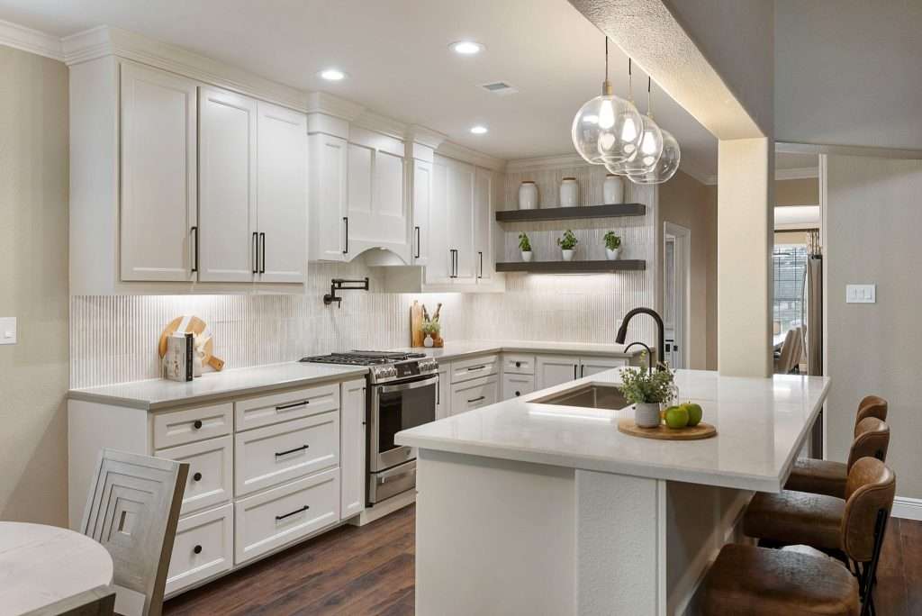
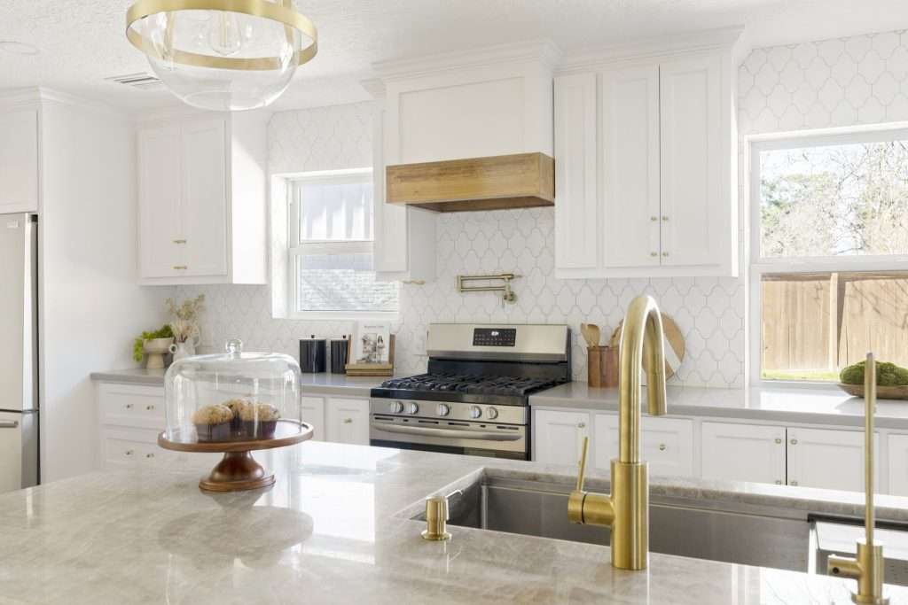
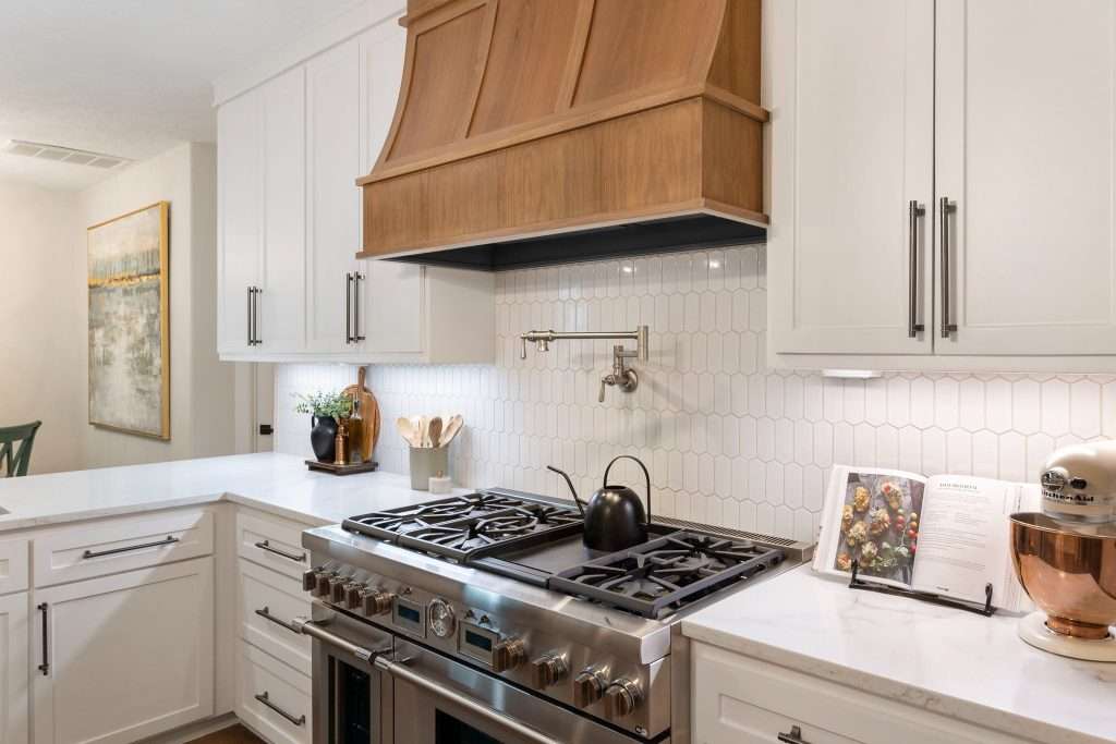
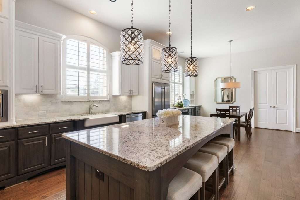
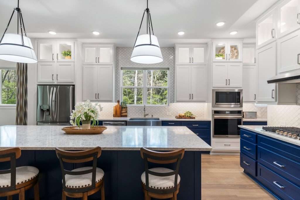
kitchen cabintes design

The rule of thumb is this: put your money into whatever your hands, feet, or backside touch every single day. Save on whatever mostly just gets looked at. Daily-contact surfaces take the wear. Decorative pieces don’t.

Countertops, cabinet hardware, flooring, and upholstery earn the splurge. They get used dozens of times before breakfast is even over. The National Kitchen and Bath Association has long pointed remodeling homeowners toward exactly these zones. That’s where a budget delivers the most day-to-day value.

Here’s where that shows up in a real remodel:

Countertops and Cabinet Hardware
These get touched, leaned on, and wiped down more than almost anything else in the house. A pull that feels solid in your hand is worth the investment. So is a surface that shrugs off daily spills.

Flooring Underfoot
You walk across your kitchen floor barefoot, in work boots, and everything in between, all in the same week. It needs to hold up to that, not just photograph well.

Seating You Actually Sit In
Your family’s dining chairs and sofa cushions get used every single night. That matters more than the accent chair nobody sits in.

Think about the builder-grade fixtures that come standard in a lot of Texas floor plans. They’re usually the first thing homeowners want to replace, and honestly, that’s the tell. Standard-grade hardware gets touched constantly, and it shows the wear fastest.

Once you sort a room this way, darling, the rest of the budget question gets a whole lot easier.

Countertops: The Marble-vs-Quartzite Move
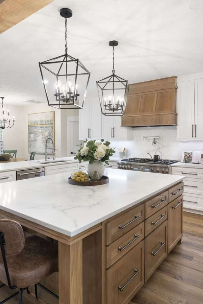
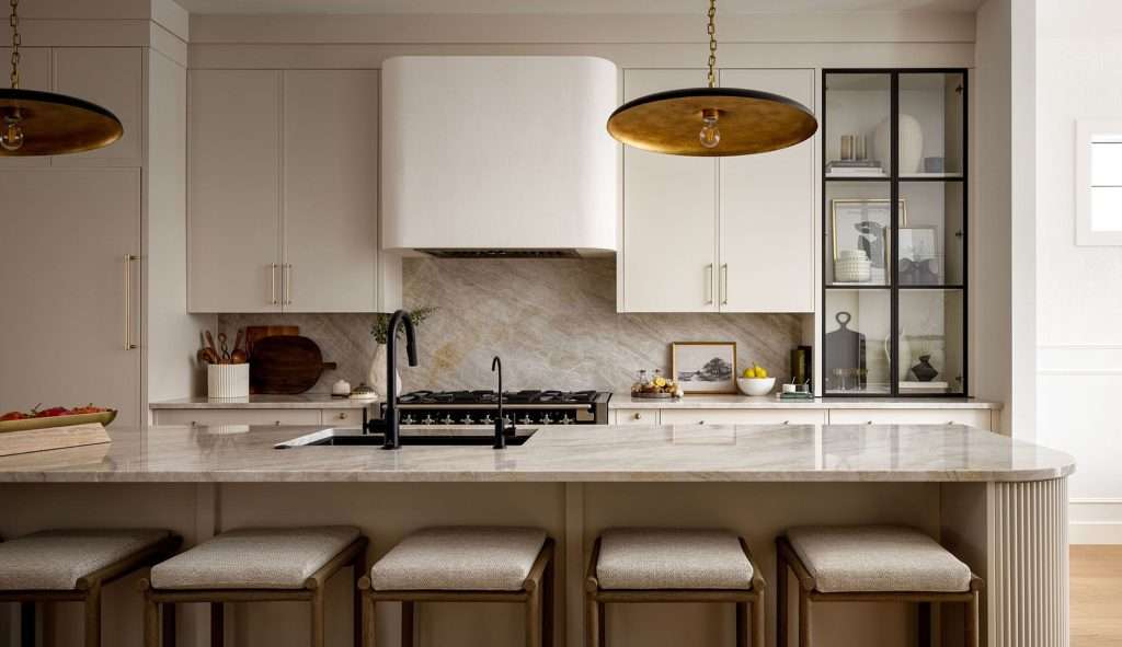
The Marble-vs-Quartzite

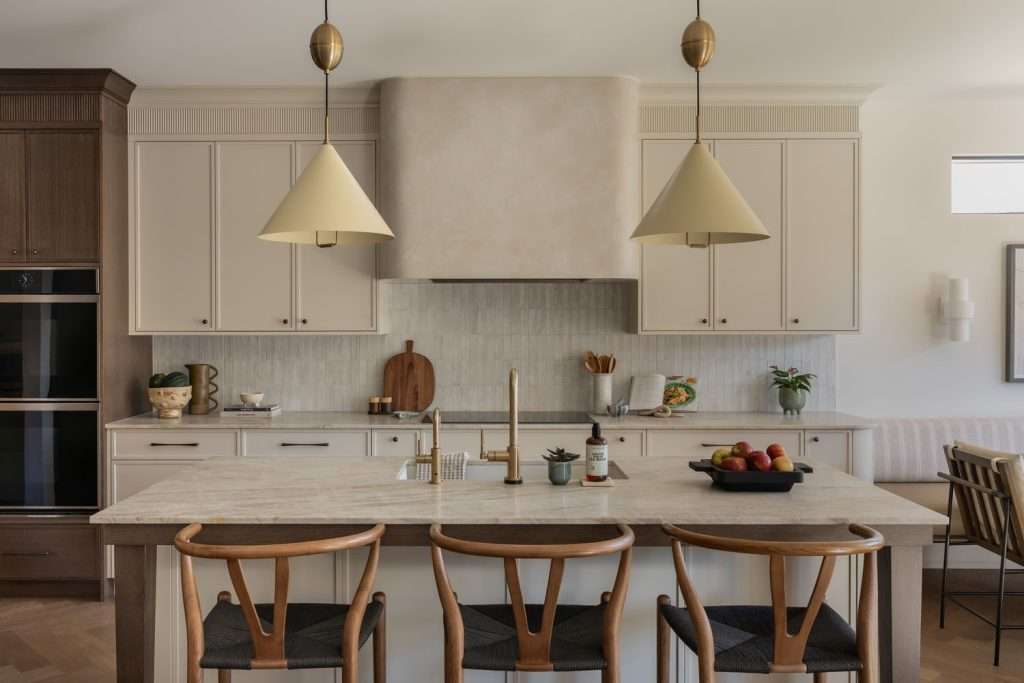
The smartest kitchens we build don’t force a choice between marble and quartz. They use marble where you’ll see it and quartzite where you’ll actually use it. That single move is the whole splurge-versus-save decision in one countertop.

Marble is gorgeous, and it’s also porous. It stains from wine, coffee, and citrus. It needs real maintenance education before a client signs off on it, a fact the Natural Stone Institute’s own guidance on stone care and porosity backs up. That’s not a knock on marble. It’s a reason to be selective about where it lives in a kitchen.

Marble: The Showpiece
Save it for a backsplash, a wall, or an accent that gets admired more than it gets scrubbed. That’s where the veining does its job, no coffee ring undoing it by Tuesday.

Quartzite: The Workhorse
A natural stone, mid-tier on price, harder than marble and more forgiving than people expect. This is where the working counter goes: the cutting board, the hot pan, the flour dusting.

Quartz: The Zero-Fuss Option
Man-made, engineered for easy maintenance. The right call anywhere you want one less thing to think about, sugar.

We used this exact pairing on our Magnolia kitchen transformation. It’s the same logic our kitchen remodel team in Conroe walks clients through before anyone signs off on “I want marble.” The conversation almost always starts with “marble or quartz,” like there are only two options. There’s usually a smarter third one.

Flooring and Fabric: Spend on What Survives Houston
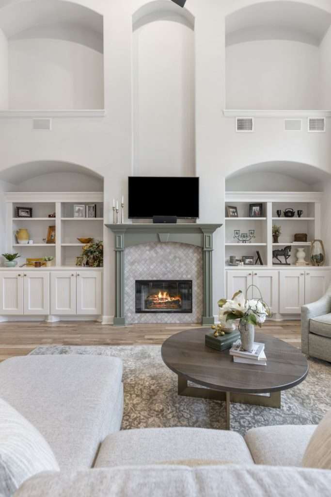
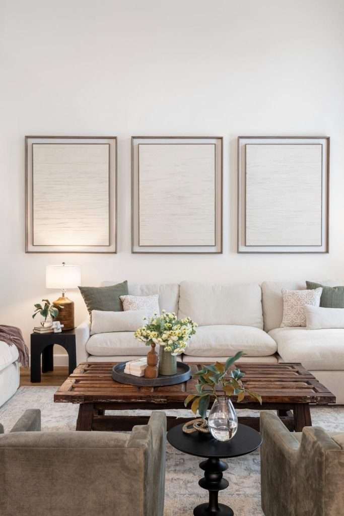
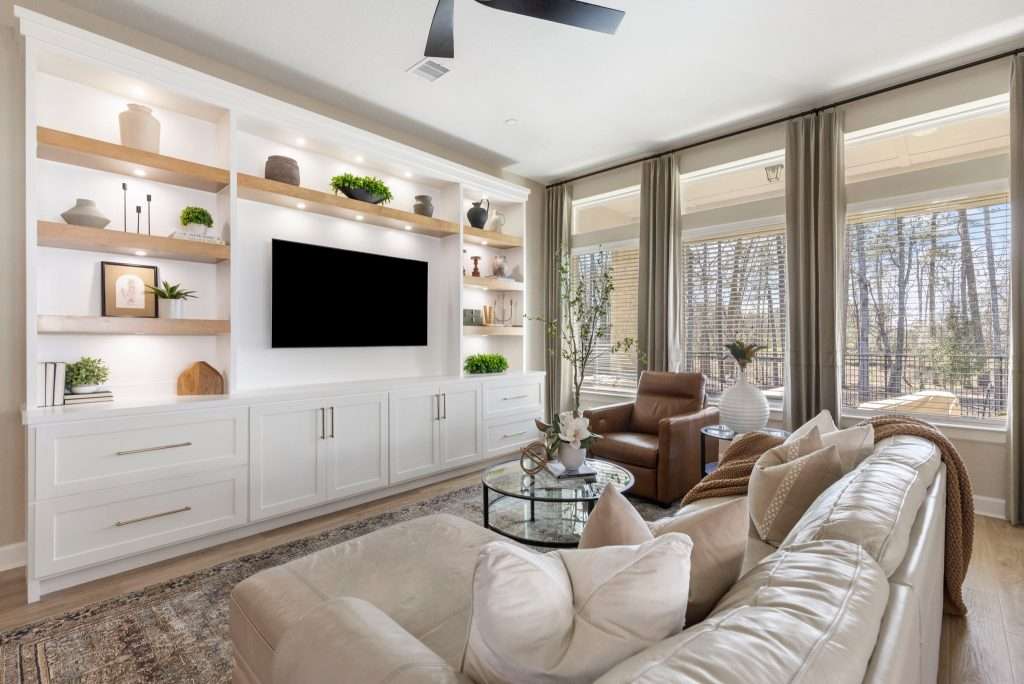
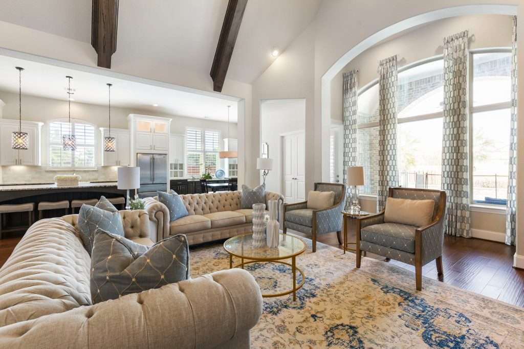
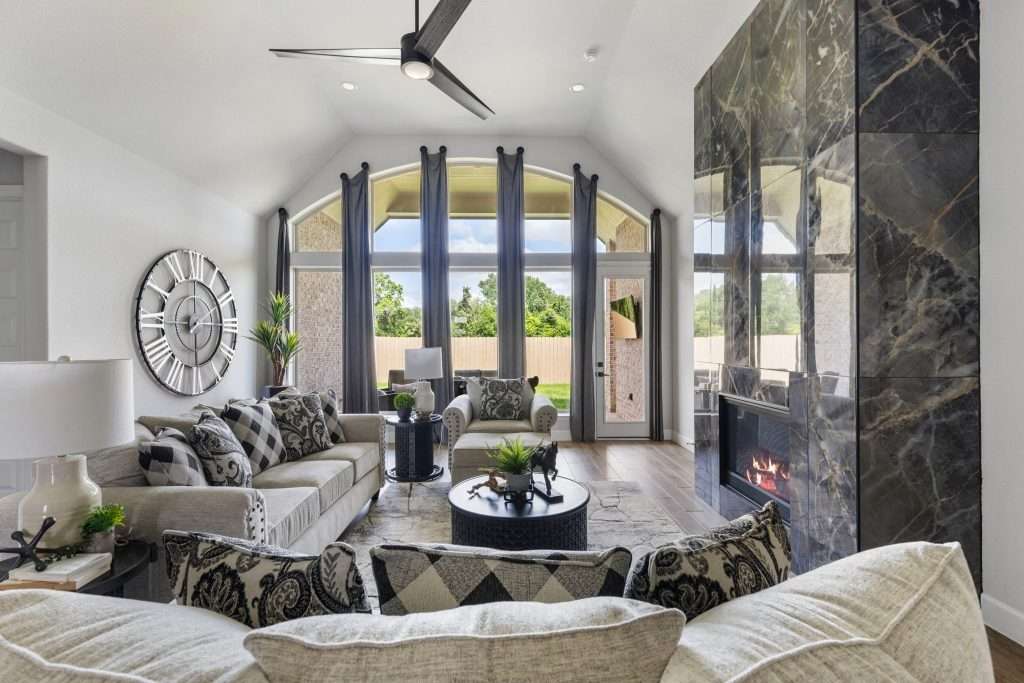
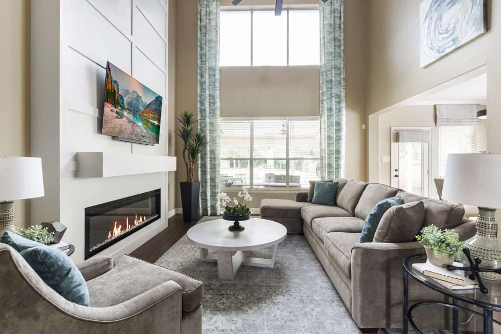
open space living room

Houston decides more of your material budget than most homeowners realize. Spend where the material has to survive our heat, our humidity, and our flooding. Save on anything that doesn’t have to fight the climate.

What Survives Houston Humidity

Our heat index runs different than California’s or the East Coast’s. Houston floods in a way most of the country doesn’t plan for. That’s why LVT, luxury vinyl tile, has become the standard in so many Houston-area homes. It’s water-tolerant, and replaceable in sections when the worst happens. Tile floors are common here too, because they stay cooler underfoot in August. A material that thrives in a dry or cold climate can fail fast in ours. That’s one reason we don’t chase California-style organic flooring trends built for other climates. They were never engineered for Gulf Coast conditions. The same tile that reads as timeless in a Conroe kitchen would crack in a New York winter. The Texas A&M AgriLife Extension has documented how our region’s heat and humidity stress building materials. That stress rarely shows up in a showroom sample. Local design here isn’t really a style preference. It’s a materials engineering problem.

What Survives Daily Life

The same logic applies to fabric. Performance fabric belongs on anything your family actually sits on. The stain protection is woven into the fibers at manufacturing, not sprayed on afterward, so it takes the spills a real household throws at it. That’s the difference between a couch you baby and a couch you live on. We put it on every project for that reason. We’ve written more about why this fabric choice holds up in real Conroe homes, including the spill test we run in person, so give that a look before you rule white furniture out.

If flooring is next on your list, our flooring team in The Woodlands can walk you through which materials are worth the splurge in this climate. We’ve also broken down some lower-impact flooring options worth knowing before you decide.

Where It’s Safe to Save
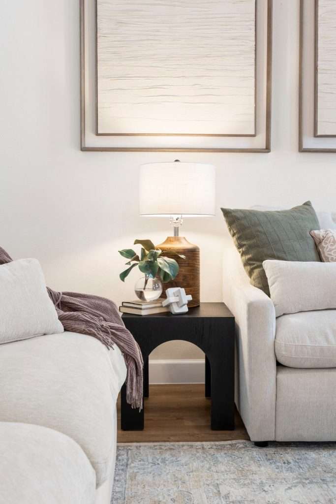
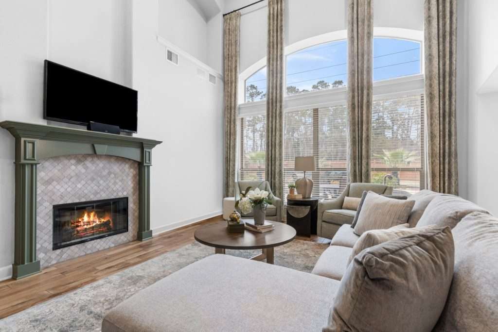
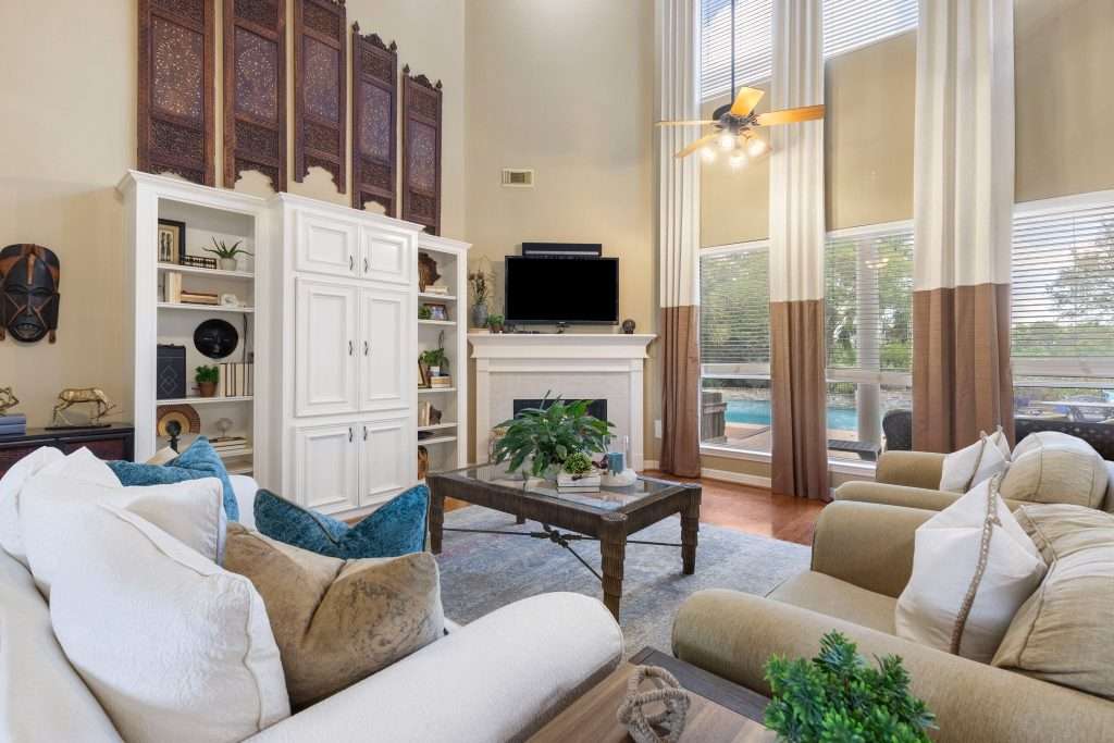
living room design

The safest place to save in any remodel is anything decorative or trend-driven. Or anything you could swap out in an afternoon without touching a wall. This is also where reusing what you already own does the most good.

One of the biggest ways to save on a remodel isn’t a material choice at all. It’s resisting the pressure to start over and buy everything new. Some designers will push a full replacement on every single item. We’d rather reimagine what you already have and pair it with a few new pieces. The “gut it all” approach spends money solving a problem that didn’t need solving. Every dollar you don’t spend replacing something that still works is a dollar you can put toward the countertop or the fabric that actually needed it.

Accent Pillows and Throws
These change with the season and the sale rack. Save here without a second thought.

Light Fixtures You Can Swap Later
A fixture you can unscrew and replace in ten minutes is not where your remodel dollars need to live.

Art and Accessories
Trend pieces come and go fast. Buy what you love now, and don’t feel guilty about replacing it in three years.

The Remodeling magazine Cost vs. Value report consistently shows the biggest returns come from surfaces and systems you don’t replace every trend cycle. Not the accessories you swap out for fun, hun. Our interior design team in Conroe can help you sort out which pieces in your current home are worth keeping. Then you’ll know what’s actually worth buying new.

The One Line You Never Cut: A Contingency

Every remodel we take on requires a 10 percent contingency budget. It’s the one “save” you can never skip, darling. A remodel is a living project. The drawings look perfect on paper. The moment we open a wall, plumbing and wiring show up in places nobody planned to move them. That changes the math. Week one is demo, and demo is exciting: fast, dramatic, satisfying. Week two and beyond is rebuild, and rebuild is slow. That’s exactly when families get antsy, right when the dust is everywhere and the contingency is what keeps the project moving instead of stalling out.

The National Association of the Remodeling Industry recommends homeowners set aside a reserve for exactly this reason. Older Houston-area homes in particular hide surprises no drawing can predict. Skip that contingency to spend more on marble or a fancier faucet, and a remodel runs out of money by week three.

Before you land on a final number, run your own project through both of our cost calculators: the Texas kitchen remodel cost calculator and the bathroom remodel cost calculator. Both are built around real Houston-area ranges. They’ll show you exactly where a 10 percent cushion needs to sit inside your total budget, before a single wall comes down. We also wrote about why getting this step right up front saves so much stress later, if you want to go deeper.

Frequently Asked Questions

Is it ever worth spending more on countertops than on furniture?

Yes, when the countertop is a daily-contact surface and the furniture piece isn’t. A counter gets used dozens of times a day; an accent chair might get sat in once a month. Spend where the wear happens, and let the piece that gets the least use carry the smaller price tag.

What’s the real difference between quartzite and quartz?

Quartzite is a natural stone cut from the earth. Every slab has its own veining, and it’s naturally hard and durable. Quartz is engineered, made from ground stone and resin, which makes it more uniform and easier to maintain. Both outperform marble on daily wear.

Do trend colors and finishes belong in the splurge category or the save category?

Save. In the Greater Houston market, trend cycles move fast. A finish you love this year might feel dated in three. Put trend-driven choices into whatever’s easiest to change later: paint, hardware, accessories, not permanent surfaces.

How much should you actually set aside for surprises during a remodel?

Plan on roughly 10 percent of your total project budget as a contingency. Hold it separately from the rest of your spending decisions. That reserve exists for what shows up once the walls open, not for upgrades you decide on halfway through.

Spend Like You Plan to Live in It
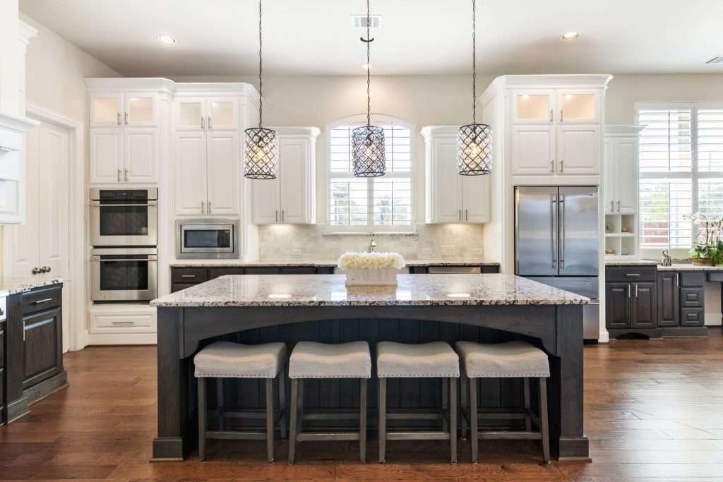
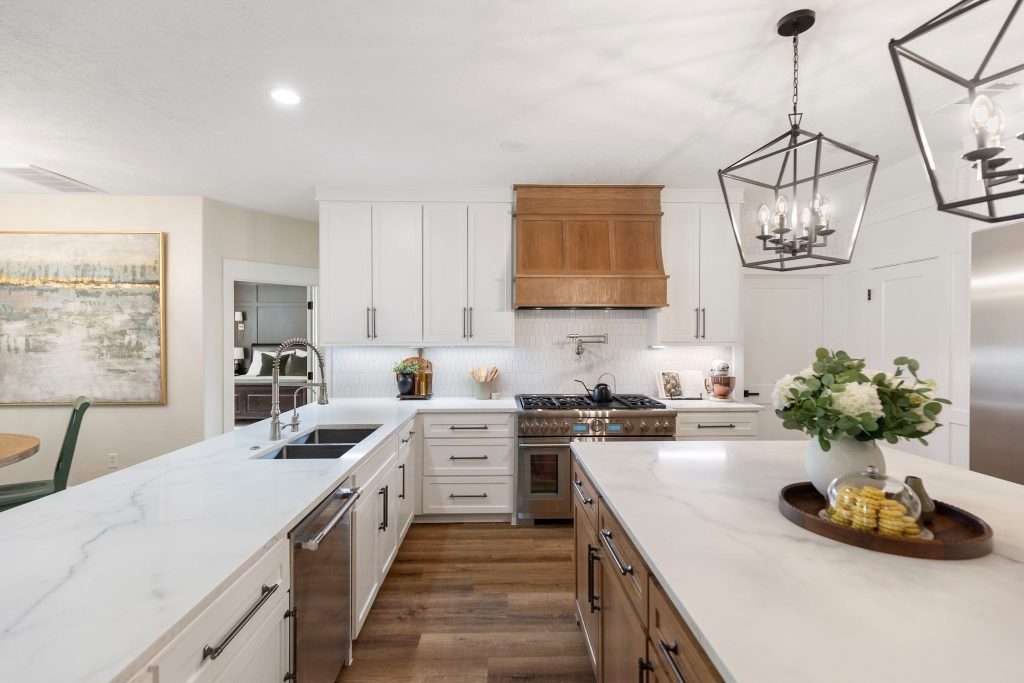
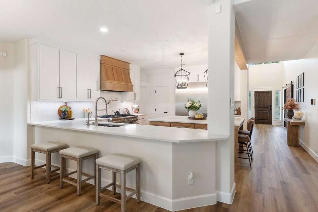
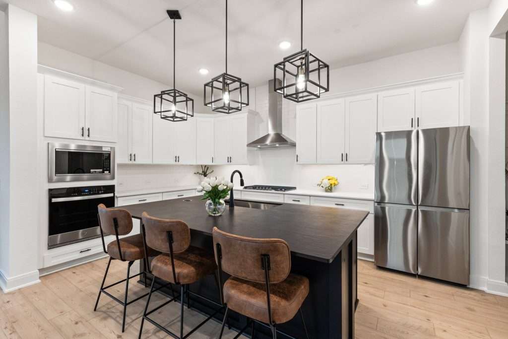
open space kitchen design

The whole point of knowing where to splurge and save in a remodel is this, baby: you get to keep living in the house after the crew leaves. That marble backsplash should still make you smile in five years. That quartzite counter should still be doing its job without a second thought.

None of this has to be complicated. Spend on what you touch. Save on what you can swap. Never touch the contingency.

If you’re ready to figure out exactly where your own budget should go, we can help. Our team works with families across Montgomery County and Greater Houston every day on this same decision. Reach out and let’s get started.
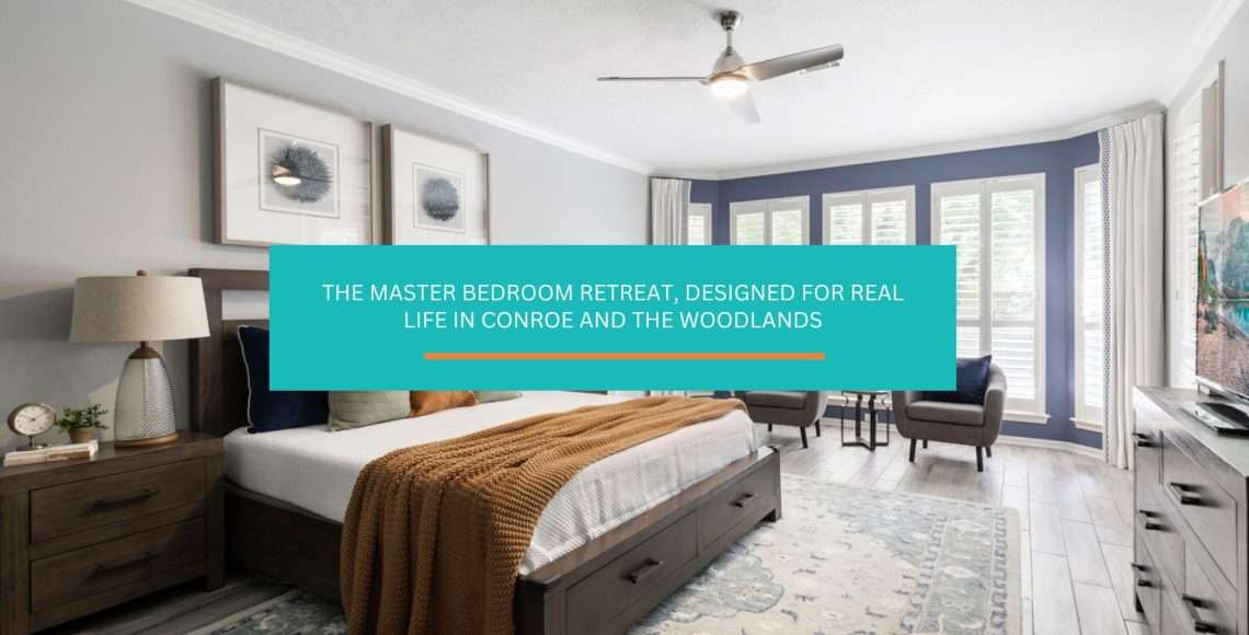
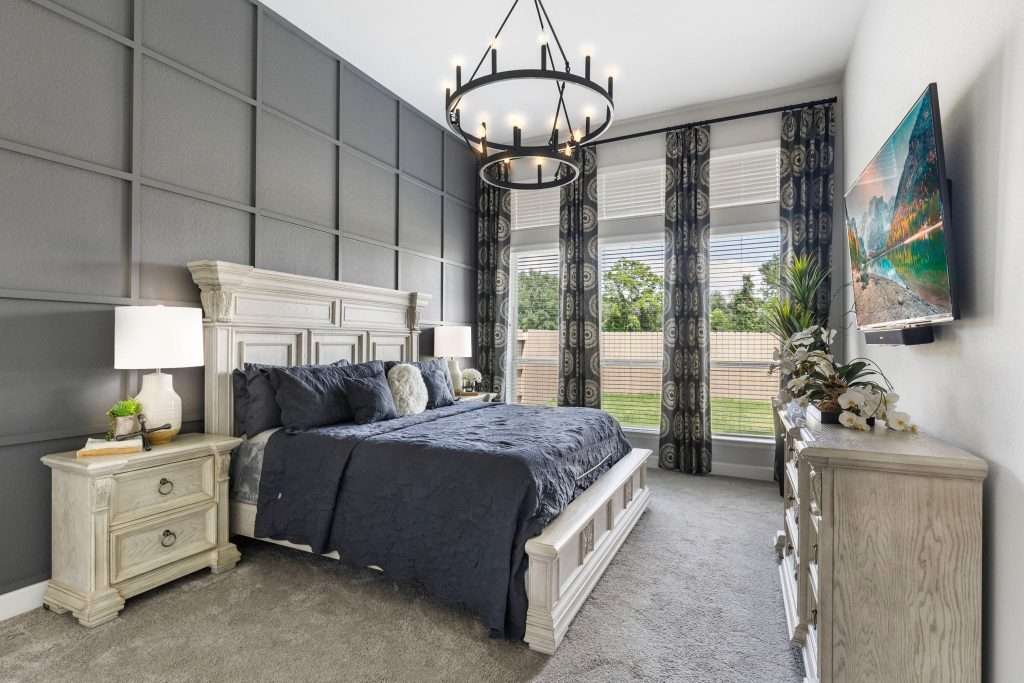
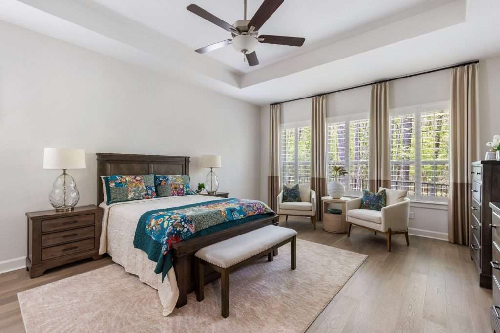
The Master Bedroom Retreat, Designed for Real Life in Conroe and The Woodlands

You have seen the bedroom. Cloud-white bedding, a velvet bench at the foot of the bed, one perfect stack of books nobody reads. You redo yours to match, and a week later the bench is a laundry pile, the white duvet has a coffee shadow, and the room still does not feel restful.

Here is what most Houston designers get wrong about a master bedroom retreat, honey. They want you to live in a glass house where everything is perfect and nothing is functional. We build the opposite.

Across close to 500 projects around Conroe and Montgomery County, we have put the same durable, real-life materials in the bedroom that we use everywhere else in the home. The room where you start and end every day should survive both ends of it. Let me show you what a retreat looks like when it is designed for the way you actually rest.

Why the Magazine Master Bedroom Doesn’t Actually Help You Rest

master bedroom design

A bedroom that photographs well and a bedroom that helps you rest are designed for two different goals, and the styled version usually loses on the one that matters. The magazine shot is built for a camera. One angle, one moment, no people in it.

Your bedroom has to work at six in the morning and eleven at night, in the dark, half asleep. That is a completely different assignment.

The bedroom’s real job is rest, and the research is not subtle about it. A cool, calm, low-clutter room helps you fall asleep and stay there. Harsh overhead light late in the evening works against your body’s natural wind-down, which is why layered, dimmable lighting matters more than one dramatic fixture. The right calming paint colors help too, though they are one layer, not the whole room.

So we design the room around how you actually use it, baby, not around how it looks in a single frame. That shift changes almost every decision that follows.

The Retreat Looks Different Depending on How You Live

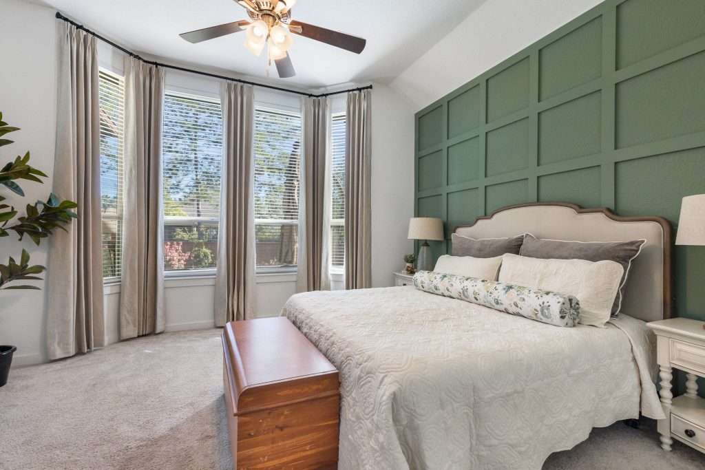
neutral master bedroom

There is no single master bedroom retreat, because the right one depends entirely on how your household actually lives. The bedroom that suits a lakefront entertainer would feel wrong for a young family, and both would swallow a townhouse.

Here is how the same room shifts across the homes we design:

  • The Lakefront Retreat. On Lake Conroe, our clients tend to be entertainers, so the primary bedroom leans clean and glamorous, with blues and aquas that echo the water just outside the window. You can see that water-feeling palette carry through our whole-home reimagining on Lake Conroe.
  • The Family Retreat. In a Conroe subdivision with school-age kids and a dog, the same room gets calmer colors, spill-tolerant materials, and a layout that resets fast at the end of a long day.
  • The Townhouse Retreat. For a young couple in a smaller footprint, the goal flips to intimate. Layered texture and smart scale make a modest square footage feel like a getaway instead of a leftover room.

In our part of Texas, where builder floor plans put big windows on the primary bedroom, the light pours in hot by mid-morning. That heat and glare shapes which fabrics and finishes hold up, so it is part of the design conversation from day one.

The retreat that fits your life is the one we design around it, honey. That is what our interior design work in Conroe is really about, matching the room to the people in it.

Bedding and Fabrics That Survive Real Mornings

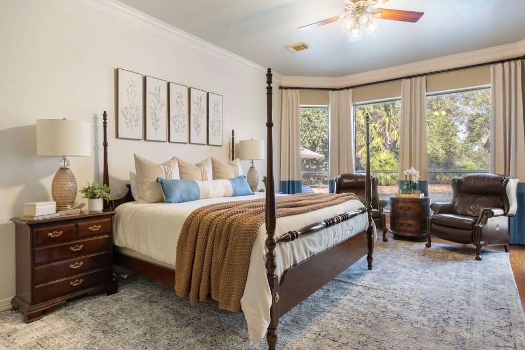
traditional bedroom design

In a bedroom you touch the fabric every single night, so the headboard, the bench, and the bedding have to be built for real life, not just for the photo. This is the exact spot where white bedding and light upholstery scare people off, and they talk themselves into a darker, heavier room they do not actually love.

You do not have to make that trade. The fabric can be engineered to take real life.

Performance fabric has its protection woven in at the manufacturing stage rather than sprayed on afterward, so a spill beads on the surface instead of soaking to the base. We prove it with a wine test at the consultation, and the same fabric that shrugs off a glass of red on a sofa does it just as well on a headboard your dog leans against every night.

That means you can have the soft, light, restful bedroom, darling, without living in fear of it. A master bedroom designed with materials made for real mornings is one you actually relax into, not one you tiptoe around.

The Storage and Built-Ins That Make a Bedroom Feel Calm

bedroom storage ideas

Clutter is the enemy of rest, so the single biggest upgrade to most master bedrooms is not a new color or a new bed. It is a storage plan. A room reads calm when everything in it has a home.

A nightstand with a real drawer, a closet that fits the clothes you own, built-ins that catch the daily pile before it lands on the bench. None of it photographs like a statement chandelier, but all of it is what your nervous system actually registers when you walk in at night.

The value of thoughtful residential design shows up most in the rooms you rest in, where function is the whole point. We go deeper on bedroom storage strategies in a separate piece, hun, if you want the tactical version.

Built-in storage is quietly where our custom cabinet work in The Woodlands does the heaviest lifting for calm. A closet designed around your actual life is the difference between a bedroom that stays serene and one that fights you every morning.

Why a Master Bedroom Is a Design Project, Not a Furniture-Store Haul

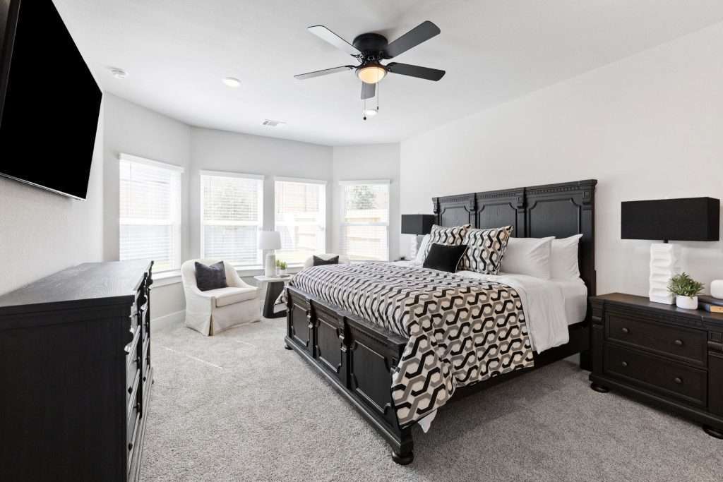
black and white bedroom

The difference between a master bedroom that works and one that never quite does is a plan, not a shopping trip. Most people redo a bedroom by buying a new bed set with matching nightstands and hoping it adds up to a room. It rarely does.

That is the other thing most Houston designers get wrong, sugar. They want you to completely start over by purchasing all new items.

We reimagine instead, marrying the pieces worth keeping with the few that change everything. And because one team handles the layout, the lighting, the built-ins, and the fabrics together, the room comes together as a single design. That single point of accountability is what keeps a bedroom from turning into five separate purchases that never talk to each other.

If you want a starting point, our bedroom remodel round-up is a good scroll. Just remember the retreat comes from the plan, not the list. Families across Conroe and Montgomery County come to us for exactly that: one plan, one team, one room that finally rests them.

Frequently Asked Questions

What makes a bedroom feel like a retreat instead of just a nice room?

A retreat is designed around rest and daily function, not just appearance. That usually means calm colors, layered and dimmable lighting, a low-clutter layout with real storage, and materials you can actually live with. A room can look beautiful in photos and still fail as a retreat if it is uncomfortable to use, hard to keep tidy, or too precious to relax in.

Does a master bedroom need to match the rest of the house?

No. A master bedroom should feel connected to the rest of the home through a shared palette or mood, but it does not need to copy any other room. In fact, the primary bedroom is often where homeowners let the design go quieter and more personal than their public spaces, since it is the one room guests rarely see.

Do you need a large bedroom to make it feel like a retreat?

Not at all. Some of the most restful primary bedrooms in the Greater Houston market are in townhouses and smaller builder homes. Intimacy is an asset in a bedroom. Smart scale, layered texture, good lighting, and built-in storage can make a modest room feel more like a getaway than a large room full of mismatched furniture ever will.

What is the most common mistake people make when redoing a master bedroom?

The most common mistake is treating the bedroom as a furniture-shopping project instead of a design project. Buying a matching bed set does not create a retreat, because it skips layout, lighting, storage, and how the room actually functions at the start and end of the day. A room built around real life outperforms a styled one every single time.

A Bedroom That Rests You, Not Just Impresses the Camera

Here is the honest truth I give every client, sugar. Your master bedroom does not owe anyone a magazine cover. It owes you a good night and an easy morning.

The white bedding can survive the dog. The bench can actually hold your weight when you sit to pull on your shoes. The room can be beautiful and still be yours to live in, spills and laundry and all.

That is not a lower standard. It is a harder one, because designing for real life takes more thought than styling for a camera ever will.

When you are ready to build a retreat that fits the way you actually rest, with a team that has designed close to 500 of them across Montgomery County and Greater Houston, let’s talk about your bedroom.

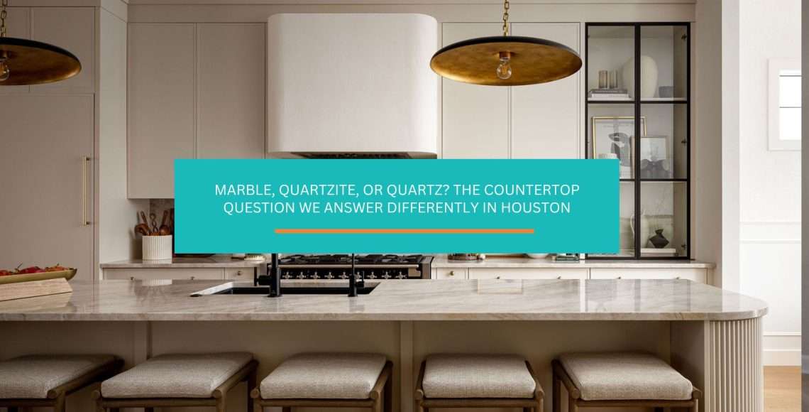
Marble, Quartzite, or Quartz? The Countertop Question We Answer Differently in Houston

The countertop showroom in Greater Houston is where most kitchen remodels go sideways before the demo has even started. A homeowner walks in expecting to choose between marble and quartz, the two names everyone has heard. They walk out with a slab number, a finish, and a feeling that something in the conversation was missed. 

Honey, what’s usually missing is the third stone, the one most Houston homeowners have never been introduced to: quartzite. Quartzite changes the math on what a beautiful kitchen counter has to cost, what it has to take, and where the marble can finally go to do what marble does best. The accessible-luxury kitchen in 2026 isn’t marble or quartz. It’s marble in one place, quartzite in another, and quartz where the math has to work hardest.

The Marble-or-Quartz Question Misses What Houston Kitchens Actually Need

Quartz countertop

When a homeowner asks us “marble or quartz?” the right answer is almost always: neither, by itself. The framing is the trap. Marble alone is a maintence commitment most working Houston kitchens cannot honor. Quartz alone is a workhorse choice that misses the moment to bring real stone into a room where stone earns its keep. The third option is the natural stone that splits the difference: quartzite. It is harder than marble, lower-maintenance than people assume, and it gives a Greater Houston kitchen the look of a luxury counter without the upkeep schedule a marble counter demands.

The right question is not which one. It is where each one belongs in the room, and which two of the three are doing the heavy lifting for the way the family actually lives. That conversation is shorter, sharper, and produces a kitchen that holds up to the next ten Texas summers.

For homeowners still working out whether the moment is right to remodel at all, our piece on when a kitchen remodel makes sense walks through the signals to watch for before the showroom visit even gets booked.

What Marble Earns Its Spot Doing, and Where It Doesn’t Belong

marble backsplash
Source: Far Studio

Marble is a love story, darling. The veining is unrepeatable. The cool surface under your hand on a hot August morning is something engineered stone cannot match. The light catches it differently every hour of the day. Designers fall in love with marble because marble is the closest thing in the kitchen to a piece of art.

What marble does not do well is survive the daily punishment of a working Houston kitchen counter. Marble is calcium carbonate, which means it is porous and acid-reactive. The Natural Stone Institute publishes maintenance guidance that all comes down to the same principle: marble needs to be sealed regularly, blotted (not wiped) when something spills, and treated with the same care a homeowner would give a hardwood floor. Coffee, citrus, wine, and tomato sauce will etch the surface if left to sit. The etch is permanent. It is part of the patina some homeowners love and most do not.

So marble earns its spot in a Houston kitchen in places where it gets to be art rather than a work surface. Our piece on backsplash materials for busy Texas kitchens covers where marble holds against the alternatives and where it does not.

  • Backsplash. Vertical surfaces don’t get the daily acid contact a counter does. The marble veining reads as the focal point of the room and the splash itself is rarely the spill zone.
  • Bar tops and dry serving counters. Areas used for entertaining once a week rather than three meals a day let marble live the life it was designed for.
  • Powder-room and primary-bathroom vanity tops in homes that don’t have toddlers. Bathroom water exposure is far gentler than kitchen acid exposure.

What marble doesn’t belong on, in a kitchen that runs hard, is the primary work counter. Our bathroom remodel team in Willis specs marble for bathroom installations regularly. Our kitchen remodel work specs it almost always as accent, almost never as the main counter.

Why Quartzite Is the Stone Most Houston Homeowners Haven’t Heard Of

Quartzite countertop
Source: Sprague Interiors

Quartzite is the answer most homeowners are reaching for when they think they want marble. It is a natural stone. It has the veining and depth marble lovers respond to. And it is dramatically harder than marble. The United States Geological Survey classifies quartzite as a metamorphic rock formed from sandstone under heat and pressure, which is why it lands at roughly seven on the Mohs hardness scale. Marble sits at three. That single fact shapes the entire daily-life math of the kitchen counter.

What that hardness means in practice:

  • Less etching from acids. Lemon juice and red wine that would dull a marble counter wipe off quartzite without leaving a mark.
  • Better scratch resistance. The knives and pots that mark marble over time leave quartzite largely untouched.
  • Heat tolerance. A hot pan placed directly on quartzite is not the catastrophe it would be on a sealed quartz counter (quartz is bound with resin that can scorch at high temperatures).

Where quartzite asks for attention: it still wants to be sealed once a year or so. It is not maintenance-free the way quartz is. But the seal-and-go schedule is closer to a granite counter than a marble one. For a Greater Houston household that hosts adult-children gatherings on weekends and runs a normal weekday cooking schedule, quartzite holds.

There is one trap to know about. The slab yard sometimes labels softer marble-adjacent stones as “quartzite” when they technically are not. The Marble Institute of America (now part of the Natural Stone Institute) provides the simple test fabricators use: a glass tile and a knife. Quartzite scratches glass and resists a steel knife edge. Soft “quartzite” does the opposite. A reputable Houston-area fabricator will run that test in front of you. If they decline, the slab is not what the label says it is.

Our Magnolia kitchen remodel team walks every quartzite client through that test before the slab gets cut.

Quartz Is the Workhorse, and That’s the Point

white kitchen design

Quartz is engineered. That is the line that opens every quartz pitch, baby, and it is the line that loses some homeowners before they hear the rest. Engineered does not mean fake. It means quartz is roughly ninety percent crushed natural quartz mineral bound with resin and pigment under high pressure. The result is a counter that holds up better to acid, stain, and impact than any natural stone on the market.

What quartz earns its place doing:

  • High-traffic primary work counters in school-district subdivisions. The kid spills, the homework station, the after-school snack bar. Quartz holds.
  • Cabinetry-heavy contemporary kitchens where the look is uniform. Quartz comes in patterns that read like marble or like a clean solid white, and the seam between two slabs almost disappears.
  • Bathroom vanities with daily-use water exposure. Sealed-once quartz outperforms sealed-every-year natural stone in the bathroom maintenance math.

Where quartz gives something up: it cannot match the depth of light a natural stone catches. Stand a Calacatta marble slab next to a Calacatta-pattern quartz slab in showroom light and the difference is immediate. The marble has movement. The quartz has pattern. For a homeowner who can tell, the difference matters. For one who can’t, quartz is the practical answer for nine out of ten kitchens. The National Kitchen and Bath Association tracks countertop preference trends, and quartz has held the top spot in new kitchen installations for several years running. The major engineered-stone manufacturers, including Cambria, publish care guidance that gives a homeowner the daily-use playbook before the slab gets installed.

Quartz is also where homeowners running tighter budgets can land without compromising on look. For families working out the math before the bid lands, our Texas kitchen remodel cost calculator is built around Greater Houston pricing for exactly the scopes that include counter selection, so a homeowner can see what shifting from quartz to quartzite to a marble accent does to the bottom line before the showroom visit gets booked.

The Pairing That Gives You Accessible Luxury

marble kitchen backsplash
Source: DWK Interiors

Here is the move that changes everything. Accessible luxury in a Houston kitchen in 2026 is not picking one of the three. It is using two of them, deliberately, in the places where each one earns its keep.

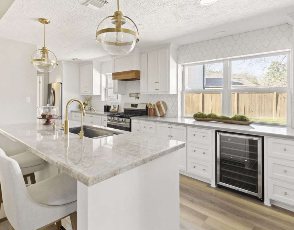
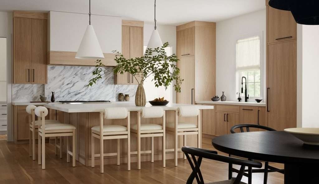
The pairing we spec most often: a working quartzite counter, a marble backsplash. The quartzite handles the cooking, the spills, the morning coffee, the kids’ homework, the daily life of the room. The marble lives behind the cooktop and the sink, where the eye lands when you walk into the kitchen and where the surface almost never takes acid. The marble veining becomes the focal point. The quartzite becomes the trustworthy ground. Our Magnolia kitchen transformation project is a worked example of this exact pairing in a Greater Houston home.

This is the move that lets a homeowner have the marble they fell in love with in the showroom without the maintenance contract that comes with putting marble on a work surface. It is also the move that opens up budget room for a better fabricator, a thicker edge profile, and a longer warranty than a single-material kitchen typically allows. Two stones, doing what each one is best at, with the budget concentrated where it gives the most back.

One technical note any homeowner spec’ing multi-slab stone needs to know, sugar. Ask your fabricator for bookmarked slabs by name. Bookmarked slabs are two pieces cut from the same block and oriented so the veins continue across the seam, the way a book opens to mirror-image pages. We learned this the way most contractors learn things in this trade: a project where we did not order bookmarked slabs, and the veins on the quartzite did not match across the counter seam. The fix was on us. The seam still stops the eye in a way it would not have if we had specified the pair correctly. Now we order bookmarked slabs every time the counter spans more than one slab. So should your fabricator, and the question to ask them by name is “are these bookmarked.” Anything else and the seam will tell.

For homeowners taking the broader look at how design moves cascade through a kitchen, our piece on how remodeling decisions affect each other walks through how the counter choice shapes the cabinet, the backsplash, and the lighting that follow it.

What Houston Climate and Entertaining Habits Add to the Math

kitchen tiles tips

Houston is its own climate problem when it comes to materials. The heat index lands different here than it does in California or the East Coast, the humidity runs heavy from spring through October, and the homes we work on are built for an entirely different climate than the homes the same materials get sold into in cooler markets. That changes which stones make sense and which ones come back to us in five years asking for replacement.

Marble in a Houston kitchen with single-pane builder windows and afternoon sun streaming across the counter is a different surface than marble in a temperate climate. The thermal cycling alone (cool tile mornings, hot August afternoons) puts more stress on a porous stone than the brochure photo suggests. Quartzite, denser and less porous, takes that cycling without complaint. Quartz, bound with resin, holds up well to humidity but does not love direct sun for years on end because the resin can yellow slightly in unusually bright kitchens. The same kitchen counters that land easily in our local builds would behave differently in a New York winter or a California coastal kitchen.

Then there is the question of how the family actually lives in the room, which changes the call further.

  • Lakefront homes on Lake Conroe lean toward entertaining-heavy layouts. The kitchen counter is also a bar. The bar reads as part of the design statement. Marble on the bar top, quartzite on the working counter, makes sense here. The bar is a once-a-weekend surface; the working counter is a three-meals-a-day surface.
  • School-district subdivision kitchens in Conroe and Magnolia run differently. The counter is a homework station, a craft project station, a snack bar, and a cooking surface in rotation all day. Quartzite or quartz across the entire counter run, with a marble backsplash as the accent, holds up to that rotation in a way pure marble would not.
  • Townhouse kitchens in Greater Houston have smaller footprints and concentrated function. Quartz often wins here on the practical math: one material, fewer seams, less budget tied up in slab selection, more budget free for the cabinetry and lighting that actually shape the room.

The same kitchen we would design for a Lake Conroe entertainer would feel out of place in a Magnolia school-district subdivision. Our Conroe kitchen remodel team starts every project with the household conversation before the material conversation, because the material answer only makes sense once we know how the kitchen is going to be lived in.

Frequently Asked Questions

Does quartzite stain like marble?

Quartzite is significantly more resistant to staining than marble because it is harder and less porous. A sealed quartzite counter handles acidic spills like lemon juice, wine, and tomato sauce far better than marble does. It is not stain-proof the way quartz is, but the seal-once-a-year maintenance schedule is gentle compared to marble’s regular reseal-and-blot routine. For most Houston households, quartzite is the right answer when the visual goal is “marble that holds up.”

Can I use marble as a backsplash if I have small children at home?

Yes, for most splash situations. Backsplashes do not see the daily acid exposure that counters do, so the maintenance burden drops significantly when marble lives vertically rather than horizontally. The exception is the backsplash directly behind a cooktop, where splatter from acidic cooking (tomato sauces, citrus reductions) can still etch over years. Sealed properly and wiped promptly after cooking, a marble backsplash is a reasonable call even in a household with kids.

What does “bookmarked slabs” mean and why ask for them by name?

Bookmarked slabs are two slabs cut from the same stone block and oriented so the veining mirrors and continues across the seam, like a book opening. Ordering bookmarked pairs is the only way to make a multi-slab natural stone counter look like one continuous surface rather than two pieces stitched together. A homeowner should ask their fabricator the literal question, “are these bookmarked,” before any natural stone counter that spans more than one slab is approved.

How do quartz countertops hold up to heat in a Houston kitchen?

Quartz is engineered with resin binders that can scorch or discolor at high temperatures, generally above 300 degrees Fahrenheit. A homeowner cannot place a hot pan directly off the burner onto a quartz counter without risking a permanent mark. Trivets and hot pads are the workaround, and most Greater Houston households adopt that habit quickly. Quartzite, by contrast, handles direct hot-pan contact without issue, which is one reason it earns the working-counter position in households that cook seriously.

Why don’t designers love hyper-veined Calacatta marble as much as they used to?

Calacatta marble is still loved, but the trend has matured. The dramatic, hyper-veined Calacatta look that dominated kitchens for several years became a signal of “designer kitchen circa 2022” rather than a timeless choice. Designers in 2026 are shifting toward softer marble veining patterns or pairing dramatic marble as an accent rather than the dominant counter surface. The move is less about the stone falling out of favor and more about marble returning to the supporting-act role it does best. The National Association of Realtors Remodeling Impact Report tracks which kitchen finishes hold resale value over time in the Greater Houston market and nationally, and softer-veined natural stone has continued to outperform the hyper-veined trend pieces.

Two Stones, One Kitchen, the Way Houston Should Do It

Sugar, the countertop conversation does not have to be a binary. The marble-or-quartz question is the wrong frame for almost every Greater Houston kitchen we work on. The right frame is two stones, deliberately placed: the quartzite working harder than the brochure makes you think it can, the marble lifted to where it gets to be the art it was always meant to be.

That is what accessible luxury looks like in a Houston kitchen in 2026. Real stone in the places it earns its keep. Engineered stone where the math has to work. Bookmarked slabs ordered by name. The maintenance schedule the family will actually follow.

When you are ready to walk into the showroom with a clearer question to ask, our team is in Conroe, Magnolia, The Woodlands, and across Montgomery County. Reach out to us and we will bring the slab-yard list, the bookmarked-pair vocabulary, and the calculator math to the first conversation.

How to Hang Art in Texas Homes Without It Floating on Big Builder Walls

Wondering how to hang art in a way that actually feels right, and not like the frame’s just floating somewhere above the sofa hoping for the best? Honey, you’re definitely not alone. Most of the art in Texas homes ends up too high, too small, or stranded in the middle of a wall like it got lost on the way down.

The frame looks lovely. The piece is gorgeous. But something feels off, and you can’t quite name what. Usually, it isn’t the art at all. It’s where the art lives. The good news is that fixing this almost never costs a thing. A little measuring tape, a fresh eye, and maybe one trip to the framer’s, and your walls start telling a much better story.

Why So Much Art Ends Up Floating Halfway Between the Sofa and the Ceiling

[image: living room sofa with a piece of art hung too high on the wall above it, leaving a wide gap between sofa back and bottom of frame]

Most art floats too high because folks instinctively hang at hand-height instead of eye-height. The arm goes up, the hammer finds a comfortable spot, the nail goes in. That’s exactly how you end up with a frame six inches below the crown molding. A sad strip of empty wall stretches between the sofa back and the bottom of the canvas, and the room feels off even when you can’t name why.

The fix is one of the oldest tricks in design: the 57-inch rule. Museums and galleries hang art so the center of the piece sits roughly 57 to 60 inches off the floor. That’s the average human eye-level when standing in a room. Your living room isn’t a gallery, but the principle still works. When the center lands at eye-level, the art reads as part of the room, not as a stamp tacked onto a wall it doesn’t belong to.

In Texas builder homes, where ceilings stretch nine and ten feet, this trips up almost everyone. The walls feel taller than they actually are. Eyes get pulled up. Hammers follow. Art ends up floating in the upper third of a wall it should anchor instead. That’s the first thing designers notice when they walk into a living room that “feels off.” Once you see it, sugar, you can’t unsee it.

How High to Hang Art Above the Sofa, the Bed, the Console, and the Mantel

living room art

Eye-level works as a starting point, but specific furniture changes the math. Art needs to feel connected to whatever sits below it, not floating above it like an unrelated thought. Here’s how the spacing actually breaks down in real homes:

  • Above the sofa. Hang the bottom of the frame 6 to 12 inches above the sofa back. Lean closer to 6 if your ceiling is standard. Closer to 12 if you have tall ceilings and want a little more breathing room. Anything more than that, and the piece starts to drift away from the sofa visually. That 6 to 12 inch range is the most consistent rule across professional hanging guides for a reason.
  • Above the bed. Same range applies, 6 to 10 inches above the headboard. A bed is a low piece of furniture by nature, and art tends to drift up faster here than anywhere else in the home. With a tall headboard, lean toward the lower end of the range.
  • Above a console or sideboard. Drop the spacing tighter to 4 to 6 inches above the surface. Console-height pieces benefit from feeling almost stacked with the furniture below. Too much gap, and the console looks abandoned.
  • Above a mantel. This one’s trickier. Aim for 4 to 8 inches above the mantel, depending on mantel depth and ceiling height. A deep mantel with chunky decor needs less space. A shallow mantel needs a touch more. The art should feel like part of the mantel composition, not a separate object hovering above it.

One more rule worth burning into memory: art should be centered on the furniture below it, not the wall behind it. People mix this up constantly, especially when a wall has odd proportions or when the furniture sits off-center for a reason. If your sofa floats four feet from a corner, center the art over the sofa, not the wall. Eyes read the furniture-art relationship first, every single time.

When the spacing’s right, the room stops feeling like a collection of decorations and starts feeling composed. That’s exactly the kind of small fix the Design on a Dime team in Conroe makes constantly in living rooms before any furniture even gets moved.

Sizing Art So It Doesn’t Look Like a Postage Stamp on a Wall

Sizing Art
Source: Kellie Eserts Interiors

Sizing is where most people lose the plot, baby. Art should fill roughly two-thirds of the furniture width below it, give or take. A 90-inch sofa wants a piece that runs about 60 inches across, or a grouping that totals close to that. A 60-inch console wants something around 40 inches wide. Smaller than that, and the art reads as decoration. Bigger than that, and the proportions start to feel pushy.

The two-thirds guideline is one of those rules that exists because it works almost every time. It’s why galleries and showrooms feel composed even when the pieces themselves are wildly different in style. Get the sizing close, and most other choices forgive themselves.

When the Art You Have Is Too Small

If the piece you love is undersized, upgrade the frame and the matting before you give up on it. A 16×20 piece floats sadly above a sectional. The same piece in a 24×30 frame with a generous 3 to 4 inch mat reads completely differently. Custom framing has a reputation for being expensive, but for a meaningful piece, it usually costs less than buying new artwork. Local framers in Conroe and Magnolia run mat-and-frame upgrades for under a couple hundred dollars on most pieces.

When You Need to Cluster Instead of Hang Solo

Three smaller pieces hung tight together can fill a space a single small piece never could. The grouping reads as one composition because eyes treat it that way. Keep spacing between the pieces tight, around 2 to 3 inches, and align either the tops, the bottoms, or the centers. Random scatter looks like art that fell off a moving truck.

For homes with the kind of wide-open builder layouts you see across the Greater Houston area, going bigger almost always wins. Big walls swallow modest art. The size that looks plenty bold leaning against the wall in the store often disappears once it goes up. When in doubt, go up a size, sugar.

gallery wall ideas
Source: Blake & Dane

Gallery walls go wrong the same way every time. Someone collects pieces they love, hangs them up roughly equidistant, and the result feels chaotic instead of curated. A gallery wall needs an anchor piece, consistent spacing, and a unifying thread to read as intentional. Without those three, it’s just clutter on a wall.

Pick the Anchor Before You Pick Up a Hammer

Start with the anchor piece. Pick the largest or visually heaviest piece in the group and decide where it lives first. Everything else builds around it. If you’re working over a sofa, the anchor usually sits centered over the sofa, with smaller pieces orbiting around it. If you’re climbing a stairway wall, the anchor often sits at the bottom or middle of the run. The anchor-piece method is what separates “thought-out” from “thrown-up.”

Use the Paper Template Trick to Save Your Walls

Trace each frame onto craft paper. Cut it out. Tape the cutouts to the wall before you put a single nail in. Shift, stand back, shift again. By the time the layout looks right, you’ve already saved yourself patching a dozen extra holes. No more “I’ll just try it here” regret. This is the single biggest gallery-wall move that separates designer-level walls from regret walls.

Spacing should run 2 to 3 inches between frames, consistently. Closer than that feels cramped. Wider than that breaks the grouping into separate pieces. Pinterest gallery walls that look effortless almost always follow this rule, even when nothing else about the styling stays inside the lines.

Find One Unifying Thread and Repeat It

The unifying thread can be subtle. Maybe all the frames are black. Maybe all the art is black-and-white photography. Maybe the colors stay in a soft palette and the frames vary wildly. Pick one element to repeat, and the rest of the wall earns the right to be eclectic. Small layout tweaks like this make a bigger difference than most people expect, especially in big open builder rooms where one statement wall changes the whole space. That’s exactly the styling our Design on a Dime team in The Woodlands tackles when a homeowner wants a gallery wall that actually reads as composed.

Where to Hang Art in Tricky Texas Spaces (Two-Story Foyers, Long Hallways, Vaulted Walls)

hallway art
Source: Interior Occupations

Some walls in Texas homes don’t follow normal rules, and the standard 57-inch guideline needs to bend when the architecture demands it. Two-story foyers, vaulted living rooms, and long entry hallways each call for a different hanging strategy. Here’s how to handle the worst offenders without making things worse:

  • Two-story foyers. The single biggest mistake is hanging one normal-sized piece centered at human-eye-level. The wall above swallows it. Either go genuinely massive (think 48 inches tall or more), or stack two to three pieces vertically with tight spacing so the composition fills the height. Eyes need something to follow up the wall, not a single small island in the middle of nowhere. We see this all the time in Lake Conroe homes and master-planned-community foyers across the area.
  • Long entry hallways. Hallway art needs rhythm. Hang pieces at consistent intervals, roughly 4 to 6 feet apart, all with their centers at the standard 57-inch eye-level. Treat the hallway like a gallery corridor, not a place to dump leftover frames. Sizes can vary if you want, but keep the centers aligned. The walk-through becomes part of the experience instead of an afterthought.
  • Stairway walls. Follow the slope. Art on a staircase wall should run diagonally with the rise, with each piece centered roughly 57 inches above the corresponding step. People miss this constantly and end up with a horizontal row of art on a diagonal wall, which always looks awkward.
  • Vaulted living rooms. Anchor low. The temptation in a vaulted space is to hang big art high, where the wall feels emptiest. Don’t. Anchor your major pieces in the lower 8 feet where humans actually live. Leave the upper triangle of wall mostly bare, or fill it with a single large statement element if needed. Rooms with art floating in the vault feel lonelier than rooms where the upper space simply rests.

The vaulted-ceiling problem in particular shows up across tall-ceiling rooms in newer Texas subdivisions. Builders love the drama of a 17-foot peak. Homeowners struggle to know what to do with all that air. Some of the same tricks that make a ceiling feel taller actually work in reverse here: you want the room to feel anchored and human-scaled, not amplified. Our team in Cypress walks homeowners through this all the time when a great room feels echoey and uncomposed.

Working With the Art You Already Own Instead of Buying New

art in design
Source: DWK Interiors

Most homes already have plenty of art, darling. The pieces are just scattered, mismatched, or hung in the wrong places. Before you spend a single dollar on something new, walk through your house and pull every piece off the walls into one room. Lay them out on the floor. Group them by color, by subject, by frame style, by mood.

You’ll Find Stories You Didn’t Know You Had

Three small black-and-white photos that felt boring on separate walls suddenly become a striking trio together. The watercolor your aunt gave you that’s been hiding in the guest bathroom turns out to be the perfect accent over the entry console. Kids’ art collected over a decade earns its own dedicated wall in the playroom or hallway. Most “we need to buy more art” situations are actually “we already have plenty, we just need to use it better” situations.

Reframing Is the Cheapest Design Upgrade There Is

Reframing transforms how a piece reads. Swap a beat-up frame for a clean modern one and the art looks brand new. Add a generous mat to a small piece and it suddenly belongs on a bigger wall. Local framers across Montgomery County run consistent specials, and the work usually pays for itself the first time you see the piece in its new spot.

Mix old with new freely. Heirloom pieces sit perfectly next to thrift-store finds and modern prints, as long as the frames have one shared element, like a color, a finish, or a similar weight. The art doesn’t need to match. The frames just need a thread of agreement.

If the whole exercise feels overwhelming, that’s where a fresh set of eyes earns its keep. Our design team in Magnolia does floor-layouts of clients’ existing art constantly, like the kind we pulled together for our Jodi Project. Sometimes the wall you’ve been staring at for years just needs one outside perspective to start working.

Frequently Asked Questions

Should art match the wall color or contrast with it?

Contrast almost always wins. Art reads better against a wall that gives it room to stand out, whether that means a darker wall behind lighter art or a lighter wall behind darker pieces. Matching the wall color too closely makes the art disappear into the background. If your wall is a soft neutral, art with rich color or strong tonal contrast lands clearly. If your wall is a saturated color, simpler frames and quieter art tend to work better.

Is it ever wrong to hang art directly above a doorway?

In most rooms, yes. The space above a doorway sits in the upper third of the wall, where eyes don’t naturally rest. Any piece up there usually feels disconnected from the rest of the room. There are exceptions, like a long horizontal piece that visually links a doorway to the surrounding wall, or a stairway run where the doorway is one stop in a vertical sequence. As a default, anchor art at human eye-level and leave the over-door zone alone.

Should art be centered on the furniture below it or on the wall behind it?

Center it on the furniture, not the wall. Eyes read the furniture-and-art pairing as one unit. A sofa that sits a little off-center on a wall still wants its art centered above the sofa itself. The only time you center on the wall is when there’s no furniture beneath the piece, like an art-only accent wall in an entryway or hallway.

How do you know when a wall is too small for the art you have?

If the piece comes within roughly 6 inches of the wall edges on either side, the wall is too small. Art needs breathing room around it to read properly. A piece that nearly touches the corners feels squeezed in. Either move that piece to a larger wall, or scale down to art that takes up about two-thirds of the available wall width with comfortable margins on either side.

Can the same art style work throughout a whole house?

It can, as long as there’s some variety in size, frame style, and subject. A whole home of identical black frames and abstract prints starts to feel like a chain hotel by the third room. The fix is to let the styles loosely echo, while letting individual rooms have their own moments. Buyers in the Greater Houston market actually respond well to homes that feel curated rather than themed; identical art in every room reads as a model home, not a real one.

Walls That Actually Tell Your Story

The whole point of art in a home isn’t to fill a wall, baby. It’s to give a room something to say.

When the heights are right and the sizes work, the gallery wall actually reads as a gallery and not a wreckage. Your walls stop feeling like decoration and start feeling like part of the home’s personality. The pieces you’ve collected over the years finally have somewhere to live where they can be seen.

Sometimes that takes a tape measure, a paper template, and a slow afternoon of rearranging. Sometimes it takes a fresh set of eyes who can see the wall the way you can’t anymore.

Design on a Dime Interiors helps families across Montgomery County and Greater Houston make their walls work harder. Sometimes that means reframing what they already own. Sometimes it’s styling a whole home from scratch.

If your art’s been floating awkwardly for a while now, reach out to our team today, and we’ll walk through it with you.

Butler’s Pantry, Scullery, or Walk-In Pantry: Which One Fits a Real Texas Home

A butler’s pantry keeps showing up on renovation Pinterest boards lately, and you’re not imagining that. Or maybe it’s a scullery. Or a walk-in pantry. Honestly, most folks can’t tell them apart.

You know that moment when twenty people are coming over in four hours? The main kitchen’s running hot. Every inch of counter space is already stacked three pans deep. That’s when folks start asking whether their open-concept kitchen is actually working for them, darling.

The island becomes staging. The range becomes prep. The sink becomes dish chaos. And every guest gets a front-row seat to all of it. If you’ve ever mid-gathering wished for a second kitchen you could just close a door on, stick around.

Butler’s Pantry, Scullery, and Walk-In Pantry Are Not the Same Thing

Butler's Pantry, Scullery, and Walk-In Pantry
Source: Olly & Em

A butler’s pantry is a transitional space between the kitchen and dining room built for serving and staging. A scullery (sometimes called a prep kitchen or “dirty kitchen”) is a full secondary workspace with a sink and often a cooktop. A walk-in pantry is a food storage room. Three different spaces, three different jobs, and honey, each one solves a different problem in your home.

The confusion is understandable. All three get called “butler’s pantry” in real estate listings because that’s the term that sells. But the functional difference matters when you’re deciding what to actually build.

Here’s how the three compare in real Texas homes:

FeatureButler’s PantryScullery / Prep KitchenWalk-In Pantry
Primary useStaging, serving, bar areaActive cooking and dishwashingFood and equipment storage
Typical size30 to 50 sq ft50 to 100 sq ft30 to 80 sq ft
Sink includedOften a bar sinkYes, full sinkRarely
Secondary cooktopNoOftenNo
Appliance storageYes (coffee, wine, bar)Yes (plus large items)Mostly food, some small appliances

If your frustration is counter clutter from small appliances and entertaining visibility, a butler’s pantry solves it. If your frustration is that messy cooking takes over the main kitchen, you need a scullery. If your frustration is running out of food-storage space, you need a walk-in food pantry, and we’ve got a whole guide on those already.

Knowing which one you need saves you from spending kitchen-remodel dollars on the wrong solution. If you’re figuring out what fits, our team has helped plenty of families across Conroe and Cypress work through exactly this decision during a kitchen remodel.

What Texas Homeowners Actually Use These Spaces For

wal-in pantry
Source: Lee Ann Baker Interiors LTD.

Texas homeowners use these spaces for a handful of specific jobs, and knowing which jobs you actually have determines whether the space earns its keep. Spoiler, sugar: not every home needs all five.

Across the projects we’ve worked on in Montgomery County and Greater Houston, the same five patterns show up again and again:

  • The appliance hideaway. This is the number-one reason folks add one. The stand mixer, the espresso machine, the toaster oven, the food processor, the blender, the juicer. They all live here, plugged in and ready, behind a cabinet door or inside an appliance garage. Your main counters stay bare. It’s a huge visual shift even on a Tuesday night, and a well-designed built-in cabinet setup does most of the heavy lifting here.
  • The holiday staging zone. Thanksgiving prep, Christmas cookie marathons, and Super Bowl spreads all generate more dish-per-square-foot than any other time of year. A secondary sink and prep counter means one person can wash while another plates while a third carves. Nobody’s crowding the main island.
  • The coffee and breakfast bar. Pour-over setup, espresso machine, tea kettle, cereal and bread storage, maybe a microwave drawer. The morning routine gets its own zone that’s out of the way of whoever’s cooking eggs.
  • The hidden bar for entertaining. Wine fridge, glassware, cocktail tools, a small ice maker. When friends drop by after a Lake Conroe afternoon, you’re pouring drinks in your dedicated bar space instead of shoving kids’ homework aside on the kitchen island.
  • The post-party staging dump. This one’s underrated. A second sink and counter run means dirty dishes, foil-wrapped leftovers, and stacked trays can leave the main kitchen while you’re still hosting. Morning you will thank evening you, baby.

The question to answer before you plan the space is which of these five you actually do more than three times a year. That’s the test. Everything else is aspirational, and aspirational doesn’t justify the square footage.

If you’re trying to figure out how much of this fits into a specific floor plan, take a look at our Magnolia kitchen transformation. It shows what happens when secondary prep zones get designed alongside a full kitchen remodel. The team at Design on a Dime can walk you through which patterns fit your lifestyle before any demo starts.

When Adding One Makes Sense for Your Home, and When It Doesn’t

butler's pantry design
Source: Sprague Interiors

Adding a butler’s pantry or scullery earns its place under three conditions. You host at least six to eight times a year. You have adjacent convertible space in your floor plan. Your kitchen already struggles to absorb daily clutter. It stops making sense when the only available square footage comes from shrinking your main kitchen or cutting into rooms you actually use.

Here’s the framework we walk homeowners through, hun:

  • Do you host more than six times a year? Thanksgiving, Christmas, birthdays, summer barbecues, football watch parties. Add up the gatherings. You should hit eight-plus annual uses for the space to earn its keep. Fewer than that, and a well-organized pantry or a simple appliance garage gets you 80% of the benefit at a fraction of the cost.
  • Is there convertible space adjacent to your kitchen? A coat closet, a back hallway, an oversized walk-in pantry, an underused formal dining room, or the dead space between the kitchen and laundry. Those are the easiest conversion candidates in most Texas builder homes. If the only option is stealing from your main kitchen, the math usually doesn’t work.
  • Do you have small-appliance overflow? Count the appliances on your counter right now. If it’s more than three, you’ve already outgrown your kitchen’s storage capacity. A dedicated appliance zone solves that directly.
  • Does your main kitchen open to the living room? Open-concept kitchens benefit the most because the visual clutter is the biggest problem. A closed-off galley kitchen doesn’t gain as much from a secondary space.
  • What’s your honest entertaining style? If you genuinely host and cook, a scullery with a second sink is worth every penny. If you entertain mostly with takeout and wine, a butler’s pantry with a bar setup does more work for you.

Before committing, run the numbers against the full remodel scope. Our Texas kitchen remodel cost calculator gives you a realistic picture of what a secondary zone does to your total project. It keeps you from planning for something that blows the budget before demo starts.

For families in Spring, we’ve helped plenty of folks work through this exact decision before the first cabinet gets ordered.

Design Choices That Decide Whether You’ll Love It or Regret It

pantry design
Source: Jessica Nelson Design

Six design decisions separate butler’s pantries people love from the ones they regret. None of them are about style, darling. All of them are about how the space will actually work two years after you move in.

  • Sink or no sink. A sink changes everything about what the space can do. Without one, you’re staging and storing. With one, you’re prepping, washing, and containing mess. Plumbing adds cost, but if you’re using this for holiday cooking, it’s non-negotiable.
  • Cabinet height that matches what you’re storing. Full-height upper cabinets hold platters and seasonal serveware. Shorter uppers give you counter clearance for small appliances. Decide what lives here before you spec the cabinetry, because the wrong height either makes the space feel cramped or wastes vertical real estate. A pass through what changes in cabinet planning is worth doing early.
  • Lighting that works for actual tasks. One overhead can fixture does not cut it. You need task lighting under uppers, accent lighting inside glass cabinets if you have them, and a switched outlet near the counter. A butler’s pantry with bad lighting feels like a closet. Period.
  • Door type, swing, and sightlines. A pocket door maximizes floor space. A pair of French doors looks beautiful when open. A barn door is trendy but lousy for sound isolation. Pick based on how you’ll actually use the space, not just what looks good in the reveal photo.
  • Ventilation if you’re cooking. If your scullery has a cooktop, it needs a hood vented to the outside. EPA guidance based on ASHRAE standards points to 100 cubic feet per minute as the minimum exhaust capacity for residential kitchens. In Texas humidity, enclosed cooking spaces make hitting that minimum non-optional.
  • Power for every appliance you’ll plug in. Count the outlets you’ll need, then add two more. Appliance garages with switched outlets mean coffee makers and toasters stay plugged in but turn off when the door closes. This is the detail everyone forgets until they’re living in the space.

The cabinetry choices here matter more than in the main kitchen because everything becomes visible the moment you open the door. Our team at Design on a Dime works with families across Montgomery County on custom cabinet layouts where every inch earns its place.

How to Add One Without Rebuilding the Whole House

kitchen pantry design
Source: Morrison Interiors

Most Texas builder homes have at least one convertible space that can become a butler’s pantry without touching structural walls. The trick is knowing where to look, honey.

Here are the five most common conversion candidates we see:

  • The oversized walk-in pantry. If your current walk-in pantry is more than 40 square feet, it can probably split into two. You get a smaller food pantry plus a butler’s pantry with a counter run. You’re not adding square footage, you’re repurposing it.
  • The coat closet off the kitchen. A 4-by-5-foot coat closet backs into a butler’s pantry at a fraction of a full addition cost. You lose coat storage, but most Texas families have an entryway closet that handles that already.
  • The formal dining room. Many newer Conroe and Woodlands homes include a formal dining room that gets used twice a year. Steal 3 to 4 feet off one wall for a pass-through butler’s pantry between the dining room and kitchen. You’ve just improved both rooms.
  • The laundry adjacency. Some floor plans put the laundry room right off the kitchen. The wall between them often has room for a narrow butler’s pantry. You carve it from the laundry’s less-used end.
  • The back-of-house hallway. Some floor plans have a dead hallway between the kitchen and the garage entry that’s basically a traffic lane. Widen or line that space with cabinetry and a small counter. You’ve got a drop-zone butler’s pantry that works double duty.

Most of these conversions stay well within a kitchen remodel budget. They don’t require new foundations. Reworking the roofline isn’t part of the plan. What they do require is careful planning to get the plumbing, electrical, and cabinetry right the first time, because secondary spaces like these have zero room for error.

This is exactly where a bigger remodel plan benefits from looking at the whole floor plan, not just the kitchen footprint. Our Lake Conroe home reimagining is a good example of what happens when the secondary zones get planned in from day one. If you’re weighing a remodel that could include a butler’s pantry, we help families across Houston figure out which conversion path fits the existing bones of the house.

Frequently Asked Questions

Is a butler’s pantry worth it if we don’t throw huge parties?

Yes, if you hit the usage threshold in a different way. A butler’s pantry earns its space through frequency, not the size of your events. Families who use it daily for coffee stations, small-appliance storage, and weekly grocery organization often get more value than homes that only use it for holiday hosting. If your daily kitchen clutter is the problem, a butler’s pantry solves it regardless of how often you entertain.

Does adding one help or hurt resale value in the Greater Houston market?

Butler’s pantries consistently add resale value in the Greater Houston market, especially in homes priced above $400,000 where buyers expect entertaining features. Research tracked by the National Association of Home Builders shows storage features rank among the most valued amenities for home buyers across price points. The key is that the space reads as functional and intentional, not as a converted closet with a countertop slapped on. Good design matters more than raw square footage.

Can this work in a newer Texas builder home with a fixed footprint?

Yes, in most cases. Newer Texas builder floor plans usually include at least one convertible space. That might be an oversized walk-in pantry, a coat closet off the kitchen, or a rarely-used formal dining room. A well-planned conversion typically adds a butler’s pantry without expanding the home’s footprint or moving load-bearing walls. The design challenge is fitting the function into the existing space, not adding space to the home.

What’s the practical difference between a scullery and a prep pantry?

A scullery is a full secondary workspace with a sink and often a secondary cooktop for active cooking and dishwashing. A prep pantry is a smaller space focused on food prep, staging, and appliance storage, usually without a cooktop. The shorthand: if you can cook a full meal in it, it’s a scullery. If you can prep and stage but not cook, it’s a prep pantry. Most Texas homes have room for one, not both.

A Second Kitchen That Earns Its Place in Your Home

Look, hun, the reason butler’s pantries and sculleries are having a moment isn’t because they’re trendy. It’s because the way we actually live in our kitchens finally outgrew the floor plans we were handed.

We host more. We own more appliances. We hate counter clutter. And most folks have lived through at least one Thanksgiving where one person was making gravy, another was carving the turkey, and a third was washing dishes. All of it happening within a three-foot radius.

A well-planned secondary zone is the fix. The right zone for your home depends on how you entertain, how much prep spills into the main kitchen, and what convertible square footage you’re working with.

Sometimes it’s a simple appliance garage inside existing cabinetry. Sometimes it’s a full scullery carved from a pass-through hallway.

That’s the kind of judgment call where a professional design perspective pays for itself. Design on a Dime Interiors works with families across Montgomery County and Greater Houston on kitchen remodels that balance beauty with everyday function. Your space should actually work for the way you cook, host, and live.

If you’re thinking about a kitchen remodel that could include a butler’s pantry or scullery, reach out to our team today.

A Quick Home Reset for Busy Families: 10+ Design Rules That Make Your Home Easier to Keep Tidy

Design rules that make your home easier to keep tidy aren’t about being stricter and more organized, ‘cause that was never the reason why your home is messy, sugar. You see, the real reason is your space wasn’t designed for real family life.

So, it’s all about making your space work with you. 

If it feels like you’re always cleaning but never quite caught up, your home may be missing a few systems that support your everyday routines.

The good news? 

Small shifts in how your home is set up can change how it feels and functions. 

When your home starts doing some of that work for you, keeping things tidy gets a whole lot easier. Stick with me, and you’ll see what I mean.

1. Stop the Mess at the Door With Drop Zones

entry zone
Source: En Masse Architecture and Design

You wanna know the real secret to keeping your home from looking like a tornado hit it every single day?

It all starts right at your front door, where backpacks, muddy shoes, mail, and a million jackets come flying in like they own the place. All of it lands there first and then slowly drifts into every other room.

That’s how you know it’s time for a proper drop zone at your entrance. 

Begin with the basics. I’m talking hooks at the right height for every family member, a bench for sitting and removing shoes, and closed storage, like cubbies or cabinets, to keep things out of sight. When everything has a clearly defined spot, things actually get put away without a daily reminder.

Now, before dirt, mud, and mystery gunk colonize your house, you need to think like a gatekeeper. 

Add a washable rug or a boot tray to catch dirt before it travels. Choose water-resistant flooring, such as tile or vinyl, that can handle wet shoes and busy mornings. 

Don’t stop at the entry, darlin’. Every high-traffic room needs a smaller drop zone wherever clutter tends to land, including your kitchen and living room. Trust me, staying tidy gets a whole lot easier.

If your entryway never quite works, no matter how many hooks or baskets you add, Design on a Dime can help you turn that high-traffic headache into something that runs smoothly without the constant upkeep.

2. Make One-Touch Living the Default

living room design

If you feel like you’re constantly picking up the same things over and over, it’s not a discipline problem. It’s a design problem, sugar. 

Your home isn’t set up to support one-touch living, which means things get handled two, three, sometimes five, times before they finally land where they belong.

The goal is simple: 

Every item should have an easy-to-reach home, so that it can be put away the first time you touch it. 

And that starts with placement. Storage needs to live right where the item is used, not across the house or tucked into an overstuffed closet.

Think through your daily routines

Mail should be sorted near the entry, not carried into the kitchen. Laundry should go straight into a nearby hamper, not a corner pile (yes, I know about it). Dishes should move directly into the dishwasher, not sit in the sink “for later.”

When your layout supports these small decisions, everything changes. Clutter stops building up ‘cause there’s no pause between using something and putting it away. It becomes second nature.

3. Cut Back on Clutter-Catching Surfaces

bright neutral living room

Flat surfaces have a way of inviting clutter in and making it feel right at home. Kitchen countertops, coffee tables, dressers, and even that one chair in the corner all turn into landing spots for things that don’t really belong there. 

That’s the thing, sugar:

The more open surface you have, the more clutter and dust your home will collect.

The fix isn’t more bins or prettier baskets. It is reducing how much space is available for things to pile up in the first place. So, clear off anything that isn’t used daily and be honest about what really earns its spot. I’d say that a few well-chosen pieces always look better than a mix of random items that keep shifting around.

Next, give your essentials a defined place. You can use trays for smaller items, drawers to hide everyday clutter, and cabinets to keep surfaces visually calm. 

Remember: 

Less surface clutter means less to clean.

Your space deserves protection from “occasional-use items” that just sit there gathering grime. And when you do include accessories, choose ceramic, glass, and metal. These wipe down quickly and don’t hold onto dust the same way textured decor can.

4. Use Closed Storage to Keep Everyday Mess Out of Sight

open space living room

Open storage looks all nice in photos, sure, but in real life? Well, let’s just say it can turn into visual clutter real fast. 

When everything is on display, your space never quite feels settled. That’s where closed storage makes all the difference, hun:

It gives your everyday items a place to go without asking them to look pretty all the time.

Just think about the things that tend to pile up. Toys, shoes, sports gear, and extra blankets. These aren’t decorative, but they’re part of daily life. Built-ins with doors, storage benches with lift-up lids, and cabinets that blend into your space help you tuck all of that away in seconds.

Of course, placement matters just as much as the storage. You wanna keep it close by. I’m talkin’ a bench with hidden storage near the entry, cabinets in the living room, and drawers in a play area. 

You’re not getting rid of the reality of family life. You’re simply giving it a better place to live. 

That’s exactly what we did in our Jennifer Heights Project, too.

The right mix of cabinets and built-ins can make everyday items disappear without making them harder to access. Design on a Dime can help you plan a home that feels calmer without sacrificing function. 

5. Take Storage Up the Walls to Free Up Your Floors

laundry room design

If your floors always feel crowded, the issue might not be how much you own, hun. It’s how low everything is stored. When storage stays at ground level, it fills up fast and spills over even faster. 

That’s when your home starts to feel tight and harder to manage.

The fix is simple, really: 

Start thinking vertically

Your walls have more storage potential than you might be using right now. Hooks, wall rails, and floating shelves can hold everyday stuff without taking up precious floor space. Bags, jackets, backpacks, or even cleaning tools can all move up and out of the way.

I can’t recommend this enough for busy zones. 

Add a simple row of hooks near the entry so things actually get hung up. Use shelving in bedrooms or play areas to keep toys accessible but off the floor. Even narrow wall space can hold more than you think when you use it intentionally.

When you raise storage off the ground, the whole room opens up, hun. Cleaning gets easier, movement feels smoother, and your home starts working with you, not against you.

6. Set Up Your Kitchen for Quick, Easy Cleanup

kitchen interior

The average family spends 30 minutes every single night cleaning up after dinner, but I’ve got some news for you: 

Your kitchen layout might be sabotaging you before you even start.

If cleaning your kitchen feels like it takes forever, it’s not just the mess. It’s the way your space is set up. 

My advice?

Focus on creating a tight cleanup zone. The sink, dishwasher, and trash should sit close enough that you can move between them without taking more than a few steps. When those three work together, dishes go from counter to clean in one smooth motion instead of bouncing around the room.

I mean, think about what happens right after meals. Scraps should go straight to the trash, plates into the dishwasher, and anything that needs rinsing should be handled right there at the sink. If you have to walk across the kitchen for any of that, it slows you down every single time.

While you’re at it, pay attention to storage. Keep everyday dishes, utensils, and cleaning supplies within easy reach of this zone. When everything you need is right where you use it, cleanup feels a lot less like a chore at the end of a long day.

This comes down to smart planning behind the scenes. Design on a Dime takes your layout, storage, and daily routines into account, so that everything flows in a way that saves you time without you even thinking about it.

7. Clear Your Countertops for Good With These Bathroom Tweaks

bathroom design

Bathroom counters tend to fill up fast because so many small items get used every single day. I’m talking toothbrushes, skincare, hair products, makeup; it all adds up, baby. When everything lives on the counter, the space starts to feel crowded before your day even begins.

The goal? 

Move as much as possible off the surface and into storage that’s still easy to reach to reclaim the precious counter real estate.

Drawers with dividers are a must-have for daily essentials. Just grab what you need and close it right back up without creating a mess. Under-sink cabinets can handle any bulkier items and backups, so that they’re not competing for space up top.

Keep only the essentials out, and even then, give them “boundaries.” A simple tray near the sink can hold soap and a couple of everyday items, so they stay contained instead of spreading.

If your current vanity is lacking, this is where built-in storage really shines. Trust me, when your bathroom supports your routine, your counters stay clear and your mornings feel a whole lot calmer.

8. Choose Finishes That Handle Real Life Without Showing It

kitchen faucets

Some homes look spotless, but only when no one is living in them. That’s typically a sign the materials are working against you, ‘cause, baby, the right finishes? They should hold up to daily life, and still look good in between cleanings.

I mean, do you want to spend your whole life scrubbing, wiping, and stressing over every little scuff? Yeah, I didn’t think so.

For starters, avoid anything that’ll show every fingerprint, smudge, and speck of dust. High-gloss surfaces and very dark or very light solids will only highlight the wear and tear. Instead, look for finishes with a bit of variation or texture

Think matte surfaces, subtle patterns, and mid-tone colors; they do a far better job of disguising everyday use.

Oh, and don’t forget about durability. Non-porous materials, like quartz, are easy to wipe down and resist stains. Textured tile and stone, on the other hand, can help “hide” dirt in busy areas like your entryway and bathroom. 

Even something as simple as choosing the right paint finish can make walls easier to maintain.

Think of it like this: 

You’re not lowering your standards. You’re choosing finishes that support the way your family actually lives day to day.

9. Arrange Furniture to Support Flow and Stop Clutter Pile-Ups

traditional living room design

When the living room looks like an obstacle course where everyone’s tripping over bags, tossing coats on chairs, and leaving shoes in random spots, the problem isn’t your family. 

It’s your furniture layout, sweetie. 

Yes, you read that right.

You see, layout has a way of shaping behavior. When pathways feel blocked or awkward, people naturally drop things wherever they can and keep moving.

So, start by looking at your natural routes. 

Where do people enter, turn, and pass through on a typical day? 

You should be able to walk through without weaving around furniture or squeezing past corners. When the path is clear, people are less likely to pause and set things down in random places.

Now, pay attention to where things typically land. That chair covered in clothes or that corner stacked with bags? It’s telling you something. So, either remove that temptation or give it purpose with a nearby basket, cabinet, or designated storage piece.

When your layout supports how your family actually moves through a room, clutter has fewer opportunities to settle in and stay.

Sometimes, clutter is less about what you own and more about how your space is working for you. Design on a Dime can help you open up pathways, reduce those clutter hot spots, and make your space easier to live in.

10. Build Storage That Adapts as Your Family Changes

What works for your home right now might not work a year from now, hun. Think about it: 

Kids grow, routines shift, and suddenly, that perfectly organized system starts falling apart. That’s usually a sign your storage is too “fixed.” 

Instead, you should be going for something flexible.

The goal is to choose solutions that can adjust as your needs change. Think adjustable shelves that can move up or down, modular closet systems that can be reconfigured, and options that serve more than one purpose over time. 

What holds toys today, for example, might need to hold school supplies or sports gear later on.

On that note, it helps to design with access in mind, too. 

Lower storage works well for younger kids who are learning to put things away on their own. As they grow, those same areas can shift into something more “structured” without a full redesign.

Built-ins can still be part of this, as long as they’re planned with flexibility in mind. That’s how you avoid the constant reorganizing and keep things manageable through every stage, baby.

11. Do a Simple Spring Reset That Keeps Everything on Track

spring bedroom

Once your home is set up with the right systems, believe me, keepin’ it tidy is gonna get a whole lot easier. That’s where a quick seasonal reset comes in. 

Think of this as a light refresh that helps keep things working the way they should without turning into a full weekend project.

For starters, you can do a quick walkthrough of the main areas. Look for anything that’s started to drift out of place or pile up again. Remember, sugar, you’re not deep cleaning here, just getting things back to their intended homes.

Next, edit what you no longer need. Think outgrown clothes, unused gear, and any other items that tend to sneak back in over time. Cleaning these out creates breathing room, so your systems can keep doing their job.

While you’re at it, and storage areas so they match your current routines. Swap seasonal items, reset baskets, and make sure everything is still easy to reach and use.

Finally, do a quick surface reset: 

Clear, wipe, and simplify. 

Do this every season, and your home stays manageable without ever feeling like it got away from you.

Frequently Asked Questions

Can good design really reduce how often I have to clean?

Yes, it can. When your home is set up with the right layout, storage, and materials, mess has fewer places to land and spread. And that means less daily upkeep and fewer long cleaning sessions.

What is the best place to start if my home feels overwhelming?

The best place to start would be your entry or main drop zone. It is usually the source of most daily clutter, and fixing it first can create a sort of “ripple effect” throughout the rest of your home.

Do I need custom storage to make this work?

No, you don’t always need custom storage. I’d say many houses can improve a lot with better placement and a few well-chosen pieces. Custom solutions help when your layout needs something more tailored or long-term.

How often should I reset or reorganize these systems?

A light reset every season is usually enough. This keeps things aligned with your current routines without letting clutter slowly build back up.

What if I don’t have a mudroom or large entryway?

You can still create a small drop zone, even if you don’t have a mudroom. A few hooks, a narrow bench, or even a wall-mounted organizer can do the job in a tight space.

A Home That Finally Works With You

You’ve got the design rules, you’ve got the strategies, and now you’ve got a choice to make: 

You could keep battling that same clutter every single day, or you could redesign your home to really work for your family’s life. 

If you’re beginning to see where your space could work a little better, you’re already on the right track. And sometimes, all it takes is a clear plan to bring it all together in a way that feels natural and lasting.

That’s exactly where Design on a Dime comes in. With the right guidance, your home can become a place that feels easier to live in every single day. 

Time to make your move, darlin’. Reach out to our team to get started.
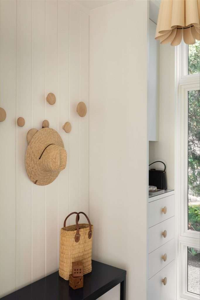
The “Finishes Trio” That Makes Kitchens Look Updated (Without Replacing Cabinets)

Honey, the “finishes trio” that makes kitchens look updated is one of those quiet design tricks that can completely shift how your space feels without touching your cabinets. 

If your kitchen looks a little tired, but still works just fine, chances are the issue isn’t your cabinets, anyway. It’s how the details come together… or don’t. 

The good news is you don’t need to gut your entire kitchen to fix that. 

With the right combination of finishes, your kitchen can feel more current, more cohesive, and a whole lot more intentional. There’s a whole strategy to it, so let me show you how to spot what’s missing and bring it all into balance.

What the Kitchen Finishes Trio Is and Why It Works

kitchen interior

If your kitchen feels tired but the cabinets are still in good shape, you don’t need to start from scratch, hun, especially when your wallet is giving you side-eye about a full renovation. Besides, most likely, the issue is the lack of cohesion in the details.

And that’s where the kitchen finishes trio comes in.

This approach focuses on three high-impact elements you interact with every day:

  • Cabinets
  • Fixtures
  • Accents

I’m talking knobs, pulls, faucets, sink finishes, backsplashes, and countertops. When all these finishes are chosen with intention, they start to “talk” to each other. The result? 

A kitchen that feels pulled together instead of… well, pieced together.

You’re not aiming for everything to match perfectly. In fact, that can make a space feel flat. What you want, instead, is harmony. Think of it like getting dressed, hun: 

Your shoes, jewelry, and handbag don’t have to be identical, but they should belong in the same story.

Trust me, when the finishes work together, something shifts. Your eye moves smoothly across the space, the cabinets look more modern, even if they haven’t changed, and your whole kitchen feels calmer, more polished, more considered.

And here’s the real win: 

This kind of update gives you a visible transformation without the cost or disruption of a full renovation. It’s a smart, layered way to refresh what you already have and make it feel new again.

Sometimes, the hardest part isn’t the update itself, it’s knowing which changes will make a real difference. Design on a Dime can help you focus on the details that move the needle.

The Main Elements Every Finishes Trio Needs

kitchen finishes tips

Once you understand the idea behind a “finishes trio,” your next step is knowing what pieces are doing the heavy lifting. That’s the thing, honey:

Not every surface in your kitchen needs attention. Just a few well-chosen elements can shift the entire feel of the space.

Think of it like assembling your kitchen’s A-list squad. You’ll need three stars that complement each other while bringing their own flair to the party.

Cabinets and Hardware

[image]

I like to think of hardware as the jewelry of your kitchen, with cabinets as the foundation.

Knobs and pulls sit right at eye and hand level, which means they get noticed more than you might realize. Swap these out, and suddenly, those cabinets feel different, even if the paint color hasn’t changed one bit.

That’s where you get to introduce your primary finish. Think brushed brass, matte black, or polished nickel. Whatever direction you choose, let the color of your cabinetry and hardware help set the tone.

Of course, you need to keep scale and shape in mind, as well. Longer pulls can feel more modern; smaller knobs lean more classic. The finish matters, but the form plays its part here, too.

Fixtures

white kitchen design with gold finishes

Now, sugar, this is where function meets style in a big way.

Your faucet is the most used feature in that kitchen, so it’s naturally gonna draw attention. Now, remember what I said earlier about your hardware being the jewelry? 

Well, your faucet is the statement piece that anchors the look.

Lighting falls into this category, too, by the way, especially if it’s over your kitchen island or sink. Pendants and sconces help carry your finish upward, so the room feels balanced from top to bottom.

The goal here is connection: 

Your fixtures should relate to your hardware, not compete with it. They don’t have to match perfectly, but they should feel like they belong in the same family.

Accents, Backsplash, and Countertops

Accents, Backsplash, and Countertops

This third layer is what softens everything and makes the space feel complete.

Your backsplash, countertop edge, or even small accent details can help bridge the gap between finishes. They can introduce a little texture, tone, and a bit of contrast, so your kitchen doesn’t feel too flat or overly coordinated.
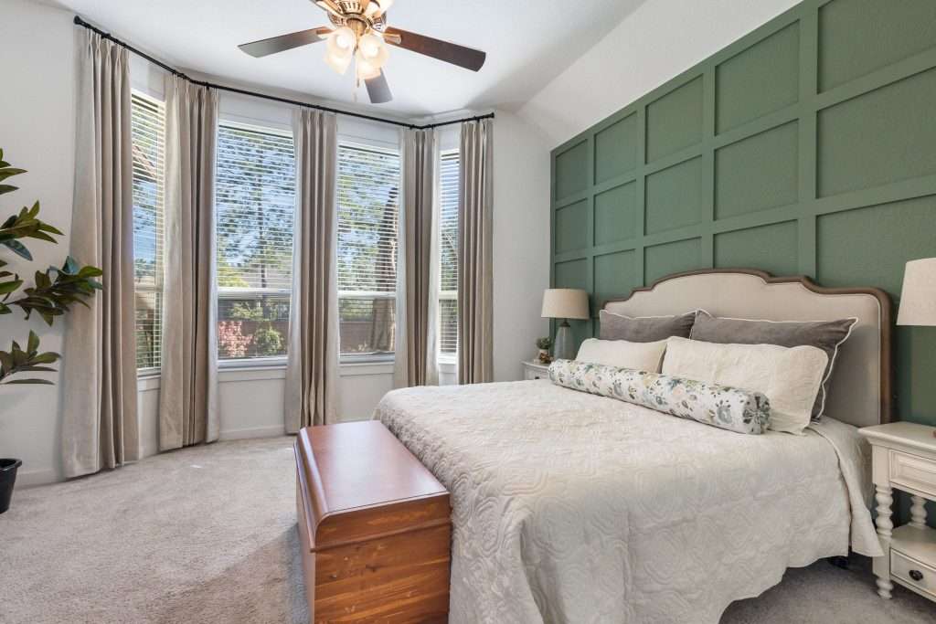
For example, a warm-toned backsplash can make brass hardware feel richer, while a subtle veining in the countertop can tie together cooler metals, like chrome or stainless steel. You get the idea.

And that’s where the real magic happens: 

These materials help blend the harder finishes into something that feels natural and lived-in.

When these three elements are chosen with intention, your kitchen starts to feel cohesive without looking overly styled. Again, it’s not about matching everything, darling. It’s about creating a rhythm your eye can follow from one surface to the next.
Getting these three elements to work together calls for an understanding of balance, scale, and tone. That is exactly where our team steps in, helping you pick finishes that feel cohesive from any angle and tailored to the way you use the space.

Tri-Color Combinations That Just Work in Real Kitchens

kitchen cabinets ideas

Sometimes, it helps to see how this all comes together in a real, livable way. Sugar, I know that better than anyone. 

So, allow me to introduce you to the kinds of combinations that’ll feel natural the moment you walk into the room. Nothing is forced, and nothing is trying too hard.
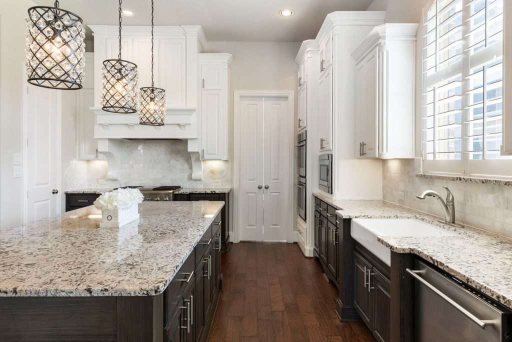
Warm Transitional Trio

[image]

This one feels inviting right off the bat. I’m talking:
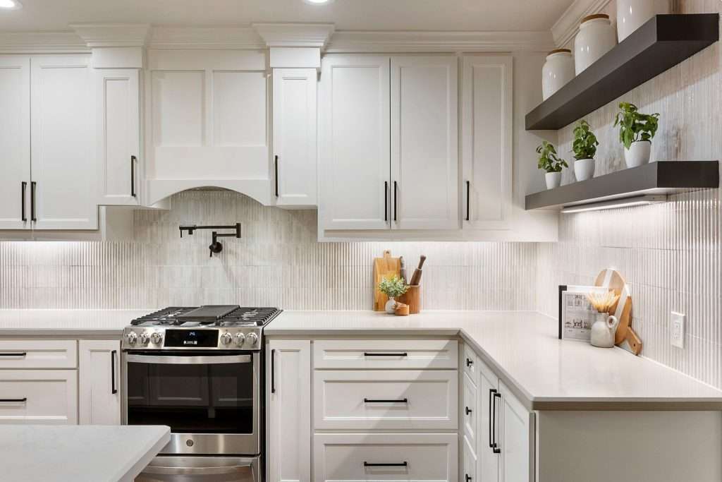
  • Brushed brass hardware
  • Aged brass faucet
  • Soft white or linen pendants with subtle brass details

Everything leans warm, but there’s still a bit of variation in tone. Your hardware and faucet relate closely, while the lights soften the look and keep things from feeling too shiny. If you’ve got creamy cabinets, wood accents, or anything with a bit of warmth already built in, you’re gonna love this.

Modern Contrast Trio

black and white kitchen design

If you’re going for a cleaner, sharper look, this combination brings that edge without feeling cold:

  • Matte black hardware
  • Stainless steel faucet
  • Black and glass pendant lighting

Here, contrast does the heavy lifting. The black hardware grounds the space, while the stainless faucet adds a bit of brightness. The lighting can tie it all together by echoing the black and letting a little light pass through the glass.

You can really see that black hardware working its magic in our Ellerden Forest Project.

Soft Neutral Trio

soft nrutral kitchen

Now, hun, this one is all about ease and quiet polish. You can go with:

  • Champagne bronze hardware
  • Polished nickel faucet
  • Linen or fabric-shade lighting

Nothing here is loud, and that’s exactly the point. These finishes blend in instead of competing. The slight warmth of the champagne bronze goes so well with the cooler shine of polished nickel, while the soft lights keep everything feeling relaxed.

If your kitchen is light and airy, this combination is gonna fit right in. It adds dimension without taking over the space.

Each of these trios follows the same idea: 

A clear direction, a little variation, and just enough repetition to make everything feel connected.

Seeing combinations is one thing. Making them work in your kitchen is another. We guide that process by translating ideas into options that fit your cabinets, lighting, and overall home style, so the end result feels natural and complete.

Where Most “Finishes Trios” Go off Track

white kitchen

Sure, this “finishes trio” can do a whole lot of good, but here’s a little truth for you, sugar:

Even the most gorgeous kitchen trio can fall apart faster than a poorly staked cake when you make one of these classic mistakes.

Here are a few that tend to trip people up the most:

  • Treating one element like it doesn’t matter

Every piece in your trio has a job to do. When one gets rushed or overlooked, the kitchen may feel a little off. A beautiful faucet can’t carry the look on its own, and great hardware won’t fix lights that feel out of place. Each element needs to get the same level of intention if you want the room to feel complete.

  • Letting one finish dominate everything

It’s easy to fall in love with a finish and use it everywhere; I get it. The problem is, when everything matches too closely, the kitchen can feel flat and one-note. You lose the sense of depth that makes it feel designed instead of assembled. A little variation keeps things interesting and gives your eyes somewhere to move.

  • Choosing pieces that don’t relate in style

Finish is only part of the story, darling. Shape and style matter just as much. If your hardware feels traditional but your lighting is ultra-modern, there’s gonna be some tension in the room. Even if the finishes are technically compatible, the mix can feel unsettled. You want your selections to feel like they belong in the same conversation.

  • Ignoring how finishes show up in real life

Some finishes look one way in a showroom and another once they’re installed. Lights, surrounding colors, and even the size of your space can change how the finish reads. If you don’t take that into account, you can end up with something that feels stronger or duller than you might’ve expected. A quick sample test in your own kitchen can save you from that surprise.

  • Forgetting the bigger picture

Your kitchen doesn’t exist on its own. If the finishes don’t connect with nearby rooms, the transition can feel abrupt. So, keep an eye on the flow into adjoining spaces; it can help everything feel more natural.

As long as you avoid these pitfalls, your finishes have room to do what they’re meant to do: 

Bring the whole kitchen together in a way that feels steady, thoughtful, and easy to live with.

How to Update Your Kitchen Using the Finishes Trio (Step-by-Step)

blue kitchen cabinets

Look, darling, I get it. You’ve picked your three finishes, and now you’re staring at your kitchen, wondering where the heck to start.

The good news is, you don’t need to tear anything out or start from scratch.

Here’s the game plan, sugar:

  • Step 1: Take stock of what is staying

Start by looking at your fixed elements. I’m talking cabinets, countertops, and floors; they’re setting the tone, baby, whether you realize it or not. So, pay attention to their undertones and overall style, ‘cause that’ll guide every decision you make next.

  • Step 2: Choose your dominant finish

Pick the finish that’ll lead the whole look, usually your hardware or your faucet. Go with something that feels right next to your cabinets and doesn’t fight them. Once you lock this in, everything else gets easier.

  • Step 3: Select a supporting finish

Then, bring in a second finish that complements the first. It could be a little lighter, a little darker, or even a different metal altogether. The goal is to add some dimension without creating tension. That is gonna keep your kitchen from feeling flat.

  • Step 4: Update your hardware first

If you want a quick win, start here, sugar. Switching out cabinet hardware is simple, affordable, and instantly noticeable. It sets the tone for the rest of the upgrades and gives you some momentum to keep on going.

  • Step 5: Layer in your fixtures and lighting

Next, move to your faucet and lighting. These pieces can help carry your finishes across the space from top to bottom. Make sure they relate back to what you chose for the hardware, though, so that the whole room actually feels connected.

  • Step 6: Step back and fine-tune

Before you call it a day, take a moment to look at everything together. Check how the finishes feel in your lighting throughout the day. Make small adjustments if something feels too strong or out of place, ‘cause sometimes, it’s the little tweaks that bring everything into balance.

Follow this order, and I promise things won’t get overwhelming. You’re building your kitchen layer by layer, which means each step brings it closer to that pulled-together, updated look.

Even a simple update can feel a little overwhelming once you start making decisions. Design on a Dime’s process brings clarity to each step, making sure every finish is chosen with intention.

Frequently Asked Questions

How long does a “finishes trio” update usually take?

Most updates can be done in a few days to a couple of weeks. Hardware swaps are quick, while lights and plumbing updates typically take a little more coordination. But either way, it’s still gonna be a lot faster than a full renovation, I can promise you that.

Is this approach renter-friendly?

In many cases, yes, it is renter-friendly. Swapping the hardware and even some lighting fixtures can all be done without any permanent changes. Be sure to save those original pieces, though, so everything can be returned later if needed.

What finish is most timeless for kitchens?

If you want something timeless, hun, you can’t go wrong with polished nickel, stainless steel, or soft brass tones. These finishes have staying power ‘cause they’re comfortable around both warm and cool palettes.

No, “finishes trio” trends tend to change less frequently than paint colors. While paint trends shift annually, finishes such as honed stone and natural woods prioritize timeless durability over seasonal cycles.

Which finish should I choose first when building my trio?

You should start with the element that feels most fixed in your space. For many kitchens, that is the faucet or the hardware. Once that decision is made, the rest can be built around it with much more confidence.

Fall Back in Love With Your Kitchen

Sometimes, the smartest update isn’t the biggest one, hun. It’s the one that makes everything you already have feel more considered, more connected, and honestly, a whole lot more beautiful.

That’s what the finishes trio does so well: 

It gives your kitchen a sense of intention without turning your life upside down in the process.

A few small changes can shift the entire feel of a space. And once it clicks into place, honey, you’ll wonder why you ever thought you needed a full remodel in the first place. Who knew, right? 

If you’re looking at your space, not quite sure how to pull it all together, don’t worry. Design on a Dime can help you shape your kitchen so that every choice works together from the start. Just reach out to our team when you’re ready!

Spring Hosting Ready: Make Your Dining Area Work for Real People, Not Catalog Photos

Make your dining area work for real people and suddenly, hosting feels a whole lot easier. 

No awkward chair shuffling, no guests squeezing past each other, and no rugs grabbing chair legs every time someone leans back from the table.

The truth is, plenty of dining rooms look lovely in photos but fall apart the moment real life shows up. 

Friends gather, chairs move, dishes pass around the table, and the space starts working a lot harder than those catalog shots ever suggested.

If that sounds a little too familiar, darling, stick around, because we’re about to transform your dining room from pretty-but-painful into party-ready perfection.

Dining Table Layout Rules That Keep Guests Moving Comfortably

Dining Table Layout Rules

When your dining room feels like a game of Tetris gone wrong, chances are the problem is the layout

When your table, chairs, and surrounding pathways are too close together, the room can feel like a puzzle nobody can solve. Someone pulls out a chair, and suddenly, the whole room has to adjust.

Here are the layout rules you can always count on to keep your dining area comfortable.

Give Chairs Enough Breathing Room

The first thing to check is the space between the table edge and the wall or nearby furniture.

When someone pulls out a chair, they’re gonna need enough room to sit down without bumping into things behind them.

Here’s a helpful rule of thumb:

  • 2.5 feet behind a chair is the bare minimum
  • 3 feet of clearance feels comfortable in most homes
  • 3.5 to 4 feet leaves room for walking behind seated guests

You’re gonna want that added space if your dining space connects to another room.

I mean, if someone is carrying dishes from the kitchen, you probably don’t want them squeezing sideways past the chairs just to reach the table.

Protect the Path Between the Kitchen and the Table

While you’re at it, think about the route food takes during a meal.

Most homes have a natural kitchen-to-table pathway, but when the furniture blocks that route, hosting can become frustrating, fast.

If the only way to reach the table is by weaving around chairs, brushing past guests, or detouring around a corner, I can tell you one thing:

That layout needs a little help.

Try to keep a clear serving path between your kitchen and dining area, even if it means shifting the table slightly away from the wall or rotating it to create a wider walkway. And, it should go without saying, but no bulky furniture in the main pathway.

Even a few extra inches can make the room feel easier to move through.

When the layout is right, the dining room starts working the way it should.

Chairs slide out easily, guests move through the space without bumping into furniture, and serving dinner feels relaxed instead of chaotic.

It’s a small set of spacing rules, but they make a big difference in how comfortable the room feels once the table is full.

Sometimes, the difference between a dining room that feels cramped and one that flows well comes down to planning. At Design on a Dime, we spend a lot of time studying how people actually move through their homes, so the layout supports real life, not just a pretty floor plan.

Seating Math for Dining Tables That Prevents Chair Crashes

dining room interior

A dining table might technically seat six or eight people, but that doesn’t always mean it feels comfortable once everyone sits down.

Nothing crashes a dinner party faster than chairs playing bumper cars every time someone needs to grab the salt. 

So, let’s talk real numbers that’ll save your shins and your sanity, starting with the 24-inch rule.

The easiest way to figure out how many people a table can handle is to look at the edge space. 

You see, each person needs around 24 inches of table edge to sit comfortably. So, a 72-inch rectangular table, for example, fits three people on each long side; throw in a chair at each end, and you have seating for up to eight, depending on the chair size. 

The shape of your table dictates the math here:

  • Round Tables Create Flexible Seating

Round tables follow the same spacing rule, although the seating arrangement feels a little different. ‘Cause there are no corners, folks can shift their chairs a little without throwing off the whole layout. That makes round tables perfect for conversation. For reference, a 48-inch table usually seats four people, but could stretch to six if needed. If you’ve got a smaller dining room, get a round table. No sharp corners to walk around and no one stuck at the end of the table. It’s a win-win!

  • Rectangular Tables Maximize Seating

Rectangular tables are the classic choice for a reason. They make the most of longer dining rooms and give you clear seating zones along both sides. For example, a 72-inch table typically seats six, an 84-inch one usually seats eight, while even longer ones can handle ten or more. Trust me, hun, the longer surface gives everything a little breathing room.

  • Extension Tables Give You Flexibility for Hosting

One of the simplest ways to make a dining area work for real life is to choose a table that can grow when you need it. I’m talking extension tables with leaves that add extra length when guests come over. The rest of the year, the table can stay compact for everyday meals. That level of flexibility is hard to beat when the dining room pulls double duty as a workspace or a homework station. When it’s time to host, you simply add the leaf and pull up a few more chairs. No squeezing required.

Remember what the goal of good seating design is, sugar: 

Not just fitting people around the table, but making sure everyone enjoys being there.

Getting the seating right is about more than squeezing in more chairs. Design on a Dime’s team can help you rethink table size, chair style, and layout so the dining area supports everyday meals as well as larger gatherings.

Dining Room Rug Sizing That Lets Chairs Slide Easily

Dining Room Rug Sizing

Your dining chairs are doing that rug-edge tango because you sized that thing with your heart, rather than your measuring tape, sugar, and we’re fixing that right now.

I mean, a dining room rug should make the space feel grounded and welcoming. What it should definitely not do is trap chair legs every time someone leans back from the table. ‘Cause that little snag at the edge of a rug? 

It can turn a relaxed dinner into a balancing act pretty quickly.

Now, the good news is that rug sizing isn’t all that complicated once you know the basic rules. 

  • Let the Rug Extend Beyond the Table

The most important rule is giving chairs enough room to stay on the rug, even when they’re pulled out. A good guideline is to extend the rug about 24 inches past the table on every side. That added space lets folks slide their chairs back without catching the rug edge or tipping onto the bare floors. If you’re unsure about sizing, just grab a roll of painter’s tape and outline the rug dimensions on the floor. It’s a simple trick you can use to visualize how everything will fit before buying anything.

  • Match the Rug Shape to the Table

Dining rooms tend to feel more balanced when the rug shape mirrors the table shape. Rectangular tables tend to look best on rectangular rugs, and round tables feel more natural on round rugs. You get the idea. This keeps the proportions of the room in line and prevents the awkward corners from sticking out. Of course, there are gonna be some exceptions to that rule; think open dining spaces, for example.

  • Choose a Rug That Chairs Can Move On

Rug texture matters more than many people expect. Chairs are constantly sliding in and out, which means your rug needs to handle movement without putting up a fight. Low-pile rugs are usually the easiest choice because they let the chairs glide smoothly. Think flatweave rugs, low wool pile rugs, or durable synthetic blends. Thick shag rugs or very plush styles are just gonna trap crumbs, which is not ideal around a dining table.

Rugs can completely transform a dining space, but only when the scale is right. That’s where Design on a Dime Interiors comes in.

Layered Dining Room Lighting That Makes Every Meal Feel Special

Layered Dining Room Lighting

Lighting sets the mood in a dining room, sugar.

You can have the prettiest table, comfortable chairs, and a rug that fits just right. But if that lighting is harsh or flat, the room will never feel quite as inviting as it should.

That’s why I usually recommend adding three layers of lighting. It makes a dining room feel warm, relaxed, and a little bit special once everyone gathers around the table.

And when those layers work together? Baby, the space glows in the best possible way. Our Jodi Project is a perfect example of what I mean.

  • Start With a Well-Placed Chandelier

The overhead fixture is the centerpiece of most dining rooms. I’m talking a chandelier or a pendant that helps anchor your table visually while serving as the main source of light for meals. Placement matters, of course. It should usually hang about 30 to 36 inches above the table surface. That way, the light is close enough to illuminate the table without blocking conversation across the room. The goal is to create a warm pool of light over the table while still leaving the rest of the room softly lit.

  • Add Soft Lighting Around the Room

Once your main fixture is in place, the room benefits from a second layer of light around the edges. That’s where sconces, lamps, and buffet lighting come in. Wall sconces can gently brighten vertical surfaces and artwork, while a lamp on a sideboard can add a cozy glow that softens up the room in the evening. The goal is to keep the dining room from feeling overly bright. 

  • Use Dimmers to Adjust the Mood

I cannot recommend dimmer switches enough. They allow the lights to shift depending on the vibe. Think brighter lights for everyday family dinners or homework at the table, and a gentler glow when friends gather for a long meal or a celebration. Being able to adjust the brightness helps the dining room transition easily from everyday use to hosting mode.

  • Choose Warm Bulbs for a Welcoming Glow

The final detail is the type of lightbulbs you use. Dining rooms almost always feel better with warm white bulbs, typically in the 2700K range. That warmth gives the space a comfortable glow. Plus, it keeps skin tones looking natural. Cooler bulbs can feel a bit too bright or clinical for a space meant for conversation and lingering meals. I’m guessing “clinical” is not the vibe you’re going for.

This is one of those design details that folks might not notice right away, but everyone feels the difference once the room is lit just right.

Furniture Scale Tricks That Make Small Dining Areas Work Harder

Small Dining Areas

When you’re wrestling with a cramped dining area, the biggest mistake isn’t the lack of space but choosing furniture that fights against every precious inch you do have.

You want something that works with the room instead of crowding it. And trust me, baby, when the scale is right, even a compact dining space can feel open, comfortable, and ready for guests.

A few simple swaps can make a surprising difference.

  • Slim Chairs Keep the Layout Flexible

Chair style plays a huge role in how spacious your dining area feels. Chunky frames and oversized backs can fill up the room fast, even if the table itself is fairly compact. Slim chairs with open backs tend to work much better in smaller dining areas. They take up less physical space and allow more light to pass through, which helps the room feel lighter. Oh, and consider armless designs; they will slide fully under the table when they’re not in use.

  • Banquettes Turn Corners Into Seating

If your dining area sits along a wall or in a corner, a banquette could be a smart solution. Built-in or upholstered bench seating hugs the wall, which means no need for chairs on one side of the table. Fewer legs, less visual clutter, and more room for people; what’s not to love? Plus, they tend to feel cozy and welcoming, which makes them a favorite for casual dining areas.

  • Bench Seating Adds Flexibility

Freestanding benches, like the one used in our Flores Project, are another great option. Instead of multiple chairs, you get one bench that can slide neatly under the table when it’s not in use. When folks come over, just pull out the bench, and you instantly get extra seating. Families with kids and homes where seating needs change depending on the occasion are gonna love this one because they keep the dining area adaptable without adding more bulky furniture.

  • Visual Lightness Makes the Room Feel Bigger

One last trick I often rely on is something called visual lightness. Even when furniture fits the space physically, heavy shapes and dark finishes can make the room feel all crowded. Pieces with lighter finishes, slender legs, or open bases allow the eye to travel through your space instead of stopping at every object. That’s how you get a dining space that feels calm and easy to move around, even when several people are gathered at the table.

See, honey, I told you small spaces can still host big moments. Good meals, good company, and plenty of room to enjoy both. That’s the dream, baby!

From space-saving seating to tables that fit your space just right, Design on a Dime can help you create a dining area that feels both functional and welcoming.

Frequently Asked Questions

Can a dining table be placed against a wall?

Yes, it can, especially in smaller dining areas. Placing one side of the table against a wall or banquette can free up valuable walking space. This setup is great for everyday meals, and the table can always be pulled out when you need extra seating for guests.

What is the best table shape for a narrow dining room?

Rectangular tables usually work best in narrower rooms because they follow the natural proportions of the space. If circulation is tight, a smaller oval table can be a great option, too, since the curved edges soften the layout and make it easier to move around.

Should dining chairs match the table exactly?

No, not necessarily. Mixing chairs with the dining table can add personality and make the space feel more relaxed. The key is keeping a common thread, such as similar wood tones, finishes, or overall style, so the space still feels cohesive.

How do you make a dining area feel more welcoming for guests?

Small details often make the biggest difference in a dining area. Comfortable seating, warm lighting, and a clear layout help guests settle in easily. Adding simple touches, like fresh flowers, a table runner, or a bowl of fruit, can also make the space feel more inviting without much effort.

Can a dining table double as a workspace?

Yes, it can. Many households use the dining table for multiple purposes. Good lighting, comfortable chairs, and a clutter-free surface can make it just as functional for working or homework during the day as it is for meals in the evening.

A Dining Space That Works for the Way You Gather

Look, hun, you’ve wrestled the dining space into submission, and now it’s ready to handle whatever spring throws at you, whether that’s brunch with the in-laws or taco Tuesday with neighbors. 

No more apologizing for the “cozy” seating or dodging questions about that mysterious stack in the corner. Remember that your space isn’t trying to land a magazine cover; it’s designed for actual humans who spill, laugh, and need elbow room. That’s the whole point, baby.

Now, sometimes, a few adjustments are enough to make all the difference. Other times, your space needs a more intentional plan to bring everything together.

That’s where a professional design perspective can really help.

Design on a Dime Interiors knows how to create a space that balances beauty with everyday functionality, so your home works just as well for quiet weeknight dinners as it does for lively gatherings with friends.

So, if you’re thinking about updating your dining area or reworking the layout, reach out to our team today!

7 Bathroom “Stress Points” You Can Fix Before You Touch a Single Tile

Bathroom “stress points” have a sneaky way of showing up in the middle of your morning routine, baby. 

Not when you first walk in and admire the tile, though, but when two people reach for the same sink, when the floor stays damp no matter how often you wipe it, and when the counter fills up again five minutes after you cleared it.

Most of these frustrations have nothing to do with style, darling. So, before you pick out pretty tiles, fix the stuff that’s actually making you crazy every single day.

Here’s the good news:

You can actually solve most of these headaches by tweaking where things sit, how traffic flows, and where your stuff actually lives. And I’m about to show you how.

1. The Morning Bottleneck

bathroom layout design

You know what happens when two adults try to brush their teeth at the same sink at 7 a.m.?

Somebody’s getting an elbow to the ribs, that’s what.

That tight three-foot zone in front of a single vanity becomes prime real estate when routines overlap. One person is reaching for the faucet, the other is leaning into the mirror, and suddenly, the doorway is blocked by someone waiting for their turn. 

It’s not the size of the bathroom that causes the stress most days, baby. It’s how the space is organized. Our Arbor Project is proof of that.

If you’re planning a remodel, I suggest you start here: 

For a functional double vanity, you need at least 60 inches of total width; 72 inches would be even better if you want to avoid crowded vibes. On that note, sink centers should sit 30 to 36 inches apart so the elbows aren’t competing for territory.

Of course, clearance matters just as much as width. Leave 30 to 36 inches of open floor space in front of the vanity, so both adults have room to step back and move without performing a careful little dance. 

Those small conflicts are what create the bottleneck.

A peaceful morning doesn’t start with prettier tile. It starts with enough space for everyone to move around without bumping shoulders before coffee.

Sometimes, the difference between a stressful morning and a smooth one comes down to inches of space and smart layout decisions. Design on a Dime’s team can help you rethink your vanity placement, spacing, and circulation, so your shared bathroom feels calm instead of crowded.

2. Poor Vanity & Mirror Placement

mirror placement tips in the bathroom

The truth is, your bathroom can have plenty of square footage and still feel uncomfortable if the vanity and mirror are positioned all wrong. 

This isn’t about style, though. It’s about alignment, height, and how your body actually fits the space.

Let’s start with height.

The standard vanity height used to hover around 30 to 32 inches. Today, most are built at 34 to 36 inches. That small change makes a big difference for anyone tired of hunching over to wash their face, and I’d say that’s most of us. 

If you’re bending at the waist every morning, your vanity is working against you. Plain and simple.

Mirror placement matters just as much. 

A mirror hung too high forces shorter family members to stretch. But too low, and taller adults may end up ducking. Ideally, the center of the mirror should land close to average eye level for the main users; that’ll keep everyone visible without awkward posture.

Now, let’s talk depth.

Standard vanity depth is about 21 inches. In tighter bathrooms, that depth can crowd walkways and pinch elbow space. In wider bathrooms, a shallow vanity can leave you feeling like you are teetering at the edge of the counter. 

You need comfort, not just compliance with a standard measurement.

And don’t forget about lighting. It ties it all together. Overhead lights alone create shadows under the eyes and chin, but with sconces placed at eye level on both sides of the mirror, you get even illumination and eliminate those harsh lines that make mornings feel harder than they need to be.

3. Counter Clutter That Refuses To Leave

bathroom counter tips without clutter

If your bathroom counter never seems to clear off, it’s not a discipline problem, hun. It’s a design problem.

And let me tell you something:

Counters fill up when the space doesn’t support how you actually get ready. If your top drawer is just one big empty box with no dividers, everything slides together in a tangled mess. Makeup brushes mix in with floss, and hair ties disappear. 

So, what do you do? You leave it all on the counter where you can see it.

That’s not laziness. That’s survival.

Outlet placement plays a quiet but powerful role here, too. If the only outlet is tucked behind the sink or off to one side, your hair dryer and electric toothbrush will live front and center. And without a dedicated outlet inside a drawer or cabinet, cords tend to sprawl across the countertop like they pay rent.

Then there’s the issue of concealed daily storage. Not deep linen cabinets. Not bulk backup supplies. Just a simple, reachable place for the things you use every single morning. If those products don’t have a clear home, they’ll settle on the counter and refuse to budge.

Even dispenser placement contributes to the mess. When soap sits far from the faucet, water drips across the counter every time you reach for it. The same thing happens when toothbrush holders are all crammed into corners; toothpaste smears follow. 

Small misplacements create constant micro-messes.

Clear counters aren’t about having fewer products. They’re about giving everyday items a logical, close-by landing spot so the surface can finally breathe.

4. Storage That Doesn’t Match Your Routine

bathroom storage

If clutter is the symptom, storage is the system behind it.

And when that system doesn’t match your daily routine, things spill over fast.

Yup, you read that right. The real culprit isn’t your messy habits, hun. It’s storage so poorly designed that it practically begs you to pile everything on the nearest flat surface.

Let’s start with linen overflow. If your only towel storage is a single shallow cabinet, bulky bath sheets and backup toilet paper will end up crammed wherever they fit. That means stacked on the vanity, balanced on the tub edge, or squeezed into spaces never meant to hold them. 

You need linen storage that accounts for real towels, not just that showroom-perfect pair folded in thirds.

Now, look up.

Most bathrooms ignore vertical space completely. Walls stop at standard cabinet height, leaving valuable storage potential unused. I’m talkin’ tall cabinets that extend closer to the ceiling and open shelving placed above the toilet. They’ll double your capacity without stealing floor space. 

Otherwise, everything just competes for the same lower cabinets.

There’s probably no need to tell you what happens when your toiletries have no dedicated niche or ledge. The bottles collect along the tub edge. 

And then there’s the medicine cabinet question. A flat wall mirror might look sleek, but it removes an entire layer of functional storage. Get yourself a recessed or surface-mounted medicine cabinet that keeps the everyday essentials close without crowding the drawers below.

When storage aligns with how you move through the room, the whole bathroom feels intentional instead of improvisational.

Ready for practical storage zones that help keep everyday essentials organized while maintaining a clean, polished look? Design on a Dime can plan it for you.

5. Splash Zones That Leave Your Floors Soaking

vanuty design

If you’re constantly stepping into damp socks, your bathroom is trying to tell you something.

The truth is, water always travels farther than we think it will. The problem isn’t just the shower, though. It’s how the entire room handles moisture from start to finish.

First, think about towel placement. If the nearest towel bar sits across the room, you’ll drip your way there every single time. Towels should be within arm’s reach of the shower or tub exit, period. When they’re not, water migrates across the floor in a trail that repeats itself daily.

Vanity proximity matters, too. When sinks sit tight against a side wall, water splashes have nowhere to go but down the cabinet face and onto the floor. Shallow backsplashes and short side splashes leave drywall vulnerable

Over time, that moisture stains paint, swells trim, and weakens finishes.

Then, there’s the slope. Bathroom floors and shower pans should gently guide water toward drains. When the pitch is off, even slightly, puddles form. And those puddles seep into grout lines and settle along edges where caulk breaks down first.

And let’s not forget your shower door swing. Does it open toward your vanity or toward the main walkway? When the door directs water into high-traffic areas, splashes spread fast, turning a quick, simple rinse into a room-wide cleanup.

Don’t worry, though; most wet floor issues aren’t dramatic plumbing failures. They’re small design choices that ignore how water behaves. And the sooner you address them, the better.

Control those splash zones, and your bathroom instantly feels cleaner, safer, and far less stressful to walk into each morning. Design on a Dime’s team can help.

6. Surfaces That Make Cleaning Harder Than It Should Be

bathroom mirror design

Every bathroom holds a handful of surfaces that make you cringe a little when it’s time to tackle them, and girl, you’re not alone in this squeamish struggle.

I’m guessing one of the germ zones that’s keeping you on edge is the sink. I mean, it’s secretly disgusting. Before you disinfect, it’s home to 2,733 bacteria per square inch. The good news is that, after a thorough cleaning, that number drops to just 3 colonies. Worth the elbow grease, right?

Toilet handles and faucets need daily attention, obviously.

And those high-touch fixtures? They’re germ magnets that demand quick daily wipes.

Some bathrooms look beautiful on install day, then slowly turn into a scrubbing marathon. And no, it’s not ‘cause you’re not cleaning. 

It’s ‘cause the materials and layout were working against you from the start.

On that note, let’s talk about the layout.

If your toilet is wedged tightly between a wall and a vanity, cleaning could become an acrobatic event. You should have at least 15 inches from the toilet centerline on both sides. Without that breathing room, grime builds up in narrow gaps that are nearly impossible to reach comfortably.

Baseboard-to-floor gaps are another hidden trouble spot. 

When trim isn’t sealed properly, moisture and dust tend to collect along the edges. And over time, that line darkens and becomes harder to restore.

Low-maintenance bathrooms aren’t about perfection, honey. They’re about selecting surfaces and spacing that respect your time and energy. Easy-to-clean design is a calm design.

7. Layouts That Ignore How You Actually Move

white bathroom tiles

A bathroom can check every measurement box and still feel off. Why?

‘Cause the layout was drawn for a blueprint instead of a real human routine.

Standard bathroom layouts treat your morning routine like a one-size-fits-all T-shirt, and, darling, we both know how poorly those actually fit. And when they ignore how you actually move, you end up taking extra steps every single day because someone just prioritized pretty pictures over practical flow.

Here’s the worst part, sugar: 

Standard layouts create bottlenecks during peak morning hours, yet builders keep copying the same tired floor plans.

So, let’s start with a simple question:

What do you reach for first when you walk in? 

If the toilet is the first thing you see from the doorway, that visual alone can make the space feel exposed and uncomfortable. 

Now, pay attention to the door: 

Does the door block the vanity when it’s open? Does it trap someone behind it? 

Then, there are the emotional discomfort points. Maybe it’s the toilet sitting too close to the tub. Maybe it’s having to squeeze between the vanity and the wall. Maybe it’s bending awkwardly to reach a switch that is tucked behind a door.

None of these issues shows up in a showroom display. But your body feels them every single day, and we all know that just adds stress to your plate.

Great bathroom design starts by understanding how people actually move through the space. Design on a Dime always begins with this kind of routine-focused planning, so the final layout supports real life, not just a floor plan.

The 5-Minute Routine Test Before You Buy Anything

blue bathroom tiles ideas

How many times have you stood in the showroom staring at gleaming fixtures, only to bring one home and realize it’s completely wrong for your actual routine?

Here’s your secret weapon: 

Walk through your morning bathroom dance right there in the store. Yes, really!

‘Cause the thing is, you don’t need another pretty fixture, sugar. You need one that fits your real life.

Here’s the simple “reality check” I give clients all the time. It takes a mere five minutes, and it can save you years of frustration and, not to mention, hard-earned cash:

  • Reach Check

Stand at a display vanity like you’re brushing your teeth. Lean in and pretend you’re washing your face. Are you crowding the sink? Is the mirror height comfortable? If you have to strain, stretch, or bend awkwardly in the store, trust me, it’ll only feel worse at home.

  • Elbow Check

Place your hands on either side of the sink as if you were mid-routine. Imagine someone standing beside you. Does it feel cramped? If there’s not enough personal space here, hun, it certainly won’t magically expand in your bathroom.

  • Movement Check

Turn as if you’re reaching for a towel, then step back like you’re drying off. Imagine your path from sink to shower. Does it feel smooth in your mind, or are you already adjusting your steps?

  • Quality Scan

Open all the drawers and test the weight of that hardware; you want solid construction and smooth operation. If something feels flimsy in a showroom, it probably won’t survive a busy household, and it’s just gonna be a waste of money.

This little routine test keeps you grounded. It shifts the focus from trends to function. And that, hun, is how you design a bathroom that feels good long after the excitement of new fixtures fades.

Frequently Asked Questions

How do I know if my bathroom layout can be improved without moving plumbing?

First off, many stress points can be reduced without relocating major plumbing lines. You can try adjusting vanity size, upgrading to a recessed medicine cabinet, or reworking storage interiors; this can dramatically improve function while keeping core fixtures in place.

Is it worth adding a double vanity in a small bathroom?

It depends on the width more than the square footage. If you cannot comfortably fit adequate sink spacing and elbow room, a well-designed single vanity with smart storage might function better than squeezing in two cramped sinks.

Can poor bathroom design affect home resale value?

Yes, it can. Buyers will notice awkward layouts, insufficient storage, and visible wear from moisture issues. That’s why functional improvements often add more long-term value than purely cosmetic upgrades.

How early should layout planning happen in a remodel?

Layout decisions should be finalized as early as possible, before you’ve picked out new tile, cabinetry, and fixtures. Once finishes are chosen, it becomes harder and more expensive to adjust spacing or placement mistakes.

What is the biggest mistake homeowners make before renovating a bathroom?

The biggest mistake is falling in love with materials before evaluating how they move through their space. Remember, function first, finishes second, always leads to a more satisfying result.

Ready for a New Bathroom?

Look, you could spend a million years picking the perfect subway tile, but if your bathroom still feels like a chaotic obstacle course every morning, what’s the point? 

Start with these stress points first, and I promise you’ll actually enjoy the space you’re creating. 

When the layout respects how you move, store things, and share the space, the whole room starts to feel calmer. Mornings run smoother. Cleaning takes less effort. And even small routines feel easier ‘cause the room finally works with you instead of against you.

If you’re thinking about remodeling and want a space that truly fits the way you live, Design on a Dime can help guide the process from the very beginning. Reach out to our team today!

The Most Common “Almost Right” Design Mistakes Designers See

Honey, the most common “almost right” design mistakes are the ones that leave you scratching your head, wondering why the room looks good but still doesn’t feel quite settled. Nothing seems wrong at first glance. 

The furniture is nice, the colors work, and everything is tidy. Yet something feels just a little off.

That lingering feeling usually comes down to subtle imbalances the eye notices before the brain can name them. Designers are trained to spot these misalignments and make small adjustments that bring the space into harmony.

The good news is you don’t need a full makeover. 

A few thoughtful refinements can turn “almost right” into a room that feels comfortable and welcoming. So, stick with me, and I’ll show you how to fix those sneaky mistakes.

1. Furniture That Feels Out of Proportion

Furniture That Feels Out of Proportion

Sometimes, a room looks nicely furnished at first glance, yet something feels slightly unsettled. 

More often than not, honey, the problem is scale. When furniture doesn’t match the size of the room or the visual weight of the surrounding pieces, the space can feel awkward even when every item looks stunning on its own.

A too-small sofa is one of the most common culprits. In a large living room, a petite couch can look like it’s floating rather than anchoring the seating area. On the other end of the spectrum, you can have this large, out-of-place sectional that swallows the room and makes everything else feel squeezed in.

I’m sure you know what I’m talkin’ about. 

On that note, the balance between pieces matters just as much. 

A bulky coffee table coupled with delicate chairs, or slim accent tables next to a heavy-looking upholstered sofa, creates visual tension instead of harmony.

Designers pay close attention to proportions ‘cause they set the tone for comfort and cohesion. You want pieces that share a similar visual weight, with breathing room around them. 

When scale feels tricky to judge, a designer’s eye can make all those pieces feel balanced from the start. Design on a Dime will help you choose furniture that fits both the room and the way you live.

2. Rugs That Leave the Room Feeling Unsettled

Rugs That Leave the Room Feeling Unsettled

A space can have beautiful furniture and still feel oddly disconnected if the rug isn’t doing its job. Hear me out, sugar: 

Rugs are more than decorative layers underfoot. They ground the space, create cohesion, and visually tie furnishings together into a single conversation area.

One of the most common issues I see is the “floating furniture” effect. When all the seating sits completely off the rug, each piece feels isolated rather than part of a unified arrangement. 

And sure, the room may look tidy, but it lacks the sense of “togetherness” that makes a space feel inviting.

Undersized rugs cause similar problems. A rug that only fits under the coffee table can make the room feel smaller and fragmented. I always want to make sure that at least the front legs of sofas and chairs rest on the rug, helping anchor the layout and define the seating zone.

Grounding matters because it quietly establishes where living happens within a space. When the rugs are properly scaled and positioned, the room feels anchored, comfortable, and complete without anyone quite knowing why.

3. Lighting That Brightens the Room (but Flattens the Mood)

Lighting That Brightens the Room

The thing about lights is that the room can be perfectly visible yet still feel lifeless when lighting relies on a single source. 

There’s no doubt that overhead fixtures provide general illumination, but when they carry the entire load, the space loses warmth, depth, and atmosphere. And trust me, designers can tell.

Many homes depend almost exclusively on ceiling lights. While practical, this approach casts uniform light that flattens textures and creates shadows in all the wrong places. The result? 

A room that feels stark instead of welcoming, especially in the evening hours when softer light should take over.

That’s where layered lighting comes in. 

You want to combine ambient light for overall glow, task lighting for reading or cooking, and accent lighting to highlight architectural features and décor. Table lamps, floor lamps, sconces, and under-cabinet lighting each add dimension while making daily activities more comfortable.

Good lighting shifts how the room feels throughout the day. It softens edges, enhances colors, and creates cozy pockets of illumination that invite people to linger. And when it’s layered with intention, the space gets depth and a sense of ease that overhead fixtures alone simply can’t provide.

Layered lighting can completely transform how a space feels after sunset. Design on a Dime’s team often incorporates lighting plans that add warmth and everyday comfort.

4. Art Placement That Throws Off the Whole Wall

Art Placement That Throws Off the Whole Wall

Artwork has the power to finish a room, but let me tell you something: 

When placement is slightly off, the entire wall can feel disconnected. 

The most common issue, one I’ve seen time and time again, is hanging art too high. When the pieces sit well above eye level, they feel detached from the furniture below and get your attention… for all the wrong reasons.

Scale plays an important role, too. 

You don’t want a small frame floating on a large wall. It’ll look lost. The same goes for pieces that are way too narrow; they fail to visually support the seating area. 

Designers often aim for artwork that spans roughly two-thirds of the furniture width beneath it, helping the arrangement feel balanced and intentional.

Grouping mistakes can also disrupt that harmony. Frames spaced too far apart or arranged without a clear structure create visual clutter rather than cohesion. You want consistent spacing and aligned edges to help multiple pieces read as a unified composition.

Art should feel connected to the room instead of hovering above it. That alignment brings a sense of calm order that completes the space.

5. Color Choices That Coordinate but Feel One-Dimensional

Color Choices That Coordinate but Feel One-Dimensional

A room can feature a perfectly coordinated palette and still feel… well, a little flat. Why does that happen? 

Well, when color choices stay within one narrow tone or intensity, the space lacks the variation that gives it richness and visual interest.

Monochromatic schemes are a common culprit. 

Using a single shade throughout can feel calm, but without lighter and darker variations, everything blends together. 

Walls, upholstery, and accessories all tend to merge visually rather than complement one another.

You need tonal layering; that’s what creates depth. Mix shades within the same color family, then introduce subtle contrast through texture, wood tones, metals, or accent hues. That little “interplay” allows the eye to move comfortably around the room instead of landing on one uninterrupted wash of color.

Warmth plays a role here, too. A palette that leans too cool can feel sterile, while one without contrast can seem unfinished. Adding warm neutrals, natural materials, or a deeper accent tone is a good idea. It helps restore that balance.

And that, sugar, is how you get a room that feels layered and inviting instead of flat.

6. Spaces That Feel Overmatched Instead of Collected

living room design

Matching furniture sets, identical finishes, and repeating fabrics might seem like the safest path, and I get that, hun. But let me tell you: 

When everything matches too perfectly, the room just feels a little stiff. 

You end up creating a space that feels more like a showroom than a home. And I guess that’s not the look you’re going for here.

When every piece shares the same wood tone, upholstery, and style, the eye has nowhere to rest. It reads as predictable rather than layered, which could make it feel flat, despite the quality of the furnishings. 

Trust me, even small variations can make a meaningful difference.

The key is to think in terms of coordination, not duplication. So, don’t hesitate to mix finishes and textures, ‘cause when you introduce contrast, you add visual interest without sacrificing harmony.

This curated approach brings warmth and personality into a space. Instead of looking like it arrived in one delivery truck, the room feels thoughtfully assembled over time. That subtle contrast is what gives a space sophistication while still feelin’ relaxed and inviting.

7. Furniture Arranged for Walls Instead of Living

living room sofa ideas

Many rooms look tidy but feel awkward because the layout follows the perimeter instead of the way people actually live. 

I know that pushing every piece against the walls might seem like it creates more room, but it often leaves the center feeling empty, with the seating disconnected.

When furniture hugs the walls, conversation becomes strained. Guests lean forward to be heard, and your space lacks the sense of intimacy that encourages folks to settle in. 

Instead, try pulling the seating inward. This creates a natural gathering area and makes your space feel welcoming rather than… “cavernous.”

And while we’re at it, don’t forget the traffic flow. 

Walkways should feel intuitive, allowing movements without weaving around obstacles. You need to leave clear paths while still anchoring the seating arrangement, so the room feels organized.

Focal points deserve attention, as well. Whether it’s a fireplace, a window, or a media console, arranging furniture to acknowledge a visual anchor gives the room purpose. 

And trust me, when layout decisions prioritize function, flow, and connection, the space simply feels ready to be lived in. Design on a Dime can help you create a thoughtful layout that makes the room feel instantly more welcoming.

8. Window Treatments That Shrink the Room Instead of Framing It

Window Treatments

Windows bring in light and life, but when your treatments are treated as an afterthought, they can diminish the entire room. Yes, hun, they can make that big of a difference.

Case in point: 

Curtains that are too short or too narrow can make your windows appear smaller, and ceilings feel lower than they really are. Panels that stop at the sill or hover just above the floor interrupt the vertical line of the wall, and, similarly, rods mounted just above the window frame can “compress” visual height. 

That’s why I usually hang rods several inches above the frame and extend them wider than the window so panels can stack neatly to the sides. That small change is enough to create the illusion of taller ceilings and broader windows.

Oh, and you definitely want fuller panels. They add softness and balance. When curtains are too skimpy, your space can feel unfinished, even if everything else is beautifully arranged. But when you’ve got lots of fabric? 

You introduce texture and movement, softening hard edges and adding comfort.

So, yes, window treatments frame the view, but they also support your room’s proportions. Do it right, and your windows become an architectural feature rather than an overlooked detail.

9. Minimal Styling That Reads As Unfinished

living room styling

I’m not gonna argue with you that clean, uncluttered spaces don’t feel peaceful, ‘cause they do. But when styling stops short of adding warmth and dimension, the room can come across as incomplete rather than intentionally minimal. 

And the difference often lies in layering, hun.

Empty surfaces, for example, are a common sign. A coffee table with nothing on it and shelves that are left completely bare can make the space feel a little uninhabited. 

Done well, styling can introduce that sense of life while still preserving breathing room.

Texture is every bit as important. When every surface is smooth and every finish similar, your eye has little to engage with. 

That’s why designers often bring in woven baskets, ceramics, books, greenery, and textiles, darlin’. These elements add depth without creating visual noise.

Remember, true minimalism is curated, not stripped away. 

It relies on balance, contrast, and a few well-chosen elements to bring interest and warmth. Even a simple vignette of stacked books, a sculptural object, and a few natural elements can take surfaces from empty to intentional.

You can have comfort without sacrificing simplicity. You just need to handle layering with care.

10. Rooms That Look Polished but Feel Impersonal

reading room design

A space can be beautifully designed, perfectly styled, and still feel like no one actually lives there. And you know why? 

Because when a room leans too heavily on catalog inspiration and trend-driven pieces, it can look finished yet lack the warmth that makes it feel like home. That’s actually one of the main issues we’ve tackled while working on the Jennifer Heights Project.

It’s something I like to call the showroom effect. 

Everything coordinates, surfaces are pristine, and accessories feel carefully chosen… but, somehow, still generic. 

Without personal touches, the room feels staged rather than lived in.

You see, meaningful objects are what bring authenticity into a space. I’m talkin’ family photographs, travel finds, heirloom pieces, and books that reflect real interests. These elements don’t need to dominate the design. Even small, thoughtfully placed items can shift the emotional tone of a room.

Aim for a balance of polish and personality. A structured space paired with lived-in details feels welcoming and genuine rather than overly formal, softening the design and inviting connection. 

You get that by layering in pieces that hold memory and meaning.

The finishing layer of a home is the story it tells. Design on a Dime helps you weave personal pieces and meaningful details into a design, so the spaces feel warm, authentic, and truly lived in.

Frequently Asked Questions

What is the most common decorating mistake designers notice?

The most common decorating mistake designers notice is the imbalance rather than the obvious “errors.” Think proportion, lighting, and layout choices; these are the most frequent reasons a space feels slightly off.

How do designers make a room feel balanced?

They usually combine proper scale, layered lighting, varied textures, and visual contrast so the eye moves comfortably through the space. That’s what gives a room that much-needed balance.

Can small changes really improve a room’s design?

Yes, they can. Adjusting the rug placement, adding lighting layers, and introducing texture can significantly improve a room’s design, especially in terms of comfort and cohesion.

Is minimal design harder to get right than traditional styles?

It can be, primarily because minimal spaces require careful editing and thoughtful layering to avoid feeling empty or unfinished.

When should I consider professional design help?

You should consider professional design help if a space feels off despite multiple updates. A designer can quickly identify those subtle, hard-to-spot imbalances and suggest effective adjustments.

Bringing Everything Into Balance

When a room feels slightly off, it rarely calls for starting over. More often than not, it needs a thoughtful eye and a few strategic adjustments to restore harmony. Once proportion, lights, and layering all begin working together, the space settles into a sense of ease you can feel the moment you walk in.

Remember, hun:

Great design is never about perfection. It’s about creating rooms that support real daily life while still feelin’ comfortable and welcoming to everyone who enters. 

Sometimes, that means shifting a layout, softening a window, or adding pieces that reflect the people who live there.

If your house feels close but not quite right, a professional perspective can make all the difference. Design on a Dime Interiors specializes in refining spaces so they feel balanced, personal, and polished. Ready for that finishing touch? 

Reach out to our team today and take the next step toward a home that truly feels complete.

Contact us to schedule your consultation!