
Some homes have one room that never quite keeps up with the rest of the house. In this case, it was the laundry room. Functional, yes, but visually flat and working far harder than it should. It was the one space that broke the rhythm of an otherwise thoughtfully designed home.
Design on a Dime Interiors was brought in to change that. The goal was not to simply refresh finishes, but to reimagine how this room worked day to day while giving it a presence that finally felt intentional. What emerged was a space that balances order and personality, proving that even the most practical rooms deserve care, attention, and design clarity.
This project shows how a focused plan, custom solutions, and confident design choices can turn an overlooked room into one that feels finished, cohesive, and genuinely enjoyable to use.
Why This Space Needed Attention
Despite the rest of the home feeling thoughtful and complete, the laundry room stood apart in the wrong way. It functioned, but only at the most basic level. Storage was visible and cluttered, circulation felt tight, and there was no clear system for how the space was meant to be used day to day.
For a room used multiple times a week, it created unnecessary friction. Supplies were out in the open. Pet items competed with household essentials. Tasks that should have felt routine felt visually noisy and slightly chaotic.
This was not a lack of space. It was a lack of structure.
Laundry rooms are workspaces, even when they are beautiful. In this case, the room asked the homeowner to adapt to it rather than supporting her routine. There was no dedicated zone for her dogs, no concealed storage for everyday items, and no sense of visual calm.
What the client wanted was not excess. She wanted clarity.
- A place for everything
- Storage that disappeared when not in use
- A layout that made movement intuitive
- A room that felt intentional rather than leftover
Because the bones of the space were solid, the opportunity was not to expand but to rethink. The laundry room could become both a functional hub and a design moment.
This project was never about adding more. It was about refining what already existed and giving the space a purpose that matched the rest of the home.
Vision and Priorities (What the Homeowner Asked For)
A Clear Ask, Grounded in Real Life
From the beginning, the homeowner was clear about what was missing and why it mattered. She did not want a laundry room that simply looked better. She wanted one that worked better.
The space needed to support multiple roles without feeling crowded or improvised. Laundry routines, storage, and pet care all had to coexist in a way that felt natural rather than forced. The goal was ease, not excess.
Functional Priorities
Function led every conversation. The wish list focused on solutions that would remove friction from daily routines.
- A dedicated area for two dogs that felt integrated, not added on
- Pull-out cabinetry to keep supplies accessible but out of sight
- Storage designed around how the room was actually used
- Clear zones that reduced overlap and visual noise
These priorities shaped the layout before any finishes were discussed.
Design Direction
Once the functional framework was defined, attention shifted to how the room should feel. The homeowner wanted a space that matched the rest of her home in character and confidence.
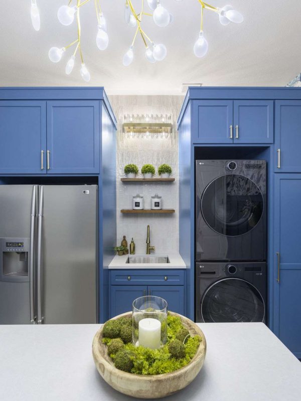
Design elements were chosen to give the room presence without overwhelming it. Wainscoting added structure and depth. Bold wallpaper introduced personality. Rich cabinetry color grounded the space, while lighting was selected to make the room feel warm and intentional rather than purely utilitarian.
The vision balanced restraint and expression. Practicality stayed at the center, but beauty was never treated as optional.
Rethinking the Layout (Design Decisions That Changed Everything)
Once priorities were clear, the existing layout quickly revealed its limitations. The room asked too much of too little structure. Storage, circulation, and pet needs overlapped in ways that created friction throughout the day.
Rather than working around those constraints, the layout was rethought from the ground up. The focus shifted to how the homeowner moved through the space, where tasks naturally paused, and where visual clutter tended to collect.
Creating Order Through Placement
Cabinetry, appliances, and storage zones were repositioned to give each function its own role. Circulation paths were simplified so movement felt natural rather than tight or reactive. Work areas were defined clearly, allowing the room to support multiple uses without feeling busy.
This planning phase removed guesswork later in the build. Every element had a reason for being where it was.
By resolving layout challenges early, the design avoided decorative fixes that mask deeper issues. Storage capacity was built in rather than added on. Pet accommodations were integrated rather than carved out as an afterthought.
The result was a framework that allowed design details to enhance the space instead of compensating for it.
This transformation was not about making the kitchen bigger for the sake of scale. It was about making it work better. By opening the layout and designing with intention, the kitchen finally became what the clients always wanted it to be. The true center of the home.
Custom Millwork and Storage Solutions
With the layout resolved, attention shifted to how storage could quietly carry the weight of daily use. This was not about adding more cabinets. It was about building the right ones.
Custom millwork was designed around how supplies were reached, put away, and reused throughout the week. Frequently used items needed to be accessible without staying visible. Less-used items needed a home that did not interrupt the flow of the room.
Pull-Outs, Concealment, and Flow
Pull-out cabinetry played a key role in keeping surfaces clear while maintaining convenience. Storage could be accessed quickly, then tucked away just as easily. This allowed the room to feel calm even when it was actively being used.
Concealed compartments handled everything from laundry essentials to pet-related items, eliminating the need for open shelving or temporary storage solutions. Every element was sized and placed intentionally, supporting the rhythm established in the layout phase.
Built to Last and Live With
The cabinetry finish added visual depth, but its real value showed up in daily interaction. Doors, drawers, and interiors were built to handle constant use without feeling heavy or overworked.
This level of customization turned the laundry room into a space that supports the household quietly and consistently. Nothing competes for attention. Everything has a place.
Lighting played a critical role in this transformation. New vanity fixtures softened the space while improving visibility, creating a balance between function and atmosphere. The result feels polished but relaxed, offering a sense of quiet luxury that supports both busy mornings and slower evenings.
This bathroom is no longer just another room in the house. It has become a private retreat that reflects how the clients want to start and end their day. Thoughtful, comfortable, and designed entirely around real life.
Design Details That Elevated the Space
Once the foundation of the room was in place, design details were layered in with intention. These choices were never meant to overpower the space. They were chosen to give it presence and a sense of completion.
Wainscoting introduced structure and rhythm, grounding the walls and giving the room a tailored feel. It created visual order that echoed the functional clarity established earlier in the process.
Color and Pattern With Purpose
Bold wallpaper brought personality into the room, but it was used thoughtfully. Rather than overwhelming the space, it added energy and depth, giving the laundry room an identity of its own.
The cabinetry color anchored the design. Rich and confident, it balanced the pattern and prevented the room from feeling light or temporary. Together, these elements created contrast without chaos.
Lighting That Changed the Mood
Lighting played a quiet but important role. The fixtures selected softened the space and made it feel intentional rather than purely functional. Tasks felt easier. The room felt warmer.
What was once a purely utilitarian area now felt like part of the home’s design story, not a space hidden away for chores.
The Finished Room: A Space That Finally Feels Complete
The finished laundry room no longer feels like an afterthought. It feels resolved. Every surface, cabinet, and detail works together to create a space that supports daily routines without asking for constant adjustment.
Where clutter once lived, there is now clarity. Storage does its job quietly. Movement through the room feels natural. Tasks that once felt rushed or messy now unfold with ease.
This level of detail work requires patience and precision. It is not about trends or decorative flourishes. It is about craftsmanship and consistency. By repeating the same elevated trim language throughout the downstairs, the home gained a sense of cohesion that could not have been achieved with surface updates alone.
The millwork quietly supports every other design decision in the home. It frames the bolder moments, softens the transitions, and ensures that every room feels complete.
Designed for Use, Not Just for Show
This room was designed to be lived in. Pull-outs glide easily. Dog areas feel intentional rather than tucked away. Supplies stay hidden, but always within reach.
The design holds up whether the room is mid-task or freshly reset. It does not rely on styling to feel complete. Its order is built in.
Part of the Home’s Larger Story
Most importantly, the laundry room now belongs to the home. Its finishes, colors, and details feel connected rather than separate. It carries the same level of care as the more visible spaces, proving that function and beauty can coexist anywhere.
What was once overlooked is now a space the homeowner genuinely enjoys using.
What It’s Like to Work With Design on a Dime Interiors
A Process Built on Listening
This project moved forward with clarity because it started with attention. Time was spent understanding how the space was used, what felt frustrating, and what needed to change for the room to truly support daily life.
Decisions were not rushed. Priorities were defined early, and every choice that followed tied back to those original conversations. This approach kept the process grounded and prevented unnecessary revisions later.
Thoughtful Planning, Steady Execution
Clear planning created momentum. Once the layout and storage strategy were set, the build unfolded with intention. Each phase had a purpose, and progress remained steady because the groundwork had already been done.
Communication stayed consistent throughout the project. Questions were addressed as they came up, and adjustments were handled without derailing the larger plan. The goal was always to respect the homeowner’s time and the rhythm of daily life during construction.
Designed for Real Homes and Real Routines
Design on a Dime Interiors approaches projects with the understanding that homes are meant to be lived in. Spaces need to work before they impress.
This laundry room reflects that philosophy. The result is not just a finished space, but a smoother routine and a room that continues to support the household long after the project is complete.
Ready to Reimagine Your Home?
Not every project begins with a major renovation. Sometimes it starts with one room that feels unfinished or harder to use than it should.
If there is a space in your home that does not support your routines, Design on a Dime Interiors helps uncover why and guides the process of making it work better. The goal is not to overdesign, but to create spaces that feel calm, intentional, and built around real life.
A thoughtful conversation is often the first step toward meaningful change.