
Exploring Paint Color Psychology: How Color Affects Your Room and Mood
Imagine being in a room filled with dark colors and cluttered with furniture.
How would that make you feel?
Color choice is very important in interior design. It can transform a space, making it look modern and expensive.
Colors affect our mood, creating a calming, soothing, or energizing environment, but they can also make us uncomfortable.
According to science, every color can somehow affect our mood and energy levels.
To understand this, we’ve made a list of colors known for evoking special feelings so you can make the perfect environment according to your color choices.
Understanding Color Psychology: The Science Behind Colors
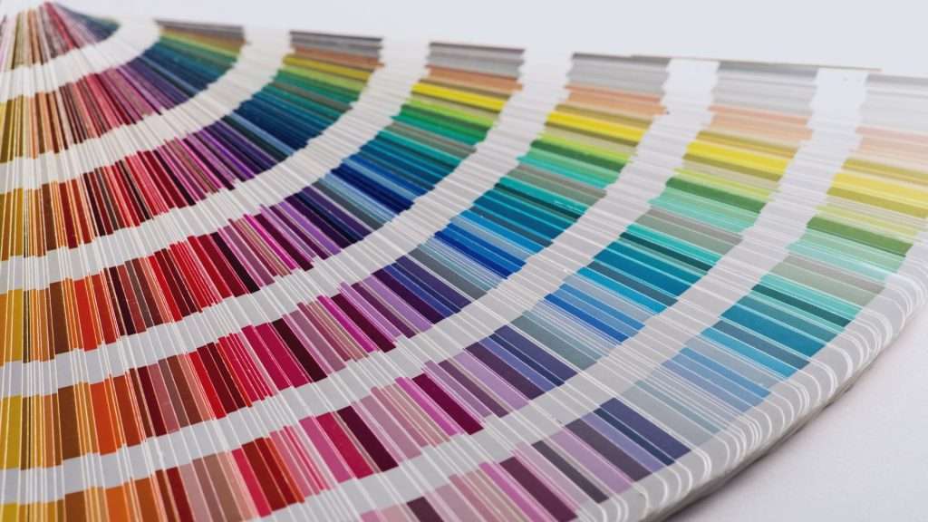
Colors can stimulate our brain in many ways, affecting our mood and energy levels. Color psychology explores how these hues evoke specific emotions and reactions and is a powerful tool in interior design.
For someone seeking painting inspiration, understanding the impact of each paint color can help them create rooms that exude vibrancy, calmness, and elegance—completely tailored to their expectations.
For example, warm colors like red, yellow, and orange can increase our energy, which makes them perfect for your home office or gym.
Cooler tones like blue and green can improve our concentration and give us a relaxed feeling. These are the best choices for living rooms and bedrooms.
Cultural influences and beliefs can also shape our color choices. Here are some fun facts about color psychology that you might not have known.
- Purple dye was once a rare, expensive luxury.
- Women and men see colors differently.
- Certain colors can cause psychological changes.
- Many ancient languages didn’t have the word for the color blue.
- Colors mean different things around the world.
It’s important to acknowledge that our personal experiences can shape our color choices: you can connect some memory and environment with a specific color and avoid or use it.
The Warm Spectrum: Inviting Colors That Energize
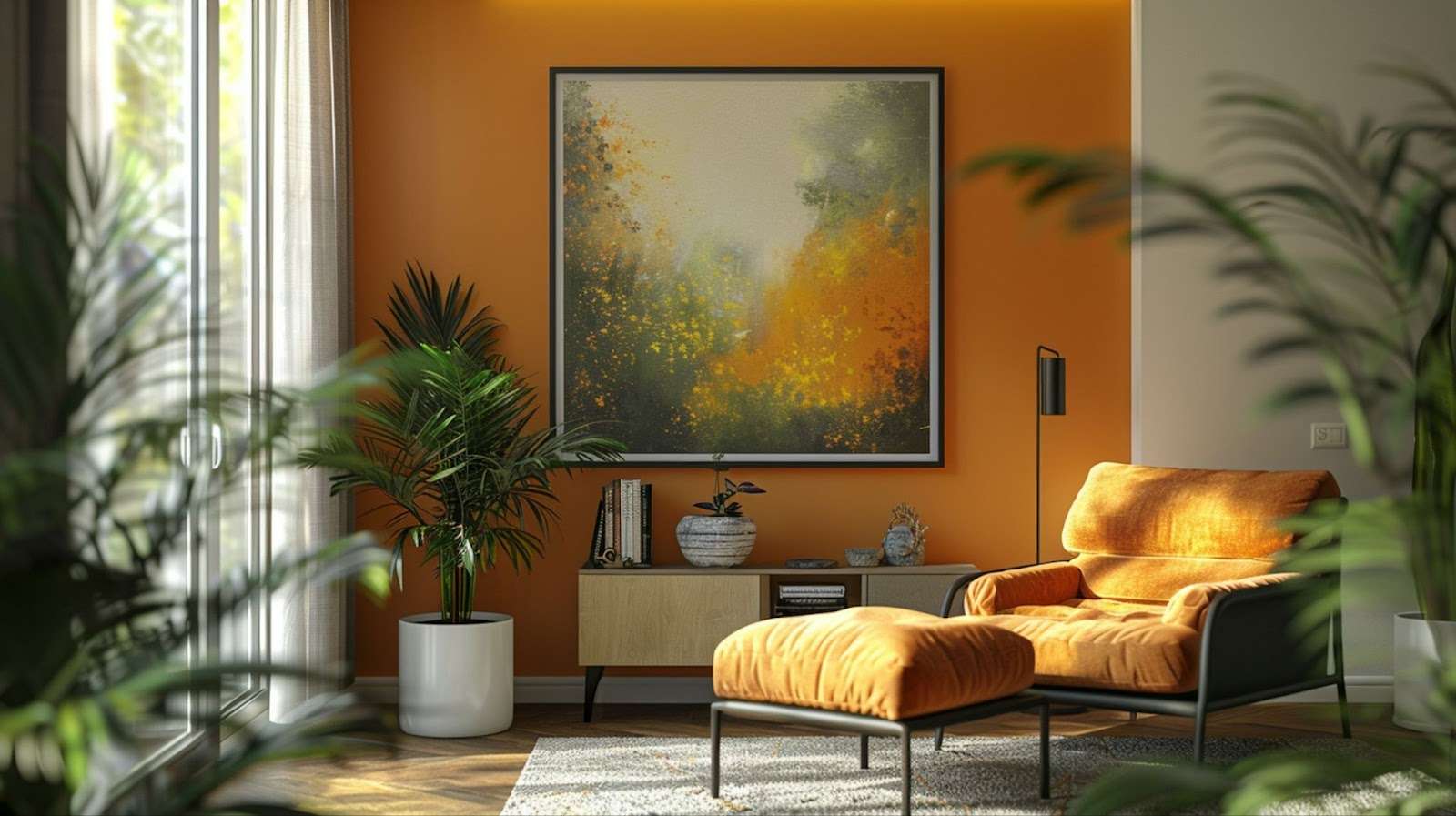
Warm colors like red, yellow, and orange are known for lifting our energy and creating inviting, inspirational spaces.
These hues also evoke positivity and are perfect for the rooms where social activities are encouraged.
Many people choose these colors for the home office because they give additional energy and inspiration. In the kitchen or dining room, warm colors can stimulate our appetite, adding a lively vibe, perfect for wine evenings and social gatherings.
Each of these colors has its character: red can evoke excitement, orange can create a feeling of a friendly environment, and yellow can give a sense of optimism and inspiration.
Use these colors thoughtfully to enhance your mood and connection with your loved ones.
Are you ready to transform your home and paint it in a color that reflects your personality and character? Stroll down our painting service page to see how we do the job!
The Cool Spectrum: Calming Colors That Soothe

Cool tones like blue, green, and purple are known for their calming qualities, making them ideal choices for spaces planned for relaxation.
Blue is usually associated with water and open skies, which give us a sense of tranquility.
That’s why it’s the perfect choice for bedrooms and bathrooms.
Green can give you this special feeling if you love nature and spending time outdoors. It is inspired by nature and fosters balance and peace, giving us a restful environment.
Soft shades of purple, like lavender, can also give us a natural feeling with a touch of luxury and calm.
Use these colors for bedrooms or your living room to create a calming, relaxing atmosphere and a peaceful heaven.
Neutrals: Balancing Act for Versatile Spaces
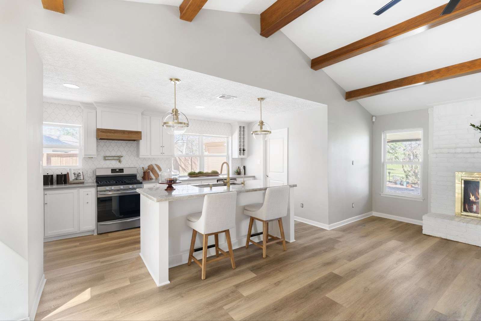
If you visit spa centers, you must have noticed they are painted in neutral tones, such as soft whites, warm beiges, or earthy taupes.
Neutral tones promote relaxation by creating a visually calm environment. This is especially beneficial if you want to transform one of your rooms into a luxurious wellness retreat.
White, gray, and beige tones are staples in interior design.
They reduce stress levels and are a great foundation for combining with other colors and natural materials like wood, stone, and metal.
As a backdrop, neutrals enhance bolder accents without overwhelming our senses.
They are the perfect choice for adding depth and dimension to a room.
For their calming and restful qualities, neutrals are used in bedrooms, but they can also be a great foundation in a living room, allowing you to introduce bold artwork, furniture, or accent pieces.
Color Combinations: Creating Harmony and Contrast
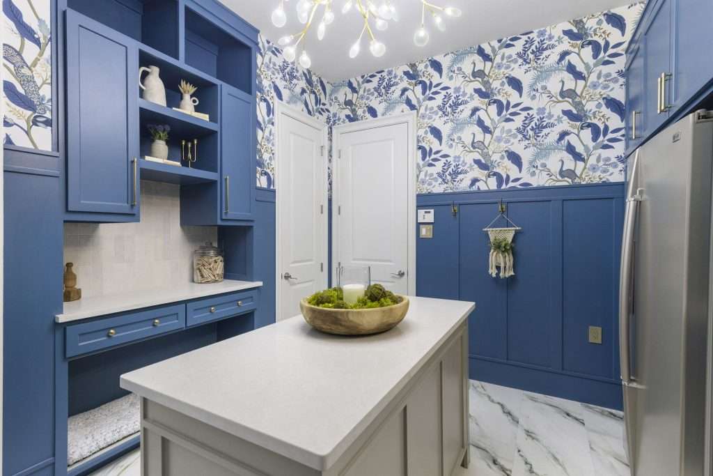
Color combinations can also greatly impact a room’s mood and energy.
There are several options to do it:
You can use complementary colors like blue and orange for an exciting and energetic feel. It can create a dynamic contrast and make your space vibrant and positive.
Use analogous color schemes like blue, green, and teal for rooms where you want to relax, read, and enjoy your free time.
Monochromatic schemes can produce a soothing and sophisticated feel, and softer tones with contrasting accents can highlight focal points, making the space perfect for social gatherings and work.
Ready to create a space your dream space? Schedule a consultation with Design on a Dime Interiors today!
Personal Preferences: The Impact of Individual Color Choices
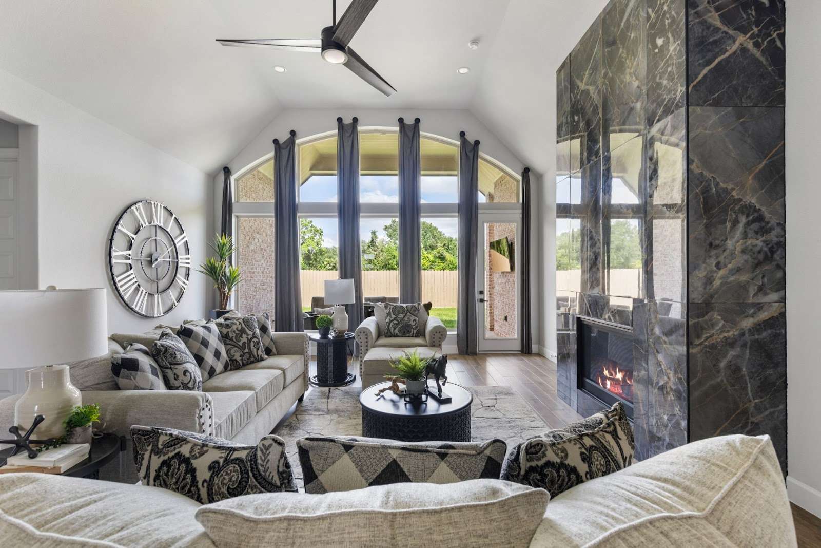
We can discuss popular choices and some rules that explain how some colors impact our emotions and well-being.
But still, the choice is yours, depending on your preferences, experiences, and tastes.
Colors impact each person differently; for instance, blue may evoke feelings of tranquility and ease to some, but for others, it could feel cold and less inviting.
When choosing hues, consider how some colors make you feel. Think about your experiences, memories, and environment, where specific colors have brought you energy or comfort.
Tips for Choosing the Right Color for Your Space

Let’s imagine that you have chosen the right color for your room.
It’s time to test paint samples on the walls and observe how shades look in different lighting throughout the day.
Be careful since artificial and natural light can alter color’s intensity, so start your painting during the day.
Another thing to consider is the room’s purpose. Yellow and terracotta are the best for a cozy and energizing feel, ideal for kitchens and living rooms. Cool tones like blues and greens promote relaxation, so consider them for your bedrooms and bathrooms.
Light shades can make your room feel bigger and airy, and darker shades can make your room smaller, giving you more intimacy. You can try virtual tools from Sherwin-Williams or Benjamin Moore to visualize colors in your space and make the perfect choice for your ideal home!
Transform your home into the space you’ve always wanted! Visit our remodeling page to see some of our best work—maybe you’ll find something that resonates with your style.
Final Comments: Transforming Your Space Through Color
Colors have a deep impact on our mood and behavior. By thoughtfully selecting colors, we can create spaces that promote relaxation, warmth, comfort, hard work, and energy.
Paint is a powerful tool for shaping our mood, inspiration, and activities. So, carefully plan your room’s color to transform your living space into a true reflection of yourself!
If you’re ready to skyrocket your new painting project, contact us—we’ll be happy to help!