Kitchen Paint Colors: Redefining the Heart of Your Home

Your kitchen is the heart of your home, where family and friends gather. The right paint color transforms its mood, making it warm and inviting or sleek and modern.

In Conroe, choosing kitchen colors requires consideration of natural light, humidity, and home style. From heat-resistant finishes to space-enhancing shades, we’ll help you select colors that work best for Texas homes.

This article covers:

  • How paint colors affect mood and space.
  • Trending kitchen paint colors for 2025.
  • Best shades for different kitchen sizes.
  • Coordinating wall colors with cabinets and countertops.
  • Texas lighting considerations.
  • Durable, eco-friendly paint options.

Whether you’re going DIY or hiring a pro, we’ll help you choose the perfect shade to make your kitchen beautiful and functional.

How Kitchen Paint Colors Affect Space & Mood
kitchen colors

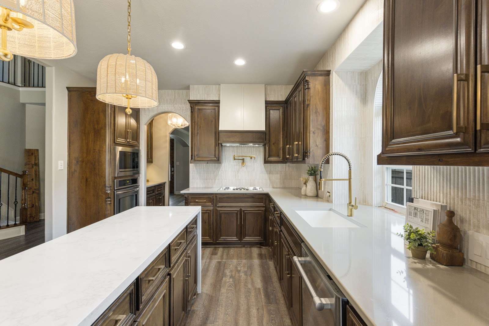
The colors you choose for your kitchen walls can significantly impact both the perception of space and the ambiance of the room. Whether you prefer a bright and airy feel or a bold and dramatic statement, your paint selection plays a crucial role in shaping the kitchen’s overall atmosphere.

Bright & Airy Tones

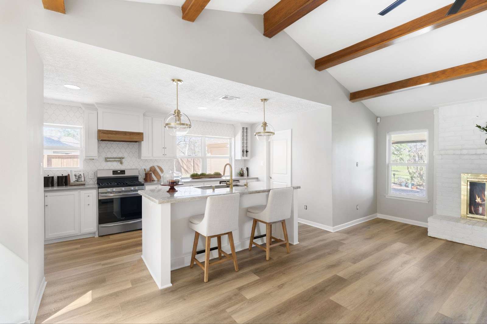
For small kitchens or spaces with limited natural light, soft whites, light grays, pale blues, and warm beiges work best. These hues reflect light, making the kitchen feel larger, open, and inviting—a great solution for compact Houston homes with fewer windows. Learn more about soft and warm color palettes.

Warm & Cozy Shades

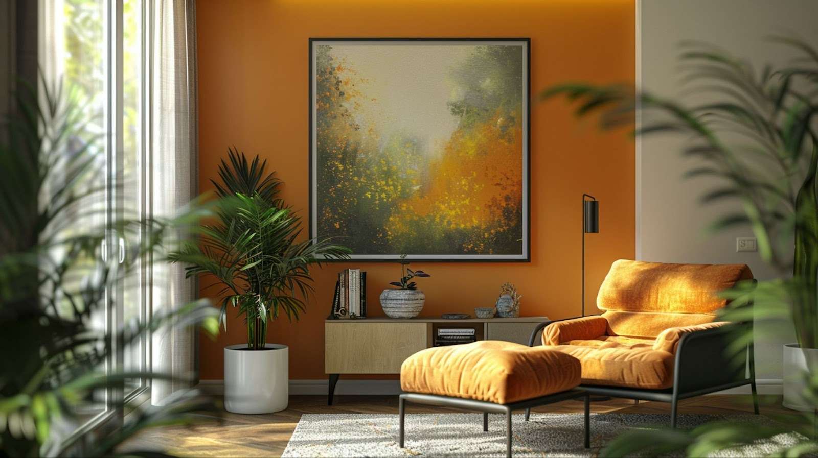
For a welcoming, traditional aesthetic, earthy tones such as terracotta, soft yellows, and muted oranges enhance the warmth of farmhouse-style kitchens, particularly those featuring natural wood cabinetry. These colors create a cozy, intimate setting, perfect for family meals and gatherings in Southern-style homes.

Bold & Statement Colors

Deep blues, forest greens, charcoal, and black bring depth, elegance, and a sophisticated edge to modern kitchens. These dramatic shades work particularly well in large, open-concept spaces, commonly found in contemporary Conroe homes. Explore bold color choices.

Regional Homes Considerations 

Texas homes receive ample natural light, which makes balancing brightness with the right undertones essential to prevent colors from feeling too warm or cool. Additionally, humidity-resistant paints are a must for Houston’s climate, ensuring long-lasting durability and preventing peeling or discoloration over time.

Selecting the perfect shade can transform your kitchen into a functional, visually appealing space. Whether you’re aiming for a cozy retreat or a vibrant cooking area, choosing the right paint color makes all the difference!

Top Kitchen Paint Color Trends for 2025 in Texas

Kitchen design trends continue to evolve, and in 2025, Texas homeowners are embracing a mix of nature-inspired tones, rich statement colors, and warm neutrals. Whether you’re updating a cozy kitchen in Conroe or a modern open-concept space in Houston, choosing the right color can enhance both aesthetics and functionality while complementing Texas home styles and climate conditions.

Nature-Inspired Greens
nature - inspired kitchen colors
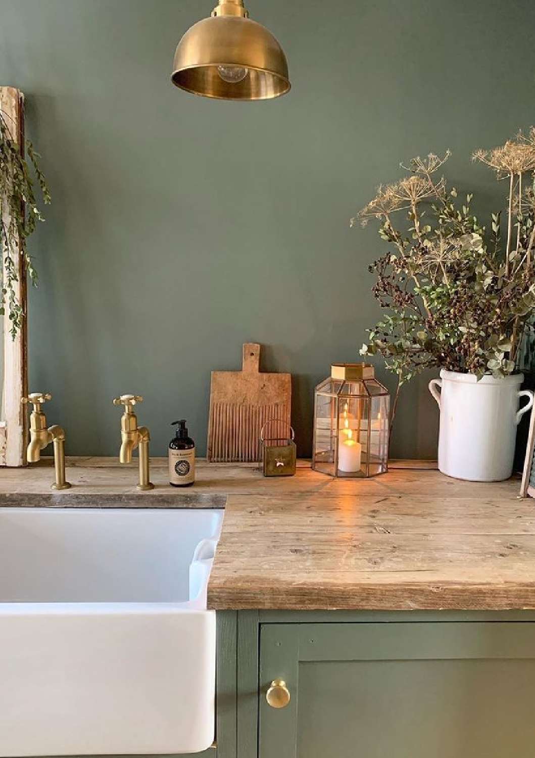
Source: @SimplyScandiKatie

Shades of olive, sage, and forest green remain popular for their organic, grounding appeal. These hues pair beautifully with wood cabinets, brass fixtures, and natural stone countertops, making them ideal for rustic farmhouse and modern Texas kitchens. Green tones reflect the growing trend of bringing the outdoors in, creating a serene and balanced environment, perfect for families who want a welcoming yet fresh look in their kitchen.

Rich Blues for Depth & Sophistication
teal kitchen

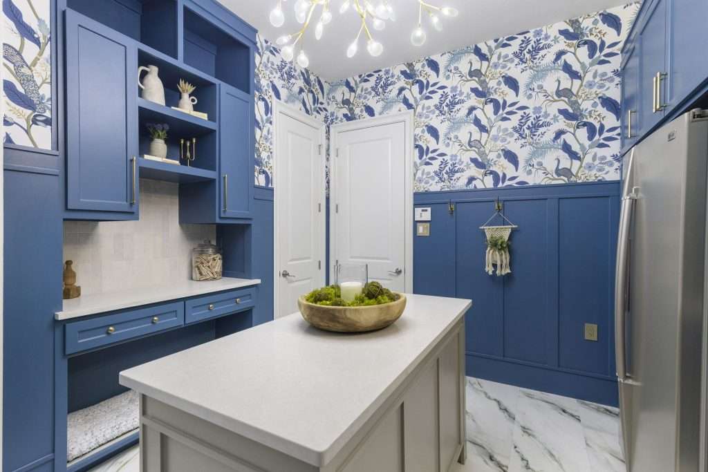
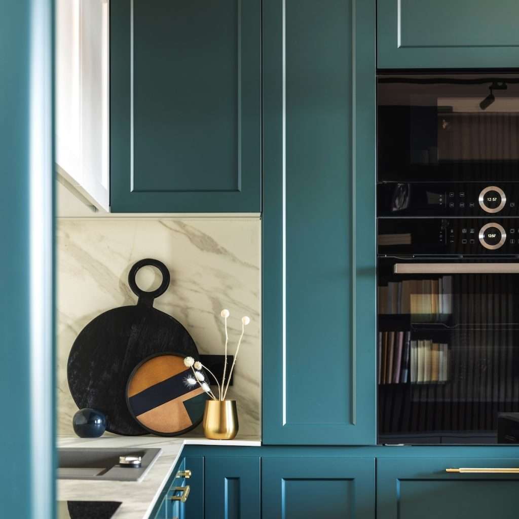
Deep blues, including navy, teal, and midnight blue, are perfect for adding a bold contrast to white or light cabinetry. These colors bring a moody, high-end feel, particularly in large kitchens with abundant natural light, common in Texas homes. For homeowners who enjoy an elegant yet contemporary aesthetic, deep blue hues can make a striking impact, especially when combined with gold or matte black hardware.

Earthy Neutrals for a Warm, Inviting Feel
earthy tones for kitchen walls

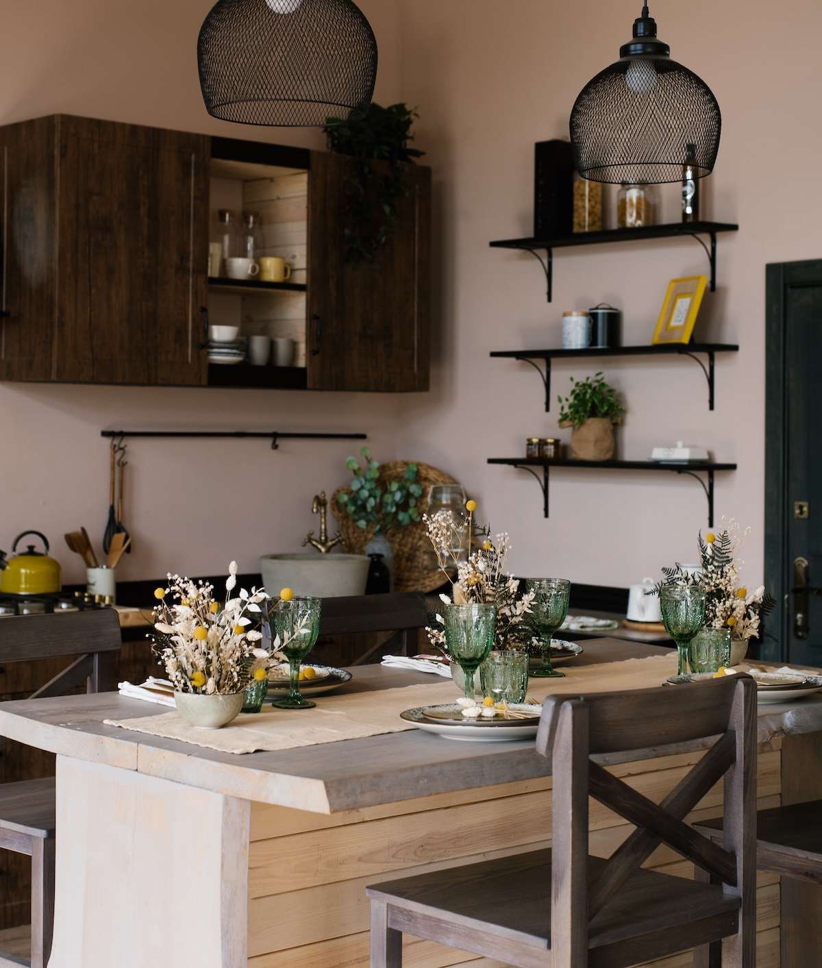
Warm beiges, mushroom gray, and sandstone are making a comeback, offering a softer alternative to stark whites. These neutrals reflect the laid-back yet refined aesthetic found in many Conroe and Houston-area homes. As homeowners seek more versatility, these colors serve as a perfect foundation for different design styles, whether it’s a modern kitchen with sleek cabinetry or a traditional setup with vintage-inspired decor.

Bold & Dark Hues for a Luxe Look

dark hues kitchen walls

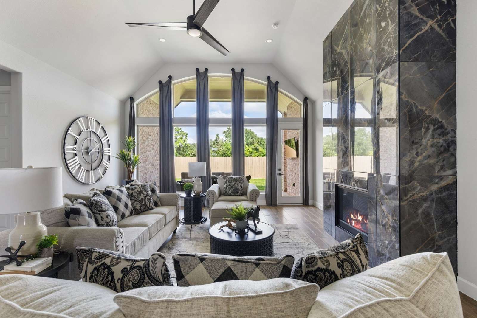
For those wanting a modern, dramatic effect, charcoal, deep brown, and black are trending in open-concept kitchens. These shades work well with industrial and contemporary designs, often seen in urban Texas homes. Darker tones create a sense of intimacy and depth, making them an excellent choice for homeowners looking to craft a bold statement without overpowering their space.

Soft Pastels for a Subtle Pop of Color
pastel colors kitchen trend

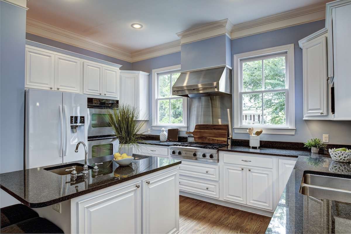
For homeowners who want color without overwhelming the space, blush pink, powder blue, and soft peach add personality while maintaining an airy feel. These shades are especially suited for smaller kitchens, helping them feel bright and spacious. Soft pastels can also be used strategically as accent walls, bringing a delicate contrast to otherwise neutral-toned kitchens.

Regional Considerations for Texas Homes

  • Bright Sunlight & Heat: Texas homes receive ample sunlight, so using cooler hues like soft blues and greens helps balance warmth. Too much warmth can make a space feel stifling in the Texas heat, making these colors a great way to achieve equilibrium.
  • Humidity & Durability: In high-humidity areas like Houston, choosing mildew-resistant, easy-toclean finishes ensures paint longevity. Matte or satin finishes are often preferred as they offer a balance between durability and ease of maintenance, making them ideal for high-traffic kitchens.
  • Reflecting Local Architecture: Homes in Texas range from Spanish-style haciendas to modern minimalist designs, influencing the color palettes homeowners choose. Neutral and earthy tones work well in traditional homes, while deep blues and greens complement more contemporary spaces.

By selecting one of these on-trend kitchen paint colors, you can create a space that is both stylish and functional, perfectly suited for Texas living. Whether you’re looking to refresh your kitchen with a calming pastel or make a bold statement with a deep, rich hue, 2025 offers a range of exciting options tailored to your home’s needs.

Best Kitchen Paint Colors Based on Kitchen Size

Not all kitchens are created equal—some are cozy and compact, while others are sprawling open-concept spaces. Choosing the right kitchen paint colors isn’t just about what looks good—it’s about making the space work for your home, your lighting, and your lifestyle. 

The right shade can make a small kitchen feel larger, bring warmth to an oversized space, or create balance in an open floor plan. Let’s break it down.

Small Kitchens: Light & Airy for an Open Feel

small kitchen color choice
Like what you see? Check out the entire project/transformation here!

When space is limited, color becomes one of your best tools for creating the illusion of openness. Light, reflective shades like soft whites, creamy beiges, pale blues, and warm grays help bounce light around, making the kitchen feel more spacious and inviting.

For Texas homes, especially in Conroe and the Houston area, where kitchens often connect to dining and living spaces, a cohesive, neutral palette can make everything flow effortlessly. Matte or satin finishes work best here to provide depth without overwhelming the space. Learn more about choosing the right finish for your kitchen walls.

Large Kitchens: Bold & Defined for Character
large kitchen color choice

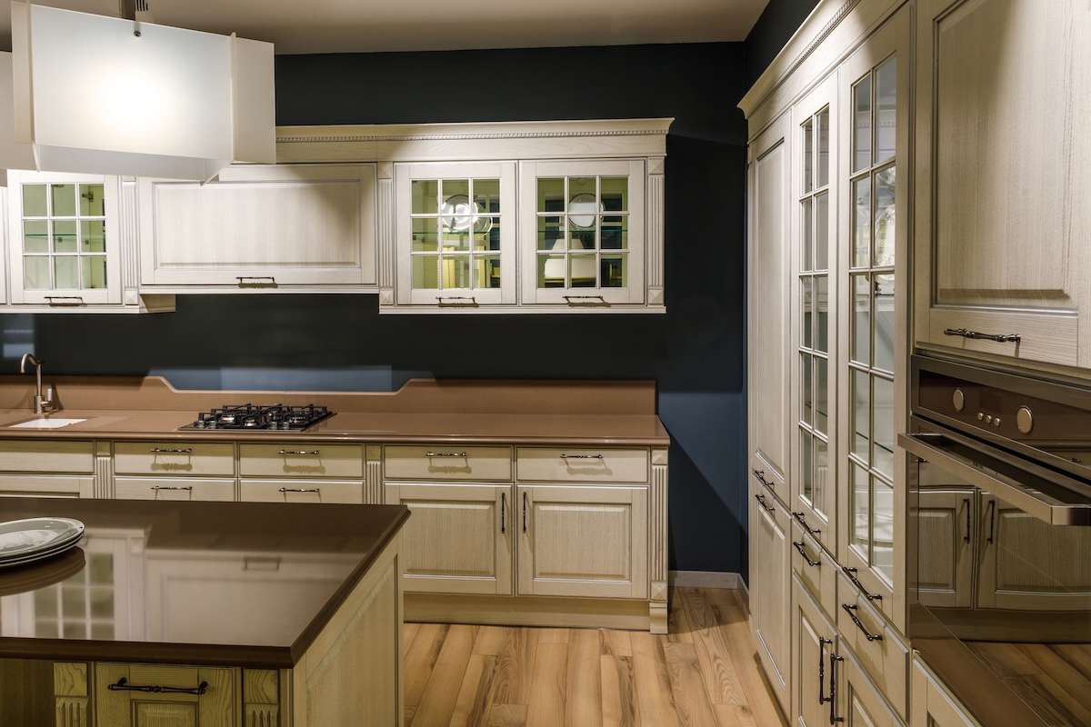
Bigger kitchens give you the freedom to experiment with richer, deeper hues that add personality and contrast. Navy blue, deep green, and charcoal gray work beautifully on accent walls, islands, or even all-over wall colors for a cozy, dramatic feel.

If your kitchen has an abundance of natural light—common in many Texas homes—darker shades can anchor the space without making it feel closed in. Pairing bold colors with light-colored countertops and cabinetry keeps things balanced and prevents an overwhelming look. Get inspired by bold color choices for your home.

Open Concept Kitchens: Seamless & Harmonious

open space kitchen color choice

Open floor plans are a staple of modern Texas home design, but they come with a challenge—how do you define the kitchen without disrupting the flow of the space?

A balanced approach is key. Soft neutrals like greige, warm taupe, or muted pastels keep the kitchen feeling distinct without clashing with adjacent living areas. For those who want some variation, using a slightly darker shade on lower cabinets or an island can add just enough contrast. Explore how open-concept design plays into color choices.

Whether your kitchen is small and cozy, large and luxurious, or seamlessly connected to the rest of your home, your paint color choice sets the mood. Lighter hues open up compact spaces; bold shades bring drama to larger kitchens, and seamless palettes unify open-concept designs.

Not sure which shade will work best in your kitchen? Let’s talk. At Design on a Dime Interiors, we specialize in helping Texas homeowners find the perfect color to match their space, style, and daily life. Schedule a consultation today!

Coordinating Kitchen Paint Colors with Cabinets & Countertops

Choosing the right kitchen paint color is important, but making sure it complements your cabinets and countertops is what truly ties the space together. A well-coordinated color scheme enhances the overall look, creating a harmonious and stylish kitchen. Whether you prefer bold contrasts or a seamless blend, here’s how to achieve the perfect combination.

White Cabinets: A Timeless and Versatile Choice
white cabinets

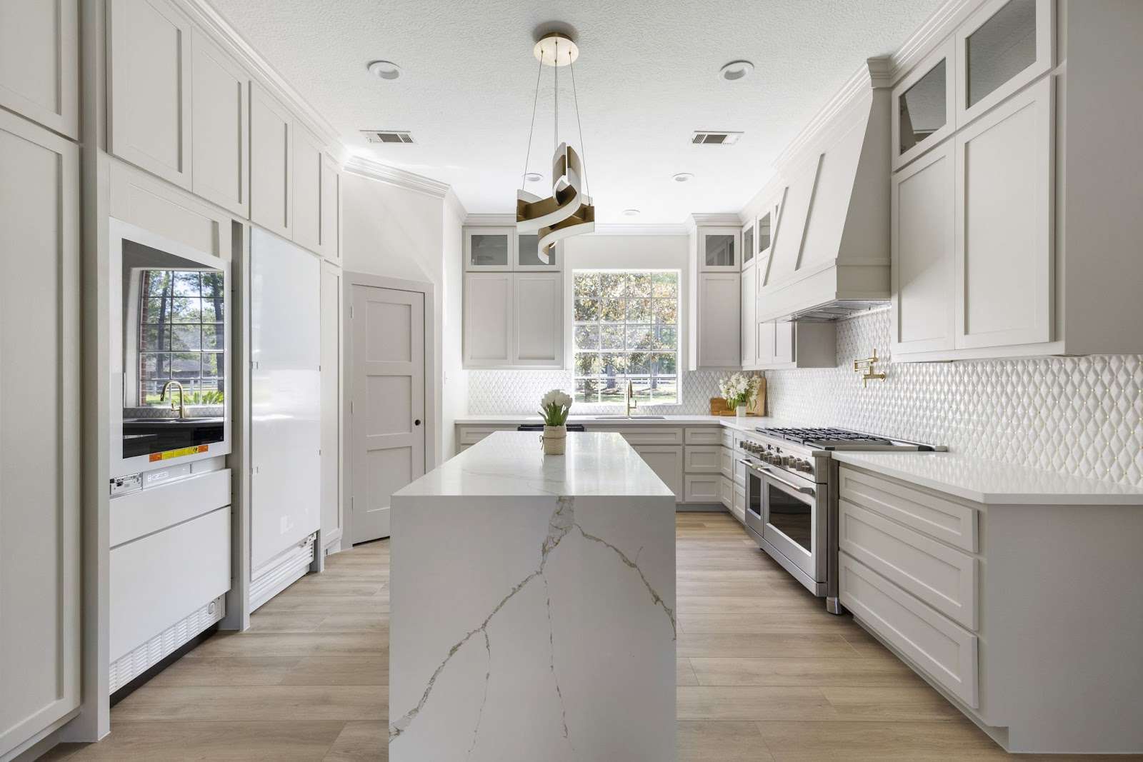
White cabinets offer a clean, bright look that pairs well with nearly any paint color. For a modern aesthetic, opt for cool grays or soft blues. To create a warm and inviting atmosphere, consider beige, muted greens, or terracotta. If you’re feeling bold, navy, charcoal, or even black can create striking contrast and a contemporary edge. Check out how bold colors can change your space.

Wood Cabinets: Enhancing Natural Warmth
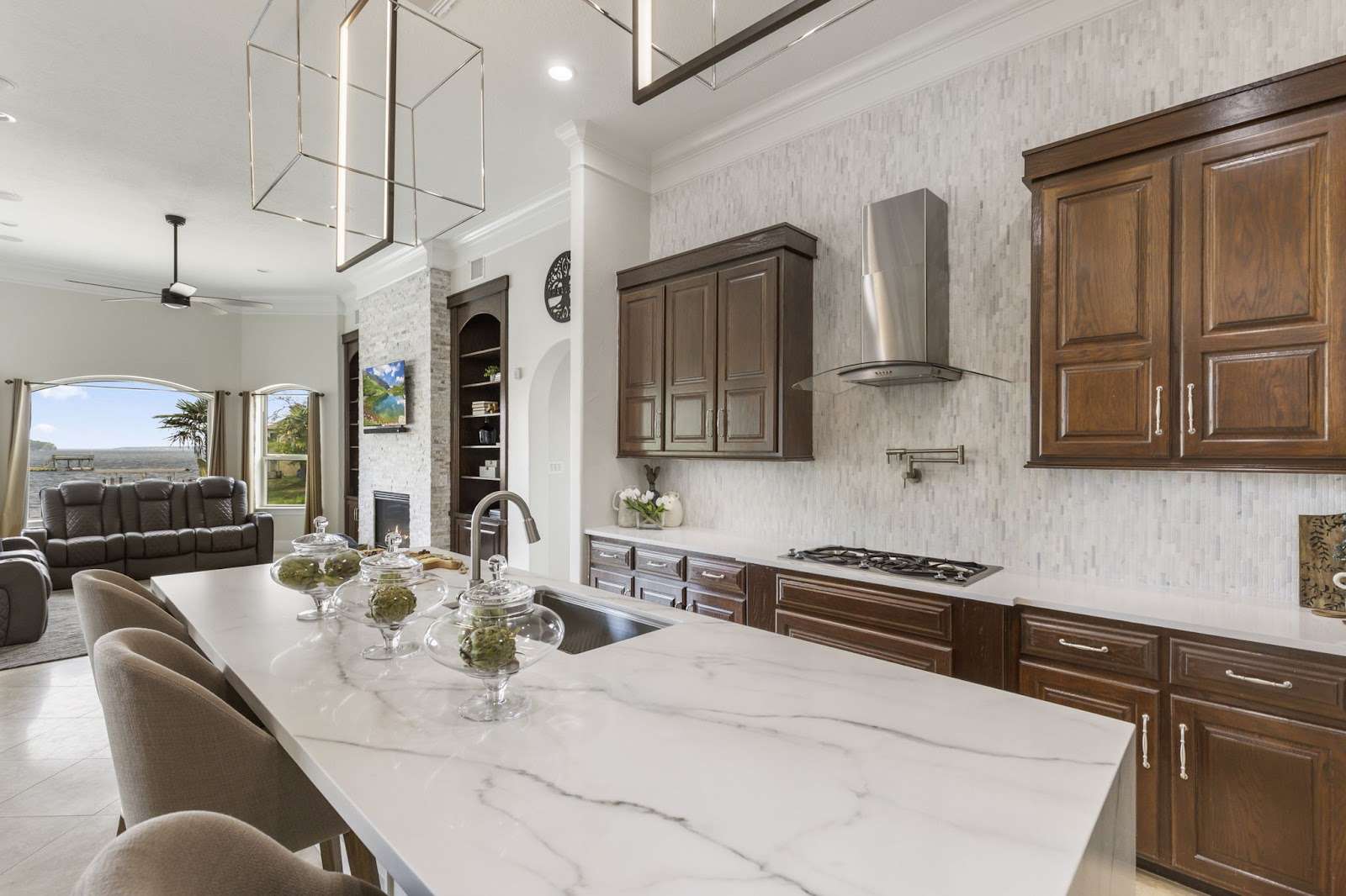
wood cabinets

Wood cabinets, whether light oak, rich cherry, or deep walnut, pair beautifully with earthy tones such as sage green, mushroom gray, or sandy beige. For a modern touch, deep blues and jewel tones offer a striking contrast while maintaining a cohesive look. The key is to highlight the natural beauty of the wood grain while ensuring the space remains balanced and visually appealing.

Dark Cabinets: Creating Contrast and Depth
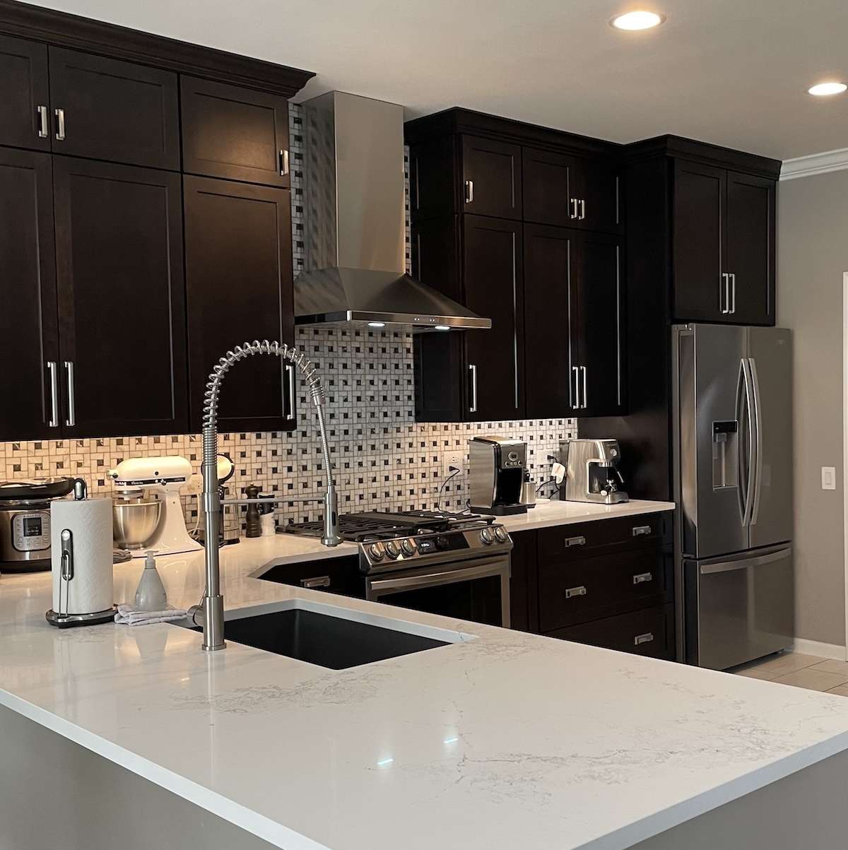
dark kitchen cabinets

Dark cabinetry in shades like espresso, charcoal, or black lends a sophisticated and luxurious feel to a kitchen. To prevent the space from feeling too dark, balance it with light wall colors such as warm white, greige, or pale blue. If you want a hint of warmth, dusty rose, taupe, or muted mustard can add a touch of personality without overwhelming the space. Pairing light countertops like white quartz or marble enhances contrast and keeps the kitchen from feeling closed in. See how color contrast can transform your space.

Coordinating Paint with Countertops: The Finishing Touch

Your countertops act as a bridge between your cabinets and walls, bringing the entire color palette together. If you have white or light marble countertops, choose soft greens, powder blues, or classic grays for a cohesive and elegant look. Warm granite or butcher block countertops pair best with earthy shades like terracotta, taupe, or olive green, while dark quartz or black countertops shine against warm whites, misty blues, or soft blush tones. Find colors that go well with different materials.

Bringing It All Together

Coordinating kitchen paint colors with cabinets and countertops isn’t just about aesthetics—it’s about crafting a space that feels intentional, inviting, and uniquely yours. Whether you prefer a bold contrast or a subtle and seamless flow, the right color choices will make all the difference.

Not sure where to start? We’re here to help! At Design on a Dime Interiors, we specialize in creating beautiful, well-balanced spaces that reflect your style. Book a consultation today!

Kitchen Paint Colors for Texas Lighting Conditions
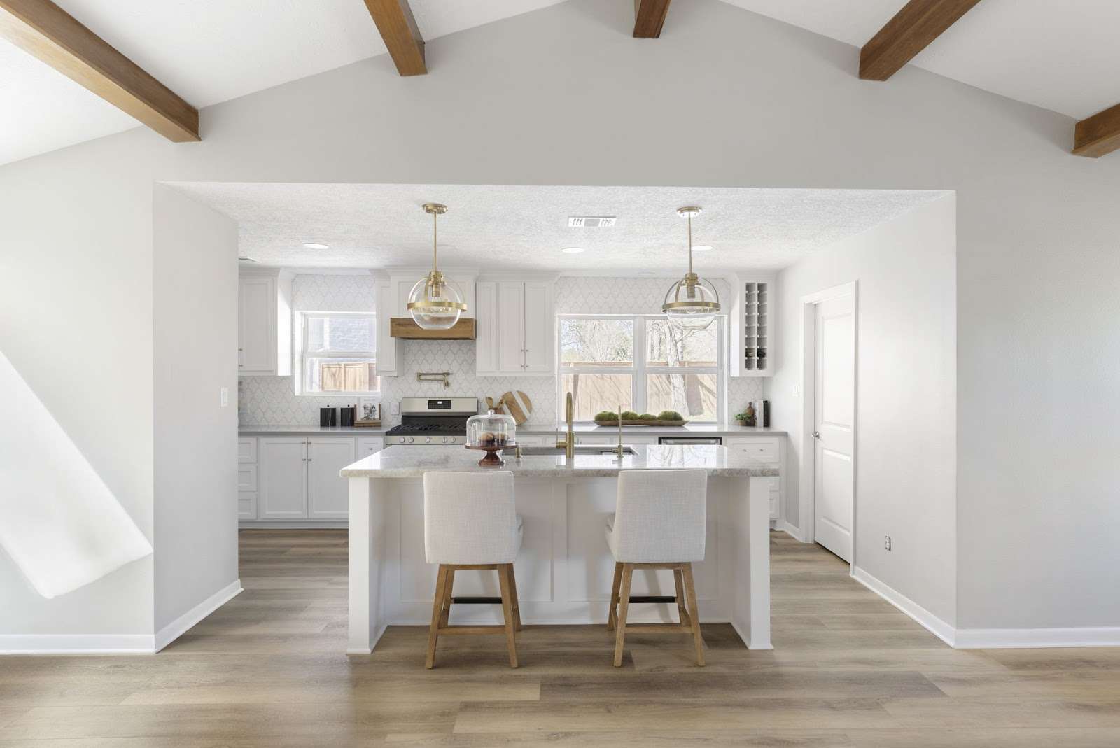
Kitchen Paint Colors for Texas

Texas kitchens get plenty of sunlight and shifting tones throughout the day, making paint color selection crucial. The right shade ensures your kitchen looks inviting and balanced from morning to evening.

North-Facing Kitchens: Add Warmth

North-facing spaces get cool, indirect light, which can make colors appear darker. Opt for soft whites, buttery yellows, terracotta, or warm beiges to brighten the space. Avoid cool grays and blues, which may feel too cold.

South-Facing Kitchens: Soften the Brightness

With consistent sunlight all day, colors can feel more intense. Muted greens, cool blues, and soft taupes help balance the warmth. Avoid bright whites or deep reds, which can feel overwhelming in strong sunlight.

East & West-Facing Kitchens: Adjust for Shifting Light

  • East-facing kitchens get soft morning light but cool shadows later. Warm grays, creamy whites, and blush pinks keep it inviting.
  • West-facing kitchens receive golden evening light, making earthy tones like terracotta, deep greens, or charcoal gray ideal. Avoid bright yellows or oranges, which can feel overpowering.

Why Lighting Matters for Kitchen Remodels

Lighting impacts how colors look throughout the day. Whether you’re painting or remodeling, getting the right shade makes all the difference. 

At Design on a Dime Interiors, we create kitchens that shine in every light. Explore our kitchen remodeling services today!

Paint Finishes & Their Impact on Kitchen Walls
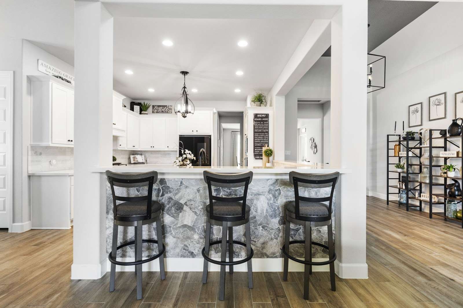
Paint Finishes for Kitchen Walls

Let’s talk paint finishes—because the right one makes your kitchen look fabulous and last for years. Whether you want sleek and modern or warm and cozy, picking the right finish is key!

Matte: Soft, But High Maintenance

Matte paints give a modern, velvety touch, but they show everything. If your kitchen sees lots of action (hello, kids and pets!), matte might not be your best bet. Best for ceilings or low-traffic areas.

Eggshell & Satin: The Sweet Spot

Need balance? Eggshell is elegant and easy to clean, while satin handles moisture like a champ—perfect for kitchens, especially in humid Texas.

Semi-Gloss: Tough & Kitchen-Approved

For wipeable, grease-resistant walls, semi-gloss is your best friend. It’s ideal for cabinets, trim, and backsplashes, keeping your kitchen fresh with minimal effort.

High-Gloss: Bold & Reflective

Want some drama? High-gloss adds shine, but beware—it shows every imperfection. Great for accents, not full walls.

Best Finishes for Texas Kitchens

In humid Houston, satin and semi-gloss hold up best, resisting grease and moisture. A good-quality, washable paint saves time on cleaning, too!

Choosing the Right Finish for Your Kitchen

The right finish makes all the difference—whether you want matte elegance or semi-gloss durability. Need expert advice? We got you! At Design on a Dime Interiors, we help Texas homeowners find the perfect fit. Let’s make your kitchen shine!

DIY vs. Hiring a Professional for Kitchen Painting
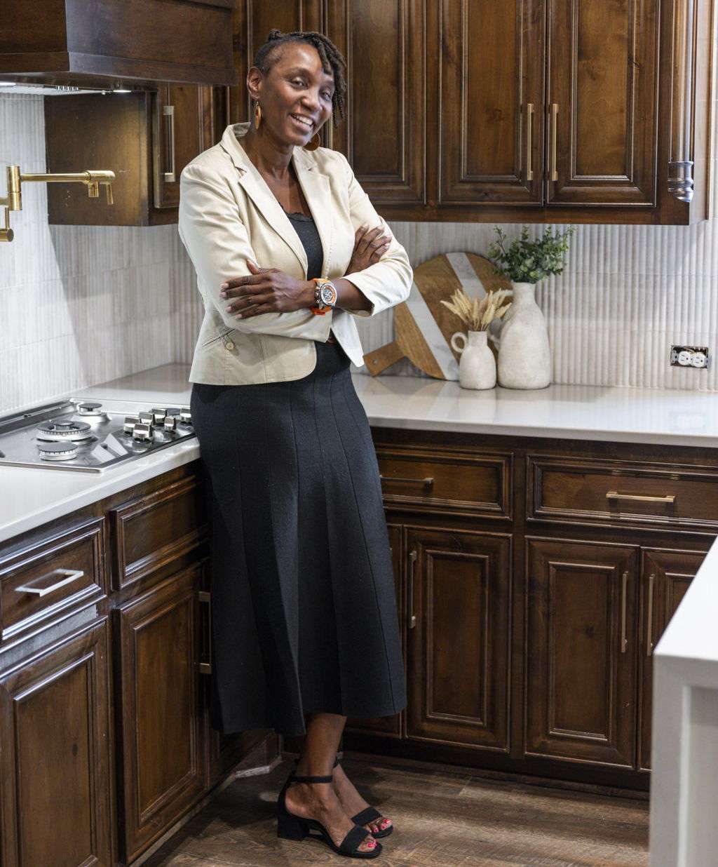
Hiring a Professional for Kitchen Painting

Painting a kitchen seems simple, but getting it right takes skill. A DIY project saves money, but hiring a pro guarantees a smooth, long-lasting finish. Which is best for you? Let’s break it down.

DIY Kitchen Painting: Pros & Cons

DIY is budget-friendly and lets you work at your own pace. But it requires proper prep, including cleaning, taping, and priming. Mistakes—like uneven coats and streaks—can lead to costly fixes. A DIY job works best for small spaces with minimal obstacles.

Why a Professional is Worth It

A pro delivers flawless results, proper surface prep, and quick turnaround. They know the best paints for high-moisture areas and handle tricky spaces like cabinets and trim. Plus, no cleanup stress for you!

Which One is Right for You?

If your kitchen is small and simple, DIY could work. But for cabinets, large spaces, or a premium finish, hiring a pro ensures a stunning, long-lasting result.

Let the Experts Help!

Need a flawless kitchen makeover? Design on a Dime Interiors has you covered. Book a consultation today!

Sustainable & Eco-Friendly Kitchen Paint Options

Want a kitchen refresh that’s stylish and eco-friendly? Traditional paints release harmful VOCs, but today’s options let you upgrade without impacting air quality. Here’s how to choose better.

Low-VOC & Zero-VOC Paints

Low-VOC and zero-VOC paints reduce toxins and are ideal for humid Texas homes. Brands like Benjamin Moore Natura, Sherwin-Williams Harmony, and Behr Premium Plus offer durable, eco-friendly options.

Natural & Recycled Paints

For a greener choice, ECOS Paints and Green Planet Paints use clay, chalk, and plant-based ingredients. If affordability is key, Amazon Paints and Recolor Paints offer recycled paints with great coverage.

Durable, Washable Finishes

Eco-friendly paints should also last longer. Choose satin or semi-gloss finishes to resist moisture and stains in busy kitchens. Find the best finishes here.

Best Choices for Texas Homes

Texas heat and humidity demand washable, fade-resistant paints. Low-VOC and natural options improve indoor air quality while handling the elements. See the Texas Commission on Environmental Quality for more eco-friendly home tips.

Upgrade Your Kitchen Sustainably

Want an eco-conscious kitchen makeover? Design on a Dime Interiors specializes in beautiful, sustainable remodels. Book a consultation today!

Bringing It All Together: The Perfect Kitchen Paint Choice

Choosing the right kitchen paint color is more than just a design decision—it’s about creating a space that feels right for you. Whether you want light and airy, bold and dramatic, or eco-friendly and durable, the right color sets the mood, enhances functionality, and complements your home’s unique style.

From selecting the best shades for Texas lighting to matching your walls with cabinets and countertops, every detail plays a role in achieving a cohesive and inviting space. Finishes matter too, ensuring durability in high-traffic, high-moisture areas like the kitchen.

If you’re ready to transform your kitchen with the perfect paint, let the experts at Design on a Dime Interiors help. With personalized color consultations, expert remodeling services, and a keen eye for detail, we ensure your kitchen looks stunning and stays that way.

Let’s create a kitchen you’ll love for years to come. Schedule a consultation today!
Painting Design: Unleashing the Power of Color in Your Home in 2025

Renovation projects allow you to transform your space, making it larger and more modern with new furniture, tiles, windows, and decor. However, you don’t need to invest in big projects like that. 

Sometimes—a simple, fresh coat of paint is all you need!

Choosing the right paint color for your walls can completely change the atmosphere of your space. You can select various hues based on your preferences to make your area feel larger, cozier, brighter, or more calming.

Color choices can enhance your mood, create striking focal points, and bring more energy and enjoyment to your environment. Most importantly, they can increase the value of your property.

Let’s explore the popular color choices of 2025 and get some great ideas for a color makeover in your space!

Transform Your Space: The Must-Know Color Trends of 2025

color trend in 2025

Over time, painting has evolved from simple wall colors to sophisticated works representing your taste and artistic expression

Today, interior design trends embody personality and creativity through diverse color palettes, designs, and innovative techniques.

Some of the popular hues of 2025 are bold colors! 

You can create dynamic and personality-filled interiors using fiery red, plum purple, electric blue, or sunlit yellow. 

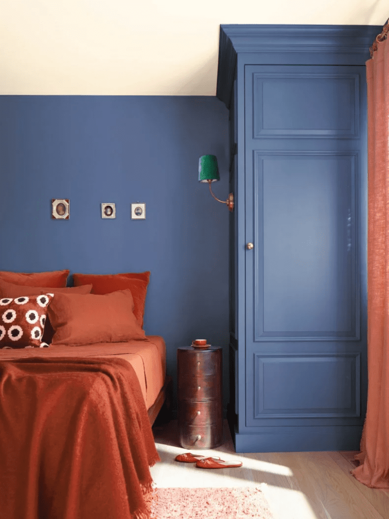
Burnt orange and rust colors can denote Texas sunsets and rustic charm.

Rustic Elegance creates a warm and inviting space by blending raw materials with classic elements. Reclaimed wood, natural stone, and leather upholstery are a few materials used to make the rustic elegance aesthetic of Texas culture.

Bold colors can give various effects, from adding warmth to adding drama, sophistication and a welcoming atmosphere. 

Here’s how different bold colors can impact your space:

  • Fiery Red: Adds warmth, creating a cozy and intimate living room.
  • Golden Yellow: Adds warmth, making a kitchen sunny and cheerful.
  • Deep Purple: Adds drama, turning a living room into a regal showpiece.
  • Emerald Green: Adds drama, creating an elegant dining room ambiance.
  • Navy Blue: Adds sophistication, making a home office feel professional.
  • Charcoal Gray: Adds sophistication, creating a sleek and elegant bedroom retreat.
  • Terracotta: Creates a welcoming atmosphere in an entryway, making guests feel at home.
  • Teal: Creates a welcoming atmosphere in a sunroom, perfect for relaxation.

For modern interiors, combine them with some neutral furniture or complementary colors for contrast or metallic accents for sophistication, and you will create balance and harmony for your living space.

Textured wall finishes are great for giving additional energy to your space. They create a visual interest and influence how light interacts with the room. 

Some of the most popular techniques are sponging, rag rolling, Venetian plaster, sand texture paint, and metallic glazes. 

Venetian plaster suits various climates with its durability and ability to regulate humidity. Conditions and blends seamlessly with Texas’s Mediterranean-inspired architecture. 

Each of these techniques has some unique effect on the space:

  • Sponging gives a soft, cloud-like texture with subtle variations of color, adding warmth and movement.
  • Rag rolling gives an effect of a layered—fabric-like texture on your walls—creating a rich, vintage feel.
  • Venetian plaster is smooth, yet textured, creating a natural-stone or marble look, bringing elegance and sophistication for luxe Texas spaces.
  • Sand texture gives a sandy appearance of your walls, giving it a raw and organic appeal.
  • Metallic glazes give a shimmering, light-reflective finish that enhances light and adds a modern luxurious feel. 

Its versatility allows for both traditional European stucco looks and contemporary aesthetics. 

This makes it a great fit alongside the state’s popular modern farmhouse and rustic elegance styles.

Design on a Dime Interiors can help you discover painting solutions that’ll make your home pop. 

Reach out and let’s “paint” your vision into reality!

Transform Your Home with These Essential Features & Styles

color trends in Texas

In addition to various contemporary colors that differ from traditional neutrals, accent walls are another amazing design tool for your walls.

Accent walls can dramatically transform your space, adding depth, contrast, and personality. 

They often serve as a striking backdrop for furniture and decor. 

Options for accent walls include bold paint colors, wallpaper, or natural materials like wood or stone

Homeowners in areas like Conroe, Texas, are embracing the comeback of accent walls by using shiplap, board and batten, bold color accents, and textured finishes, blending both traditional and contemporary design elements. 

The distinctive trend of accent walls, which made a big splash in the early 2000s, are back with a modern twist, allowing homeowners to make bold statements influenced by vibrant colors and textures.

Don’t just paint—create an ambiance! 

Our painting services deliver exceptional results with premium materials and expert techniques. Let’s craft a space that inspires!

Distinctive Design Elements

murals in home design

Some wall designs can elevate your space to a new level of art

Murals are an excellent choice, serving as captivating focal points and artistic centerpieces.

Murals transform walls into stunning storytelling canvases, adding a deeply personal touch to interiors. 

Texas boasts a vibrant mural scene, from the “Greetings From Austin” postcard at Roadhouse Relics to historical works in San Angelo and community-driven art in Houston. 

These murals offer a glimpse into Texas culture and history, with self-guided tours available in cities like Austin.

Depending on the room, they can evoke different feelings

For instance, a hand-painted mural of a serene forest in your bedroom can create a sense of calm. On the other hand, an abstract mural with geometric patterns in earthy or jewel tones can enliven a dining space. 

A large-scale depiction of a misty mountain range or a tropical rainforest can introduce depth and tranquility, making your living room feel more inviting and luxurious. 

Color blocking is another innovative artistic technique that uses contrasting or complementary colors to define spaces and create visually striking effects. 

This method highlights architectural features—delineates functional zones in open-plan layouts, or adds artistic flair to a living space

There are many ways to incorporate this unique technique and refresh and energize your space:

In the living room, for instance, consider a half-painted wall with the lower half in deep emerald green and the upper half in crisp white. This combination creates a modern contrast while maintaining a sense of balance. 

A two-tone wall featuring terracotta and warm cream for the dining room can evoke an earthy atmosphere, enhancing the mealtime experience. 

In your home office, a color-zoned area with an arched block of electric blue behind the desk can promote an energizing environment for work.

Pro tip: 

For Texas residents, choosing colors should reflect the state’s warm climate, cultural influences, and natural landscapes. Opt for earthy and warm neutrals, sunset-inspired hues, charcoal black, creamy beige, and natural wood tones. 

Dreaming of a home makeover?

Design on a Dime Interiors specializes in transformations that deliver maximum impact. Let’s see how we can “brush up” your space!

Illuminate Your World with Brilliance

bedroom lighting

Making a lighting choice for your interior plays a vital role in how paint colors are perceived. It influences the mood and depth of the space throughout the day. 

Understanding the relationship between light and color is essential, as it can guide you in making the best design choices for your home. 

Natural Light 

The sunlight changes throughout the day—influencing how we perceive colors. 

It’s important to consider the orientation of your home; north-facing rooms often make colors appear muted, while south-facing spaces tend to enhance warmth and brightness.

Colors can look different in sunlight. 

For example, a soft beige may appear warm in the morning but take on cooler undertones in the evening. 

A pale gray can feel fresh and airy in bright daylight yet may seem moody as the sun sets. A navy blue may look rich and bold during the day but can appear almost black at night. 

Choose colors carefully, as their appearance changes with the light!

Led Fixtures

living room lighting

Led lights are an excellent tool for controlling the ambiance of your room. 

Both color temperature and brightness influence the warmth, depth, and vibrancy of the space. 

There is a significant difference between warm and cool LEDs, so be careful when choosing one.

Here’s a breakdown of the key differences between warm and cool LED lighting in bullet points:

  • Color: Warm LEDs are reddish-yellow (lower Kelvin), cool LEDs are bluish-white (higher Kelvin).
  • Atmosphere: Warm creates cozy, cool creates bright/modern.
  • Use: Warm for bedrooms/living rooms, cool for kitchens/offices.
  • Brightness: Cool LEDs appear brighter.

Daylight LEDs mimic natural light—keeping colors true to their original tones or slightly cooler.  

Sometimes, they can emphasize undertones and make dark colors appear sharper. 

These lights are perfect for areas where color accuracy is crucial, such as studios and workspaces. 

Here’s something to bear in mind:

Switching to energy-efficient LED lighting can reduce electricity use in homes by 15%, saving the average household about $225 annually—according to the U.S. Department of Energy or IMARC group.

Design on a Dime Interiors believes everyone deserves a beautiful home!

Our expert team will guide you through options and creative techniques that will reflect your unique style and personality. 

Schedule a consultation today and let us help you “hue”-nlock the potential of your home!

Accent Lighting

Accent lighting is designed to highlight specific areas, objects, or architectural features in your home. It can draw attention to accent walls, murals, textured wall finishes, or bold contemporary colors.

Wall sconces provide soft, indirect lighting that emphasizes the texture and color of the walls. 

Picture lights are ideal for illuminating gallery walls or bookshelves. Recessed spotlights effectively highlight particular areas, such as a fireplace or an accent wall. 

Additionally, home lights can serve as a focal point—especially over dining tables or kitchen islands.

Integrating Smart Technology into Painting Design

AI-powered color-matching tools

One thing is crystal-clear!

If you’re struggling to make the right choice, don’t hesitate to seek help from AI!

Smart technology is revolutionizing our approach to painting and interior design. 

Various AI-powered color-matching tools can assist you in selecting the perfect colors and decorations for your space. https://remodelai.app/paint-ai/

Using augmented reality, smartphone apps like Sherwin-Williams Color Snap, Benjamin Moore Color Portfolio, or Dulux Visualizer enable you to preview different paint colors directly on your walls.

Additionally, tools like Adobe Color and Behr’s ColorSmart can generate complementary color palettes, ensuring a harmonious look with the right combinations.

Discover your unique style with Design on a Dime Interiors!

Our interior design pros will bring your dream home to life. Let us help you elevate your interiors with innovative design solutions and expert guidance!

Unleash the Power of Color in Your Home

Ready to say “hue-llo” to a refreshed and revitalized home? 

From statement accent walls to textured finishes that add depth and character, a splash of color and the right painting techniques can breathe new life into any space you are planning to renovate. 

Remember to consider your local climate, the way sunlight dances through your rooms, and the style of your beloved furniture when choosing your palette. 

Considering these elements will ensure a balanced and personalized look that truly reflects you.

Don’t let your design dreams remain just a painting in your mind! 

Contact Design on a Dime Interiors today for expert guidance to help you turn your vision into a vibrant reality. 

We’re here to help you “brush” up your space and create a home you’ll adore!

exterior design trends texas feature

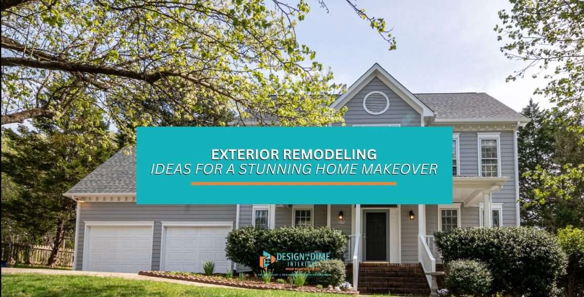
Exterior Remodeling Ideas for a Stunning Home Makeover

A beautifully remodeled exterior can significantly enhance your home’s curb appeal and increase its overall property value — making it a worthwhile investment for any homeowner

Whether you want to make minor updates or complete a transformation, our insights will guide you through the process. 

At Design On A Dime Interiors — we specialize in crafting elegant and functional exterior transformations tailored to your unique style and needs.

Let our team of experts assist you in elevating your home’s exterior to create a stunning first impression that reflects your personality and enhances your living experience.

Popular Exterior Design Trends for 2025

Popular exterior design trends in Houston, TX.

In the opening quarter of 2024, homeowners nationwide invested $463 billion in home improvement projects

This figure highlights the ongoing trend of property owners dedicating significant resources to enhancing and upgrading their living spaces.

As we move into 2025, the world of exterior design is evolving. 

It emphasizes personalization, sustainability, and indoor-outdoor living. 

Moreover, homeowners are increasingly looking for ways to enhance their properties — not just for aesthetic appeal — but also to boost value and functionality. 

With that in mind, here are some of the most popular exterior design trends for 2025.

Modern Farmhouse Style: A Timeless Classic with a Twist

Modern farmhouse exterior design for homeowners in Texas.

The modern farmhouse style continues to capture the hearts of homeowners, not just in Texas but across the country. 

This style blends rustic charm with contemporary elegance.

The contrast of deep black with crisp white in this design creates a striking visual that highlights architectural details and adds sophistication. 

Rustic accents, such as reclaimed wood beams or barn-style doors, further enhance this style — providing warmth and character. 

One thing’s for sure: This trend allows homeowners to enjoy the cozy feel of a traditional farmhouse while incorporating modern elements that keep the design fresh and relevant.

Reach out to us to add character and warmth to your living space! 

Contemporary Minimalism: Clean Lines and Neutral Tones

Minimalistic exterior design trends in Texas

Contemporary minimalism is another trend gaining traction in 2025. 

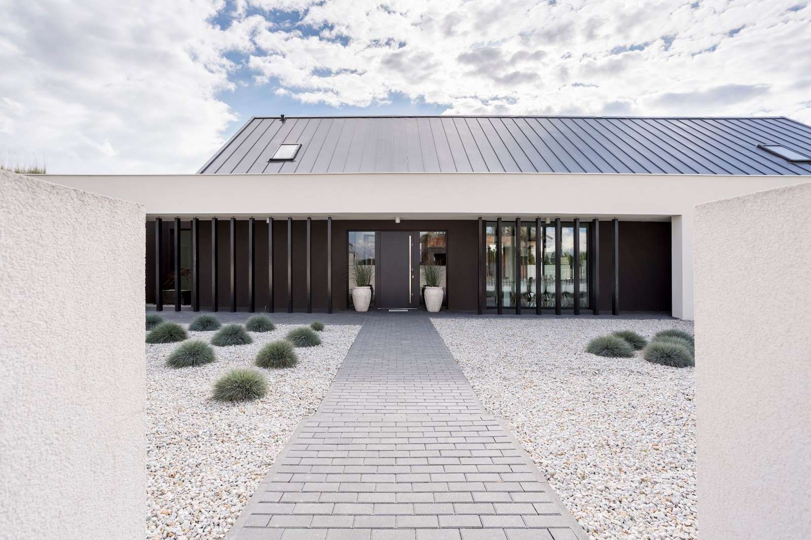
This design philosophy focuses on simplicity and functionality, and it is characterized by clean lines, neutral tones, and minimalist landscaping. 

Homeowners are opting for streamlined facades that eliminate unnecessary ornamentation, allowing the beauty of the materials to shine through. 

The use of muted color palettes—think soft grays, whites, and beiges—creates a serene environment that promotes relaxation. 

Additionally, minimalist landscaping with native plants and simple landscaping enhances the overall aesthetic without overwhelming the senses

Here’s a tip:

This trend is perfect for those who appreciate a clutter-free lifestyle and want their home to reflect that ethos.

Mixed Materials: Creating Visual Interest and Depth

Mixed materials for exterior design

One of the most exciting trends for 2025 is the use of mixed materials in exterior design

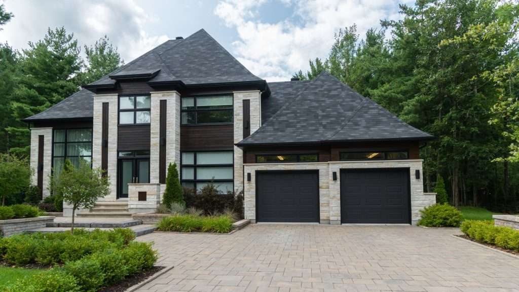
Homeowners in Conroe are increasingly combining wood, stone, and metal to create visually dynamic facades that stand out in their neighborhoods. 

For instance, pairing horizontal wood siding with vertical metal panels can add texture and depth to a home’s exterior while showcasing individual style. 

This trend enhances visual interest and allows for greater design creativity. 

Now, homeowners can achieve a unique look that reflects their personality while ensuring durability and low maintenance.

Don’t just “wing it”—let us help you design your perfect nest—inside out! 

Visit our interior design service page and let’s start your transformation together!

Expansive Windows: Blurring the Lines Between Indoor and Outdoor Spaces

A homeowner enjoying expansive windows

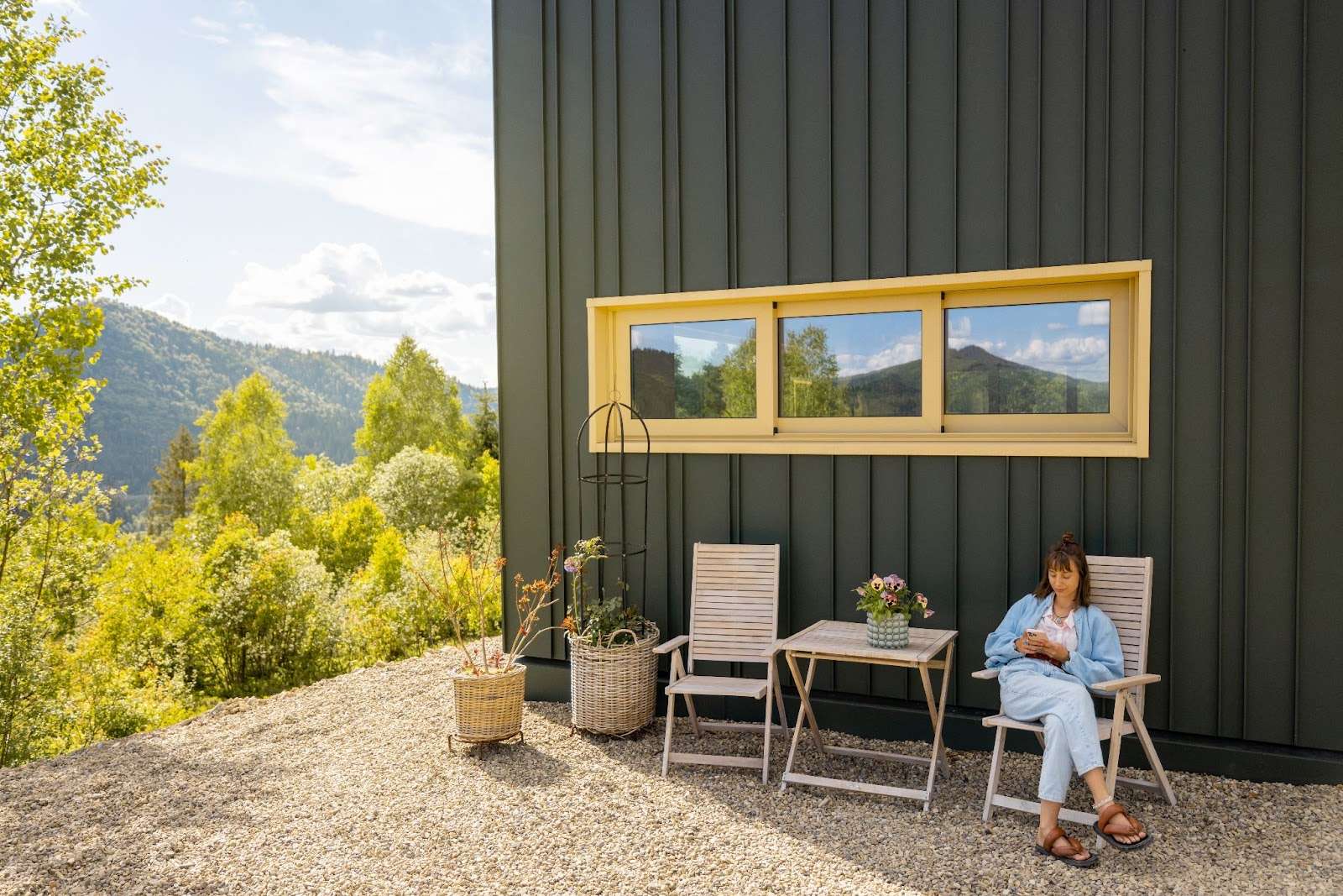
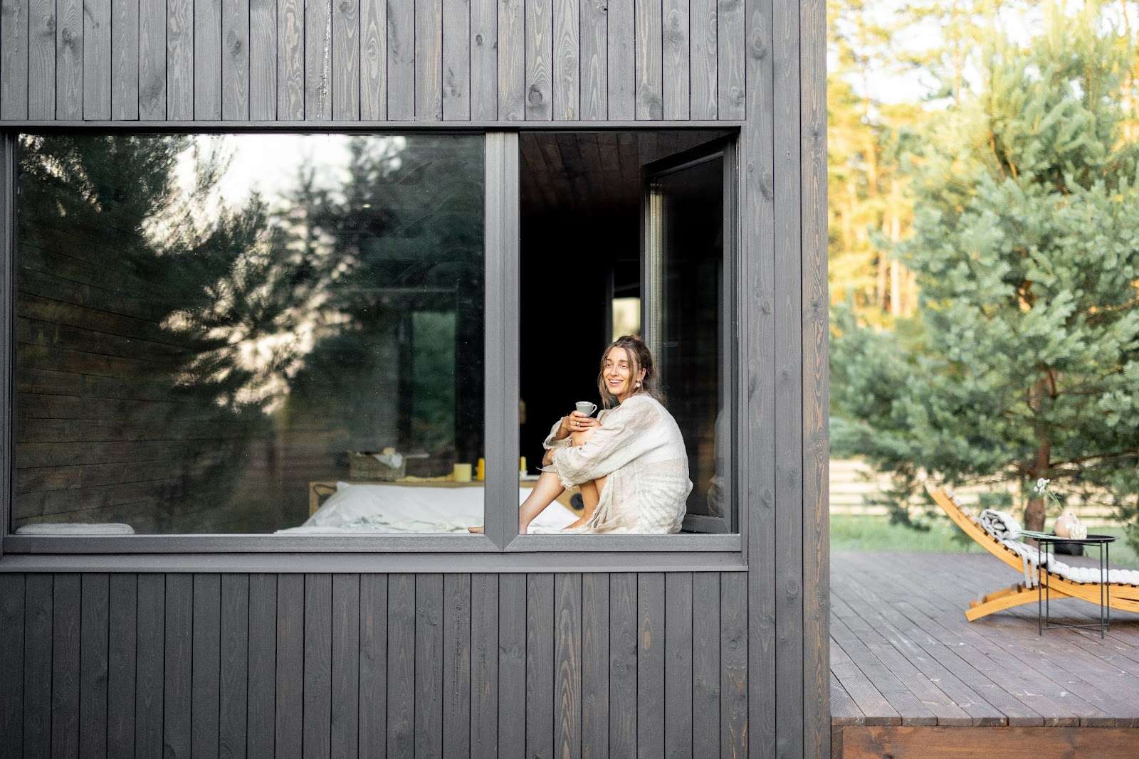
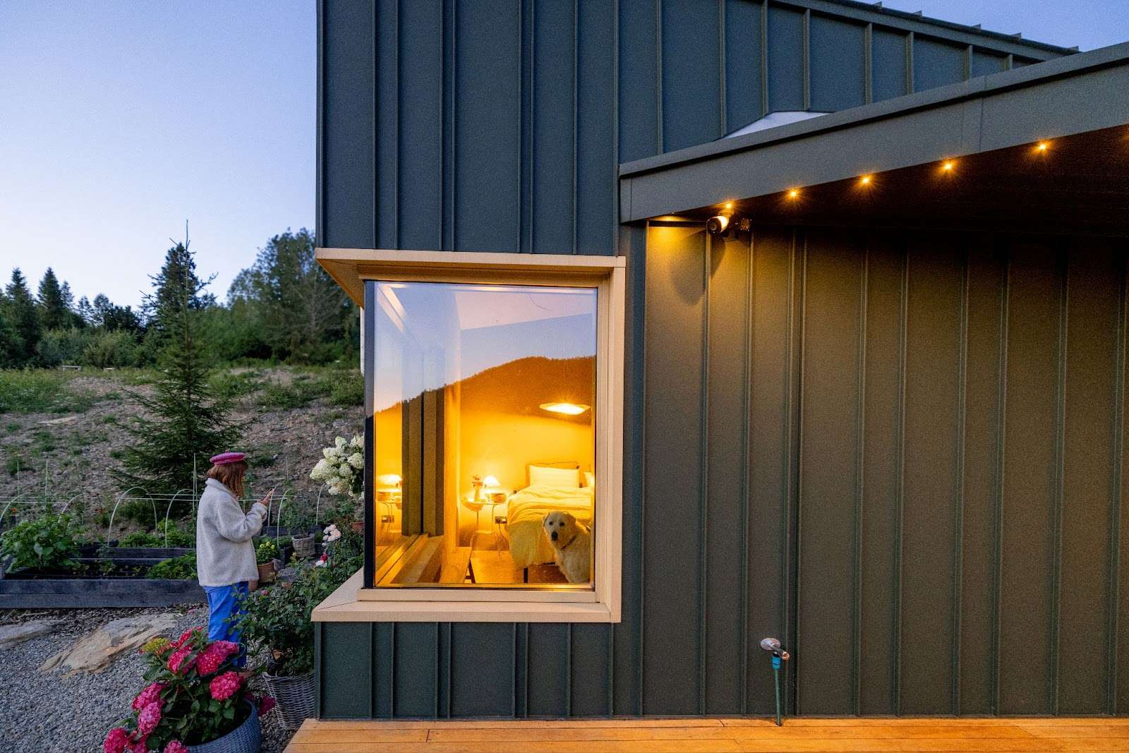
Expansive windows are becoming a hallmark of modern home design in 2025 as part of the growing trend towards indoor-outdoor living. 

Large windows allow natural light to flood interior spaces while providing unobstructed views of the outdoors. 

This approach creates a transition between indoor and outdoor areas — giving homes a moody vibe and making them feel more connected to their surroundings. 

Sliding glass doors leading to patios or decks further enhance this effect, creating inviting spaces for relaxation and entertainment. 

Homeowners increasingly prioritize energy-efficient window options that look great and contribute to sustainability efforts.

Ready for a change? Explore our lighting ideas and get started on your home makeover today! Reach out now, and let’s kick off this project together!

Sustainable and Eco-Friendly Materials: A Responsible Choice

Sustainable materials for exterior design

Sustainability is the #1 priority for homeowners’ minds in 2025. 

The demand for eco-friendly materials is rising as people become more aware of their environmental impact. 

Recycled materials such as reclaimed wood, stone, and metal are used more frequently in exterior designs. 

Additionally, homeowners opt for energy-efficient windows and doors that reduce energy consumption while enhancing comfort. 

This trend reflects a broader commitment to sustainability in home design — ultimately allowing homeowners to create beautiful spaces without compromising their values.

Bold Front Doors: Making a Statement

Stylish and bold front doors in Houston, TX.

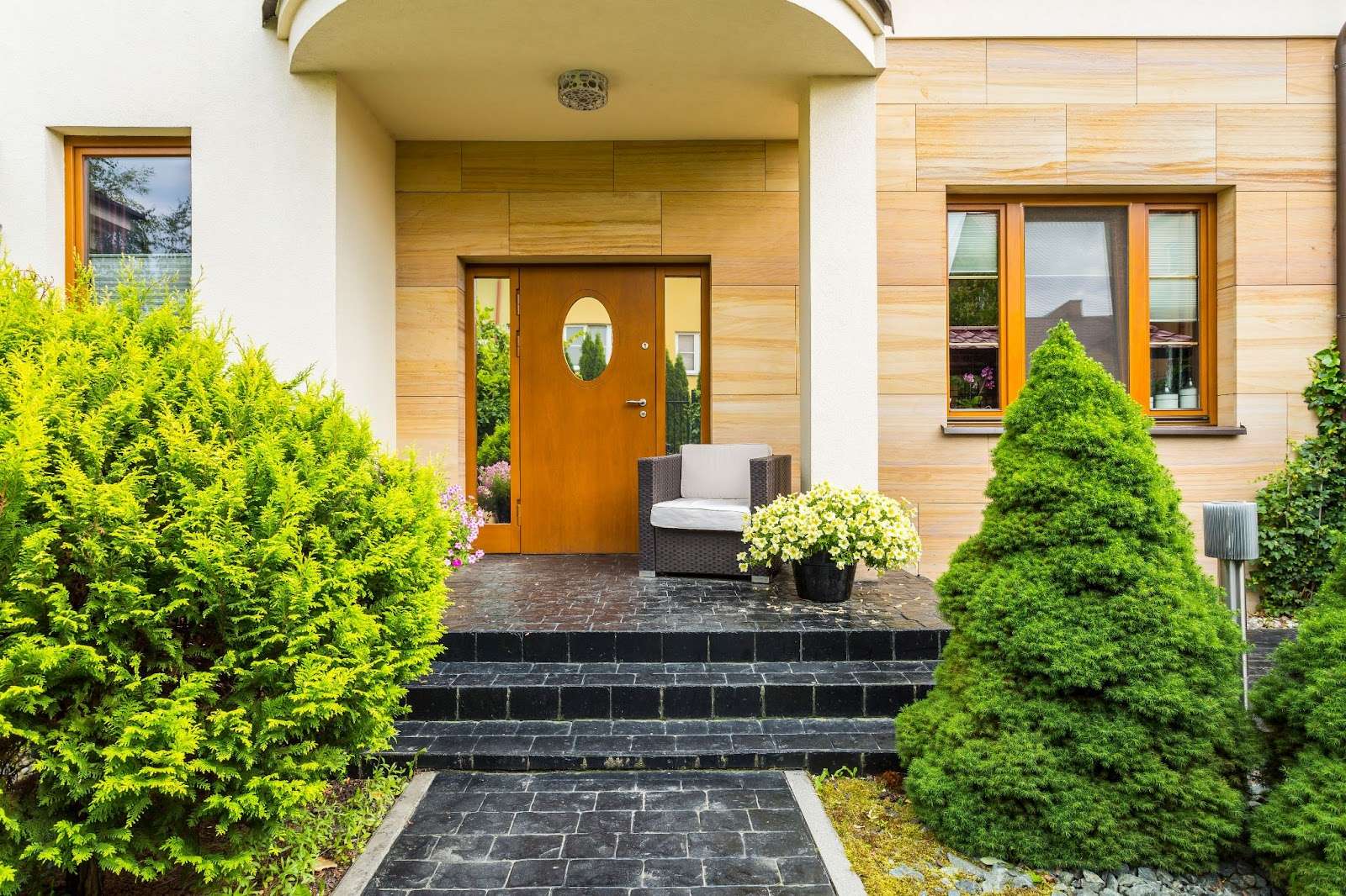
In 2025, front doors will be one of the smallest yet most impactful features of a home’s exterior. 

Homeowners are moving away from traditional white or wood doors in favor of bold colors like teal, yellow, or deep red. 

These vibrant hues provide an eye-catching contrast against darker exteriors or neutral palettes, adding personality and charm to entryways. 

Brightly colored doors enhance curb appeal and express individual style, making them an essential element in modern exterior design.

Transform your space with a fresh coat of paint that reflects your unique style! 

Our expert painting services will turn around your home, making it feel brand new again. 

Contact us today to schedule a consultation and bring your vision to life!

Outdoor Living Spaces: Where Comfort Meets Style

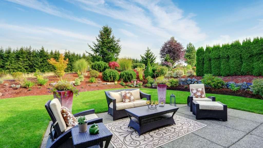
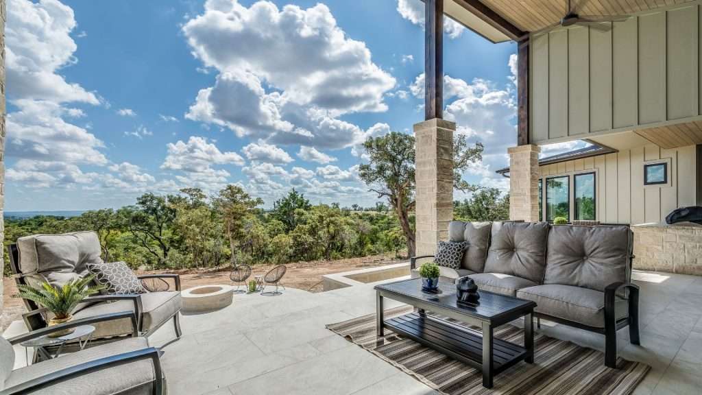
Creating outdoor living spaces is about expanding your usable area while enhancing your home’s aesthetic appeal. 

Imagine stepping out onto a beautifully designed deck or brand-new patio that just invites you to relax and entertain. 

With stylish outdoor entertainment areas, you can host summer barbecues, cozy family gatherings, or simply unwind with a good book.

After all, why limit your living space to indoors when you can enjoy the great outdoors? 

Let’s make your backyard the ultimate hangout spot!

Pergolas and Gazebos: Shade with Style

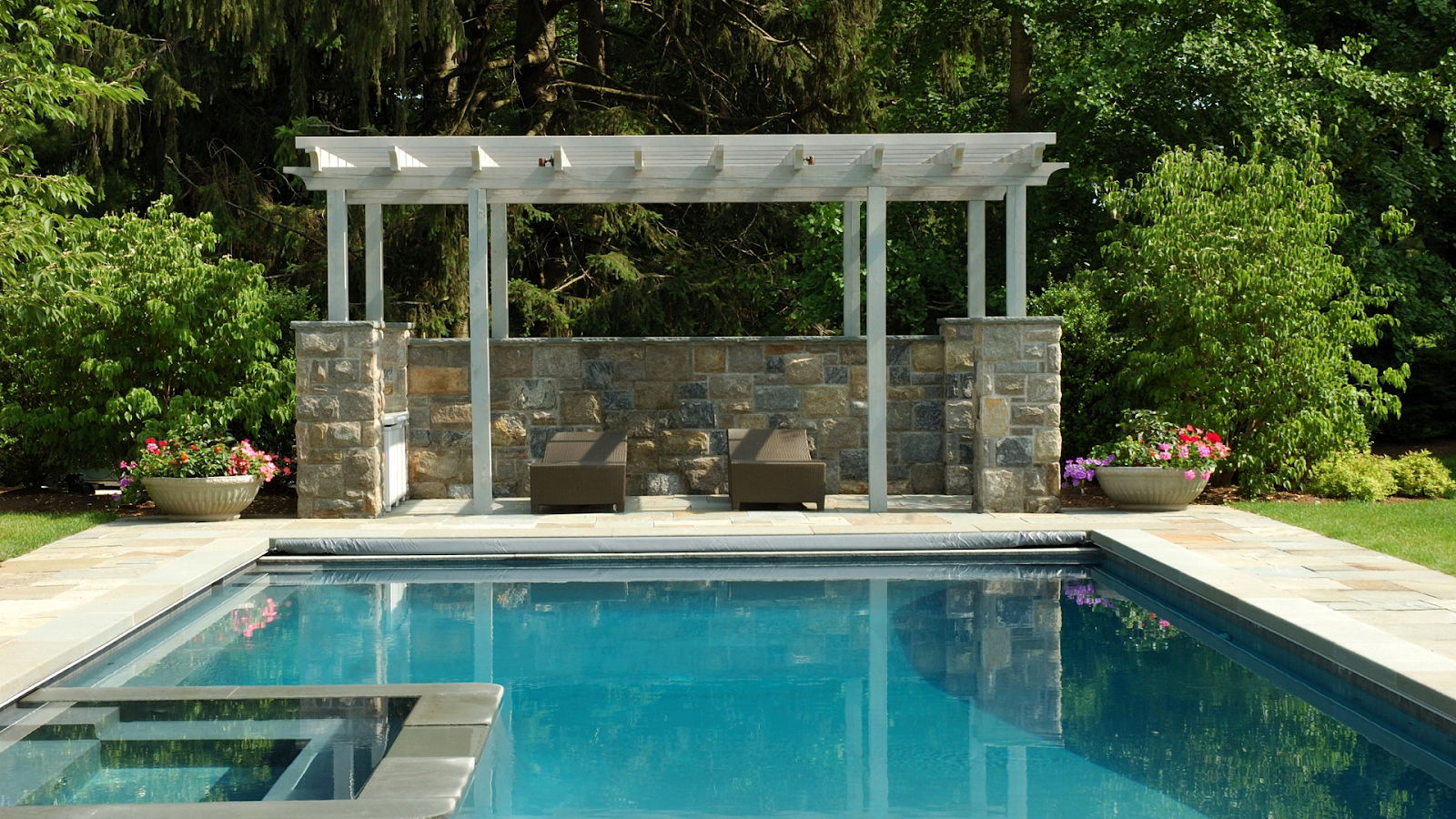
Pergolas and gazebos with a pool in backyard

Pergolas and gazebos are the perfect solution for adding a touch of elegance to your outdoor setting. 

Their origins can be traced back to Ancient Egypt, where they were used in gardens to provide shade and enhance outdoor spaces. 

The first known pergola is believed to have been built around 1400 B.C. for an Egyptian court official. 

This demonstrates its practical use and role as a symbol of status and elegance in garden design. 

These structures provide much-needed shade and create a cozy nook for relaxation or entertaining. 

With these stylish additions, you’ll be saying goodbye to sunburns and hello to shade-tastic moments!

Seamless Transitions: Bridging Indoor and Outdoor Bliss

blending indoors and outdoors together in a seamless design

One of the best ways to enhance your outdoor living experience is by designing spaces that effortlessly connect your indoor and outdoor areas. 

Think of it as creating a “flow” that allows you to move seamlessly from your kitchen to your patio without missing a beat. 

Large sliding glass doors, open-concept layouts, and cohesive decor can help blur the lines inside and out, making your home more expansive and inviting. 

With these thoughtful transitions, you’ll enjoy the best of both worlds—indoor comfort and outdoor charm!

Transform your home with Design On A Dime Interiors

Our expert remodeling services will help you create the perfect space tailored to your style and needs. 

Don’t wait—visit our remodeling service page today, and let’s bring your vision to life with a stunning remodel that reflects your unique taste!

Landscaping and Curb Appeal Enhancements: Spruce Up Your Space!

Landscaping boosts curb appeal and home value

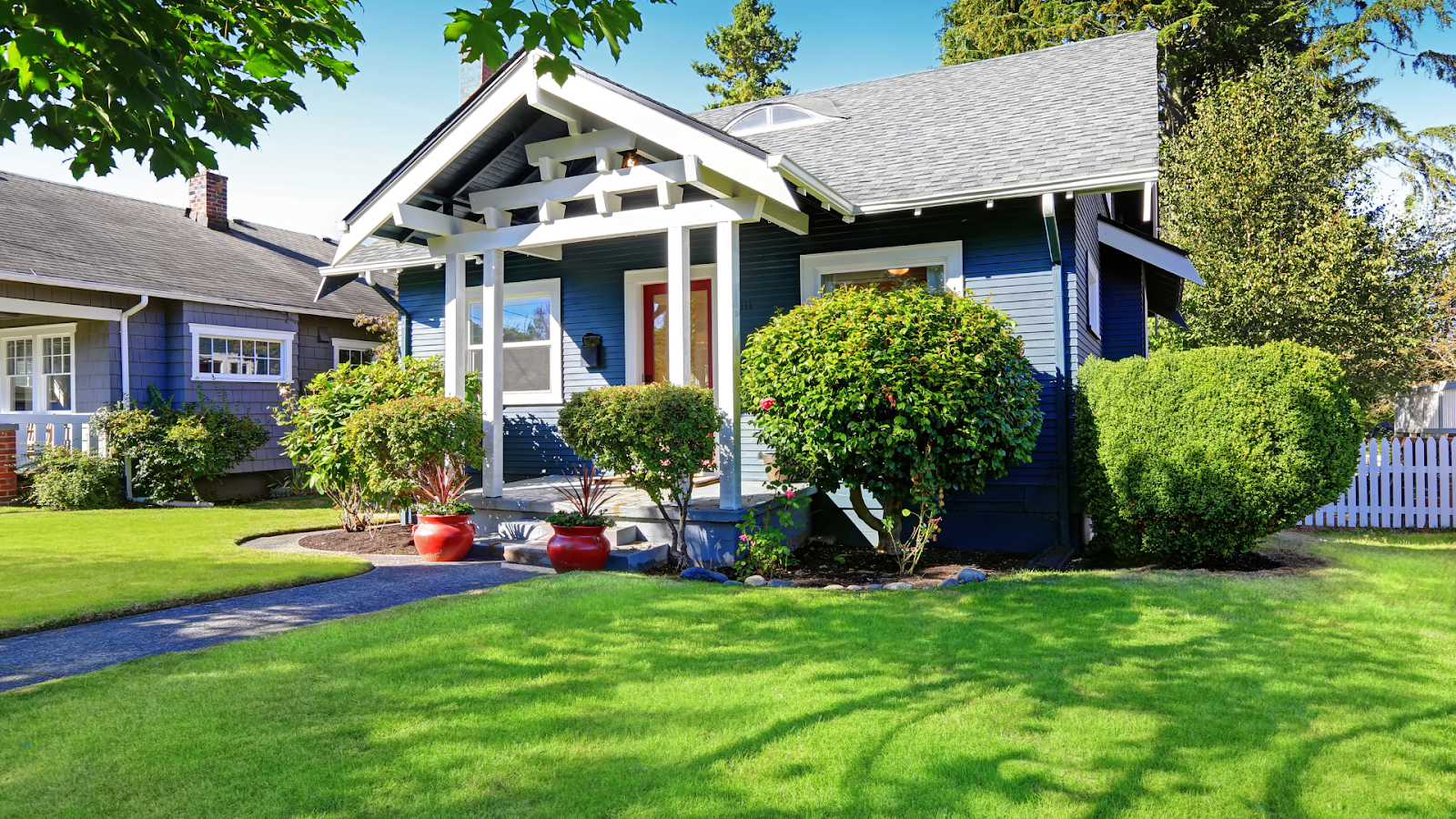
Regarding enhancing your home’s curb appeal, landscaping is key. 

A well-designed exterior boosts your property’s aesthetic and creates a welcoming atmosphere for guests. 

Let’s dig into some fantastic landscaping ideas to make your home look its best all year round!

Low-Maintenance Plants: Beauty Without the Fuss

Low maintenance plants for your backyard.

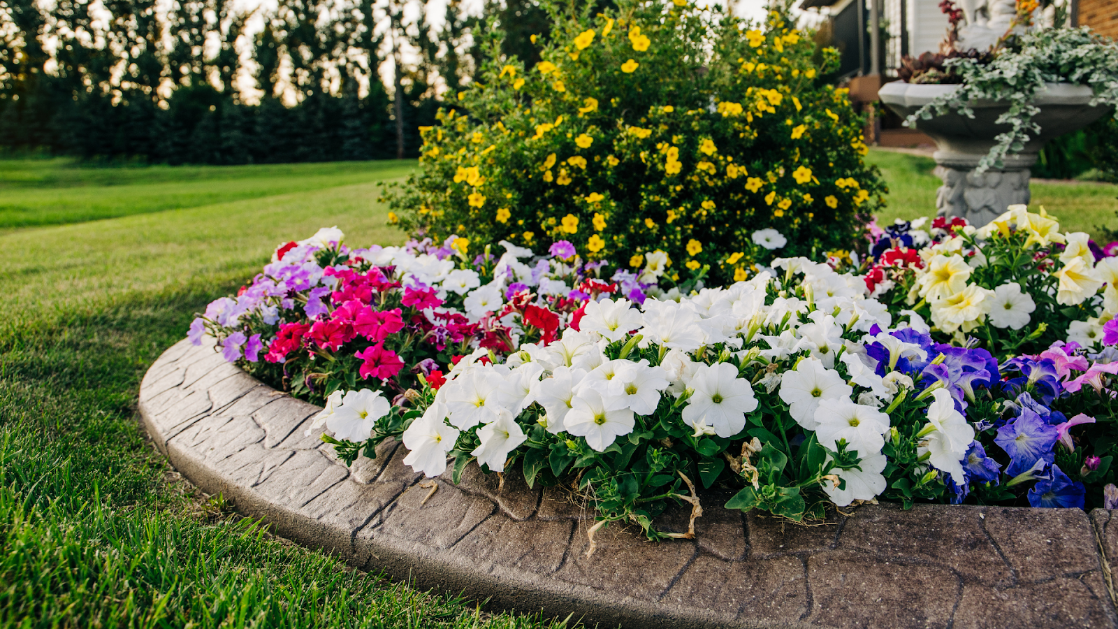
One of the most popular trends in landscaping today is using low-maintenance, drought-resistant plants

These green beauties are perfect for homeowners who want to enjoy a vibrant garden without constant upkeep. 

Think of them as the “set it and forget it” option for your outdoor space!

Plants like succulents, lavender, and ornamental grasses add color and texturе and thrive in various conditions, making them ideal for busy lifestyles. 

With these hardy plants, you can achieve year-round beauty without breaking a sweat—or your watering can

Plus, they’re great for the environment, helping to conserve water while still looking fabulous.

Hardscaping Elements: Structure with Style

Hardscaping elements for style in exterior design.

While plants are essential for any landscape, hardscaping elements can take your curb appeal to the next level. 

Incorporating retaining walls, pathways, and water features adds structure and sophistication to your outdoor space.

These elements enhance the visual appeal of your home and provide functional benefits, such as preventing soil erosion and improving drainage. 

So, why not “rock” your landscape with some stylish hardscaping? 

It’s a solid investment that pays off in both beauty and practicality!

Discover how Design on a Dime Interiors can elevate your home’s style—start your transformation now!

Seasonal Touches: Keep It Fresh and Fun

Seasonal touches for exterior design

Add seasonal touches to your landscaping to keep your curb appeal fresh throughout the year. 

These little updates can make a big difference, whether vibrant spring flowers or festive winter decorations!

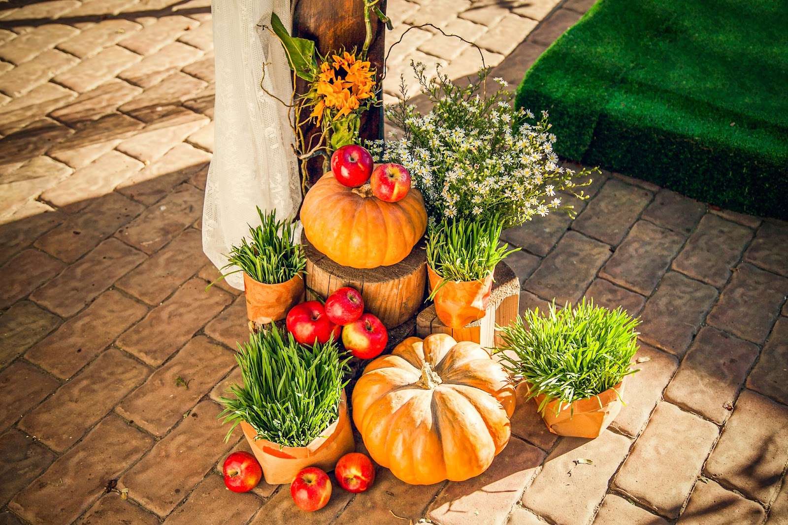
For example, you can create a cozy atmosphere in the fall with pumpkins that celebrate the season. 

In winter, string lights or decorative wreaths can add charm and warmth to your entrance. 

Regularly changing up your decor’ll keep your home looking lively and inviting—after all, variety is the spice of life!

The Finishing Touch: A Welcoming Entrance

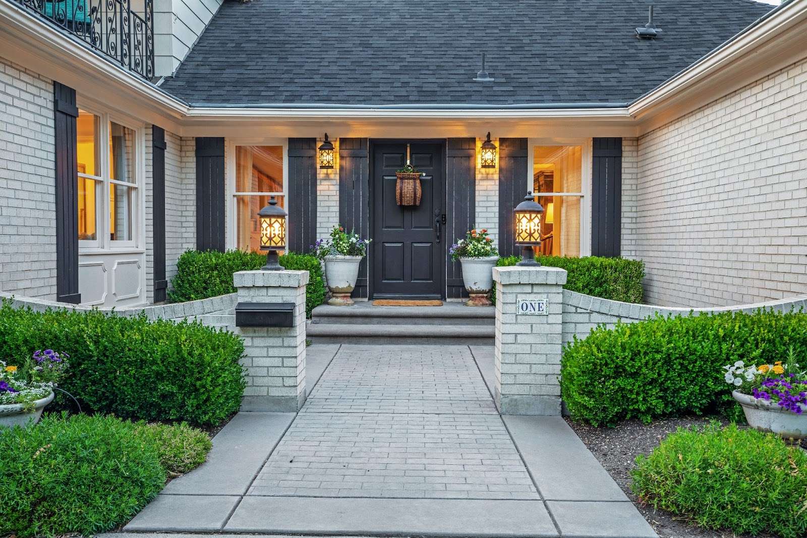
welcoming entrance makes a big impression

Don’t forget about the importance of a welcoming entrance! 

A well-maintained front door area can set the tone for your entire home. Consider adding planters with seasonal flowers flanking your door or updating your doormat to reflect your personality.

 A simple touch like this can make guests feel at home before stepping inside!

The Kings and Queens of Exterior Remodeling in 2025

Exterior remodeling has the potential to elevate your home’s aesthetics and functionality — creating a stunning first impression that reflects your style. 

The possibilities are endless, ranging from modern farmhouse designs to sustainable materials! 

So why not take the first step and transform your home today?

Design On A Dime Interiors combines style and quality to bring your vision to life. 
Don’t wait—schedule a consultation with us now, and let’s craft a custom exterior makeover that will have your neighbors green with envy!

2025 house painting ideas

2025 House Painting Ideas: Top Trends for Every Room

Sometimes, we don’t need to buy new furniture for a complete home makeover; only fresh paint on our walls can redefine our home’s aesthetic.

As we enter 2025, painting trends are evolving, and the right colors and techniques can bring new life to our space.

In this guide, we’ll explore the top painting ideas for every room in your home, including innovative painting techniques and some handy tips. 

With Design on A Dime Interiors by your side, you can achieve a stunning, neat look with our professional painting services.

Let’s get started!

Trending Color Palettes for 2025

Trending color palettes for 2025

In 2025, the emphasis is on versatile color palettes that reflect your home’s individuality. Many colors are available for home design, ranging from bold hues to timeless neutrals

And there’s something for everyone:

Grounded and inviting, earthy tones are set to make a big statement in 2025. The most popular shades include warm beiges, terracottas, and olive greens

These colors create a relaxing atmosphere and a natural ambiance, making them ideal for living rooms, bedrooms, and any space where harmony and tranquility are desired. 

Bold accents are a fantastic choice for those who appreciate a touch of drama. Deep blues, emerald greens, and rich purples add intensity and elegance to any room.

You can incorporate these colors in various ways—on statement walls, furniture, or trim—to achieve a striking visual effect.

Neutral classics like soft whites and grays with warm undertones will remain popular. 

They are versatile backdrops that can be combined with various furniture and home decor. They are very adaptable to changing trends and personal styles. 

You can use them in every room, but they are also a great option for open-concept spaces.

Wondering about the most popular color in 2024?

Benjamin Moore’s 2024 Color of the Year, Blue Nova, is a mesmerizing blue with a subtle touch of violet. This captivating shade draws inspiration from the longing for exploration, whether it’s around the world or beyond into the cosmos!

With so much choice, choosing the right color can be difficult, but that’s where Design on a Dime Interiors comes in. 

Our experts understand how to balance colors, natural lighting, and your personal style!

Scroll through our interior design service page and invite our experts into your humble home for a complete transformation in 2025!

Innovative Painting Techniques for 2025

Innovative painting techniques

Some exciting painting techniques and new color trends can completely renovate your home. 

One is color blocking, which involves creating “blocks” of colors from ceilings to floors. For the best effect, we recommend using bold, contrasting hues to define zones in open spaces or highlight architectural features.

Gradient walls are another popular option. Use ombre effects, starting light at the top and deepening toward the floor. 

Blend analogous colors for harmony, or go bold with complementary transitions.

Textured finishes like Venetian plaster can give your elegant, modern interiors a marble-like surface. 

Limewash is a good option for living rooms, with its chalky texture and eco-friendly vibe, perfect for rustic styles. 

Faux finishes can create the illusion of materials like concrete, wood, or metallic sheens to add character.

Room-Specific Painting Ideas

Calm colors for the bedroom

Unique colors can give a personal touch to every room in your home.

In the living room, you can use bold colors and textured finishes, such as Venetian plaster, to create a focal point behind your sofa or TV. 

Opt for electric blue, fiery red, or yellow for your kitchen for additional energy and vibrancy.

Bedrooms should provide private, relaxing time, and so do the colors. Use lavender, muted teal, or even soft plum purple to get that vibe. 

For the bathroom, choose rich hues like charcoal black, emerald green, or deep navy for visual interest, paint niches, shelves, or the back of a door in contrasting colors.

Exterior House Painting Trends

Exterior house painting

You can also refresh your home by changing how it looks outside. 

Various options are available, depending on your taste and the effect you want to achieve.

For those who love dark and moody exteriors, charcoal gray, navy blue, and black are the perfect choices. 

Gray is a versatile color that fits perfectly with minimalist landscapes and metallic trims. Navy blue offers a coastal vibe, especially paired with crisp white or soft beige accents. Black creates a bold, modern statement, perfect for modern home designs. It is usually softened with greenery and warm wooden finishes.

To give your home natural harmony, paint your humble nest in tones like taupe, creamy white, or sand, which blend perfectly with natural materials like stone and wood. 

Combine taupe with earthy hues like raw wood for a rustic Scandinavian-inspired look. Subtle two-tone schemes like a light facade with deeper neutral trim can add dimension while staying grounded. 

If you want to add a pop of color, use shades like fiery red, electric blue, or yellow for vibrant, energetic front doors. Pair them with complementary or contrasting colors to add your personal touch, and add cute little details like planters or mailboxes in matching tones.

Add a stroke of genius to your interiors! Design a stylish space with budget-friendly paint accents. Reach out now, and let’s get your project going!

Accent Walls and Ceilings

Painting an accent ceiling in the living room

Statement walls (as well as statement lighting) are a thing again, and there are various kinds, depending on the room and overall home aesthetics.

Bold colors like fiery red, electric blue, or plum purple can anchor the room and draw attention to key areas. 

Textured finishes can also add depth and tactile interest, and patterns like geometric stencils and vertical stripes can make a space bigger.

Your ceiling can be your “fifth wall if you use soft pastels like champagne gold, silver, and bronze to reflect sunlight and add some luxury. 

The ceiling color matches it with elements like trims or furnishings for a cohesive design.

Eco-Friendly Paint Options

Eco-friendly painting options for interior design

Eco-friendly and sustainable living are becoming increasingly popular. 

Eco-friendly paint options are a great way to create your perfect spaces while minimizing environmental impact. Various non-toxic and sustainable materials and paints can help reduce our ecological footprint. 

It’s good to know some tips before you start choosing your eco-friendly paints:

Look for certifications like Green Seal, Greenguard, or the EPA’s Safer Choice label. 

Research brands that openly share their commitment to sustainability and pair eco-friendly with techniques that will help you reduce paint usage.

A great option for painting your home eco-friendly is using low-VOC and Non-Toxic paints. VOCs (volatile organic compounds) are chemicals that are released into the air and can harm your health and the environment. 

Similar Read: 5 Inspiring & Simple House Painting Ideas for Every Room in Your Home

Low-VOC paints reduce these harmful emissions and are safer for kids, pets, and individuals with chronic diseases.

Natural pigments, derived from clay, minerals, and plant-based ingredients, are also a perfect green option for your home. They give earthy tones that mimic nature, add character and authenticity to spaces, and create an organic aesthetic.

Eco-conscious painting aligns with sustainable lifestyles. Choose recyclable or biodegradable packaging, use water-based formulations, and use products with LEED certifications (Leadership in Energy and Environmental Design).

Go green while you paint the town—or your home

Reach out to us for a fresh look that’s easy on the planet.

Combining Paint with Other Design Elements

Combining paint with other design elements in Conroe, TX

Creating your perfect home involves choosing the ideal colors and combining them with various design elements and accessories

Therefore, carefully integrate paint with textures, lighting, and decor.

Paint the primary walls and wallpaper the feature wall to add visual interest. 

For a balanced look in your room, choose patterns and colors that complement the accent wall.

Painted walls can be paired with natural or paneling wood for a warm and layered vibe. This time, use earthy colors like terracotta or olive green.

You can also combine painted walls with tiles for additional contrast or texture, especially in bathrooms and kitchens. Neutral wall paint can perfectly complement some interesting, bold, geometric patterns of the tiles. 

Try to get as much natural light as possible in your rooms, as bright spaces enhance vibrant colors like yellow or red. Warm lighting enriches deeper tones, making them look cozier, but cool lighting complements modern colors like electric blue or charcoal black.

Did you know we spend over 90% of our time indoors, often without the quality and quantity of light needed to thrive? Embracing natural light in your spaces can boost mood, enhance well-being, and create a healthier, more vibrant environment.

Remember to match painted walls with complementary furniture: earthy tones pair well with natural materials and warm woods, while bold colors can be accented with jewel-tone cushions or rugs.

Transform your home with a fresh coat of paint! Check out our painting services, and let our experts bring your vision to life.

Tips for Long-Lasting Painted Finishes

Durable long finishes for painting are important in Conroe, TX

To achieve durable painted finishes, it’s important to prepare properly.

Clean the walls to remove dirt and grease, ensuring proper paint adhesion. Use a primer to create a smooth and even base. Tinted primers work best with darker colors, reducing the number of paint coats.

It’s very important to pick the right paint for the room based on its purpose. For example, matte finishes hide imperfections and are suitable for bedrooms, ceilings, or any rooms not high in traffic. 

The satin finish is ideal for living spaces and bathrooms because it is moisture-resistant and easy to clean. 

Gloss and semi-gloss finishes are great for trims, doors, and high-traffic areas due to their durability.

To keep your walls clean, dust them regularly with a microfiber cloth. 

For stains, you can sometimes use a mild soap and water solution with a clean, soft sponge

For touch-ups, keep a small amount of paint for corrections to always have a fresh, clean, and modern home.

The Final Verdict On The Best Color Palettes in 2025

Painting is the easiest and most versatile way to renovate your home. By understanding lighting effects, color choices, contemporary techniques, and the combination of textures and paints, you can create visually stunning and long-lasting spaces.

If you’re ready to bring this vision to life, call Design on A Dime Interiors now!

 Whether considering a complete renovation, or a single accent wall, our team will provide you with the most professional advice and services. 

Contact us today to schedule a consultation and make your dreams of the perfect home come true!

black accent wall feature

The Allure Of Black Accent Walls In Interior: Transform Your Space With Bold and Timeless Ideas

Black accent walls are becoming increasingly popular in modern interior design — offering a unique blend of elegance and drama. 

These striking features can transform any space in your home, further adding depth and sophistication. 

This guide will explore how a black accent wall can enhance your home and provide style tips, practical advice, and inspiring ideas. 

So, if you’re considering incorporating this bold design element, Design On A Dime Interiors is here to help you bring your vision to life!

Why Choose a Black Accent Wall?

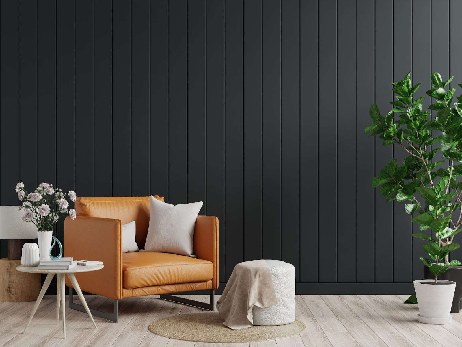
A black accent wall in interior design

A black accent wall adds depth, drama, and sophistication to any room — it captures the immediate attention of anyone who steps into your home!

This bold design choice can transform a mundane space into a stylish retreat or make an ideal backdrop for artwork or statement furniture. 

Also, let’s not forget that there is not only one shade of black you can opt for in your interior design.

Black’s versatility allows it to complement a wide range of color palettes, from soft neutrals to vibrant hues, enhancing the overall aesthetic of your home. 

For example, a black wall in living rooms can highlight architectural features or create a cozy atmosphere when paired with warm lighting. 

In bedrooms, on the other hand, it fosters intimacy and tranquility.

But that’s not all. 

Black accent walls can be particularly effective in home offices, inspiring creativity and focus

Whether you choose painted walls, textured finishes, or bold wallpaper patterns, an accent wall will elevate your interior design game and leave a lasting impression on anyone who enters your space.

Here’s a fun fact about accent walls:

It’s not a new trend that emerged recently. Black accent walls were popular during the 2000s.

Best Rooms for Black Accent Walls

Now that we’ve covered the 101 on black accent walls let’s turn our focus toward the rooms where this color can create a focal point:

Living Rooms

A black accent wall in the living room

Use a black wall to highlight statement furniture or a fireplace — creating a dramatic backdrop that enhances your decor.

Bold color choices paired with a black accent wall can elevate the overall aesthetic, making the space feel more sophisticated and inviting. 

When combined with warm neutrals or vibrant colors, a black accent wall can transform an ordinary living room into a stylish retreat that reflects one’s personality. 

Additionally, it is a perfect canvas for showcasing artwork or decorative elements, allowing them to stand out beautifully. 

Ready to take your space from flop to bop? 

Don’t just sit there—let’s get this project rolling! Contact Design On A Dime Interiors today. We promise to make your home so stunning that everyone will say, “Wow, that’s a wall of a difference!

Bedrooms

A black accent wall in the bedroom

A black accent wall can create a cozy and intimate atmosphere in your master bedroom.

It’s perfect for relaxation and unwinding after a long day at work!

This design choice adds depth and sets the stage for a retreat where you can escape the hustle and bustle of daily life. 

Incorporating dark room ideas, such as soft lighting and rich textiles, can enhance the warmth of the space, making it feel inviting and restful. 

Pairing a black wall with lighter bedding or colorful accents can achieve a striking balance that promotes tranquility. 

If you’re ready to transform your bedroom into a stylish sanctuary, visit our painting services page to learn how Design On A Dime Interiors can help bring your vision to life!

Home Offices

A black accent wall in a home office

Incorporating a black accent wall into your home office can transform the space from drab to fab, creating a dramatic yet sophisticated atmosphere. 

This bold choice adds depth and serves as a perfect backdrop for creativity and productivity. Let’s explore how to make this design decision work for you and sprinkle in some puns along the way!

A black accent wall is like a suit of armor for your home officeit protects against boredom while making a strong style statement.

It allows you to mix and match until your heart’s content. 

For instance, consider pairing it with warm neutrals like ivory or taupe; this combination can soften the starkness of black and create a cozy vibe that invites inspiration rather than intimidation.

Accessories for a Black Accent Wall

Accessories for black accent walls

You can create a stunning look with a black accent wall in your home office through thoughtful accessory choices and decor ideas. 

Here are some effective ways to enhance the aesthetic appeal of a black wall:

Artwork Showcase:

Consider a gallery-style arrangement with various frame styles to add an eclectic touch. This will draw the eye and inject personality into the space, making it more inviting and creative.

Floating Shelves:

Install floating shelves in lighter woods or painted white to create visual interest and functionality. These shelves can hold books, decorative items, or plants, providing storage and style. 

The contrast of the light shelves against the dark wall adds depth and dimension to your office.

Metallic Accents:

Incorporate metallic elements such as brass or copper fixtures, picture frames, or decorative objects. 

These shiny accents pop against the matte black surface, adding a touch of glamour and sophistication to your workspace.

The Final Verdict on Black Accent Walls

A black accent wall is the dark horse of interior design. It offers versatility and elegance that can elevate any room. 

Implementing these design tips and tricks lets you create an amazing focal point that truly stands out—whether in your living room, bedroom, or home office!

If you’re ready to plunge into the world of bold design and see how a black accent wall can transform your space, contact Design On A Dime Interiors today

Don’t let your vision fade into the background—paint it black, and let us bring it to life!

Exploring Paint Color Psychology

Exploring Paint Color Psychology: How Color Affects Your Room and Mood

Imagine being in a room filled with dark colors and cluttered with furniture

How would that make you feel? 

Color choice is very important in interior design. It can transform a space, making it look modern and expensive. 

Colors affect our mood, creating a calming, soothing, or energizing environment, but they can also make us uncomfortable.

According to science, every color can somehow affect our mood and energy levels

To understand this, we’ve made a list of colors known for evoking special feelings so you can make the perfect environment according to your color choices.

Understanding Color Psychology: The Science Behind Colors

paint color picker

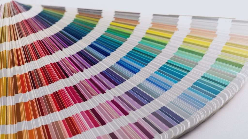
Colors can stimulate our brain in many ways, affecting our mood and energy levels. Color psychology explores how these hues evoke specific emotions and reactions and is a powerful tool in interior design.

For someone seeking painting inspiration, understanding the impact of each paint color can help them create rooms that exude vibrancy, calmness, and elegance—completely tailored to their expectations. 

For example, warm colors like red, yellow, and orange can increase our energy, which makes them perfect for your home office or gym. 

Cooler tones like blue and green can improve our concentration and give us a relaxed feeling. These are the best choices for living rooms and bedrooms.

Cultural influences and beliefs can also shape our color choices. Here are some fun facts about color psychology that you might not have known.

  • Purple dye was once a rare, expensive luxury.
  • Women and men see colors differently.
  • Certain colors can cause psychological changes.
  • Many ancient languages didn’t have the word for the color blue.
  • Colors mean different things around the world.

It’s important to acknowledge that our personal experiences can shape our color choices: you can connect some memory and environment with a specific color and avoid or use it.

The Warm Spectrum: Inviting Colors That Energize

Warm colors for your interior design

Warm colors like red, yellow, and orange are known for lifting our energy and creating inviting, inspirational spaces. 

These hues also evoke positivity and are perfect for the rooms where social activities are encouraged. 

Many people choose these colors for the home office because they give additional energy and inspiration. In the kitchen or dining room, warm colors can stimulate our appetite, adding a lively vibe, perfect for wine evenings and social gatherings.

Each of these colors has its character: red can evoke excitement, orange can create a feeling of a friendly environment, and yellow can give a sense of optimism and inspiration. 

Use these colors thoughtfully to enhance your mood and connection with your loved ones. 

Are you ready to transform your home and paint it in a color that reflects your personality and character? Stroll down our painting service page to see how we do the job! 

The Cool Spectrum: Calming Colors That Soothe

cool color spectrum in interior design

Cool tones like blue, green, and purple are known for their calming qualities, making them ideal choices for spaces planned for relaxation.

Blue is usually associated with water and open skies, which give us a sense of tranquility. 

That’s why it’s the perfect choice for bedrooms and bathrooms. 

Green can give you this special feeling if you love nature and spending time outdoors. It is inspired by nature and fosters balance and peace, giving us a restful environment.  

Soft shades of purple, like lavender, can also give us a natural feeling with a touch of luxury and calm. 

Use these colors for bedrooms or your living room to create a calming, relaxing atmosphere and a peaceful heaven.

Neutrals: Balancing Act for Versatile Spaces

If you visit spa centers, you must have noticed they are painted in neutral tones, such as soft whites, warm beiges, or earthy taupes. 

Neutral tones promote relaxation by creating a visually calm environment. This is especially beneficial if you want to transform one of your rooms into a luxurious wellness retreat.

White, gray, and beige tones are staples in interior design. 

They reduce stress levels and are a great foundation for combining with other colors and natural materials like wood, stone, and metal. 

As a backdrop, neutrals enhance bolder accents without overwhelming our senses. 

They are the perfect choice for adding depth and dimension to a room. 

For their calming and restful qualities, neutrals are used in bedrooms, but they can also be a great foundation in a living room, allowing you to introduce bold artwork, furniture, or accent pieces.

Color Combinations: Creating Harmony and Contrast

color combinations - contrast on interior design

Color combinations can also greatly impact a room’s mood and energy. 

There are several options to do it:

You can use complementary colors like blue and orange for an exciting and energetic feel. It can create a dynamic contrast and make your space vibrant and positive.

Use analogous color schemes like blue, green, and teal for rooms where you want to relax, read, and enjoy your free time. 

Monochromatic schemes can produce a soothing and sophisticated feel, and softer tones with contrasting accents can highlight focal points, making the space perfect for social gatherings and work.

Ready to create a space your dream space? Schedule a consultation with Design on a Dime Interiors today!  
Personal Preferences: The Impact of Individual Color Choices

We can discuss popular choices and some rules that explain how some colors impact our emotions and well-being. 

But still, the choice is yours, depending on your preferences, experiences, and tastes.

Colors impact each person differently; for instance, blue may evoke feelings of tranquility and ease to some, but for others, it could feel cold and less inviting. 

When choosing hues, consider how some colors make you feel. Think about your experiences, memories, and environment, where specific colors have brought you energy or comfort. 

Tips for Choosing the Right Color for Your Space

choosing a color for the space with Melody Stevens

Let’s imagine that you have chosen the right color for your room

It’s time to test paint samples on the walls and observe how shades look in different lighting throughout the day. 

Be careful since artificial and natural light can alter color’s intensity, so start your painting during the day.

Another thing to consider is the room’s purpose. Yellow and terracotta are the best for a cozy and energizing feel, ideal for kitchens and living rooms. Cool tones like blues and greens promote relaxation, so consider them for your bedrooms and bathrooms.

Light shades can make your room feel bigger and airy, and darker shades can make your room smaller, giving you more intimacy. You can try virtual tools from Sherwin-Williams or Benjamin Moore to visualize colors in your space and make the perfect choice for your ideal home! 

Transform your home into the space you’ve always wanted! Visit our remodeling page to see some of our best work—maybe you’ll find something that resonates with your style.

Final Comments: Transforming Your Space Through Color

Colors have a deep impact on our mood and behavior. By thoughtfully selecting colors, we can create spaces that promote relaxation, warmth, comfort, hard work, and energy.

Paint is a powerful tool for shaping our mood, inspiration, and activities. So, carefully plan your room’s color to transform your living space into a true reflection of yourself!

If you’re ready to skyrocket your new painting project, contact us—we’ll be happy to help! 

house painting ideas

5 Inspiring & Simple House Painting Ideas for Every Room in Your Home

Ever feel like your home could use a little spark? A quick transformation that doesn’t involve knocking down walls or emptying your savings?

Experience the magic of wall paint!

With the right paint colors and creativity, you can completely revamp your living spaces and make them feel like new again. Whether you’re craving eye-catching accent walls or subtle shades that soothe the senses, there’s a color scheme just waiting to bring your vision to life.

The possibilities are endless!

From adding a pop of color to brighten dull corners to choosing shades that flow from room to room. 

So, get ready to explore vibrant color schemes and soothing tones. It’s time to transform your home into the stylish haven you’ve always dreamed of!

1. Living Room with Cozy Neutrals for a Warm Welcome

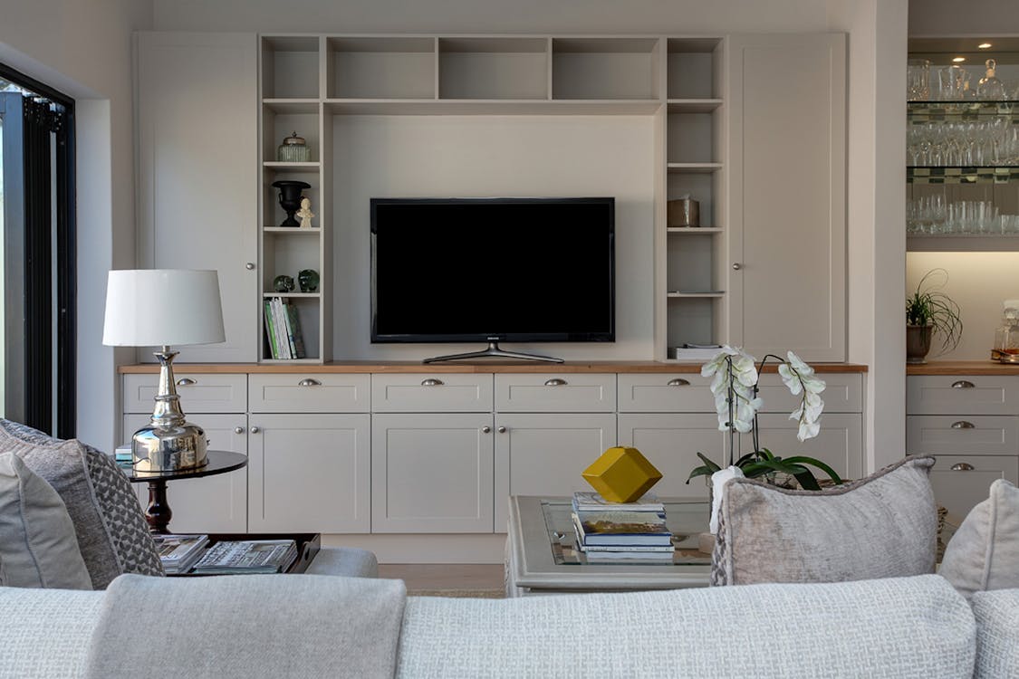
Living room design

When it comes to creating a warm, inviting living room that’s perfect for both binge-watching and dinner parties, neutral tones like soft greys and beiges are the unsung heroes of room design. These versatile paint colors set the stage for relaxation while keeping things classy.

A painted wall in a gentle grey or beige can make your space feel open and airy, creating the perfect backdrop for everything from casual hangouts to elegant gatherings.

But don’t stop at just the walls!

A fresh coat on the ceiling or woodwork in a complementary hue will tie the entire room together, adding depth and dimension to your cozy setup.

Pair those soft neutrals with statement pieces like a gallery wall, and you have a living room worthy of a magazine spread.

Feeling adventurous? Add a hint of texture with wallpaper on a feature wall for that extra touch of style—just make sure it complements your paint colors!

These subtle shades aren’t just for living rooms, either.

They can work wonders in your dining room paint choices, creating a seamless flow between spaces while still offering enough contrast to define each area. Whether you’re entertaining guests or kicking back after a long day, a neutral palette gives your living space the calming vibe it needs to feel like home—without the fuss.

If you don’t feel like it or are unsure of how the colors would fit your specific situation and preferences – check out our painting services, and don’t hesitate to reach out for a consultation – we’d love to help!

2. Kitchen With Bold Colors for a Vibrant Cooking Space

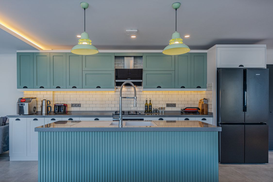
Modern kitchen with bold colors

If one room in your home deserves a little extra spice, it’s the kitchen—and no, we’re not just talking about your secret chili recipe.

Bold, energetic colors like reds, yellows, and blues can turn your kitchen from bland to bam in no time. It’s all about using paint to inject some personality into the heart of your home, creating a space that feels dynamic, lively, and ready for your next culinary masterpiece (or, you know, reheating leftovers).

According to color psychology for homes, red stimulates appetite, which is perfect for a kitchen, right?

Yellow brings a sunny, happy vibe, while blue adds a cool, calming contrast. And don’t worry, you don’t have to go full-on rainbow to make these colors work. Try color blocking or using a bold wall color for an accent wall while keeping the rest of your palette more subdued.

Interior designers love these vibrant hues for a good reason. 

They instantly brighten the space and make even the simplest kitchens feel like you’re in the best house on the block.

Want to take it up a notch? Consider some fun wall painting ideas, like geometric patterns or color gradients, to give your kitchen an extra dose of style. You can even explore paint effects, like sponging or stenciling, to add texture and flair.

The main point is, don’t be afraid to experiment with bold, energetic colors. They’ll make your kitchen the most exciting room in the house—just try not to burn your toast while admiring your new wall color!

While you’re at it, reach out to us and let’s start cooking!

3. Bedroom Featuring Calm and Relaxing Shades for Better Sleep

elegant bedroom with woodwork

Your bedroom should be your sanctuary—a place where relaxation takes center stage and sleep comes as easy as counting sheep (no need to hit snooze on that idea!).

Calming shades like pastels and soft blues are the perfect color choices to create a serene, peaceful vibe that helps you drift off into dreamland.

Looking for interior painting ideas that don’t scream “too bright to sleep”? Opt for bedroom paint colors that soothe the senses without drawing attention. Think soft blues that mimic the sky at dusk or gentle pastels that feel like a whisper on your walls and ceiling.

And hey, if you’re feeling daring, you can even add a touch of a dark color in small doses, like a navy accent wall. It’ll ground the space while keeping things calm and cozy.

A fresh coat of paint can do wonders for your sleep quality, making your bedroom feel like a whole new world of tranquility.

Add color strategically to enhance the atmosphere: lighter shades open up the space, while darker ones keep things intimate. If you’re still stumped for paint color ideas, remember this simple tip: the softer the shade, the easier it is on the eyes (and your busy mind).

Want to take the plunge into calming bliss? Now’s the perfect time to explore ideas to add color to your bedroom and finally wake up feeling refreshed.

Ready to snooze in style?

Scroll through our bedroom gallery.

4. Bathroom With Spa-Inspired Hues for a Fresh Look

 Bathroom remodel process

Who says your bathroom can’t feel like a luxury spa?

With the right color on the walls, you can create a serene, resort-like vibe without booking a five-star vacation. Fresh spa-inspired hues like crisp whites, soft light greens, or breezy aqua tones instantly give your bathroom that clean, calming feel we all dream of after a long day.

Want to create a unique oasis?

Try painting the walls and ceiling the same color—it’ll give your bathroom a cozy, cocoon-like effect. The power of paint doesn’t stop there. Choosing a paint that complements your fixtures and tiles can create a cohesive look that feels oh-so-stylish.

For a pop of tranquility, paint the wall behind your mirror or tub in a fresh aqua, giving the space a subtle focal point. And don’t forget those ceiling ideas—a splash of the same spa color up top can tie the whole room together for a polished, new look.

Ready to soak in more inspo? Paint can help transform your bathroom from basic to beautiful, so dive in and see more ideas to bring your spa day home!

Contact us today, and let’s create a luxury spa in no time!

5. Home Office With Productive and Energizing Palettes

Home office space

Want to turn your home office into a productivity powerhouse? 

The color of the walls might be the secret weapon you need! Energizing hues like yellows and greens are known for being color-enhancing productivity champs, so why not let them inspire your daily grind?

When you paint your walls with these lively shades, you’ll notice a boost in focus and creativity. Need some paint ideas to create a fresh, energized space for working?

Go for a cheerful yellow that brightens the room without being overpowering or a soft green that brings a calm, nature-inspired vibe. Both are great options for making your room feel energized and focused.

Want to go bolder?

Try painting them the same color from floor to ceiling for an immersive workspace that oozes energy. Pair your chosen shade with a color that complements the furniture or other features in your home office for a balanced, cohesive look.

So whether you’re using the color wheel to select the best paint or simply looking to refresh your space, remember: a splash of the right color can transform your office into a focus zone. Ready to get started? Your productivity upgrade is just a paint can away!
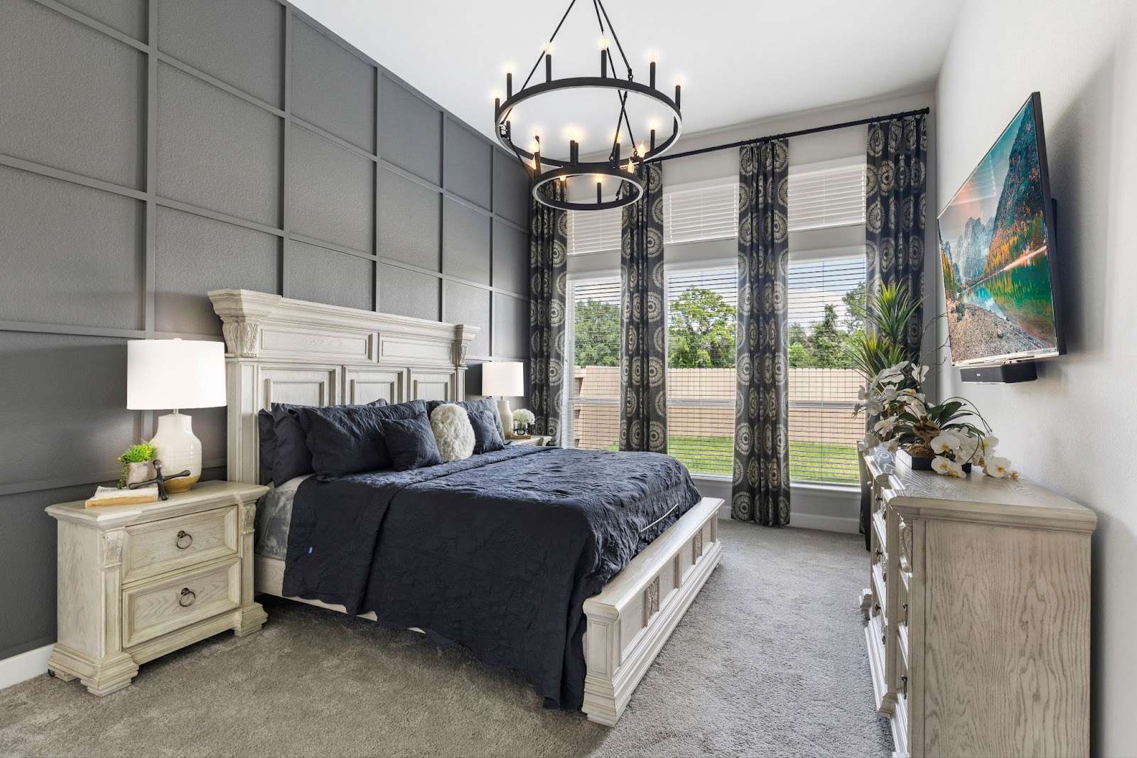
Best Interior Painting Ideas For Every Room

Choosing the right paint for each room is key to creating the perfect ambiance and functionality in your home. Whether you want to set a relaxing mood in the bedroom or a vibrant energy in the kitchen, the right color palette makes all the difference.

Be creative with paint. Use bold shades as a focal point in the room or add visual interest with contrasting hues and paint finishes. From matte to glossy, finishes can dramatically enhance your design.

Ready to refresh your space? Transform your home with Design on a Dime Interiors!

How Much Does It Cost To Paint A House in 2024? Paint Cost Insights

Planning to paint your house in 2024?

Get ready for a roller coaster ride of costs—literally and figuratively. From skyrocketing paint prices to evolving trends, the world of home makeovers has never been so colorful or so expensive.

But hey, it’s all part of the fun, right?

So, how much does it cost to paint a house these days?

Well, that’s the million-dollar (okay, maybe not quite that much) question! Whether you’re tackling an interior refresh or giving your home’s exterior a fresh coat of personality, the cost to paint in 2024 comes down to several factors: paint quality, labor, prep work, and, of course, the square footage you’re looking to transform.

Spoiler alert: the bigger the space, the bigger the bill.

Forget about the days when a can of interior paint cost pocket change. With eco-friendly options and premium finishes dominating the market, the simple question of “How much does it cost to paint?” is a bit like asking how long a piece of painter’s tape is. 

Basically, it all depends on your choices. Add in labor, tools, and those inevitable last-minute touch-ups, and you’ll realize that even a small project can come with a hefty price tag.

But don’t let that scare you off!

Understanding the cost of paint is the first step in making savvy choices. With the right approach, you’ll quickly implement your next home transformation.

So, let’s get rollin’!

Key Factors Affecting Interior Paint Costs

A couple sitting and painting a room

When painting your home, the total cost is never just about the color you pick. Sure, that perfect shade of “Cozy Cream” might set the mood, but what sets your budget is a cocktail of factors that can leave your wallet feeling a little… brushed off. So, what makes a painting project cost as much as it does? Let’s dip our brushes into the details!

The Size of the Canvas: Square Footage

First things first, size always matters.

When it comes to interior house painting or deciding to paint the exterior, the bigger your home, the bigger your budget needs to be.

The average cost per square foot varies, but generally speaking, interiors cost between $1.50 and $4 per square foot, and exteriors cost between $1 and $3.

Want to paint a room that feels like a palace? Be prepared to dish out more dough. Smaller projects, like a bathroom or cozy bedroom, naturally come with a smaller price tag, but if you’re dreaming of slapping a new coat across your 4,000-square-foot mansion, the total cost may leave you needing a seat.

Professional Painter Costs

Unless you plan to pull a weekend warrior move and do it all yourself, you’ll be paying for the pros.

Hiring professional painters means adding labor costs to the equation, and believe me, these guys know how to charge by the brush stroke. Most painters charge per hour, and rates can vary from $25 to $100 depending on your location and the job’s complexity.

Got cathedral ceilings or fancy trims? 

Those extra flourishes will also fluff up the total cost. And while you’re paying these fine folks, remember that quality painters are worth the investment. They’ll get those coats of paint on smoothly, without any roller marks you’ll regret looking at every day.

We take our painting services seriously, so while you’re at it, scroll through our page

Paint Quality That Affects The Cost

Speaking of coats of paint, don’t forget that not all paint is created equal.

Sure, you could grab the cheapest gallon of paint, but you might be trading savings for subpar results. High-quality paint offers better coverage, durability, and longevity, meaning fewer coats of paint and less frequent touch-ups.

On average, a gallon of interior paint may cost anywhere from $20 for basic paint to $100 or more for premium finishes. Exterior paint is often even more costly due to its need to withstand the elements. Keep that in mind when calculating the total cost of your painting project; a few extra bucks up front could save you from a headache down the road.

Location, Location, Location: How Much Does It Cost To Paint?

Where you live plays a huge role in determining the average cost to paint your home. Big cities like New York or Los Angeles? Expect prices that’ll make your head spin faster than a paint mixer.

Rural areas may offer lower labor rates, but you might have a harder time finding top-tier painters, which could affect the quality of your painting project. Don’t forget that even the cost of a gallon of paint can vary depending on your region due to local supplier pricing and demand.

At the end of the day, the total cost of a painting job is like a puzzle with every piece.

Size, labor, paint quality, and region of a picture. Want to save a little cash? Consider tackling smaller rooms or accent walls yourself and leaving the tough stuff to the pros.

No matter how you slice it, understanding these key factors will help you get a clearer picture of how much it will cost to paint your home. This way, you can make your painting dreams come true without breaking the bank—or spilling the paint!

Oh, and don’t forget to contact us about your paint color idea. We have some great ideas up our sleeve!

Interior vs. Exterior House Painting Costs

Professional painting for a house

When it comes to painting a house, the battle of interior vs. exterior house painting is as classic as black and white (or should I say “Pewter Gray” and “Crisp White”).

Though both involve slapping on a fresh coat of paint, the costs can vary more than expected.

Let’s start indoors, where cozy dining room colors and trendy wall paint ideas often set the scene.

How much does interior house painting cost? Well, for starters, trendy wall ideas inside a house are usually less expensive per square foot compared to the exterior house painting cost. However, don’t let that fool you.

Between moving furniture, covering floors, and taping off trim, the prep work indoors can be a time-sucking beast. The overall cost to paint the interior typically falls between $2 and $6 per square foot, depending on the complexity of the job.

And if you’re aiming for those chic dining room paint colors or trying to match Pinterest-worthy wall paint ideas, prepare to factor in more time to paint and multiple coats, which could increase costs.

Meanwhile, exterior house painting is an entirely different paint can of worms.

For one thing, we’re talking about bigger surfaces, like the entire house exterior and—don’t forget—the garage paint job!

But that’s not all; outdoor painting involves extra steps like power washing, scraping off old paint, and dealing with unpredictable weather (rain, of course, loves to ruin your perfectly planned paint day).

So, while the cost to paint the interior of a house might be more about detail and finesse, exterior house painting costs usually come down to scale, durability, and weather-proofing. On average, the exterior house painting cost can range from $1,500 to $4,000, depending on the size of the home, the quality of the paint, and whether you’re springing for that professional painter who doesn’t mind scaling ladders like a superhero.

While the overall cost for an exterior job may seem higher, it’s an investment that can protect your home from the elements while giving it a snazzy curb appeal makeover. Plus, a fresh coat of paint on the outside could actually save you money down the road by preventing damage, making it more than just an aesthetic decision.

Painting Estimate: Labor, Materials, and Other Expenses

Cost to paint a home

When it comes to the cost of painting a home, it’s easy to think it’s all about the paint. But hold onto your brushes—a lot more goes into it. Whether you’re transforming your home office paint from “Dreary Beige” to “Motivational Blue” or refreshing your living room, here’s a breakdown of where your money goes.

Labor: The Pros of the Brushes

First up: labor.

If you hire a painting contractor, you’re not just paying for their time with a roller. 

You’re covering their expertise, precision, and the hours spent prepping your walls. Labor costs can range anywhere from$20 to $50 per hour, depending on your location and the painter’s experience. For larger spaces, like when you need to paint an entire home, many contractors charge per square foot, which can range from $2 to $4. That adds up quickly, especially if you’re looking to paint a room (or a few) with fancy finishes or multiple colors.

Having dilemmas? No worries, just contact us, and we’ll help you get rolling!

 It’s Not Just About the Paint

Next comes materials; yes, we’re talking more than just the amount of paint needed. Let’s start with the obvious: paint itself. The paint you choose matters. Basic paint can cost as little as $15 per gallon, but high-quality, eco-friendly options can go for $50 or more per gallon. Don’t forget the paint type—are you going for flat, satin, or eggshell finishes? Each has its price point. But that’s just the tip of the paintbrush. You’ll also need primer, brushes, rollers, painter’s tape, drop cloths, and, if you’re going for an outdoor job, maybe even scaffolding.

Other Expenses: Surprise, Surprise!

Finally, there are a few sneaky extras that can sneak up on your budget. For example, if your walls need repair before they’re painted, that’ll cost extra.

High ceilings? Adding to the final painting estimate, you might need to rent special equipment. And let’s not forget the cost of cleanup—because nobody wants to be the one scrubbing up splatters on the floor after a painting contractor leaves.

In the end, the cost to paint a room or an entire home isn’t just about what’s on the walls—it’s about all the little things that go into making it look perfect.

While it might seem like a lot, remember that a great paint job can transform your space, making it worth every penny. To that, we say— look at our interior design page!

Money Painting Project Tips: Need to Paint And Save?

Holding a paint roller

If you’re looking to spruce up the interior of a home or refresh the exterior of your home without draining your savings, you’re in luck! There are plenty of ways to cut down on the cost of painting a house while still achieving high-quality results. Let’s roll out money-saving tips that won’t skimp on style or longevity.

1. Choose the Right Type of Paint

Not all paint is created equal, and while quality paint is worth the investment, it doesn’t always mean going for the most expensive option. Opt for durable mid-range paints that offer excellent coverage and long-lasting results without breaking the bank.

The type of paint you choose can greatly affect the cost, so be strategic!

2. Buy Paint in Bulk

If you’re tackling multiple rooms or painting the entire exterior of a house, buying paint in bulk can save you money. Many painting companies offer discounts on larger quantities, helping to reduce the total project cost.

Plus, having extra on hand means you’re prepared for future touch-ups.

3. Time It Right

Timing is everything—especially with painting! To save on labor, consider scheduling your project during the off-season, when painting companies are more likely to offer lower rates. Winter and early spring are usually slower for exterior jobs, which can work in your favor.

The time has come for your new painting experience, and we’re just one call away! Contact us now, and let’s discuss!
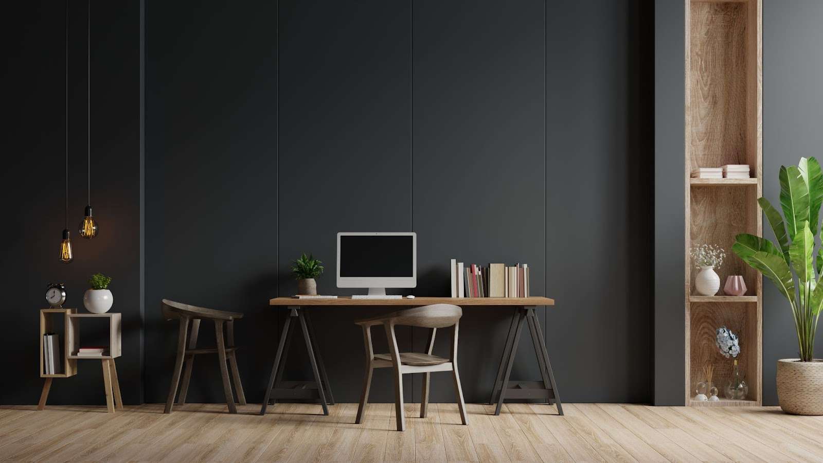
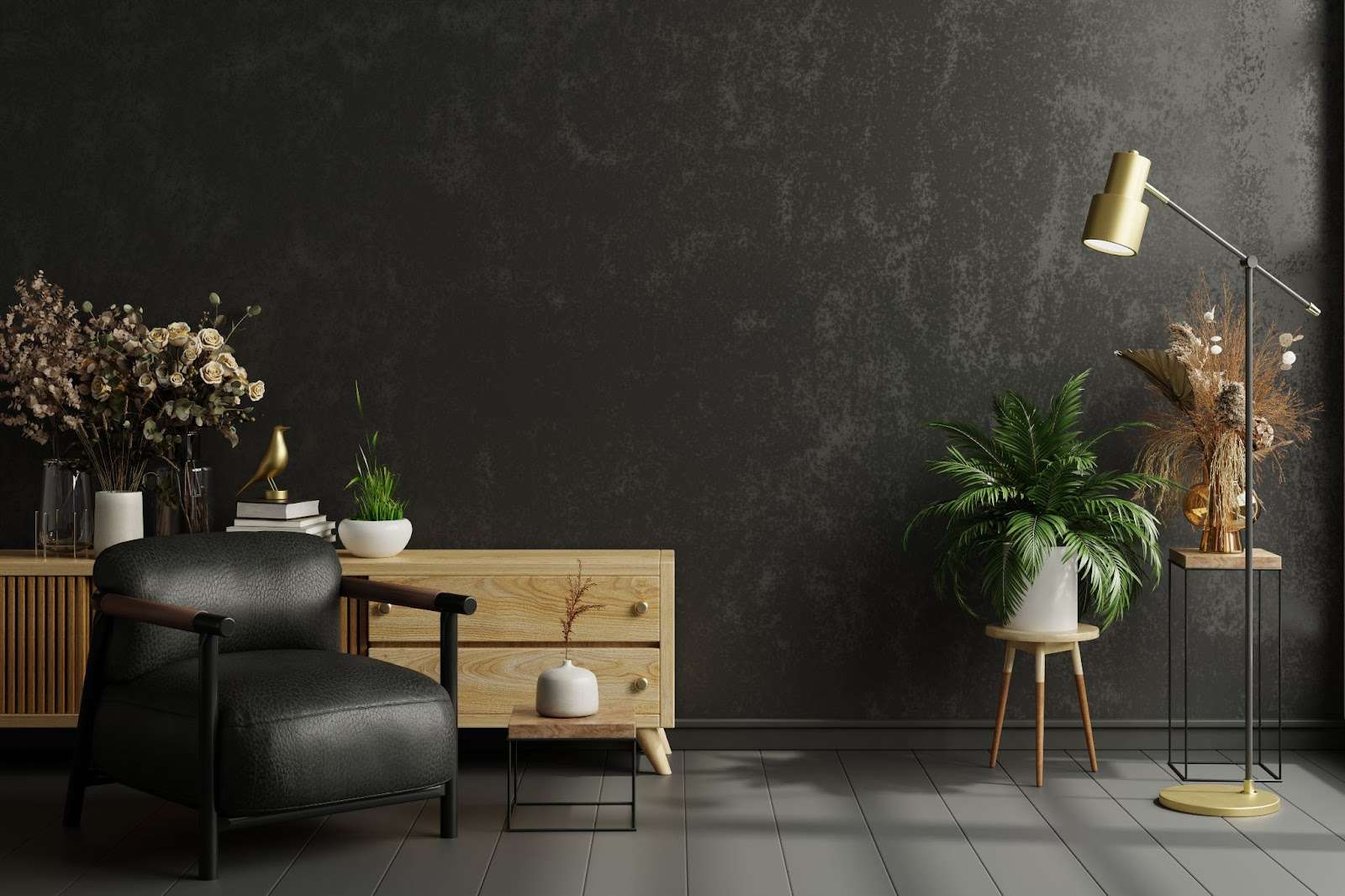
4. DIY What You Can

If you’re handy with a roller, consider doing some of the prep work yourself. While it’s wise to leave more complicated tasks to the pros, you can save on labor by handling simpler jobs, like taping or priming, yourself.

With a little planning, you can give your home a fresh look without breaking the bank!

Final Thoughts on Planning Your 2024 House Paint

Planning to get your home painted in 2024?

Well, buckle up because it’s not just about picking a color swatch and calling it a day. 

There’s a lot to consider before you start painting the walls or tackling those exterior painting costs. From the type of paint you choose to whether you DIY or hire the pros, many factors affect the price. Sure, it can feel expensive to paint a house, but with the right planning, you can avoid turning your wallet the same color as your walls—empty!

Remember, whether you’re freshening up the exterior of your home or transforming the indoors, the project’s overall price tag can fluctuate. Size, labor, and paint quality all affect the total. But with a bit of savvy budgeting and a little off-season scheduling, you can save money without sacrificing the result.

In the end, painting your house is an investment. And hey, nothing beats that feeling of walking into a freshly painted room that looks like a million bucks (without costing it)!

Design on a Dime is your right-hand man when it comes to painting the interior and exterior of your house, so don’t hesitate one more minute—schedule an appointment with us now!

Best one-coat interior paints of 2024 banner

The Best One-Coat Interior Paints for 2024: Top Picks For Your Home

When painting your home, time is money, and no one wants to spend extra hours waiting for two coats of paint to dry.

That’s where the magic of one coat of paint comes in. In 2024, one-coat paints are taking center stage for their ability to transform a room quickly and easily without compromising on quality.

Just consider the following scenario

You’re painting your kitchen, bathroom, or even that dreaded hallway, and instead of the usual back-and-forth, you’re done in a single stroke! One-coat paints save you time but also reduce paint usage, which is perfect for DIY enthusiasts and professional painters alike.

So, whether you’re freshening up the kitchen walls or giving your bathroom a new look, these paints do the job with minimal hassle.

No more layering with two coats. Just grab your roller and watch as your space transforms in record time!

With one-coat paints, efficiency meets style, which makes them a must-have for anyone looking to make home improvements in 2024.

Ready to roll? Let’s dive into the best one-coat paints for every room in your home!

What to Look for in a One-Coat Paint

Man and woman painting

When choosing the best one-coat paint, remember a few things to ensure you don’t feel like you’ve missed a spot. 

Getting a flawless finish with just one coat sounds like a dream, but making sure you pick the right paint is essential for a smooth, long-lasting result.

Coverage: The “Cover-Up” Act

The key to one coat coverage is in the details. A high-quality one-coat paint should effortlessly cover your old paint without extra layers. Brands like Benjamin Moore and Glidden are well-known for delivering excellent coverage, ensuring your walls look fresh and clean in one go. 

But don’t forget—not all paints are created equal. Check the label for claims like “high hiding” and “maximum coverage.”

Those are the ones who know how to keep the past in the past!

Durability: “Staying Power” Matters

Let’s face it.

The best paint isn’t just about looking good on day one; it must stand the test of time.

Whether it’s the muddy footprints in the hallway or a mysterious stain in the kitchen, durability is critical. Look for paints that are known for their resilience and scrub-ability.

coat paint that can handle everyday wear and tear while keeping its finish looking sharp is a real keeper. Many top options, like Home Depot’s exclusive lines, are specifically formulated to resist stains and scratches, keeping your space fresh.

Sheen: The Gloss Boss

Now, let’s talk about sheen.

The finish of your paint can drastically change the look of a room, so it’s important to choose wisely. A semi-gloss or satin finish is your best bet if you’re painting a high-traffic area like the bathroom. These sheens are durable, easy to clean, and even give your walls extra shine.

On the flip side, a matte finish works wonders in spaces where you want to hide imperfections: great for that old paint lurking beneath.

Paint and Primer in One: “Prime Time”

No one wants to waste time priming, so many of the best one-coat paints come with built-in primer.

This combo saves you an entire step, providing better adhesion and coverage in fewer layers. Benjamin Moore and Glidden are two major brands that offer paint and primer options, making the job easier for both DIYers and pros.

To be 100% certain about your paint job, contact us at Design on a Dime, and let’s get rolling!

Best Interior Paint in 2024: A Colorful Revolution In One Coat

Living room paint

If you’re like most of us, you’ve probably found yourself standing in a paint aisle, squinting at a million different cans, wondering if you need to spend an entire weekend painting two coats on those walls.

Well, fear not! We’ve curated the ultimate list of the best one coat paint for your interior walls in 2024.

1. Benjamin Moore Aura

The Benjamin Moore Aura line is often hailed as the holy grail of one-coat coverage. This paint brand is known for its impressive range of colors and its ability to cover even the most stubborn mildew stains.

With flat and eggshell finishes, you can achieve your desired look without sacrificing durability. It’s ideal for high-humidity areas like bathrooms, where mildew tends to make itself right at home.

And the best part? There’s no need for a second coat! This paint is so good it’s almost like cheating at home improvement.

2. Sherwin-Williams Infinity

Sherwin-Williams’ Infinity Line takes the cake as one of the best interior paints of 2024

This best one-coat paint offers amazing coverage, durability, and stain resistance.

It is perfect for areas that see a lot of action—think kids’ rooms, kitchens, or even the hallway where everyone kicks off their shoes (or leaves dirty fingerprints). It’s a superhero in a can with an ultra-smooth finish and no need for a second coat. It’s also easy to clean, so you can quickly wipe away any “creative” crayon art.

Take this moment to scroll through our painting service and maybe catch up on some Sherwin ideas! 

3. Behr Marquee

Available at Home Depot, Behr Marquee has built a solid reputation for being the best interior paint for the price.

Its one-coat coverage makes it perfect for those who want to finish their weekend project in one weekend. Marquee’s wide range of paint colors means you can go from calming neutrals to bold accent walls without worrying about whether the flat paint will need extra layers.

Oh, and did we mention it dries quickly? This is perfect for when you “accidentally” lean on the wall right after finishing.

4. PPG Timeless

PPG Timeless can cover old, dingy walls with just one coat, making it one of the best one-coat paints for people who want fast results that last. Its mildew-resistant formula makes it an excellent choice for basements or bathrooms. The eggshell finish is particularly popular, giving walls a subtle sheen without being too glossy.

And trust us—no one will miss that second coat when they see how fabulous your room looks.

Sounds intriguing, right? Reach out to us, and let’s start planning together! 

Best One-Coat Paints for Ceilings and Trim: Get Ready to Look Up!

Paint equipment on the floor

Painting ceilings and trim can feel like a workout you didn’t require!

But with the best one-coat paint options, your ceilings and trim look fresh without needing a second coat (or a nap afterward).

Ceilings

When painting ceilings, you want something that covers well, doesn’t drip all over your face, and dries quickly.

Enter acrylic paint! It’s one of the top one-coat paint options for ceilings, providing the best coverage. Just a gallon of paint easily covers around 400 square feet. Look for matte finishes that hide imperfections so no one will know you’ve skipped arm day.

Trim

You need tough and durable paint for the trim, especially if your kids use the baseboards as bumper cars.

Satin or semi-gloss acrylic paints work wonders here, offering excellent drying time and a clean finish. These one-coat paint options are designed to last, so you won’t have to touch up whenever someone scuffs the wall.

In short, pick the right one coat paint and spend more time admiring your handiwork—because who really wants to do a second coat?

As you can “see,” we’re all about making your interior shine, sparkle, and dazzle! Check out our interior design service and soak up all the inspo for your next project!

Tips for Getting the Best Results With One Coat Paint

You’ve got your one coat paint ready to go, but before you grab that roller, let’s make sure you’re set for a flawless finish. No one wants to brag about “covering in one coat” only to end up with streaks that scream, “I missed a spot!

Prep Like a Pro!

Prep is key before you get too excited about your single coat of magic.

Clean walls ensure better adhesion, and trust me, one coat paint options work best on smooth surfaces—not over last year’s spaghetti sauce splatters. Sand any rough areas and patch up imperfections. Your wall is your canvas, and we want it to be a masterpiece!

Pick the Right Tools

Don’t let your tools betray you. For coverage in one, use a high-quality roller with a thick nap (the fluffier, the better). Cheap brushes or rollers will leave you a mess even conventional paint wouldn’t dare cause. Invest in a good roller, and your paint covers like a dream.

The Power of Paint & Primer

Opt for a paint and primer combination.

These best overall options are your ticket to smooth sailing. Not only will this reduce your workload, but you’ll also get a beautiful, rich finish in a snap.

Plus, your color will pop brighter than ever.

Avoid the Dreaded Overlap

The biggest rookie mistake?

Do not blend those edges. Whether you’re working with bold shades or a neutral color palette, ensure you overlap your strokes to prevent lines. Smooth and steady wins the race; one smooth coat, and you’re golden!

So, prep right, use the right tools, and soon enough, you’ll sit back, admiring your walls like an artist who just nailed their masterpiece!

One Coat Countdown: Best One Coat Paint of 2024

When getting the best results with one coat, choosing top brands is crucial. They ensure you don’t have to worry about multiple coats or streaks. Before you start, prep your walls by cleaning and sanding them, which helps the new paint adhere smoothly.

Always use one coat for efficiency, but don’t rush—overlap strokes to avoid lines. A good type of paint combines paint and primer, allowing you to finish in one. With the right approach, you’ll never have to paint every wall twice again, making your project quicker and more rewarding.

Ready to start the painting project? Contact us now, and let’s discuss the best one coat paint finish!

Best Dining Room Paint Colors: Ideas & Inspiration for Your Space

In the dining room, we share meals, have morning coffee, engage in important conversations with loved ones, and create many cherished memories.

That’s why many people consider it the heart of the home. Therefore, most want to make it calm, inviting, and fresh for early-morning breakfasts and late-night wine sessions.

Selecting the perfect color for your dining room is crucial for achieving a cohesive interior design.

However, it can be challenging as it depends on your personal preferences and the overall decor of your house.

Design on a Dime can help you find the perfect paint to enhance your living space!

Setting the Table for Color

dining room table

Choosing the right color for your dining room can significantly affect the mood and atmosphere, enhancing the overall dining experience. 

The perfect dining room colors can create a warm and inviting ambiance, encourage engaging conversations, and add a touch of elegance and sophistication to your home. To strike the right balance, consider coordinating the wall colors with the furniture in your dining area.

Another important thing to think about is what effect you want to achieve.

Do you want to give your room more space or make it smaller and more intimate? Do you prefer a traditional style or a modern, minimalist design? Do you have an accent wall that needs to be combined with your dining room walls?

There are numerous questions to ask and plenty of options to choose from. 

Each color can make a statement, and the great news is that most of them are easily accessible for purchase online or at your local Benjamin Moore store. Now that you know this, we can look into how various tones enhance your space and motivate you to create a cozy, inviting, and stylish atmosphere.

In urgent need of some paint inspo? Check out our painting service page for all the deets.

Classic Neutrals: Timeless Elegance

Classic Neutrals: Timeless Elegance Dining Room
Source: Storie Collective

If you’re a fan of a classic style, neutral colors are a perfect choice.

White paint never goes out of fashion, but tones like beige, gray, taupe, and off-white can offer a sense of calm that complements a wide range of decor styles, from traditional to modern.

Neutrals are perfect for intimate family dinners and larger gatherings. Their calming effect doesn’t overwhelm the senses, allowing you to shift to other design elements, like furniture, lighting options, or artwork, and feel relaxed and at ease in your home.

Lighter neutral shades, such as off-white and pale gray, can make a room feel more spacious and airy, especially in small eating spaces with limited natural light. These timeless colors never go out of style, so consider them a long-term investment in your home’s decor.

One of the best things about neutrals is that they are adaptable for every occasion, from holiday themes to simple everyday setups. This adaptability can give you the confidence to design your home for any event, knowing that your neutral colors will always be a perfect fit.

You can also consider a creative masking tape wall idea for the most versatile dining area. 

And for more tips on elevating your dining room design, just contact Design on a Dime!

Bold and Vibrant Hues: Making a Statement

bold hue paint color for dining room
Source: CAROLYNLEONA 

Bold colors are the best paint colors for those who love vibrant and energetic environments.

Popular dining room tones include deep blues, rich greens, teal, vibrant reds, or bright yellow. They encourage warmth and activity and are perfect for dinner parties. Red paint, for instance, is known to stimulate appetite and evoke a sense of passion.

In open-plan layouts, bold colors can help define the dining space and visually separate it from the kitchen or living room. For example, if you paint a bold accent wall emerald green, it draws attention to the dining space.

Using bold colors creates a strong contrast that adds depth and dimension to the room. A charcoal gray or black accent wall against lighter furnishing creates a dramatic look that feels modern and sleek.

A deep green also works well as a statement wall, drawing immediate attention and setting the tone. Combine it with modern furniture and white walls to make a unique dining room area.

Red walls are ideal for spaces that encourage lively conversations and socializing. They pair well with classic, formal furniture featuring a lot of wood, elegant light fixtures, and traditional decor elements such as artwork.

Teal is one of the most popular dining room colors, blending the calmness of blue with the sophistication of green. Its cool undertones provide calmness, while its richness adds luxury. Combine your eating area with warm metallics like copper or gold to make it more elegant and modern.

Bold colors best match contrasting elements like wood, metal, or velvet. Some small decor pieces, like artwork, cushions, and table settings, can echo the bold tone.

Add some warm lighting to make the colors more inviting, but try to include natural lights to make the colors stand out even more.

Are you caught up in all of it? No worries—just call us, and we’ll help you find the perfect solution! 

Soft Pastels: Creating a Calm and Inviting Atmosphere

soft pastel dining room
Source: Desiree Burns Interiors

Soft pastel colors calm the mind and ease tension, making them ideal for spaces where people gather and enjoy each other’s company. The colors are gentle, often muted with white and gray, resulting in a soft, delicate tone. Mint green, sage green, light lavender, powder blue, pale peach, and buttercream yellow can be used in the dining areas to achieve that relaxing feeling.

Blush pink is a popular color choice for a modern dining space design. The pastel adds a touch of elegance without feeling too formal. You can combine it with gold and brass details and white furniture. If you own a farmhouse, this bright color can give it a modern and fresh look!

Light lavender, known for its calming effect, is the best color choice for creating a serene dining space. It works beautifully with neutral shades like beige, cream, or warm white, especially if you have a dining nook. The color can also highlight unique decor elements like fresh flowers, subtle lighting, or delicate fabrics.

Sage green sets the right mood for any space, especially your dining area. It reflects nature and brings the outdoors in. Pair it with wood tones and natural materials like rattan chairs and linen tablecloths. It evokes calm and freshness, like a cool breeze or a garden in a spring.

Pastel colors are great to combine with neutral furniture and are perfect for wainscoting and wallpapers. Choosing from many options is difficult, but you can check for Benjamin Moore paint to find your ideal match.

If you love elegant dining full of rich colors and stylish decorations, visit our inspiration gallery on Design on a Dime. Remember that the color you choose reflects your personality and taste!

Earthy Tones: Bringing Warmth and Comfort

olive green dining room
Source: Light and Dwell

For a cozy, warm, and welcoming ambiance in your dining area, earthy tones such as terracotta, olive green, and warm brown make perfect paint choices. They can add depth and warmth to your space while maintaining a grounded and inviting atmosphere. 

A rich reddish-brown terracotta tone is a perfect color to add a rustic charm to your eating space. Whether you use it on wall colors or decor, it gives a vibrant yet comforting energy. Terracotta can set the mood and goes well with many decor ideas, like ceramics, vases, and dark wood colors. 

Olive-green walls create a natural and airy ambiance, providing positive energy for the start of the day and evening gatherings. They pair well with a variety of styles, from rustic to modern. You can combine them with natural materials like stone, wood, and textiles to create a comfortable space, or put a white-painted shelf filled with fresh herb jars to create your own herb garden.

The warm brown tones of your walls combine perfectly with wooden furniture and shelving. This is a perfect choice if you’re trying to achieve a cozy and warm atmosphere for your family or guests. This versatile color can be combined with most dining designs—from rustic inspiration to a more modern one. Find the perfect textile to mix with warm brown walls in neutrals like Sherwin Williams extra white or Ben Moore Decorator’s white.

Modern and Trendy Shades: Fresh Ideas for 2026

You can’t go wrong with modern design.

As we move into 2026, color trends shift towards bold, contemporary colors. One of the most popular is vibrant coral, which combines orange and pink with a warm, inviting tone. You can use it as an accent wall color and combine it with neutrals, adding cushions, tableware, or artwork in calming, neutral tones.

Blue dining rooms create a modern and fresh ambiance and are a real hit in interior design. Combine them with white dining chairs and white textiles or cushions. You can paint a chair rail blue and complement it with soft neutrals.

With these vibrant colors, the options are endless.

Charcoal gray is a very elegant and modern option, especially for white dining rooms. Paint the walls charcoal gray while painting the chair rail white. Add many white details and a big white chandelier over the dining table. It gives the room a rustic touch while keeping it modern.

While bold and vibrant colors can add a fresh, modern elegance to your dining room, it’s important to use them wisely.

Always balance bold colors with neutral tones and minimalist furniture to avoid making your space feel smaller or overwhelming. This approach ensures that your dining room will exude a contemporary charm.

Final Thoughts on the Best Dining Room Color for Your Space

We all cherish the memories made in our dining rooms during meals and gatherings. To enhance your dining experience, select colors that elevate the space and complement your style and personality.

With the right wall color, you can decorate and furnish your dining area in any design – from modern to traditional. The key is to choose a palette that complements the style of your home.

Don’t forget to join us on Design on a Dime for the most amazing ideas, inspirations, and tips for home decoration, renovation, and wall painting.

Contact us to schedule your consultation!