Paint colors for bedrooms in your home

Best Bedroom Paint Color Ideas for 2024 to Transform Your Space

If you want to change your interior design, you don’t have to buy new furniture or renovate it completely. Sometimes, all you have to do is change your white walls to some other color, and your job is done.

If you’re a homeowner, decorate your bedroom with a new color palette, and you’ll have a completely different environment for the best parts of the day – sleeping and waking up!

Ideal bedroom wall colors can soothe the atmosphere and affect your well-being, sleep quality, and overall mood. Applying a fresh coat of paint to your bedroom creates a cozy feeling that represents your unique style.

If you plan to set the tone for the new year and find a perfect color for your bedroom, you’re in the right place; together, we can discuss the trends and see what color suits you best.

1. Serene Greens: Bringing Nature Indoors
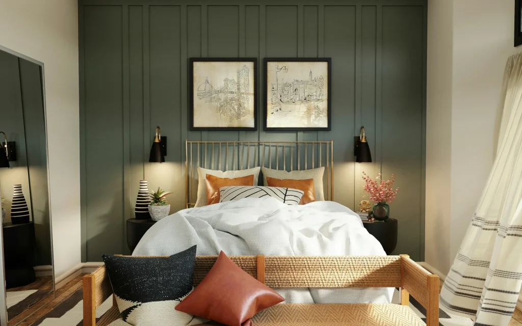
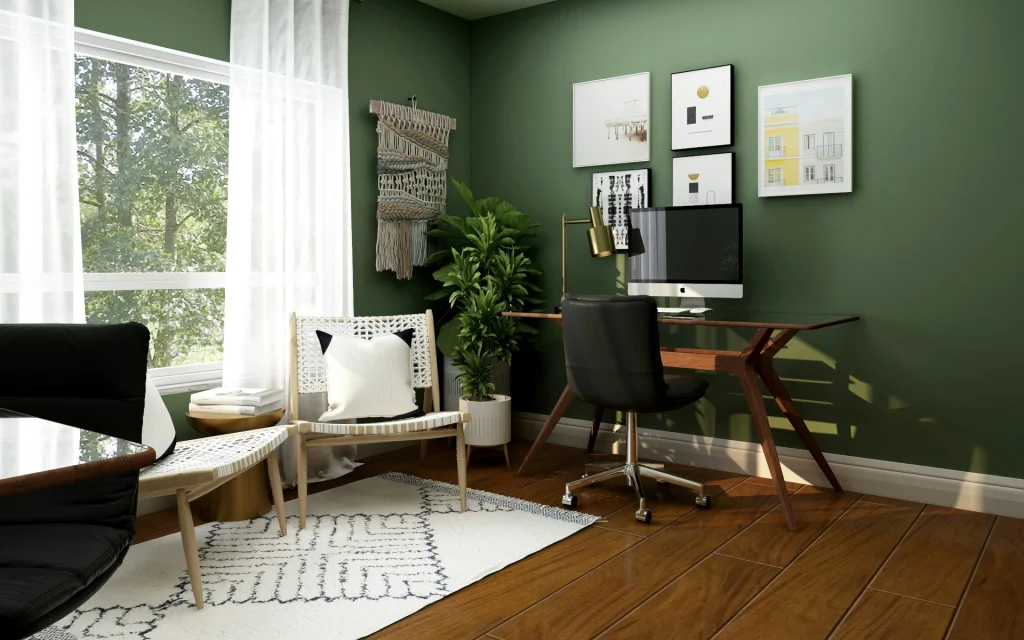
Green pops of color in your bedroom

Green, the color of nature, can bring a soothing and rejuvenating feeling to any bedroom. As one of the most versatile and calming colors, green can transform your space into a haven of peace and tranquility, helping you to relax and unwind after a long day. 

From soft, muted tones like sage to rich, vibrant shades of emerald, green offers a spectrum of shades that go well with many styles and designs. Sage green evokes a sense of calm and simplicity, making it ideal for a minimalist or Zen-inspired bedroom. Bold emerald green gives a luxurious and energetic vibe that adds depth to your space. Mint green is a light, cool-toned color that evokes a sense of freshness. It combines the tranquility of blue, with the natural qualities of green.

So, to create a connection to nature, incorporate green into your bedroom. Whether you paint all four walls or use green as an accent color, this versatile color can breathe life into your bedroom.

If green is one of your favorites, this is the perfect time to check out our painting service, and let’s get right to painting!

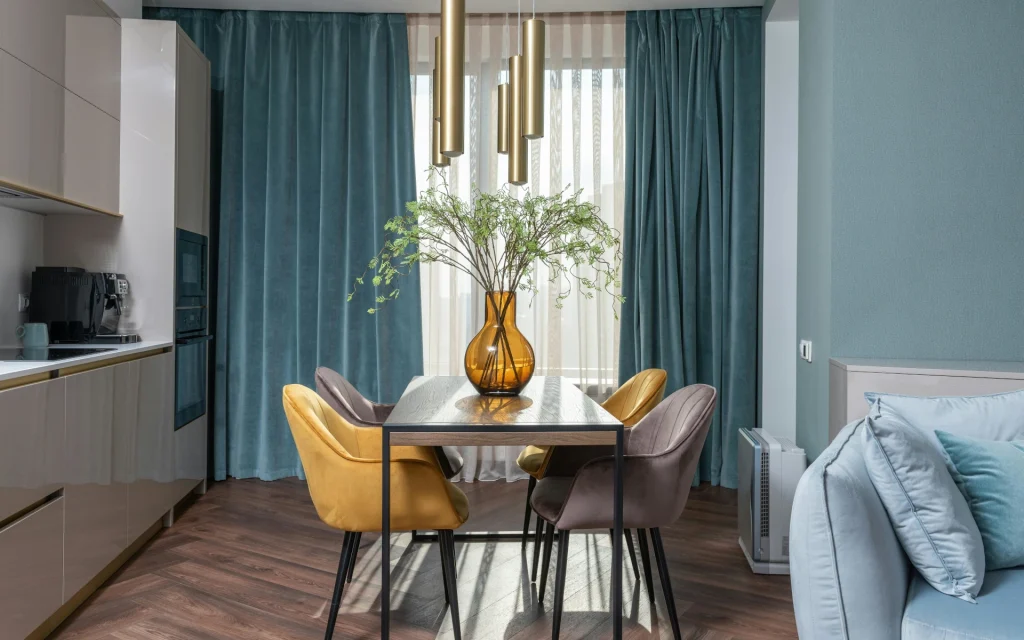
2. Warm Neutrals: Cozy and Inviting
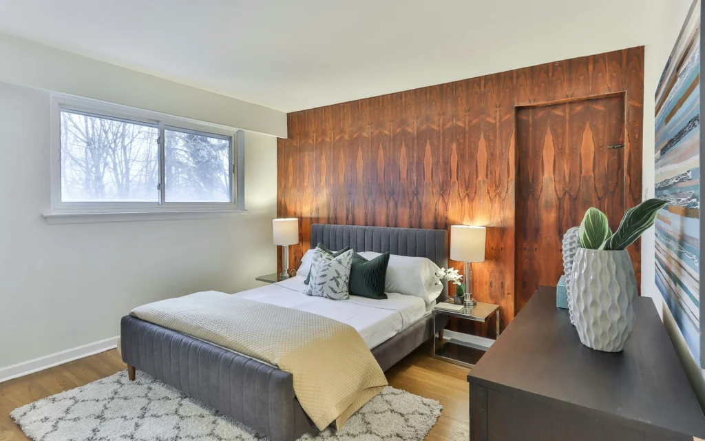
Warm colors can make a difference in your bedroom

Warm neutrals, such as beige, taupe, and gray, are subtle shades that can create an elegant and comforting atmosphere in your bedroom.

Beige and taupe provide a soft, earthy base that can add warmth to your space without overwhelming it.

They can be paired with other neutral tones and complement accessories like rugs, accent pillows, and bedding. Beige can make your bedroom feel more airy, while taupe adds depth, grounding the room and making it more intimate. 

Warm grays, with their beige undertones, bring a contemporary twist to traditional neutrals. They are perfect for creating a modern look while adding the necessary warmth for a cozy bedroom. They can be paired with cool and warm accents, allowing you to change up your decor over time without repainting.

Ivory, a pale, off-white with subtle warmth, can be perfect for creating a soft and serene environment. Pair it with neutral materials like hardwood or soft textiles to create a layered look.

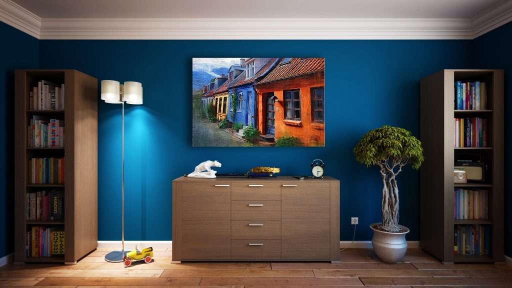
3. Moody Blues: Deep and Dreamy
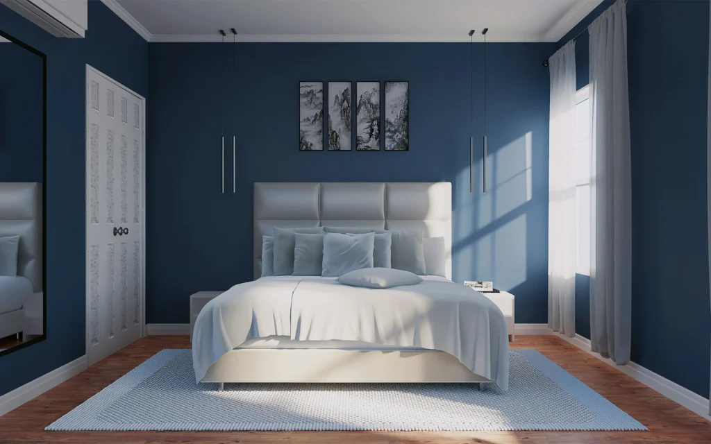
Warm blues for paint inspiration

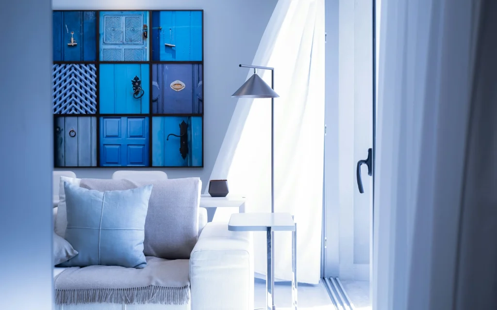
Shades of blue are some of the most popular contemporary bedroom color ideas. The rich, intense tones of deep blue can bring depth and tranquility and make a room feel more saturated for a perfect, dreamy atmosphere.

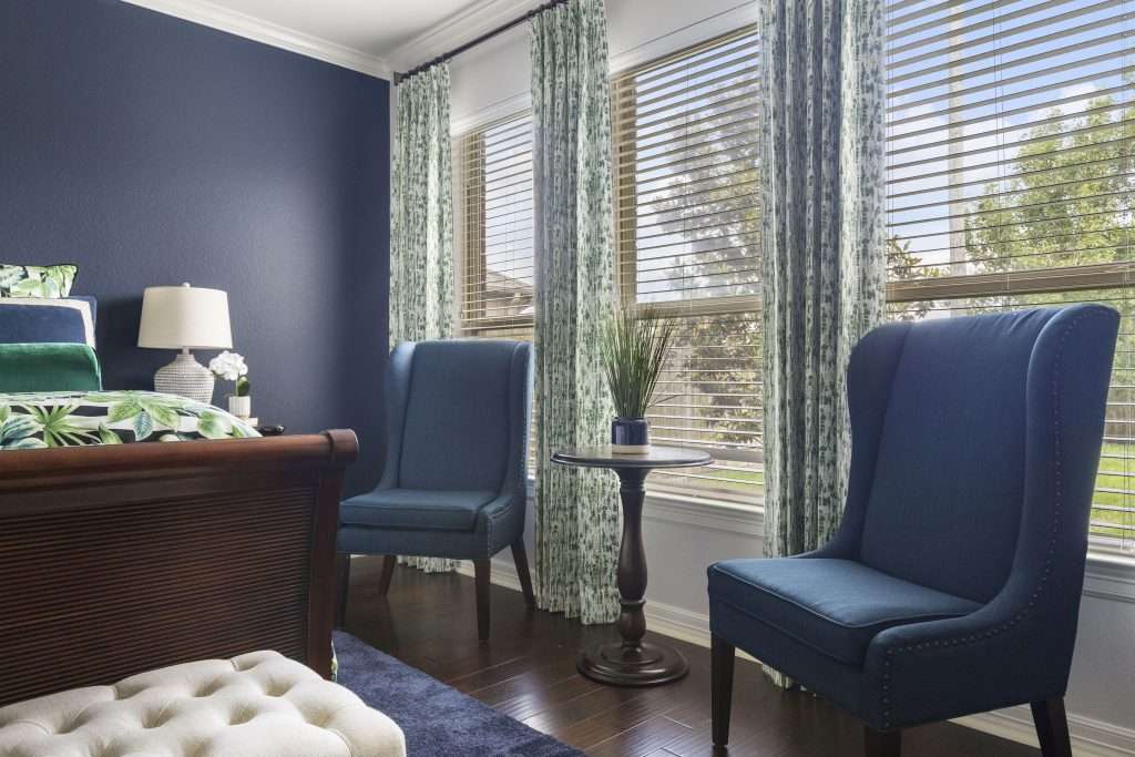
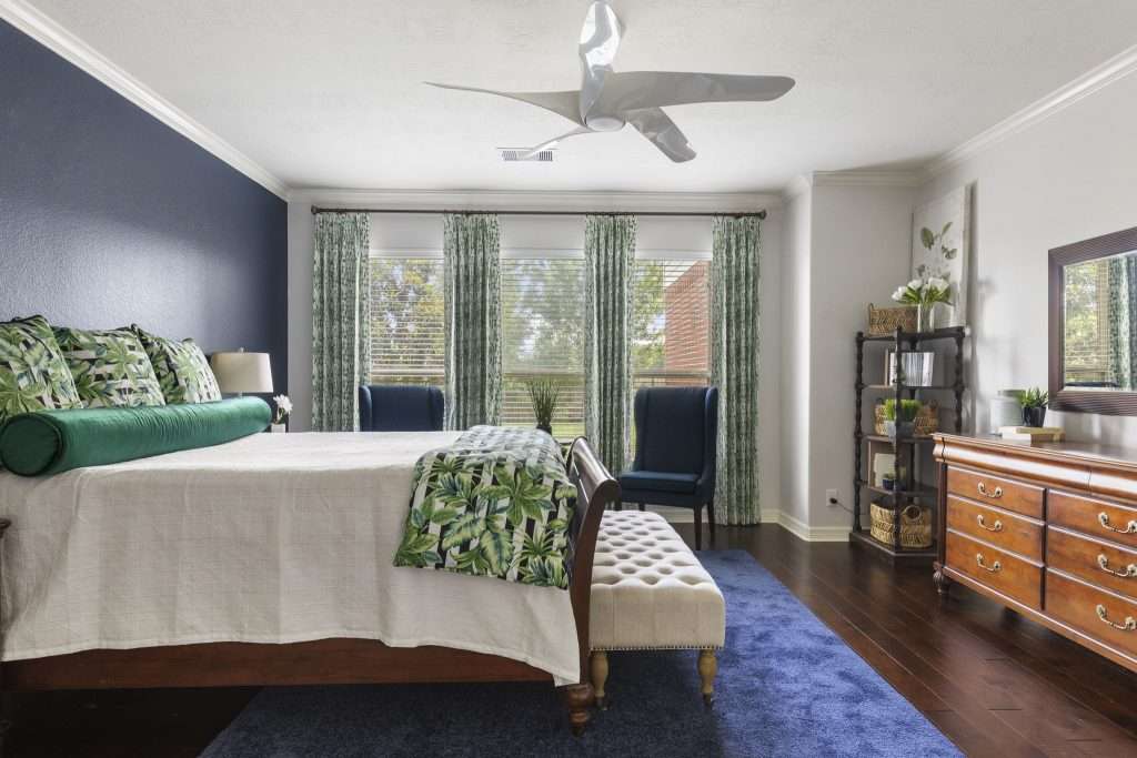
The calming effect of navy blue will help you feel relaxed and at peace in your sleeping space, especially if you are thinking of incorporating a blue accent wall in your design theory. This classic dark blue with a hint of black is ideal for accent walls or as a primary color for your bedroom, guest room, or any other room where you want that dramatic yet relaxing feel.

Royal blue is the perfect choice for headboards. Its slightly brighter hue than navy blue brings a touch of drama, but when combined with neutral tones, it creates a balanced look. 

And if you want to create a cocooning effect, use midnight blue. It is deep and mysterious and pairs best with rich textures like velvet and silk.

Want to focus on peace and thinking in your room for rest? No worries, check out our interior design service, and we’ll help you find the best color!

4. Soft Pinks and Corals: Romantic and Fresh
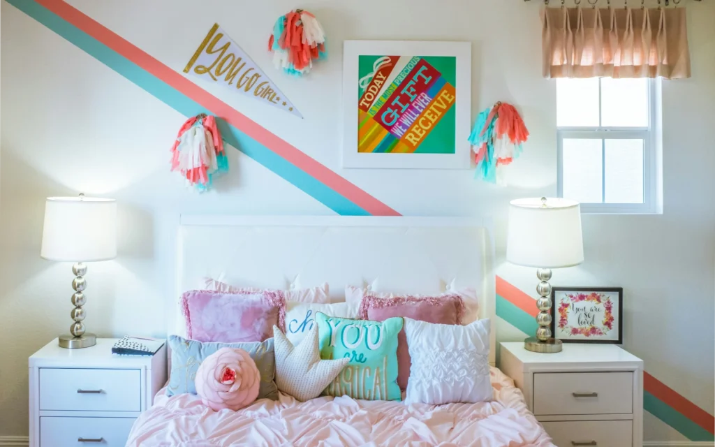
A restful pink for your kid's bedroom

Gentle pink and coral shades can create a fresh and romantic atmosphere in your bedroom. Soft pinks add a touch of sweetness and calm, while corals add energy to any space. Both colors can be options for a contemporary bedroom and a chic and aesthetic living room.

Consider painting your small bedroom blush pink for a warm and romantic environment.

It’s a very light hue that can give the effect of a bigger space. You can also use it on the ceiling to create a calming backdrop with various decor and styles.

Peach pink gives a feeling of a more inviting space to your bedroom. It pairs well with neutral tones like cream and gray. This versatile color can be combined with various furniture designs like metallic and white. It also goes well with light laminate floors or white and cream carpeting.

Consider pink cotton candy to evoke a nostalgic and playful feel in your room. This soft and whimsical hue perfectly combines with wooden furniture and linen fabrics.

Sounds intriguing? Reach out to Design on a Dime and let’s start this project together, now! 

5. Bold and Vibrant: Making a Statement
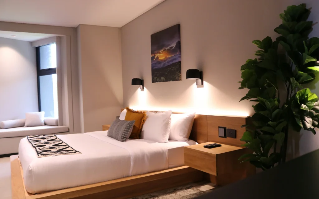
Bold bedside table idea for a design

Bold and vibrant paint colors can bring more energy into your bedroom, whether it’s your main bedroom or a guest bedroom. These colors work well for accent walls, adding visual interest and depth to the space.

Consider using rich reds, striking yellows, or playful purples to create a bold focal point. You can introduce these bold hues through a statement piece, such as an upholstered headboard, which is both functional and decorative.

For instance, you can pair a red accent wall with soft or medium gray to tone down its intensity. A yellow accent wall complements creamy white or eggshell, while taupe pairs well with purple, adding depth and elegance to the room

However, be careful about bald colors as they can easily overwhelm the space. Limit them to accent walls or smaller accessory elements rather than covering all four walls.

6. Earthy Tones: Grounded and Harmonious
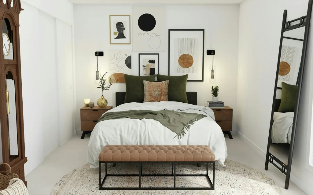
A bedroom retreat that reflects peace

Earthy colors like terracotta, ochre, and clay infuse any space with a natural and grounded feel, creating a deep connection to nature and promoting peace and relaxation, especially before bedtime.

The inviting reddish-brown undertones of terracotta establish a welcoming ambiance in your bedroom. You can also install a brick wall to your room, and paint it in terracotta tones for additional elegance.

Take a minute and think about a stunning green accent wall. Sounds great, right?

At the same time, ochre evokes a feeling of spaciousness and complements neutral tones, especially white bedding or throw pillows. These organic colors can bring the warmth of sunlight and the tranquility of the earth, which are important for a good night’s sleep and an energetic, happy waking up.

The soft, clay shade is a muted, peaceful tone, that you can pair with many furniture designs. The best option is to combine it with woven baskets and jute rugs, for a natural, organic aesthetics.

7. Monochromatic Schemes: Elegant Simplicity
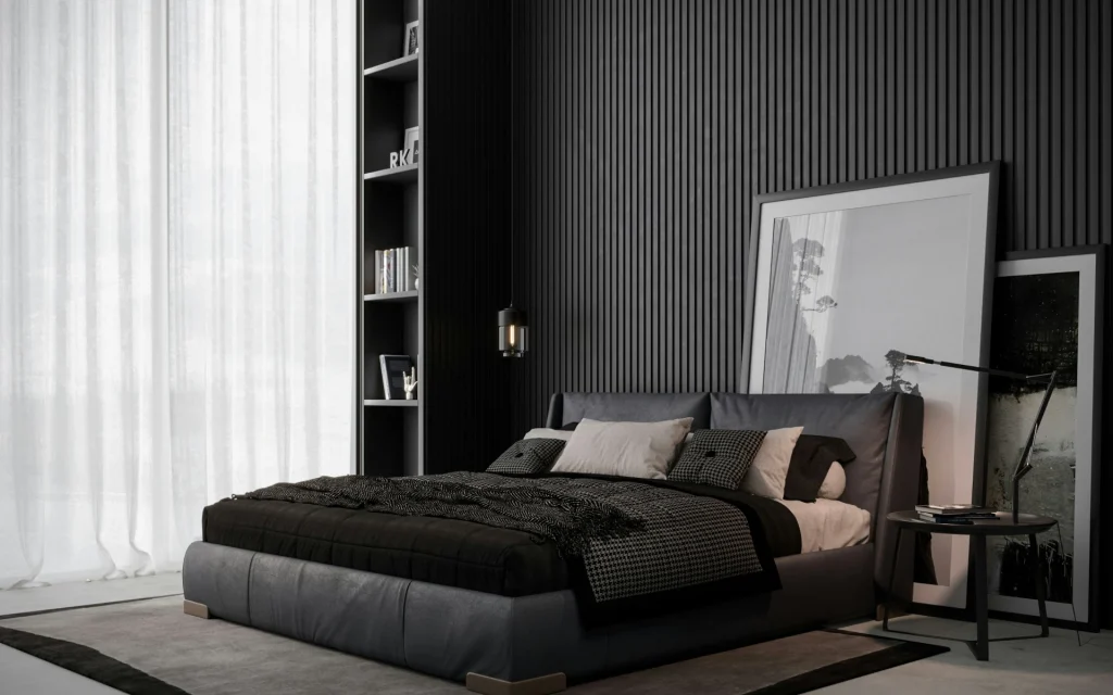
If you want to keep it classic, let’s introduce monochromatic color schemes. These schemes involve using different shades, tones, and tints of a single color to make your makeover project more elegant.

This color pallet also works well with garage paint ideas – not just the interior design, though. 

This method is relatively easy to achieve. Carefully select the right color and play with its variations to add depth and interest to your room while keeping it simple. Start by choosing a base that reflects the feeling you want to create.

For a calming and relaxing feeling, it’s best to use soft blues and grays.

Use different shades and tones of your chosen color.

For example, a room in shades of blue might feature a pale sky blue on the walls, deeper navy in the furniture, and soft slate in accessories. Apply darker shades to architectural features like trims, moldings, or built-ins to contrast and highlight these elements without introducing new colors.

You can also incorporate different textures to improve your monochromatic palette. So add matte finishes or glossy surfaces paired with natural materials like wood and stone. For example, the monochromatic gray room can feature a soft, velvet sofa and woolen elements, all in shades of gray.

Remember this: it’s important to balance light and dark tones within the same color family to avoid overwhelming the space. Also, take into account the room’s natural lighting when choosing your shades. Lighter tones can help reflect light and create an airy feel, while darker tones can create a more intimate and dimmer atmosphere.

So, if you’ve got that settled, let’s move on – contact us now, and let’s discuss the right color palette for you!

Final Comments on The Best Bedroom Color Paint Ideas

Your bedroom wall painting is no longer limited to white and simple. With the new trends, designs, colors, and patterns, you can truly personalize your space, reflecting your unique style, feelings, and wishes.

It’s up to you whether you opt for simple, neutral tones or bold, contemporary combinations. The options are endless, and your safe, relaxing space can become your real work of art.

If you need more ideas for your interior design, look no further; join us on Design on a Dime today, and with our helpful guide, see what fits you the best.

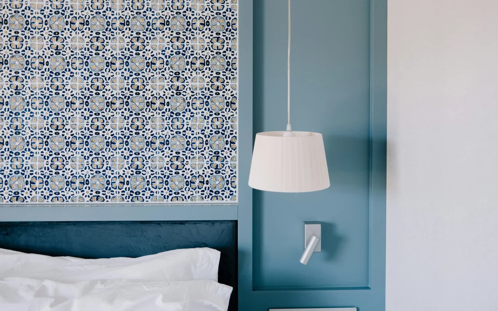
Bedroom Paint Color Ideas for Stunning Interior Walls: The Best Color Ideas in 2024

Think of it like this.

Selecting the perfect wall paint color for your bedroom is like choosing the perfect outfit for an event you’re going to, and it’s an important one.

The right shade can transform the entire ambiance, mood, and aesthetic of your space. Basically, it can turn the whole room around.

But don’t forget about one fact while you’re discussing paint ideas. It’s not just about color; it’s about creating an environment that feels personal and comfortable.

So, ready to explore a world of stunning shades that will make your bedroom the ultimate retreat? 

We’ll go through some fantastic color ideas that promise to refresh and spruce up your space.

1. Tranquil Blues That Create a Calm Oasis

Blue accent wall in the bedroom

It’s undeniable.

There’s nothing quite like the calming influence of blue tones, especially two-toned shades. Blue has long been celebrated in interior design for its ability to evoke a sense of tranquility and peace, making it an ideal bedroom color. 

For instance, sky blue is a perfect choice for those seeking a light, airy feel in their bedroom. 

This shade can make the room feel more spacious and open, reflecting natural light beautifully. It works exceptionally well in rooms with ample sunlight, enhancing the brightness and giving the space a fresh, invigorating feel. Sky blue can be paired with white or light-colored furniture and decor to maintain a crisp, clean look.

Moving slightly deeper, powder blue offers a gentle, understated elegance. This shade provides a soothing backdrop without overpowering the room’s decor. Powder blue walls can create a serene environment conducive to relaxation and restful sleep. It’s a versatile paint color inspiration that pairs beautifully with both contemporary and traditional furnishings. This paint is also an excellent choice for a home office.

For those who prefer a bolder statement, navy blue is an excellent choice. While it may seem intimidating at first, navy can add a touch of sophistication and coziness to your bedroom. It’s a color that envelopes the space, creating a cocoon-like effect perfect for unwinding after a long day. 

If you long for a blue retreat in your bedroom, reach out to us now!

2. Bold Accents That Add Drama and Depth

Accent details for a room in your home

Ready to take your bedroom from bland to grand? Well, then, bold colors are your secret weapon! 

Popular paint colors like deep reds, vibrant yellows, and rich greens can add an exciting flair to your bedroom walls.

A bedroom color scheme featuring deep reds can create a passionate, cozy atmosphere.

Vibrant yellows, on the other hand, bring a burst of sunshine, making even the gloomiest days feel brighter. Rich greens, reminiscent of lush forests, can infuse your space with a sense of tranquility and freshness. 

One of the best wall painting ideas is to use bold colors as accent walls.

This technique draws the eye and creates a focal point without overwhelming the room. Think about painting one wall a deep, dramatic shade while keeping the others neutral. 

For DIY enthusiasts, incorporating bold colors can be a fun and rewarding project. Imagine the satisfaction of stepping back to admire a striking, one-of-a-kind bedroom color scheme that you created. When using bold colors, clean lines are essential.

If you’re feeling particularly adventurous, try a geometric pattern in a bold color.  Pair these bold accents with complementary accessories like throw pillows, curtains, or rugs to tie the look together. The goal is to create a cohesive design that feels balanced and inviting.

Bold colors can also be incorporated through furniture and decor. A vibrant yellow headboard or a deep red dresser can act as statement pieces that enhance your wall color. Remember, the aim is to create a harmonious blend where each element complements the others.

Incorporating bold accents into your bedroom is about making a statement without shouting. By thoughtfully placing these popular paint colors, you can achieve a dramatic yet sophisticated look that’s uniquely yours. So go ahead, embrace your inner artist, and create a bedroom that’s bursting with personality and style!

Imagine waking up in a room that feels like an energizing embrace. But before you start slapping paint on every surface, let’s talk strategy. Call us up now!

3. Earthy Greens That Bring Nature-Inspired Serenity

Calming gray colors for your guest room

Looking to bring a breath of fresh air into your bedroom? Earthy green tones mixed with a mid-century modern design are the way to go!  

These colors are perfect for those seeking a peaceful retreat within their own home. 

Green is the color of life and renewal, making it an ideal choice for a restful bedroom environment. A wall mural featuring leafy patterns or botanical themes can transform your space into a lush haven.

Olive green, with its warm undertones, offers a cozy, inviting feel, while sage green brings a soft, calming presence. Moss green, rich and moody, adds a touch of elegance and mystery.

These shades promote a sense of serenity and connection to the natural world, making them the perfect color for a restful night’s sleep. 

When it comes to design ideas, consider using green as the main wall color or as an accent. A feature wall in a moody, deep green can serve as a stunning backdrop for your bed, creating a focal point that exudes calm and sophistication. For those who prefer a lighter touch, pale sage walls paired with white trim offer a fresh, airy feel.

Don’t forget about the power of paint finish!

A matte finish can give your walls a soft, velvety appearance, while a satin or semi-gloss finish adds a subtle sheen that enhances the color’s depth. The right paint finish can elevate your green hues, making them more eye-catching and dynamic.

For 2024, the trend leans towards creating personal sanctuaries within our homes, and what better way to do that than with earthy greens?

These colors not only make your bedroom look stylish but also feel like a retreat from the hustle and bustle of everyday life. Pair your green walls with natural materials like wooden furniture, linen bedding, and woven accessories to complete the look.

Picture yourself waking up to a room that feels like a tranquil forest glade—pure bliss! We can make that happen, so call us now!

Final Thoughts on The Best Bedroom Paint Color 

It’s the end of the perfect wall paint for your bedroom in 2024!

Choosing the perfect paint for your bedroom adds dimension to the room. Painting the walls in darker colors, soft blues, beige,  or just going with a simple white paint with an accent wall helps you create an illusion, brighten your space, and add the extra texture that your room needs. Keep this in mind, though. Before you make a decision, go through all of the options!

So, if you’re looking to spruce up your bedroom design and get inspired, call us now

Let’s discuss the best colors on the walls of your bedroom that hold transformative power!


Wall paint ideas with masking tape

5 Creative Wall Paint Design Ideas with Masking Tape

Masking tape helps us create clean, sharp edges while painting and prevents the paint from spreading onto adjacent surfaces. It is designed to adhere well to surfaces and is easy to remove, without leaving any residue or damaging the surface.

However, masking tape is more than just a tool for protecting surfaces. It can bring our creative ideas to life by allowing us to create different and unique wall paint designs, from simple patterns to real works of art.

Let’s explore how this tool can help us add a personal touch to our interior design.

Clean Lines and Bold Shapes

Easy wall paint with painter's tape

If you want to change the wall design in your room, masking tape is a fantastic way to introduce a dynamic and modern feel. There are various paint design ideas with tape – but we will begin with clean lines and bold shapes for your DIY wall painting project.

To make it precise and neat, you will need several tools:

  1. Masking tape
  2. Desired paint colors
  3. Paint brushes or rollers
  4. Measuring tape or ruler
  5. Pencil
  6. Drop cloths or plastic sheeting.

For additional precision, you can also get painter’s tape.

Start by cleaning the wall surface, ensuring the paint adheres properly. Then, let your creativity flow as you choose from various geometric patterns such as triangles, diamonds, or hexagons.

These patterns can add a modern and unique touch to your accent wall design, for instance.

Sketch your desired geometric pattern on paper and then place it on the wall. Use a pencil and measuring tape to mark the outlines of your shapes on the wall.

Carefully place the masking tape along the pencil lines, pressing it down firmly. For triangles, tape the three sides of each triangle; for the diamonds, tape the four sides, ensuring the angles are sharp. And for hexagons, you will need six sides, each of the same length. 

Now that you’ve made preparations, it’s time to paint the shapes.

Paint within the taped areas, using your chosen color. Depending on the paint and the color, you might need to add multiple coats; let each coat dry completely before applying the next

Carefully remove the tape once it’s dry to the touch. To avoid lifting the paint, put the tape at a 45-degree angle. If the color was seeping under the tape, you can correct the edges with a small brush.

Admire your two-tone wall and painting skills. 

Oh, and if you’re looking for some assistance, check out our painting service, and let’s talk colors!

Stripes and Chevrons

Masking tape wall paint design

You can create patterns that elongate, widen your space, and add depth and dimension. Stripes and chevrons are great wall painting ideas that can give your room an amazing makeover.

Horizontal stripes, paired with a blue accent wall, for instance, are a simple wall design hack that can make your room look wider and more spacious.

Start by marking the width of each stripe on the wall using a measuring tape and pencil. Use a level to ensure that the lines are straight, and then, place masking tape along the pencil lines, pressing the tape edges firmly.

Now, you are ready to apply paint between the taped areas.

As usual, ensure the paint is completely dry before removing the tape. Carefully peel off the tape at a 45-degree angle for crisp and straight lines. Horizontal stripes are an amazing design for bedroom wall paint.

Some other tape wall paint design ideas can create the illusion of a room’s increased height. For example, vertical stripes can make your ceiling appear higher and more spacious.

To get these patterns on your walls, start by measuring the width of each stripe and marking it with a pencil. Use a level to ensure that the lines are straight. Next, apply tape along the pencil lines, pressing the edges down firmly. Begin painting between the taped areas, but, as usual, wait for everything to dry before removing the tape.

You can also use diagonal stripes to get a dynamic and modern touch to your room. Determine the angle and width of the stripes and mark the lines using a pencil and a ruler. Tape along the marked lines, secure the tape and paint within the taped sections. Once the paint is fully dry, your diagonal stripes are ready, and you can then carefully remove the tape.

And to add a stylish and sophisticated look to your walls, try chevron patterns. Using a measuring tape and pencil, mark the starting points for the chevron pattern.

Draw zigzag lines using a ruler, and ensure equal spacing and angles. Place masking tape along the zigzag lines and paint between the taped areas. You might need multiple coatings for full coverage. Wait until the paint is completely dry, and carefully remove the masking tape. 

Sounds exciting? We’re all ears. Check out our interior design service, and let’s talk about your next project.

Bold and Vibrant Statements

Wall art with tape

Use your colors carefully to create a striking visual impact with color blocking using masking tape.

Complementary colors offer a vibrant and dynamic contrast, ideal for energetic spaces like living rooms. Contrasting colors can give you a bold look, making them a good choice for kitchens and entryways. Analogous colors create a harmonious and cohesive appearance and are perfect for calm spaces like bedrooms and offices.

Before you decide what colors you will use for your masking tape painting, make a strategy: plan your layout by deciding on the number and sizes of the sections and marking them lightly on your walls with a pencil and ruler. For a balanced look, consider symmetrical designs.

Test your colors with small swatches to see how they look in different lighting. Remember to clean your walls before painting or add a primer if necessary.

Accent Walls

Accent walls in your home

Accent walls are the best option for those who want to add a touch of artistry to their rooms; they add visual interest and depth to any room without overwhelming the entire space.

The possibilities are endless: you can experiment with various patterns, like geometric, stripes, and chevrons. You can also make abstract designs by experimenting with random shapes, lines, and colors. Accent walls are also a great choice for garage paint ideas.

Turn yourself into an experienced interior designer by creating landscapes, cityscapes, portraits, and other intricate patterns. You can also make murals by outlining larger shapes or patterns.

Using tape to create different colors and patterns on one accent wall can bring a stunning focal point to any room. Experiment with different tape designs and turn your DIY project into a true work of art.

If accents are your thing, reach out to us now

Ombre and Gradient Effects

Minimalist gradient wall

Create elegant tape wall designs with ombre and gradient effects by choosing a color palette that smoothly transitions from dark to light or between complementary shades.

Prepare the wall, mark the gradient zones with a pencil and ruler, and apply masking tape along these lines to define each color section and control blending. Start with the darkest color in the most prominent section, allowing it to dry before applying the transition color.

Blend the transition color into the dark one using a dry brush or sponge.

Continue by applying and blending lighter colors from brightest to lightest, feathering each color into the previous one. Choose colors with similar undertones for a natural gradient and test your blending on a sample board.

Final Thoughts on Wall Paint Design Ideas

Masking tape is one of the easiest ways to transform your space and add artistry to your walls. With so little effort, tools, and so many techniques and ideas, you can create a captivating environment with many eye-catching details and geometric shapes.

If you need more design ideas for your perfect home, join us on Design on a Dime.

We can give you many creative solutions and budget-friendly tips to transform your space into a stylish haven!

Home Office Paint Ideas

Boost Your Productivity with These Inspiring 5 Home Office Paint Colors

Creating a productive home office environment is crucial for achieving peak efficiency. The right home office colors can significantly impact your mood, focus, and overall work performance. 

The colors you choose can either invigorate your mind or leave you feeling uninspired. 

Lucky for you, this guide explores the five best home office paint colors that can transform your workspace. From the relaxing effects of teal to the motivating energy of bright shades, we’ve got you covered.

Get ready to boost productivity with our top picks, featuring choices from shops like Benjamin Moore and Sherwin-Williams that will redefine your interior decor.

These office colors will help you create the perfect office paint environment for your needs. 

So, let’s dive in and get inspired to turn your home office into an efficiency powerhouse!

Top 5 Inspiring Home Office Paint Ideas

A calm paint color for a home office

Let us help you find inspiration in 2024 for your office wall with these five colorful paints! 

Calming Blues for Focus and Tranquility

When it comes to choosing the perfect color for a home office, shades of blue stand out for their ability to boost productivity and enhance tranquility. 

Blue tones are known to lower stress levels and improve focus, making them ideal colors for home offices.

Consider a soft, sky blue for your accent wall. This gentle hue can create a serene environment, helping you stay calm during hectic workdays. For those looking to add a touch of richness, a deeper navy can add a sophisticated touch to your decor while still providing the benefits of a relaxing atmosphere. 

Incorporating blue into your home office can be the right move, whether you want to create a serene backdrop or a unique touch. 

And why? You’ll find yourself more focused and ready to tackle any task as you work at your desk, surrounded by these soothing tones.

So, get inspired and transform your office with the right paint today! Call us to discuss your vision!

Energizing Yellows for Creativity and Optimism

A yellow table and cup in an office

First, we want you to imagine starting your day in an environment bathed in the warm glow of yellow, making even the most mundane tasks feel a bit more enjoyable.

So, adding yellow to your interior can be done in various ways.

For a subtle approach, consider soft neutrals like pale buttercream, which can create a light and airy feel without overwhelming the senses. Oh, and if you’re feeling bold, a vibrant sunflower yellow can make a powerful wall that energizes the room and inspires innovative thinking.

Interior designers often recommend pairing yellow with furniture in blues and greens to create a balanced and harmonious look, and not without a good reason.

This combination not only improves the aesthetic appeal but also contributes to a grounded and relaxing atmosphere, allowing you to stay focused while maintaining a cheerful vibe.

For more ideas and professional tips, visit Design on a Dime.

Stimulating Greens for Balance and Refreshment

Green paint for a home office space

As mentioned, green hues are perfect for creating a balanced and refreshing home office environment.

This vibrant color not only brings a touch of nature indoors but also promotes a sense of peace and equilibrium, essential for effective work sessions. 

These soft neutrals can provide a peaceful backdrop that enhances concentration without overwhelming the senses, and they’re very popular with rustic designs. A bold emerald green can add a unique touch to your interior for a more energetic vibe.

As mentioned, Benjamin Moore’s Soft Fern or Sherwin-Williams’ Clary Sage are excellent options that can nicely saturate your space with the right balance of calmness and vibrancy.

Also, designers often recommend pairing green with natural furniture and decor to create a cohesive look that promotes a connection to nature.

Sophisticated Neutrals for a Professional Look

White paint for a home office

Neutral colors like gray, beige, and white are perfect for creating a sophisticated and professional home office space.

These colors provide a timeless elegance that can make any room feel polished and put together, making it an optimal choice for those looking to increase productivity.

When choosing the right neutral tones, avoid colors that might appear too bland. Instead, select hues with subtle undertones that can add depth and interest. 
For instance, a warm beige with a hint of yellow can create a cozy atmosphere, while a cool gray can offer a sleek, modern look. For a classic touch, a crisp white with a contrasting trim can make the room feel fresh and clean, especially when combined with plenty of natural light.

To spruce up a neutral palette, consider adding accents of bright colors or incorporating textured elements like a patterned curtain or a mobile art piece. This can help to spark a sense of inspiration without compromising the professional aesthetic.

Ready for a major change? Contact us, and let’s get started with re-painting your home!

Soft Pastels for a Calm and Inviting Space

A calming paint color for a home office

When it comes to creating a peaceful environment, soft pastel colors are your best bet.

These gentle colors can make your office feel less like a space you need to work in. As mentioned, soft colors like yellow, blue, or pink can reduce stress and help you maintain focus without feeling overwhelmed.

Also, soft pastels like pale pink can add a touch of warmth without the intensity of a dark color. A light lavender, for instance, brings a subtle purple hue that’s both calming and sophisticated.

Remember: Pastels have the unique ability to mute a room’s harshness while maintaining an airy feel.

Final Thoughts on Home Office Paint Colors

Changing your home office with the right paint colors can dramatically boost everything you do and enhance your work environment. From the calming influence of soft pastels to the energizing effect of bright yellows, each color offers unique benefits.

Don’t shy away from experimenting with colors like purple or dark colors to add depth and interest. Remember, the perfect hue may vary depending on your style and natural light.
Feeling overwhelmed? Start small by testing a sample to see how the color influences your mood and efficiency. If you need help finding the right shade, consider consulting a professional like us to achieve a polished, cohesive look.
So, are you ready to transform your workspace? Contact us and get started today!

Two-tone wall paint ideas

Two-Tone Walls: A Guide To Painting Ideas for Modern Homes

wo-tone walls are a game-changer when it comes to interior design in 2024. 

Imagine the elegance of a lighter color on the top half of the wall, making your ceilings look higher, while a darker color on the bottom half grounds the space, creating a cozy yet sophisticated ambiance.

This guide will explore the greatness of two-tone wall ideas to inspire your next home makeover, from painted walls that define zones to half-painted walls that add a touch of artistic flair.

The right coat of paint can revolutionize your living space

Ready to jump into the world of toned walls?

Let’s explore how to achieve the perfect balance of color and style in your home.

Two-Tone Walls 101

So, what is this, and how can it be achieved? First, we must mention that this modern painting technique, which involves using two colors on a single wall, is gaining popularity because of its ability to add depth, dimension, and style to any space.

By strategically pairing a lighter color with a darker shade, you can create a striking visual contrast that transforms a room’s aesthetic.

How To Choose the Right Color Combinations and Paint A Two-Tone Wall?

As mentioned, the possibilities for two-tone walls are endless, but choosing the right color combos is an important step to achieving the desired effect.

This growing trend in modern home design is all about creating contrast and harmony in your living spaces.

So, start by selecting your favorite color and build your color palette around it.

For instance, pairing a dark blue with a lighter shade can add depth and dimension to any room. Consider using a more dark color on the bottom half of the wall and a lighter tone on top to make your ceilings look higher, and your space feel more open.

Using a color card can help you visualize these mixtures before committing.

Don’t be afraid to experiment with different hues and finishes. An eggshell finish on the upper half of the wall paired with a crisp matte on the lower half can create a sophisticated look.

Dark colors like navy or forest green can be balanced with soft neutrals for a stylish yet welcoming feel.

Practicality is also key. Make sure to use acrylic paint to avoid seepage and achieve a clean, crisp line between the two tones. Taping off the area with painter’s tape and using a paint roller for an even coat of paint can help maintain that straight line.

To see more ideas, platforms like Pinterest can provide endless inspiration, showcasing everything from classic combinations to bold, avant-garde designs!

If you’ve got an idea on your mind or need professional help – check out our painting service!

Vertical vs. Horizontal Two-Tone Designs for Your New Two-Tone Wall

Vertical two-tone designs create a sense of height and sophistication.

Painting vertical stripes or sections can draw the eye upward, which is an important step in making your ceilings look higher. This approach is ideal for rooms with low ceilings or for adding a touch of elegance to spaces like the dining room.

Using a straight line and a paint roller, apply your chosen palette of colors from the point where you want the division to start, creating a seamless transition between the two shades.

On the other hand, horizontal two-tone designs can make a room feel more expansive and grounded. Painting the bottom color in a darker tone and the top in a lighter hue helps visually widen a small space, making it feel larger, more open, and clutter-free

This technique works wonders in smaller rooms or areas where you want to create a cozy yet airy atmosphere.

To achieve a clean finish, use painter’s tape to mark off the half of the wall you wish to paint, ensuring a crisp, straight line between the two colors.

Don’t have ideas on how to pair two-tone paintings or how to choose two different colors that will match? Visit our website and find ideas or the phone number of our designer.

Two-Tone Walls in Different Rooms: Paint Color Ideas

Transforming your home with two-tone walls can create distinct vibes for each room.

Here are a few great tips:

Living Room:  Consider using contrasting paint colors in the living room to craft a stylish and inviting atmosphere.

Bedroom: For a cozy bedroom, choose calming hues to make the space relaxing and intimate.

Kitchen:  Two-tone walls in the kitchen can add vibrancy and character, making meal prep more enjoyable. Just make sure to match the colors with the flooring idea.

Bathroom:  Bathrooms benefit from fresh and modern looks with lighter and darker painted two sections, creating a sense of space and cleanliness.

Remember, never use one color across all walls; opt for a unique combination. Use a string with chalk to mark regular intervals for precise painting, and ensure the tape when the paint is still wet for sharp lines.

For more creative ideas and inspiration, sign up for an interior design consultation!

It’s a great resource to help you transform your home today!

Coordinating Two-Tone Walls with Furniture and Decor: A Pinterest Dream

Creating harmony between two-tone walls and your existing furniture and decor is essential for a cohesive and stylish space.

Creating harmony between two-tone walls and your existing furniture and decor is essential for a cohesive and stylish interior design.

For example, in a Scandinavian home, a soft light blue on the top and crisp white on the bottom can be accented with natural wood furniture and neutral textiles, creating a serene atmosphere. Alternatively, pairing a dark green with beige adds depth and sophistication, especially with rich leather furniture and gold accents.

When coordinating two-tone walls with furniture, consider the dividing line where the colors meet on your wall. This line acts as natural trim that complements your decor. When the paint is dry, use painter’s tape to achieve a crisp edge.

Furniture should enhance your wall colors without competing. If the top half is a light shade, more dark furniture can anchor the space. Conversely, lighter furniture can brighten a room with darker paint on the walls.

Textiles tie the room together, right?

So, choose throw pillows, rugs, and curtains that reflect your two-tone walls. For instance, a dark green and beige wall can be enhanced with patterned textiles incorporating both colors.

Accessories also play a vital role. Metallic finishes like brass or chrome add luxury, while wooden elements keep things warm. Color blocking in both decor items and fashion can mimic the two-tone effect for a cohesive look.

Final Comments on Two-Tone Walls 

Transforming your home with two-tone walls is not only an aesthetic upgrade but also a fun and creative project.

No matter whether you decide to paint the top half a different color or go for a more intricate design, the impact is undeniable. We’ve covered how to paint a two-tone wall, from choosing your first color to perfecting your trim lines.

Remember, paint from the ceiling down for the smoothest application, and always allow your first coat to dry completely before starting the second.

Tools like a good pencil for marking and a reliable rag for clean-ups are crucial. Brands like Dulux offer excellent options to get you started.

Experimentation is key – don’t be afraid to explore your creative side and learn how to make a new two-tone wall!

For more inspiration, visit Design on a Dime, and discover new ideas for elevating your home’s style!

Mid-century modern exterior paint

The Ultimate Guide to Mid-Century Modern Exterior and Interior Paint Colors

Choosing the right paint colors for your mid-century modern home is a crucial step in achieving the perfect aesthetic.

Mid-century modern design, characterized by clean lines, organic shapes, and a connection to nature, requires a thoughtful approach to color selection.

This comprehensive guide will help you navigate the world of exterior and interior paint colors to create a cohesive and stylish mid-century modern home.

Understanding Mid-Century Modern Exterior House Design

A paint roller in the color blue

The mid-century modern design emerged in the mid-20th century and has remained a popular architectural and interior design style ever since. Its key features include:

  • Clean Lines: Simple, uncluttered lines define the architecture and furniture.
  • Organic Shapes: Inspired by nature, the design incorporates organic and fluid shapes.
  • Integration with Nature: Large windows and open floor plans connect the indoors with the outdoors.
  • Functionality: Emphasis on practicality and simplicity in design.

Choosing Mid-Century Modern Exterior Paint Colors

A retro and mid-century decorated home

Your home’s exterior paint color is the first thing people notice and sets the tone for the overall design. Here are some tips and ideas for selecting the perfect mid-century modern exterior paint colors.

Light or Dark Exterior

Deciding whether to go with a light or dark exterior is the first step. Consider the climate and surroundings of your home:

  • Light Exterior: This style is perfect for sunny climates like Palm Springs, CA. Bright white or light colors reflect sunlight, keeping the home cool and creating a vibrant contrast with the lush landscape.
  • Dark Exterior: This style is ideal for cooler climates where darker colors add warmth and depth. Deep browns, grays, and greens blend well with natural surroundings and look stunning year-round.

Consider Fixed Elements

Your home’s fixed elements, such as the roof, brick, stone, wood accents, soffits, and eaves troughs, play a significant role in determining the exterior paint colors. Here’s how to work with these elements:

  • Roof: Brown-toned roofs with red undertones limit your color choices to neutrals. Blue or green undertones offer more flexibility. Black and gray roofs provide the greatest freedom in selecting body colors.
  • Brick and Stone: Complement the undertones of your brick or stone. Red/brown bricks work with taupes and deep browns, while gray bricks allow for blues, greens, and neutrals. Painted brick can either blend with the body color or stand out as a trim.

Selecting Exterior Colors

Choose three exterior paint colors for a balanced and cohesive look:

  1. Body Color: The most dominant color determines the overall appearance. Light, mid-tone, or dark colors all have their unique charm.
  2. Trim Color: Provides contrast or harmony with the body color. High contrast (e.g., white trim on a dark body) creates a striking look, while low contrast offers a more subdued elegance.
  3. Accent Color: Adds personality and is usually reserved for the front door or decorative elements. Bold, vibrant colors are often used to make a statement, especially if you’re looking for garage-paint inspo.

Popular Mid-Century Modern Exterior Paint Combinations

Different buckets of paint

Now that you’re more than familiar with mid-century paint colors, let’s see how you can combine them.

White and Wood Accents

  • Description: Clean, crisp white walls paired with natural wood accents.
  • Examples: White siding with teak or walnut trim and doors.
  • Best For: Sunny climates and minimalist designs.

Deep Gray and Warm Wood

  • Description: Sophisticated gray with warm wood tones creates a cozy and modern feel.
  • Examples: Charcoal gray siding with cedar trim and doors.
  • Best For: Cooler climates and homes with natural surroundings.

Bold Blue and Bright White

  • Description: High-contrast combination that stands out.
  • Examples: Navy blue siding with white trim and a bright front door.
  • Best For: Creating a dramatic and stylish look.

Olive Green and Neutral Trim

  • Description: Earthy green tones with neutral trims for a natural look.
  • Examples: Olive green siding with taupe trim and beige accents.
  • Best For: Homes surrounded by greenery and natural landscapes.

Sounds interesting? Check out our painting service, and let’s discuss the perfect mix.

Testing Exterior Paint Colors

Sampling and testing paint colors is essential to see how they look in different lighting conditions. Here’s how to do it:

  • Sample Boards: Paint sample boards and place them on various exterior walls.
  • Observe Throughout the Day: Check the colors at different times (morning, noon, evening) to see how they change.
  • Consider Distance: Step back and view the colors from a distance to get the full effect.

Mid-Century Modern Interior Paint Colors

The interior paint colors you choose can transform your living spaces, making them stylish and inviting. Mid-century modern interiors often feature a mix of neutrals and bold accents to create a harmonious and dynamic environment.

Creating a Cohesive Interior Palette

A cohesive color palette ensures that all rooms flow together seamlessly.

Here’s how to achieve it:

  • Base Colors: Start with neutral base colors like white, gray, beige, or taupe.
  • Accent Colors: Add bold accent colors through furniture, decor, and feature walls.
  • Natural Elements: Incorporate natural materials like wood, stone, and plants.

Popular Mid-Century Modern Interior Color Combinations

So that’s that for exterior paint, but what about mid-century interior paint? No worries, we got you covered!

White and Wood Tones

  • Description: Timeless and neutral base highlighting the beauty of natural wood.
  • Examples: White walls with teak or walnut furniture and white cabinetry with wooden countertops.
  • Best For: Living rooms, kitchens, and bedrooms.

Gray and Warm Browns

  • Description: Adds depth and sophistication to your interior.
  • Examples: Soft gray walls with brown leather sofas and gray tiles with wooden vanities.
  • Best For: Living rooms, bathrooms, and dining rooms.

Black and White

  • Description: Classic and modern high-contrast palette.
  • Examples: Black accent walls with white furniture, black cabinetry with white countertops.
  • Best For: Living rooms, kitchens, and bedrooms.

Blue and Orange

  • Description: Vibrant and playful retro feel.
  • Examples: Navy blue walls with orange accent chairs and light blue walls with orange dining chairs.
  • Best For: Living rooms, dining rooms, and bedrooms.

Looking for the perfect color blend? We have some ideas you’d like. Hire us as your interior designer, and let’s discuss the perfect match.

Tips for Selecting Interior Paint Colors

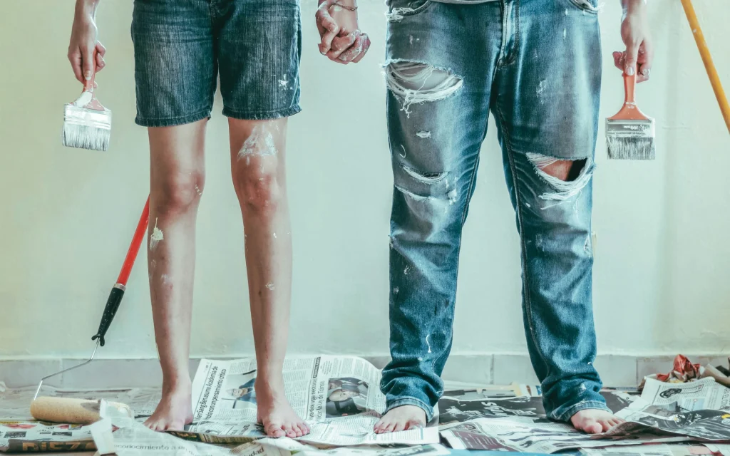
Two people painting the house

Selecting the perfect interior paint colors for your mid-century modern home requires a balance of aesthetics, functionality, and personal style. Here are some detailed tips to guide you through this process:

Start with Neutrals

Neutrals form the foundation of mid-century modern interiors, providing a versatile and timeless backdrop. Here’s how to effectively use neutral colors:

Opt for various shades of white to create a bright and airy feel. Pure white can be stark, so consider warmer whites with slight undertones of beige or gray to add warmth and depth. White walls work beautifully with natural wood furniture and bold accent colors.

Gray is a sophisticated choice that adds modernity to any space. Light grays can make a room feel more open and airy, while darker grays can add drama and elegance. Combine gray walls with brightly colored furniture and decor for a balanced look.

Bold Accents

Bold colors add character and personality to your space. Use them strategically to make a statement without overwhelming the room:

Paint one wall in a room a bold color, creating a focal point that draws the eye. This technique works well in living rooms, bedrooms, and dining areas. Popular bold colors for mid-century modern interiors include mustard yellow, teal, and burnt orange.

Introduce bold colors through statement furniture pieces. A brightly colored sofa or a set of vibrant dining chairs can serve as the centerpiece of a room. Ensure that these bold pieces complement the overall color scheme.

Natural Elements

Integrating natural elements into your interior design is a hallmark of mid-century modern style. These elements add texture, warmth, and a connection to the outdoors:

Use wood in furniture, flooring, and decorative accents. Different types of wood, from light oak to dark walnut, can be used to create contrast and interest. Wood paneling on walls can also add a mid-century feel to your home.

Incorporate stone elements like fireplaces, countertops, and accent walls. Natural stone adds a rugged texture and a sense of permanence. Marble, slate, and granite are popular choices that complement mid-century modern aesthetics.

Naturale is the new black, and we’re always keeping up with trends. Reach out now to discuss the perfect interior design for your mid-century modern home.

Embrace Mid-Century Color Schemes

Mid-century modern interiors often feature specific color palettes that evoke the era. Here’s how to embrace these classic schemes:

Colors like olive green, burnt orange, mustard yellow, and brown were popular in mid-century design. Use these hues to create a retro feel in your home. Soft pastels like mint green, baby blue, and pink can add a playful and light-hearted touch. These colors work well in smaller doses, such as in accessories or accent walls.

Harmonize with Existing Elements

Consider the existing elements in your home when choosing interior paint colors:

Take into account the color of fixed finishes like flooring, countertops, and cabinetry. Your wall colors should complement these elements to create a cohesive look.

 Natural and artificial lighting can significantly affect how colors appear. Test paint samples in different lighting conditions to see how they change throughout the day.

Personalize Your Space

Your home should reflect your personal taste and style. Here are some ways to personalize your mid-century modern interior:

Consider the psychological effects of colors. For instance, blue is calming and perfect for bedrooms, while yellow is energizing and works well in kitchens and workspaces. Use your favorite colors in artwork, cushions, rugs, and curtains. These items can be changed seasonally or whenever you want to refresh your space.

If you enjoy DIY, consider painting your own artwork or upcycling furniture with bold colors to add a unique touch to your home.

Final Thoughts

Choosing the right paint colors for your mid-century modern home can transform your space and enhance its beauty and functionality.  Only by carefully selecting your color palette and considering fixed elements, lighting, and decor can you create a cohesive and stylish look that celebrates the timeless charm of mid-century modern architecture.

Oh, and remember to sample and test colors before making a final decision, and don’t be afraid to use bold accents to add personality and flair to your space.There’s one more thing, though. Call us now, and let’s discuss your design ideas!

Exploring Soft Warm Color Palettes: Inspiration & Ideas for Your Home

Soft dining room design

The palette you choose can dictate how you feel in those rooms’ day to day

There are many options to choose from, and we’ll focus on our favorite of the today – soft and warm color palettes!

The mission today is to help you understand, plan out, and create luxurious results that give you the most bang for your buck. 

So let’s cover it all, and get your home up to a new standard!

Understanding Soft Warm Types And Undertones

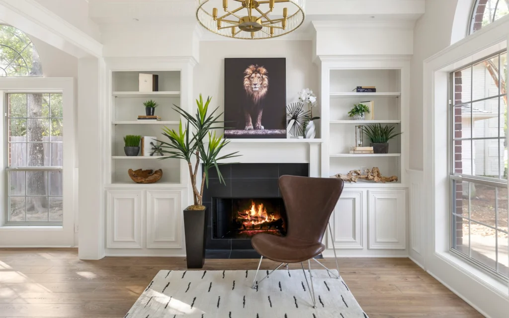
A fire place with a brown chair and wooden aesthetics

Okay, so what exactly do words like soft and warm mean in this context? 

Well, it’s pretty simple! Just think softer not overly saturated colors, that all share the same warm undertones (red, orange, yellow). 

Warm Browns for Creating Cozy and Grounding Spaces

What’s the first thing that comes to mind when we say the word “natural“? 

Well, chances are that your mind went to some browns and greens. Now, greens unfortunately fall under the cool tones, but browns are as natural as they come. 

A golden brown, for instance, gives you a luxurious addition and can be well-balanced with other soft autumn colors. A hazel brown (even light hazel) is less warm but still falls into the same palette, so it contrasts beautifully with that part of the color wheel.

The perfect start is to use earthy tones for a natural feel. That way, you have the perfect foundation to create the best palette for your home decor and remodel ideas for 2024.

Incorporating Wood Finishes and Textures For That Soft Autumn Vibe

Okay, so wood grains and colors already work in their own right. 

That’s why a wooden cabin never goes out of style. But if you have a good natural foundation, you can contrast it. Adding a soft and cooler tone, like an olive green, creates a beautiful combination that makes your room pop! 

Even a turquoise can be thrown in, as long the difference between the two colors compliments one or the other.

Now, we know that making the final choices can be a bit overwhelming! Once call can make all the difference when it comes to design.

Check out our painting service, and we’ll find the perfect option for you!

Sunny Yellows for Cheerful and Inviting Vibes

Let’s move on from the threes and the browns and look up! 

Sunny colors bring an upbeat vibe that, if used carefully, help create a cheerful and inviting vibe. The sunny color palette is ideal when used as an accent color in your room designs. Similar to bright warm palettes, they work best when paired with neutral colors for balance. 

Soft Neutrals for Timeless Elegance and Versatility

If you’re more into a calm (but elegant) lifestyle, pin soft neutral colors and don’t look back.  When layered correctly, these add incredible depth and sophistication to your home.

You want a calm and elegant room, sure, but not too boring. 

But don’t worry, just do your research! Or, if you don’t have the time, you can rely on research that we already prepared for you! Call now, and let’s talk!

Blush Pinks for Creating Serene and Romantic Settings

There are other colors that nature offers for your home remodeling, and they’re often stunning and perfect. Look for pink hues (or to make sure we’re in the soft autumn part of the world) the blush pink hues.

These can create a beautiful, romantic addition to your home. Even if you just want to just use it as a general-purpose color, it can add a serene light spring color type and color palette for any of your rooms.

Color Analysis for Soft, Warm Palettes

A table decor featuring flowers

So what’s the science behind these soft color palettes? 

This is a small collection of colors on the color wheel

The soft part usually refers to a smaller saturation, while the warm obviously refers to them falling on the warmer side of the wheel. This can then be separated further, and that’s where we actually get into the fancy names like soft summer, true autumn, etc.

These two color palettes, for instance, share some hues! 

Remember; it’s just the idea, and the vibe that you’re going for that dictates how you’ll be able to contrast these pallets later on. 

Autumn colors are best complemented with green hues, while summer options, on the other hand, work best with blue hues.

So what does that mean? 

Well, the simplest way to explain it is for you to find the warm hues that you like, and then just draw a straight line across and find its opposite on the wheel! That’s where the blues and the greens will start to make more sense. 

Is The Soft Palette Really You?

So, let’s say you figured out you want an autumn color palette. Well, that’s amazing! But why is that? What makes you want a certain color style over the other? 

Sure, maybe you just wanted to learn all about the soft hues and fell in love along the way! But it’s more complex than that. It’s an accumulation of a myriad of factors that come from your life!

So, to find the perfect color palette for your interior design, you need to look into your wardrobe because you already created it. If all of your outfits lean towards a combination of warm hues and a dark autumn style – well, chances are that you’ll prefer that for your home as well. 

Choosing the Right Paint Colors and Finishes

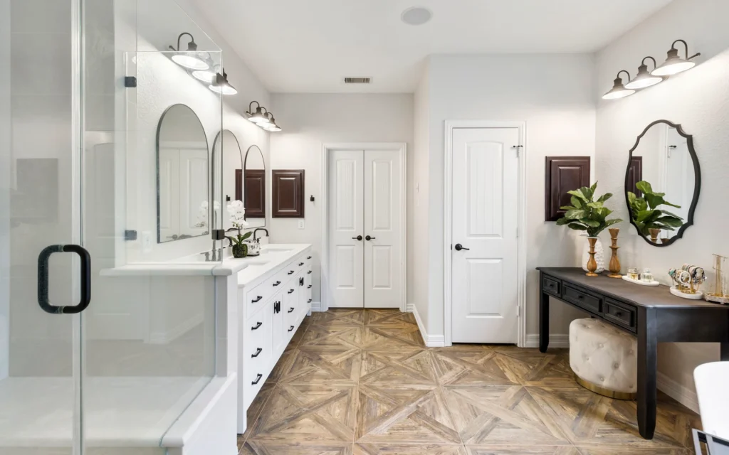
Bathroom renovation with white finishes

The last step on this journey is, of course, choosing the finish! A couple of terms that you might run into the most are matte, satin, and gloss.

Matte finishes, traditionally, have no shine to them. This works perfectly with some more neutral pallets. But don’t worry, you don’t have to have a completely dull finish if you go for a matte one. Modern paints are much more advanced, and even if you get a matte finish, you can add some beautiful sheen that will still help your colors pop. 

Next up is a high gloss, or most commonly just a gloss finish. The opposite end of the scale does just what you would expect it to. It gives you an amazing shine that brings out accent colors beautifully. 

Last but not least, the satin finish. This option is what’s referred to as the perfect middle ground. Not too much shine, and not too flat. If you can’t make up your mind, well, just go for the satin finish!

Embracing Soft And Warm Trends in Interior Design

Soft kitchen interior design

As far as interior design for your home goes, it’s supposed to create a perfect foundation for the rest of your ideas. 

The soft autumn’s pallet brings a nostalgic and timeless beauty that the high contrast counterparts don’t have. These colors are created based on the surrounding nature, after all!

Final Thoughts on Soft Warm Color Palettes for Your Home

The soft and warm color palettes create the perfect blend for your home. They’re a foundation for interior design, and we’re not just talking about 2024. 

When you have this base, the pallet directs your eye, and it can make you look at the rest of the room and bring attention to whatever lovely furniture you might choose. It just all works together  – and it forms a symphony of colors!

If you’re convinced (as you should be), we can help and make sure that your ideas get realized to their full potential. 

So let’s get started!

A white-painted bathroom

Ultimate Guide to Bathroom Paint: Best Colors and Ideas for Your Space

Are you ready to transform your bathroom into a sanctuary with the power of just a good shade of paint?  

We bet you are.

Choosing the right color for your bathroom walls is more than just a design decision; it’s about creating an ambiance that invigorates and relaxes.  

In this comprehensive bathroom-centered guide, we’ll dig deep into the best paint colors for bathrooms, but we won’t stop there. We’re going to offer insights into hues that evoke tranquility, enhance space, and resist mold and mildew – basically all you need to revamp your bathroom!

So, say goodbye to bland bathrooms and hello to a revitalized space with the best paint for the bathroom that reflects your personality and enhances your daily routine!

Bathroom Paint: What to Know Before You Buy

A paint brush painting walls and ceiling of a bathroom

So, you’re gearing up to give your bathroom a fresh coat of paint—bravo! 

But, hear us out.

Before you dive into a sea of color ideas and matte finishes for your spa space, let’s make sure you’re equipped with the knowledge you need to navigate this watery world of sheens, stains, and spa-like serenity.

Before you even think about paint chips, take stock of your bathroom.

Is it a cozy cabinet of calm or a bustling hub of activity? 

For small bathrooms, light, airy colors like soft blues or pale yellows can create the illusion of space. Matte finishes also help minimize imperfections, making them perfect for petite powder rooms.

Sheen or matte finish? Ah, the eternal bathroom paint debate, or one shall say, to be or not to be?

Sheen adds a subtle shimmer and is easy to wipe clean, making it ideal for busy family bathrooms. On the other hand, matte finishes offer a sophisticated, velvety texture that can hide flaws and evoke spa-like tranquility.

What can we say – choose wisely, or make a well-informed choice with us.

If you need help picking the best color for your home – check out our painting service!

And let’s face it – bathrooms can, and often, do, get messy. 

From toothpaste splatters to makeup mishaps, your walls are bound to encounter a few stains along the way. In this case, it’s best to go for acrylic-based paints with built-in stain resistance for easy cleanup and long-lasting beauty.

Don’t forget about your bathroom cabinets, though! 

Choose a durable, moisture-resistant paint that can stand up to daily wear and tear. Satin or semi-gloss finishes work best for cabinets, offering both style and resilience.

Why Bathrooms Are Hard To Paint

A beige bathroom with details

Several key factors contribute to this difficulty, and we’re here to discuss them,

Steam from Showering

Steam from hot showers and baths fills the air – creating an atmosphere that is constantly moist. This high level of humidity can cause traditional paints to peel, bubble, or even develop mold and mildew over time.

Therefore, selecting a paint specifically designed for bathrooms is essential. 

A good option is a high-quality bathroom paint that is formulated to withstand moisture, ensuring longevity and preventing unsightly damage.

If you don’t want your bathroom perfectly painted, check out our bathroom remodel service!

Inevitable Splashes

Secondly, bathrooms are high-traffic areas where splashes and spills are inevitable.

Toothpaste, water, and other bathroom products can easily end up on the walls, necessitating a paint that is washable and easy to clean. Glossy paints – which have a shiny finish – are an excellent choice for bathrooms due to their durability and resistance to stains.

They can be wiped down with ease, making them ideal for maintaining a clean and fresh appearance in a busy bathroom environment.

With us, you don’t have to worry about making a wrong choice. Reach out, and let’s discuss the best option for your bathroom paint.

The Struggle of Aesthetics

Yup, we all want our bathroom to be aesthetically-pleasing – it’s natural.

While functionality and durability are crucial considerations when selecting paint for a bathroom, homeowners also want their bathroom to look stylish and inviting. 

Fortunately, there are plenty of bathroom color ideas to choose from that can enhance the overall design of the space. Opting for a high-quality paint in a color that complements the existing decor can yield the best results.

It’s possible to strike a balance between practicality and aesthetics.

To overcome these challenges, it’s important to choose a high-quality bathroom paint that is washable, glossy, and available in a range of attractive colors. 

The Best Paint to Use In Bathrooms

Renovated bathroom with a tub

Without further ado, let’s get right into it – choosing the best bathroom paint color for your interior! 

Semi-Gloss

A bathroom with a semi-gloss finish

Semi-gloss paint finish is a top choice for bathroom walls simply for its durability and moisture resistance. The high-gloss sheen adds a modern touch, but also creates a protective barrier against moisture, which is essential for bathrooms.

This acrylic-based paint is easy to clean, making it ideal for maintaining the freshness of your bathroom walls.

So, whether you’re planning on painting your bathroom walls, ceilings, or even the tub surround, semi-gloss paint provides a smooth, glossy finish that enhances the overall look of your bathroom.

Not to mention that it’s especially recommended for high-moisture areas and for those who prioritize easy maintenance when it comes to painting projects.

Envisioning a semi-gloss spa experience in your home? Contact us now.

Satin

A bathroom with a satin finish

You can achieve the perfect balance with bathroom paint colors. How, you may wonder?

Well, satin finish paint strikes a perfect balance between matte and glossy; offering a subtle sheen with a touch of elegance.

This interior paint provides a luxurious feel for the homeowner or anyone who enters this soothing place, and it also offers excellent durability and moisture resistance.

The smooth finish of this paint choice makes it easy to clean (again, a major advantage), making it suitable for bathrooms where cleanliness is paramount.

It’s also nice to mention that satin finish paint is versatile enough to be used on walls, ceilings, and even trim. This provides a cohesive look throughout your bathroom.

Eggshell

A bathroom wall with an eggshell finish

Eggshell finish paint is a popular option for bathroom walls, especially in 2024. It offers a soft, velvety sheen to the space. Additionally, the subtle luster of this finish adds depth to the walls while providing excellent durability and moisture resistance.

The versatility and durability make it a top choice for those looking to give their bathroom a fresh, updated look with the right paint.

Bathroom-Specific Paint

A specific paint for bathroom interior

Bathroom-specific paint is formulated specifically to withstand the unique challenges of high-moisture environments

Basically, this is a tough-enough choice for your bathroom interior.

This specialized paint is designed to resist mold, mildew, and moisture – making it an ideal choice for bathroom walls and ceilings. 

The advanced formula provides long-lasting protection against moisture-related issues, ensuring that your bathroom walls stay clean and fresh for years to come.

Important note:

Using bathroom-specific paint is essential for maintaining a clean and hygienic environment.

Mold-Resistant Paint

A bathroom with mold-resistant paint

Mold-resistant paint is a must-have for bathrooms. This is a space where high moisture levels can lead to mold and mildew growth.

This specialized paint contains additives that inhibit mold and mildew growth, helping to keep your bathroom walls clean and healthy. Its advanced formula provides long-lasting protection against moisture-related issues, making it an excellent choice for bathroom walls and ceilings.

Mold-resistant paint is essential for maintaining a fresh, hygienic environment.

Waterproof Paint

An open-concept bathroom with a tub

Waterproof paint offers the ultimate protection against moisture. What it does is it creates a barrier that basically repels water and prevents moisture from seeping into the walls. 

This specialized paint is perfect for areas prone to splashes, such as around the tub and shower. Its waterproof properties make it ideal for bathroom walls and ceilings, where moisture resistance is essential. 

A waterproof paint provides long-lasting protection against moisture-related issues – ensuring that your bathroom stays clean and dry for years to come.

Looking for a waterproof solution for your bathroom? Look no further than us – reach out now, and let’s discuss the best possible option for your home.

Low-VOC Paint

A bathroom with low-VOC paint

Low-VOC paint is an environmentally friendly option that emits fewer volatile organic compounds (VOCs) than traditional paint formulas. This interior paint choice is ideal for bathrooms, where ventilation may be limited and indoor air quality is a concern.

Its low-VOC formula reduces harmful emissions, making it safer for you and your family. Whether you’re painting walls, ceilings, or trim, low-VOC paint provides excellent coverage and durability without compromising on performance. With its eco-friendly credentials and high-quality finish, low-VOC paint is the perfect choice for creating a healthy and beautiful bathroom space.

The 3 Most Popular Bathroom Colors in 2024

The trends in bathroom colors continue to evolve – and will probably do so, but for now, let’s shift our focus on creating tranquil, spa-like spaces that promote relaxation and rejuvenation in 2024.

Here are the three most popular bathroom colors dominating the scene this year:

Soft Gray

A soft gray paint for bathrooms

Soft gray remains a timeless and versatile choice for bathroom walls in 2024. 

This neutral color provides a calming backdrop that pairs beautifully with a variety of design styles, from modern to traditional. 

The elegance behind soft gray makes it ideal for creating a serene atmosphere in the bathroom, promoting a sense of tranquility and balance. 

When selecting the best paint for bathroom walls in this shade, opt for a matte finish to achieve a subtle, velvety texture that complements the soothing ambiance of the room. 

Many leading paint manufacturers offer a wide range of soft gray shades, allowing you to find the perfect tone to suit your aesthetic preferences and create a cohesive look in your bathroom makeover.

Coastal Blue

A coastal blue color for bathrooms

Coastal blue emerges as a popular choice for bathroom walls in 2024 – and it’s no wonder.

This paint color is bringing a refreshing and invigorating vibe to the space. 

The soothing hue evokes the tranquility of the ocean – creating a sense of escape and relaxation. 

Coastal blue is particularly well-suited for small spaces, as it can visually expand the room and create a sense of openness. When choosing the best paint for bathroom walls in coastal blue, consider opting for a flat or matte finish to achieve a soft, subtle look that enhances the coastal-inspired aesthetic. 

Of course, you can customize the color to suit your personal style and create a cohesive look in your bathroom paint job.

Warm Beige

Warm beige is also a widely popular bathroom color choice in 2024 – adding warmth and sophistication to the space. 

This versatile, yet still,  neutral color creates a welcoming atmosphere and pairs effortlessly with a variety of accent colors and finishes

Warm beige is an excellent choice for creating a spa-like retreat in the bathroom – of course, if you’re looking to create such an ambiance.

With this color, you are promoting a sense of comfort and relaxation. 

When selecting the best paint for bathroom walls in warm beige, consider opting for a matte finish to achieve a soft, velvety texture that enhances the cozy ambiance of the room. 

Summing Up

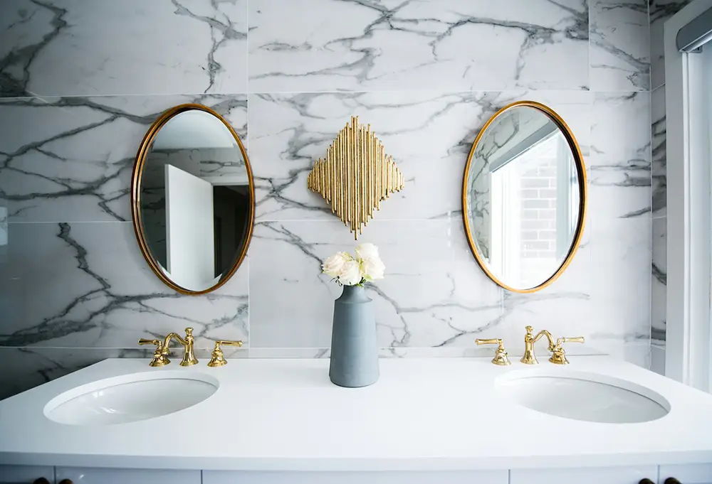
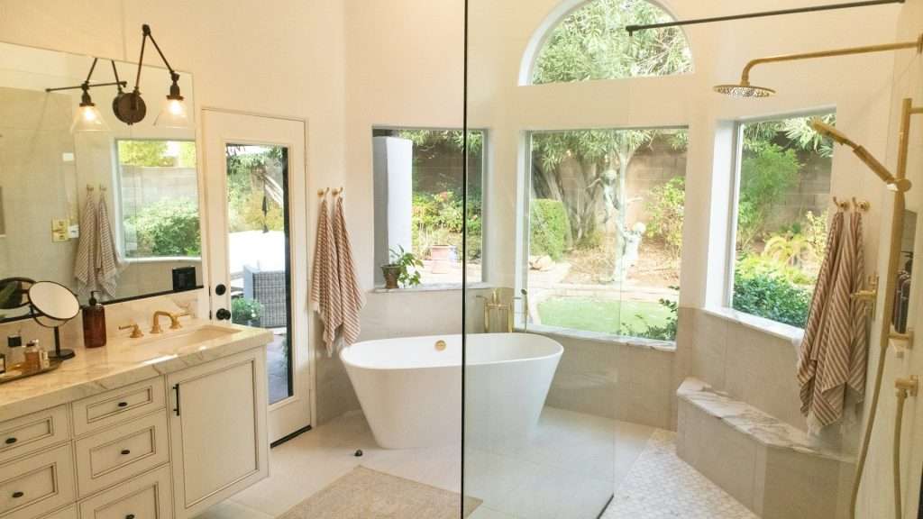
A bathroom sink with a plant decoration

Finally, we’ve reached the very end of this comprehensive guide, and so far, we’ve explored the transformative power of bathroom wall paint, from creating a spa-like ambiance to resisting mold and mildew. 

In the end, the decision is up to you. So, whether you’re drawn to the sophistication of soft gray, the refreshing vibe of coastal blue, or the warmth of beige – don’t worry one bit — there’s a perfect hue to suit your style and enhance your bathroom’s atmosphere

With Design on a Dime, it’s time to say bye to bland bathrooms and hello to a revitalized space with a fresh coat of paint. Ready to paint your walls and elevate your bathroom feel? Contact us now and let’s turn your vision into reality.

Top 10 Garage Paint Color Ideas to Elevate Your Garage Interior

Let’s get straight to the point!

Welcome to our guide on transforming your garage with the top 10 paint color ideas.

Your garage is more than just a place to park your car – it’s an extension of your home and deserves to look its best

You use your garage for storage, as a workshop, or as a multipurpose space – and so, it needs to be kept in good shape.

So, naturally, choosing the right color can make a big difference in its appearance and functionality.

In this article, we’ll explore a variety of garage color options that will help you elevate your garage interior, all while reflecting your personal style and enhancing the overall ambiance of the space.

Are you prepared for the garage makeover of your dreams? Scroll down!

Importance of Garage Aesthetics

Your garage is more than just a utilitarian space — it’s an extension of your home and should reflect your personal style and attention to detail. 

Investing in visually-pleasing garage aesthetics can have several benefits, and we’re here to list them:

Enhanced Property Value

A well-maintained and visually appealing garage can increase the overall value of your property. Potential buyers are often impressed by a garage that is organized, clean, and aesthetically pleasing. 

Who wouldn’t be?

Improved Functionality

An organized and visually-pleasing garage makes it easier to find items, navigate the space, and complete tasks. 

When everything has its place and the garage is well-lit and inviting, you’re more likely to use it effectively for storage, hobbies, or even as a workspace.

Boosted Mood and Morale

Stepping into a garage that is bright, clean, and aesthetically pleasing can also have a major positive impact on your mood and morale — and that’s a fact. 

It can motivate you to tackle new and exciting projects, spend time on interesting hobbies, or simply just take a moment for yourself and enjoy the space for relaxation.

Extended Living Space

Many homeowners are now using their garages as extended living spaces for entertaining, exercising, or pursuing their hobbies. By investing in garage aesthetics, you can create a welcoming environment that integrates with the rest of your home.

Ready to transform your garage without breaking the bank?

Explore our design tips and start your garage makeover today – check out our painting service!

Top 10 Garage Paint Color Ideas

Transforming your garage with a fresh coat of paint is a simple yet impactful way to elevate its appearance and functionality.

With the right paint colors, you can create a space that is not only visually appealing but also reflects your personal style and enhances the overall ambiance of your home.

These color choices are sure to breathe new life into your garage interior. 

So, let’s start!

Classic White

Classic white is a timeless and versatile choice for your garage interior. Its clean and bright appearance instantly freshens up the space.

White walls can also reflect light, making the garage feel more spacious and airy. 

While you’re at it, consider using classic white for walls and ceilings, and cabinets to create a clean and timeless look that will never go out of style.

Slate Gray

Slate gray brings sophistication and depth to your garage interior. The rich and modern hue adds a touch of elegance to the space, which creates a sleek and stylish ambiance.

This dark gray color also serves as a neutral backdrop that pairs well with a variety of accent colors and design styles. 

Navy Blue

Navy blue is a bold and striking choice for your garage interior – that’s for sure, but we’re all about bold choices over here. The deep and dramatic hue of navy blue adds depth and character to the space, creating a sense of luxury and sophistication.

Not to mention that it also provides a versatile backdrop for a variety of color scheme options, from modern to traditional. Consider using navy blue for accent walls or as a bold pop of color for your garage door and trim to create a memorable and stylish garage interior.

Olive Green

Olive green brings a touch of nature and tranquility to your garage interior. Its earthy and soothing hue creates a serene and inviting atmosphere, making the space feel cozy and welcoming. It also pairs well with a variety of accent colors and design elements, allowing you to customize the look of your garage to suit your personal style. 

Here’s an idea – consider using olive green for walls or as an accent color for built-in cabinets and accessories to create a relaxing and stylish garage interior.

Charcoal Black

Charcoal black is a bold and dramatic choice for your garage interior, adding a sense of sophistication and depth to the space.

Its deep, rich hue creates a striking contrast against lighter colors — making it a standout feature in any garage. 

Terracotta Red

Terracotta red brings warmth and vibrancy to your garage interior, especially if you’re going for a Mediterranean vibe. The rich, reddish-brown hue adds a touch of elegance and character to the space, making it feel cozy and inviting. 

Beige

Beige is a classic and timeless paint color choice for your garage interior, offering a neutral backdrop that complements any garage design style.

Its warm, sandy tones create a sense of comfort and tranquility, making the space feel cozy and inviting. 

Royal Blue

Royal blue is a regal and sophisticated choice for your garage interior, adding a sense of luxury and opulence to the space. Its deep, rich hue creates a striking contrast against lighter colors, making it a standout feature in any garage.

Sunset Orange

Sunset orange brings warmth and energy to your garage interior, evoking the vibrant colors of a summer sunset.

Consider using this color for cabinets or shelving if you’re looking to create a fun and inviting garage interior. 

Metallic Silver

Metallic silver adds a touch of glamour and sophistication to your garage interior, creating a sleek and modern look that is sure to impress. The reflective surface catches the light and adds depth to the space, making it feel more spacious and airy.

Discover affordable ways to elevate your garage interior! Dive into our specially crafted collection of projects and design inspiration.

Give your garage a makeover today – check out our interior design service!

How to Choose a Garage Paint Wall Colors: 5 Top Tips

Choosing the perfect paint color for your garage walls can seem daunting, but it doesn’t have to be!

Here are some quick tips and tricks to help you make the right choice:

Consider Lighting

Take note of the natural and artificial lighting in your garage. Lighter colors can help brighten up a dimly lit space, while darker colors may absorb light and make the garage feel smaller.

Test Samples

Before committing to a color, test out samples on your garage walls. Paint a small section and observe how it looks at different times of the day. This will give you a better idea of how the color will appear in your space.

Consider Functionality

Think about how you use your garage and choose colors that suit your needs. For example, if you use the space as a workshop, you may want to opt for darker colors that can hide dirt and stains.

Coordinate with Flooring

Take into account the color and material of your garage flooring when selecting wall colors. Choose complementary hues that create a cohesive and harmonious look.

Think Long-Term

While trendy colors can be tempting, consider how your color choice will hold up over time. Opt for timeless hues that will remain stylish for years to come.

The Final Verdict on Garage Paint Ideas

To wrap things up – choosing the perfect paint color for your garage can transform it from a mundane space into a stylish and functional extension of your home.

The final verdict is totally up to you. 

You can opt for classic white for a clean and timeless look, slate gray for modern sophistication, navy blue for bold elegance, or olive green for tranquil warmth.

The key is to select a color that reflects your style and meets your needs.

Browse our cost-effective design solutions and get started on your makeover journey. What’s the hold up? Contact us now!

Blue accent wall ideas

Stunning Blue Accent Wall Ideas for Beautiful Home Decor

Looking to elevate your living space with a touch of color?  You’ve landed on the right page.

Consider this your official welcome into the world of blue accent walls!

Blue is a versatile and timeless color that can evoke many emotions, and that’s for sure. From tranquility to boldness, this accent wall color is able to completely transform your living space.

So, whether you’re aiming to create a serene sanctuary or make a striking statement in your master bedroom, per se, blue walls offer endless possibilities.

Feeling intrigued? Stick around as we explore some stunning blue wall ideas and discover how you can elevate your space with the power of blue. 

Elevating Your Space with Blue Accents

Blue is more than just a color. In the world of home decor, it’s a mood enhancer as well. Research actually suggests that blue hues have a calming effect on the mind and body. This makes these shades ideal for creating relaxing environments.

incorporating blue accents into your decor can help promote a sense of calmness and well-being, but more importantly, it can turn your home into a peaceful retreat from the hustle and bustle of daily life.

On a similar note, blue is known to stimulate creativity and productivity – which makes it a perfect choice for your home office. By strategically incorporating blue accents into your decor, you can enhance both the aesthetic and functionality of your living space.

Ready to elevate your space with stunning blue accents?

Check out our interior design service for personalized design recommendations tailored to your home. 

Let’s create a space you’ll love coming home to!

Blue Accent Wall Ideas For Your Bedroom, Living Space & Home Office

Whether you’re looking to create a peaceful retreat in your bedroom with a navy blue accent wall, add a pop of color to your nest, or enhance productivity in your home office with a dark blue wall, these shades offer endless possibilities for elevating your decor.

Let’s discover the perfect shade that complements your style and ambiance. 

Ocean-Inspired Tranquility

Create a serene oasis in your bedroom with an ocean-inspired blue feature wall. Soft shades of aqua or turquoise can evoke the calming essence of the sea, lulling you into a state of relaxation. 

To complete this peaceful vibe, pair your blue accent wall with crisp white linens, natural textures, and coastal-inspired decor.

You can also add touches of beach-inspired decor, such as seashells, driftwood, and rattan furniture. This will significantly enhance the coastal ambiance and bring the beauty of the ocean into your home.

As a final touch, elevate your ocean-inspired bedroom by adding a woven headboard or whitewashed wood paneling. 

Teal Oasis in the Home Office

Transform your home office into a vibrant and inspiring workspace with a bold teal accent wall. Teal is a harmonious blend of blue and green, and it symbolizes balance, creativity, and growth. 

With a teal accent wall into your home office, you can create a stimulating environment that fosters productivity and innovation – perfect if you’re working from home.

Pair your teal accent wall with sleek, modern furniture, metallic accents, and pops of contrasting colors to create a dynamic and energizing workspace that fuels your creativity and helps you stay focused and motivated.

Let’s create a space you’ll adore returning to every day!

Contact us now for personalized design recommendations crafted just for your home.

Midnight Blue Elegance

It’s time to add a touch of sophistication and drama to your living room with a midnight blue accent wall.

These rich, dark blue shades add elegance and luxury – instantly enhancing the style of any room in your home. 

Try pairing your midnight deep blue wall with a plush white sofa, metallic accents, and chic textiles to create a cozy and luxurious ambiance – perfect for enjoying every moment indoors. 

Also, consider soft lighting to enhance the intimate atmosphere and create a sense of warmth and comfort. 

After all, with its timeless appeal and understated elegance, a midnight blue accent wall adds a touch of glamour to any living space. 

Bold Navy Statement

Make a bold statement in your dining room or entryway with a navy blue bedroom wall.

Navy is a versatile and sophisticated color that exudes confidence and style, and by incorporating a navy blue wall into your home decor, you can create a focal point that anchors the room and adds visual interest. 

Pair your navy accent wall with crisp white trim, wood accents, and metallic fixtures to create a classic and timeless aesthetic

To finalize your makeover project, add touches of color and texture with vibrant artwork, decorative accessories, and statement furniture pieces to personalize the space and make it your own.

Sky Blue Serenity

Image alt tag: A living room with a blue accent wall

Transform your nursery or child’s bedroom into a whimsical and enchanting space with a sky blue accent wall.

Soft, pastel blues evoke feelings of serenity and innocence, creating a peaceful and nurturing environment for your little one. 

Pair your light blue wall with playful decor, such as colorful wall art, patterned textiles, and whimsical accessories, to create a magical and imaginative space that sparks joy and wonder. 

With its soothing properties and playful appeal, a sky blue accent wall creates a charming and inspiring backdrop for your child’s dreams and adventures.

Take the first step to transform your space!

Contact us today for a personalized design consultation and let’s bring your vision to life.

Practical Tips for Blue Accent Wall Decor

When incorporating blue accent walls into your home decor, it’s extremely important to consider the following practical tips:

Choose the Right Shade

Experiment with different shades of blue to find the perfect hue for your space. Lighter blues create a sense of airiness and openness, while darker blues add depth and drama.

Before saying “Yes” to the color, consider the mood you want to evoke and the overall aesthetic of your space when selecting a shade of blue.

Balance with Neutrals

Offset the boldness of a blue accent wall with neutral furnishings and decor. White, beige, and gray tones provide a sophisticated backdrop for your blue masterpiece, allowing it to take center stage without overwhelming the space.

Incorporate neutral textiles, such as rugs, curtains, and throw pillows, to create a cohesive and harmonious look that enhances the beauty of your blue accent wall.

Consider Lighting

Lighting options can be a deal breaker!

Pay attention to the natural and artificial lighting in your space, as it can affect the appearance of your blue accent wall. Blue tones may appear cooler in rooms with ample natural light, while warmer lighting can enhance the richness of darker blues.

Experiment with different lighting fixtures and bulbs to find the perfect balance that highlights the beauty of your blue accent wall and creates the desired ambiance in your space.

Summing Up: Ready To Add Shades Of Blue To Your Living Space? 

Time to sum up what we’ve learned so far. 

Blue accent walls represent a simple yet impactful way to refresh your space and express your personal style. Whether you’re drawn to calming ocean hues, bold navy statements, or playful pastel – there’s a shade of blue out there for every taste and aesthetic. 

Embrace the versatility and beauty of blue, and watch as your living space comes to life with style, elegance, and personality.

Take the plunge and elevate your living space with stunning blue accents today!

If you’re ready to transform your home with beautiful blue accent walls, we’re here to help.

Contact us for expert design advice and personalized decor solutions.

Let’s turn your vision into reality!

Contact us to schedule your consultation!