
Unexpected Red Theory: Use a Pop of Red to Elevate Your Space
The Unexpected Red Theory has been shaking up the design world since 2023—and let me tell you, it’s got some serious charm.
Just imagine a room that feels perfectly fine, but maybe a bit too polite. Then—bam!—in comes a dash of red, and suddenly that space is alive, confident, and unforgettable.
It’s not about drowning your home in crimson, darling; it’s about those clever, surprising touches that make people stop and smile. Think of it as your room’s wink, its little bit of sass.
Curious how to master this subtle yet powerful design move?
Stick around, because we are about to unpack how this playful idea can bring fresh energy into any space you call home.
What Is the “Unexpected Red” Theory?

Red has always had a way of strutting into a room like it owns the place, but the famous “Unexpected Red” Theory is not about painting every wall fire-engine bright—quite the contrary. It’s about letting red play the surprise guest:
Showing up in just the right spot to make everything else look sharper, fresher, more alive.
Imagine a calm, neutral living room where all the tones are whispering quietly, and then—bam—you see a cherry-red chair taking center stage. Or it may be a ruby vase on a beige shelf, a crimson lamp perched in a soft-gray corner.
You get the idea, sugar.
Those little jolts of color wake the eye up and bring the whole space to life.
And the beauty of this idea is the balance. Red works best in doses—small but mighty accents that feel intentional rather than overwhelming. Done right, it’s not chaos, it’s choreography.
That one red touch guides the gaze, makes the room feel more designed, and gives people something to smile about when they walk in.
Sometimes it takes a trained eye to know where those pops of red will shine the brightest. If you’re curious how to make it sing in your own home, Design on a Dime can help you strike just the right note.
Origins & Rise of the Trend
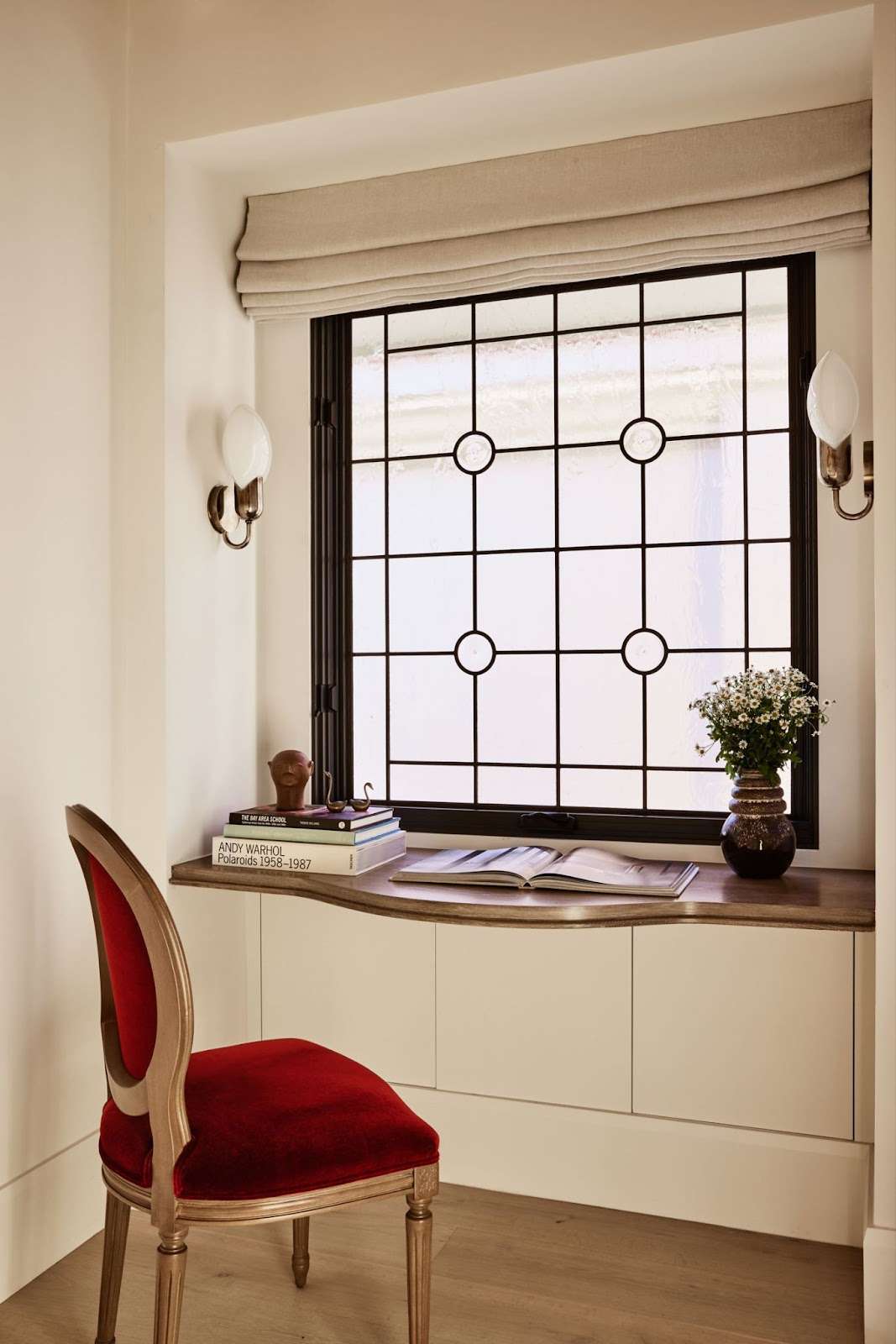
Like most good design ideas, the Unexpected Red Theory didn’t just pop out of nowhere. It’s got roots and a runway, darlin’.
On one side, you’ve got a long line of artists who proved red could shake the dust off tradition. From the Fauves splashing unapologetic scarlet across their canvases to Cubists slicing color into bold shapes, the modernist movements showed us that red was never meant to sit quietly in the corner.
You’ll notice their rebellious spirit still echoing in today’s interiors, especially when you splash in that daring red that can turn a once tame space into something magnetic.
Then came social media—and honey, that’s when the match hit the flame.
In 2023, designer Taylor Migliazzo Simon dropped a TikTok that casually explained how a single pop of red can transform a space. Nearly a million views later, red was no longer just a designer’s secret—it was a full-blown trend.
Before you knew it, everyone from Elle Decor to that Pinterest board you swear you barely use was talking about it. The movement’s been fueled by shares, media buzz, and wild experiments in mismatched rooms everywhere.
So, really, it’s a marriage of old and new.
You’ve basically got this juicy mix of art history’s love affair with daring color and the viral energy of TikTok; that’s how an age-old design principle became today’s buzziest decorating trick.
Why Red Works: Psychology & Visual Impact
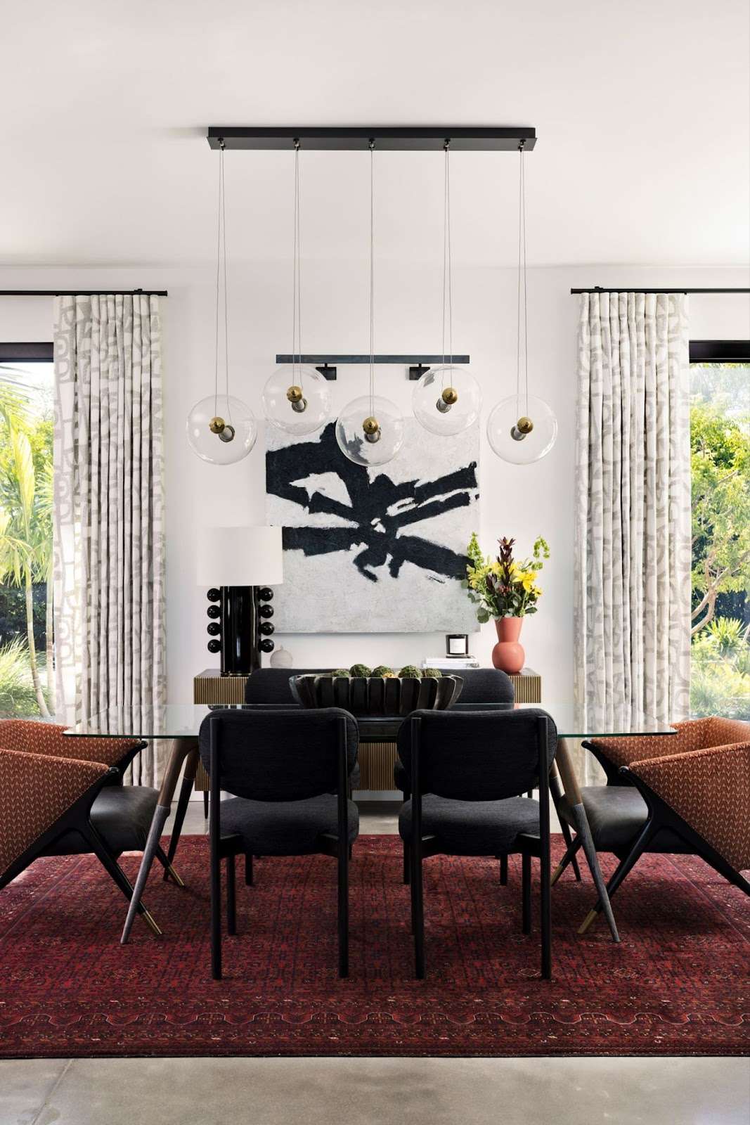
Red isn’t just a pretty face in your room—it’s got personality, presence, and a little bit of sass. A single red accent can pull the eye, set the mood, and make everything else in the space feel sharper, warmer, and a lot more intentional.
Think about it, darlin’:
A scarlet pillow on a soft beige sofa doesn’t just sit there; it wakes up the whole room like it’s had a double espresso.
And that right there is the magic of red’s visibility and emotional pull. It signals energy, confidence, and excitement, even when used sparingly. That pop of red will guide attention toward a favorite piece of art, a unique architectural detail, or a reading nook, making the space feel thoughtfully curated without trying too hard.
Now, honey, red’s influence is not just emotional; it’s visual science.
In color theory, red creates contrast, naturally draws the focus, and adds dimension to neutral and muted palettes. Pair it with complementary shades—think soft blues, gentle grays, or warm taupes—and you can create a balanced, harmonious look.
A touch of blush or terracotta could soften the intensity in intimate spaces like bedrooms, while cherry-red accents in kitchens and dining areas can boost energy and appetite.
The trick?
Less is more.
One confident pop of red can do what an entire wall might struggle to achieve. Too much, and your space feels jittery, like it’s had one too many cups of coffee. But when you get that balance right, that single red detail transforms your room from calm and quiet to bold, vibrant, and full of life.
Of course, you could go in the opposite direction with strategically placed blue accents—like we did for the Laura Project.
If you’d love a hand weaving bold accents into a design that still feels like you, that’s exactly where Design on a Dime’s Dream Team steps in.
How to Use Unexpected Red in Your Space
Nothing perks up a room faster than a clever pop of red, honey. It’s your secret weapon for instant energy and style, and the best part?
You don’t need to repaint the whole house.
The trick is knowing where to place it so your space feels intentional—not like Valentine’s Day exploded in it. Whether you start small or go full-on bold, red accents can bring depth, personality, and that little “wow” factor every room deserves.
Soft Furnishings & Accessories
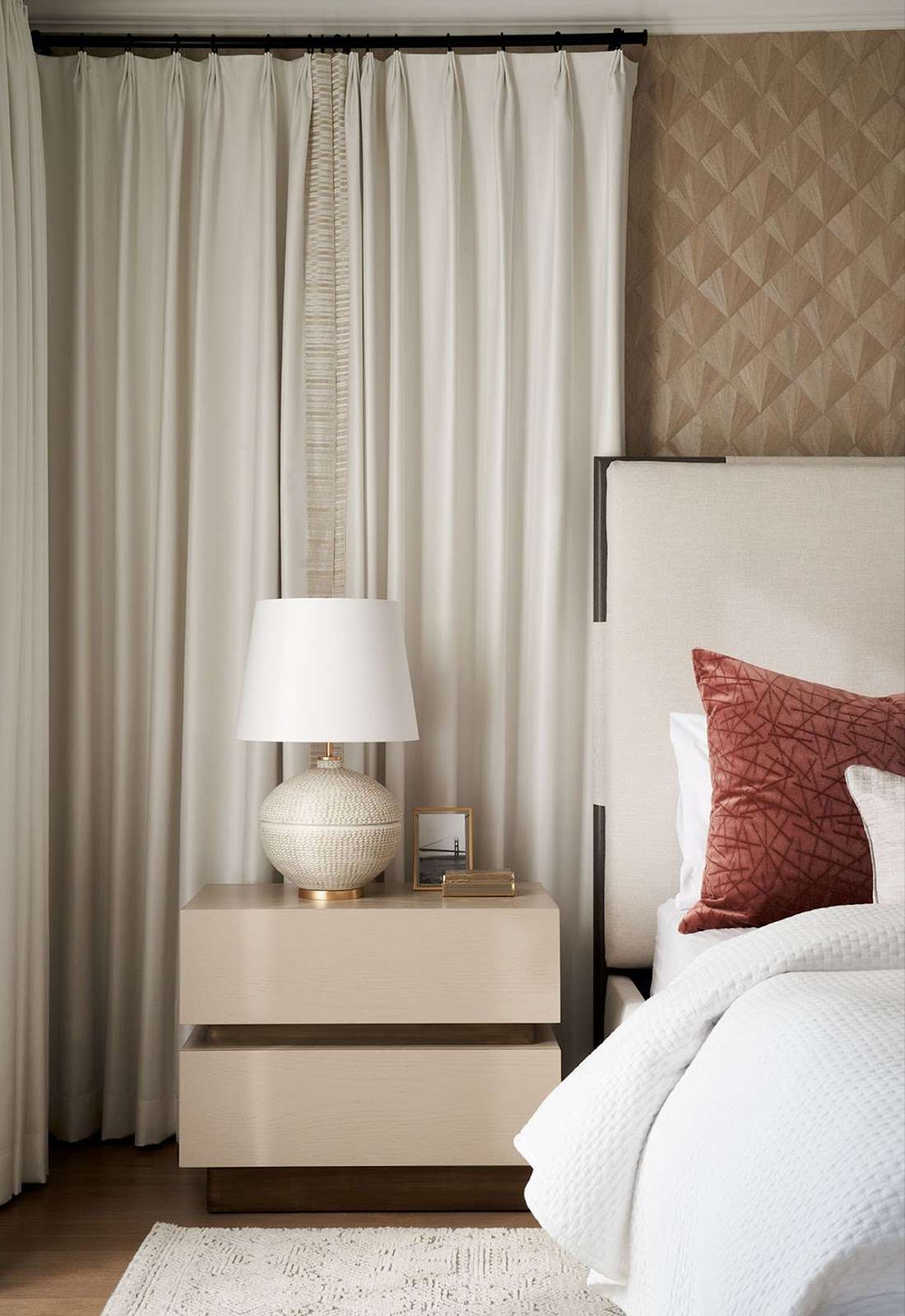
Start where it’s easiest to swap and play—pillows, throws, lamps, and frames.
A single scarlet pillow on a neutral sofa or a crimson throw folded across the armchair can make the living room sing. Lampshades, picture frames, or even a bold rug can do the same trick.
Oh, and don’t be afraid to layer textures, honey—velvet, boucle, or lacquered finishes will add dimension and keep the red from feeling flat.
These small-scale pieces let you experiment without commitment, and swapping them out seasonally (or whenever your mood shifts, honestly) is a breeze.
Architectural & Permanent Features
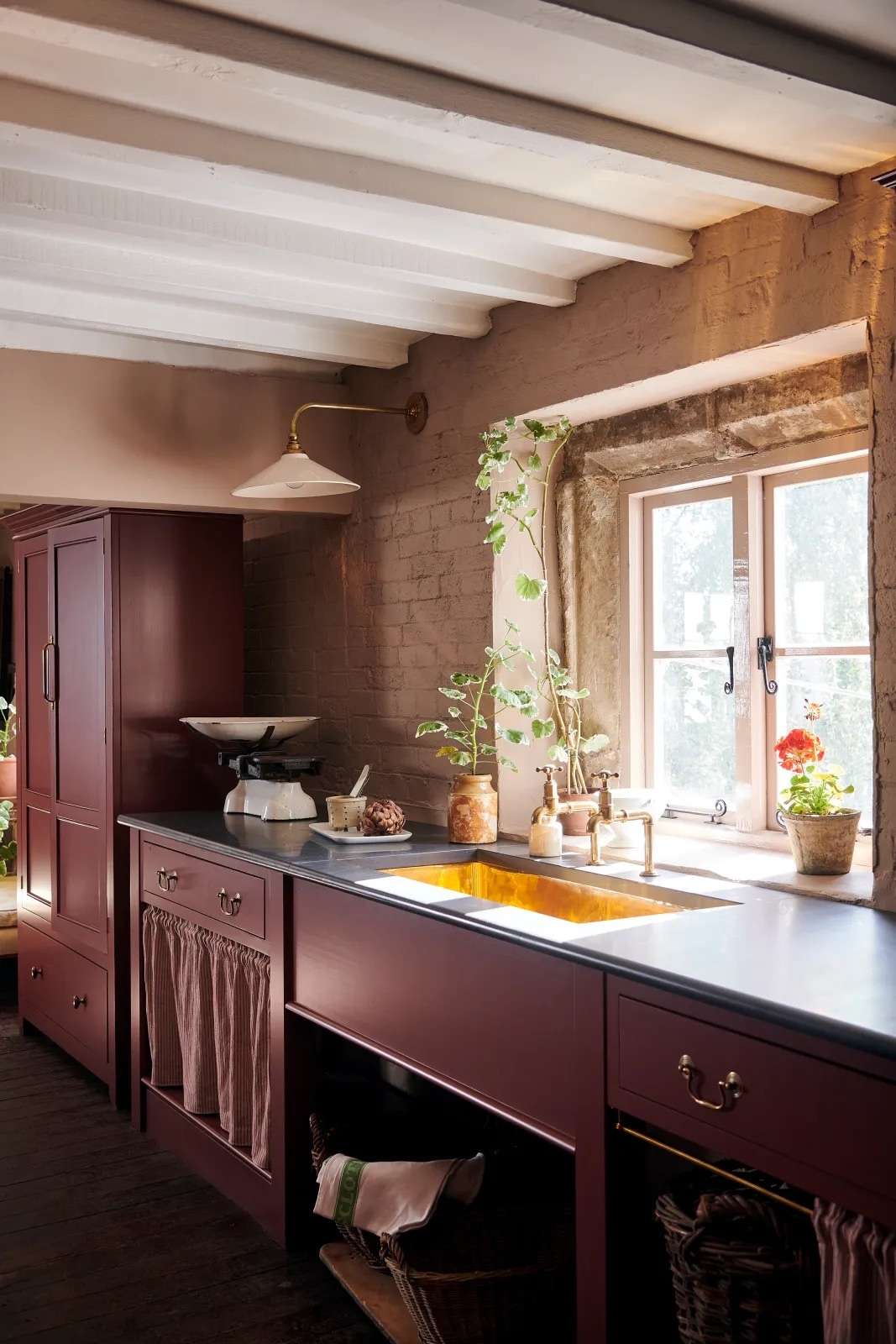
For the brave hearts ready to make a bolder statement, red can shine in the doors, trim, accent walls, and cabinetry.
Can you imagine a deep cherry-red door opening into that sunlit hallway of yours, or a muted gray kitchen with a striking red island? Even trim or stair railings painted red can act as a subtle but confident guide for the eye.
Permanent features take planning, sure—but when done thoughtfully, they anchor the room and create a sophisticated, intentional look that feels anything but timid.
Wall Art & Statement Pieces
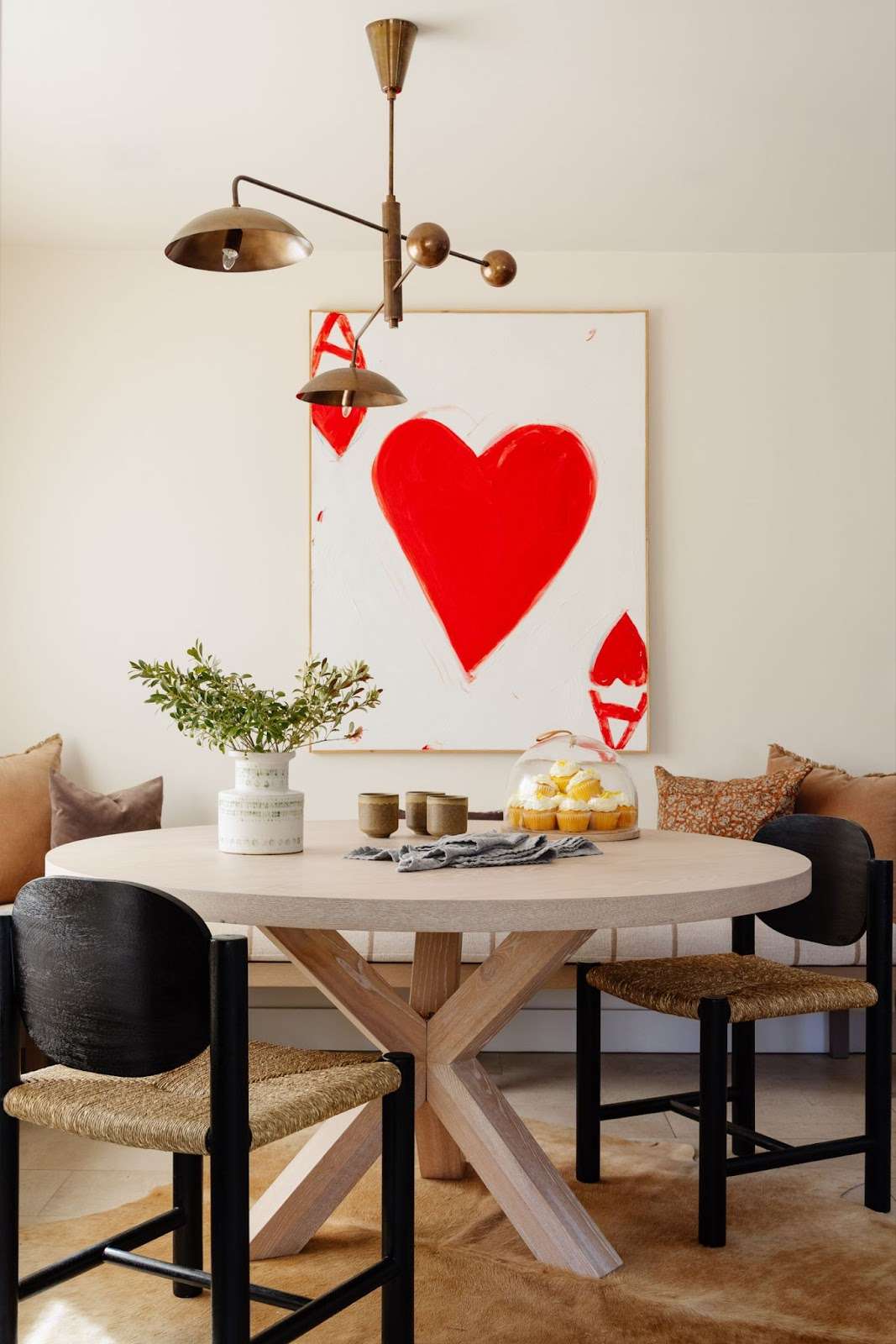
Red wall art is a designer’s best friend—dramatic, engaging, and swap-friendly.
A ruby-hued painting or a bold graphic print can spark conversation, anchor your seating area, or highlight architectural details without the permanence of paint.
You can mix in small accents like a red vase or sculptural object nearby to carry the color throughout the space, creating rhythm without overwhelming the eye.
Specialized Applications
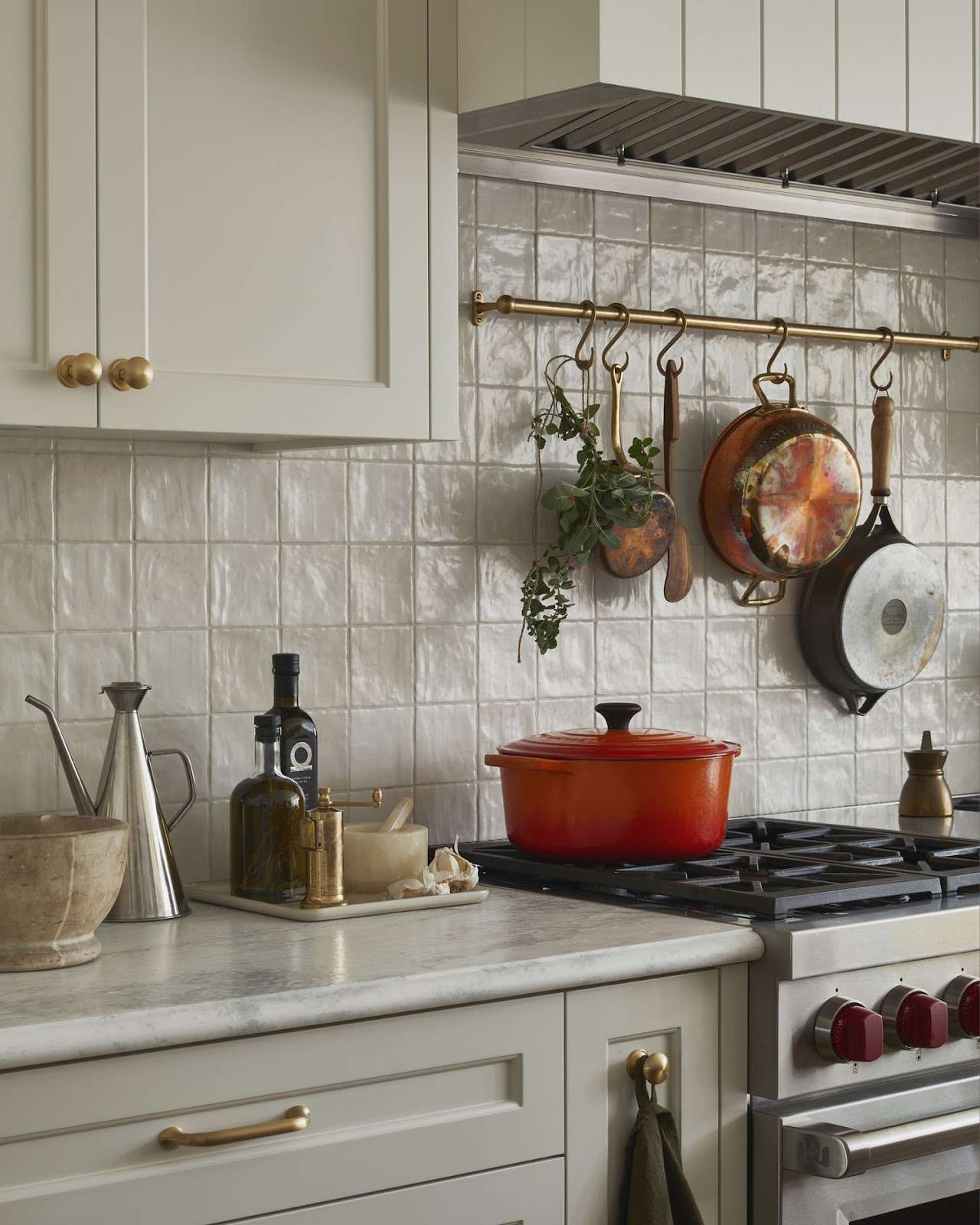
Some rooms deserve a little extra flair, wouldn’t you agree?
In kitchens, for example, red stools and accents add a playful “hello” that makes the space feel lived-in and lively. Entryways love a red bench or console for instant curb appeal inside the door. Even pantries or hidden nooks can benefit from a cheerful cherry hue to brighten the mundane.
And in bedrooms? Well, a softer terracotta or blush-red accent can make the space feel intimate and cozy, while still keeping things balanced.
Again, placement and restraint are everything, honey.
One red accent can transform a space, and thoughtful layering through texture, scale, and complementary neutrals lets it shine without stealing the show.
So, mix, match—and don’t be afraid to let your room smile. And if you’re itching to try a daring red moment but don’t know where to start, Design on a Dime will help you dream it up. From throw pillows to statement pieces, we’ll tailor every choice to your home’s personality.
Pitfalls & Criticisms: When It Doesn’t Work
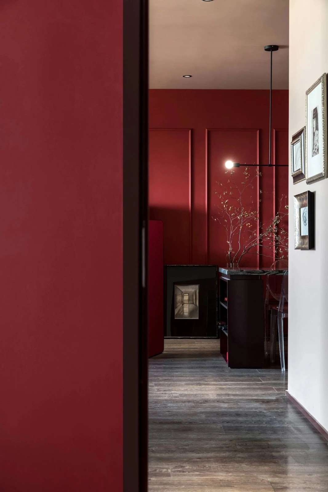
Red can be bold, beautiful, and full of personality—but honey, it’s not magic on its own. What I’m saying is, use it without putting in any thought, and the room can go from chic to chaotic faster than a Texas summer thunderstorm rolls in.
So, here’s what to watch for:
Overwhelming Visual Clutter
Ever walk into a room and feel like your eyeballs are doing the Macarena? Yeah, well, that’s visual clutter talking.
A single red accent demands quite a bit of attention—but if your space is already crowded with competing patterns, jam-packed shelves, and overall has zero breathing room, your pop of red will only get lost in the madness.
To tame it, give your pieces space to shine. We’re not going for “Where’s Waldo?” vibes here.
Area rugs, open shelving, and well-planned window treatments can help define zones and create a calmer flow, letting your red accent truly sparkle.
Clashing Color Schemes
Red loves company—but it doesn’t play nicely with just anyone.
Throw a fire-engine red onto icy grays without a transitional shade, and you’ll definitely feel your eyes do a double-take.
The trick, darlin’, is harmony:
Combine red with complementary or muted tones, add texture, and use soft accents to smooth transitions. Remember, high-voltage reds mixed with other saturated colors may feel like a neon circus instead of chic drama. Let your statement color sing—but don’t let it brawl.
Disrupted Spatial Balance
Red is a spotlight-stealer, honey. And if you scatter it haphazardly or pile too much into a tiny space, it can dominate everything else in the room.
That cozy nook? Overpowered. That gallery wall? Ignored.
Experts suggest keeping your color palette tight—three colors max—and strategically placing red accents, so that they’ll guide the eye rather than hijack it. On that note, multi-functional furniture and “going vertical” can help maintain flow, letting red do its confident strut without overwhelming the room.
Too Much Red, Too Little Restraint
Even the most daring red can overstay its welcome, but matte finishes, smaller-scale accents, and mindful repetition can keep the intensity in check.
Remember—less is more. A single throw pillow, a lampshade, or a vase can make a room sing. Overdo it, and your space might feel like it just had five cups of espresso and can’t sit still.
Red can be a showstopper—but that balance is everything. If you would rather skip the trial-and-error and go straight to a design that works beautifully, our Dream Team can help you get there with ease.
Frequently Asked Questions
Can the Unexpected Red Theory work in small spaces?
Yes, it works in small spaces, too! You can use a single red accent or a smaller-scale accessory to create impact without overwhelming the room.
Are certain shades of red better for different rooms?
Absolutely. Deep reds feel cozy in bedrooms, cherry or tomato reds can energize your kitchen, and bright crimson pops work particularly well in living areas or as accents throughout your home.
How do I mix red with patterned fabrics or wallpaper?
You can pair red with patterns that have subtle, neutral tones; that way, you’ll avoid visual chaos. Also, be sure to use red sparingly—in one or two elements—to tie the look together.
Can red be used outdoors in the same way?
Yes! Red planters, outdoor cushions, or accent chairs can create focal points in patios and garden spaces, the same way they do indoors.
What lighting works best for red accents?
Warm, natural light can add to the red’s richness, while cooler lighting might mute it. Adjustable lamps and dimmers can help you control the intensity, so they’re definitely worth considering.
Unexpected Red, Unforgettable Spaces
Here’s the thing, sugar—your home should make you grin every time you walk through the door. A dash of red can be that spark, that little wink that turns ordinary into unforgettable.
But color’s just the beginning.
The real magic happens when every piece—from the furniture and textures to lighting and yes, even those pops of red—comes together in harmony.
That is where a designer’s eye can save you from second-guessing, and help you land on a look that feels effortless. If you’re itching to give your space a glow-up, reach out—Design on a Dime is ready to help you play bold and create a stylish, inviting atmosphere that reflects your creativity!