
Colorful Quiet Luxury: How to Bring Warmth and Elegance Into Your Home
Colorful, quiet luxury is all about mixing soul-soothing calm with a little sparkle of personality.
It’s that feeling you get when you walk into a room and instantly breathe easier, yet still notice the richness in every detail. Think understated neutrals that whisper comfort, paired with accents that shine just enough to make you smile.
This style doesn’t shout—far from it. It hums, wrapping your home in warmth, refinement, and just the right touch of joy. Stick around, honey, because once you see how this approach can transform any room, you’ll never look at “luxury” the same way again.
Understanding the Essence of Quiet Luxury
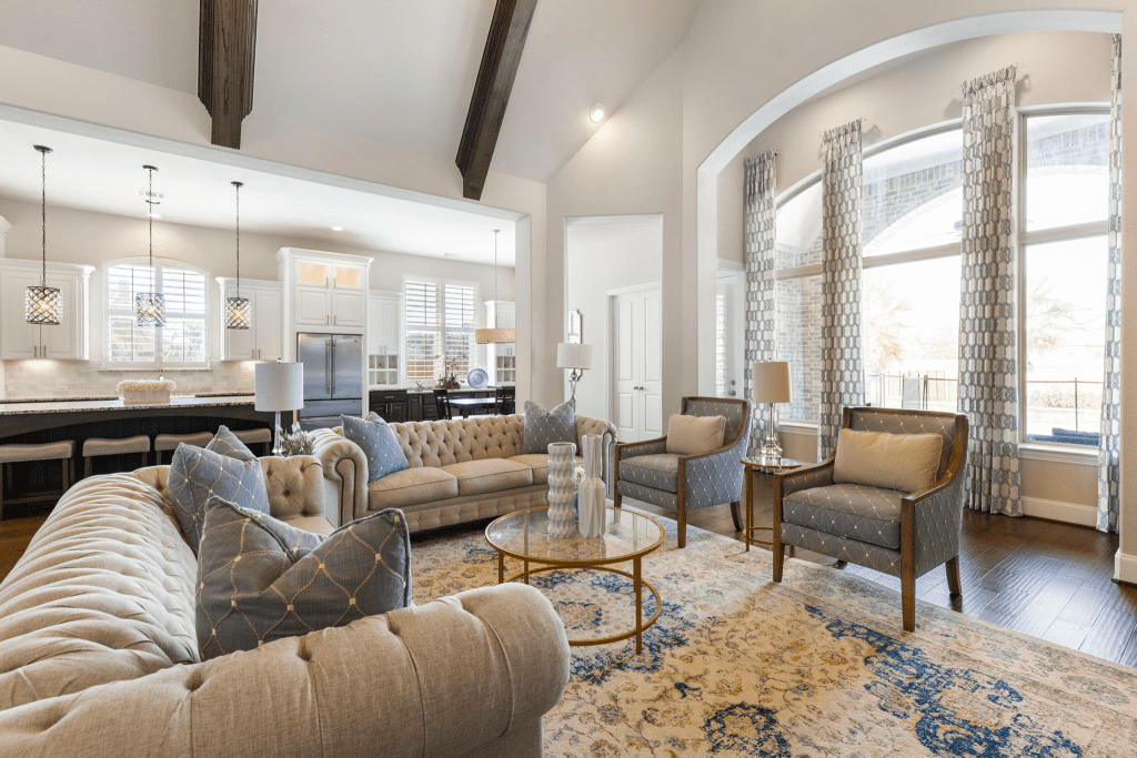
If you’ve ever walked into a room that feels calm, rich, and inviting all at once—but nothing in it is shouting for attention—honey, you’ve already met quiet luxury.
It’s the design world’s soft-spoken charmer, the one that wins you over not with glitter, but with grace.
Here’s the secret:
It all starts with a neutral foundation. Off-whites, sandy beiges, warm taupes, and soft grays create that grounded, timeless backdrop where everything else can shine. These colors are like good friends—rather than competing, they just let the room breathe.
Then comes the soul of it all—quality materials. I’m talking supple leathers, natural linens, velvety plaster walls, or slabs of marble that feel cool under your touch. These pieces are more than just pretty; they have substance. They age gracefully, tell a story, and earn their keep.
Textures are where quiet luxury really leans in. A nubby wool throw thrown over that smooth stone bench, silk pillows against a matte oak headboard, or woven grasses beside polished metal; each contrast adds a new layer of richness.
It’s less about decorating and more about composing, like building harmony in music.
And let’s not forget form, honey. In quiet luxury, shapes are sculptural without being showy—like a curved sofa that hugs the room, a ceramic vase with just the right imperfections, or a table whose clean lines feel effortlessly balanced. They hold presence without ever needing to shout.
At the end of the day, quiet luxury is about editing. Every piece, every shade, every finish has a reason for being there. And if your home could talk, it would say, “Understated, darling—not unseen!”
The Colorful Evolution in Quiet Luxury
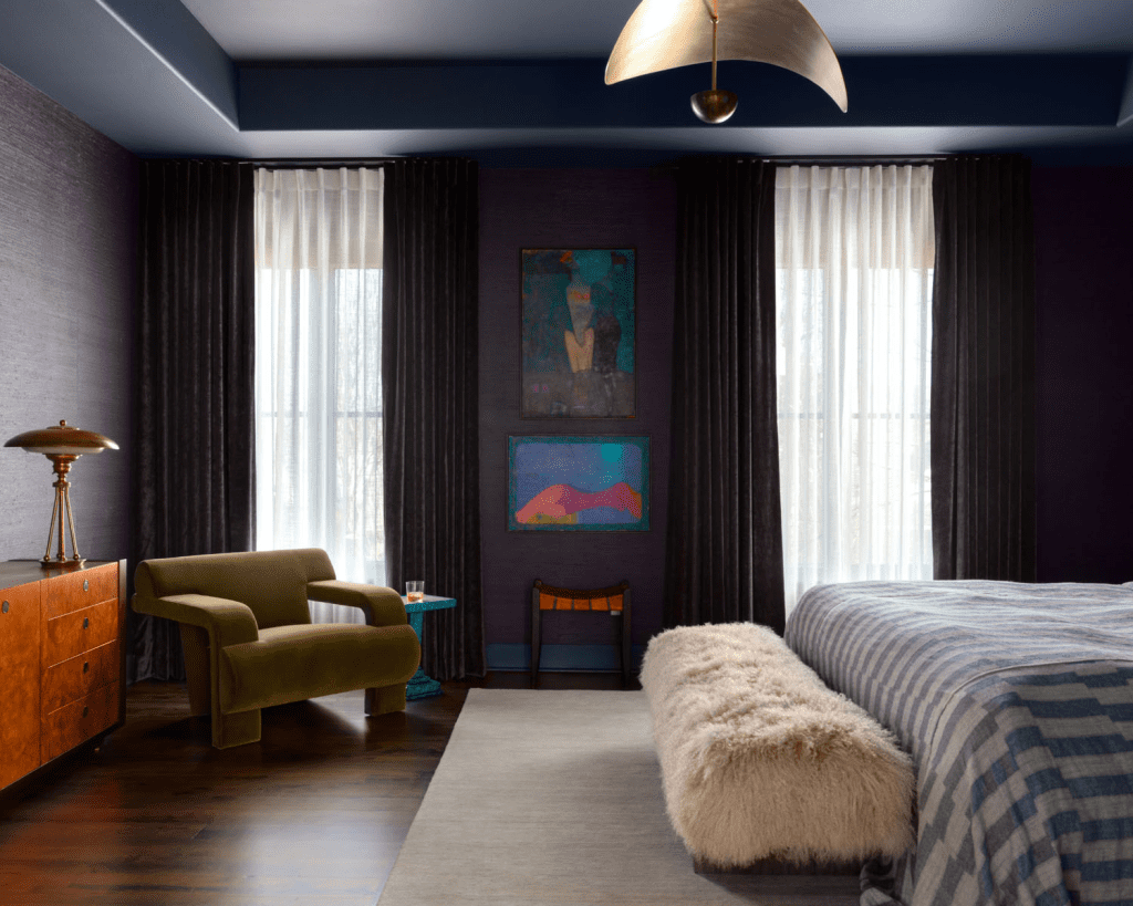
Quiet luxury isn’t married to beige and ivory alone. Lately, it’s been stepping out in richer shades, like olive green, dusty rose, mustard, and deep aubergine.
These muted jewel tones slip right into a serene space without stealing the show.
They add personality and warmth while maintaining that calm, cultivated feel. It’s the difference between a whisper and a knowing smile—still quiet, but now with a little sparkle.
Take actress Jaclyn Smith’s own interiors as an example. She leans on green velvet seating, gold-trimmed shelving, and elegant marble to show how color can be bold and refined at the same time.
It proves you don’t really need neon brights to make an impression; just a touch of richness combined with craftsmanship and restraint.
The beauty of these colors is that they’re grounded. Jewel tones in their muted form behave like neutrals with a little more drama. They hold their own alongside stone, wood, linen, or leather, blending seamlessly into the quiet luxury palette.
Used sparingly and with intention, they keep your space sophisticated while inviting a little joy into the mix.
Quiet luxury may whisper, but now it’s doing so in color—and honey, it sounds even better.
If the shift toward richer hues and layered textures has you daydreaming, Design on a Dime can help turn that spark of inspiration into a home that feels both timeless and uniquely yours.
How to Weave Color Into Quiet Luxury: 3 Key Strategies
Colorful quiet luxury works best when it feels curated, not crowded. Here are four tried-and-true strategies for letting color shine while keeping the mood sophisticated and calm.
1. Textural Depth
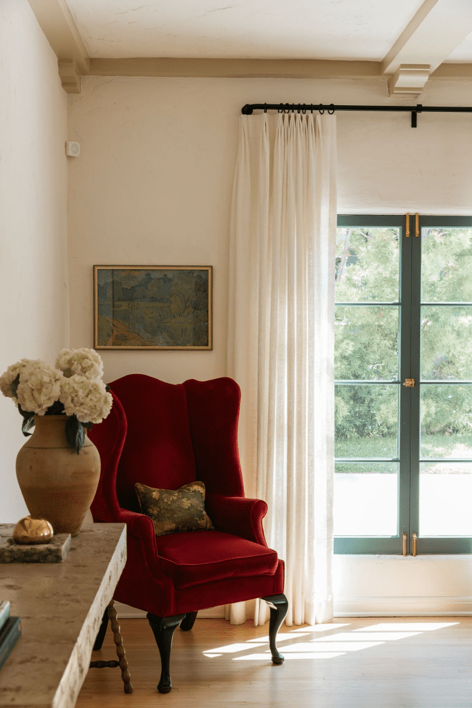
Now, darlin’, color has way more impact when it comes hand-in-hand with touch.
Yes, I’m talkin’ texture:
A deep red velvet chair feels different than red paint on the wall, because the texture adds body and dimension. So, layer in bouclé throws, raw linen, stone, and natural fibers alongside saturated tones, and you’ll notice the room suddenly hums with warmth.
Texture lets bold colors breathe, softening their edges so they don’t feel heavy.
2. Subtle Metallics
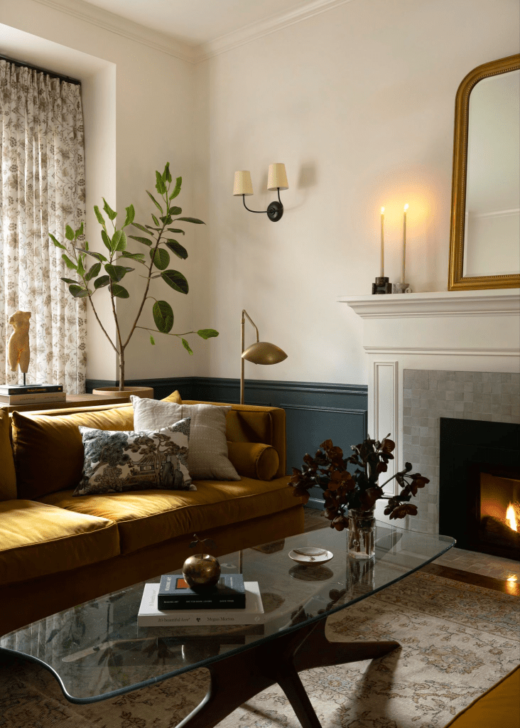
Quiet luxury loves a little gleam, sugar—but never a glare.
I’m talkin’ brushed gold hardware on your cabinetry, rose-gold lamp bases, and slim brass frames around artwork. These touches act like soft lighting; they bounce color gently, adding refinement without shouting.
Mixing metals can be just as effective, by the way:
A hint of warm brass with a touch of cool steel creates a space that feels collected, not cookie-cutter. And that’s the vibe we’re going for here.
3. Nature-Inspired Palettes
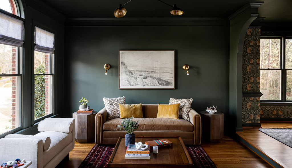
When in doubt, honey, look outside.
Earth and water tones—think mossy greens, river-stone grays, and clay browns—ground jewel hues, so they never feel artificial.
Pairing aubergine with warm wood or sapphire with slate tile brings a natural harmony that keeps luxury approachable. Even subtle gradients, like mineral-inspired plasters and softly veined marble, create depth without needing a lot of ornament.
Together, these strategies keep colorful, quiet luxury balanced: intentional layers, tactile richness, gentle shimmer, and nature as your guide. Done right, your home won’t just look elegant; it’ll feel like a space you never want to leave.
Not sure how to balance bold jewel tones with soothing neutrals? That’s where Design on a Dime’s Dream Team shines—helping you land on the right mix that feels curated, never cluttered.
Real-World Applications & Room Guides
Quiet luxury is more than a pretty idea, sugar; it’s something you can live in every single day.
Our Sanchez Project is proof that when you strike the right balance, color doesn’t just decorate a room—it tells a story:
It’s a true masterclass in quiet luxury, with rich blues layered with creamy neutrals, custom drapery that feels tailor-made, and wallpaper that whispers personality instead of shouting it.
Here’s how you can bring colorful quiet luxury home, from the living room to the smallest nooks.
Living Room
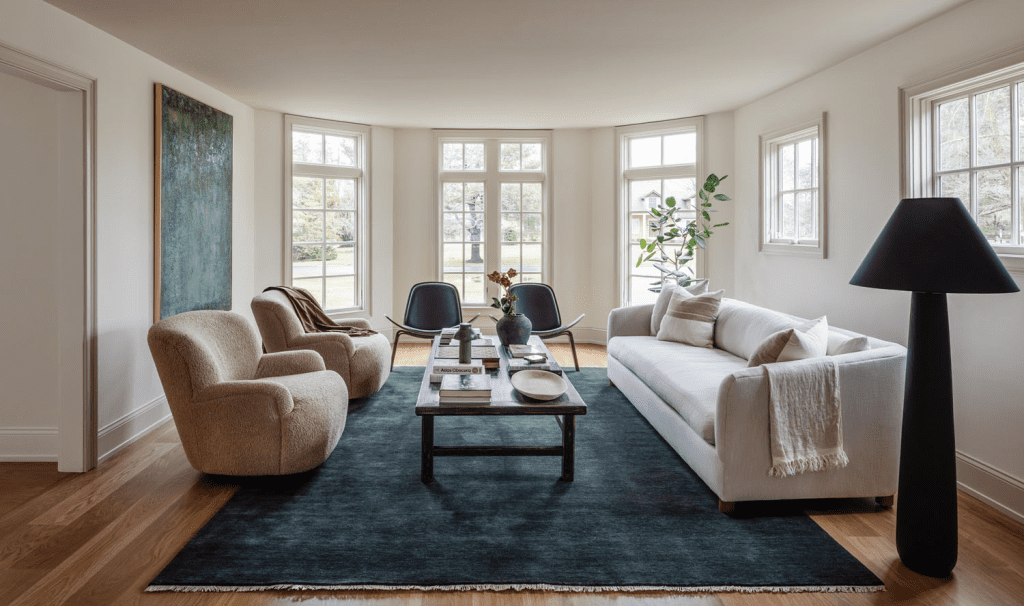
Think of your living room as the stage where quiet luxury makes its first entrance.
A jewel-toned velvet sofa—maybe in aubergine or emerald—anchors the space, while creamy neutrals and layered textures keep the look balanced.
If you’re not ready to commit to big-ticket color, that’s okay, too. Even a subtle accent wall in olive or a pair of deep-green pillows can work wonders.
Actress Jaclyn Smith does this beautifully with her own home:
A plush green chair paired with gold shelving strikes just the right note of colorful elegance, without tipping into “look at me” territory.
Kitchen
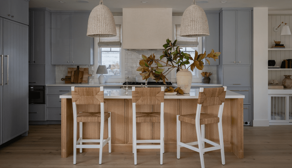
The kitchen may be the heart of the home, but we both know that doesn’t mean it has to be a sea of white cabinets.
Muted tones—like sage, blush, or soft blue—bring that quiet personality while keeping things serene. Pair them with natural stone countertops, marble backsplash, or brushed brass hardware, and suddenly, one of the most hardworking rooms in the house feels refined.
A tonal color scheme works best here:
Keep the cabinetry soft and understated, then let natural materials and gleaming finishes add depth.
Bedroom
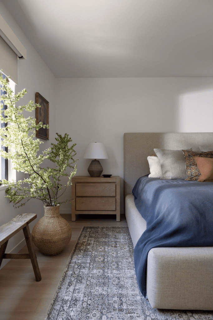
Now, sugar, this is where quiet luxury whispers the loudest.
You can start with a base of creams, taupes, or warm grays; then, layer in plush bedding in dusty rose or a deep, moody blue. Oh, and consider throwing in a velvet headboard or silk-trimmed pillows to heighten the feeling of indulgence.
Lighting matters, too—opt for soft lampshades or sculptural sconces that glow rather than glare.
The result?
A bedroom that cocoons you at night and greets you with calm in the morning.
Small Spaces & Accents
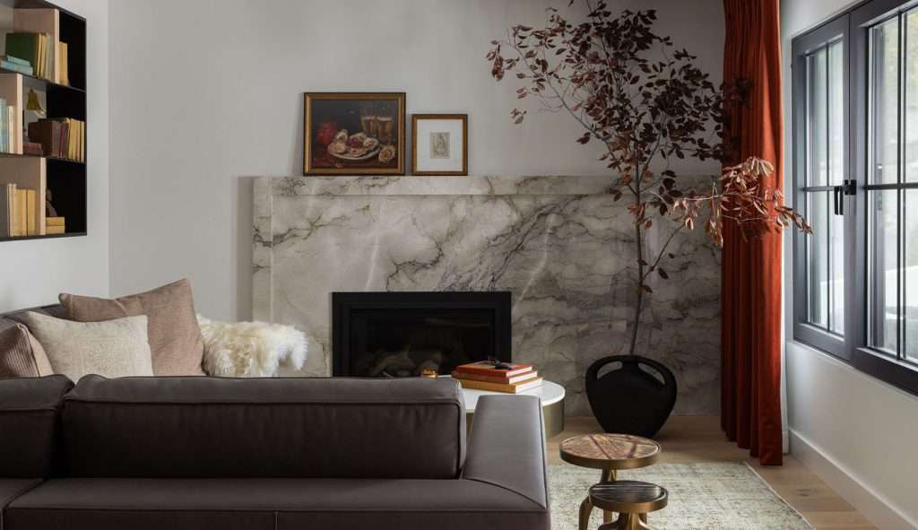
Not every corner needs a full makeover. In fact, in smaller spaces, colorful, quiet luxury thrives on restraint.
A jewel-toned throw on a neutral sofa, hand-painted pottery in the entryway, and a simple set of aubergine plant pots can all inject warmth without overwhelming the room. Even a single piece of artwork with muted gemstone hues can set the tone for an entire hallway.
These little touches show that you don’t need the square footage—or a sky-high budget—for your home to radiate quiet sophistication.
Whether it’s a jewel-toned nook or an airy, earth-toned kitchen, the Design on a Dime team loves helping homeowners translate ideas into spaces that actually work for their lifestyle.
Why Colorful Quiet Luxury Strikes a Chord
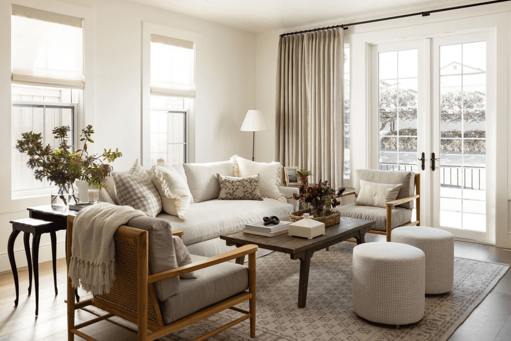
Design isn’t just about looking pretty, darling—it’s about how a room feels.
Jewel tones like sapphire and emerald bring a lift, like sunshine after a gray day, while soft neutrals steady the heart and calm the mind. Put the two together, and you get balance—a space that feels both joyful and grounding.
That emotional harmony is why colorful quiet luxury resonates so deeply:
It gives us beauty we can live with, not just admire from afar.
These days, folks seem to be drifting away from cold, stark minimalism and craving something warmer and more personal. A cream sofa with aubergine pillows, kitchen cabinets in muted blush, or even a single green velvet chair says, “This is my story.”
The trend reflects a shift toward individuality, but with a timeless backbone—classic forms, curated details, and colors that never shout over each other. It’s about personality without the clutter, comfort without the chaos.
And let’s not forget that quiet luxury carries a conscience.
More and more, people are choosing quality over quantity—think solid wood tables, marble counters, handwoven textiles, or vintage finds that have already stood the test of time. There’s pride in investing in pieces that last, whether it’s a well-loved heirloom or a handcrafted accent picked up from a local artisan.
Sustainability and style aren’t competing here—they’re holding hands.
At its heart, colorful quiet luxury is more than a design choice. It’s a lifestyle shift toward living beautifully, intentionally, and with a wink toward the future. It resonates because it feels good today and promises to stay relevant tomorrow.
If this design approach feels like it’s speaking your language, let’s explore how to bring it into your home in a way that feels personal, practical, and deeply beautiful.
Frequently Asked Questions
How do I know if colorful, quiet luxury fits my personal style?
Well, sugar, if you enjoy a calm, neutral base but crave small touches of rich, expressive color, this style is probably going to be a great fit. It balances timeless elegance with personality—something you’d definitely want in your space.
Can colorful, quiet luxury work in a rental home or apartment?
Yes, it absolutely can. Think removable wallpaper, bold throw pillows, and artwork with jewel tones. These rental-friendly touches don’t require permanent changes—plus, they let you bring the style with you when you move.
What kinds of materials pair best with this look?
Natural and high-quality finishes—think marble, stone, linen, velvet, solid wood—bring both durability and understated elegance. They keep things refined rather than flashy, making them a great fit for this look.
Is it possible to mix colorful, quiet luxury with other design styles?
Yes. It works beautifully with mid-century modern, transitional, and even boho design, especially when you focus on quality pieces and a restrained color palette.
Are vintage or secondhand pieces a good fit for colorful, quiet luxury?
Yes—in fact, they’re ideal. A vintage wood sideboard or a set of antique glass lamps adds character, while supporting sustainability. It’s a win-win!
Ready to Bring Colorful Quiet Luxury Home?
At the end of the day, colorful, quiet luxury isn’t about chasing trends—it’s about creating a home that feels like you.
Spaces that glow softly with richness, welcome you in with ease, and leave enough sparkle to make every day feel special. Each choice tells a story of warmth, curiosity, and refined taste, without overwhelming the senses.
If your rooms are craving that balance of calm and character, this is the perfect moment to start shaping it. And if you’d love a guiding hand, Design on a Dime is here to help bring your vision to life with style, soul, and just the right touch of surprise.
Get in touch—let’s start layering your story today.