
How to Hang Art in Texas Homes Without It Floating on Big Builder Walls
Wondering how to hang art in a way that actually feels right, and not like the frame’s just floating somewhere above the sofa hoping for the best? Honey, you’re definitely not alone. Most of the art in Texas homes ends up too high, too small, or stranded in the middle of a wall like it got lost on the way down.
The frame looks lovely. The piece is gorgeous. But something feels off, and you can’t quite name what. Usually, it isn’t the art at all. It’s where the art lives. The good news is that fixing this almost never costs a thing. A little measuring tape, a fresh eye, and maybe one trip to the framer’s, and your walls start telling a much better story.
Why So Much Art Ends Up Floating Halfway Between the Sofa and the Ceiling
[image: living room sofa with a piece of art hung too high on the wall above it, leaving a wide gap between sofa back and bottom of frame]
Most art floats too high because folks instinctively hang at hand-height instead of eye-height. The arm goes up, the hammer finds a comfortable spot, the nail goes in. That’s exactly how you end up with a frame six inches below the crown molding. A sad strip of empty wall stretches between the sofa back and the bottom of the canvas, and the room feels off even when you can’t name why.
The fix is one of the oldest tricks in design: the 57-inch rule. Museums and galleries hang art so the center of the piece sits roughly 57 to 60 inches off the floor. That’s the average human eye-level when standing in a room. Your living room isn’t a gallery, but the principle still works. When the center lands at eye-level, the art reads as part of the room, not as a stamp tacked onto a wall it doesn’t belong to.
In Texas builder homes, where ceilings stretch nine and ten feet, this trips up almost everyone. The walls feel taller than they actually are. Eyes get pulled up. Hammers follow. Art ends up floating in the upper third of a wall it should anchor instead. That’s the first thing designers notice when they walk into a living room that “feels off.” Once you see it, sugar, you can’t unsee it.
How High to Hang Art Above the Sofa, the Bed, the Console, and the Mantel
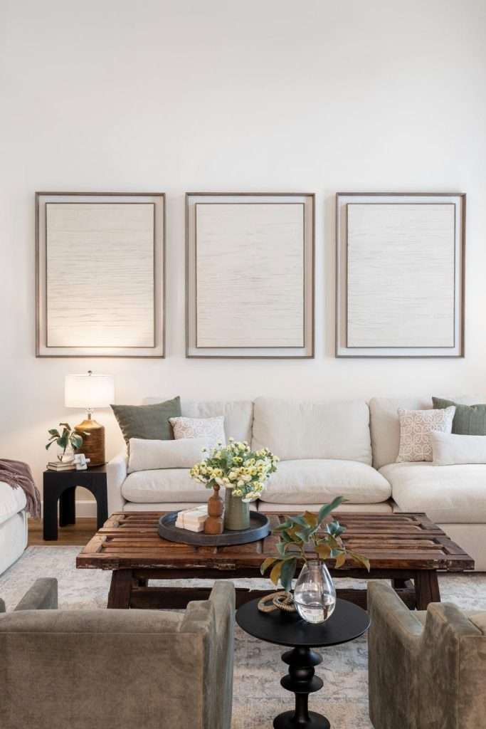
Eye-level works as a starting point, but specific furniture changes the math. Art needs to feel connected to whatever sits below it, not floating above it like an unrelated thought. Here’s how the spacing actually breaks down in real homes:
- Above the sofa. Hang the bottom of the frame 6 to 12 inches above the sofa back. Lean closer to 6 if your ceiling is standard. Closer to 12 if you have tall ceilings and want a little more breathing room. Anything more than that, and the piece starts to drift away from the sofa visually. That 6 to 12 inch range is the most consistent rule across professional hanging guides for a reason.
- Above the bed. Same range applies, 6 to 10 inches above the headboard. A bed is a low piece of furniture by nature, and art tends to drift up faster here than anywhere else in the home. With a tall headboard, lean toward the lower end of the range.
- Above a console or sideboard. Drop the spacing tighter to 4 to 6 inches above the surface. Console-height pieces benefit from feeling almost stacked with the furniture below. Too much gap, and the console looks abandoned.
- Above a mantel. This one’s trickier. Aim for 4 to 8 inches above the mantel, depending on mantel depth and ceiling height. A deep mantel with chunky decor needs less space. A shallow mantel needs a touch more. The art should feel like part of the mantel composition, not a separate object hovering above it.
One more rule worth burning into memory: art should be centered on the furniture below it, not the wall behind it. People mix this up constantly, especially when a wall has odd proportions or when the furniture sits off-center for a reason. If your sofa floats four feet from a corner, center the art over the sofa, not the wall. Eyes read the furniture-art relationship first, every single time.
When the spacing’s right, the room stops feeling like a collection of decorations and starts feeling composed. That’s exactly the kind of small fix the Design on a Dime team in Conroe makes constantly in living rooms before any furniture even gets moved.
Sizing Art So It Doesn’t Look Like a Postage Stamp on a Wall
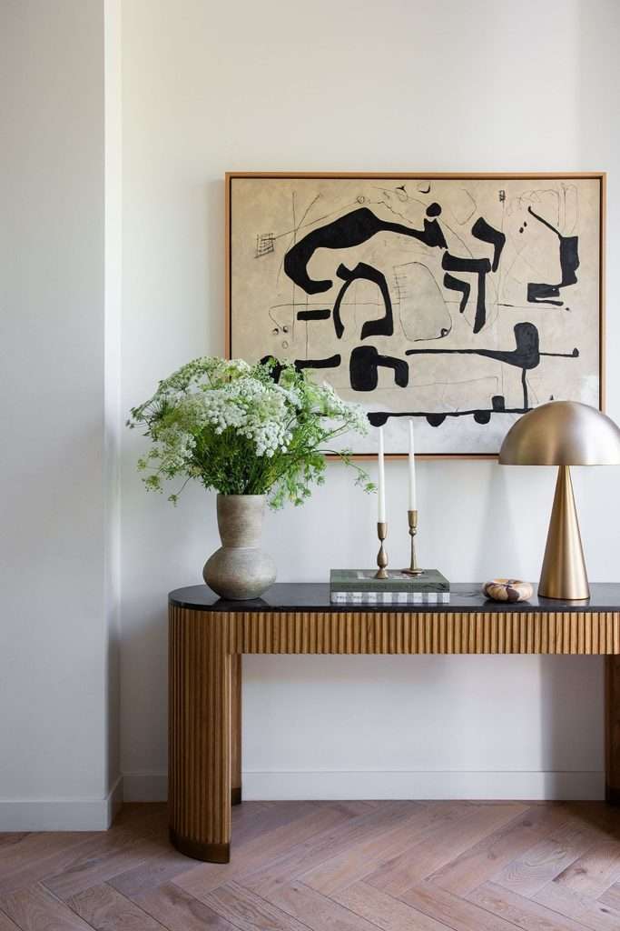
Sizing is where most people lose the plot, baby. Art should fill roughly two-thirds of the furniture width below it, give or take. A 90-inch sofa wants a piece that runs about 60 inches across, or a grouping that totals close to that. A 60-inch console wants something around 40 inches wide. Smaller than that, and the art reads as decoration. Bigger than that, and the proportions start to feel pushy.
The two-thirds guideline is one of those rules that exists because it works almost every time. It’s why galleries and showrooms feel composed even when the pieces themselves are wildly different in style. Get the sizing close, and most other choices forgive themselves.
When the Art You Have Is Too Small
If the piece you love is undersized, upgrade the frame and the matting before you give up on it. A 16×20 piece floats sadly above a sectional. The same piece in a 24×30 frame with a generous 3 to 4 inch mat reads completely differently. Custom framing has a reputation for being expensive, but for a meaningful piece, it usually costs less than buying new artwork. Local framers in Conroe and Magnolia run mat-and-frame upgrades for under a couple hundred dollars on most pieces.
When You Need to Cluster Instead of Hang Solo
Three smaller pieces hung tight together can fill a space a single small piece never could. The grouping reads as one composition because eyes treat it that way. Keep spacing between the pieces tight, around 2 to 3 inches, and align either the tops, the bottoms, or the centers. Random scatter looks like art that fell off a moving truck.
For homes with the kind of wide-open builder layouts you see across the Greater Houston area, going bigger almost always wins. Big walls swallow modest art. The size that looks plenty bold leaning against the wall in the store often disappears once it goes up. When in doubt, go up a size, sugar.
Building a Gallery Wall That Doesn’t Look Like a Random Pinterest Board
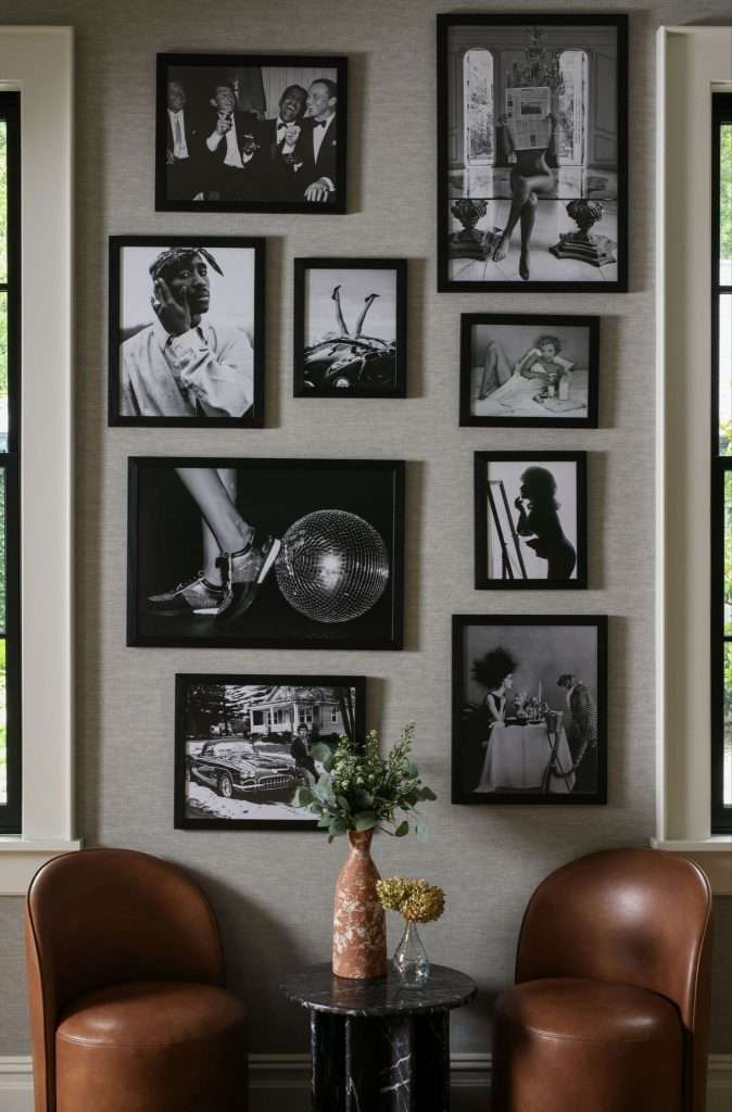
Gallery walls go wrong the same way every time. Someone collects pieces they love, hangs them up roughly equidistant, and the result feels chaotic instead of curated. A gallery wall needs an anchor piece, consistent spacing, and a unifying thread to read as intentional. Without those three, it’s just clutter on a wall.
Pick the Anchor Before You Pick Up a Hammer
Start with the anchor piece. Pick the largest or visually heaviest piece in the group and decide where it lives first. Everything else builds around it. If you’re working over a sofa, the anchor usually sits centered over the sofa, with smaller pieces orbiting around it. If you’re climbing a stairway wall, the anchor often sits at the bottom or middle of the run. The anchor-piece method is what separates “thought-out” from “thrown-up.”
Use the Paper Template Trick to Save Your Walls
Trace each frame onto craft paper. Cut it out. Tape the cutouts to the wall before you put a single nail in. Shift, stand back, shift again. By the time the layout looks right, you’ve already saved yourself patching a dozen extra holes. No more “I’ll just try it here” regret. This is the single biggest gallery-wall move that separates designer-level walls from regret walls.
Spacing should run 2 to 3 inches between frames, consistently. Closer than that feels cramped. Wider than that breaks the grouping into separate pieces. Pinterest gallery walls that look effortless almost always follow this rule, even when nothing else about the styling stays inside the lines.
Find One Unifying Thread and Repeat It
The unifying thread can be subtle. Maybe all the frames are black. Maybe all the art is black-and-white photography. Maybe the colors stay in a soft palette and the frames vary wildly. Pick one element to repeat, and the rest of the wall earns the right to be eclectic. Small layout tweaks like this make a bigger difference than most people expect, especially in big open builder rooms where one statement wall changes the whole space. That’s exactly the styling our Design on a Dime team in The Woodlands tackles when a homeowner wants a gallery wall that actually reads as composed.
Where to Hang Art in Tricky Texas Spaces (Two-Story Foyers, Long Hallways, Vaulted Walls)
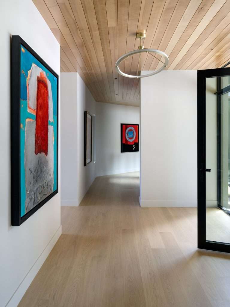
Some walls in Texas homes don’t follow normal rules, and the standard 57-inch guideline needs to bend when the architecture demands it. Two-story foyers, vaulted living rooms, and long entry hallways each call for a different hanging strategy. Here’s how to handle the worst offenders without making things worse:
- Two-story foyers. The single biggest mistake is hanging one normal-sized piece centered at human-eye-level. The wall above swallows it. Either go genuinely massive (think 48 inches tall or more), or stack two to three pieces vertically with tight spacing so the composition fills the height. Eyes need something to follow up the wall, not a single small island in the middle of nowhere. We see this all the time in Lake Conroe homes and master-planned-community foyers across the area.
- Long entry hallways. Hallway art needs rhythm. Hang pieces at consistent intervals, roughly 4 to 6 feet apart, all with their centers at the standard 57-inch eye-level. Treat the hallway like a gallery corridor, not a place to dump leftover frames. Sizes can vary if you want, but keep the centers aligned. The walk-through becomes part of the experience instead of an afterthought.
- Stairway walls. Follow the slope. Art on a staircase wall should run diagonally with the rise, with each piece centered roughly 57 inches above the corresponding step. People miss this constantly and end up with a horizontal row of art on a diagonal wall, which always looks awkward.
- Vaulted living rooms. Anchor low. The temptation in a vaulted space is to hang big art high, where the wall feels emptiest. Don’t. Anchor your major pieces in the lower 8 feet where humans actually live. Leave the upper triangle of wall mostly bare, or fill it with a single large statement element if needed. Rooms with art floating in the vault feel lonelier than rooms where the upper space simply rests.
The vaulted-ceiling problem in particular shows up across tall-ceiling rooms in newer Texas subdivisions. Builders love the drama of a 17-foot peak. Homeowners struggle to know what to do with all that air. Some of the same tricks that make a ceiling feel taller actually work in reverse here: you want the room to feel anchored and human-scaled, not amplified. Our team in Cypress walks homeowners through this all the time when a great room feels echoey and uncomposed.
Working With the Art You Already Own Instead of Buying New
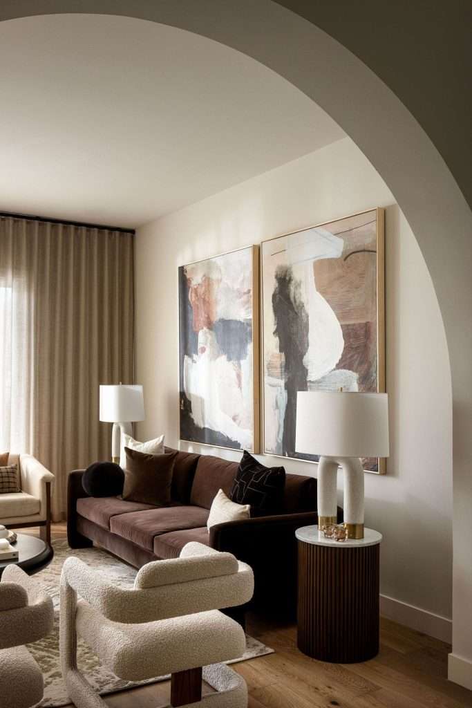
Most homes already have plenty of art, darling. The pieces are just scattered, mismatched, or hung in the wrong places. Before you spend a single dollar on something new, walk through your house and pull every piece off the walls into one room. Lay them out on the floor. Group them by color, by subject, by frame style, by mood.
You’ll Find Stories You Didn’t Know You Had
Three small black-and-white photos that felt boring on separate walls suddenly become a striking trio together. The watercolor your aunt gave you that’s been hiding in the guest bathroom turns out to be the perfect accent over the entry console. Kids’ art collected over a decade earns its own dedicated wall in the playroom or hallway. Most “we need to buy more art” situations are actually “we already have plenty, we just need to use it better” situations.
Reframing Is the Cheapest Design Upgrade There Is
Reframing transforms how a piece reads. Swap a beat-up frame for a clean modern one and the art looks brand new. Add a generous mat to a small piece and it suddenly belongs on a bigger wall. Local framers across Montgomery County run consistent specials, and the work usually pays for itself the first time you see the piece in its new spot.
Mix old with new freely. Heirloom pieces sit perfectly next to thrift-store finds and modern prints, as long as the frames have one shared element, like a color, a finish, or a similar weight. The art doesn’t need to match. The frames just need a thread of agreement.
If the whole exercise feels overwhelming, that’s where a fresh set of eyes earns its keep. Our design team in Magnolia does floor-layouts of clients’ existing art constantly, like the kind we pulled together for our Jodi Project. Sometimes the wall you’ve been staring at for years just needs one outside perspective to start working.
Frequently Asked Questions
Contrast almost always wins. Art reads better against a wall that gives it room to stand out, whether that means a darker wall behind lighter art or a lighter wall behind darker pieces. Matching the wall color too closely makes the art disappear into the background. If your wall is a soft neutral, art with rich color or strong tonal contrast lands clearly. If your wall is a saturated color, simpler frames and quieter art tend to work better.
In most rooms, yes. The space above a doorway sits in the upper third of the wall, where eyes don’t naturally rest. Any piece up there usually feels disconnected from the rest of the room. There are exceptions, like a long horizontal piece that visually links a doorway to the surrounding wall, or a stairway run where the doorway is one stop in a vertical sequence. As a default, anchor art at human eye-level and leave the over-door zone alone.
Center it on the furniture, not the wall. Eyes read the furniture-and-art pairing as one unit. A sofa that sits a little off-center on a wall still wants its art centered above the sofa itself. The only time you center on the wall is when there’s no furniture beneath the piece, like an art-only accent wall in an entryway or hallway.
If the piece comes within roughly 6 inches of the wall edges on either side, the wall is too small. Art needs breathing room around it to read properly. A piece that nearly touches the corners feels squeezed in. Either move that piece to a larger wall, or scale down to art that takes up about two-thirds of the available wall width with comfortable margins on either side.
It can, as long as there’s some variety in size, frame style, and subject. A whole home of identical black frames and abstract prints starts to feel like a chain hotel by the third room. The fix is to let the styles loosely echo, while letting individual rooms have their own moments. Buyers in the Greater Houston market actually respond well to homes that feel curated rather than themed; identical art in every room reads as a model home, not a real one.
Walls That Actually Tell Your Story
The whole point of art in a home isn’t to fill a wall, baby. It’s to give a room something to say.
When the heights are right and the sizes work, the gallery wall actually reads as a gallery and not a wreckage. Your walls stop feeling like decoration and start feeling like part of the home’s personality. The pieces you’ve collected over the years finally have somewhere to live where they can be seen.
Sometimes that takes a tape measure, a paper template, and a slow afternoon of rearranging. Sometimes it takes a fresh set of eyes who can see the wall the way you can’t anymore.
Design on a Dime Interiors helps families across Montgomery County and Greater Houston make their walls work harder. Sometimes that means reframing what they already own. Sometimes it’s styling a whole home from scratch.
If your art’s been floating awkwardly for a while now, reach out to our team today, and we’ll walk through it with you.