
What Designers Notice Immediately When They Walk Into a Room
Have you ever wondered what designers notice immediately when they walk into a room?
Well, honey, it has very little to do with throw pillows and everything to do with how your space feels at first glance. Before a single word is spoken, the room is already telling its story. You can sense whether it feels calm or chaotic, generous or tight, welcoming or a little “off.”
Interior designers are trained to read those signals fast, usually without consciously trying. It’s part instinct, part experience, and part knowing how people actually live in their homes.
In a split second, those first impressions reveal what’s supporting daily life and what’s quietly getting in the way. And once you know what designers see first, you’ll start noticing it, too.
The Room’s Dimensions and Architectural Bones
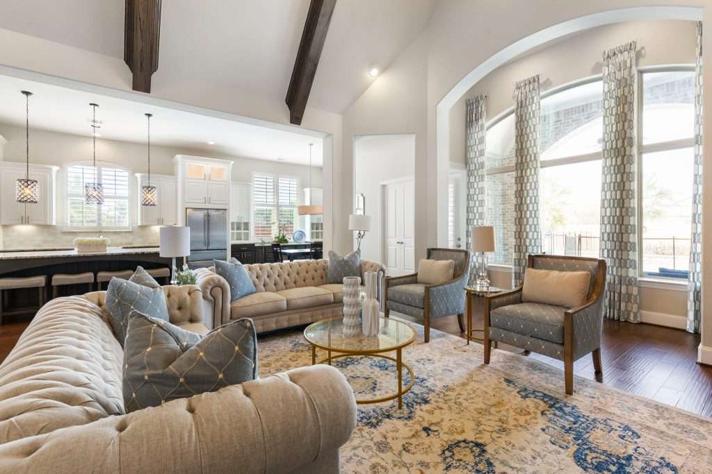
Before you buy a single pillow, your room’s size, shape, and bones quietly decide what’ll actually work and what’ll look like a hot mess, no matter how pretty it seemed online.
One of the first things designers clock is how easily people can move through the space. Clear walking paths matter more than most folks realize, sugar, ‘cause when there’s not enough breathing room between furniture pieces, the whole room starts to feel tense.
You want people moving naturally, without sidestepping chairs or squeezing past corners. That’s good flow in a nutshell.
I also look at how furniture fits the room’s scale.
Oversized sofas tend to swallow a small living room, while undersized pieces can make a generous space feel oddly empty.
Rugs tell a story, too. When they’re too small, everything “floats.” When they’re sized correctly, they quietly pull the whole room together and make it feel grounded.
Windows and ceiling height are part of the room’s bones, as well. Low ceilings, narrow windows, and odd angles aren’t flaws, but they do influence how your space should be arranged. I read these details quickly because they shape every decision that follows.
Good bones make everything else a lot easier. Our Jennifer Heights Project is proof of that. But when the proportions don’t work? No amount of styling can fully hide it.
So, if your room feels tricky no matter how many times you rearrange it, it’s usually not you. It’s the bones asking for a smarter plan. Design on a Dime can help you figure it out.
Natural Light and How It Moves Through the Room
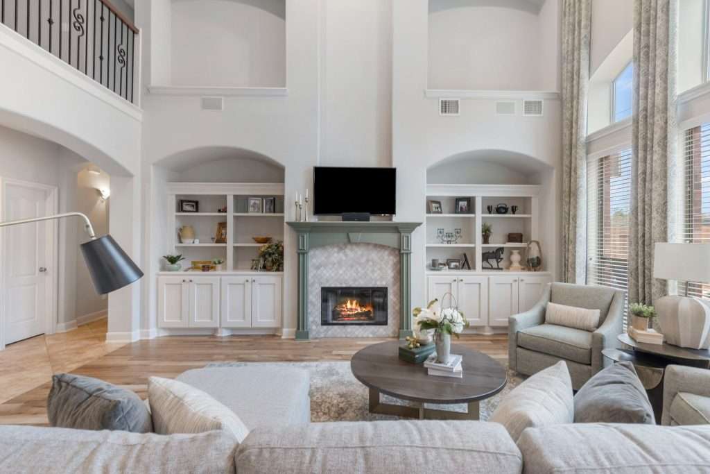
Natural light is one of those things designers notice instantly, whether the space is flooded with it or quietly starved for it. Before I even look at your furniture and finishes, I’m watching how sunlight enters the space, how far it travels, and how it changes from morning to afternoon.
You see, window size and placement matter more than most people think.
Bigger windows bring in more light, yes, but it’s also about where that light lands:
A bright window that stops short of the seating area could leave the space feeling “uneven,” while light that reaches deep into the space makes everything feel more open and welcoming.
Orientation plays a role, too. North-facing light tends to stay soft and consistent, while south-facing rooms may shift dramatically throughout the day. Designers clock those changes right away because they tend to affect wall colors, fabric choices, and even how comfortable a room feels at different hours.
Oh, and let’s not forget shadows. They’re part of this conversation, as well. Harsh glare, deep corners, and heavy contrasts can make a room feel “jumpy.” On the flip side, balanced daylight creates a natural rhythm that simply makes your space better, both in real life and in listing photos.
Good natural light doesn’t just brighten a room. It shapes mood, highlights what works, and quietly reveals what needs help. When the light is right, everything else has a better chance to shine.
How Your Space Is Really Being Used
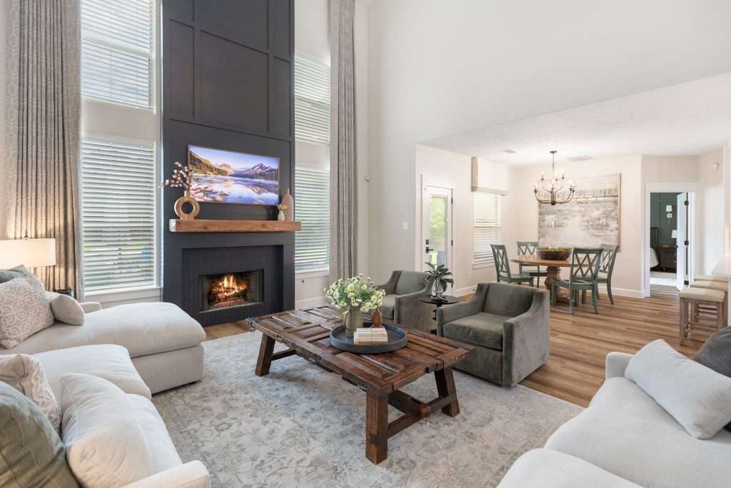
When I walk into your space, I’m stalking your daily routines and little rituals first, ‘cause your morning coffee shuffle and late-night Netflix flop tell me exactly what this room needs to do for you.
I’m not just lookin’ at furniture. I’m reading habits. That half-empty coffee mug on the side table, that throw blanket that never quite gets folded, and the shoes parked by the door.
You get the idea.
One of the first things I notice is whether the room’s setup actually matches real life.
A living room that’s clearly styled for company but used mostly for movie nights will always feel a little “off.” The same goes for dining rooms that double as homework stations and guest rooms that are pulling office duty, too.
When function and reality don’t line up, the room starts working against you instead of with you.
I read how you truly live, not how you wish you lived, and where daily activities naturally land. Mail piles up where there’s no drop zone. Bags land on chairs when there’s no nearby storage. These patterns show up immediately, and they point to gaps in the layout rather than personal shortcomings.
And don’t you worry, sugar, I look at these clues with kindness. Most people don’t have hours to reset their homes every day, and they shouldn’t need to. The goal is to shape the room around your real routines, not an idealized version of them.
Traffic Flow and How Furniture Shapes the Space
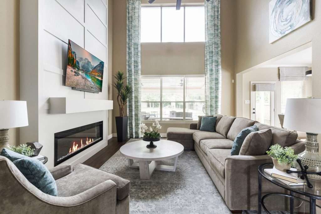
The moment a designer steps into a room, we’re already moving through it in our minds. We notice where you enter, where your body naturally wants to go, and where the furniture tells you to stop short.
Trust me, if a room feels awkward, nine times out of ten, it’s ‘cause the flow is fighting the layout.
Furniture is what creates the traffic flow, whether it’s doing that job well or not. Chairs that block walkways, sofas shoved into corners, and tables floating just a little too far out all interrupt movement. You can feel it right away, hun.
People hesitate, sidestep, or take the long way around, and the room quietly loses its ease.
Designers also note how furniture defines zones.
A living room might need to support conversations, TV watching, and everyday lounging, but those areas should feel intentional, not accidental. When the pieces drift into pathways or overlap too much, the room starts to feel crowded. Yes, even if it isn’t small.
One thing that always surprises people is how often pulling furniture slightly away from the walls improves flow. Floating the key pieces can open up clear paths and make the room feel more balanced.
And when you’ve got good traffic flow, people can move comfortably without thinking about it.
Furniture supports movement instead of blocking it, and your space feels calmer and easier to live in from the very first step inside.
If your furniture has you dodging corners and taking the long way around, a thoughtful layout can change everything. Sometimes, it just takes a fresh perspective to unlock that easy, natural movement. And that’s exactly what Design on a Dime brings to the table.
The Visual Balance of Color and Contrast
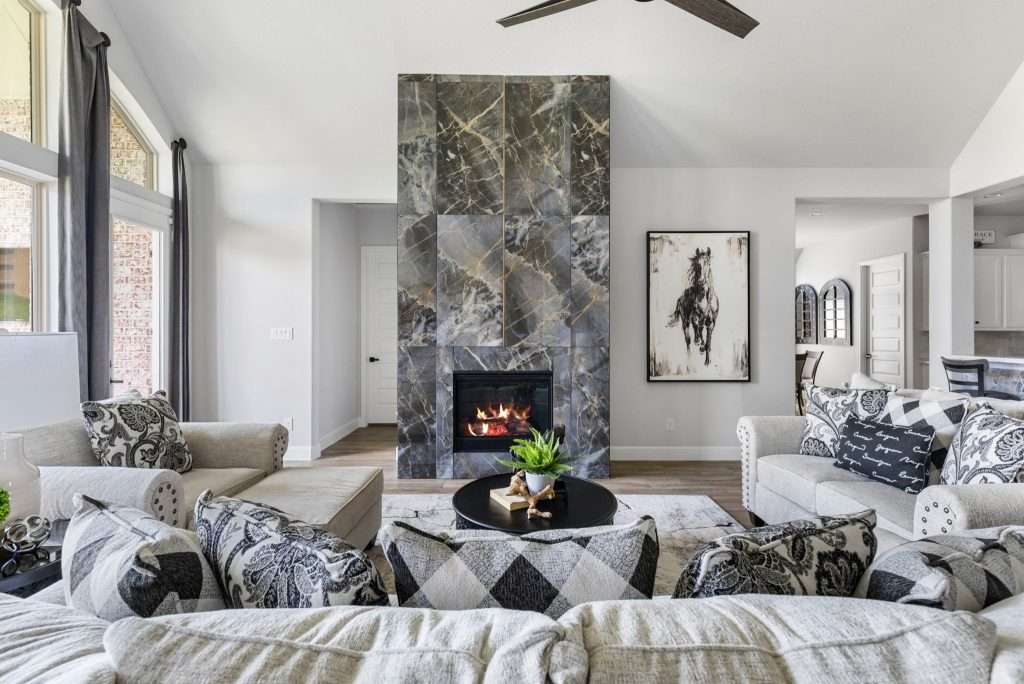
Color is one of the fastest reads in any room. Within seconds of walking in, I can tell whether a space feels calm, busy, heavy, or unfinished.
And, honey, that reaction almost always comes from color and contrast.
I usually look at the dominant tones first.
Are the walls, furniture, and flooring all speaking the same language, or are they quietly arguing with each other?
Clashing undertones are a common culprit.
A warm beige next to a cool gray can make a room feel unsettled, even if both colors are beautiful on their own.
Contrast matters just as much, darling. Every piece in the room carries visual weight, from a dark sofa to a bright piece of art and a shiny metal table. When everything is bold, the eye gets tired. When everything is pale, the room can feel flat and forgettable.
Designers notice right away whether there’s a clear place for the eye to land.
Of course, we pay attention to what’s missing, too. A room without a focal point often feels scattered, while a room with too many focal points feels loud. You want to aim for that sweet spot; a calm foundation with a few intentional moments of contrast.
When color is balanced, the room feels settled and confident. Nothing has to shout.
Your favorite pieces stand out naturally, and the space feels welcoming instead of overwhelming.
If your room feels a little loud or oddly flat, color is often the quiet culprit. A balanced palette doesn’t mean boring, though. Design on a Dime will help you choose something that lets your favorite pieces shine.
Clutter, Storage Gaps, and Missed Opportunities
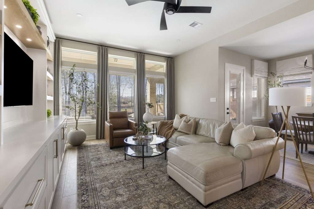
Look, honey, I’m gonna notice the clutter the second I walk in. Not ‘cause I’m judging, but because clutter blocks a room from doing its job.
You know that hallway chair where all your mail, backpacks, and three mystery chargers go to die, or that one closet that won’t close all the way?
Yeah, most people have one of those.
The good news is, all that chaos is basically a giant neon sign pointing to one thing:
Your space is asking for better support.
What I’m really seeing there are storage gaps. When everyday items don’t have a clear home, they’ll land wherever they can. Over time, those piles become part of the room’s landscape, making it feel smaller and more stressful than it needs to be.
I’d say unused vertical space is one of the biggest missed opportunities. I see it all the time:
Walls that could handle shelving, tall cabinets, or hooks are often left bare, and floors end up carrying the burden.
Designers clock this instantly ‘cause it’s the fastest way to reclaim space without changing the footprint.
Of course, furniture gets a closer look, too. Pieces that only serve one purpose usually take up more room than they deserve, hun. That’s why I’m all for storage ottomans, beds with drawers, and coffee tables with hidden compartments. They solve multiple problems at once.
Trust me, when clutter is addressed at the source, rooms open up.
Material Quality and Finish Consistency
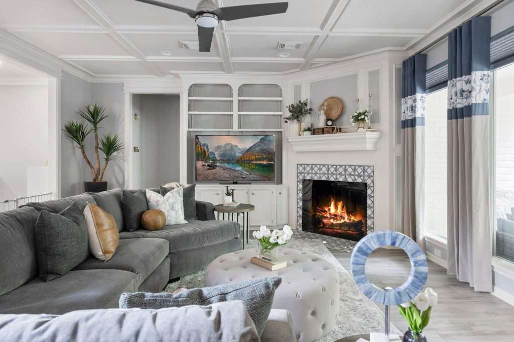
When you walk into any space, your eyes instantly judge the craftsmanship, even if you don’t know you’re doing it.
My point?
Those joints, seams, and edges need to look tight and intentional, because anything wobbly or loose feels more like a rushed weekend project. And that’s not the vibe you should be going for, baby.
Let me tell you, material quality shows up fast.
Real wood just feels different than pressed board. Well-built drawers glide rather than stickin’. Upholstered pieces sit firm and supportive instead of sinking at the corners. All these details matter because they affect how a room looks, how it functions, and how it holds up over time.
Of course, finish consistency is just as important. Designers notice right away when a space has too many competing surfaces.
A little brass here, a little chrome there, and suddenly, the room feels unsettled instead of layered.
Don’t get me wrong, mixed metals can work, but only when they’re repeated with intention.
We’ll also read how finishes interact with light and textures. Glossy surfaces reflect energy, matte finishes calm things down, and wood tones add warmth. When all those elements feel connected, the space looks polished without trying too hard.
When the quality is there, and the finishes are cohesive, the space looks more expensive, custom, oh, and yes, totally “you.”
Nothing looks accidental. The room simply shows it was designed with care.
Knowing where to invest and where to save can make a space feel improved without blowing your budget. Design on a Dime can help you choose materials and finishes that play well together.
Design Challenges and Creative Opportunities
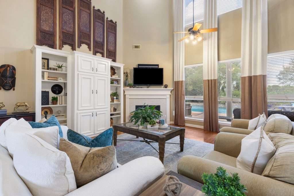
I know that designing dreamy spaces sounds glamorous, but behind all the pretty pillows and perfect paint colors, there is a whole circus of challenges that you rarely see under the spotlight. But this is something a
designer can’t ignore.
Within a few seconds of walking into a room, we know whether everything is working together or quietly competing for attention.
You see, honey, this isn’t about perfection. It’s about harmony.
A cohesive space feels settled.
The furniture relates to itself. The colors support each other. The finishes, lighting, and layouts all feel like they belong in the same conversation. Nothing is trying too hard, and nothing feels forgotten. Even simple spaces can feel complete when these pieces are aligned.
A fragmented room? Well, let’s just say it tells a different story.
Styles clash instead of layering. New pieces fight older ones. Your eye doesn’t know where to rest.
It doesn’t matter if every item is lovely on its own. That’s still gonna happen when the room has been built one purchase at a time, without a clear plan.
Now, for the good news:
That cohesion rarely requires you to start over. More often than not, it comes from editing, repeating a few key elements, and making intentional choices.
When a room finally feels pulled together, you feel it in your body, hun. You relax. And that’s the goal every time.
Frequently Asked Questions
Do designers notice personal collections like books, art, or memorabilia right away?
Yes, we notice, but not in a judgmental way. We’ll look at whether collections feel curated or scattered and whether they’re helping tell a story or just adding visual noise. We might need to edit, group, and spotlight your collections, though, so they feel intentional, not cluttered.
What do designers think when they see visible TVs, cords, and tech clutter?
We’ll see missed potential, but we’ll also see opportunity. Exposed wires and oversized screens signal that your layout and focal points could be better supported with smarter placement. We’re thinking about hiding the wires, framing the TV, balancing speakers, and letting architecture, art, and light lead again.
How do designers view homes with pets and pet-related furniture?
First off, designers don’t judge you for pets. They notice whether the space accounts for them thoughtfully with durable materials, discreet storage, and layouts that reduce mess and wear.
What do designers notice about safety when they enter a room?
When it comes to safety, they usually scan the space for tripping hazards, unstable furniture, poor lighting, and sharp corners that disrupt comfort and ease of movement. Our goal is to ensure you can move safely, protect kids and pets, and avoid potential accidents.
Can a room still feel “off” even if everything is new?
Yes, it can. New pieces without a clear plan can still feel disjointed when scale, style, or finishes don’t work together. Of course, you don’t want everything to match, either, but you do need cohesion.
Seeing Your Space a Little Differently Now
So, honey, now you’re seeing your space with designer eyes, not only “Does this couch spark joy?” vibes, and you may be realizing that your home has been giving you signals all along. Not in a dramatic way, but in small, everyday moments when something feels slightly off or surprisingly easy.
That awareness is powerful, ‘cause once you notice it, you can’t unsee it.
If you’re feeling inspired but unsure where to start, that’s completely normal. Sometimes, it helps to pause, take a few photos, and look at your space with fresh eyes.
That’s where Design on a Dime comes in. We’ll help you make sense of what your space is already telling you and turn that into practical, approachable design decisions.
If you’re ready for guidance that feels supportive instead of overwhelming, contact our team today.