
Color Transitions: How to Flow Paint Colors From Room to Room
Color transitions are more than a design trick. Knowing how to flow paint colors from room to room is the secret to a home that feels easy, connected, and warm.
Think of it like music, where each note blends into the next, carrying you through the whole song without a stumble. The same happens with color when each shade knows how to greet the next one kindly.
Get it right, and your home will feel balanced, like it was always meant to be that way. Get it wrong, and it could end up feeling choppy, like a story missing a few pages.
Stick around, darlin’, because I’ll walk you through how to create that smooth rhythm in your home.
Principles & Foundations
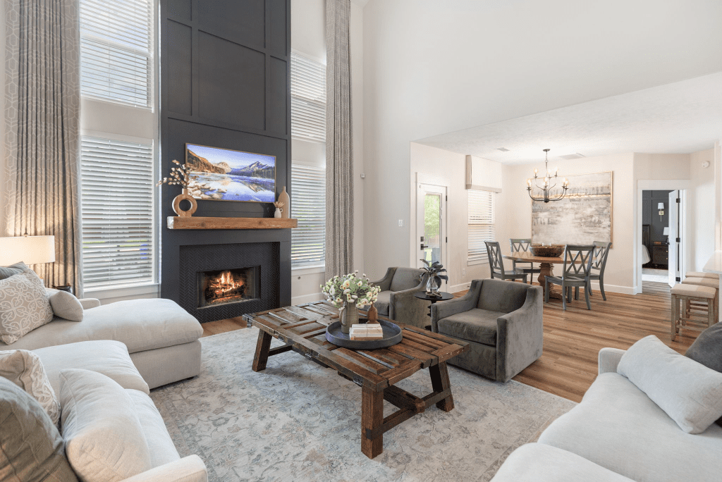
Color transitions do not start with a paintbrush; they start with a plan, honey. Before you even step foot in the paint store, it’s worth pausing to understand the foundations that make your home feel pulled together instead of pieced together.
Think of it like music; every room can have its own verse, but they all need to play in the same key.
Once you’ve got those guiding principles in place, mapping a whole-home palette becomes a lot easier.
Mapping a Whole-Home Palette for Seamless Flow
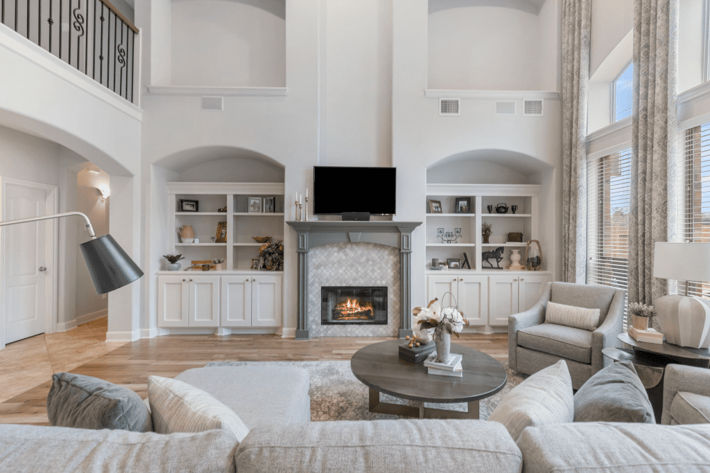
Seven colors is your sweet spot for a whole-house plan that feels balanced without slipping into chaos.
You can think of it like building a family:
One dominant shade leads in your main spaces, two or three secondary colors add personality, trim and ceiling colors hold everything steady, and a couple of accents keep it lively.
Start in your anchor room, usually the living room or kitchen, since it rules the sightlines. What happens there echoes everywhere else, so sample carefully. A soft neutral works beautifully for large, open areas, then let those secondary colors glide into nearby rooms to create a natural rhythm.
For example, for our Flores Project, we went with a soft but rich green paint color to bring some vibrancy while keeping things connected and airy. It became the anchor that allowed adjacent spaces to transition smoothly, showing how a single thoughtful hue can set the tone for an entire palette.
Oh, and remember:
Paints could look completely different in morning light versus evening shadows, so be sure to check your choices throughout the day.
If you’re feeling stuck, peek at pro palettes from paint brands. They often group shades that already share undertones, which keeps things cohesive without looking matchy. More often than not, less is more:
Limit accents, repeat them often, and watch how the whole house hums in harmony.
Reading Undertones and Finding Neutrals That Bridge Them
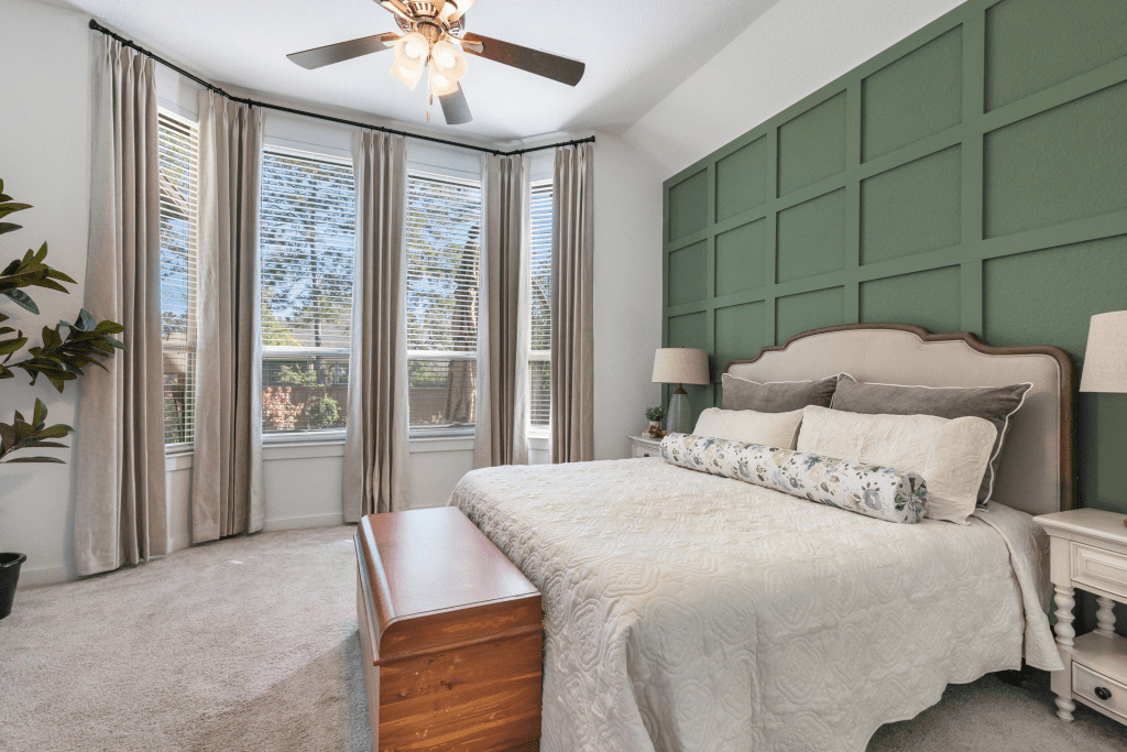
Undertones are the quiet little rascals running the whole paint show. You may see “gray” or “beige” on the can, but what you’ll actually live with is that undertone, and that decides whether your spaces flow or fight.
Warm undertones carry red or yellow, giving creams their cozy glow and nudging blues towards purple. They’re wonderful for living spaces, though you’ll want to test carefully so those rosy notes don’t sneak up looking dingy.
Cool undertones lean blue or green, perfect for crisp bedrooms and spa-like baths, but they can read a little chilly under stark light.
Neutrals are your peacemakers. They’ll bridge the warm rooms to the cool ones, smoothing the shift like butter on hot cornbread.
Here’s a quick trick for spotting those hidden undertones:
Line your swatch up against true red, blue, or yellow. Once you know what’s hiding under the surface, you can keep the story consistent, even when the headline colors change.
Sightlines and Spatial Flow
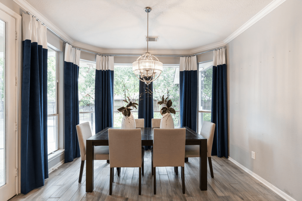
Here’s where things get real practical, sugar.
Walk through your home and pay attention to what you see from one room into the next. Those sightlines are like arrows pointing the eye, and they decide where your transitions need to feel softer and where you can get bold.
If two rooms connect wide-open, stick with related hues or small shifts in value, not a jarring jump. Save the dramatic changes for spots with a natural break, like a hallway, a doorway, or an arch where your eyes expect a reset.
Trim and ceilings are your secret anchors here; keeping them consistent makes even the biggest palette changes feel intentional.
Color can also pull a little magic trick on the space itself:
Pale, cool walls stretch the room wider. A ceiling that’s lighter than the walls feels taller. Deep, warm hues, on the other hand, wrap you up cozy, perfect for a reading nook or dining room.
Think of it as shaping the mood; breezy, lifted, or intimate, all with the sweep of a brush.
Let our team at Design on a Dime take the guesswork out of color transitions. With expert color selection and attention to undertones, we help your home feel effortlessly connected from room to room.
Application & Room-by-Room Guidance
Theory is one thing, but the real magic happens when you roll it onto your walls and carry it through your house. Applying color with intention means looking at the bones of a space, including the trim, the doors, and the ceilings, before you start layering in accents or bold moves.
These quiet features act like the rhythm section in a band, keeping everything steady while the solos play.
Trim, Doors, and Ceilings for Consistency
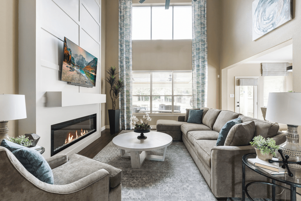
Framework first, flair second. That’s the secret to color harmony, darling.
Start with your trim, because it’s the underline of your home, crisp and steady. White trim bridges shifting wall colors with ease, while charcoal or soft black adds definition without stealing the show. In damp spots, like bathrooms, pick a moisture-resistant finish so it holds up beautifully.
Keep doors uniform, too. They’re the steady heartbeat between rooms.
Black feels tailored, white feels airy, and either can tie a whole home together, especially when you repeat the hardware.
And don’t forget to look up. Ceilings are often ignored, but they matter more than you think.
A consistent ceiling color, like white or soft off-white, keeps the rooms open and lets colors glide gracefully from one space to the next. I suggest sticking to the natural gradation of darker floors, mid-tone walls, and lighter ceilings for a smooth rhythm that feels balanced and intentional.
Transitional Color Schemes
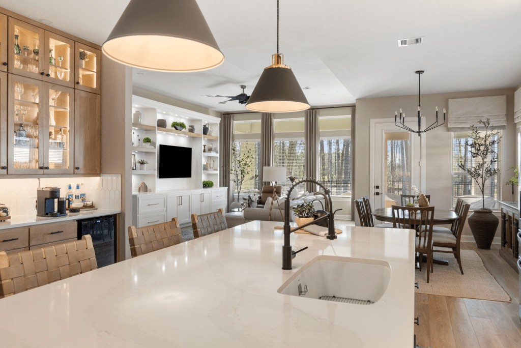
If you love a calm, collected backdrop with just a touch of personality, muted bases with accents are your best friend.
Keep the walls soft (think ivory, greige, sand, or pale moss) and let textures and furniture do the talking. Then, sprinkle in accents like seasoning: a sky-blue throw, olive cushions, cinnamon artwork, or bronze fixtures.
The trick is to layer. Neutral walls, upholstered furniture in warm creams, and then those second or third notes that add character.
Picture a beige sofa with textured gray pillows and a blue throw. Add in a lemon-yellow painting or brass lamp, and suddenly the room sings without shouting.
Repeating accents across adjoining rooms ties everything together, creating that flow we’re after without overwhelming the eye.
Open-Plan & Adjoining Rooms
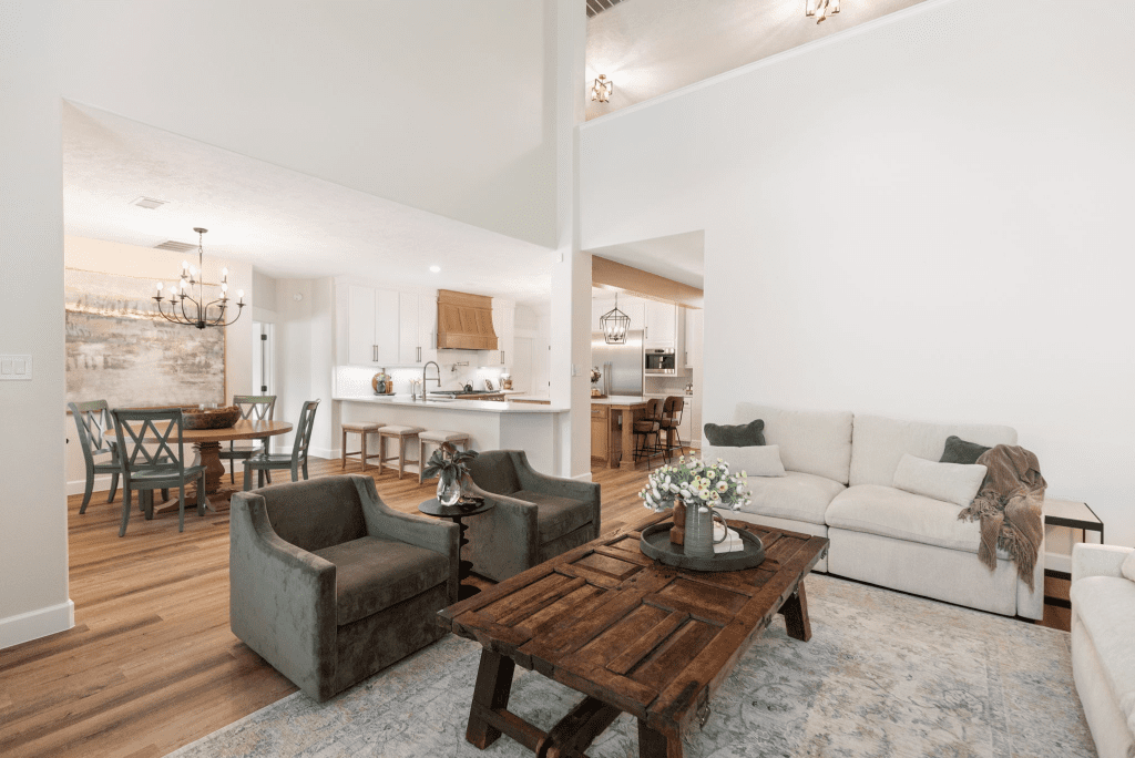
Open spaces can be tricky, sugar, since your eye sees everything at once. The key?
Knowing when to keep steady and when to shift.
Use natural architectural breaks, like columns, fireplaces, ceiling beams, or framed openings, as your cue. That’s where you can nudge a wall slightly deeper, add an accent finish, or change the undertones without causing chaos.
Keep main walls light and airy with whites, beiges, or gentle grays, then add depth in nooks and alcoves where your eyes expect a change. Always match undertones to fixed features like wood floors, marble, or tile, so nothing feels off.
Here’s a quick cheat for transition points:
- Fireplace and built-in shelves: Deepen the value slightly
- Office nook or alcove: Shift from a matte to a satin finish
- Framed opening or archway: Soften the temperature from warm to cool
- Curtain-framed wall: Add a hue pop within controlled edges
When in doubt, keep contrasts lower in open areas. Low-contrast shifts let your eye move smoothly, while bold contrasts belong in spaces with a natural doorway or break.
Smart Sampling & Color Consultations That Save You Money

Paint chips and screen swatches can’t tell you the whole story. Your home’s light does. That is why smart sampling is non-negotiable.
Use oversized sample boards, move them around different spaces, and check them morning, noon, and evening. You can even swap in different bulbs, like LED, incandescent, and daylight, and see how playful paint can be.
Here’s where professional help pays off. A color consultation saves you from wasting money on endless testers and repainting regrets. The result is a palette that feels intentional, flows beautifully, and makes the most of your budget.
Why guess when you can know for sure?
A tailored color palette means no weird undertones, no cave-like corners when you wanted cozy, and no sterile whites clashing with warm wood shades. Just a home that feels harmonious from one room to the next. Design on a Dime can make it happen.
Cohesive Whole-Home Tips & Special Cases
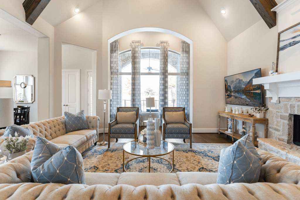
Once you’ve laid down your main palette and practiced those sightline rules, you can have a little fun. This is where color play meets personality, where you lean into new techniques, explore trends, and even bend a few rules when the space calls for it.
The trick, sugar?
Knowing how to do it with intention, so your home still feels connected and stylish, not chaotic.
Emerging Trends and Fresh Techniques
Color lovers are leaning into bold new ideas that can bring extra charm when used thoughtfully. Here are a few trends you should definitely consider for that lovely home of yours:
- Double drenching: Walls, ceilings, and even trim, dressed in the same color for a cocoon-like feel.
- Color capping: Painting only your ceilings a saturated shade while keeping the walls light, for that dramatic but airy lift.
- Tonal gradients: Layering one hue in lighter and darker values across adjacent rooms in the home for a sophisticated flow.
- Special effects: Glazed transitions, ombré fades, and feathered edges can be stunning options for stairwells and lofts, but they need a careful hand to avoid looking faddish.
Now, hun, remember, these techniques are best in feature areas, including entryways, dining rooms, and statement spaces. They’re not something you’d have across your whole house.
The 60-30-10 Rule for Balance
If all else fails, this timeless 60-30-10 guideline will keep your home looking harmonious.
It’s simple, really. You should use 60% of one dominant hue (usually wall color), 30% as a secondary tone (furniture, drapery, cabinetry), and 10% as accents (pillows, artwork, small decor).
Think of it like a recipe:
Just enough spice without overpowering the dish. It works every time.
When and How to Break the Rules
Sometimes, breaking color rules is the only way to get that breathtaking “wow.”
For instance, a dark ceiling in a small powder bath can make it feel jewel-box rich, while a bold accent wall that continues onto the ceiling beam can help define an open loft.
The key is balance:
Break one rule at a time, and let the rest of the space play steady backup so the risk feels intentional, not random.
Common Mistakes You Want to Avoid
Even the best ideas could flop if they’re not grounded. So, honey, be sure to watch out for these pitfalls:
- Too many colors: More than seven in a whole-home plan, and things could feel restless.
- Ignoring undertones: A “gray” with a sneaky purple undertone can wreck your neutral flow.
- Stopping color mid-sightline: If you can see two rooms at once, the paint colors in them need to complement.
- Overusing bold finishes: High gloss can be gorgeous in moderation, but it may be overwhelming across large surfaces, like walls.
Steer clear of those, and your home will feel cohesive, polished, and full of heart.
Whether you are experimenting with tonal gradients, soft accents, or subtle transitions, Design on a Dime brings professional precision and creative insight to every brushstroke, making your color story sing.
Frequently Asked Questions
How do I know if my color palette will complement my existing furniture?
Pull your main fabric or wood tones into the palette first. For example, if your couch is gray and has a cool undertone, lean into cooler paint choices; if you have warm oak floors, choose hues that complement that warmth.
Can I use wallpaper as part of a color transition strategy?
Yes, you can. In fact, wallpaper works beautifully as a “bridge.” Be sure to select patterns that echo colors from adjoining rooms, though; that way, it will feel intentional rather than isolated.
Should flooring influence my paint transitions?
Yes, it absolutely should. After all, floors act like the “fifth wall.” Coordinating undertones with wood, tile, or carpet will keep everything cohesive and prevent any color clashes.
How do stairways or hallways fit into a transition plan?
You should treat stairways and hallways as connectors. A neutral shade works best here, giving the eye a breather before moving into the next room’s personality.
Seamless Color Transitions, Beautiful Homes
Color transitions are more than just paint on walls, sugar; they’re what make your home feel like one story instead of scattered chapters.
The right choices can turn movement from space to space into a gentle flow that feels natural and easy on the eyes.
If you are feeling stuck between swatches or want the confidence that your palette will sing from entryway to upstairs nook, that is where Design on a Dime can help. Our team loves guiding homeowners toward a palette that flatters your light, your furniture, and your style.
Ready to see how good harmony can feel?
Get in touch with our team today and step into a home that finally feels pulled together.