
Why Some Rooms Feel “Off” and How Designers Fix the Balance
If you’re wondering why some rooms feel “off,” the answer is not bad taste or broken design rules. It is your brain picking up on that imbalance before you ever find the words for it.
You walk in, pause to look around, and something just does not settle. The room feels awkward, heavy, or oddly unfinished, even if everything in it seems perfect.
Designers are trained to read those signals instantly. They pick up what your eyes are tripping over, where the space feels tense, and why it’s not giving you that easy and relaxed vibe it should. But once you figure out what’s throwing things off, the fix feels a lot more doable.
Keep reading, darlin’, because this is where that vague discomfort finally starts to make sense.
The Real Reason Behind a Room Feeling “Off”

Bottom line up front, sugar:
Visual weight is what makes some pieces in your room quietly support the space, while others demand all the attention. How that weight is spread out is what affects whether a space feels calm and comfortable or a little uneasy.
Once you understand visual weight, you stop guessing and start making intentional choices.
Bigger furniture, darker colors, bold patterns, and thicker textures naturally feel heavier to the eye. A deep charcoal sofa, a chunky bookcase, and a busy rug will always carry more presence than pale walls, slim furniture legs, glass, and open materials.
That doesn’t make those heavier elements wrong, hun, but it does mean they need balance.
Lighter elements do a lot of quiet work in the room. Soft wall colors, lighter ceilings, and open finishes help the space feel more breathable and relaxed. Even vertical choices matter. When the eye is encouraged to travel up through tall furniture, art placement, and subtle contrasts, the space feels more evenly grounded.
I mean, who wants a room that feels bottom-heavy, anyway?
Texture and placement play a role, too.
A few objects grouped tightly together pull attention much faster than those same items spread out across the room. When everything visually crowds one side, your eyes keep snapping back there, and your brain never quite gets to rest.
Designers pay close attention to this because our minds are wired to prefer balance. Studies consistently show that cluttered, visually overloaded spaces increase stress and mental fatigue, even when we cannot quite explain why.
This is where the psychology of space comes in:
Balanced rooms feel easier to be in because the eyes move through them without effort. Nothing is yelling for attention, and, at the same time, nothing feels forgotten. When visual weight is evenly distributed, the room feels settled, welcoming, and naturally comfortable.
It’s the kind of space where you exhale without realizing it.
If reading this made you look around your room and think, “Well… that explains a lot,” you’re not alone. At Design on a Dime, we help clients move from guesswork to clarity by identifying where visual weight might be working against their space and reshaping it so the room finally feels easy to be in.
The Three Types of Balance Designers Rely On
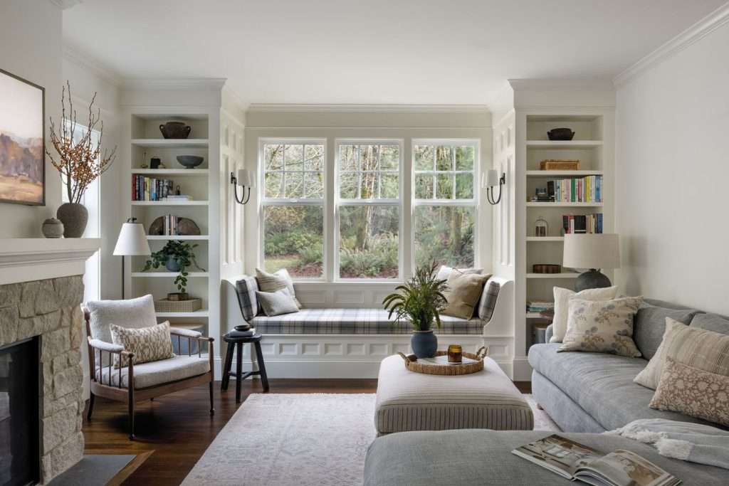
Think of balance as your shortcut to a room that feels settled instead of slightly off. Designers rely on three main types of balance to get there, and once you recognize them, you start seeing why certain spaces feel so good and others never quite land.
Here’s the thing, sugar:
Balance matters because our brains crave order, even when we love personality and creativity.
When the visual weight in a space feels evenly distributed, everything feels calmer, more comfortable, and easier to live in. But when it’s not?
Your eyes keep searching for a place to rest.
- Symmetrical balance is the most familiar. It is the classic twin look; I’m talkin’ matching lamps on both sides of the bed or identical chairs flanking a fireplace. This type of balance feels orderly and reassuring, which is why it works great in bedrooms, living rooms, and rooms meant for rest. That symmetry tells your brain everything is under control.
- Asymmetrical balance is where things get more interesting. Instead of matching pieces, you use different items that still carry similar visual weight. Think a sofa balanced by two lighter chairs, or a tall floor lamp offset by layered artwork. The pieces might not be the same, but the space still feels stable. This approach feels modern, relaxed, and intentional when done well. It’s also where many rooms go wrong when the visual weight isn’t carefully considered.
- Radial balance pulls everything toward one central point. Imagine a round dining table with chairs arranged evenly around it, or a seating area underneath a chandelier. This kind of balance creates a strong sense of connection and flow, especially in social spaces where people naturally gather.
You might not even realize it, but layout plays a major role in how comfortable a space feels. That reaction is not accidental. When balance is working, the space feels calm, curated, and complete without trying too hard.
Once you understand which type of balance a room is leaning toward, the fixes become much clearer. You are no longer decorating blindly. You’re choosing twins, contrasts, or centered layouts on purpose, and the intention behind those choices is what makes a space finally feel right.
Once you can spot which type of balance a room is leaning toward, decorating stops feeling random. This is the lens Design on a Dime relies on to help you make confident decisions that feel cohesive, even when mixing styles, eras, and furniture you already love.
Visual Weight Mistakes That Make a Room Feel Wrong
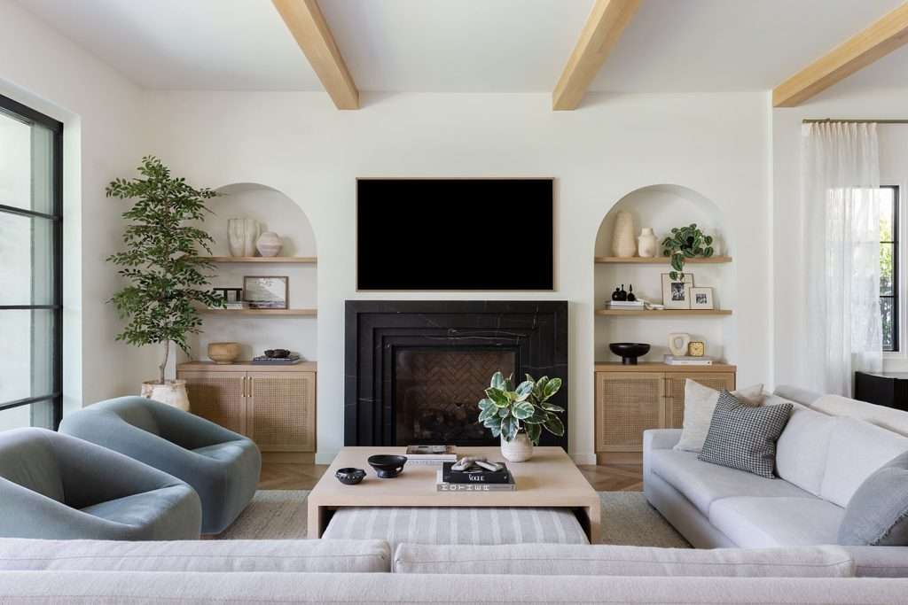
You know the feelin’. You walk into a room, and nothing is technically wrong, but something just doesn’t sit right.
In most cases, that reaction comes down to visual weight and scale working against each other.
- Visual weight is the perceived heaviness of what you see, and your eye is incredibly quick to pick up on it when it’s uneven. Think too many dark colors on one wall, a massive sectional paired with a coffee table that feels like it wandered in by mistake, or a handful of small decor pieces scattered around with nothing substantial to ground them. When the weight is concentrated in only one area or mismatched in size, your brain reads it as “imbalance” before you even have the words for it.
- Scale and proportion make that imbalance louder. Furniture that’s too large overwhelms the room and shrinks the space around it, and furniture that is too small makes the room feel underfurnished and awkward, like it never quite grew into itself. When pieces are scaled correctly to the space and the people using them, movement feels easier, and the space instantly calms down.
Color and texture play into this more than most people realize. When all the bold colors or heavy textures live on one side of the room, your eye keeps getting pulled there. The same thing happens when the lights are uneven or when one area feels crowded while another feels empty.
A room needs moments to breathe, honey, and negative space is just as important as what fills it.
If your room feels off, it’s not being dramatic. It is responding to mixed signals. The good news? Once you learn to spot these weight and scale issues, fixing them becomes much more straightforward.
If any of these mistakes sounded familiar, that doesn’t mean your room is beyond saving. It usually means the space needs a second set of trained eyes to spot what is quietly throwing things off. Design on a Dime specializes in fine-tuning scale, layout, and visual flow, without starting from scratch.
How Designers Fix the Balance
Once you can see what’s throwing a room off, the fix is rarely complicated. It’s mainly about giving the eye a place to land, spreading visual weight with intention, and letting your space breathe rather than crowding every inch.
And darlin’, that’s where rooms stop feeling accidental and start feeling composed.
You can check out our Jennifer Heights Project for a real-life example of these principles in action.
Create a Focal Point That Grounds the Room
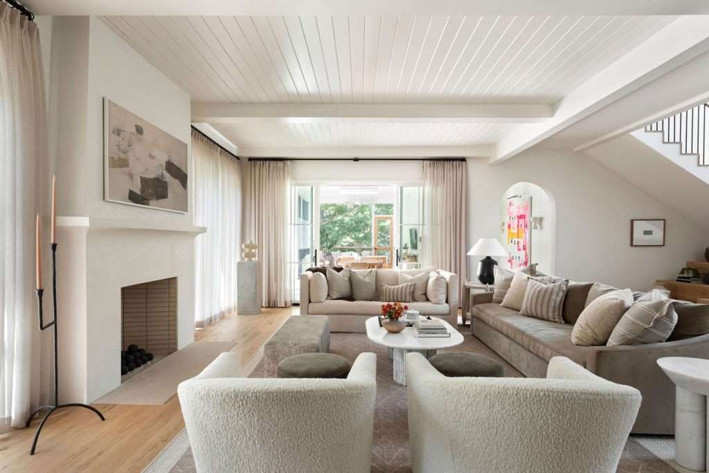
When a space feels underwhelming and scattered, it’s often because nothing is clearly in charge. A strong focal point acts like the anchor of the room. It quietly tells your eye where to go first and helps everything else fall into place.
Your focal point might already be there. A fireplace, a large window, a statement light fixture, or a piece of art with presence can all do the job. The key?
Choosing one and letting it take the lead.
When everything tries to be important, nothing actually is.
Once you have that anchor, furniture and decor should support it instead of competing with it.
Sofas face it. Rugs and seating relate to it. Even lights work in its favor, drawing attention where you want it instead of letting the room feel aimless.
In bedrooms, the bed usually does all the heavy lifting. In living rooms, it might be the fireplace or the view. Either way, once the focal point is clear, the room starts to feel intentional, not accidental.
Now, a quick gut check helps here.
What do you notice within the first few seconds of walking in?
That first impression tells you exactly where your anchor is, or whether the room still needs one.
Balance Visual Weight With Color, Texture, and Scale
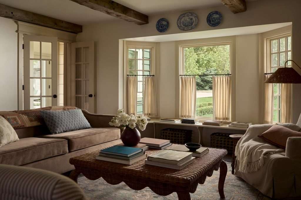
This is where many rooms quietly lose their footing.
You see, honey, visual weight is not just about size. Color, pattern, texture, and height all carry weight, too, and designers use them like tools.
The goal?
Make sure no single area feels overloaded.
Dark colors and bold patterns feel heavier than light, quiet ones. Rich textures, like velvet, leather, and heavy wood, pull more attention than smooth and airy finishes. But if all of that weight gathers on one side of the room, the space starts to feel lopsided, even if you can’t really explain why.
Instead of stacking them all in one corner, designers spread them throughout the room.
Accent colors show up in more than one place. Patterns are repeated enough to feel cohesive. Repetition creates rhythm, and rhythm creates calm.
Scale matters here, too. A large sofa needs chairs that can hold their own. Small pieces of art floating over a king bed will always feel lost. Remember:
Designers rely on proportion, not instinct.
Let Negative Space and Sightlines Do Their Job
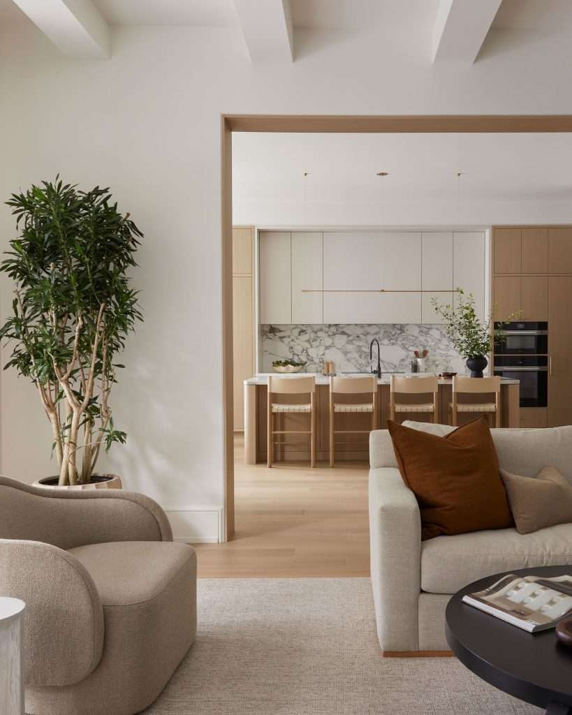
One of the biggest differences between a designer room and a crowded one is what gets left out.
Negative space is not wasted space, and you should stop treating it as such. Because dear, it’s what gives the room rhythm and relief.
Pay close attention to sightlines. From the doorway, from the sofa, from the kitchen pass-through.
Clear paths and open views let your eyes travel through the room without bumping into obstacles, which helps the space feel calmer and more spacious, even when it’s not particularly large.
Furniture height plays into that balance. Lower pieces can stretch a tight room and keep windows feeling open. Taller pieces, on the other hand, help ground rooms with higher ceilings.
Mixing heights keeps the space from feeling flat, but remember:
Too much of one height could actually make the room feel boxed in.
A balanced space usually includes at least one area that stays intentionally quiet. A blank wall. An open corner. A clear path to a window or focal point.
That pause is what allows everything else to shine.
This is the part where many folks stall, not because the ideas are hard, but because it is tough to see your own space clearly. Design on a Dime helps translate these principles into real-life layouts that will work for how you live, so your home feels composed, comfortable, and fully settled.
Frequently Asked Questions
How do I know if my room needs professional help or just a small adjustment?
If moving a few pieces around and editing decor improves things quickly, you’re likely close. But if a space still feels unsettled, even after several tries, a professional eye could spot what you might be missing.
Can a room feel off even if everything matches?
Yes, it certainly can. Remember that matching does not guarantee balance. Spaces might still feel flat and “heavy” when scale, spacing, and visual flow are working against the layout.
Does ceiling height affect how balanced a room feels?
Yes, ceiling height does affect how balanced a room feels. Low ceilings often need lighter, lower furniture, while higher ceilings benefit from taller elements that visually ground the space.
Is it possible to overcorrect balance and make a room feel stiff?
Yes, it absolutely is. Overcorrecting (think too much symmetry or too many rules) can drain personality out of the room. Balance should always feel natural, not forced.
What is the biggest mistake people make when trying to fix a room themselves?
The biggest mistake people make is adding more instead of editing what’s already there. Most rooms feel better once all the unnecessary pieces are simply removed or repositioned, not necessarily replaced.
When a Room Finally Clicks
That uneasy feeling you get in a room is not random, honey, and it’s not a personal failure, either.
It’s simply your space asking for a little clarity.
See, when a space is balanced, it stops demanding attention and starts supporting your life. It feels easier to move through, easier to relax in, and easier to love.
If you’ve adjusted, edited, and shifted things around, and the room still won’t settle and “click,” that is often the moment where a trained eye makes all the difference. At Design on a Dime, we help homeowners spot what is quietly working against their space and guide it back into balance without starting from scratch.
If you are ready for that sense of ease, you can reach out to our team. Sometimes, all a room needs is the right nudge to fall into place.