
Why Neutral Rooms Fail and What Gives Them Staying Power
When you think about why neutral rooms fail, most people assume it’s about beige being boring. But in most cases, it’s about good intentions falling flat.
You see, most people choose neutral colors hoping for calm, comfort, and timeless style, then end up with spaces that feel unfinished or oddly cold.
I know that disconnect can be frustrating, especially when the room looks fine “on paper.”
The truth is, neutral rooms are quiet by nature. So, every small choice you make carries more weight. And when something is slightly off?
You feel it right away.
If you’ve ever walked into a neutral space and thought, something’s missing, you’re in the right place, hun.
The Hidden Psychology Behind “Boring” Neutral Rooms

Here’s the not‑so‑boring truth about “boring” neutral rooms:
They’ll quietly work on your brain, helping you feel calmer, safer, and more grounded, without shouting for attention. And when you surround yourself with soft whites, grays, and beiges, you’re basically giving your nervous system a weighted blanket.
Plus, neutrals act like total chameleons, letting bolder pieces shine without causing visual drama. Because they reduce sensory overload, your brain doesn’t waste energy sorting through all that chaos; it finally gets to exhale.
That’s also one of the reasons why neutral rooms tend to age better than trend-driven spaces:
They feel stable even when your schedule doesn’t.
And that simple, quiet backdrop becomes the stage where you can focus, reset, and actually feel at home. Calm space, sharper mind, happier you.
Yet, somehow, neutral rooms get a bad reputation.
The problem is rarely the colors themselves, though. It’s what happens around them.
Where things usually go wrong is when that quiet foundation is mistaken for “done.”
Neutrals aren’t meant to stand alone, darlin’. Without enough contrast, texture, and intentional lighting, you end up with a space that feels unfinished or flat. At that point, it’s no longer peaceful.
It’s just underwhelming.
In other words, neutrals don’t fail because they’re boring. They fail because they’re incomplete.
When neutrals are meant to calm and ground you, the right paint choices matter more than most people realize. Design on a Dime’s team ensures that your walls actually support the mood you want, instead of quietly working against it.
How Undertones Shape a Calm, Neutral Palette
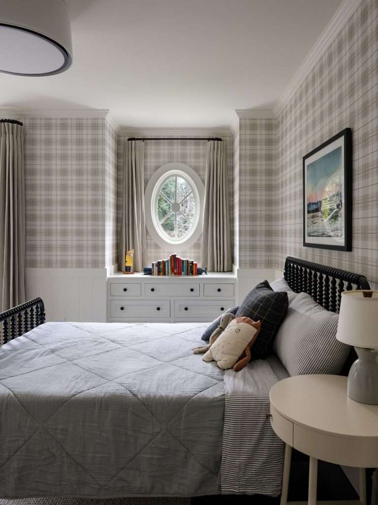
Here’s a little truth for you, sweetheart:
Your “neutral” room isn’t actually neutral at all; it’s loaded with sneaky undertones that can make the space feel calm and cozy or… well, weird and “off.”
You may not be able to name the issue right away, but honey, your brain can feel it.
You’ve got to learn how to spot if those colors lean warm or cool, because that gentle beige you loved on Pinterest can turn straight-up Band-Aid pink or icy blue on your walls.
Undertones are especially important because neutrals are often used across large surfaces. Walls, floors, cabinetry, and upholstery all live close together. When their undertones work in harmony, your space feels cohesive and easy to settle into. But when they fight each other?
That calm vibe disappears.
Understanding Warm and Cool Neutrals Without Overthinking It
Although both warm and cool neutrals look “safe” on the paint chip, their undertones create very different emotional responses once they’re on the actual walls.
Warm neutrals tend to carry soft yellow, cream, or red undertones. They make the spaces feel inviting and grounded, which is why they’re perfect in living rooms, bedrooms, and homes with lots of natural wood.
Cool neutrals lean into blue, green, and gray undertones. They can feel clean and modern, but if overused or paired incorrectly, they may read cold or sterile.
The key isn’t choosing one category over the other. It’s keeping them consistent within a space.
Warm walls usually want warm flooring and finishes nearby. Cool walls, as you can imagine, call for cooler materials and metals.
Train your eye with a quick check:
- Compare neutral swatches next to a true white.
- Notice whether it flashes yellow, pink, blue, or green.
- Place it beside wood floors, cabinets, or large pieces of furniture.
- See if it loves brass or chrome more.
And most importantly, ask yourself, “Does this feel cozy or chilly?”
Your reaction tells you more than the label on the paint can.
Light Changes Everything With Neutrals
Even the most thoughtful undertone choice can fall apart if lighting is ignored.
Natural light shifts throughout the day, and artificial lighting adds a whole different layer. Morning light can make a neutral feel soft and fresh, while evening light might pull out undertones you never noticed before.
And that, honey, is why testing is non-negotiable.
Paint large samples or create sample boards and move them around the space. Be sure to look at them in the morning, midday, and at night, under the actual bulbs you plan to use.
When you find one that feels calm in each of these lighting conditions, you’ve found the neutral that’ll age well.
Undertones can be tricky to spot on your own, especially when lighting comes into play. Design on a Dime can guide those choices, make sure your neutral palette feels cohesive from the start, and save you from costly repaints.
The Critical Role of Contrast in Defining Neutral Spaces

If your neutral room looks a little “meh,” it’s probably starving for contrast, not begging for more beige.
Honey, what you need is that flirty balance of light and dark, like creamy walls with a few inky accents, so your space actually has a heartbeat. Then, you mix in different textures and tones, from knobby pillows to smooth wood and cozy throws, and suddenly, your quiet room starts whispering, “Hey there, I’m fabulous.”
You see, contrast isn’t about adding bold color. It’s about variation.
Light against dark. Soft next to solid. Smooth balanced with textured. Without that interplay, neutral spaces can start to blur together and lose their sense of structure.
Finding the Right Balance Between Light and Dark
Trust me, darlin’, contrast is the secret spice that keeps your neutral room from looking like a bowl of plain oatmeal. And yes, your space deserves better.
You use light and dark like salt and pepper. It’s that simple.
Lighter neutrals help a room feel airy and expansive, especially on walls and large surfaces. Darker tones add weight and warmth, which keeps the space from floating away.
Here’s how you keep that balance working for you:
- Light walls combined with a deeper sofa add depth without heaviness.
- A dark rug under lighter furniture grounds the seating area.
- Darker floors with lighter walls can make ceilings feel higher.
- One darker accent wall creates definition without closing the room in.
- Dark doors or trim act as clean outlines that sharpen the entire space.
The goal isn’t drama. It’s clarity.
When that contrast is handled well, neutral rooms feel intentional and comfortable, and that’s exactly what keeps them from ever feeling bland.
Texture Is the Secret Ingredient That Makes Neutral Rooms Work
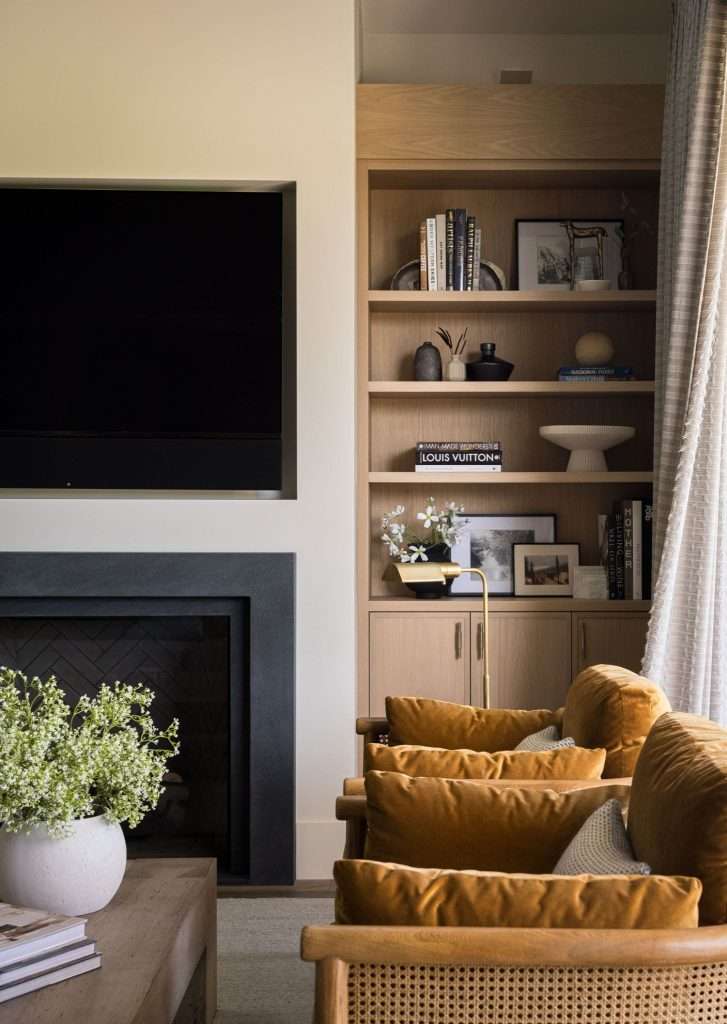
Let me tell you, honey:
When color takes a step back, texture has to step forward.
Think of texture as the element that gives your eyes something to explore. It brings dimension without adding noise. It’s the secret sauce that saves a neutral room from looking like a waiting room. Without it, even the most beautiful palette can feel flat or unfinished.
Mixing Textures and Tones
You’ve got your light and dark working like a charm, but without texture and tone, your neutral room still risks looking like a beige pancake, hun.
Start with a calm base of whites, beiges, or soft grays. From there, the goal is to bring in contrast through materials, not color.
You want to layer at least three textures, so you have a variety of surfaces that behave differently in the light and to the touch.
- Soft textures like linen, wool, and velvet bring warmth and comfort.
- Natural textures such as wood grain, rattan, and jute add character and grounding.
- Smoother finishes like metal, glass, and stone create balance and keep the room from feeling too heavy.
Intentionally combining smooth, rough, soft, and hard surfaces creates a textural contrast that gives even the simplest neutral palette depth and interest. Plus, adding soft textures like plush pillows and throws can significantly increase the cozy factor by inviting tactile exploration.
What matters is variety:
When everything is smooth, the space feels cold. When everything is soft, it can feel dull.
Layering Texture to Turn a Flat Room Into an Inviting One
Now, sugar, texture layering is where neutral rooms really come to life.
Instead of relying on one statement piece, you build that interest gradually. Soft meets structured. Organic meets refined. Each layer adds depth without overwhelming the space.
Here are a few simple strategies that go a long way:
- Anchor the room with a textured rug, such as jute or wool.
- Layer pillows in different fabrics on a neutral sofa.
- Drape a knit or woven throw over a smooth chair.
- Bring in baskets, ceramics, or woven shades for subtle variation.
- Use one textured wall treatment, like grasscloth or brick, to create a focal point.
The goal isn’t clutter, sugar. It’s comfort and balance.
Easy Neutral Room Fixes That Make an Immediate Difference
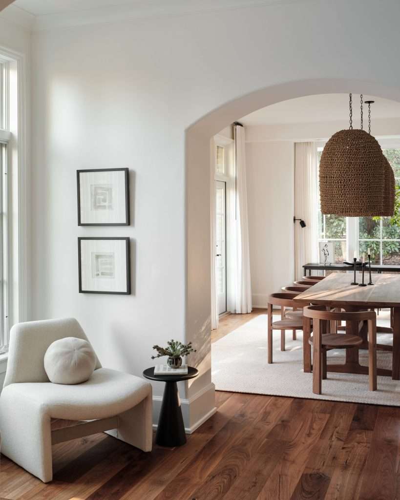
Light and shadow can work all kinds of magic, but if the bones of your neutral room are wrong, no amount of perfect lighting will save it from looking tired.
The good news is that you don’t need to start over to make your neutral room feel better. In most cases, a few thoughtful adjustments can completely change how your space feels without repainting every wall and replacing major furniture.
These are the kinds of fixes you should reach for when a room needs life, not a full makeover:
- Add One Patterned Element to Wake the Room Up
If everything in the room is solid and smooth, the space can start to feel “sleepy.” One well-chosen pattern gives your eyes something to engage with. This doesn’t mean loud or busy. A subtle stripe, a soft geometric, a layered rug, a pair of accent pillows, or a piece of artwork with movement. One pattern is often enough to shift the entire energy of the space.
- Bring in Something Sculptural or Curved
Neutral rooms often lean heavily on clean lines. When everything is straight and boxy, your space can feel stiff. So, you want to introduce one element with shape. A rounded chair, a curved mirror, a sculptural lamp, or even a soft arched silhouette in art can make a space feel more relaxed and welcoming, all without adding color.
- Use Dark or Metallic Accents as Visual Punctuation
A neutral room may benefit from a few deeper notes to ground it. Think black picture frames, aged brass hardware, bronze lighting, or darker wood accessories; these elements help define a space. They’re a bit like punctuation marks. They give the space structure, without overpowering the calm palette.
- Layer in Greenery or Organic Elements
Plants are one of the fastest ways to soften a neutral space. They introduce color, texture, and life all at once. If live plants feel intimidating, high-quality faux options can still add visual warmth. You can also bring in organic elements, such as branches, stone bowls, or ceramic pieces with natural variation. These touches break up uniform finishes and make the room feel more lived in.
- Swap One Flat Surface for Something Textured
You don’t need texture everywhere. One intentional change is enough to make a big impact. Think woven lampshades instead of smooth ones, or a chunky throw over a sleek sofa. Add in a textured basket, a woven bench, or a tactile wall piece, and you’ll take the room from feeling bare to feeling complete.
Trust me, all you need are small, high-impact changes.
Sometimes the biggest transformation comes from updating just one surface. Professionally painted walls, a trim refresh, or finish upgrade can instantly upgrade the entire room without a full redesign. Design on a Dime’s team can make it happen.
Designing Neutral Rooms That Evolve With Your Home
Curious how to keep your neutral rooms from feeling stuck in time while your life keeps changing?
You treat them like a wardrobe, not a museum.
Think of neutrals as the bones of your home; a steady foundation that can shift as your routines, hobbies, and people change around you.
When the walls, large furniture, and flooring stay calm and cohesive, everything else gets more freedom. You can let your “wild side” live in pillows, art, and rugs. When your taste shifts, those are the pieces you’ll swap. The room stays grounded, but it never feels stuck, and you’re not starting from scratch.
‘Cause, honey, homes are meant to be lived in, not preserved.
You can see this approach in action in our Ellerden Forest Project, where warm neutrals, natural textures, and thoughtful paint choices create a home that feels calm, cohesive, and truly lived in.
When you pick your neutrals with intention, they become a long-term partner instead of a short-term trend. They support bold choices when you want them, and calm when you need it. That’s what makes a neutral room feel timeless, personal, and ready for whatever comes next.
Starting with a strong, well-executed neutral base gives your home room to grow. Design on a Dime lays that foundation, so that all future updates feel easy and intentional.
Frequently Asked Questions
How many neutral tones should I mix in one room?
You can mix up to three to five related neutral tones in one room. This includes your walls, major furniture, and accents, not just paint colors.
How do neutral rooms impact home resale value in Texas markets?
When it comes to home resale value, neutral rooms typically perform well in Texas markets because they signal move-in readiness and broad appeal. Buyers in Texas markets tend to respond positively to spaces that feel clean, cohesive, and easy to personalize.
How can renters use neutrals without painting or renovating?
Renters can use neutrals with rugs, curtains, removable wallpaper, lights, and neutral-toned furniture; they all create impact without requiring any permanent changes. Texture can do most of the work when paint is off-limits.
Do neutral rooms require more maintenance than colorful ones?
No, they won’t necessarily require more maintenance, but finishes do matter here. Mid-tone neutrals and layered textures tend to hide wear better than stark whites and ultra-light fabrics.
How often should neutral-heavy spaces be updated to avoid feeling dated?
You should refresh neutral-heavy rooms seasonally by adding new accents, then do a deeper style update every three to five years. That’s usually enough to keep neutral spaces feeling current.
When Neutrals Finally Feel Like Home
So, here’s the tea, honey:
Your neutral room doesn’t have to look like a sad waiting room with better pillows.
When you play with undertones, contrast, and textures, you’re not just decorating. You’re setting the mood every single day.
Think of neutrals like the background music to your life. They support how you live, how you rest, and how your home shows up for you over time.
Give them depth, give them warmth, and watch your home glow like it finally found its spotlight.
At Design on a Dime Interiors, neutral spaces are built to feel layered, livable, and flexible enough to grow with you.
Ready for a change? Get in touch with our team today.