
Color Memories: Designing With Hues That Tell Your Story
“Color memories” aren’t just pretty shades on a wall, hun. They’re the hues your heart never forgot.
Maybe it’s that soft peach of your mama’s Sunday dresses or the dusty blue of the skies on a road trip that felt like freedom. Lord knows, some colors just stay with us.
And when you bring those shades into the home, something shifts. The room no longer just looks styled. It feels familiar, warm, and a little bit like coming home to yourself.
I am here to show you how those personal little sparks of color can shape your space with more soul than any trend ever could. So, pull up a chair, honey, and let’s wander through the hues that have been waiting to tell your story.
Finding the Colors of Your Favorite Memories
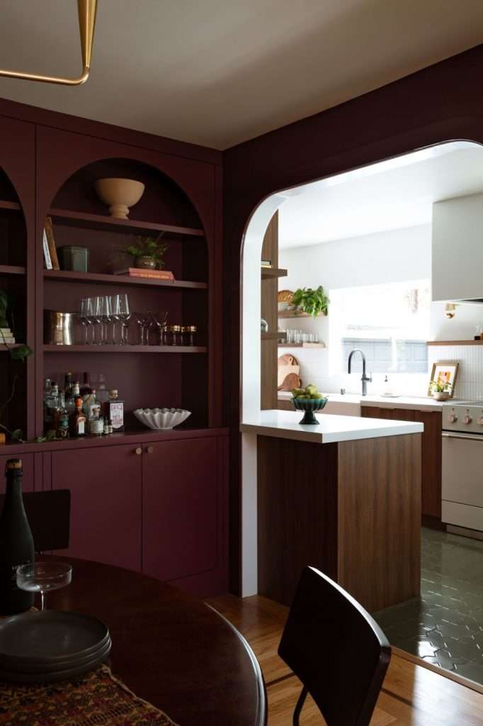
Ever notice how certain moments come back to you in full color while others show up looking a bit washed out and blurry around the edges?
That’s your mind doing what it does best, honey.
You see, our brains latch onto color in a powerful way, and research shows that colorful scenes tend to be remembered more accurately than black-and-white ones. It’s one of the main reasons why a familiar hue can pull you right back into a moment you haven’t thought about in years.
Think about the places that shaped you. Maybe your childhood home, that beach trip you still smile about, or the first apartment you decorated all by yourself.
Go ahead and picture one.
You probably didn’t see just a vague room. You saw the exact shade of the cabinets, the red pot, the warm light on the tile, and the color of the sweater you were wearing.
Those hues are tied to how your memory filed that moment away.
That’s why this part of the design process starts with reflection.
So, gather old photos, scroll through your camera roll, or jot down a few memories that always make your heart warm, and look for the colors that keep showing up. Build a small mood board if you like.
You’ll be surprised by how quickly a pattern appears.
That’s ‘cause these colors aren’t just visuals. They’re emotional anchors that help your home feel familiar, personal, and beautifully yours.
Turning Your Memories Into a Personal Interior Palette
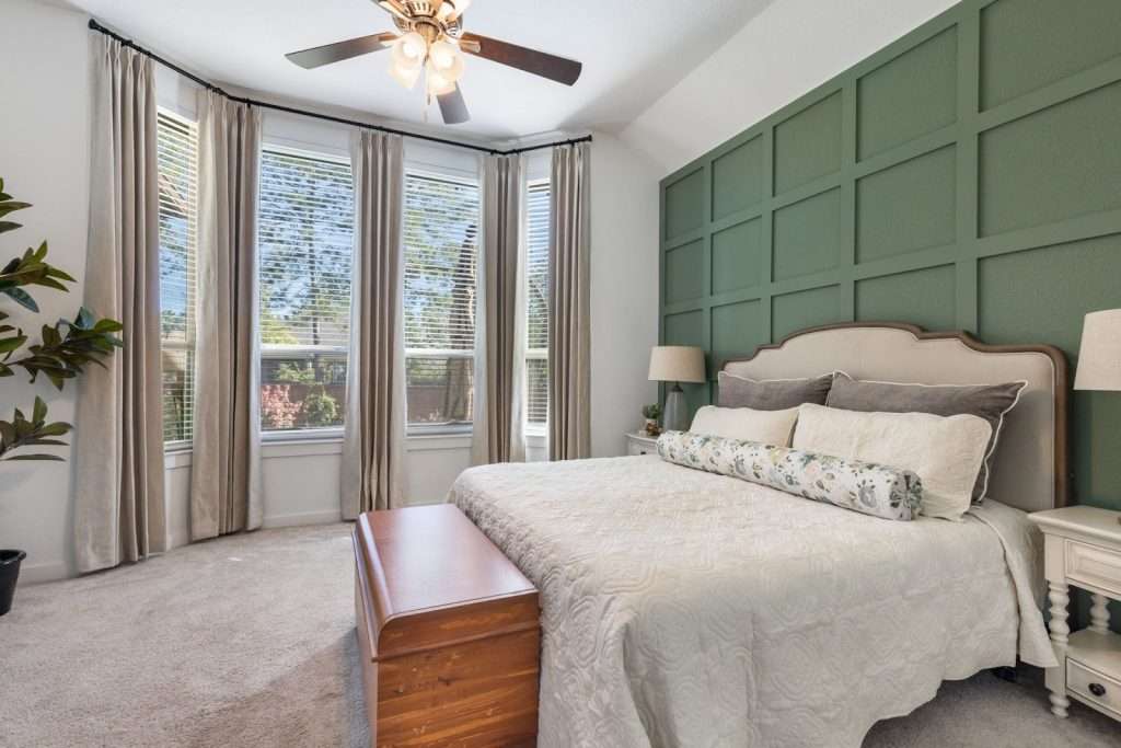
Once you’ve got all those memory colors in front of you, the next step is shaping them into a palette that actually works in your home.
Think of it like choosing the lead singer, the backup vocals, and the soft hum that holds it all together. This palette will need a dominant hue, a few supporting colors, and a set of neutrals that will let the whole story breathe.
Let’s start with the color that carries the strongest feeling.
Maybe it’s the buttery yellow hue from your grandmother’s kitchen or the deep green from a forest trail you loved. That becomes your anchor.
From there, you can pull two or three quieter hues that live in the same memory. It may be the warm wood tones, the soft cream trim, or the muted sky that you didn’t notice until now.
Now, look at how those colors behave in real life.
Some memory shades are bold and full of personality. If that’s the case, use saturation and texture to keep them balanced. A vivid blue might work better as a velvet pillow than a full wall. A soft, nostalgic pink could shine as a rug or a piece of artwork instead of taking over the whole room.
And neutrals? They’re your peacekeepers, hun. They help your memory colors stand out without shouting.
Oh, and don’t forget to sample your palette in natural light, evening light, and lamp light. You’ll see how each shade settles into the space.
When you build your palette this way, you’re not picking colors just because a trend report likes them. You are choosing hues that have lived with you, traveled with you, and stayed in your heart all along.
If you ever find yourself loving your colors but struggling to make them play nicely together, that is exactly where a trained eye can help. Design on a Dime specializes in shaping meaningful color palettes that feel balanced, livable, and true to you, not trendy for trend’s sake.
Balancing Nostalgia With Beautiful, Lasting Design
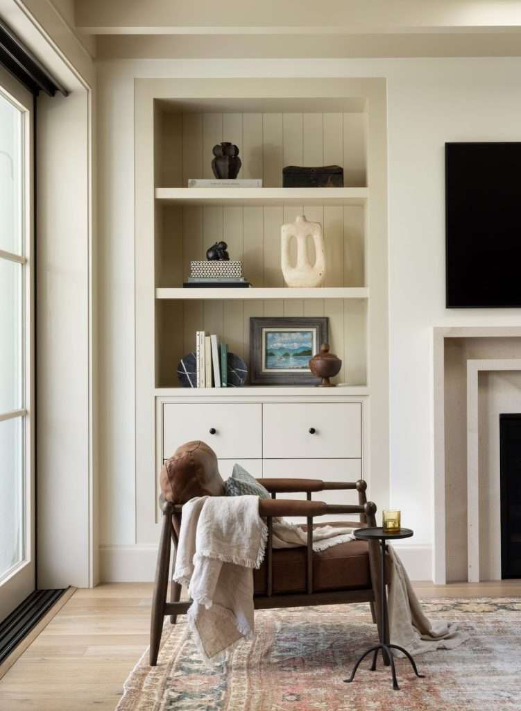
Bringing memory colors into your home doesn’t mean turning your living room into a scrapbook, darlin’.
The goal is to let those meaningful tones shine while still giving your space a polished, grown-up feel. And that’s where balance comes in.
Light, room size, and existing furniture all play a part in how far your memory colors can go.
Like I said earlier, you first need to check how your chosen tones look in real light. A soft blue that reminds you of summer mornings might feel airy in a bright space, but turn chilly in a shaded hallway. A warm coral from a favorite vacation can glow beautifully in small accents, but feel too intense on every wall.
Let your lighting guide how much of each memory color you use.
It also helps to think of your nostalgic shades in different volumes. Some colors deserve a whisper, some can handle a sentence, and a rare few earn the whole paragraph.
Maybe your brightest memory shade works best in pillows, art, or a patterned throw. Your softer tones can move into larger pieces like drapery or rugs. Neutrals will do the grounding, helping the sentimental colors feel intentional instead of overwhelming.
Be careful not to recreate the memory too literally, though. You don’t need to rebuild Grandma’s kitchen tile by tile to honor the feeling it gave you. Instead, “borrow” the warmth, the softness, and the comfort that memory carries.
You’ve got all these textures, wood tones, metal finishes, and natural materials you can use to elevate the nostalgic hues, but you want them to read timeless, not theme-driven.
When your colors are chosen with care and placed with balance, your home ends up feeling personal and inviting, and, most importantly, beautifully current. Remember:
It’s not a museum of your memories. It’s a living story that still has room to grow with you.
We took a similar approach with the Renee Project, where decades of cherished pieces were thoughtfully layered into a lighter, refreshed design that still honored the home’s original story.
Finding that sweet spot between sentimental and stylish can be tricky, especially when light, furniture, and layout come into play. That’s the kind of thoughtful balancing act Design on a Dime brings to every project, helping memory-filled spaces feel polished, timeless, and easy to live in.
Ideas and Real-Life Examples of Color Memories in Action
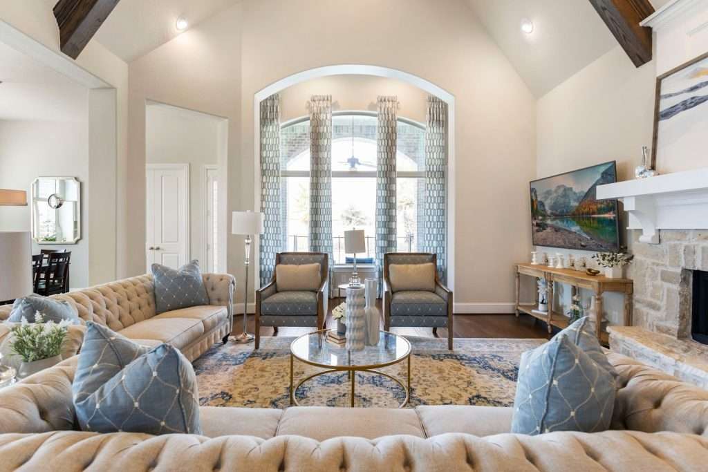
Sometimes it helps to see how memory colors come together in an actual room.
When you look at a space through the lens of a particular moment you treasure, the palette, textures, and finishes all start to tell the story in a quiet, beautiful way.
Picture a beach memory. Maybe it was a calm morning when the water looked like soft aqua and the sand felt warm under your feet. That could inspire your living room design, for example.
Think pale blue walls, sandy beige upholstery, and a woven jute rug. Add a driftwood bowl or a piece of art with soft wave patterns, and suddenly the whole room feels like a breath of coastal air without slipping into a theme.
Now, think of your childhood home that always felt gentle and safe. Perhaps the walls were a muted pastel hue, or the kitchen smelled like vanilla and warm wood. A space that is inspired by that memory might use blush or buttercream in small accents, paired with oak furniture, quilted textures, and soft light.
The feeling is far from childish, honey. It’s stable, warm, and quietly nostalgic.
Travel memories are often the boldest.
If you fell in love with a market full of saturated jewel tones, you can bring them in through pillows, pottery, textiles, or a patterned rug. Then balance them with natural textures, like rattan, stone, or aged brass. The room becomes lively and layered, just like travel itself, without overwhelming the eye.
If you enjoy visualizing ideas, gather a few photos from moments that still tug at your heart and turn them into a small mood board. Look for repeating colors, textures, and shapes. That could help you see which memories are guiding you, and how they might grow into a space that feels beautifully personal.
If these examples sparked ideas but you’re not sure how your own memories would translate into finishes, textures, and furnishings, you are not alone. Design on a Dime can help turn abstract inspiration into clear, cohesive design plans that still feel deeply personal.
Bringing Your Memory-Inspired Room to Life
Once you’ve gathered all your colors and the feelings behind them, it is time to start shaping a space that reflects your story. You don’t have to repaint a whole room on day one, hun. Start small, stay curious, and let your home grow with you.
Here’s a quick checklist to get you moving in the right direction:
- Pull three or four colors from a memory that still feels meaningful.
- Test those colors in natural and evening light to see how they behave.
- Look for textures and patterns from the same moment, like woven baskets, soft linens, and natural wood.
- Try small pieces first. Pillows, throws, candles, artwork, or a single decor object can help you test a hue without commitment.
- Add one change at a time so the room unfolds gently instead of all at once.
- Sit with the space for a few days and notice how it makes you feel.
If you enjoy experimenting, you can go a step further and make a little workbook for yourself. Print a few photos, tape down fabric or paint samples, write a sentence about the memory, and note which colors feel right.
This makes the process fun instead of overwhelming.
Remember that a memory-inspired home is not meant to be “permanent” in every detail. Your tastes might shift, and your life will keep giving you new moments to draw from. Treat your palette like a living thing that can grow and change.
What I’m trying to say is:
Your home doesn’t have to lock in a single chapter. It can celebrate all the beautiful ones still to come.
Taking those first steps can feel exciting and a bit overwhelming all at once. Whether you want help testing colors, layering textures, or pulling it all together, Design on a Dime is here to support the process, so your space grows thoughtfully and with confidence.
Frequently Asked Questions
Can memory-inspired colors work in a modern or minimalist home?
Yes, they can work in modern or minimalist homes because memory colors don’t have to be bold or literal. In modern spaces, in particular, they often show up through subtle tones, textures, or just one meaningful accent.
What if my favorite memory colors feel too bold for everyday living?
That’s a common problem. The good news is that you can soften up your favorite memory colors by using muted versions, limiting them to smaller elements, or combining them with calm neutrals.
How do I know when a memory color no longer fits my space?
If your space starts to feel heavy or disconnected from how you live today, that might be your sign that it’s time to adjust. Remember that memory-inspired design is meant to evolve with you, not stay frozen.
Are memory colors better used in certain rooms?
They often shine in bedrooms, living rooms, and entryways where emotion matters most, but they can still work anywhere in your home, as long as you find the right balance.
Can a designer help translate memories into colors without taking over the vision?
Yes, they can. A good designer will always listen first. Then, they can help shape those personal ideas into a palette that works beautifully in real life.
Your Home Deserves a Story Only You Can Tell
Every room in your home has a chance to hold a little bit of who you are, darling. When you choose colors that carry memories and meaning, you are not just decorating. You are creating a space that feels honest, grounded, and deeply familiar in the best way.
And a home built with that kind of intention has a warmth you simply cannot buy off a shelf.
If you ever feel unsure about how to pull those personal hues together, Design on a Dime is always happy to guide you. We love helping people shape homes that reflect their real lives and the moments that made them.
When you’re ready to explore your own color story, reach out and let us guide you through the next step.