
Why Matching Sets Make Rooms Feel Stale & How to Avoid a Showroom Look
Have you ever thought about why matching sets make rooms feel stale?
It’s weird, isn’t it? It’s something most people feel before they can explain it.
You walk into the room, everything technically works, yet something feels “off.” The space looks finished, but it doesn’t feel personal, comfortable, or alive.
That’s ‘cause spaces designed around perfectly matching furniture often miss the subtle details that make a home feel welcoming. All that sameness kills visual rhythm, so your eyes have nowhere fun to land. And instead of telling a story, the room just sits there, all polite and forgettable.
Mix things up a bit, baby, and you’ll see how much more personality and energy your home can release.
Why Exact Matches Often Make Rooms Feel Stale
Here’s a little tough love for your living room:
That perfectly matching furniture set you purchased in one swoop is stealing your personality, baby. When every piece is the same style, color, and vibe, your room stops feeling like you and starts feeling more like a store display.
You end up living inside a catalog, not a home.
What Matching Sets Really Communicate
When every major piece in a room matches perfectly, it sends a very specific message. Sadly, it’s not the one most folks intend.
You see, perfectly matching furniture tends to read as “bought all at once.” Instead of feeling curated and personal, the room takes on a showroom energy.
Polished, yes. Memorable, not so much.
This kind of sameness leaves no room for your story. No visual hints of where you’ve been, what you love, how you actually live; all those delicious little details that make the space unforgettable for you. The space feels finished before it ever feels lived in, and it ends up coming across as stiff and impersonal.
Homes that feel inviting usually look like they were built over time, even when they weren’t. That sense of “evolution” is what matching sets quietly erase from your space.
The Issue of Everything Saying the Same Thing
Another issue with exact matches is visual monotony.
When furniture shares the same shapes, finishes, and tones, your eyes have nowhere to pause, no story to follow, no surprise to enjoy. Nothing stands out as a focal point ‘cause everything is shouting, “Look at me!” in the exact same voice.
And when everything blends together, nothing stands out. Simple as that, honey.
Instead of guiding the eye through the room, the space becomes flat. There’s no rhythm, no movement, no moment that makes you want to look twice.
That’s when even a lovely piece of furniture will lose its impact.
You don’t need chaos, you just need a little contrast; the visual “seasoning” that makes rooms feel layered, lived-in, and completely yours. And as you’ll see later, it can be as simple as varying silhouettes, mixing up finishes, and introducing one unexpected texture.
Those small changes give the eye something to engage with, so your space has character, not copy-paste energy.
Why One-Note Materials Fall Flat
While it sounds safe and “designer-y,” a room where everything matches a little too perfectly could actually end up working against you.
When every wood tone, fabric, and finish is cloned, your space stops feeling alive.
Coordinated? Yes. Custom? Not quite.
Using the same material repeatedly flattens your space. There’s no depth, no layering, and no sense of intention beyond staying “safe.”
Mixing materials, even subtly, adds warmth and dimension. Think lighter wood paired with a deeper tone and metal finishes that complement instead of mirroring each other.
This kind of contrast acts like seasoning in a good meal. You don’t need a lot, but without it, everything is gonna taste the same.
I know that exact matches often feel like the easy answer, honey, but spaces with character usually come from thoughtful variations. That’s how you go from something that looks nice to something that feels good to be in. And that’s always the end goal.
If your space looks “put together” but doesn’t quite feel like home, that’s usually a sign it needs editing, not replacing. That’s where Design on a Dime’s trained eye can spot what’s missing and help your spaces feel personal again, without starting from scratch. That kind of thoughtful refinement is our sweet spot.
Visual Interest Matters More Than Exact Matching
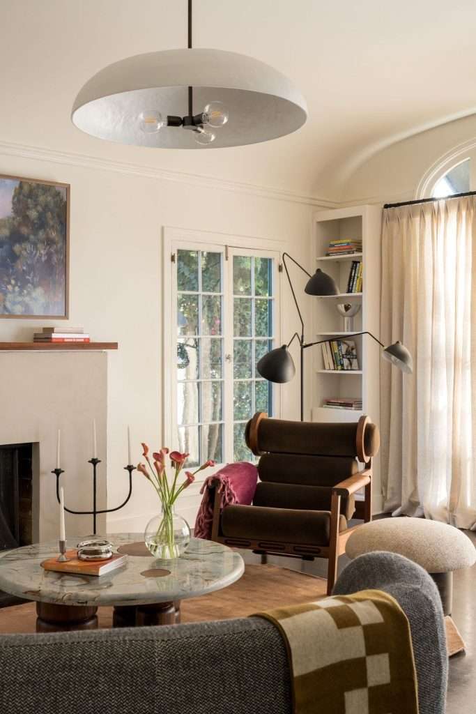
When you want a room that actually feels alive, visual rhythm matters more than everything matching like twins at a family reunion. Visual rhythm is the pattern your eye follows, and it keeps the space from feelin’ like a furniture showroom.
But when that rhythm is missing? Even beautiful furniture can feel flat. The room might look finished, but it doesn’t feel complete. And that’s not the vibe we’re going for, baby.
How Visual Rhythm Actually Works

Visual rhythm is created through repetition and variation working together.
You repeat certain elements, so the room feels connected. That might be a color that shows up in different materials, a curve echoed in several places throughout the room, or a finish that shows up more than once without being everywhere.
You get the idea.
But at the same time, you want to vary scale, texture, and shape so the room doesn’t feel predictable. This balance is what keeps the space interesting without making it feel chaotic.
When that rhythm is done well, the eyes naturally move from one area to the next. The room feels easy to understand and, more importantly, easy to live in, even if you can’t really explain why.
How Contrast Creates Visual Rhythm
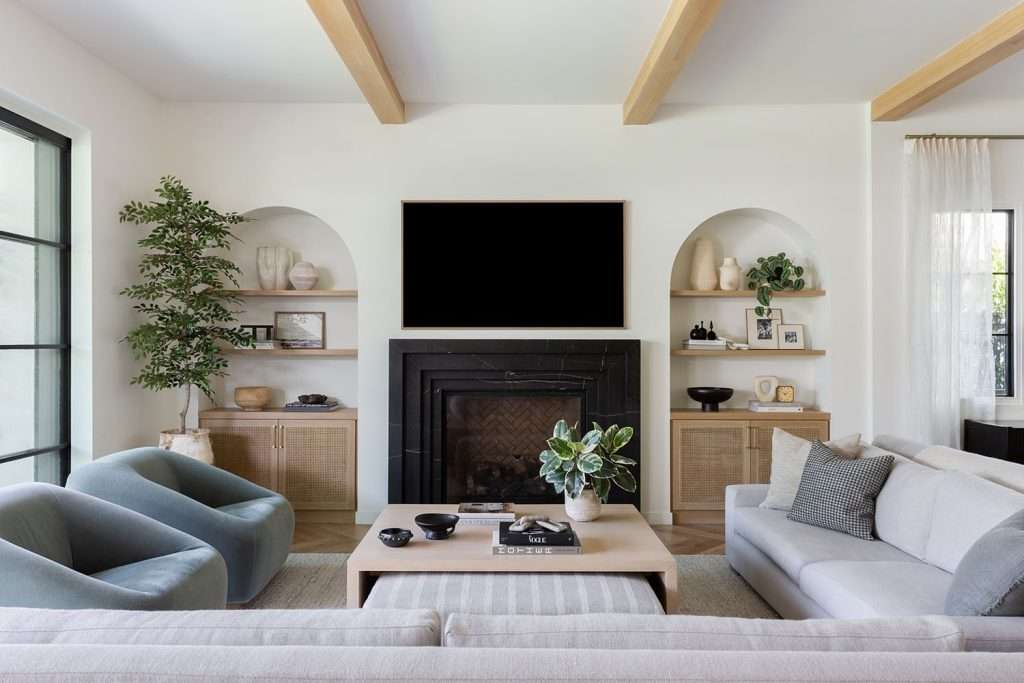
Visual rhythm might get your room dancing, but contrast gives it the drama and depth that make folks stop and stare.
Contrast helps your eyes understand what matters and where to go next. Without it? Yeah, you guessed it:
Everything blends together, and the space starts feelin’ all flat.
Now, contrast shows up in a few key ways.
For one, light and dark help define a room, ‘cause when everything lives in the same value range, nothing actually stands out.
Then, you’ve got scale. Pairing larger pieces with smaller ones adds balance and prevents the room from feeling heavy or monotonous. Otherwise, your eyes have no reason to linger.
Shape is another quiet hero, honey. Straight lines feel sharper when softened by a curve. Rounded forms stand out more when they’re not surrounded by copies of themselves. You get the idea.
That’s the difference between a room that looks nice and a room that actually feels good to be in.
When contrast and rhythm work together, the space feels curated instead of copied. Not loud. Not chaotic. Just wonderfully composed.
And once you understand that, darlin’, it’s much easier to let go of exact matching and start designing with intention.
Visual rhythm is one of those things you can feel instantly, even if you can’t name it. Creating that sense of ease and flow takes intention, not perfection. Design on a Dime’s team keeps the focus on how your home lives and feels, not just how it looks on paper.
Curating Pieces That Coordinate Without Copying
Furniture stores love a perfect matching set because it’s easy to sell. The problem is that it rarely leads to a room that feels like you.
You’re more likely to end up with a room that looks like a model home, instead.
Real homes need coordination, not duplication.
You want pieces that get along without looking like they showed up wearing the same outfit. That balance is what makes a space feel thoughtful instead of cookie-cutter.
Here’s how designers create cohesion without falling into the matchy trap:
Use a Cohesive Palette, Not Identical Pieces

Color is your anchor, honey, not your handcuffs.
Start by choosing a clear color family, then let the shades vary. A room feels richer when it includes light, medium, and deeper tones of the same hue, instead of one exact color repeated everywhere.
The same idea applies to materials:
Wood doesn’t all need to match. Metals don’t need to be twins. A painted finish can live happily next to a natural grain or a woven texture.
When the palette is consistent but the forms change, the room feels connected and layered instead of flat.
Mix Styles With Intention
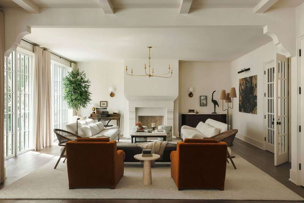
Now, sugar, this is where your personality can really show its lovely face.
Combining things from different styles keeps a room from feeling like it came straight off a showroom floor. A clean-lined sofa, for example, can look even better next to a vintage accent chair, while a modern dining table gains some warmth when paired with softer, more traditional seating.
The key is intention.
You’re not throwing random pieces together. You are choosing contrast that feels balanced in scale, color, or material, so the room still feels cohesive.
If you want to see what that balance looks like in real life, the Laura Project is a perfect example. We went with personal, not polished-to-death.
When done well, mixed styles make a space feel collected over time, even if it was pulled together quickly.
Let Texture Do the Heavy Lifting
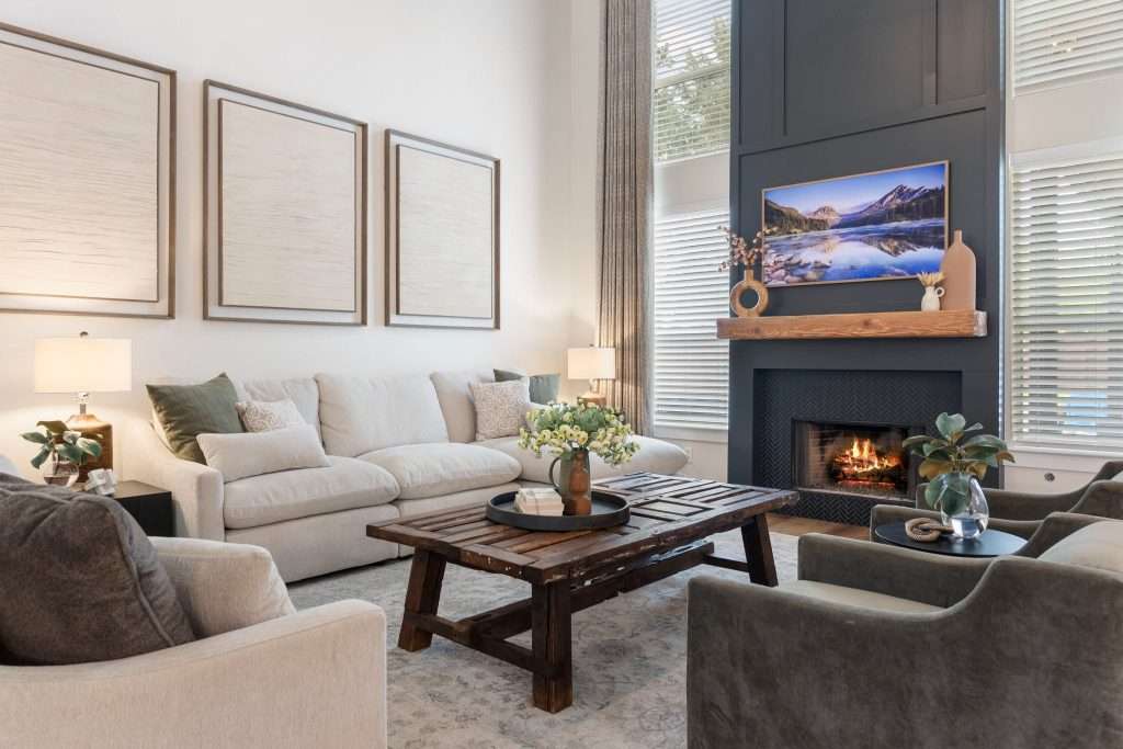
Texture is one of the easiest ways to add depth without touchin’ your color scheme.
Smoother surfaces tend to feel more inviting when paired with something tactile. Think linen against wood grain, leather next to a woven rug, or matte finishes balanced by a touch of sheen.
These layers give your eyes something to explore and make the room feel more comfortable and lived in.
Even small touches matter, sugar:
Pillows, throws, greenery, and accent pieces can all shift the entire feel of a room without overwhelming it.
And when texture and contrast are working together? The space feels intentional, never repetitive.
Coordinating without copying is an art, darling. Knowing what to keep, what to layer in, and what to swap makes all the difference. Design on a Dime helps you find that kind of clarity and avoid that cookie-cutter vibe.
Frequently Asked Questions
Are matching furniture sets ever the right choice?
Matching furniture sets can work in very limited situations, like temporary spaces or short-term rentals, but most long-term homes benefit from some variation, so the space can grow and adapt over time.
How do I know if my room feels coordinated or just overmatched?
If every major piece shares the same finish, shape, and scale, a room is likely overmatched. Coordinated rooms usually repeat colors and materials, but you won’t catch them repeating the exact pieces.
What is the easiest way to update a room that already has a matching set?
The easiest way to update a room that already has a matching set is to start with the smallest swap. Think replacing a coffee table, nightstand, or lights; that usually makes a bigger impact than changing one larger piece of furniture.
Does mixing furniture styles make a room look messy?
No, it doesn’t, as long as it’s done with intention. A shared color palette, similar scale, or repeated material can keep mixed styles feeling cohesive, instead of chaotic and messy.
How many finishes or materials is too many?
Most rooms feel balanced with three to five finishes. Beyond that, the space might start to feel busy unless everything is carefully edited.
Designing a Home That Feels Like You
Now that you’ve seen how that matchy-matchy set can suck the soul straight out of a room, I know you’re ready to mix things up with confidence.
Play with contrasts, layer textures, and let those pieces flirt instead of cloning each other. Trust me, a few thoughtful changes can completely shift how a space lives and breathes.
Your home should feel collected, not copied, and absolutely unapologetic.
And if you would rather not figure it all out alone, Design on a Dime is here to help.
Get in touch whenever you’re ready, baby. I’ll help you turn “kind of cute” into jaw-dropping, stop-the-earth stunning in every room.