
The Most Common “Almost Right” Design Mistakes Designers See
Honey, the most common “almost right” design mistakes are the ones that leave you scratching your head, wondering why the room looks good but still doesn’t feel quite settled. Nothing seems wrong at first glance.
The furniture is nice, the colors work, and everything is tidy. Yet something feels just a little off.
That lingering feeling usually comes down to subtle imbalances the eye notices before the brain can name them. Designers are trained to spot these misalignments and make small adjustments that bring the space into harmony.
The good news is you don’t need a full makeover.
A few thoughtful refinements can turn “almost right” into a room that feels comfortable and welcoming. So, stick with me, and I’ll show you how to fix those sneaky mistakes.
1. Furniture That Feels Out of Proportion
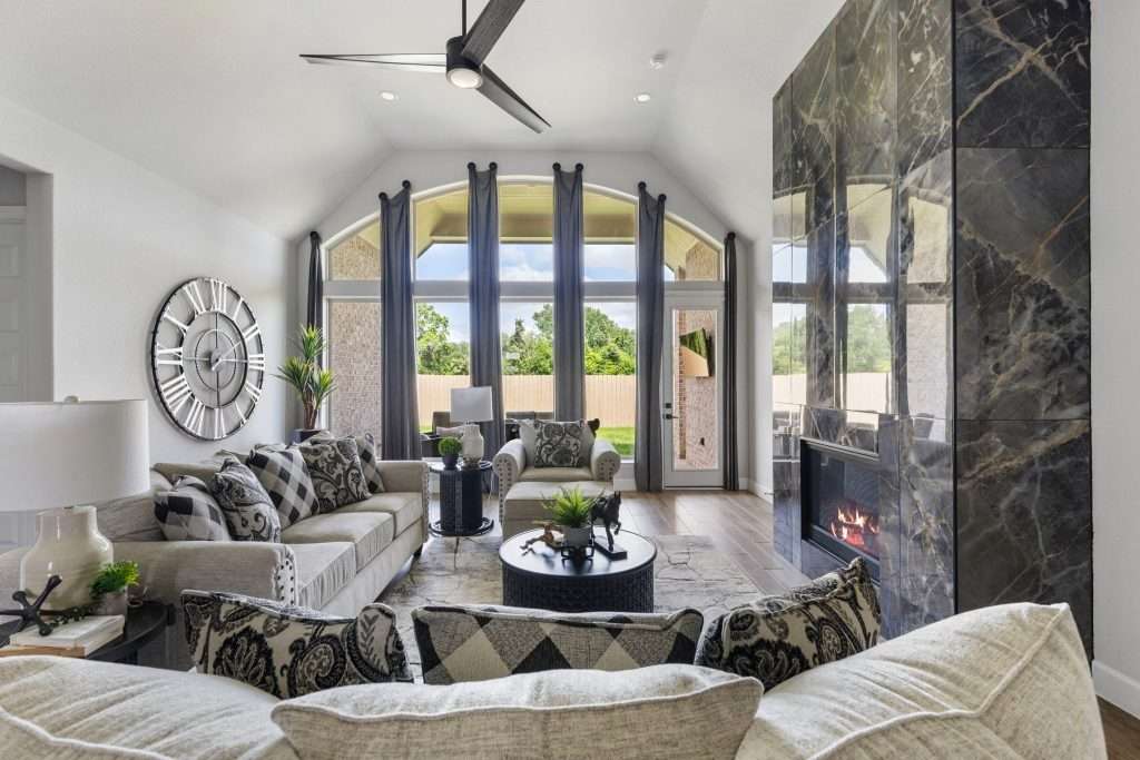
Sometimes, a room looks nicely furnished at first glance, yet something feels slightly unsettled.
More often than not, honey, the problem is scale. When furniture doesn’t match the size of the room or the visual weight of the surrounding pieces, the space can feel awkward even when every item looks stunning on its own.
A too-small sofa is one of the most common culprits. In a large living room, a petite couch can look like it’s floating rather than anchoring the seating area. On the other end of the spectrum, you can have this large, out-of-place sectional that swallows the room and makes everything else feel squeezed in.
I’m sure you know what I’m talkin’ about.
On that note, the balance between pieces matters just as much.
A bulky coffee table coupled with delicate chairs, or slim accent tables next to a heavy-looking upholstered sofa, creates visual tension instead of harmony.
Designers pay close attention to proportions ‘cause they set the tone for comfort and cohesion. You want pieces that share a similar visual weight, with breathing room around them.
When scale feels tricky to judge, a designer’s eye can make all those pieces feel balanced from the start. Design on a Dime will help you choose furniture that fits both the room and the way you live.
2. Rugs That Leave the Room Feeling Unsettled
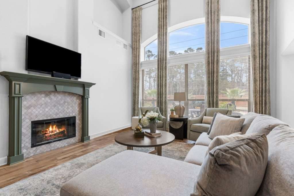
A space can have beautiful furniture and still feel oddly disconnected if the rug isn’t doing its job. Hear me out, sugar:
Rugs are more than decorative layers underfoot. They ground the space, create cohesion, and visually tie furnishings together into a single conversation area.
One of the most common issues I see is the “floating furniture” effect. When all the seating sits completely off the rug, each piece feels isolated rather than part of a unified arrangement.
And sure, the room may look tidy, but it lacks the sense of “togetherness” that makes a space feel inviting.
Undersized rugs cause similar problems. A rug that only fits under the coffee table can make the room feel smaller and fragmented. I always want to make sure that at least the front legs of sofas and chairs rest on the rug, helping anchor the layout and define the seating zone.
Grounding matters because it quietly establishes where living happens within a space. When the rugs are properly scaled and positioned, the room feels anchored, comfortable, and complete without anyone quite knowing why.
3. Lighting That Brightens the Room (but Flattens the Mood)
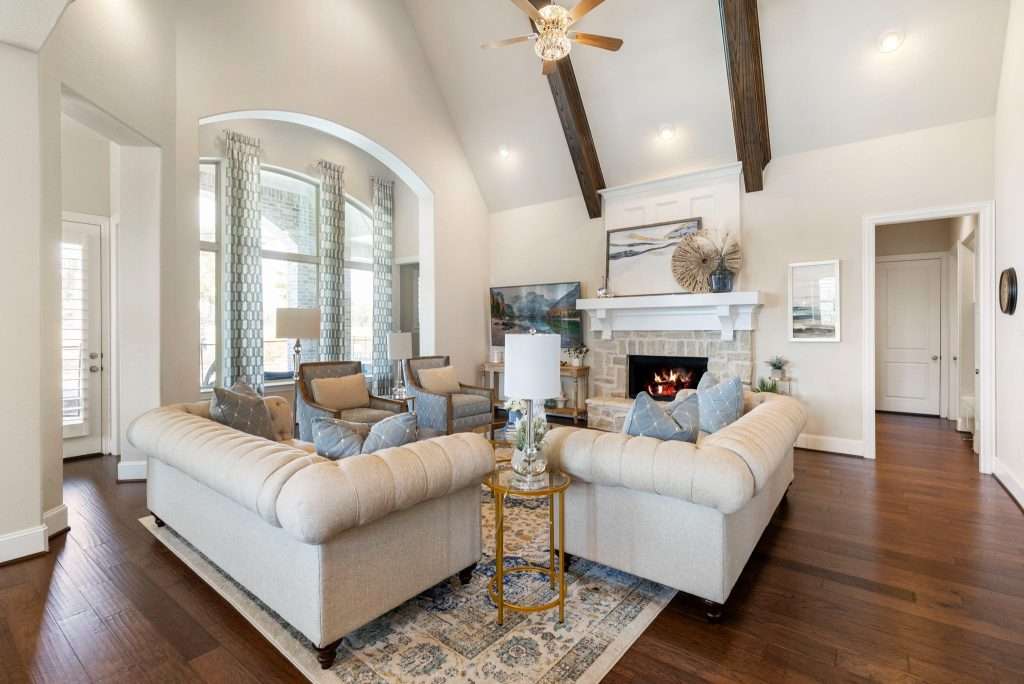
The thing about lights is that the room can be perfectly visible yet still feel lifeless when lighting relies on a single source.
There’s no doubt that overhead fixtures provide general illumination, but when they carry the entire load, the space loses warmth, depth, and atmosphere. And trust me, designers can tell.
Many homes depend almost exclusively on ceiling lights. While practical, this approach casts uniform light that flattens textures and creates shadows in all the wrong places. The result?
A room that feels stark instead of welcoming, especially in the evening hours when softer light should take over.
That’s where layered lighting comes in.
You want to combine ambient light for overall glow, task lighting for reading or cooking, and accent lighting to highlight architectural features and décor. Table lamps, floor lamps, sconces, and under-cabinet lighting each add dimension while making daily activities more comfortable.
Good lighting shifts how the room feels throughout the day. It softens edges, enhances colors, and creates cozy pockets of illumination that invite people to linger. And when it’s layered with intention, the space gets depth and a sense of ease that overhead fixtures alone simply can’t provide.
Layered lighting can completely transform how a space feels after sunset. Design on a Dime’s team often incorporates lighting plans that add warmth and everyday comfort.
4. Art Placement That Throws Off the Whole Wall
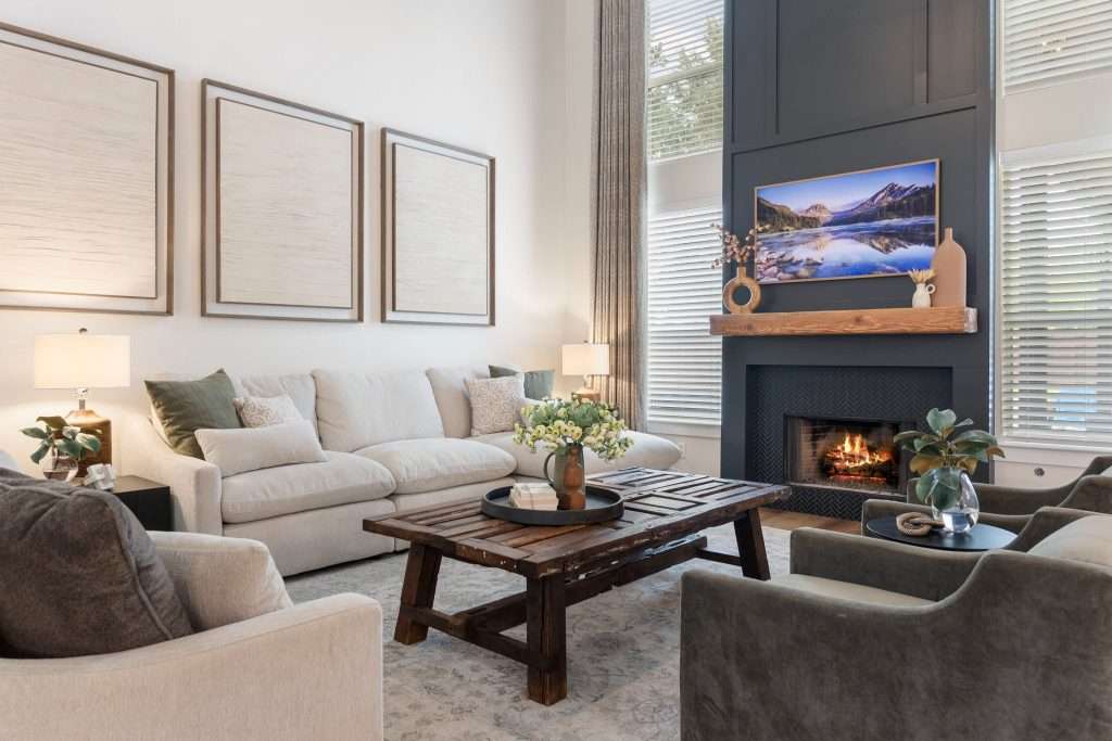
Artwork has the power to finish a room, but let me tell you something:
When placement is slightly off, the entire wall can feel disconnected.
The most common issue, one I’ve seen time and time again, is hanging art too high. When the pieces sit well above eye level, they feel detached from the furniture below and get your attention… for all the wrong reasons.
Scale plays an important role, too.
You don’t want a small frame floating on a large wall. It’ll look lost. The same goes for pieces that are way too narrow; they fail to visually support the seating area.
Designers often aim for artwork that spans roughly two-thirds of the furniture width beneath it, helping the arrangement feel balanced and intentional.
Grouping mistakes can also disrupt that harmony. Frames spaced too far apart or arranged without a clear structure create visual clutter rather than cohesion. You want consistent spacing and aligned edges to help multiple pieces read as a unified composition.
Art should feel connected to the room instead of hovering above it. That alignment brings a sense of calm order that completes the space.
5. Color Choices That Coordinate but Feel One-Dimensional
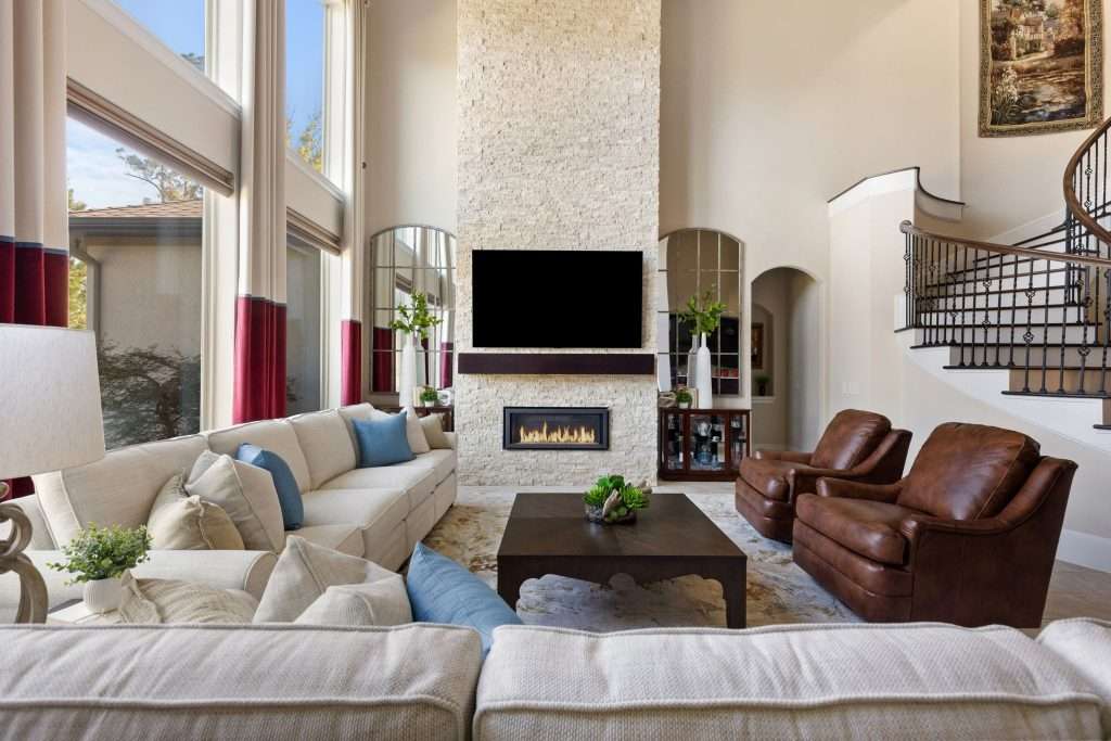
A room can feature a perfectly coordinated palette and still feel… well, a little flat. Why does that happen?
Well, when color choices stay within one narrow tone or intensity, the space lacks the variation that gives it richness and visual interest.
Monochromatic schemes are a common culprit.
Using a single shade throughout can feel calm, but without lighter and darker variations, everything blends together.
Walls, upholstery, and accessories all tend to merge visually rather than complement one another.
You need tonal layering; that’s what creates depth. Mix shades within the same color family, then introduce subtle contrast through texture, wood tones, metals, or accent hues. That little “interplay” allows the eye to move comfortably around the room instead of landing on one uninterrupted wash of color.
Warmth plays a role here, too. A palette that leans too cool can feel sterile, while one without contrast can seem unfinished. Adding warm neutrals, natural materials, or a deeper accent tone is a good idea. It helps restore that balance.
And that, sugar, is how you get a room that feels layered and inviting instead of flat.
6. Spaces That Feel Overmatched Instead of Collected
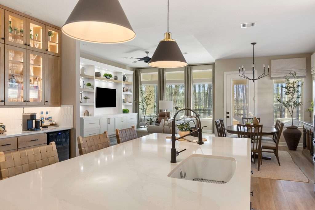
Matching furniture sets, identical finishes, and repeating fabrics might seem like the safest path, and I get that, hun. But let me tell you:
When everything matches too perfectly, the room just feels a little stiff.
You end up creating a space that feels more like a showroom than a home. And I guess that’s not the look you’re going for here.
When every piece shares the same wood tone, upholstery, and style, the eye has nowhere to rest. It reads as predictable rather than layered, which could make it feel flat, despite the quality of the furnishings.
Trust me, even small variations can make a meaningful difference.
The key is to think in terms of coordination, not duplication. So, don’t hesitate to mix finishes and textures, ‘cause when you introduce contrast, you add visual interest without sacrificing harmony.
This curated approach brings warmth and personality into a space. Instead of looking like it arrived in one delivery truck, the room feels thoughtfully assembled over time. That subtle contrast is what gives a space sophistication while still feelin’ relaxed and inviting.
7. Furniture Arranged for Walls Instead of Living
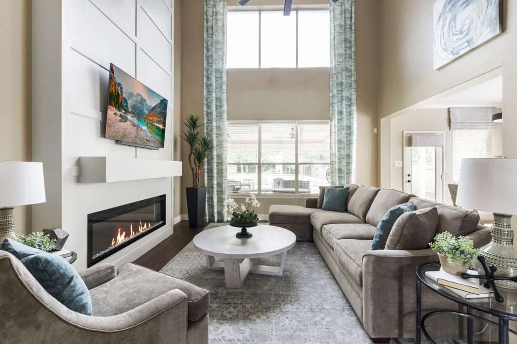
Many rooms look tidy but feel awkward because the layout follows the perimeter instead of the way people actually live.
I know that pushing every piece against the walls might seem like it creates more room, but it often leaves the center feeling empty, with the seating disconnected.
When furniture hugs the walls, conversation becomes strained. Guests lean forward to be heard, and your space lacks the sense of intimacy that encourages folks to settle in.
Instead, try pulling the seating inward. This creates a natural gathering area and makes your space feel welcoming rather than… “cavernous.”
And while we’re at it, don’t forget the traffic flow.
Walkways should feel intuitive, allowing movements without weaving around obstacles. You need to leave clear paths while still anchoring the seating arrangement, so the room feels organized.
Focal points deserve attention, as well. Whether it’s a fireplace, a window, or a media console, arranging furniture to acknowledge a visual anchor gives the room purpose.
And trust me, when layout decisions prioritize function, flow, and connection, the space simply feels ready to be lived in. Design on a Dime can help you create a thoughtful layout that makes the room feel instantly more welcoming.
8. Window Treatments That Shrink the Room Instead of Framing It
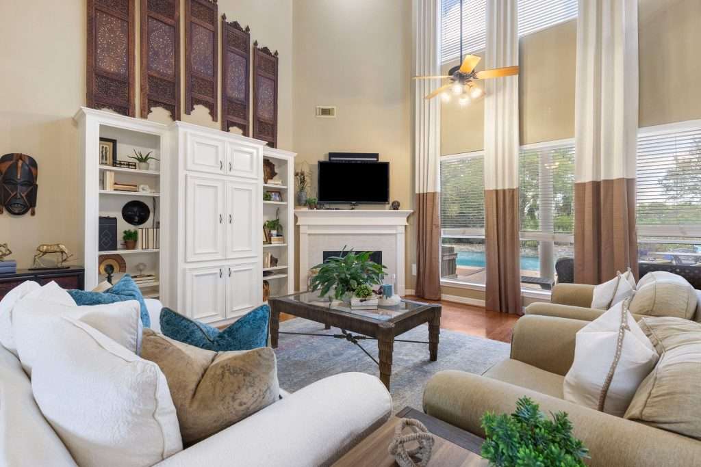
Windows bring in light and life, but when your treatments are treated as an afterthought, they can diminish the entire room. Yes, hun, they can make that big of a difference.
Case in point:
Curtains that are too short or too narrow can make your windows appear smaller, and ceilings feel lower than they really are. Panels that stop at the sill or hover just above the floor interrupt the vertical line of the wall, and, similarly, rods mounted just above the window frame can “compress” visual height.
That’s why I usually hang rods several inches above the frame and extend them wider than the window so panels can stack neatly to the sides. That small change is enough to create the illusion of taller ceilings and broader windows.
Oh, and you definitely want fuller panels. They add softness and balance. When curtains are too skimpy, your space can feel unfinished, even if everything else is beautifully arranged. But when you’ve got lots of fabric?
You introduce texture and movement, softening hard edges and adding comfort.
So, yes, window treatments frame the view, but they also support your room’s proportions. Do it right, and your windows become an architectural feature rather than an overlooked detail.
9. Minimal Styling That Reads As Unfinished

I’m not gonna argue with you that clean, uncluttered spaces don’t feel peaceful, ‘cause they do. But when styling stops short of adding warmth and dimension, the room can come across as incomplete rather than intentionally minimal.
And the difference often lies in layering, hun.
Empty surfaces, for example, are a common sign. A coffee table with nothing on it and shelves that are left completely bare can make the space feel a little uninhabited.
Done well, styling can introduce that sense of life while still preserving breathing room.
Texture is every bit as important. When every surface is smooth and every finish similar, your eye has little to engage with.
That’s why designers often bring in woven baskets, ceramics, books, greenery, and textiles, darlin’. These elements add depth without creating visual noise.
Remember, true minimalism is curated, not stripped away.
It relies on balance, contrast, and a few well-chosen elements to bring interest and warmth. Even a simple vignette of stacked books, a sculptural object, and a few natural elements can take surfaces from empty to intentional.
You can have comfort without sacrificing simplicity. You just need to handle layering with care.
10. Rooms That Look Polished but Feel Impersonal
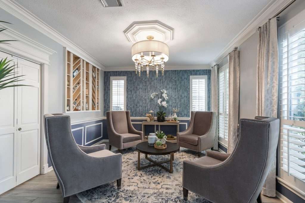
A space can be beautifully designed, perfectly styled, and still feel like no one actually lives there. And you know why?
Because when a room leans too heavily on catalog inspiration and trend-driven pieces, it can look finished yet lack the warmth that makes it feel like home. That’s actually one of the main issues we’ve tackled while working on the Jennifer Heights Project.
It’s something I like to call the showroom effect.
Everything coordinates, surfaces are pristine, and accessories feel carefully chosen… but, somehow, still generic.
Without personal touches, the room feels staged rather than lived in.
You see, meaningful objects are what bring authenticity into a space. I’m talkin’ family photographs, travel finds, heirloom pieces, and books that reflect real interests. These elements don’t need to dominate the design. Even small, thoughtfully placed items can shift the emotional tone of a room.
Aim for a balance of polish and personality. A structured space paired with lived-in details feels welcoming and genuine rather than overly formal, softening the design and inviting connection.
You get that by layering in pieces that hold memory and meaning.
The finishing layer of a home is the story it tells. Design on a Dime helps you weave personal pieces and meaningful details into a design, so the spaces feel warm, authentic, and truly lived in.
Frequently Asked Questions
What is the most common decorating mistake designers notice?
The most common decorating mistake designers notice is the imbalance rather than the obvious “errors.” Think proportion, lighting, and layout choices; these are the most frequent reasons a space feels slightly off.
How do designers make a room feel balanced?
They usually combine proper scale, layered lighting, varied textures, and visual contrast so the eye moves comfortably through the space. That’s what gives a room that much-needed balance.
Can small changes really improve a room’s design?
Yes, they can. Adjusting the rug placement, adding lighting layers, and introducing texture can significantly improve a room’s design, especially in terms of comfort and cohesion.
Is minimal design harder to get right than traditional styles?
It can be, primarily because minimal spaces require careful editing and thoughtful layering to avoid feeling empty or unfinished.
When should I consider professional design help?
You should consider professional design help if a space feels off despite multiple updates. A designer can quickly identify those subtle, hard-to-spot imbalances and suggest effective adjustments.
Bringing Everything Into Balance
When a room feels slightly off, it rarely calls for starting over. More often than not, it needs a thoughtful eye and a few strategic adjustments to restore harmony. Once proportion, lights, and layering all begin working together, the space settles into a sense of ease you can feel the moment you walk in.
Remember, hun:
Great design is never about perfection. It’s about creating rooms that support real daily life while still feelin’ comfortable and welcoming to everyone who enters.
Sometimes, that means shifting a layout, softening a window, or adding pieces that reflect the people who live there.
If your house feels close but not quite right, a professional perspective can make all the difference. Design on a Dime Interiors specializes in refining spaces so they feel balanced, personal, and polished. Ready for that finishing touch?
Reach out to our team today and take the next step toward a home that truly feels complete.