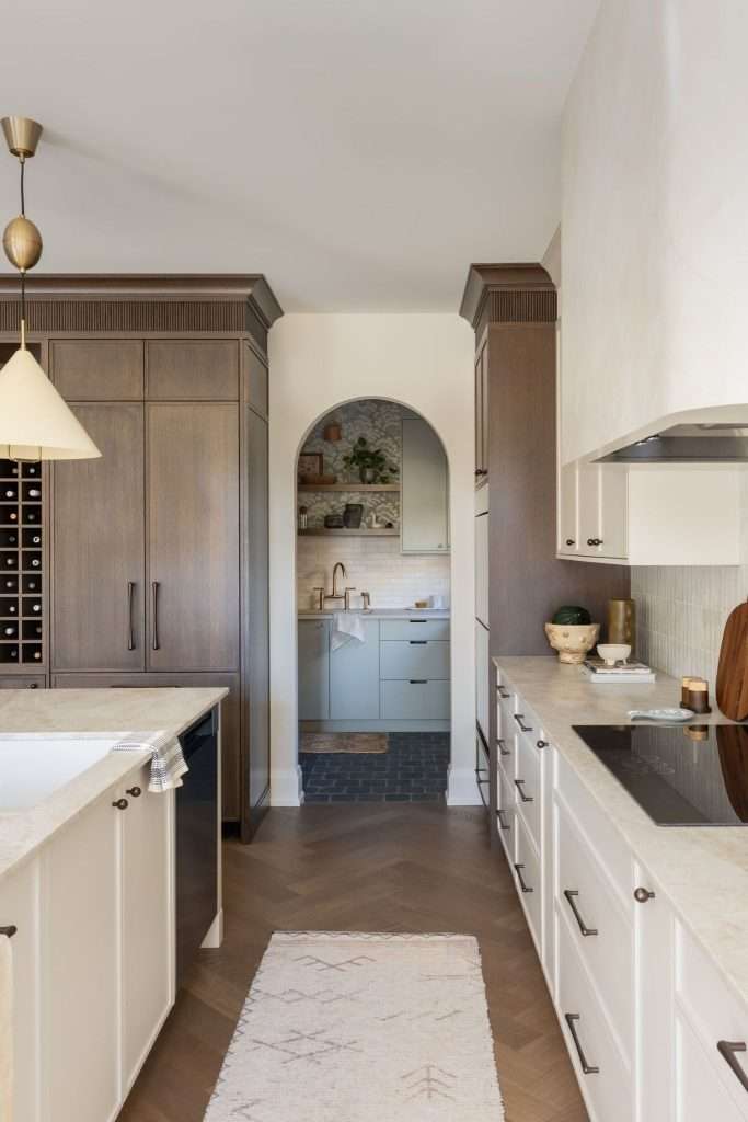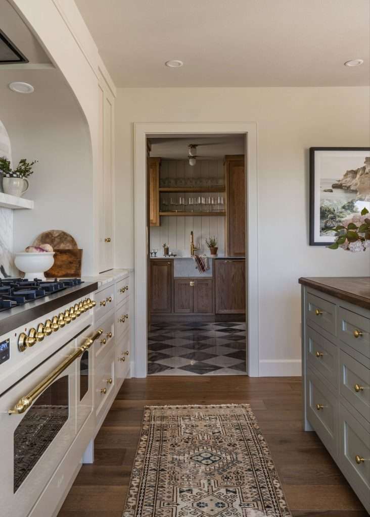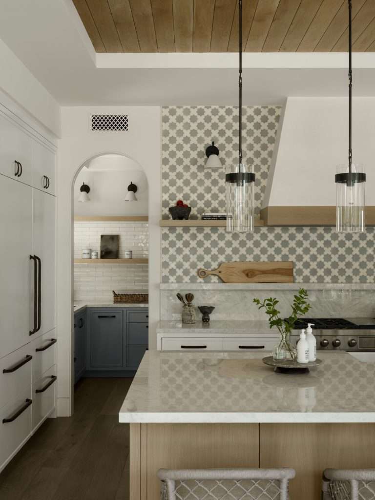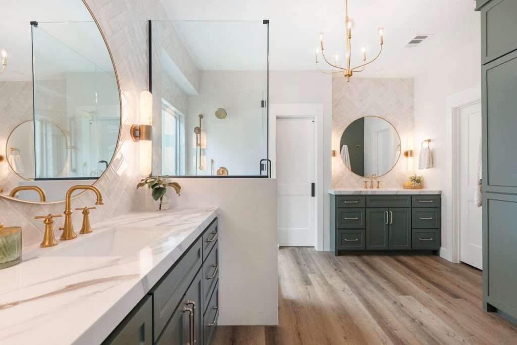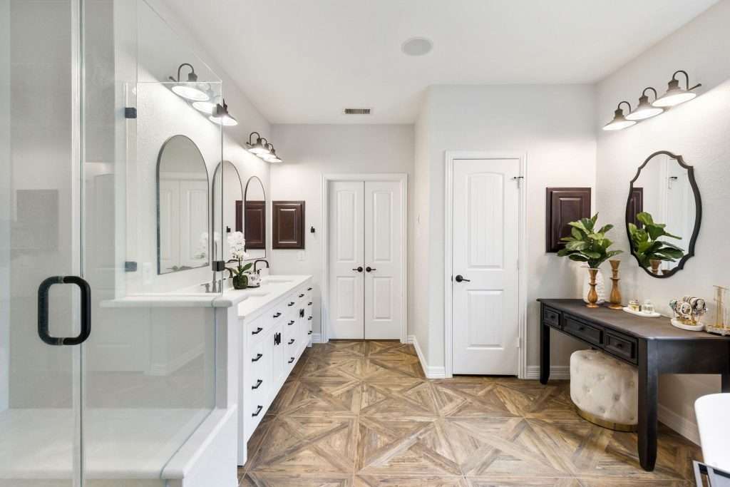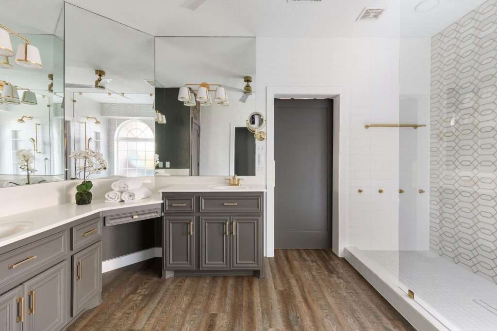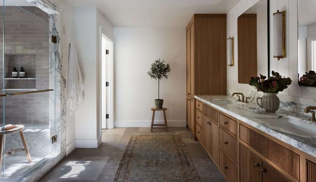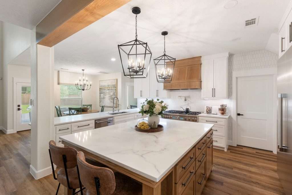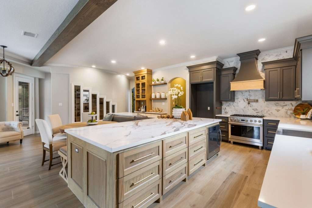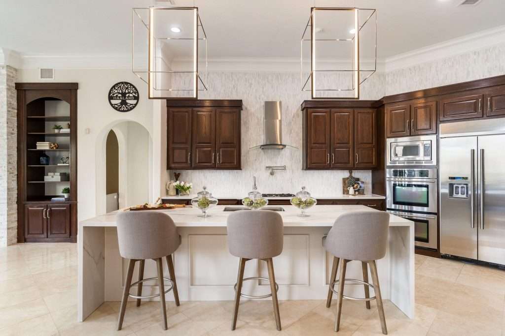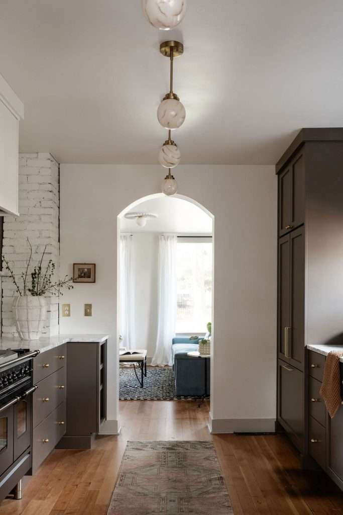
Kitchen Lighting Ideas for Texas Homes With Better Glow, Function, and Evening Comfort

Kitchen lighting ideas tend to look gorgeous on Pinterest at 2 p.m., when the sun’s pouring through every window and the room practically lights itself. But come 7 p.m., when you’re actually pulling something out of the oven and trying to chop onions on a counter that’s somehow in shadow, the picture changes. 

The pretty pendant over the island isn’t doing what you hoped. The recessed cans are leaving weird dark patches. And nobody warned you that the dimmer switch you splurged on would buzz like a confused mosquito. 

Honey, it’s not your eyes. It’s that your kitchen was probably wired to look fine, not to actually work after dark. Stick with me, and we’ll fix the part nobody talks about until they’re standing in their finished kitchen wondering why it still feels off.

Why Your Kitchen Feels Off Even With All the Lights On
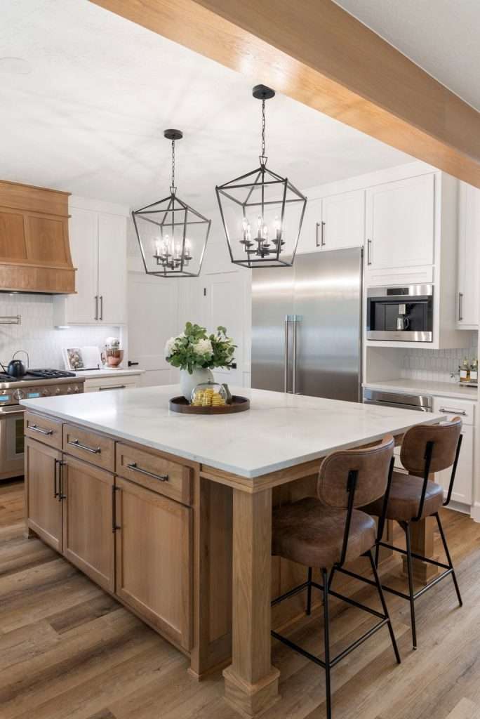
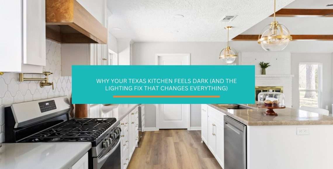
Most kitchens that feel “off” in the evening have one thing in common: they’re trying to do every job with a single layer of light. One ceiling fixture, or a row of recessed cans down the middle of the room, and that’s it. That setup might be enough to find the fridge, but it’s nowhere near enough to actually cook, host, or clean up without squinting.

The reason is simple. Overhead light from the center of a room casts your own shadow onto the counters in front of you. Stand at the sink or the stove and your body blocks the light from reaching the surface you’re working on. The brighter that overhead fixture is, the harsher the shadow gets. You end up with glare on the floor and dimness right where the knife is. Lighting upgrades sit alongside countertops and cabinets as the most common kitchen remodel categories, with both recessed and under-cabinet fixtures chosen by roughly 70% of renovating homeowners according to Houzz’s 2026 U.S. Kitchen Trends Study. The pattern is clear: nobody who remodels a kitchen skips lighting on purpose. They just rarely plan it well.

You see the same pattern in newer Texas builder kitchens almost without exception. Big open layout, gorgeous natural light during the day, then one fan-light combo or four can lights bolted to the ceiling and called done. It’s a layout problem, not a brightness problem, and you can’t fix it by swapping bulbs.

The kitchens that actually feel right after dark are the ones where light is doing different jobs from different directions. That’s the whole game. The rest of this article walks through why some rooms feel off once the sun goes down, and how to make yours feel right at every hour.

The Three Layers Every Working Kitchen Needs
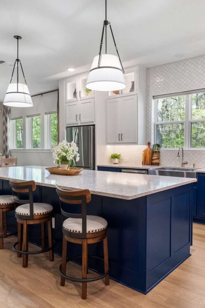
Every kitchen that works at night runs on three layers of light: ambient, task, and accent. The American Lighting Association treats this as the foundation of any residential lighting plan, and there’s a reason designers across every style category land on the same framework. Each layer does a different job, and when one’s missing, the room feels wrong even if you can’t say why.

Here’s what each layer is actually for, in plain terms:

  • Ambient lighting is the base coat. This is your overall room fill, the light that lets you walk in and see everything at a comfortable level. Recessed cans, flush mounts, semi-flush fixtures, even a chandelier in a big open space. It’s the layer that keeps the room from feeling cave-like. But it’s also the layer most kitchens over-rely on, which is exactly why they fail.
  • Task lighting is the working coat. This is light aimed directly at the surfaces where you do things: the counter, the cooktop, the sink, the island. Under-cabinet strips, pendant lights over an island, a directional puck over the sink. Task light has to come from in front of you or above the work surface, never from behind your shoulder, or you’re back to shadow problems.
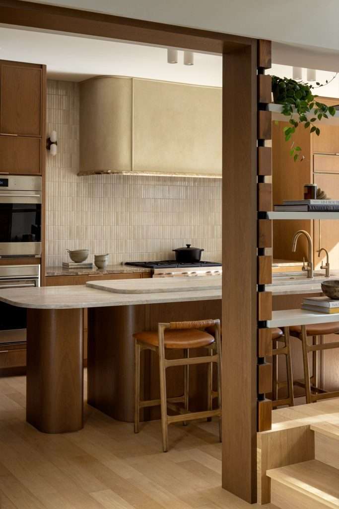
  • Accent lighting is the mood coat. Toe-kick lights along the cabinet base. In-cabinet lighting behind glass-front uppers. A small picture light over open shelving, or an LED strip washing the wall above the cabinets. Accent layers add depth and soften the room at night. They also give your kitchen that warm, lived-in glow you’ve probably noticed in magazine shots without being able to name what’s making it work.

When all three layers are running and you can dim them independently, the same kitchen can feel bright and energetic at breakfast. By 8 p.m., it can feel soft and hosting-ready, all without changing a single fixture. This same layered approach shows up in our home lighting basics guide and applies in just about every room of the house. The kitchen is just where missing a layer hurts the most.

If you’re planning a kitchen update and your contractor’s electrical plan only shows one circuit and a row of cans, push back. At Design on a Dime Interiors in Conroe, we plan all three layers on separate switches before a single wire goes in the wall. Re-doing it later costs ten times what doing it right costs the first time.

Where Texas Builder Kitchens Usually Get It Wrong

Most builder kitchens in our part of Texas were designed for the daytime listing photo, not for the family that ends up living in the house. The result is a predictable set of mistakes. They show up in home after home across Conroe, The Woodlands, Cypress, and pretty much every master-planned subdivision in Montgomery County.

Here’s what we see most often, in order of how much it ruins the room:

  • Recessed cans clustered in the middle of the ceiling. The most common pattern is four to six cans in a tight square or rectangle right above the floor space, nowhere near the perimeter counters. That puts every bit of overhead light behind you when you’re working at the counter, which is exactly where you don’t want it. Cans should be over the counters, not over your head.
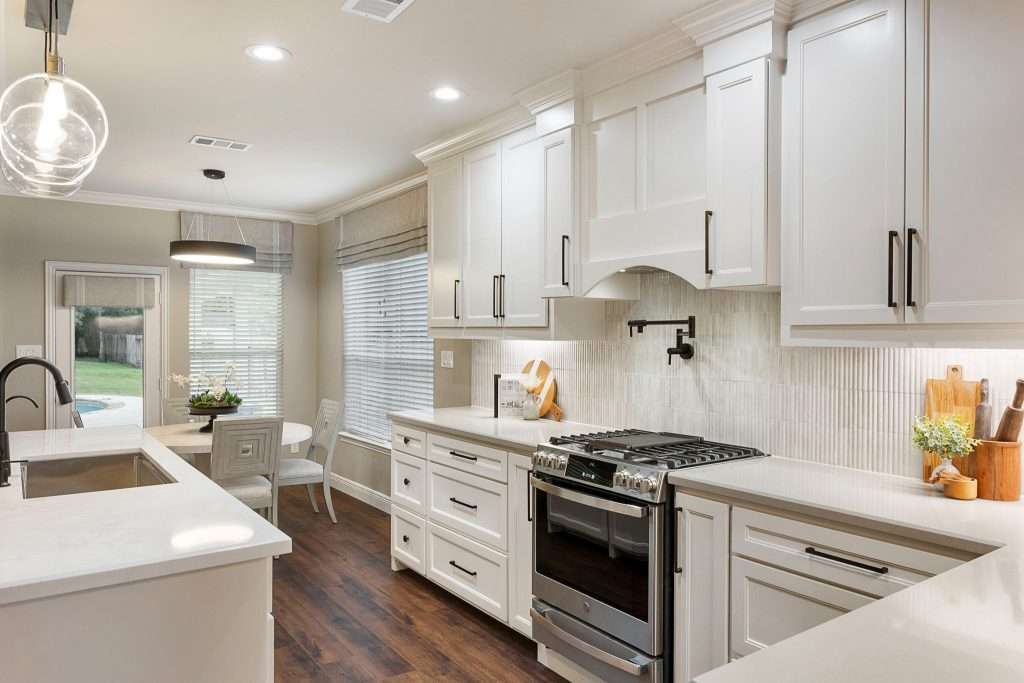
  • No under-cabinet lighting at all. This one’s almost universal in builder homes. The uppers cast a hard shadow across the back of every counter. So even with the recessed cans on, the surface where you’re actually chopping is the darkest spot in the room. Under-cabinet light is the single biggest functional upgrade you can make to a kitchen. It’s also usually the first thing builders skip to save sixty bucks per linear foot.
  • Pendants hung at random heights over the island. The published guideline from kitchen and bath designers is that pendant bottoms should sit roughly 30 to 36 inches above the island countertop for most ceiling heights. Builder pendants tend to come in too high and too small. That means they’re not lighting the island. They’re decorating the ceiling. The NKBA kitchen planning guidelines treat pendant placement as part of the workspace plan, not the decor plan, and that’s the right way to think about it.
  • One fan-light combo asked to do everything. In smaller Texas kitchens or galley layouts, the entire lighting plan is sometimes a single ceiling fan with a builder-grade light kit. The fixture has to handle ambient, task, and any mood lighting all at once. It can’t, and the room feels flat at every hour because of it.
  • Everything wired to one switch. Even kitchens with multiple fixtures often have all of them wired to a single circuit. That makes it all-or-nothing. You can’t dim the cans independently of the pendants, and you definitely can’t run accent lighting without flooding the whole room. Switch zoning is half of what makes a layered plan actually function.

The good news is that almost all of this is fixable, and most of it without moving a wall. We help families across The Woodlands re-plan lighting during kitchen remodels. A good chunk of the work is just fixing what the original builder plan got wrong.

Layout-Specific Lighting That Actually Works
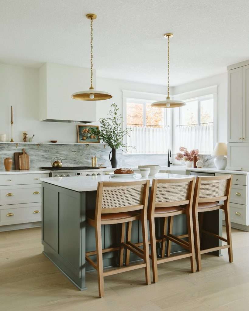
Source: Sunday House

Lighting plans aren’t one-size-fits-all, and the layout of your kitchen drives the placement more than the style of your fixtures does. The same set of fixtures, hung the same way, can work beautifully in one floor plan and feel completely wrong in another. Here’s how to think about it by layout type.

Galley Kitchens

Galley kitchens are narrow, with counters running down two parallel walls. They’re common in older Houston homes and starter properties around Conroe and Spring. The wrong instinct here is a single row of recessed cans down the middle of the hallway, which puts your shadow on whichever counter you’re working at.

The fix is two things: under-cabinet lighting on both runs, plus recessed cans positioned over each counter, not in the center walkway. If the kitchen is long enough, two flush mounts spaced evenly will outperform a row of cans. They spread light wider and bounce more of it off the cabinet faces.

L-Shaped Kitchens

L-shapes are the dominant layout in newer-build subdivisions, especially anything from the last twenty years. The corner is always the dark spot. Most builder plans put the cans where they’re easiest to wire, not where the work is happening. The corner counter ends up in deep shadow.

The plan that works: under-cabinet lighting along the entire L. Recessed cans positioned over the counters, not the floor. One decorative fixture, usually a flush mount or a small chandelier, centered in the room or over a small breakfast nook if there is one. If there’s a peninsula instead of a full island, treat it like a small island with one or two pendants.

U-Shaped and Open-Concept Island Kitchens

This is the dominant Texas builder layout, especially in Cypress, Katy, and the master-planned communities along Lake Conroe. Open kitchen, big island, eight-to-ten-foot ceilings, and the whole room flowing into the family area.

Island kitchens need pendants. Two or three, depending on island length. Size them so the combined width of all the pendants together equals roughly half to two-thirds the length of the island. Smaller pendants in a row look fussy. One enormous pendant over a long island looks lonely. Get the scale right and the room reads professional immediately.

You’ll also want recessed cans over the perimeter counters, under-cabinet lighting on every run, and ideally a separate decorative fixture if you have a breakfast area. Five circuits is not too many for a kitchen this size. Three is the bare minimum.

Our Magnolia kitchen transformation project is a good example of how this comes together in a real home. The original plan had two cans and a fan-light combo. The finished kitchen runs four perimeter cans, two island pendants, full under-cabinet runs, and toe-kick accent strips. Every layer is on its own dimmer.

If you’re remodeling a kitchen in Spring or anywhere in the surrounding area, this is the layout-and-lighting conversation we have in every initial walkthrough. The lighting plan has to be set before the cabinet boxes go in. Most of the wiring lives in or above the cabinets.

Bulb Color, Dimmers, and the Stuff Nobody Tells You
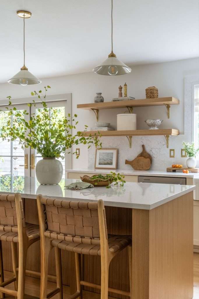
Source: BB Meyer Design

Once you’ve got the layers and the layout figured out, the next thing that ruins kitchens is the technical stuff. Nobody walks you through it at the lighting store. Color temperature, color rendering, dimmer compatibility. This is where good plans go sideways at the last minute.

Here’s what actually matters:

  • Color temperature is the warmth or coolness of the light, measured in Kelvins. Lower numbers are warmer, higher numbers are cooler. The U.S. Department of Energy breaks the standard ranges into soft white at 2700K to 3000K, bright white around 3500K to 4100K, and daylight at 5000K and above. For kitchens, my standard recommendation is 2700K to 3000K across every fixture. It’s the warm, golden tone that makes wood cabinets look like wood and skin tones look healthy. Anything above 3500K starts feeling like a hospital break room. Anything above 4000K and you can stop pretending it’s a home.
  • Color rendering index (CRI) tells you how accurately a bulb shows the colors of the things it lights. Sunlight is 100. Cheap LED bulbs can run as low as 70. That’s why food sometimes looks weird and washed out under them. Look for bulbs at 90 CRI or higher, especially for any fixture that’s lighting food or skin. The CRI number is usually printed on the bulb packaging in small type, and the ENERGY STAR LED guidance page is a quick reference for what to verify on the label. If CRI isn’t listed at all, that’s a sign to put it back.
  • Dimmer compatibility is the silent kitchen killer. Modern LED bulbs need LED-rated dimmers to work right. The wrong combination causes flickering, buzzing, or the bulb refusing to dim past about 30 percent before just shutting off. Every fixture in your kitchen should be on a dimmer, and the dimmer needs to be matched to the bulb. The bulb manufacturer’s website usually publishes a compatibility list. It’s worth ten minutes of cross-checking before installation day.
  • Cabinet color affects how much light you actually need. White and light cream cabinets bounce light around the room and make a kitchen feel brighter at lower lumen counts. Dark navy, black, or deep walnut cabinets absorb light. The same plan that worked in a white kitchen will feel dim in a dark one. If you’re going dark, plan for roughly 30 percent more total lumens than you’d use in a light kitchen. Lean heavier on under-cabinet and accent layers to compensate. Our guide on what to know before updating your kitchen cabinets gets into this interaction in more detail.
  • Switch zoning is a planning decision, not a fixture decision. Each layer of light should be on its own switch and its own dimmer. Recessed cans on one. Pendants on another. Under-cabinet on a third. Accent on a fourth. Sounds like overkill until you’ve lived with it for a week, at which point you’ll never want a kitchen wired any other way again.

Sugar, this is the layer of decision-making where most homeowners get tired and tell the electrician to just do whatever’s standard. Don’t do that. The bulbs and dimmers cost almost nothing relative to the cabinet and counter budget. They’re the difference between a kitchen that feels right and one that doesn’t. The way the light reads at night sets the whole tone, just like the finishes trio that makes kitchens look updated sets the daytime tone.

Pulling It Together Without Overspending
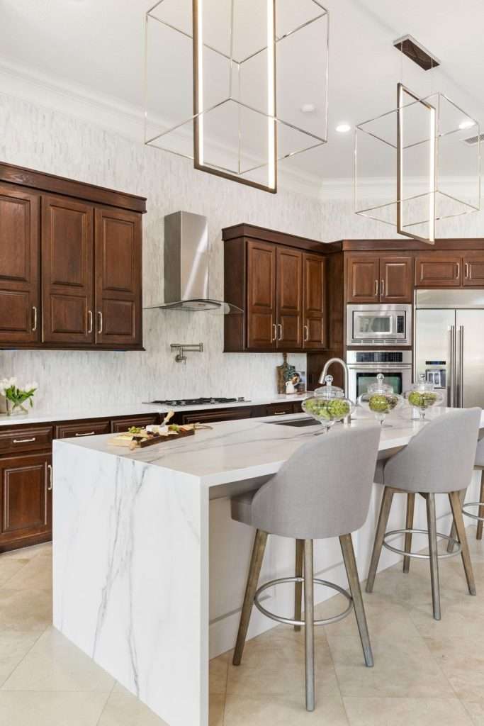
A great kitchen lighting plan doesn’t have to cost a fortune, but it does have to spend the budget in the right places. The mistake I see most often is homeowners blowing the lighting budget on one statement pendant and skipping every functional layer underneath it. The pendant looks great in photos. The room still feels wrong because the actual work surfaces are dark.

Here’s where to put your money, in priority order:

  • Spend real money on under-cabinet lighting. Hardwired LED strips with a high CRI, on their own dimmer, are the single biggest functional upgrade in a kitchen. Budget roughly 8 to 15 dollars per linear foot for the strips themselves, plus electrician time for hardwiring. Battery-powered puck lights are a tempting shortcut. They fail within a year and look like an afterthought.
  • Spend on the right pendants over the island. Two or three good pendants in the right scale will outperform six bad ones. A high CRI, good dimmer compatibility, and a finish that suits the room matter more than brand or fixture trend. Budget anywhere from 150 to 600 dollars per pendant for solid mid-range fixtures.
  • Save on recessed cans. Standard 4-inch or 6-inch LED recessed lights from a major lighting brand are perfectly fine. There’s almost no functional difference between the budget version and the high-end version once you’re looking at high-CRI LED. Save the money for the layers above.
  • Skip most “smart” lighting features unless you’ll actually use them. App-controlled bulbs, color-changing strips, voice-activated everything. These are nice add-ons. They’re often the first thing people stop using after the novelty wears off. If you genuinely want a programmable scene-setter for the kitchen, get one good system and skip the rest.
  • Don’t skip dimmers anywhere. Dimmers cost between 15 and 50 dollars each, and every single fixture needs one. The kitchen that can shift from morning-bright to evening-soft on the same wiring is the kitchen that actually gets used at every hour.

If you’re trying to figure out where lighting fits inside a bigger kitchen budget, our Texas kitchen remodel cost calculator walks through the full project breakdown, including electrical and lighting line items. It’s the fastest way to see what a complete plan looks like at your scope, your finishes, and your zip code, before you sign anything with a contractor. Worth a few minutes before any kitchen meeting.

For homeowners in Montgomery and the surrounding area, kitchen lighting almost always gets planned alongside cabinets, counters, and electrical. All four touch each other. Trying to add a real lighting plan after the cabinets are installed is possible, but it’s the most expensive way to do it. Plan the light first, then the boxes go in around the wiring.

Frequently Asked Questions

Should kitchen pendants line up with the cabinet edges or the island edges?

Pendants align with the island, not the cabinets. Center each pendant over the island so the bottom of the fixture sits roughly 30 to 36 inches above the countertop. Space them so the cluster reads as visually balanced from across the room. The cabinet edges are irrelevant to pendant placement. Pendants are lighting and decorating the island, not the perimeter run.

Are recessed lights enough on their own in a kitchen?

Recessed lights alone are almost never enough. They handle ambient lighting, but they can’t handle task lighting. Anyone standing at the counter blocks the light from reaching the surface. A kitchen with only recessed cans will feel dim during real work no matter how many cans you add. Layered lighting (recessed plus under-cabinet plus pendants or decorative fixtures) is the standard for a reason.

Why does my kitchen lighting look fine during the day but harsh at night?

Daylight enters from windows at multiple angles, so it fills the room evenly and softens everything. Artificial overhead lighting comes from one direction only. That creates harsh shadows on counters and on faces. The fix is adding light from other angles, which is what task and accent layers do. A single source of overhead light will always feel harsh at night, regardless of brightness.

What’s the right number of pendants over a kitchen island?

For most island lengths in Texas builder homes, two or three pendants is right. Aim for a combined pendant width that equals roughly half to two-thirds the length of the island. A six-foot island typically takes two larger pendants. A nine-foot island typically takes three medium pendants. One enormous pendant over a long island can also work, but only when the fixture is genuinely scaled to the space.

Does cabinet color change how much lighting I need?

Yes, significantly. Light-colored cabinets reflect ambient light back into the room. You can get away with fewer lumens overall. Dark cabinets absorb light, so the same fixture plan will feel noticeably dimmer. Plan for roughly 30 percent more total lumens in dark-cabinet kitchens. Rely more heavily on under-cabinet and accent layers to keep work surfaces properly lit. Buyers in the Greater Houston market often request dark, moody kitchens, so this is a common adjustment we make in remodels across Conroe and The Woodlands

Light Is What Makes a Kitchen Feel Like Home

Look, baby, you can put the prettiest cabinets in the prettiest finish in the prettiest layout. If the lighting is wrong, the room will still feel off every single night you live in it. Light is what your kitchen actually feels like after the sun goes down. Get it right and the room will earn its keep at every hour, from coffee at 6 a.m. to leftovers at 10 p.m.

The kitchens that feel finished are the ones where you stop noticing the lighting altogether. The room just feels good and you can’t quite say why. That’s the layered plan doing its job behind the scenes.

Sometimes it’s a small adjustment. Add an under-cabinet run, swap a few bulbs to the right Kelvin, put the pendants on a dimmer. Other times it’s a bigger conversation, especially if the original wiring is fighting against you.

That’s where having a designer in the room before the electrician shows up changes the whole project.

Design on a Dime Interiors plans kitchens for families across Montgomery County and Greater Houston with the lighting figured out from day one. The finished room feels right at every hour, not just in the photos.

If you’re thinking about a kitchen update and want the lighting plan worked out before the wires go in the walls, reach out to our team today.

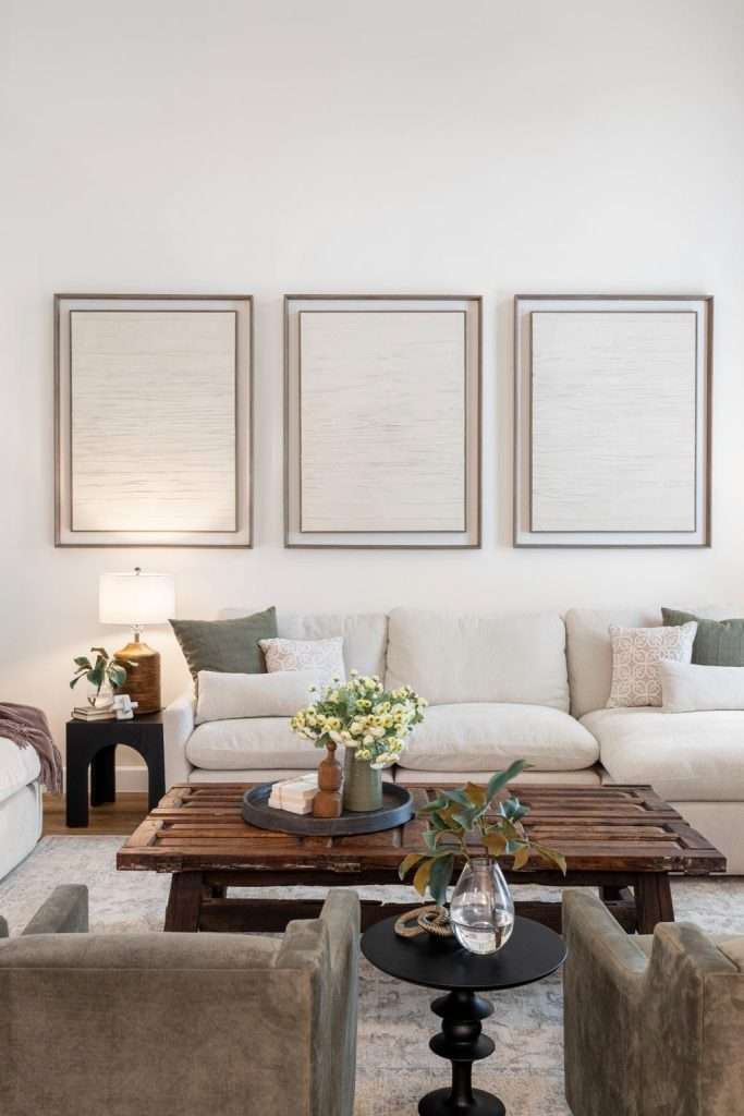
How to Hang Art in Texas Homes Without It Floating on Big Builder Walls

Wondering how to hang art in a way that actually feels right, and not like the frame’s just floating somewhere above the sofa hoping for the best? Honey, you’re definitely not alone. Most of the art in Texas homes ends up too high, too small, or stranded in the middle of a wall like it got lost on the way down.

The frame looks lovely. The piece is gorgeous. But something feels off, and you can’t quite name what. Usually, it isn’t the art at all. It’s where the art lives. The good news is that fixing this almost never costs a thing. A little measuring tape, a fresh eye, and maybe one trip to the framer’s, and your walls start telling a much better story.

Why So Much Art Ends Up Floating Halfway Between the Sofa and the Ceiling

[image: living room sofa with a piece of art hung too high on the wall above it, leaving a wide gap between sofa back and bottom of frame]

Most art floats too high because folks instinctively hang at hand-height instead of eye-height. The arm goes up, the hammer finds a comfortable spot, the nail goes in. That’s exactly how you end up with a frame six inches below the crown molding. A sad strip of empty wall stretches between the sofa back and the bottom of the canvas, and the room feels off even when you can’t name why.

The fix is one of the oldest tricks in design: the 57-inch rule. Museums and galleries hang art so the center of the piece sits roughly 57 to 60 inches off the floor. That’s the average human eye-level when standing in a room. Your living room isn’t a gallery, but the principle still works. When the center lands at eye-level, the art reads as part of the room, not as a stamp tacked onto a wall it doesn’t belong to.

In Texas builder homes, where ceilings stretch nine and ten feet, this trips up almost everyone. The walls feel taller than they actually are. Eyes get pulled up. Hammers follow. Art ends up floating in the upper third of a wall it should anchor instead. That’s the first thing designers notice when they walk into a living room that “feels off.” Once you see it, sugar, you can’t unsee it.

How High to Hang Art Above the Sofa, the Bed, the Console, and the Mantel

living room art

Eye-level works as a starting point, but specific furniture changes the math. Art needs to feel connected to whatever sits below it, not floating above it like an unrelated thought. Here’s how the spacing actually breaks down in real homes:

  • Above the sofa. Hang the bottom of the frame 6 to 12 inches above the sofa back. Lean closer to 6 if your ceiling is standard. Closer to 12 if you have tall ceilings and want a little more breathing room. Anything more than that, and the piece starts to drift away from the sofa visually. That 6 to 12 inch range is the most consistent rule across professional hanging guides for a reason.
  • Above the bed. Same range applies, 6 to 10 inches above the headboard. A bed is a low piece of furniture by nature, and art tends to drift up faster here than anywhere else in the home. With a tall headboard, lean toward the lower end of the range.
  • Above a console or sideboard. Drop the spacing tighter to 4 to 6 inches above the surface. Console-height pieces benefit from feeling almost stacked with the furniture below. Too much gap, and the console looks abandoned.
  • Above a mantel. This one’s trickier. Aim for 4 to 8 inches above the mantel, depending on mantel depth and ceiling height. A deep mantel with chunky decor needs less space. A shallow mantel needs a touch more. The art should feel like part of the mantel composition, not a separate object hovering above it.

One more rule worth burning into memory: art should be centered on the furniture below it, not the wall behind it. People mix this up constantly, especially when a wall has odd proportions or when the furniture sits off-center for a reason. If your sofa floats four feet from a corner, center the art over the sofa, not the wall. Eyes read the furniture-art relationship first, every single time.

When the spacing’s right, the room stops feeling like a collection of decorations and starts feeling composed. That’s exactly the kind of small fix the Design on a Dime team in Conroe makes constantly in living rooms before any furniture even gets moved.

Sizing Art So It Doesn’t Look Like a Postage Stamp on a Wall

Sizing Art
Source: Kellie Eserts Interiors

Sizing is where most people lose the plot, baby. Art should fill roughly two-thirds of the furniture width below it, give or take. A 90-inch sofa wants a piece that runs about 60 inches across, or a grouping that totals close to that. A 60-inch console wants something around 40 inches wide. Smaller than that, and the art reads as decoration. Bigger than that, and the proportions start to feel pushy.

The two-thirds guideline is one of those rules that exists because it works almost every time. It’s why galleries and showrooms feel composed even when the pieces themselves are wildly different in style. Get the sizing close, and most other choices forgive themselves.

When the Art You Have Is Too Small

If the piece you love is undersized, upgrade the frame and the matting before you give up on it. A 16×20 piece floats sadly above a sectional. The same piece in a 24×30 frame with a generous 3 to 4 inch mat reads completely differently. Custom framing has a reputation for being expensive, but for a meaningful piece, it usually costs less than buying new artwork. Local framers in Conroe and Magnolia run mat-and-frame upgrades for under a couple hundred dollars on most pieces.

When You Need to Cluster Instead of Hang Solo

Three smaller pieces hung tight together can fill a space a single small piece never could. The grouping reads as one composition because eyes treat it that way. Keep spacing between the pieces tight, around 2 to 3 inches, and align either the tops, the bottoms, or the centers. Random scatter looks like art that fell off a moving truck.

For homes with the kind of wide-open builder layouts you see across the Greater Houston area, going bigger almost always wins. Big walls swallow modest art. The size that looks plenty bold leaning against the wall in the store often disappears once it goes up. When in doubt, go up a size, sugar.

gallery wall ideas
Source: Blake & Dane

Gallery walls go wrong the same way every time. Someone collects pieces they love, hangs them up roughly equidistant, and the result feels chaotic instead of curated. A gallery wall needs an anchor piece, consistent spacing, and a unifying thread to read as intentional. Without those three, it’s just clutter on a wall.

Pick the Anchor Before You Pick Up a Hammer

Start with the anchor piece. Pick the largest or visually heaviest piece in the group and decide where it lives first. Everything else builds around it. If you’re working over a sofa, the anchor usually sits centered over the sofa, with smaller pieces orbiting around it. If you’re climbing a stairway wall, the anchor often sits at the bottom or middle of the run. The anchor-piece method is what separates “thought-out” from “thrown-up.”

Use the Paper Template Trick to Save Your Walls

Trace each frame onto craft paper. Cut it out. Tape the cutouts to the wall before you put a single nail in. Shift, stand back, shift again. By the time the layout looks right, you’ve already saved yourself patching a dozen extra holes. No more “I’ll just try it here” regret. This is the single biggest gallery-wall move that separates designer-level walls from regret walls.

Spacing should run 2 to 3 inches between frames, consistently. Closer than that feels cramped. Wider than that breaks the grouping into separate pieces. Pinterest gallery walls that look effortless almost always follow this rule, even when nothing else about the styling stays inside the lines.

Find One Unifying Thread and Repeat It

The unifying thread can be subtle. Maybe all the frames are black. Maybe all the art is black-and-white photography. Maybe the colors stay in a soft palette and the frames vary wildly. Pick one element to repeat, and the rest of the wall earns the right to be eclectic. Small layout tweaks like this make a bigger difference than most people expect, especially in big open builder rooms where one statement wall changes the whole space. That’s exactly the styling our Design on a Dime team in The Woodlands tackles when a homeowner wants a gallery wall that actually reads as composed.

Where to Hang Art in Tricky Texas Spaces (Two-Story Foyers, Long Hallways, Vaulted Walls)

hallway art
Source: Interior Occupations

Some walls in Texas homes don’t follow normal rules, and the standard 57-inch guideline needs to bend when the architecture demands it. Two-story foyers, vaulted living rooms, and long entry hallways each call for a different hanging strategy. Here’s how to handle the worst offenders without making things worse:

  • Two-story foyers. The single biggest mistake is hanging one normal-sized piece centered at human-eye-level. The wall above swallows it. Either go genuinely massive (think 48 inches tall or more), or stack two to three pieces vertically with tight spacing so the composition fills the height. Eyes need something to follow up the wall, not a single small island in the middle of nowhere. We see this all the time in Lake Conroe homes and master-planned-community foyers across the area.
  • Long entry hallways. Hallway art needs rhythm. Hang pieces at consistent intervals, roughly 4 to 6 feet apart, all with their centers at the standard 57-inch eye-level. Treat the hallway like a gallery corridor, not a place to dump leftover frames. Sizes can vary if you want, but keep the centers aligned. The walk-through becomes part of the experience instead of an afterthought.
  • Stairway walls. Follow the slope. Art on a staircase wall should run diagonally with the rise, with each piece centered roughly 57 inches above the corresponding step. People miss this constantly and end up with a horizontal row of art on a diagonal wall, which always looks awkward.
  • Vaulted living rooms. Anchor low. The temptation in a vaulted space is to hang big art high, where the wall feels emptiest. Don’t. Anchor your major pieces in the lower 8 feet where humans actually live. Leave the upper triangle of wall mostly bare, or fill it with a single large statement element if needed. Rooms with art floating in the vault feel lonelier than rooms where the upper space simply rests.

The vaulted-ceiling problem in particular shows up across tall-ceiling rooms in newer Texas subdivisions. Builders love the drama of a 17-foot peak. Homeowners struggle to know what to do with all that air. Some of the same tricks that make a ceiling feel taller actually work in reverse here: you want the room to feel anchored and human-scaled, not amplified. Our team in Cypress walks homeowners through this all the time when a great room feels echoey and uncomposed.

Working With the Art You Already Own Instead of Buying New

art in design
Source: DWK Interiors

Most homes already have plenty of art, darling. The pieces are just scattered, mismatched, or hung in the wrong places. Before you spend a single dollar on something new, walk through your house and pull every piece off the walls into one room. Lay them out on the floor. Group them by color, by subject, by frame style, by mood.

You’ll Find Stories You Didn’t Know You Had

Three small black-and-white photos that felt boring on separate walls suddenly become a striking trio together. The watercolor your aunt gave you that’s been hiding in the guest bathroom turns out to be the perfect accent over the entry console. Kids’ art collected over a decade earns its own dedicated wall in the playroom or hallway. Most “we need to buy more art” situations are actually “we already have plenty, we just need to use it better” situations.

Reframing Is the Cheapest Design Upgrade There Is

Reframing transforms how a piece reads. Swap a beat-up frame for a clean modern one and the art looks brand new. Add a generous mat to a small piece and it suddenly belongs on a bigger wall. Local framers across Montgomery County run consistent specials, and the work usually pays for itself the first time you see the piece in its new spot.

Mix old with new freely. Heirloom pieces sit perfectly next to thrift-store finds and modern prints, as long as the frames have one shared element, like a color, a finish, or a similar weight. The art doesn’t need to match. The frames just need a thread of agreement.

If the whole exercise feels overwhelming, that’s where a fresh set of eyes earns its keep. Our design team in Magnolia does floor-layouts of clients’ existing art constantly, like the kind we pulled together for our Jodi Project. Sometimes the wall you’ve been staring at for years just needs one outside perspective to start working.

Frequently Asked Questions

Should art match the wall color or contrast with it?

Contrast almost always wins. Art reads better against a wall that gives it room to stand out, whether that means a darker wall behind lighter art or a lighter wall behind darker pieces. Matching the wall color too closely makes the art disappear into the background. If your wall is a soft neutral, art with rich color or strong tonal contrast lands clearly. If your wall is a saturated color, simpler frames and quieter art tend to work better.

Is it ever wrong to hang art directly above a doorway?

In most rooms, yes. The space above a doorway sits in the upper third of the wall, where eyes don’t naturally rest. Any piece up there usually feels disconnected from the rest of the room. There are exceptions, like a long horizontal piece that visually links a doorway to the surrounding wall, or a stairway run where the doorway is one stop in a vertical sequence. As a default, anchor art at human eye-level and leave the over-door zone alone.

Should art be centered on the furniture below it or on the wall behind it?

Center it on the furniture, not the wall. Eyes read the furniture-and-art pairing as one unit. A sofa that sits a little off-center on a wall still wants its art centered above the sofa itself. The only time you center on the wall is when there’s no furniture beneath the piece, like an art-only accent wall in an entryway or hallway.

How do you know when a wall is too small for the art you have?

If the piece comes within roughly 6 inches of the wall edges on either side, the wall is too small. Art needs breathing room around it to read properly. A piece that nearly touches the corners feels squeezed in. Either move that piece to a larger wall, or scale down to art that takes up about two-thirds of the available wall width with comfortable margins on either side.

Can the same art style work throughout a whole house?

It can, as long as there’s some variety in size, frame style, and subject. A whole home of identical black frames and abstract prints starts to feel like a chain hotel by the third room. The fix is to let the styles loosely echo, while letting individual rooms have their own moments. Buyers in the Greater Houston market actually respond well to homes that feel curated rather than themed; identical art in every room reads as a model home, not a real one.

Walls That Actually Tell Your Story

The whole point of art in a home isn’t to fill a wall, baby. It’s to give a room something to say.

When the heights are right and the sizes work, the gallery wall actually reads as a gallery and not a wreckage. Your walls stop feeling like decoration and start feeling like part of the home’s personality. The pieces you’ve collected over the years finally have somewhere to live where they can be seen.

Sometimes that takes a tape measure, a paper template, and a slow afternoon of rearranging. Sometimes it takes a fresh set of eyes who can see the wall the way you can’t anymore.

Design on a Dime Interiors helps families across Montgomery County and Greater Houston make their walls work harder. Sometimes that means reframing what they already own. Sometimes it’s styling a whole home from scratch.

If your art’s been floating awkwardly for a while now, reach out to our team today, and we’ll walk through it with you.

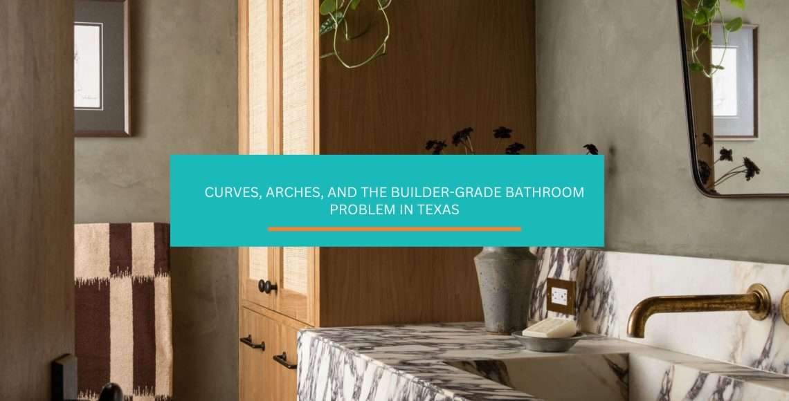
Curves, Arches, and the Builder-Grade Bathroom Problem in Texas

Curved bathroom design has been quietly taking over 2026 renovation Pinterest boards for a reason, honey. Most Texas builder bathrooms from the last fifteen years were built at right angles. Flat slab counter. Rectangle mirror. Square shower niche. Boxy tub alcove.

Every single surface meets the next at 90 degrees. On paper, that reads as clean and modern. In real life, it reads as cold. You know that feeling when you walk into a bathroom that looks fine in listing photos but feels vaguely clinical on a Tuesday morning? That’s what a room of right angles does to us, darling.

The fix that’s sweeping bathroom design right now has nothing to do with expensive materials. Everyone’s softening the shapes. Stick around.

Why Bathrooms Built Ten Years Ago Started Feeling Hospital-Like

Bathrooms built in the 2010s started feeling hospital-like because every element in them was pulled from the same right-angle catalog. Straight-edge rectangular mirror. Slab countertop with sharp 90-degree corners. Square shower niches. Boxy alcove tubs. No single choice was wrong on its own. Stacked together in a small room, they turned the bathroom into the hardest-edged space in the house.

We spend a lot of time in our bathrooms. Morning and evening. Good days and rough days. Every surface we look at sends a signal to our nervous system, sugar, whether we realize it or not. When every surface is a sharp right angle, the signal is “efficient workspace,” not “calm retreat.”

Designers in the trade press have been flagging the shift for a couple years now. Writing for Livingetc, designer Sofia Charalambous of Origins Living put it plainly: arches, ovals, and irregular organic outlines are everywhere, and they soften the straight lines of tiles and cabinetry to create a calming flow that makes even small bathrooms feel more inviting. That’s the opposite of the builder-grade default.

The practical result? Small Texas bathrooms hit the hardest. Half-baths tucked under the stairs. Secondary bathrooms off guest bedrooms. Master baths in 2,500-square-foot builder homes with three actual rooms. Every one of those spaces amplified the visual hardness because there wasn’t enough square footage to break up the right angles.

That’s exactly the kind of design tension a small layout tweak can shift without a full renovation.

What’s Actually Changing: The Soft-Shape Shift Across 2026 Bathroom Design

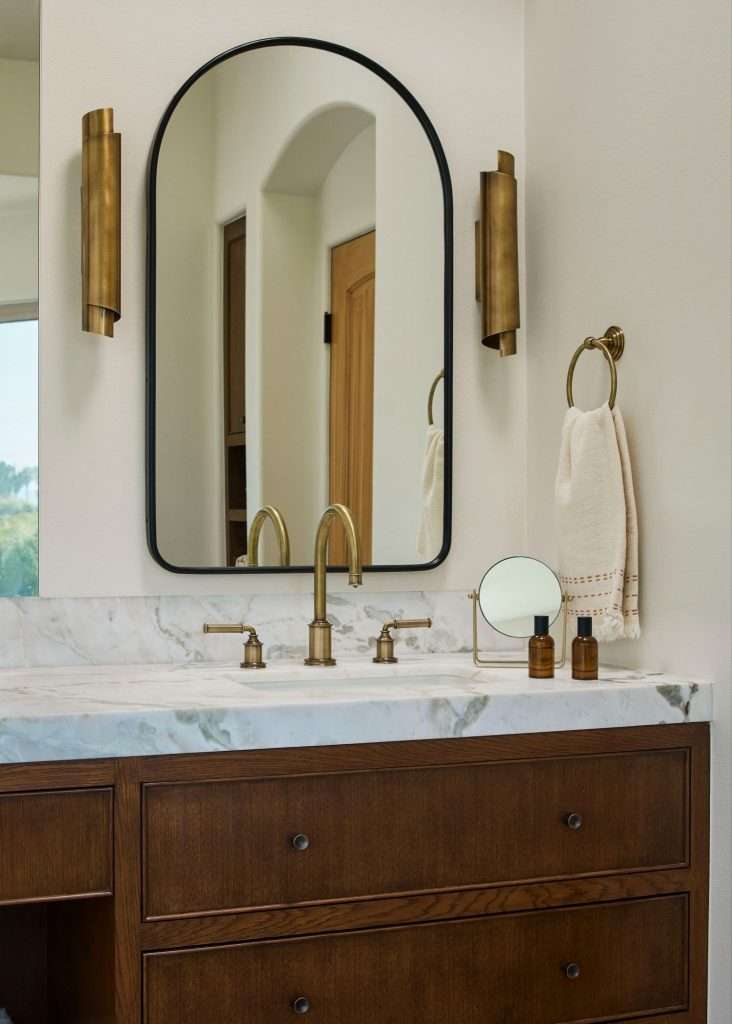
arched mirror
Source: Carian Design

The 2026 bathroom design shift centers on replacing sharp geometric edges with curved, organic, and arched forms across mirrors, vanities, tubs, and architectural openings. This isn’t one trend. It’s five related trends moving in the same direction at the same time, and together they’re reshaping how bathrooms feel.

Here’s what trade designers are actually calling out for 2026:

  • Arched and organic-shaped mirrors. The rectangular builder mirror is the first thing most homeowners swap out, because it’s the cheapest change with the biggest visual payoff. House Digest’s 2026 mirror coverage identifies arch-shaped, oval, and irregular organic mirrors as the dominant look, with designers framing them as a calming counterweight to straight tile and cabinetry lines.
  • Curved and carved stone vanities. Decorilla’s 2026 bathroom trend analysis highlights basins curving inward and countertops tapering at the edges. Honed stone replaces polished. Rounded profiles replace 90-degree overhangs. Everything feels easier on the eye.
  • Fluted vanity fronts. These are ripple-textured cabinet fronts that catch light and add tactile interest without adding cleaning headaches. They bridge curves and straight lines, which is why they’re showing up in transitional Texas homes more than almost any other 2026 element.
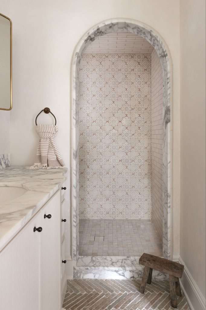
  • Arched shower niches and doorways. A simple arched opening in place of a squared-off niche or a standard door frame changes the entire visual rhythm of a bathroom. It’s also surprisingly affordable during a remodel because it’s a framing decision, not a materials decision.
  • Softened tub silhouettes. Freestanding tubs with curved chubby profiles have replaced the sharp-edged alcove look. Designer commentary documented by Porcelanosa’s 2026 trendbook notes that tactile, wave-inspired surfaces paired with smooth finishes define the new bathroom aesthetic.

All five trends share one underlying idea: a bathroom should feel calming, not clinical. That’s the whole shift in one sentence, baby. The direction tracks with what the National Kitchen & Bath Association’s 2026 Bath Trends Report found across nearly 700 industry designers, where organic and natural design ranked as the second most popular style direction for the next three years, right behind transitional and timeless.

Our team helps families across Conroe and The Woodlands figure out which of these five moves actually fits their existing bathroom bones. Not every trend belongs in every room.

Five Places Curves Show Up in a Real Bathroom, and What Each One Does

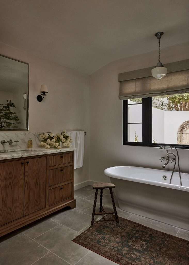
tub with a rounded, organic shape
Source: Stafford House Studio

Curves and arches show up in five distinct places in a typical bathroom renovation, and each one serves a different design purpose. Knowing which placement delivers the visual shift you’re looking for helps you decide where to spend and where to hold back.

  • Mirrors. The single highest-impact curve move, hands down. Swapping a builder-grade rectangle for an arched or oval mirror changes the visual center of gravity of the whole room. Your eye stops at the mirror, which is the focal point, and the curve becomes the first thing you notice instead of the hardest edge.
  • Vanity fronts. Fluted or curved vanity cabinet fronts add texture without shouting. They work especially well when the mirror stays simple, because the vanity takes over as the feature. In small Texas powder baths, this is often the one move that transforms the space.
  • Tub silhouettes. A freestanding tub with a rounded, organic shape reads as sculpture, not plumbing. In master baths, it becomes the focal point the whole room orients around. The tradeoff is cost and space; freestanding tubs need floor clearance that alcove tubs don’t.
  • Shower niches and shampoo nooks. An arched niche instead of a squared-off rectangle softens what’s often the most visually jarring element in a shower. This is the cheapest curve move to add during a shower remodel. It’s a tile-layout decision, not a fixtures decision.
  • Arched doorways. A curved doorway into the bathroom, or an arched passage between a bedroom and an ensuite bath, changes how the entire room reads from the hallway. It’s the most architectural of the curve moves and the one that requires the most commitment during a remodel.

The rule to hold in your head, hun: pick one or two places for the curve, not all five. A bathroom where every element is curved starts looking like a cartoon version of itself. Restraint is what makes this trend work.

For a look at how these elements integrate in a real remodel, our Ben bathroom project shows the thinking behind where to soften and where to keep clean lines. The team at Design on a Dime Interiors helps Spring-area families work through these tradeoffs before any tile goes up.

When Curves Work in a Builder-Grade Bathroom, and When They Look Bolted On

marble vanity design
Source: Backup Design

Curved and arched elements work in a builder-grade bathroom when they’re integrated with at least one other design change, and they look bolted on when they’re introduced as a single swap into an otherwise untouched space. That’s the core rule. Everything else is details.

Here’s how the math actually plays out:

  • Single-swap curves rarely land. Changing only the mirror in an otherwise all-rectangle bathroom makes the mirror look like it wandered in from another house. The eye immediately registers the mismatch. You can get away with one swap if the rest of the room already has some visual softness (natural materials, warm lighting, textured tile), but not if everything else is still builder-beige and right-angled.
  • Two-element changes create coherence. Arched mirror + fluted vanity. Curved tub + arched shower niche. Two curve elements read as intentional design, not a one-off purchase.
  • Three or more changes feel fully designed. This is the remodel tier. Arched doorway + curved vanity + organic mirror shapes a room that feels completely current. Usually the budget tier too.
  • Pairing curves with natural materials helps. Wood, stone, and natural-texture tile soften the whole room before the curves even go in. Curves against high-gloss builder-white tile and chrome fixtures can still read clinical.
  • Lighting carries more weight than people realize. Recessed can lights kill the curved-mirror effect because the light flattens the shape. A sconce, a pendant, or a backlit mirror brings the curve to life. Fixing hard-edged lighting is one of the underlying bathroom stress points that homeowners often miss when they focus only on finishes.

This is the exact kind of calculation worth running before you commit. Our bathroom remodel cost calculator helps you see what a full renovation costs against a lighter-touch update, so you’re choosing based on actual numbers instead of guessing. Families across Cypress and the broader Greater Houston market use it to sanity-check scope before any tile gets ordered.

The Quiet Advantage in a Small Powder Bath

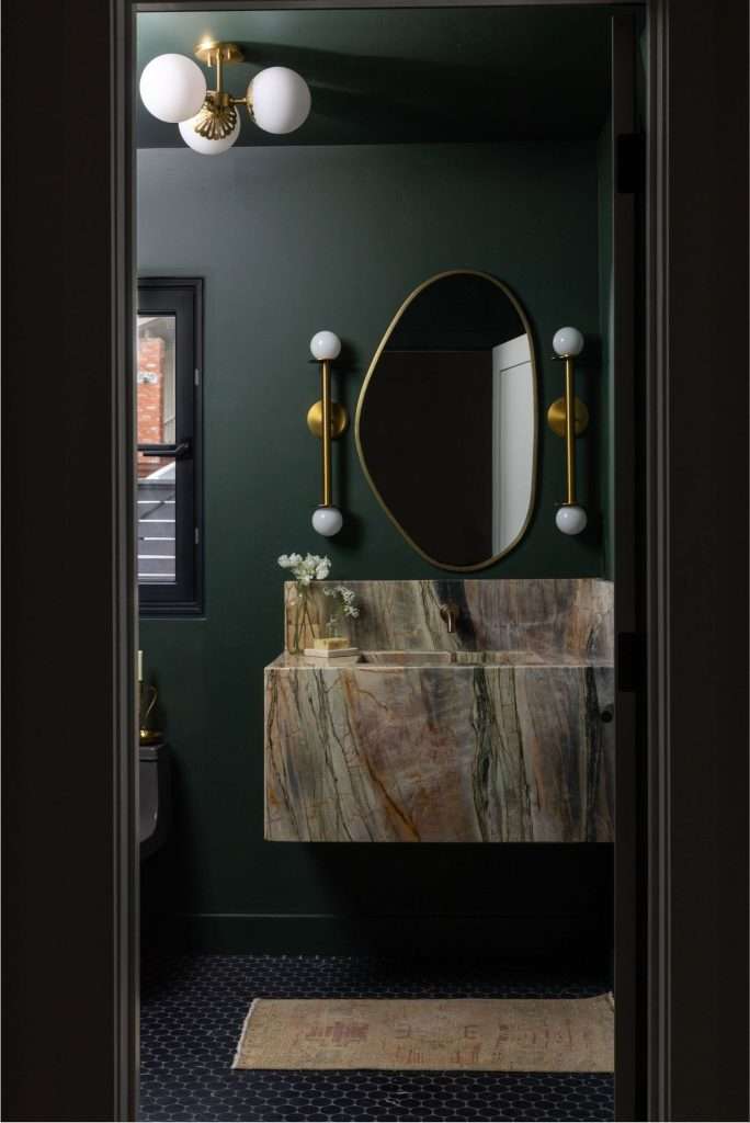
powder room tips
Source: Design for Living

Small Texas powder baths benefit disproportionately from a single curved element because the whole room can be transformed with one swap, without the integration math that larger bathrooms require. Tuck one curve into a 20-square-foot half-bath and the entire space feels different. Honey, this is where the trend delivers the most bang for your buck.

Powder baths are everywhere in Texas homes. Under the stairs. Off the foyer. Tucked beside the dining room. Most of them are 20 to 40 square feet, which means every surface is within 6 feet of every other surface, and every design choice amplifies.

The two moves that consistently transform a small Texas powder bath:

  • An arched or organic-shaped mirror. In a small space, the mirror is visually the biggest element in the room. Changing its shape changes the whole room. This alone is often enough.
  • A fluted or curved vanity front. If you’re not ready to replace the mirror, a fluted vanity front delivers the textural softness the same way. When guests come in, it’s the one element their hand touches, so texture matters disproportionately.

One curve is enough in a powder bath. Two can work if they’re in harmony. Three starts looking over-designed in a small footprint. There’s more on getting the small bath right in our breakdown of what makes a well-designed powder bath.

For homeowners in Magnolia looking at a curved or fluted vanity as part of a powder bath refresh, custom cabinetry gives you the shape and the size exactly right for the space, rather than forcing a stock vanity into an odd footprint.

How to Mix Curves and Straight Lines Without Creating a Mess

How to Mix Curves and Straight Lines in Bathroom Without Creating a Mess
Source: Platner Studio

Mixing curves and straight lines works when the curves are concentrated in one or two elements and the straight lines handle everything else, creating a clear hierarchy instead of visual competition. The failure mode is treating every element as equal. That creates chaos.

Here’s the framework:

  • Pick the hero curve. Decide which element is the curved focal point before anything else, darling. Mirror, tub, or doorway. Usually just one. That element gets to be loud.
  • Let the supporting cast stay simple. If the mirror is the hero, the vanity should be clean-lined. If the tub is the hero, the mirror stays classic. Everything else serves the hero, not competes with it.
  • Keep the tile straightforward. This is where folks go wrong most often. Curved elements against busy patterned tile is too much. Classic subway tile, large-format slabs, or simple hex patterns let the curves do the work.
  • Match metal finishes and tonal families. Mixing curves and straight lines is already a visual contrast. Don’t add metal-finish contrast on top of it. One warm metal (brass, bronze) or one cool metal (brushed nickel, matte black) running through the whole room.
  • Consider scale. A small curve in a big bathroom gets lost. A big curve in a small bathroom feels overwhelming. Match the scale of the curve to the scale of the room.

There’s a real parallel here to what designers notice when walking into a room, which is mostly about visual hierarchy and whether one element is clearly leading. When mixing curves and straight lines, the hierarchy is the whole game.

Getting the vanity shape and scale right for a specific bathroom is exactly where custom cabinetry pays off. Our team at Design on a Dime builds custom vanities sized to the exact footprint, which makes the hierarchy easier to control.

The Shortlist of Curve Choices That Actually Age Well

arches in the bathroom
Source: Colette Interiors

Four curved bathroom elements have a strong track record of aging well, and three trendier moves carry more aesthetic risk over a five- to ten-year horizon. Separating the two matters more than most homeowners realize, because bathrooms don’t get updated often, honey. The shape you pick today has to last.

The four that consistently age well:

  • Arched mirrors. Arches are architectural. They’ve been used in buildings for thousands of years. An arched mirror will not look dated in 2036. The specific frame finish might cycle, but the shape is classical.
  • Fluted or reeded vanity fronts. Fluted texture shows up in architecture across every century. It’s subtle enough that it reads as detail, not statement. Easy to live with long-term.
  • Softly curved countertop edges. A quarter-inch or half-inch radius on a slab edge is barely visible as a trend move. It reads as good craftsmanship. Bathroom countertops with softened edges have been specified by designers for decades.
  • Arched doorways and passages. Architectural curves integrated at construction level are permanent design moves. They don’t date because they’re structural, not decorative.

The three that carry more aesthetic risk:

  • Highly organic “blob” mirror shapes. Irregular asymmetrical shapes are photogenic but peak in specific style cycles. A curvy organic mirror picked today may read as distinctly 2025-to-2027 in the future. That can be fine if you plan to swap mirrors. It’s a problem if you’re building the whole bathroom around it.
  • Chubby or wavy freestanding tubs. Sculptural tubs with exaggerated curves read as statement pieces. Statement pieces date. A cleaner rounded silhouette ages better than a dramatic one.
  • Scalloped or cloud-shaped tile patterns. These are having a moment. The moment will pass. If you love them enough to re-tile in eight years, great. If not, hold back on this one.

Scalloped or cloud-shaped tile patterns. These are having a moment. The moment will pass. If you love them enough to re-tile in eight years, great. If not, hold back on this one.

The honest test for any curve move: picture it in 2036. If the answer is “yeah, that still looks fine,” it’s worth doing. If the answer is “eh, probably dated by then,” save it for lower-commitment elements like decor and mirrors you can swap.

For families looking at a bathroom renovation, our team at Design on a Dime helps Montgomery County homeowners separate the lasting moves from the trendy ones before finalizing scope.

Frequently Asked Questions

Are curved fixtures harder to clean than flat ones?

Curved fixtures are not meaningfully harder to clean than flat ones in most cases. Smooth rounded surfaces actually shed water and soap residue more easily than square corners where buildup collects. The exception is heavily fluted or scalloped surfaces, which add seams that trap more residue. For day-to-day cleaning, curved countertop edges, rounded basins, and arched mirrors are no harder to maintain than their square counterparts.

Do curved elements make small Texas bathrooms feel bigger or smaller?

Curved elements generally make small Texas bathrooms feel larger, not smaller. Soft shapes reduce the visual weight of individual elements and eliminate the harsh corners that emphasize a room’s small footprint. An arched mirror reflects more usable light than a rectangular one of the same surface area. A rounded vanity front reads as lighter than a sharp-edged box. In powder baths under 40 square feet, a single curved element often expands the perceived space more than any paint color or lighting change.

Can you add curves without a full bathroom remodel?

Yes. Three curve moves are possible without a full renovation. An arched or organic-shaped mirror swap is the easiest and typically requires no construction. A fluted vanity replacement uses existing plumbing if the sink location stays the same. A retrofit arched shower niche is possible during a shower re-tile without moving plumbing. More ambitious moves like arched doorways, freestanding tubs, or full vanity customization typically require a renovation-level scope.

Is this trend going to look dated in five years?

The trend itself is unlikely to look dated in five years because architectural arches and softened silhouettes have a long historical track record in interior design. Specific current expressions may cycle out, particularly exaggerated organic mirror shapes and heavily sculptural tub silhouettes. The underlying principle of soft shapes replacing sharp right angles has been returning to bathroom design repeatedly for a century. Classic executions of the trend (arched mirror, fluted vanity, curved-edge countertop) tend to age gracefully. Statement executions carry more risk.

A Bathroom That Feels Like a Retreat, Not a Utility Closet

Look, baby, the reason curves are having a moment in bathroom design isn’t because designers got bored of rectangles. It’s because most of us spend real, intimate time in our bathrooms, and sharp right angles send the wrong signal for a room where we’re trying to start and end our days calmly.

A single curved element can shift a whole room. A thoughtful mix of two or three changes the bathroom entirely. The key is knowing where to soften and where to keep the clean lines that make the curves stand out in the first place.

Builder bathrooms don’t have to stay hospital-hard. Most of them respond beautifully to one or two strategic curve moves without a down-to-studs remodel.

That’s the kind of judgment call where a professional design perspective pays for itself.

Design on a Dime Interiors helps families across Montgomery County and Greater Houston rework bathrooms so they actually feel like retreats, not the hardest-edged room in the house.

If you’re thinking about softening your bathroom with curves or arches, reach out to our team today.
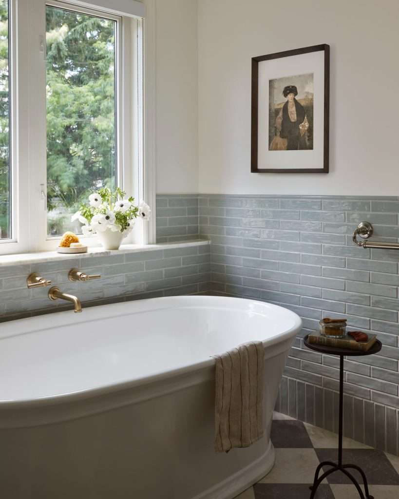
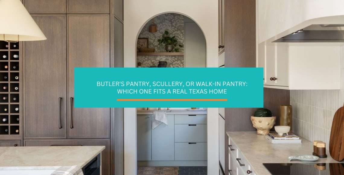
Butler’s Pantry, Scullery, or Walk-In Pantry: Which One Fits a Real Texas Home

A butler’s pantry keeps showing up on renovation Pinterest boards lately, and you’re not imagining that. Or maybe it’s a scullery. Or a walk-in pantry. Honestly, most folks can’t tell them apart.

You know that moment when twenty people are coming over in four hours? The main kitchen’s running hot. Every inch of counter space is already stacked three pans deep. That’s when folks start asking whether their open-concept kitchen is actually working for them, darling.

The island becomes staging. The range becomes prep. The sink becomes dish chaos. And every guest gets a front-row seat to all of it. If you’ve ever mid-gathering wished for a second kitchen you could just close a door on, stick around.

Butler’s Pantry, Scullery, and Walk-In Pantry Are Not the Same Thing

Butler's Pantry, Scullery, and Walk-In Pantry
Source: Olly & Em

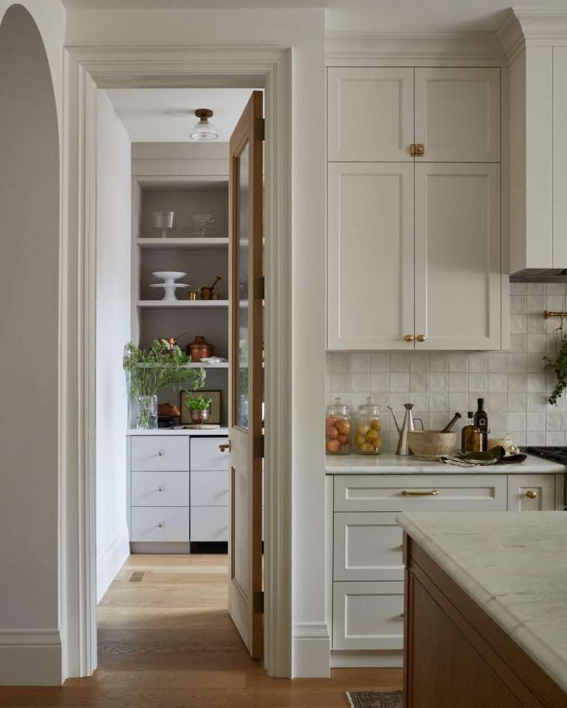
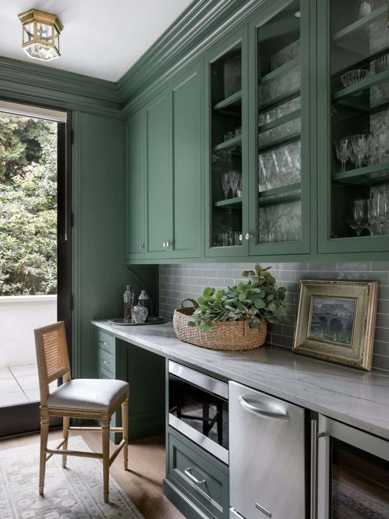
A butler’s pantry is a transitional space between the kitchen and dining room built for serving and staging. A scullery (sometimes called a prep kitchen or “dirty kitchen”) is a full secondary workspace with a sink and often a cooktop. A walk-in pantry is a food storage room. Three different spaces, three different jobs, and honey, each one solves a different problem in your home.

The confusion is understandable. All three get called “butler’s pantry” in real estate listings because that’s the term that sells. But the functional difference matters when you’re deciding what to actually build.

Here’s how the three compare in real Texas homes:

FeatureButler’s PantryScullery / Prep KitchenWalk-In Pantry
Primary useStaging, serving, bar areaActive cooking and dishwashingFood and equipment storage
Typical size30 to 50 sq ft50 to 100 sq ft30 to 80 sq ft
Sink includedOften a bar sinkYes, full sinkRarely
Secondary cooktopNoOftenNo
Appliance storageYes (coffee, wine, bar)Yes (plus large items)Mostly food, some small appliances

If your frustration is counter clutter from small appliances and entertaining visibility, a butler’s pantry solves it. If your frustration is that messy cooking takes over the main kitchen, you need a scullery. If your frustration is running out of food-storage space, you need a walk-in food pantry, and we’ve got a whole guide on those already.

Knowing which one you need saves you from spending kitchen-remodel dollars on the wrong solution. If you’re figuring out what fits, our team has helped plenty of families across Conroe and Cypress work through exactly this decision during a kitchen remodel.

What Texas Homeowners Actually Use These Spaces For

wal-in pantry
Source: Lee Ann Baker Interiors LTD.

Texas homeowners use these spaces for a handful of specific jobs, and knowing which jobs you actually have determines whether the space earns its keep. Spoiler, sugar: not every home needs all five.

Across the projects we’ve worked on in Montgomery County and Greater Houston, the same five patterns show up again and again:

  • The appliance hideaway. This is the number-one reason folks add one. The stand mixer, the espresso machine, the toaster oven, the food processor, the blender, the juicer. They all live here, plugged in and ready, behind a cabinet door or inside an appliance garage. Your main counters stay bare. It’s a huge visual shift even on a Tuesday night, and a well-designed built-in cabinet setup does most of the heavy lifting here.
  • The holiday staging zone. Thanksgiving prep, Christmas cookie marathons, and Super Bowl spreads all generate more dish-per-square-foot than any other time of year. A secondary sink and prep counter means one person can wash while another plates while a third carves. Nobody’s crowding the main island.
  • The coffee and breakfast bar. Pour-over setup, espresso machine, tea kettle, cereal and bread storage, maybe a microwave drawer. The morning routine gets its own zone that’s out of the way of whoever’s cooking eggs.
  • The hidden bar for entertaining. Wine fridge, glassware, cocktail tools, a small ice maker. When friends drop by after a Lake Conroe afternoon, you’re pouring drinks in your dedicated bar space instead of shoving kids’ homework aside on the kitchen island.
  • The post-party staging dump. This one’s underrated. A second sink and counter run means dirty dishes, foil-wrapped leftovers, and stacked trays can leave the main kitchen while you’re still hosting. Morning you will thank evening you, baby.

The question to answer before you plan the space is which of these five you actually do more than three times a year. That’s the test. Everything else is aspirational, and aspirational doesn’t justify the square footage.

If you’re trying to figure out how much of this fits into a specific floor plan, take a look at our Magnolia kitchen transformation. It shows what happens when secondary prep zones get designed alongside a full kitchen remodel. The team at Design on a Dime can walk you through which patterns fit your lifestyle before any demo starts.

When Adding One Makes Sense for Your Home, and When It Doesn’t

butler's pantry design
Source: Sprague Interiors

Adding a butler’s pantry or scullery earns its place under three conditions. You host at least six to eight times a year. You have adjacent convertible space in your floor plan. Your kitchen already struggles to absorb daily clutter. It stops making sense when the only available square footage comes from shrinking your main kitchen or cutting into rooms you actually use.

Here’s the framework we walk homeowners through, hun:

  • Do you host more than six times a year? Thanksgiving, Christmas, birthdays, summer barbecues, football watch parties. Add up the gatherings. You should hit eight-plus annual uses for the space to earn its keep. Fewer than that, and a well-organized pantry or a simple appliance garage gets you 80% of the benefit at a fraction of the cost.
  • Is there convertible space adjacent to your kitchen? A coat closet, a back hallway, an oversized walk-in pantry, an underused formal dining room, or the dead space between the kitchen and laundry. Those are the easiest conversion candidates in most Texas builder homes. If the only option is stealing from your main kitchen, the math usually doesn’t work.
  • Do you have small-appliance overflow? Count the appliances on your counter right now. If it’s more than three, you’ve already outgrown your kitchen’s storage capacity. A dedicated appliance zone solves that directly.
  • Does your main kitchen open to the living room? Open-concept kitchens benefit the most because the visual clutter is the biggest problem. A closed-off galley kitchen doesn’t gain as much from a secondary space.
  • What’s your honest entertaining style? If you genuinely host and cook, a scullery with a second sink is worth every penny. If you entertain mostly with takeout and wine, a butler’s pantry with a bar setup does more work for you.

Before committing, run the numbers against the full remodel scope. Our Texas kitchen remodel cost calculator gives you a realistic picture of what a secondary zone does to your total project. It keeps you from planning for something that blows the budget before demo starts.

For families in Spring, we’ve helped plenty of folks work through this exact decision before the first cabinet gets ordered.

Design Choices That Decide Whether You’ll Love It or Regret It

pantry design
Source: Jessica Nelson Design

Six design decisions separate butler’s pantries people love from the ones they regret. None of them are about style, darling. All of them are about how the space will actually work two years after you move in.

  • Sink or no sink. A sink changes everything about what the space can do. Without one, you’re staging and storing. With one, you’re prepping, washing, and containing mess. Plumbing adds cost, but if you’re using this for holiday cooking, it’s non-negotiable.
  • Cabinet height that matches what you’re storing. Full-height upper cabinets hold platters and seasonal serveware. Shorter uppers give you counter clearance for small appliances. Decide what lives here before you spec the cabinetry, because the wrong height either makes the space feel cramped or wastes vertical real estate. A pass through what changes in cabinet planning is worth doing early.
  • Lighting that works for actual tasks. One overhead can fixture does not cut it. You need task lighting under uppers, accent lighting inside glass cabinets if you have them, and a switched outlet near the counter. A butler’s pantry with bad lighting feels like a closet. Period.
  • Door type, swing, and sightlines. A pocket door maximizes floor space. A pair of French doors looks beautiful when open. A barn door is trendy but lousy for sound isolation. Pick based on how you’ll actually use the space, not just what looks good in the reveal photo.
  • Ventilation if you’re cooking. If your scullery has a cooktop, it needs a hood vented to the outside. EPA guidance based on ASHRAE standards points to 100 cubic feet per minute as the minimum exhaust capacity for residential kitchens. In Texas humidity, enclosed cooking spaces make hitting that minimum non-optional.
  • Power for every appliance you’ll plug in. Count the outlets you’ll need, then add two more. Appliance garages with switched outlets mean coffee makers and toasters stay plugged in but turn off when the door closes. This is the detail everyone forgets until they’re living in the space.

The cabinetry choices here matter more than in the main kitchen because everything becomes visible the moment you open the door. Our team at Design on a Dime works with families across Montgomery County on custom cabinet layouts where every inch earns its place.

How to Add One Without Rebuilding the Whole House

kitchen pantry design
Source: Morrison Interiors

Most Texas builder homes have at least one convertible space that can become a butler’s pantry without touching structural walls. The trick is knowing where to look, honey.

Here are the five most common conversion candidates we see:

  • The oversized walk-in pantry. If your current walk-in pantry is more than 40 square feet, it can probably split into two. You get a smaller food pantry plus a butler’s pantry with a counter run. You’re not adding square footage, you’re repurposing it.
  • The coat closet off the kitchen. A 4-by-5-foot coat closet backs into a butler’s pantry at a fraction of a full addition cost. You lose coat storage, but most Texas families have an entryway closet that handles that already.
  • The formal dining room. Many newer Conroe and Woodlands homes include a formal dining room that gets used twice a year. Steal 3 to 4 feet off one wall for a pass-through butler’s pantry between the dining room and kitchen. You’ve just improved both rooms.
  • The laundry adjacency. Some floor plans put the laundry room right off the kitchen. The wall between them often has room for a narrow butler’s pantry. You carve it from the laundry’s less-used end.
  • The back-of-house hallway. Some floor plans have a dead hallway between the kitchen and the garage entry that’s basically a traffic lane. Widen or line that space with cabinetry and a small counter. You’ve got a drop-zone butler’s pantry that works double duty.

Most of these conversions stay well within a kitchen remodel budget. They don’t require new foundations. Reworking the roofline isn’t part of the plan. What they do require is careful planning to get the plumbing, electrical, and cabinetry right the first time, because secondary spaces like these have zero room for error.

This is exactly where a bigger remodel plan benefits from looking at the whole floor plan, not just the kitchen footprint. Our Lake Conroe home reimagining is a good example of what happens when the secondary zones get planned in from day one. If you’re weighing a remodel that could include a butler’s pantry, we help families across Houston figure out which conversion path fits the existing bones of the house.

Frequently Asked Questions

Is a butler’s pantry worth it if we don’t throw huge parties?

Yes, if you hit the usage threshold in a different way. A butler’s pantry earns its space through frequency, not the size of your events. Families who use it daily for coffee stations, small-appliance storage, and weekly grocery organization often get more value than homes that only use it for holiday hosting. If your daily kitchen clutter is the problem, a butler’s pantry solves it regardless of how often you entertain.

Does adding one help or hurt resale value in the Greater Houston market?

Butler’s pantries consistently add resale value in the Greater Houston market, especially in homes priced above $400,000 where buyers expect entertaining features. Research tracked by the National Association of Home Builders shows storage features rank among the most valued amenities for home buyers across price points. The key is that the space reads as functional and intentional, not as a converted closet with a countertop slapped on. Good design matters more than raw square footage.

Can this work in a newer Texas builder home with a fixed footprint?

Yes, in most cases. Newer Texas builder floor plans usually include at least one convertible space. That might be an oversized walk-in pantry, a coat closet off the kitchen, or a rarely-used formal dining room. A well-planned conversion typically adds a butler’s pantry without expanding the home’s footprint or moving load-bearing walls. The design challenge is fitting the function into the existing space, not adding space to the home.

What’s the practical difference between a scullery and a prep pantry?

A scullery is a full secondary workspace with a sink and often a secondary cooktop for active cooking and dishwashing. A prep pantry is a smaller space focused on food prep, staging, and appliance storage, usually without a cooktop. The shorthand: if you can cook a full meal in it, it’s a scullery. If you can prep and stage but not cook, it’s a prep pantry. Most Texas homes have room for one, not both.

A Second Kitchen That Earns Its Place in Your Home

Look, hun, the reason butler’s pantries and sculleries are having a moment isn’t because they’re trendy. It’s because the way we actually live in our kitchens finally outgrew the floor plans we were handed.

We host more. We own more appliances. We hate counter clutter. And most folks have lived through at least one Thanksgiving where one person was making gravy, another was carving the turkey, and a third was washing dishes. All of it happening within a three-foot radius.

A well-planned secondary zone is the fix. The right zone for your home depends on how you entertain, how much prep spills into the main kitchen, and what convertible square footage you’re working with.

Sometimes it’s a simple appliance garage inside existing cabinetry. Sometimes it’s a full scullery carved from a pass-through hallway.

That’s the kind of judgment call where a professional design perspective pays for itself. Design on a Dime Interiors works with families across Montgomery County and Greater Houston on kitchen remodels that balance beauty with everyday function. Your space should actually work for the way you cook, host, and live.

If you’re thinking about a kitchen remodel that could include a butler’s pantry or scullery, reach out to our team today.
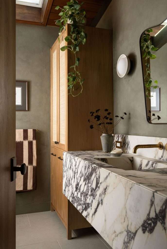
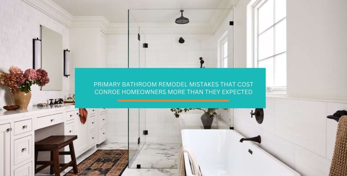
Primary Bathroom Remodel Mistakes That Cost Conroe Homeowners More Than They Expected

You’ve been tolerating that bathroom for a while now, haven’t you? Maybe it’s the dated tile that seemed fine when you moved in but now catches your eye every single morning. Maybe the layout never quite worked and you’ve just been working around it.

Whatever finally pushed you over the edge, here you are, ready to do a primary bathroom remodel and genuinely unsure where to start.

And honey, that overwhelmed feeling you’re having right now? It makes complete sense. A primary bathroom involves more decisions, more trades, and more moving parts than almost any other room in the house. Before you call a single contractor or fall down a tile Pinterest rabbit hole, there are a few things worth getting clear on first.

Why the Primary Bathroom Is the Hardest Room to Get Right

Primary Bathroom Redmodel

Most rooms give you a little margin for error. You put furniture in the wrong spot, you move it. You pick the wrong paint color, you repaint. A primary bathroom remodel does not work that way. The decisions you make at the planning stage (layout, plumbing locations, door swings, ventilation) get locked in behind tile and drywall. Change your mind after the fact and you’re looking at tear-out costs that can double your original budget.

This is the room where two people share a morning routine, often at the same time, in a space that rarely exceeds 100 square feet. Every square inch either works or it doesn’t, and the difference between those two outcomes almost always comes down to how much thinking happened before demo day.
The other thing that makes primary baths tricky: they carry a lot of emotional weight. This is the first room you walk into every morning and the last one you’re in at night. It’s not just functional. It’s personal. That means the pressure to get it right is real, and the mistakes sting a little more than they would in, say, a laundry room.

Getting this room right starts with understanding which decisions have to be made in a specific order. Skip the sequence and you’ll end up with gorgeous fixtures that fight each other, a layout that creates bottlenecks, or a finish palette that reads beautifully in photos and feels cold every single morning in real life.

Layout First, Because Everything Else Follows

master bathroom layout

The single most expensive mistake homeowners make in a primary bathroom remodel is going straight to finishes. They pick tile. They fall in love with a vanity. They find a freestanding tub on sale. And then they call someone to make it all fit, only to discover the plumbing is in the wrong place, the door can’t open properly, and the tub they bought won’t leave enough clearance to get to the toilet.

Layout decisions have to come first, every time. Here’s why: plumbing moves money fast. According to the National Kitchen and Bath Association, keeping plumbing fixtures close to existing supply and drain lines is one of the most reliable ways to control remodeling costs.

The moment you start relocating a toilet or moving a shower drain more than a few feet, you’re into slab work. In our part of Texas, where homes are built on concrete slabs rather than basements, that’s a more involved process than homeowners expect.

Before anything else gets decided, you need a clear answer to three layout questions:

  • Is the door swing eating into usable space? A lot of builder-grade primary baths have doors that swing into the room and immediately block access to the vanity or toilet. Flipping to a pocket door or barn door is a relatively affordable fix that opens up the floor plan significantly.
  • Where are the two people in this room actually standing at the same time? The classic mistake is designing for one person. Map out where each person gets ready: who’s at the vanity, who’s in the shower, who needs the toilet. Make sure those zones don’t create a traffic jam during the 7:00 a.m. rush.
  • Does the shower placement make sense for the window and ventilation situation? In Greater Houston’s humidity, ventilation matters more than it does in drier climates. Where the shower sits relative to the exhaust fan and any natural light source affects both daily comfort and long-term moisture management.

Get these three questions answered before you look at a single tile sample. The rest of the decisions will make a lot more sense once you know what you’re actually working with spatially.

The Bathtub Question That Divides Every Household

the bathtub in the bathroom ideas
Source: Victoria de la Camara

The decision that comes up in nearly every primary bathroom remodel conversation we have. Keep the tub or lose it?

The honest answer is: it depends, but probably not for the reasons you think.

The bathtub-to-shower conversion is one of the most popular remodeling requests we get, and it makes sense for a lot of households. If you genuinely haven’t used your tub in two years, you’re not suddenly going to start.

Removing it opens up floor space that can make a medium-sized primary bath feel dramatically more generous. A larger walk-in shower, better storage, a dedicated makeup area: the footprint you reclaim from a standard alcove tub goes a long way.
But here’s the part worth thinking through carefully: a home with no bathtub at all can affect resale appeal, particularly in the Greater Houston market where family buyers are a significant segment.

The National Association of Realtors consistently notes that master suites with no tub at all see more pushback from buyers than those that at least have a soaking tub or a dedicated wet room.

This doesn’t mean you have to keep the tub if you hate it. It means the decision deserves more than just “we never use it.”

A few questions worth sitting with:

  • Is there a secondary bathroom in the house that has a tub? If so, the argument for removing the primary tub gets much stronger.
  • Are you planning to sell within five years? If yes, the resale math tilts toward keeping at least a soaking tub option.
  • Would a smaller, freestanding soaking tub in the corner give you the design moment you’re after without eating the square footage of a full alcove tub setup?

This is genuinely a household conversation, not just a design choice. And honey, if two people in the house have opposite opinions on this one, it helps to work through the logic with someone who has seen how it plays out across a lot of finished projects.

The Design on a Dime team has navigated this exact conversation more times than we can count, and there’s usually a solution that satisfies both sides.

How to Set a Budget That Reflects What You Actually Want

bathroom design
Source: Maeve Design Collective

This is where most primary bathroom remodels go sideways before they even start. Homeowners come in with a number they’ve decided on, usually based on some combination of what they think it should cost and what they’re comfortable spending, and it doesn’t account for what they actually want.

The gap between “I want to spend $15,000” and “I want to move the plumbing, add heated floors, install a frameless glass shower, and use large-format tile” is significant.

Not because any of those things are unreasonable, but because pricing individual line items in your head almost always underestimates the full scope.

Here’s a more useful framing: price the project from the scope, not the other way around. Start by listing everything you actually want to change, then find out what that realistically costs in the Houston market.

If the number is higher than you expected, you can make informed trade-off decisions. If you set the budget first and try to squeeze the scope to fit, you’ll end up cutting things mid-project, which almost always costs more than planning for them from the start.

As a starting point, our Texas Bathroom Remodel Cost Calculator gives you a realistic range based on actual project data from Greater Houston homes. It’s not a substitute for a real estimate, but it’ll give you a grounded number to work from before any contractor walks through your door.

A few cost realities worth knowing going in:

  • Tile is labor-intensive. The material cost is often lower than people expect; the installation cost is where budgets get surprised. Large-format tile, herringbone patterns, and floor-to-ceiling shower tile all add labor hours. Budget accordingly.
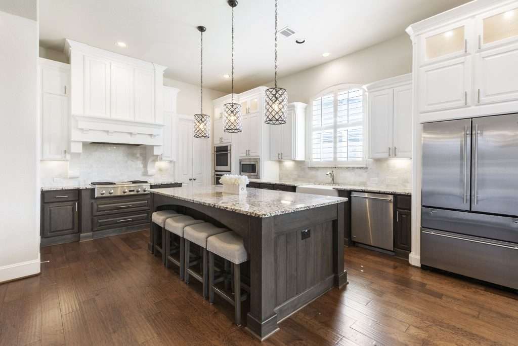
  • Plumbing rough-in is not visible but it’s never cheap. Any fixture move (toilet, shower drain, tub) involves your plumber and potentially your concrete slab. Get this scoped explicitly before finalizing your layout decisions.
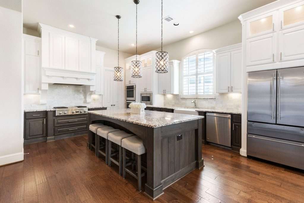
  • Ventilation and lighting are routinely underbudgeted. Both require electrical work and both matter enormously to daily comfort. They’re worth allocating real money to.

If the full scope genuinely exceeds what you can do right now, a good designer can help you sequence the project by doing the structural and plumbing work now and phasing finish upgrades over time.

That’s a real option, and it’s worth understanding how remodeling decisions affect each other before you commit to any one phase.

Finish Selections That Actually Hold Up in a Texas Climate

white bathroom design

Here’s something that doesn’t come up enough in bathroom design content: the Gulf Coast climate is not neutral. The heat, the humidity, the way natural light pours through windows at certain times of year. All of it affects how finishes look and perform in daily life.

Polished marble that looks stunning in a Seattle showroom can be a maintenance headache in a Houston-area home where the combination of hard water and humidity creates water spots and mineral buildup faster than you’d expect.

Highly reflective surfaces amplify the intense midday light that comes through south-facing windows in Texas homes. And matte tile, while beautiful in photos, shows footprints and soap residue more in a high-humidity shower environment than most people anticipate.

This doesn’t mean you can’t have any of those things. It means the selection process should account for your actual conditions, not just what photographs well.

A few finish principles that hold up consistently in Montgomery County and Greater Houston homes:

  • Honed or matte stone in larger formats tends to hide the daily wear of hard water better than polished finishes in high-humidity areas. It also reads warmer, which is useful in bathrooms that get a lot of natural light.
  • Brushed or matte metal fixtures show water spots significantly less than chrome or polished nickel. In a climate where every shower leaves mineral deposits on fixtures, this is not a small consideration.
  • Grout color is a long-term decision. Light grout looks clean in a showroom and shows everything within six months in an active household. Tinted grout or epoxy grout in a slightly darker tone extends the life of your bathroom’s clean appearance considerably.

For tile specifically, the Tile Council of North America publishes performance ratings that cover slip resistance, water absorption, and durability. None of that shows up in the lifestyle photos you’re pinning.

It’s worth knowing that porcelain with a PEI rating of 3 or higher is generally recommended for bathroom floors in residential applications.

If you’re working through selections and feeling unsure about what holds up in practice versus what just looks good on a sample board, the Design on a Dime Interiors team in The Woodlands and Spring has seen enough finished projects to tell you exactly which combinations age well and which ones don’t.

What a Functional Plan Looks Like Before Demo Day

bathroom layout plan
Source: Maxwell Design

A functional plan is not a mood board. It’s not a folder of saved Instagram posts. And it’s not a rough idea of what you want.

A real pre-demo plan is a specific document that answers every decision that can be made before anyone picks up a tool, so the project runs on decisions instead of running on questions.

Here’s what a complete plan contains before demo starts:

  • A dimensioned layout drawing showing every fixture in its final location, with clearances noted. This is not optional. Even if you’re keeping everything in place, confirming clearances and door swings on paper before demo starts costs nothing. Changing them after costs a lot.
  • A complete materials list with model numbers. Not “a white rectangular sink.” The specific sink, its dimensions, and where it’s been ordered from. Supply chain delays are real, and a project stalled because a vanity is backordered for six weeks is a painful and entirely avoidable situation.
  • A clear scope-of-work for every trade. Who is doing the plumbing? What exactly is included? Who is responsible for the electrical permit? When is the tile contractor scheduled relative to the plumber? A project where trade coordination is loosely defined almost always runs long and over budget.
  • A decision log for the things you’re not sure about yet. It sounds counterintuitive, but the fastest way to slow down a remodel is to reach a decision point mid-project with no answer ready. Document the open questions before demo starts and assign a deadline for each one.

This kind of planning is the thing most homeowners don’t know to do because they’ve never remodeled a bathroom before. It’s also exactly what a designer brings to a project. Not just the pretty part. The functional planning that keeps bathroom remodels on track.

Our ben-project bathroom remodel is a good example of what this looks like in practice. Every trade coordinated, materials selected and staged before demo, and the homeowner involved in decisions at the right moments rather than getting surprise questions mid-project.

If you’re managing this yourself, build the plan before you touch anything. If you’re working with a designer, the plan is one of the most valuable things they produce. Either way, the bathroom that finishes on time and on budget is almost always the one where someone did the pre-work.

Our Katy and Cypress bathroom remodeling clients often tell us the planning phase felt like the least glamorous part, right up until they saw how smoothly the project ran because of it.

Frequently Asked Questions About Primary Bathroom Remodels

What makes a primary bathroom feel luxurious rather than just expensive?

Luxury in a bathroom is almost always about proportion and restraint, not price. A bathroom with well-sized fixtures, thoughtful lighting, and a cohesive material palette will feel more elevated than one that mixes high-end finishes without a clear logic connecting them.
Scale is particularly important: an oversized vanity in a small bathroom reads as cramped, not grand. The rooms that feel genuinely luxurious are the ones where every element looks like it belongs exactly where it is.

How do you know whether your layout actually needs to change?

If you find yourself regularly working around the space, stepping aside for the door, reaching over someone, waiting because there’s only one usable sink position at a time, the layout has a functional problem, not just a style problem.
Style problems are solved with new finishes. Functional problems come back every single morning regardless of how beautiful the tile is. If your bathroom consistently frustrates you during use, the layout is worth addressing.

Does the primary bathroom really affect how a home feels to live in?

More than most people realize. The first room you walk into in the morning and the last one you’re in at night sets a tone that’s easy to underestimate until you change it.
Homeowners who remodel a primary bathroom consistently describe the result as feeling like the whole house shifted, not just the room. There’s something about a space that functions well and feels considered that carries into the rest of the day.

Should both people in the household have equal input on the design?

Yes, but structured input works better than open-ended collaboration. Asking “what do you want?” to two people with different tastes produces conflict.
Ask each person to identify their top three non-negotiables instead. Design around those six priorities and you end up with a bathroom both people feel ownership over. The aesthetic decisions outside the non-negotiables are usually much easier to resolve once the functional priorities are settled.

What’s the difference between a refresh and a full remodel, and how do you know which one your bathroom actually needs?

A refresh replaces surfaces and fixtures without touching plumbing or layout: new vanity, new tile, new mirror, new lighting. It can transform the way a bathroom looks and feels for a fraction of full remodel costs.
A full remodel changes the layout, relocates plumbing, or addresses structural issues. If your bathroom functions well but looks dated, a refresh may be all it needs. If the layout creates daily friction, a full remodel is the only thing that actually solves it.

A Bathroom Worth Walking Into Every Morning

Look, the primary bathroom is the one room in your house that never gets a day off. It earns its renovation budget in a way that a guest room or a formal dining room just doesn’t, because you’re in it twice a day, every day, for as long as you live in the house.

Getting it right isn’t about spending the most money. It’s about making the right decisions in the right order, with a clear picture of what you actually want before anyone picks up a pry bar.

Start with layout. Decide the tub question. Build a realistic budget from the scope you actually want. Choose finishes that perform in the Houston climate, not just finishes that look beautiful in photos. And put a real plan together before demo day so the project runs on decisions instead of delays.

Sometimes that whole process is something homeowners can manage with good information and a clear head. Other times, it helps to have someone in your corner who has been through it hundreds of times and knows where the expensive surprises tend to hide.

That’s what Design on a Dime Interiors does for families across Montgomery County and Greater Houston. We help you get from “I want to fix this bathroom” to a finished space that actually works for the life you’re living in it.

If you’re ready to start planning, reach out to our team and let’s figure out what your primary bathroom can become.

How to Plan a Bathroom Layout Before You Touch a Single Tile in Texas

You finally have the budget, the vision, and the contractor lined up. You’ve saved your inspiration photos, picked out the tile, and you’re ready. Then the remodel wraps up and you spend the next three years stepping around a door that swings into your shins every single morning, reaching past your partner to get to the sink, and wondering why your gorgeous new bathroom somehow still feels like a chore to use.

Planning a bathroom layout isn’t the glamorous part of a remodel, darling, but it’s the part that determines whether your beautiful new space actually works for your real life. And I’m going to walk you through exactly what to think about before a single tile gets pulled off the floor.

Why Most Bathroom Layouts Fail Before Demo Even Starts

Why Most Bathroom Layouts Fail Before Demo Even Starts

Most bathroom remodels that end in regret didn’t fail because of the materials or the budget. They failed at the planning stage, before anything was touched.

Here’s what usually happens: a homeowner picks finishes first and figures out placement later. The tile goes on the mood board. The vanity gets ordered. The fixtures get chosen. And somewhere deep in the planning process, somebody eyeballs the floor plan and assumes the original layout is probably fine.

The original layout is almost never fine. Builder bathrooms in this part of Texas were designed to check code requirements and fit a floor plan, not to function well for two adults getting ready in the same 60 minutes. When you open up the walls, you have a real opportunity to rethink the entire thing, and most homeowners hand that opportunity back without realizing it.

The core mistake is treating a bathroom remodel as a cosmetic project when it’s actually a spatial one. New tile in the same broken layout gives you a prettier version of the same frustrations. The planning work, the part where you think through how your household actually moves through this room, is where the real return on your investment lives.

The Traffic Flow Question You Need to Answer First

bathroom traffic flow

Before you place a single fixture, answer this question: how do two people use this bathroom at the same time, and where do they get in each other’s way?

In most Texas builder homes, the primary bathroom gets used by two people during the same morning window. One person at the sink, one in the shower, somebody needing to get past somebody else to reach the toilet. The traffic pattern through that room is happening six or seven times before 8 a.m., and if the layout fights that pattern, every single day of the year is a little bit worse because of it.

Start with the door swing. This is the single most overlooked detail in bathroom planning. A standard door that swings inward can eliminate up to 9 square feet of usable floor space in a small bathroom, and if it opens toward the vanity or the toilet, you either have to squeeze behind it or leave it partially closed while someone else is in the room. A pocket door, a barn door, or even a simple door rehang to swing outward can completely change how the room feels.

Then trace the path from the door to each fixture:

  • From the door to the vanity. This should be a clear, unobstructed path. If you’re stepping around anything to get to the sink, that’s a layout problem, not a size problem.
  • From the vanity to the shower. In a shared bathroom, this path crosses constantly. If it also crosses the toilet area, you’ve got a peak-hour traffic collision built right into the floor plan.
  • The wet zone separation. The National Kitchen and Bath Association recommends at least 21 inches of clear floor space in front of every fixture, and at least 15 inches from the centerline of the toilet to any side wall or obstruction. These aren’t decorative standards. They’re the minimum clearances that make a bathroom feel functional rather than cramped.

If your current layout doesn’t pass this traffic check, that’s the first thing to fix, and it’s worth spending money on, even if it means moving a wall.

How to Decide Where the Vanity Wall Goes Before Anything Else

How to Decide Where the Vanity Wall Goes Before Anything Else

The vanity wall is the anchor of your bathroom layout. Once it’s placed, everything else organizes around it, and moving it later is expensive. Get this right first.

In most primary bathrooms in Greater Houston, the vanity runs along the longest wall opposite the door or along a side wall adjacent to the shower. Both can work. What makes the difference isn’t which wall you choose, it’s whether that wall has the right conditions to support a functional vanity.

Three things to evaluate before committing to a vanity wall:

  • Natural light and mirror placement. Vanity lighting that fights a window is a problem you’ll live with every day. If your vanity wall has a window, you’re working around it, not with it. Side-lit vanity lighting (sconces flanking the mirror rather than overhead) is far more functional for grooming, but it requires planning the electrical before the drywall goes up.
  • Counter space per person. The standard advice is 24 inches of counter width per person for a shared vanity. That gives each person room to set things down, use the sink without bumping elbows, and store what they need within arm’s reach. A 48-inch double vanity sounds roomy until you realize 8 inches of that width goes to the sinks themselves. If your wall can’t support at least 60 inches of vanity for a shared bathroom, a single sink with good storage planning is often a better functional choice.
  • Plumbing relocation cost vs. benefit. Moving plumbing is where bathroom remodel budgets expand quickly. If your current vanity is against a wall with easy access to the plumbing stack, staying close to that location keeps costs predictable. If you’re relocating the vanity to a different wall, get that cost in writing before you fall in love with the new placement.

The vanity wall also determines where your storage lives. A designer I know always says the vanity wall isn’t just where you put the sink, it’s where you decide how much of your bathroom counter is going to be covered in stuff six months from now. Plan the storage before you finalize the vanity, not after.

Families across Conroe and The Woodlands who’ve been through a bathroom remodel will tell you: the vanity placement decision feels small during planning and enormous once you’re living with it.

Shower Placement That Prevents the Cold Floor Walk

Shower Placement That Prevents the Cold Floor Walk
Source: Ling Interiors

The most common fixture placement regret I hear from clients isn’t about the vanity. It’s about the shower.

Specifically: the distance from the shower to the towel bar, and the distance from the shower to the rest of the bathroom. In a Texas summer, stepping out of a cool shower onto warm tile is fine. In January, when a cold front has dropped the overnight temperature to 38 degrees and that slab foundation has made your tile floors absolutely frigid, the 12 feet between your shower and your towel bar feels like a different problem entirely.

Shower placement should be driven by three factors.

First, proximity to the towel bar and robe hook. These should be within arm’s reach of the shower exit, not across the room. This sounds obvious, but in a lot of builder-style bathroom layouts, the towel bar ends up on the wall nearest the door because that’s where the blocking was originally placed. During a remodel, you can move it. Do.

Second, the orientation of the shower entry. A shower that opens toward the toilet or toward a shared traffic path creates awkward moments every single day. A shower that opens toward an open wall or toward the exterior wall gives you privacy, a clear path in and out, and room for a bench or a niche without cutting into usable floor space.

Third, natural light. A shower positioned against an exterior wall can support a small window or a solar tube without much additional cost during a remodel. That natural light makes a shower feel larger and more pleasant, and it’s dramatically harder and more expensive to add after the fact.

The National Association of Home Builders has long documented that walk-in showers with bench seating and accessible entry rank among the most valued features for long-term livability, not just for aging-in-place reasons, but because they make the daily routine more comfortable for everyone.

If you’re unsure whether your shower placement is working, check out our bathroom remodel cost calculator for a sense of what layout changes typically add to a project budget. It helps to know what you’re working with before you start moving things around.

Storage That Gets Used vs. Storage That Looks Good in a Photo

bathroom storage

A lot of bathroom storage plans look great on a mood board and fall apart in real life. Here’s why: most storage is planned around what the bathroom will look like on the day of the “big reveal,” not around what it’ll look like three months later when real life has moved back in.

The most functional bathroom storage is built into the layout, not added onto it.

That means thinking about storage placement before the walls close up, not after. A few principles that make the biggest difference:

  • Shower niches over freestanding caddies, every time. A built-in niche keeps the shower walls clean, holds what you actually use, and doesn’t rust, fall, or scratch the tile. Standard placement is 48 to 60 inches off the floor on the wall opposite the showerhead. Plan the niche location before the tile is ordered, because the niche dimensions need to align with your tile layout.
  • Drawer-heavy vanities outperform door-heavy vanities. Doors look clean. Drawers get used. Deep base drawers for hair tools, divided shallow drawers for everyday items, and a single door cabinet for under-sink plumbing access is the combination that actually stays organized. If your vanity is entirely cabinet doors, expect the interior to become a pile within a few months.
  • The space above the toilet is real estate. It’s often ignored or used for a single decorative shelf. In a bathroom with limited square footage, a recessed medicine cabinet or a shallow built-in above the toilet can hold a surprising amount of what currently lives on the counter.
  • Linen storage needs to live in the bathroom or immediately outside it. Storing towels three rooms away from the bathroom is a comfort problem. If your layout has any wall space near the shower exit, even a 12-inch-deep built-in column can handle towels, toiletries, and the items that currently live in a pile on the floor.

Our custom cabinets team in Spring works through bathroom storage planning as part of the design process, because storage that’s designed alongside the layout always fits better than storage bolted on afterward.

How to Read Your Bathroom Layout Before You Commit to a Plan

bathroom design plan
Source: Caitlin Jones Design

Before you finalize any layout decision, do this: stand in your bathroom and walk through a full morning routine, out loud, narrating every step.

“I walk in. I turn on the light. I go to the sink. I open the medicine cabinet. I reach for my…” Go through the whole thing. Then do it again imagining your partner is already at the sink. Where do you go? What do you reach around? What do you have to wait for?

This exercise sounds silly, but it surfaces problems that no floor plan sketch will show you. It’s also how professional designers approach a space before any design decisions are made, because a bathroom that works on paper and a bathroom that works in real life are sometimes very different rooms.

A few specific things to check during this walk-through:

  • Does the door clear every fixture when fully open? Not partially open. Fully open.
  • Can you reach the toilet paper from the toilet without leaning? Standard placement is 8 to 12 inches from the front of the toilet bowl to the holder, at about 26 inches off the floor. Most builder installations miss at least one of these measurements.
  • Where does wet stuff drip? Step out of the shower in your mind. Where do your feet land? Is there a rug or a mat there? Does the path to the towel take you across dry floor or wet floor?
  • What happens in the dark? If you get up at 3 a.m. and navigate this bathroom without turning on the overhead light, are you walking into anything?

Families in Katy and Cypress who’ve gone through this process with our team often say that the walk-through conversation before the design presentation is where they made half their best decisions. The floor plan is a tool. Your lived experience in the room is the real data.

If you haven’t already run the numbers on what your layout changes will cost, our bathroom remodel cost calculator gives you a solid Texas-specific starting point. It’s free, takes about 60 seconds, and breaks down pricing by scope and location so you’re not guessing.

Frequently Asked Questions

What’s the biggest layout mistake homeowners make when remodeling a bathroom?

The most common mistake is keeping the original builder layout without questioning it. Most Texas builder bathrooms were designed to meet code minimums, not to support two adults using the space simultaneously. When you open up the walls for a remodel, you have a real opportunity to rethink fixture placement, door swing, and traffic flow. The homeowners who take that opportunity almost always end up with a significantly more functional space. The ones who skip it often find themselves remodeling the same bathroom again five years later.

How do you know if you have enough space for a double vanity?

The functional minimum for a comfortable double vanity is 60 inches of total width, which gives each person roughly 24 inches of counter space after accounting for the two sinks. If your vanity wall is shorter than that, a single sink with excellent drawer storage and a wide mirror is often a better choice than squeezing in two sinks that don’t have enough room to breathe. In many Greater Houston homes with older builder bathrooms, a 48-inch single vanity with thoughtful built-in storage outperforms a cramped double.

Should you move plumbing during a bathroom remodel?

It depends on what you’re gaining. Moving plumbing to get better fixture placement is often worth it, especially if the current layout creates ongoing daily friction. Moving plumbing just for aesthetics is harder to justify. The cost of relocating a drain or supply line varies significantly by how far it’s moving and what’s behind the wall, but a realistic range for plumbing relocation in a Texas bathroom remodel is $500 to $2,500 depending on scope. Get the cost before you commit to the new placement, and weigh it against how much that placement actually improves the way the bathroom functions.

Does shower size matter more than shower placement?

Placement usually matters more. A well-placed 36-by-36-inch shower that’s close to the towel bar, oriented correctly for traffic flow, and has a built-in niche will be used and enjoyed daily. A large walk-in shower that’s positioned in the wrong corner, opens into the traffic path, and requires a cold floor walk to reach the towels is a source of low-level frustration every single morning. Size is a luxury. Placement is a basic functional decision. If budget requires a tradeoff, prioritize placement.

The Part That Makes the Whole Thing Worth It

When a bathroom layout is done right, you stop thinking about it. That’s the goal. Not a bathroom that gets compliments, though you’ll get those too. A bathroom that your household uses every day without friction, without workarounds, without that small daily frustration of a space that almost works.

That’s what good planning buys you, not just a prettier room, but a room that makes your mornings a little easier and your evenings a little quieter.

If you’re planning a bathroom remodel across Montgomery County and Greater Houston and you’d like to talk through your layout before anything gets ripped out, we’d love to take a look. Start with a conversation at designonadimeinteriors.com/getstarted and let’s figure out what your bathroom could actually be.

Why Your Texas Kitchen Feels Dark (And the Lighting Fix That Changes Everything)

Kitchen lighting ideas are everywhere, but most of them skip the part where your kitchen actually starts to feel like it works. You’ve probably updated your counters, swapped the cabinet hardware, maybe even repainted. And the kitchen looks better.

But something still feels off, especially at night. The overhead light does its job in a flat, clinical kind of way, and those shadows across the counter while you’re chopping? Still there. Still driving you a little baffling every single time you cook.

The truth is, most kitchens in our area are built with one overhead fixture and a handful of recessed cans, and that’s it. It’s not your fault the kitchen feels dim, honey. It’s a builder-grade lighting plan that was never designed to make your kitchen feel like home.

It was designed to pass inspection and move on. The good news is that fixing it doesn’t require tearing anything out. It requires a strategy. And I’m about to walk you through exactly how it works.

Why Builder Lighting Leaves Texas Kitchens Feeling Flat

Why Builder Lighting Leaves Texas Kitchens Feeling Flat

Most Texas homes built in the last twenty years came out of the ground with the same lighting setup: a ceiling fixture in the center of the kitchen, a few recessed cans positioned more or less symmetrically across the ceiling, and maybe a light over the sink. The result looks fine on a listing photo taken with a wide-angle lens. In real life, it creates two problems.

First, overhead-only lighting casts shadows directly onto your work surface. Think about where the light is coming from when you’re standing at the counter chopping vegetables. It’s behind you, or directly above you.

Either way, your own body is blocking the light from reaching the place where you’re actually working. This isn’t a design flaw you notice when you’re glancing around the kitchen. You feel it every single time you reach for a knife.

Second, flat, uniform light makes a room feel smaller and less interesting. When every surface in the kitchen is lit to roughly the same intensity, there’s no depth, no warmth, no reason your eye knows where to land.

The spaces that feel expensive and inviting, the ones that stop you in your tracks when you walk in, almost always use light at multiple heights and with multiple purposes. That’s not a coincidence.

The National Kitchen and Bath Association has been studying lighting in residential kitchens for decades, and their research consistently points to the same conclusion: kitchens need layered light to function well and feel good. One source at the ceiling, however bright, doesn’t cut it.

The Three-Layer System That Makes Kitchen Lighting Actually Work

The Three-Layer System That Makes Kitchen Lighting Actually Work

Here’s the framework every well-lit kitchen is built on, and it’s simpler than it sounds once you see the names for what they describe.

Ambient light is your base layer. It’s the general illumination that lets you navigate the space, see into the refrigerator, and move around safely. Recessed cans, ceiling-mounted fixtures, and track lighting all serve this function. In most Texas kitchens, this layer already exists. The problem is it’s been expected to do everything on its own.

Task light is the focused, close-range illumination directly over your work surfaces. Under-cabinet lighting is the gold standard here because it puts the light source between your eyes and the counter, eliminating the body-shadow problem entirely. According to the Illuminating Engineering Society, kitchen work surfaces perform best with 200 to 500 lumens per linear foot from under-cabinet fixtures, depending on whether you’re prepping food or just want a warm ambient glow in the evening.

Accent light is the layer most homeowners skip entirely, and it’s the one that makes a kitchen feel designed rather than just functional. Cabinet lighting inside glass-front uppers, toe-kick strips along the base of your cabinetry, and pendants over an island all fall into this category. This layer adds depth, draws the eye, and gives your kitchen a completely different personality at 7pm than it has at noon.

Most builders only deliver the first layer. A well-designed kitchen uses all three, and the layers work together in a way that no single one of them can replicate on its own.

What Kitchen Lighting Actually Costs in a Texas Remodel

What Kitchen Lighting Actually Costs in a Texas Remodel

When you’re planning a kitchen remodel or a targeted lighting upgrade, it helps to know what you’re actually buying. Here’s how the layers break down in real terms.

Recessed lighting upgrades: If your existing cans are old halogen fixtures, swapping them for LED trim kits is one of the highest-return moves you can make. Expect to spend $75 to $150 per fixture installed, depending on whether new wiring is needed. A typical kitchen in a 2,500-square-foot home in Conroe or Spring might have six to eight cans. Replacing all of them with properly positioned, dimmable LED fixtures runs $500 to $1,200 total, depending on the electrician’s day rate in Montgomery County.

Under-cabinet task lighting: LED strip lights have become the go-to for under-cabinet applications because they provide even, continuous illumination without the hot spots that puck lights create. A professionally installed under-cabinet system for a medium-sized kitchen typically runs $800 to $2,000, including wiring to a dedicated switch. If you’re doing a full kitchen remodel, this is the time to wire it properly so the switch lives where you’d actually want it, not wherever was convenient during rough-in.

Pendant lighting over an island or peninsula: This is where the accent layer gets to do its best work. Pendants are also where homeowners most often over- or under-spend. A single statement pendant that anchors a kitchen island runs anywhere from $200 to $1,500 for the fixture, plus installation.

Two or three smaller pendants spread across a longer island is a completely different budget and a completely different look. For sizing: pendants should hang approximately 30 to 36 inches above the countertop surface, or 66 to 72 inches from the floor in kitchens with standard 9-foot ceilings.

Dimmer switches: Often overlooked, almost never optional. A kitchen where every light layer can be controlled independently on a dimmer is a fundamentally different kitchen than one where everything is on a single switch. Budget $25 to $75 per switch for quality dimmers compatible with LED fixtures. This is one of the best dollars-per-impact investments in the entire kitchen.

If you want a clear picture of what your full kitchen remodel budget should include across all these line items, the Texas Kitchen Remodel Cost Calculator breaks it down by scope, size, and location across Greater Houston.

Color Temperature: The Decision Most Homeowners Get Wrong

KITCHEN LIGHTING

Color temperature is the thing I see homeowners get wrong more consistently than almost anything else in a kitchen refresh. You pick a fixture you love, you install it, and the light looks wrong somehow. Off. Too cold, too yellow, or strangely mismatched with the fixture on the other side of the room. Here’s why that happens.

Color temperature is measured in Kelvin (K), and the number tells you whether the light leans warm or cool. 2700K to 3000K is warm white, similar to an incandescent bulb, and it makes wood tones, cream cabinets, and natural stone look beautiful. 3500K to 4000K is a cleaner, cooler white that suits modern kitchens with white or gray cabinetry, stainless appliances, and polished quartz.

The most common mistake is mixing color temperatures across different fixtures in the same kitchen. Your under-cabinet strips at 2700K paired with recessed cans at 4000K will make the kitchen feel slightly incoherent, even if you can’t immediately name why.

The light just looks “off.” The rule is simple: keep all task lighting at the same Kelvin value, and stay consistent across ambient fixtures too. If your pendants are 3000K, your cans should be 3000K.

For most Texas kitchens, 2700K to 3000K is the right call. Our homes tend to have warm-toned finishes, wood elements, and natural stone or quartz that reads beautifully under warm light. The big, open builder layouts common in neighborhoods like The Woodlands, Katy, and Cypress get a lot of natural light during the day, and a warm artificial light in the evening balances that shift naturally without feeling jarring.

One more spec worth knowing: CRI, or Color Rendering Index, measures how accurately a light source shows the true colors of objects under it. A CRI of 90 or above is the target for kitchens. Below 80 and your food, your finishes, and your paint colors will all look subtly wrong under artificial light, in a way that’s hard to diagnose if you don’t know to look for it.

Where Recessed Cans Go Wrong (And How to Fix Placement Without Starting Over)

MODERN KITCHEN LIGHTING

If your recessed cans were installed during construction, they were almost certainly positioned by a framing crew following a basic lighting plan, not a designer. That means they landed in whatever open ceiling space was available between structural members, not necessarily over the surfaces where light was actually needed.

The single most common recessed lighting mistake in Texas builder homes is cans positioned too far back from the counter edge, up in the center of the ceiling. When you stand at your counter, the light is hitting the tops of your shoulders instead of the work surface in front of you. The NKBA recommends that recessed lighting used for task purposes be positioned 24 inches out from the wall, placing the beam directly at the counter edge rather than casting it across your back.

If your existing cans are in the wrong place, the fix isn’t always a full electrical project. Sometimes repointing the trim direction on an adjustable can moves the beam enough to matter. Under-cabinet lighting, as described above, solves the problem entirely because it creates a task light source that doesn’t rely on ceiling position at all.

For new construction or full remodels, here’s the spacing rule that holds up across most kitchen configurations: position recessed cans approximately 2 feet from the wall running parallel to the counter, and space them 4 feet apart along that line.

This creates consistent coverage without pools of light and shadow between fixtures. In the open-plan layouts that are standard across most master-planned communities in Greater Houston, where the kitchen flows directly into the dining and living areas, this spacing logic also helps define the kitchen zone visually without a wall or partition doing the work.

If you’re tackling a kitchen remodel and want the lighting done right from the start, working with a designer who maps the lighting plan before the electrician touches a wire makes a significant difference. The Design on a Dime Interiors kitchen remodeling team plans the full light layering strategy as part of the design package, so you’re not retrofitting fixes after everything is already installed.

The Fixtures That Read as Finished vs. the Ones That Date Your Kitchen

The Fixtures That Read as Finished vs. the Ones That Date Your Kitchen

Fixture selection is where lighting crosses from function into style, and it’s also where I see homeowners second-guess themselves the most. Here’s the honest version: the fixture matters less than the placement strategy. A well-positioned basic pendant will always outperform a beautiful fixture installed in the wrong location. But since you’re choosing both, here’s what to actually think about.

Finish consistency is more important than fixture matching. You don’t need all your lighting fixtures to be from the same collection or the same style family. You do need them to share a metal finish, or at least finishes that are warm-toned together or cool-toned together.

Brushed brass, matte black, and aged bronze are all warm finishes. Polished chrome and brushed nickel lean cool. Mixing a warm and a cool finish in the same kitchen, without intention, is one of those “almost right” decisions that reads as unfinished without the homeowner being able to pinpoint why.

Pendants over an island should relate to the island’s scale. A single small pendant centered over a 7-foot island looks abandoned. Two or three pendants spaced evenly along the run, sized proportionally to the fixture’s head diameter relative to the island’s width, look designed.

The rule of thumb: pendant diameter in inches should be roughly one-third of the island’s width in feet, converted. A 6-foot island works with pendants around 24 inches in diameter, or smaller pendants hung in a trio.

Recessed can trim matters more than people think. Standard builder-grade trim is a flat white baffle ring. Swapping to a black baffle, a brushed brass ring, or an adjustable gimbal trim in a finish that ties to your other hardware is a detail that photographs well, reads well in person, and costs almost nothing relative to the impact. It’s the kind of move a designer notices immediately, and it costs $15 to $40 per fixture.

For homeowners in Spring,Cypress, and The Woodlands who are updating kitchens before listing or simply making the space work better for how they actually live, these fixture decisions are the kind of thing a consultation catches before money gets spent on the wrong thing.

Frequently Asked Questions About Kitchen Lighting

Does under-cabinet lighting need to be hardwired, or can I use plug-in strips?

Both work, but hardwired is almost always the right answer for a kitchen remodel. Plug-in strips require a visible cord running to an outlet, which compromises the look and creates a hazard near a prep surface. Hardwired under-cabinet systems connect to a dedicated switch, sit flush and cord-free against the cabinet bottom, and behave like permanent fixtures rather than an afterthought. If you’re already opening walls for a remodel, hardwiring adds minimal cost and delivers a result that looks intentional. Retrofit plug-in strips make sense for renters or situations where no remodel is planned.

How do I know if my recessed lighting is bright enough for cooking?

The IES standard for kitchen task areas is approximately 30 to 50 footcandles at the counter surface, which translates to roughly 300 to 500 lumens per square foot across your primary prep zones. A practical test: stand at your counter during your normal cooking hour and try to read a recipe card lying flat on the surface. If you’re straining or squinting, the task lighting is insufficient. Overhead cans alone rarely meet this threshold without under-cabinet reinforcement, particularly in kitchens with darker countertops that absorb rather than reflect light.

Do kitchen pendant lights need to be on a separate switch from the recessed lighting?

Not strictly required by code, but yes, from a design standpoint. Putting pendants and recessed cans on separate dimmer switches gives you genuine lighting flexibility: bright and even for cooking, dimmed cans with warmer pendants for dinner, or full ambient for entertaining. Buyers in the Greater Houston market increasingly expect this level of lighting control in updated kitchens, and a two-switch or three-switch lighting setup costs very little to rough in during a remodel compared to adding it after the drywall is closed.

What’s the best lighting upgrade for a kitchen that isn’t being fully remodeled?

Under-cabinet task lighting delivers the highest impact-per-dollar of any kitchen lighting update because it directly fixes the most common complaint (shadows on the work surface) without touching anything structural. If you’re not opening walls or replacing cabinetry, a hardwired under-cabinet LED system added by an electrician runs $800 to $1,500 for a typical kitchen and transforms how the space feels and functions at night. Adding dimmer switches to existing overhead fixtures is the next most impactful update and costs under $200 in most cases.

Does kitchen lighting affect how countertops and cabinet colors look?

Absolutely, and this is one of the most overlooked parts of selecting finishes. Warm-toned light (2700K to 3000K) will make warm whites, creams, wood tones, and natural stone look their best. Cool-toned light (3500K to 4000K and above) suits white, gray, and contemporary finishes, but will make warm-toned cabinets look muddy and yellow. Color Rendering Index (CRI) compounds this effect: a CRI below 80 distorts all finishes under it, which is why showroom lighting rarely tells you what your selections will look like in your actual home. Always evaluate countertop and cabinet samples under lighting that matches what you’re installing.

When the Light Finally Matches the Kitchen You’ve Been Picturing

Fixing your kitchen lighting isn’t about buying more fixtures. It’s about understanding that one overhead source was never enough, and knowing which three layers you need to replace it with. Ambient light sets the foundation. Task light eliminates the shadows that make cooking harder than it needs to be. Accent light gives the kitchen depth, warmth, and a personality that flat builder lighting never could.

Most of the time, the kitchens we walk into that feel off, not bad, just not quite right, are missing one or two of these layers. The fix isn’t dramatic. It’s deliberate.

If you’re in Montgomery County or anywhere across Greater Houston and you’re trying to figure out whether your kitchen needs a lighting fix, a cabinet update, or a full remodel to get the result you’ve been picturing, the Design on a Dime Interiors team is happy to take a look and tell you honestly what will move the needle. That’s what we’re here for.

Open Concept Is Out: Here’s What Conroe and Woodlands Homeowners Are Doing Instead

Open concept alternatives are on a lot of homeowners’ minds right now, and honestly, I get it. You knocked down those walls (or bought a home with that wide-open builder floor plan so many Texas homes come with), and for a while it felt perfect. Big, bright, airy. Then real life moved in. 

Now you’re on a work call while someone’s frying garlic ten feet away, the TV competes with homework hour, and every dish in the sink is on full display when company walks through the door. That wide-open space that once felt freeing has started to feel like one giant room with nowhere to hide. 

Sound familiar, darling? You’re not alone, and you don’t need a sledgehammer or a second mortgage to fix it. Let’s talk about what’s actually working for families around here in 2026.

Why Open Concept Stopped Working for So Many Families

kitchen and living room space
Source: Living Proper Interiors

Here’s the thing nobody warned you about when open concept was the hottest trend in real estate: it assumed everyone in your house was doing the same thing at the same time. Cooking together, entertaining together, hanging out together. And sure, that happens, especially during football season or when the whole family’s over for Sunday dinner. But it’s not the whole picture.

The reality is that homes have to do more jobs now than they did ten years ago. People work from home. Kids do virtual learning. Someone needs quiet while someone else needs to blast music to get through the dishes. And in our part of Texas, where homes tend to have those big, open builder layouts with the kitchen flowing straight into the living room, there’s often not a single door between the back of the house and the front. Zero separation means zero privacy, and that wears on you over time.

The numbers tell the story. Data from the American Institute of Architects shows that firms reporting increased requests for open concept dropped from 56% in 2018 to 33% just three years later. And recent surveys show homeowner preferences are now nearly split down the middle, with about half preferring traditional layouts with defined rooms.

That’s not a fad. That’s a genuine shift in how people want to live.

The good news? You don’t have to choose between a cavernous open plan and a chopped-up floor plan from the 1970s. There’s a whole middle ground, and it’s where most smart homeowners are landing right now. The goal isn’t to undo everything. It’s to design for the way you actually live, and that means giving each activity its own breathing room.

Budget Friendly Ways to Define Rooms Without Building Walls

Budget Friendly Ways to Define Rooms Without Building Walls
Source: Pure Salt Design Studio

You don’t need a contractor to make an open floor plan feel more organized. Some of the most effective room dividers cost less than a nice dinner out, and they’re completely reversible if you change your mind.

The secret is thinking about furniture, rugs, and vertical elements as boundaries instead of decoration. When you place things with intention instead of habit, the whole space starts to feel like it has rooms again, even without a single wall going up.

Here are the approaches I see working over and over again:

  • Turn Your Sofa Into a Wall. Most people push their sofa against the nearest wall. Flip that. Pull it away from the wall and let the back of the sofa face the dining area or the entryway. That one move creates an immediate visual boundary between two zones. Add a console table behind it, and suddenly you have a functional room divider that also holds your keys.
  • Use Area Rugs to Draw the Borders. A rug anchors a zone faster than anything else. One rug under the living area furniture, a different rug under the dining table, and your brain reads those as two separate spaces. The trick is making sure each rug is large enough to ground the furniture on top of it. Too small, and it floats. Too big, and it bleeds into the next zone.
  • Open Shelving Units as Room Dividers. A bookcase or open shelving unit placed perpendicular to the wall creates separation without blocking light. You get storage, display space, and a sense of enclosure all in one piece. Keep the top shelves lighter or leave them partially open so the room still breathes.
  • Curtain Panels on a Ceiling Track. This one surprises people, but a simple ceiling-mounted curtain track with linen panels can section off a home office nook or a reading corner in seconds. Pull them open when you want the space back, close them when you need focus. Budget friendly, flexible, and easy to install.

That kind of intentional zoning is exactly what we do for families across Conroe,The Woodlands, and the surrounding communities who want their space to feel defined without a full renovation.

How Color and Lighting Create Separate Spaces in One Room

Lighting
Source: Jessica Nelson Design

If furniture zoning is the skeleton, color and lighting are the skin. They’re what make each zone actually feel like its own space, not just a sectioned-off corner of the same room.

Paint is the most underrated room divider on the planet. A single accent wall in a deeper tone, honey, and suddenly that corner reads as a den. You don’t need to go dramatic. Even shifting from a warm white in the living area to a soft sage or warm clay in the dining nook creates a psychological boundary that your brain registers without thinking about it. And those warm, earthy tones that are everywhere right now? They work especially well in Texas homes where we get so much natural light flooding through the windows.

The key principle is contrast, not clash. Pick colors from the same family but vary the depth. A lighter tone in the area where you want energy (living room, kitchen) and a richer, more grounded tone where you want calm (reading nook, home office). The Sherwin-Williams Color of the Year page is a decent starting point if you want to see how these warm, earthy palettes are trending for 2026.

Lighting does the same job from a different angle. When one big overhead fixture lights the entire open area, everything feels like one room because it is one room, at least visually. But when you layer in a pendant over the dining table, a floor lamp by the reading chair, and task lighting at the desk, each zone gets its own atmosphere.

Think of it this way: restaurants use lighting to make a giant dining room feel intimate. Same principle applies at home. Mood lighting is one of those details that designers notice immediately, and homeowners feel without always knowing why.

Getting the color and light balance right across a whole floor plan can be tricky to DIY. That’s where working with a professional designer in The Woodlands or Conroe area helps you see the possibilities before you buy a single paint can.

Room Functions That Actually Need Their Own Space

office and reading room
Source: Sharp and Grey Interiors

Not every activity can share a room gracefully. Some functions just fight each other when they’re crammed into the same open area, and no amount of clever furniture placement fixes that. Knowing which activities actually need separation is half the battle, especially in these newer-build Texas homes where the builder gave you 2,500 square feet but somehow only three actual rooms.

Here’s what I’ve seen cause the most friction in open-concept homes:

  • Work From Home vs. Everything Else. This is the big one. You cannot take a serious video call with a toddler’s toys scattered behind you and lunch prep happening in frame. A dedicated work zone, even a small one, with some visual and acoustic separation pays for itself in productivity and sanity. A corner with a curtain divider, a small desk facing the wall, and a task lamp is enough.
  • Kids’ Homework and Study Time. Kids need a zone that says “this is where you focus.” When the homework spot is also the dining table, which is also the breakfast bar, which is also where dad’s laptop lives, nothing feels like it has purpose. A small table in a defined corner, anchored by a rug and bracketed by a bookshelf, creates that purpose.
  • A Quiet Retreat That Isn’t the Bedroom. This one’s becoming huge. The trend toward analog spaces, rooms designed specifically for reading, listening to music, or just sitting without a screen, is one of the strongest movements in design right now. Not every home has a spare room for this. But you can carve one out of a larger space with the right zoning.
  • Cooking Smells and Social Spaces. Open kitchens are great until someone makes fish tacos and the entire house smells like it for two days. A partial screen, a well-placed tall plant grouping, or even a change in ceiling height or flooring material can create enough of a boundary to keep the living area feeling separate from the kitchen without fully closing it off.

The point isn’t to eliminate openness. It’s to be honest about which parts of your life need boundaries and design around that reality.

When a Partial Wall or Built-In Makes Sense

Partial Wall dividing kitchen and living room
Source: Pure Salt Design Studio

Sometimes furniture and paint aren’t enough, and a small structural change delivers more impact per dollar than anything else. I’m not talking about rebuilding your floor plan. I’m talking about targeted, strategic additions that create real definition.

A half-wall or pony wall between the kitchen and living area is one of the most popular requests we see. It’s typically 36 to 42 inches tall, costs a fraction of a full wall, and does double duty as a countertop, display ledge, or even a built-in bookcase. You keep the sightlines. You keep the light. But you get a clear boundary that says “kitchen ends here.”

Built-in shelving units that run floor to ceiling can turn one large room into two without closing off either one. A built-in between the living room and a home office nook, for example, gives both spaces storage while creating the visual and acoustic separation that makes each zone functional. The National Association of Home Builders consistently reports that built-in storage is one of the features buyers value most, so this kind of investment pulls its weight at resale too.

A sliding barn door or pocket door on an existing opening is another option. It lets you close off a room when you need quiet and open it up when you want flow. The hardware is affordable, installation is straightforward, and the visual impact is real.

These kinds of targeted additions are where custom cabinetry and built-in work really shines. Every home’s layout is different, whether you’re in a ranch-style home near Lake Conroe or a two-story in one of the master-planned communities, and off-the-shelf solutions rarely fit the way a custom piece does.

Frequently Asked Questions About Open Concept Alternatives

Can you make an open floor plan feel like separate rooms without any construction?

Absolutely. Furniture placement, area rugs, lighting layers, and color shifts can create defined zones that feel like distinct rooms. The key is consistency within each zone. When the rug, the lighting, and the color palette all agree on where one space ends and another begins, your brain does the rest.

Does breaking up an open concept hurt resale value?

Not when it’s done thoughtfully. Buyers in the Greater Houston market are looking for flexible layouts, not just big empty rooms. Zones that serve clear purposes, like a defined home office or a cozy reading corner, actually make a home more appealing because they help buyers see how they’d use the space.

What’s the easiest first step to zone an open floor plan?

Start with area rugs. They’re the fastest, most affordable way to test different layouts and zone boundaries. Once you know where the zones feel right, you can layer in furniture placement, lighting, and color to reinforce them.

How do you keep a zoned room from feeling cluttered or choppy?

Keep a visual thread running through all the zones. That might be a consistent wall color, a shared material (like wood tones), or a repeated accent color. The zones should feel related, like chapters in the same book, not like completely different rooms shoved together.

Is the move away from open concept just a trend that will reverse?

The pendulum always swings. But the shift toward defined spaces is being driven by real lifestyle changes, not just aesthetics. Remote work, multigenerational households, and the need for quiet focus areas aren’t going away. The homes that adapt to how people actually live tend to hold their value longer than homes chasing the latest design trend.

A Home That Has Enough Rooms for Everybody

Look, baby, nobody’s saying you need to brick up the archway between your kitchen and living room. That’s not what this is about.

It’s about admitting that wide open isn’t always the answer, and that sometimes the most loving thing you can do for your family is give everyone a corner that feels like theirs. A spot where the noise fades, the clutter disappears, and they can just be.

The best part? Most of these changes don’t require a big budget or a long timeline. A weekend of rearranging furniture, a few cans of paint, and some intentional lighting can completely change how your home feels.

And when you’re ready for something more, whether that’s a custom built-in, a half-wall, or a full room-by-room design plan, that’s where a professional eye makes all the difference.

Design on a Dime Interiors has been helping families across Montgomery County and Greater Houston take what they already have and shape it into something that works for the way they actually live, without blowing the budget in the process.

So, if your open floor plan has been working against you instead of for you, reach out to our team and let’s figure out what your home really needs.

Living Room Design Ideas That Actually Work for Homes That Get Lived In

Living room design ideas are everywhere, and yet so many living rooms still feel like they’re missing something. You’ve got the sofa, the rug, maybe a gallery wall that looked perfect on a mood board. The pieces are fine. The room isn’t. That gap between “I like everything in here” and “I love this room” is more common than you’d think, and it almost never comes down to budget. It comes down to how everything in the room is working together. Or not, as the case may be. We see this with families across Greater Houston every single week, and the answer is almost always the same. Stick around, darling, because we’re about to walk through exactly why living rooms fall flat and what the design ideas are that actually fix it.

Why Most Living Rooms Feel Off Even When Nothing Is Actually Wrong

living room furniture layout
Source: LTW Design

The most common cause of a living room that feels wrong is furniture pushed against the walls. It’s the instinct almost everyone follows when arranging a room for the first time. Push the sofa back, move the chairs to the sides, leave the center open. It feels logical. The result looks and feels like a waiting area.

When furniture lines every wall, the room loses a focal point. Your eye doesn’t know where to settle. Conversation becomes uncomfortable because seating is spread too far apart to feel intimate. And the open center, which should be the heart of the space, becomes empty floor nobody knows what to do with.

But furniture placement is usually just the most visible symptom. Three other problems almost always run alongside it.

The scale mismatch. The sofa looks right in the store and wrong in the room. The rug barely covers the floor beneath the coffee table. The ceiling fixture is technically in the right spot but seems to have nothing to do with anything below it. When pieces aren’t proportionally matched to the room they’re in, the space feels permanently unresolved, regardless of how good the individual pieces are.

The single-light trap. One overhead fixture is not a lighting plan. It produces flat, even illumination that falls from the ceiling and makes a room feel functional at best, institutional at worst. Most living rooms have exactly one light source and wonder why evenings feel wrong.

Missing layers. A room that has all its furniture and still feels empty is missing depth. Textiles, variation in height, mixed materials, plants, objects at different scales. These are the things that make a space feel like people actually live in it, rather than just store their furniture there.

None of these problems require starting over. They require understanding what’s driving them and then making targeted decisions about layout, scale, light, and layering. That’s what the rest of this is about.

Living Room Layout Rules That Keep People Comfortable and Conversations Going

living room open space design
Source: Blair Burton Interiors

The foundation of a living room that feels right is a layout built around two things: how people move through the space and how people sit and talk in it. Get both of those right and the room starts feeling intentional before you’ve changed a single piece of decor.

Traffic flow comes first. The NKBA planning guidelines recommend at least 36 inches for primary walkways through a room. Secondary paths, like the gap between the sofa and coffee table, can work at 18 to 24 inches. When pathways are narrower, people unconsciously register the room as crowded, even when it isn’t.

In our part of Texas, the NAHB’s 2023 design trends report confirms what we see in homes here every week: the majority of home buyers prefer an open-kitchen-family-room layout. The kitchen flows into the dining area, the dining area flows into the living room, and suddenly there’s a lot of square footage with no natural division. Those big, open builder layouts are great for how families actually live here: Sunday dinners, football Sundays, kids moving between rooms. But they need internal structure. That structure comes from how you place the furniture, not from walls.

Floating furniture into the room is the move. Pull the sofa away from the wall, even just 12 to 18 inches. Group seating so pieces face each other. A comfortable conversation grouping keeps seating within about 8 feet of each other. Beyond that, people start to feel like they’re in different rooms.

  • Anchor with your dominant piece. For most living rooms, that’s the sofa. Place it so it faces the room’s primary focal point, whether that’s a fireplace, a TV wall, or a strong architectural feature, and build the arrangement from there. Families in Conroe with those newer open-plan layouts often find the sofa’s orientation is what finally makes the space click.
  • Protect the main traffic path. The route from the front of the house to the back shouldn’t require weaving between chairs and tables. If people are navigating furniture to cross the room, the layout is working against you.
  • Let seating breathe. A sofa or chair placed hard against a wall feels compressed. Pull it forward even slightly and the room gains air and visual depth on all sides.

Scale and Proportion: The Invisible Force Holding Your Room Back

Scale and Proportion: The Invisible Force Holding Your Room Back
Source: Interior Design: Sprague Interiors

Scale is the design principle that gets skipped most often and creates the most visible problems. A room where the proportions are off feels wrong at a gut level even when you can’t name the reason.

The area rug is the single most common scale mistake in a living room. Most people buy a rug that fits under the coffee table and stop there. The result: a small island floating in the middle of a large floor, with the seating grouping around it looking disconnected and unanchored. The correct approach is to size the rug so that all major seating pieces have their front legs sitting on it. The rug becomes the visual floor for the entire grouping, and the whole arrangement reads as intentional rather than assembled. A rug that’s too small actually makes the room feel smaller, not larger.

The ASID Universal Principles of Interior Design identifies scale and proportion as foundational principles in residential design, and the principle shows up everywhere: the relationship between sofa and coffee table height, between curtain length and ceiling height, between light fixture diameter and the room’s square footage. When these relationships are off, the room tells on itself.

A few calibration points worth keeping in mind:

  • Coffee table sizing. It should run roughly two-thirds the length of your sofa. Any shorter and it looks like an afterthought. Any wider and it starts to dominate.
  • Curtain height. Curtains hung at the window frame make a room feel lower and the windows feel smaller. Hung close to the ceiling, they draw the eye up, make the ceiling read as higher, and make the windows feel more generous. This one change can shift the perceived size of a room more than almost anything else.
  • Sofa profile versus ceiling height. A low-profile contemporary sofa in a room with ten-foot ceilings can look like furniture that wandered in from the wrong house. Taller-backed pieces or accent chairs with visual height help close that vertical gap.
  • Light fixture sizing. A useful guide for overhead fixtures: add the room’s length and width in feet, and that number in inches is a reasonable starting diameter for a chandelier or flush-mount fixture. Clients in The Woodlands often discover this single adjustment makes their ceiling fixture feel like it actually belongs in the room.

When these proportional relationships start lining up across a room, something shifts. The space starts to feel like it was designed rather than assembled.

How to Layer a Living Room So It Feels Like Home, Not a Floor Display

How to Layer a Living Room So It Feels Like Home,
Source: Susana Goss Studio

A room that has all its furniture and still feels empty is missing layers. Layering is what takes a room from “correctly furnished” to “actually warm,” honey. It’s the process of building depth through textiles, variation in height, mixed materials, and the kind of finishing details that signal real people live here.

There are four layers every living room needs, and they work in sequence.

  • The anchor layer. Your sofa, primary chairs, coffee table. The foundational pieces that set the scale and define the grouping. Everything else builds from here.
  • The textile layer. Throw pillows, blankets, area rugs, window treatments. Textiles soften hard surfaces, add color depth, and are the most flexible layer to change seasonally or when you want a refresh. A good drapery choice, hung high and wide, doesn’t just cover windows. It frames them, softens the whole room, and manages how much of that Texas brightness and afternoon heat comes pouring through the glass. We go deeper on texture layering in our guide to adding depth and interest to your spaces, which pairs well with this section.
  • The accent layer. Lamps, plants, art, decorative objects, side tables. These add personality and variation in height. The goal is visual rhythm: your eye should travel around the room and find something interesting at different levels. A tall plant in one corner, a low stack of books on the coffee table, a piece of art at eye level, a lamp throwing warm light at shoulder height. The finishing touches and accessories guide is the natural follow-on read once you’ve sorted the anchor and textile layers.
  • The finishing layer. Books, candles, objects on shelves or a console table. The things that say people actually live here. This layer is most effective when it’s edited. A few intentional finishing details land harder than a surface covered in random ones.

Flooring is part of this layering conversation, too. In homes where the living room gets real daily use, especially through football season and the holidays when the house fills up, the floor takes a beating. The living room flooring guide covers which materials hold up best under that kind of traffic while still contributing to the room’s warmth, and our flooring team in Katy can help match the right option to how your family actually uses the space.

Lighting Your Living Room Like Someone Who Designed It on Purpose

living room lighting

If your living room feels warm and inviting during the day and oddly flat after dark, the problem is almost always the lighting. Specifically, the absence of layered light.

A single overhead fixture, however attractive, produces light that falls straight down from the ceiling. It eliminates shadow, flattens surfaces, and makes a room feel like a space for tasks rather than a space for settling into. The IES Recommended Practice for Residential Lighting outlines a layered approach: ambient light for overall illumination, task light for focused activities, and accent light for depth and visual emphasis. In practice, for a living room, this means:

  • Ambient light from a ceiling fixture or recessed lights, ideally on a dimmer
  • Task lighting beside seating: a floor lamp next to a reading chair, a table lamp within reach on an end table
  • Accent lighting to draw attention to art, architectural features, or shelving

Two lamps at opposite ends of a seating grouping, honey, is one of the highest-return changes you can make in a living room. They bring the light source down from the ceiling to human height, create warmth in the room’s corners, and make the whole arrangement feel cozier and more considered without a single structural change. The mood lighting guide on the blog walks through how to build this out room by room, which is worth reading alongside this section.

Texas homes tend to get a generous amount of natural light through those big builder windows, which is a genuine gift for most of the year. In summer, though, managing solar heat gain and glare while preserving brightness becomes the actual challenge. The U.S. Department of Energy notes that properly chosen window treatments can meaningfully reduce heat gain in homes with south- and west-facing windows, which describes most of the newer construction in this area. Drapes that hang high and full solve both problems at once, and the drapery team in Spring handles exactly this kind of decision regularly for clients navigating that balance.

FAQ: Living Room Design Ideas

Why does my living room feel smaller than it actually is?

A living room reads as smaller than its square footage when furniture is pushed against the walls, the area rug is undersized for the seating grouping, or a single overhead light source is creating flat, even illumination with no depth. Floating furniture into the room, sizing the rug so the front legs of all major seating sit on it, and adding floor and table lamps at human height will typically make a space feel both larger and more inviting.

What’s the most important design decision in a living room?

Layout. Color, furniture quality, accessories, and layering all build on top of how the foundational pieces are arranged. A well-planned layout with modest furniture routinely feels better than a poorly planned layout with expensive pieces. If only one thing in a living room gets careful attention, it should be the floor plan.

How do I make a large open-plan living room feel cozier?

Define the seating zone with an area rug large enough that the front legs of all main seating pieces rest on it. Choose furniture proportioned to hold the space rather than float in it. Add light at multiple heights, not just from the ceiling. Use textiles and plants to soften corners and edges. Buyers in the Greater Houston market respond consistently to living rooms that feel warm and human-scaled rather than impressively large and hard to inhabit.

How do I know if my living room furniture is the wrong scale?

If the sofa looks small in the room, the rug appears to be floating in the middle of the floor, or the ceiling fixture seems visually disconnected from everything below it, scale is the issue. A few reference points: the coffee table should run two-thirds the length of the sofa, the rug should extend under the front legs of all seating, and curtains should hang close to the ceiling, not at the window frame.

Your Living Room Is Closer to Right Than You Think

Most living rooms aren’t broken. They’re missing the right kind of focused attention. A furniture arrangement pulled away from the walls, a rug one size larger than you think you need, a pair of lamps added to the corners, curtains hung at ceiling height instead of window height. These are not expensive or complicated changes. They’re the kind of changes that make you walk into the room on a Tuesday evening and realize you actually want to be in there.

If you’d rather work through it with someone who does this every day, that’s exactly what the Design on a Dime team is here for. We work with families across Montgomery County and Greater Houston to take living rooms from “fine” to exactly what they were always supposed to be. Get started here whenever you’re ready.

How Texas Couples Blend Two Design Styles in One Home Without Calling It a Draw

You sat down together with a blank board and the best of intentions. One of you was pinning clean lines, matte black fixtures, and furniture that looks like it belongs in a design magazine. The other was pinning cozy shiplap walls, warm wood tones, and a sectional big enough for the whole family to pile onto on a Sunday afternoon. Now you’re several months into owning your home and every room is still beige because you can’t seem to agree on a single thing.

That tension around blending two design styles is so real, darling, and you are far from alone in it. Most couples walk into this problem thinking it’s about one person winning and one person giving something up. It’s not. When it’s handled right, working with two distinct styles produces a home that’s more layered and more personal than any single-style space ever could be. You just have to know which rules to follow and which ones to ignore completely. Let’s get into it.

Why Two Design Styles So Often Produce One Very Awkward Room

rustic living room design
Source: Kallan Interiors

When two styles share a room and it doesn’t work, the reason is almost always the same. There’s no shared anchor. Both styles are competing for dominance at the same volume, and the room ends up looking like two different homes borrowed each other’s furniture. Nobody wins, and the space feels unsettled even when every individual piece is perfectly nice on its own.

The American Society of Interior Designers identifies visual cohesion as one of the foundational elements of a well-designed space. Cohesion doesn’t mean matching. It means every element in the room is in conversation with the others. When two styles speak simultaneously at full volume, neither one registers as intentional.

Here’s what usually goes wrong in rooms where a blend misfires:

  • No shared scale. A chunky farmhouse dining table paired with slender contemporary chairs doesn’t read as blended. It reads as unfinished. Scale needs to be consistent even when styles differ significantly.
  • Competing focal points. If one style anchors itself in a statement shiplap feature wall and the other anchors itself in a sleek fireplace surround, the room ends up with two centers of gravity and neither one wins.
  • No neutral connective tissue. Without a shared color, material, or finish threading through the room, there’s nothing telling the eye that these pieces belong together.

None of these are hard problems to solve. But you have to name them before you can fix them.

How to Find the Thread That Ties Two Different Styles Together

different styles living room

Before anyone buys a single piece of furniture or commits to a paint color, the two of you need to find what your styles actually share. This is almost always easier than it sounds, because even very different aesthetics tend to agree on at least a few things.

Start with tone, not style labels. Pull samples from each person’s inspiration and set them side by side. Look past the farmhouse versus contemporary categories and ask what both collections actually have in common. Warm or cool? Light or moody? Airy or grounded? Nine times out of ten, there’s a tonal overlap even when the styles look nothing alike on the surface.

From that shared tone, you build your neutral foundation. This shows up in the big fixed elements: flooring, wall color, and the largest upholstered pieces. These stay in the shared zone. The personality of each style then lives in the layered elements, such as textiles, art, accessories, and accent furniture. Think of the foundation as the grammar both styles agree to speak. What gets said on top of that foundation can be entirely your own. For more on how texture works as a bridging element, that post is a solid starting point.

When our team works with couples across Conroe and Spring, this tonal exercise is almost always the first conversation we walk through. Two people who thought they disagreed on everything usually discover they’re about three decisions apart, honey.

The 70/30 Rule That Keeps a Blended Home from Looking Indecisive

The 70/30 Interior Design Rule
Source: Pure Salt Design Studio

One of the most useful frameworks in this kind of work is the 70/30 ratio, and it’s not complicated. One style carries roughly 70 percent of the room. The other comes in at about 30 percent. The 30 percent is not decoration. It’s punctuation.

The reason this works is that it resolves the dominance question without erasing either person. The room has a clear primary identity, so it reads as designed rather than assembled. But the 30 percent brings enough of the second style that both people feel genuinely represented. A clean contemporary living room with warm wood accents and a single oversized linen throw looks intentional. That same room split 50/50 between two styles looks like a standoff.

Architectural Digest has written about this dynamic repeatedly: the most successful blends almost always have one dominant aesthetic that the secondary elements respond to. The secondary style doesn’t compete with the primary. It completes it.

Decide together which style carries the room, then give the other style its strongest expression in the accent layer. Trust me, sugar, it’s a much shorter conversation than the one you’ve been having. Here’s how that plays out in practice:

  • In a contemporary-dominant living room, the farmhouse influence shows up in a reclaimed wood coffee table, textured throw pillows, and gallery wall frames with warm wood tones. Everything else follows the contemporary lead.
  • In a farmhouse-dominant kitchen, contemporary elements sharpen the space with sleek cabinet hardware, a clean-lined pendant, and a simple stone countertop without heavy veining.
  • In a shared bedroom, the dominant style is established by the bed frame and wall color. The secondary style enters through bedding, nightstands, and artwork without disrupting the room’s primary identity.

Families settling into their homes across The Woodlands often tell us this ratio conversation is the one that finally broke the decorating paralysis. It gives both people something specific to hold onto instead of an endless negotiation over every individual piece.

The Surfaces That Do the Peacemaking in a Blended Home

open space living room

Floors, walls, and lighting are the connective tissue of a blended home. Get these three right and almost everything else becomes easier to resolve. Get them wrong and even a careful 70/30 split can still feel fragmented.

Flooring is the single most important bridge element in any home. It runs through every room and every style transition without interruption. A consistent flooring material through the main living areas creates visual continuity that quietly signals cohesion, even when the furniture and finishes around it are doing different things. You can read more about how flooring choices affect the feel of a room before you make any final material decisions. In our part of Texas, where builder floor plans run the kitchen straight into the living room with nothing in between, this matters more than it does in older homes with defined doorways. Everything is visible at once, so consistency at floor level carries a lot of weight.

Wall color works the same way. A shared, neutral-warm wall color throughout the main living areas gives both styles something to rest against. Neither style fights the wall for attention. Both get to express themselves against a background that doesn’t belong to either of them exclusively.

Lighting is the element most couples underestimate. Layering your light sources (ambient, task, and accent) softens the transition between styles in a way that overhead lighting alone never can. A warm-toned lamp on a side table closes the gap between a contemporary sofa and a rustic wood console faster than a coat of paint will.

If you’re choosing new flooring as part of a broader home blend or remodel, our team helps families across Katy and surrounding areas work through material selection as part of a full design plan, so the floor supports every decision that follows it.

How to Give Each Style Its Own Territory Without Dividing the House

traditional design living room

Once the shared foundation is in place, the most satisfying approach to a full-home blend is giving each style a room or a zone where it actually gets to lead. Not a room where it shows up for equal airtime. A room where it breathes.

This is where your floor plan becomes an asset. In the large open builder layouts common throughout Montgomery County and Greater Houston, the living and dining areas typically function as one zone. The kitchen is another. The primary bedroom is another. Dedicated rooms like a home office, a guest bedroom, or a den are natural candidates for one style to lead without any negotiation required.

One person’s style leads in the primary bedroom. The other leads in the home office or the reading room. Shared spaces follow the 70/30 ratio. The result is a home where both people feel genuinely at home in multiple rooms, not just tolerated in all of them.

The National Association of Home Builders consistently reports that a home’s interior cohesion is one of the factors buyers respond to most strongly during showings. Cohesion doesn’t require sameness. It requires a clear logic, and giving each style its own territory while keeping the connective surfaces consistent is exactly that kind of logic in action.

We’ve worked through this kind of territorial planning with couples in Humble and across the Houston suburbs whose homes were fully furnished but felt like two people living in parallel instead of together, baby. You can see the kind of transformation that kind of intentional planning makes possible in our Heather Project. The fix, almost every time, starts with getting clear on who leads where.

Frequently Asked Questions About Blending Two Design Styles

Can you blend more than two styles in one home?

Yes, and many beautifully designed homes do exactly that. The key is still establishing a dominant aesthetic and keeping a consistent tonal palette across all the fixed surfaces. When more than two styles are in play, the neutral foundation has to work harder. The more styles present, the more intentional the connective tissue needs to be. A transitional style often functions as a built-in bridge in these situations because it borrows from both traditional and contemporary design and creates natural middle ground for additional style elements to land without clashing.

What’s the most common mistake couples make when blending styles?

Starting with furniture before settling the foundation. Sofas, chairs, and dining tables are the most visible style signals, so couples tend to argue about those first. But flooring, wall color, and architectural details are the elements that determine whether any furniture choice will feel cohesive or chaotic. Get the foundation right first and the furniture decisions tend to feel significantly less contentious. Buyers across the Greater Houston market who approach it in this order consistently describe the whole process as more collaborative and less draining.

Does one style always have to take up more of the home than the other?

Not in terms of square footage, but one style does need to carry the public-facing rooms. The main living areas are where the home’s identity registers most strongly, both for the people who live there and for anyone who visits. The more private rooms, including bedrooms, a home office, or a hobby room, are where the second style can lead more fully without creating any visual tension in the shared spaces. Think of it as each person having a room that’s fully theirs, while the shared rooms follow a negotiated logic you both agreed on.

What if one person’s style is very bold and the other’s is very minimal?

Bold and minimal can work beautifully together because they have a natural counterpoint relationship. The key is keeping the bold elements in the accent layer rather than the foundation. Minimal should carry the room’s bones. Bold then enters through a single statement piece, a feature wall, or a curated collection of accessories. If bold tries to carry the foundation and minimal lives only in the accents, the space reads as chaotic with a few quiet corners. Flip that ratio and it reads as curated and confident. The power of color in creating that bold-meets-minimal balance is worth understanding before you commit to any wall color decisions.

How long does it typically take to blend two styles into one cohesive home?

It depends on scope. For a single main living area with no structural changes, a clear design plan can usually be executed within four to eight weeks from concept to installation, accounting for furniture ordering and delivery. Whole-home blends that involve new flooring, remodeling work, or custom cabinetry typically run ten to sixteen weeks. The design phase, where the actual blend logic gets decided, is often where the most time is spent. Getting that foundation right before anything is ordered saves a significant amount of time, money, and frustration on the back end.

Two Styles, One Home, One Space That Finally Feels Like Both of You

When you walk into a home that’s been thoughtfully blended, you don’t think “oh, two people with different tastes live here.” You think “this feels personal.” That is the goal, and it’s absolutely reachable even when it feels right now like you and your partner couldn’t be further apart on the design spectrum.

The work isn’t in picking one style and surrendering the other. It’s in finding the foundation you both agree on, assigning a clear logic to how your styles share space, and giving both points of view room to breathe without stepping on each other. Do that, and the result is almost always better than what either of you would have chosen alone.

If you’re ready to stop making decisions by avoidance and start seeing what your home could actually look like, our team works with couples and families across Montgomery County and the Greater Houston area every day. Get in touch with us and let’s figure out where to start.

Contact us to schedule your consultation!