Why Square Footage Is Overrated (and What Actually Makes Homes Feel Spacious)

Have you ever thought about why square footage is overrated? 

It’s something many homeowners discover the hard way after chasing bigger houses that never quite feel right. More rooms to clean, more corners to fill, and somehow, it still feels tight where it matters most. 

Here’s the truth, babe:

A home can be generous in size yet short on comfort, flow, and that easy feeling we all crave at the end of the day. 

That’s ‘cause spaciousness is less about numbers and more about how a home lives and breathes around you. If you’ve ever noticed that some homes feel open and welcoming while others get all crowded despite their size, stick with me. 

You’ll see what really makes the difference and how to make your square footage work.

Bigger Isn’t Always Better in a Home
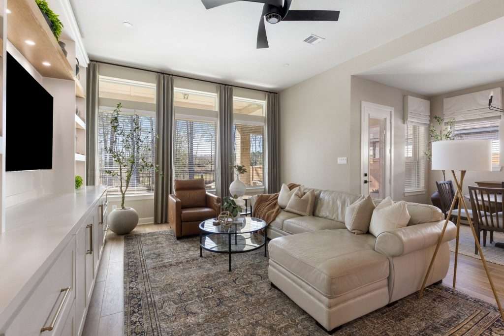
small living room ideas

For decades, we’ve been told the same story: 

More square footage means more comfort. More room to stretch out. More room to entertain. More room to grow.

But bigger doesn’t automatically mean better, sugar, and it definitely doesn’t guarantee a home that feels peaceful, functional, or joyful to live in.

A house can be 3,500 square feet and still feel cramped if the layout fights you. It can feel chaotic if every space demands attention. It can even feel lonely if the space doesn’t support the way your family actually lives.

I know the myth that size equals comfort is powerful. And I’m here to tell you that it’s also incomplete.

You see, hun, square footage is a number. Comfort, on the other hand, is an experience that comes from:

  • Natural light that lifts your mood
  • A layout that makes daily routines easy
  • Rooms that feel connected, not chopped up
  • Furniture that fits without overwhelming
  • Storage that keeps clutter out of sight

You could have thousands of square feet and still feel “squeezed in” if hallways eat up space, ceilings are too low, and sightlines stop short at every doorway. On the other hand, a well-designed 1,800-square-foot home can feel open, airy, and expansive because every inch works together.

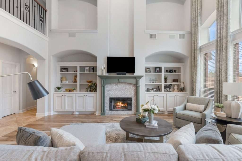
Spaciousness is about flow and breathing room, not square footage alone. Our Amara Court Project is living proof of that.

How Our Brains Judge Spaciousness
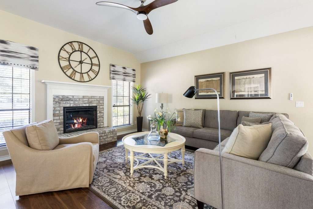
living room furniture

Let me tell you somethin’, sugar:

Square footage is a measurement. Spaciousness is a perception.

Your brain doesn’t walk into a room with a calculator, now, does it? It walks in scanning for cues.

Can I see clearly across the room? Is there light pulling my eyes forward? Do I understand where to move next? Does anything feel crowded or blocked?

Within seconds, your brain has already decided whether a room feels open or tight. And the actual square footage often has very little to do with that decision. 

  • Perception Always Wins Over Measurement

Two spaces can have the exact same square footage and feel completely different. That’s because your brain reads sightlines across the room, the distance between furniture pieces, where windows draw your gaze, how high the ceiling feels, and whether visual clutter interrupts your view.

  • Visual Openness Creates Cognitive Ease

The brain prefers environments that are easy to process. When there’s visual order, balanced light, and clear pathways, the mind relaxes. You don’t have to work to understand the room. That mental ease translates into a feeling of spaciousness.

  • Light, Height, and Proportion Shape What You Feel

Light is one of the strongest signals your brain uses to judge space. Bright, evenly lit rooms tend to feel larger because your eyes can register depth. Ceiling height plays a role here, too. Even subtle vertical emphasis, like taller drapery panels and vertical millwork, is enough to make your standard ceiling feel higher. And when your gaze travels upward, the room feels more generous.

  • Movement Signals Safety and Comfort

If you can move through a space without turning sideways or weaving around obstacles, your body relaxes. That ease sends a signal that an environment is supportive and predictable. Otherwise, all it registers is friction, and friction makes a room feel tighter than it actually is.

My point is: 

Your brain doesn’t care about impressive numbers. It cares about clarity, movement, and visual calm. And when those pieces come together, a house feels spacious in a way that no added square footage can ever manufacture.

When Square Footage Numbers Don’t Tell the Whole Story

living room layout

That bold square footage number on a listing can feel reassuring. I mean, it sounds definitive, measurable, even impressive.

But that number doesn’t always reflect how much space you’ll actually use, enjoy, or move through, sugar.

Two homes with the same square footage can live completely differently. 

One might feel open and effortless; the other might feel tight, awkward, and harder to navigate day to day.

The difference lies in usable space.

  • Why the Numbers Can Be Misleading

Square footage is generally calculated from the exterior walls, not from the space you experience inside. That means the total can include areas that do little to support daily living. When folks focus only on the number, they assume they’re gaining actual livable space when they’re actually gaining volume, transitions, and architectural drama. A larger number can create bigger expectations than the layout can fulfill.

  • Layout Inefficiencies Shrink Real Living Space

A poorly planned layout could quietly consume hundreds of square feet. I’m talking long hallways, unnecessary corridors, and awkward transitions that reduce the space where life actually happens. Rooms may be technically large but shaped in ways that limit furniture placement and block natural flow, and what good is all that extra square footage then?

  • Dead Space and Circulation Waste

Every home needs pathways; they’re part of good design. Problems appear when circulation takes priority over livability. You might see this dead space appearing as transitional zones with no clear function, corners too tight for furniture but too large to ignore, and oversized stair landings and void areas. Sure, these spaces do look impressive on a floor plan, but they don’t support daily routines. And over time, they just become decorative voids or clutter zones, not functional living areas.

Usable space is the portion of your home that supports real life.

It’s where you walk freely, sit comfortably, store belongings, and gather with the people you love. And most importantly, it’s the space that adapts to routines, rather than forcing routines to adapt to it.

Instead of focusing only on square footage, pay attention to how the home functions. ‘Cause at the end of the day, you don’t live in square footage. You live in the spaces that support your life.

If your room feels crowded, no matter how much you edit, the problem might be scale, balance, and visual weight rather than square footage. Design on a Dime helps you refine the layout and styling so rooms feel lighter, calmer, and easier to live in.

Layout and Flow As the Quiet Secrets Behind a Spacious Feel
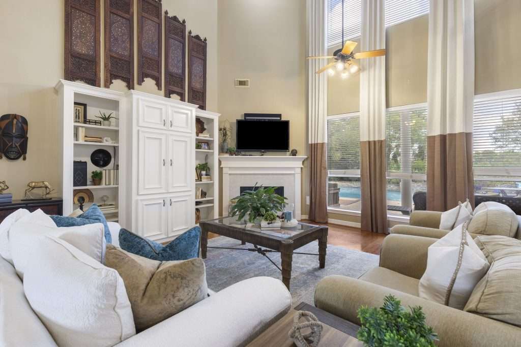
Layout and Flow As the Quiet Secrets Behind a Spacious Feel

Some homes feel generous the moment you walk in. Others feel tight, even when the square footage says otherwise. And the difference, sugar, usually comes down to layout and flow.

When your eyes can travel easily, when rooms connect naturally, and when movement feels easy, a home feels larger than its footprint. When sightlines stop short and pathways fight your routines, the space tends to shrink in your mind.

Good flow is not flashy, hun. It’s felt.

Here’s how to get it right:

  • Sightlines That Let the Eye Travel

Your brain reads distance as spaciousness. The farther your eyes can go without interruptions, the larger the room feels. Clear sightlines allow you to see across the room, into an adjacent space, or toward a window. That uninterrupted view creates depth and breathing room.

  • Open Transitions Create Connection

Rooms don’t have to be fully open to feel connected. What matters is how easily one space flows into the next. Think wide openings, aligned doorways, and consistent flooring; these help you add that visual continuity. When the eye recognizes a shared rhythm between spaces, the home feels unified rather than chopped into compartments.

  • Movement and Circulation Shape Comfort

A spacious home supports movement without friction. When traffic paths cut through seating areas or force you to weave around obstacles, the room feels crowded. When pathways are intuitive and unobstructed, the space feels easy to live in.

  • Reclaiming Hidden Space in the Layout

Many homes contain overlooked areas that quietly limit usable space. Corners sit empty, pathways duplicate one another, furniture floats without purpose; you get the idea. Small layout adjustments, such as turning an unused corner into a reading nook, shifting seating to reveal more floor area, or repositioning furniture to open sightlines, may not add square footage, but they could reveal space that was already there.

  • When Walls Help and When They Hurt

Walls provide privacy and structure, but too many visual barriers could fragment your home. Each partition interrupts light, sightlines, and flow. Strategic openness allows shared spaces to breathe; you get to keep the quiet zones where they matter most. If removing a wall isn’t practical, consider softer transitions; think cased openings, glass panels, or partial partitions that preserve connection while defining zones.

Remember, hun: 

Spaciousness isn’t created by adding square footage. It’s created by allowing your home to flow.

How Furniture and Styling Quietly Control the Size of a Room
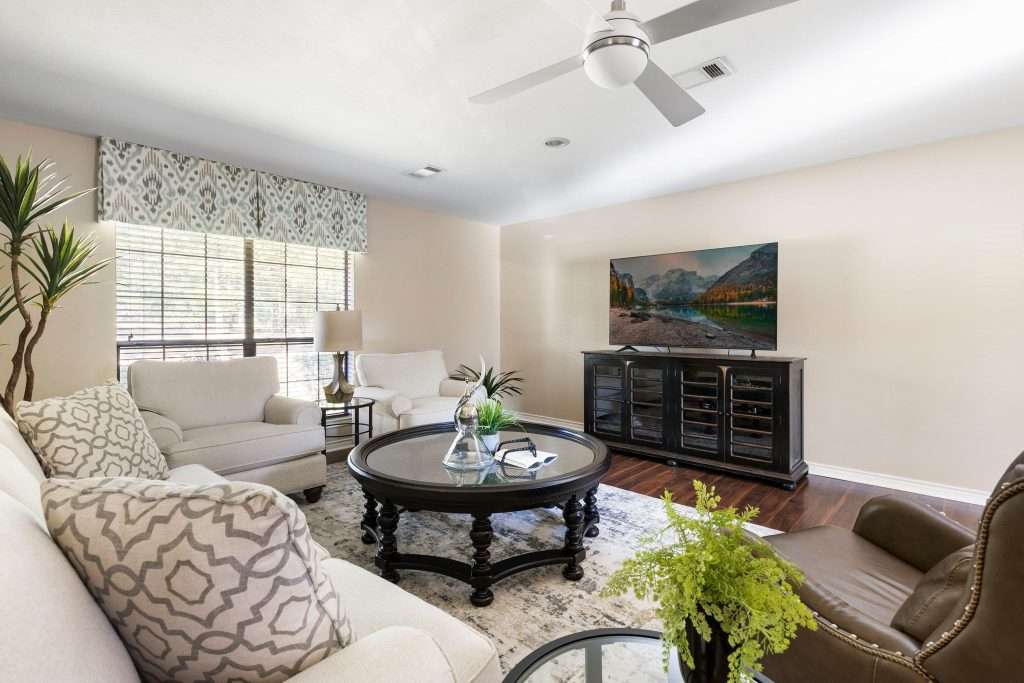
How Furniture and Styling Quietly Control the Size of a Room

Square footage may set the limits of a room, but furniture and styling decide how those limits feel. You can take a generously sized space and make it feel cramped with the wrong pieces. And you could also take a modest room and make it feel open, balanced, and oh-so-breathable.

The difference often comes down to visual weight.

Here’s what I need you to keep in mind:

  • Scale and Proportion Set the Tone

Every piece of furniture carries visual weight. Some pieces feel all light and airy; others feel dense and grounding. When furniture is oversized for the space, the walls seem to inch closer. Pathways narrow, corners disappear, and even if the measurements say that a room is spacious, it no longer feels that way. Remember, when you can see more floor, your brain registers more space.

  • Visual Clutter Shrinks a Room Fast

Clutter isn’t just about too many things, baby. It’s about too many visual interruptions. When every single surface is filled, when patterns compete, and when color changes abruptly from one area to another, your eyes have to work harder. That mental effort makes the space feel smaller. Common culprits include crowded shelves, small décor pieces scattered around, and high-contrast patterns layered without intention. Your brain prefers order and rhythm, simple as that.

  • Breathing Room Is Not Wasted Space

Folks often feel the pressure to fill every corner. Empty space can feel unfinished at first glance. In reality, negative space is what gives a room its sense of calm. Think clear walkways, visual pauses between furniture, open wall areas that prevent crowding, and spacing around all your focal points. That is when the layout feels intentional instead of squeezed. The room doesn’t need to be packed to feel complete, hun. It just needs balance.

If a space feels smaller than it should, take a close look at what’s inside it, darling. Often, the solution isn’t more square footage. It’s lighter visual weight, proportion, and the confidence to leave space where space is needed.

When a room can breathe, it expands in the mind. And honey, once it feels open in the mind, it feels open everywhere.

Color Choices That Make Your Home Feel Larger
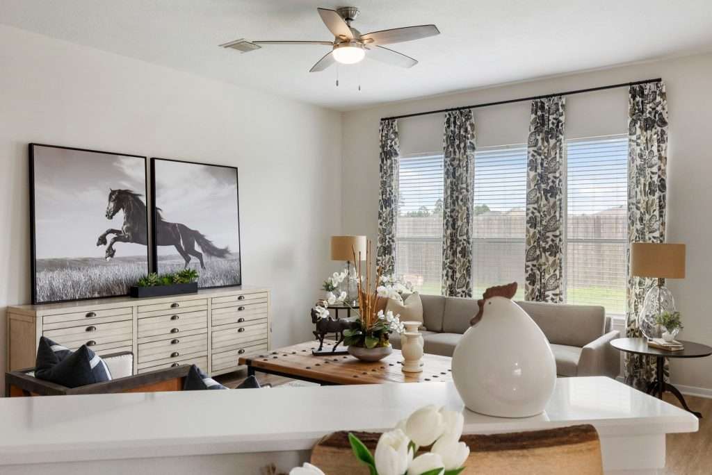
Color Choices That Make Your Home Feel Larger

Color is one of the most powerful ways to expand the space without moving a single wall. The right palette can stretch sightlines, soften any boundaries, and create a sense of calm continuity that makes rooms feel open and welcoming.

When color flows thoughtfully, the eye moves easily from one surface to the next, and that ease translates into a feeling of spaciousness.

Cohesive Palettes Create Flow

Homes feel larger when rooms relate to each other visually. Yes, honey, it’s that simple: 

A cohesive palette prevents abrupt visual stops that make spaces feel chopped up.

Of course, that doesn’t mean every room must be identical. It simply means they should feel connected.

A flowing palette might include:

  • Soft whites and warm neutrals that carry throughout the home
  • Repeating undertones, such as warm taupe, soft greige, or gentle sand
  • Accent colors that echo from room to room in small doses

When the eye moves smoothly from the entry to the living area and beyond, the entire home reads as one continuous environment.

Light Tones Amplify Brightness

Lighter colors reflect more light, which helps rooms feel brighter and more open. That’s particularly helpful in smaller homes and rooms with limited natural light.

I’m talkin’ soft neutrals, pale warm whites, and gentle gray-beige tones. They can:

  • Bounce daylight deeper into the room
  • Soften shadows that make corners feel tight
  • Create a serene backdrop that reduces visual pressure

Ceilings painted a soft white or a slightly lighter tone than the walls can make them feel higher. When your walls and trim stay in the same tonal family, visual boundaries soften and the room feels wider.

And no, bright doesn’t have to mean stark. Warm, light hues keep your space inviting while still improving openness.

Contrast Works Best When It Is Intentional

Contrast adds depth and dimension, but too much contrast can visually fragment a room.

So, instead of jumping into sharp color breaks, try to use contrast more strategically:

  • Anchor a room with a slightly deeper tone on lower furniture pieces.
  • Use darker accents sparingly to ground the space.
  • Repeat accent colors to create rhythm rather than visual noise.

A deep navy pillow, a warm wood tone, or a charcoal lamp base can all add richness without shrinking the room. Here’s how I would summarize it: 

Think of contrast as punctuation, not a paragraph.

Design on a Dime guides you toward palettes and finishes that create continuity, brightness, and a sense of effortless spaciousness.

Storage and Renovation Moves That Help Your Home Breathe
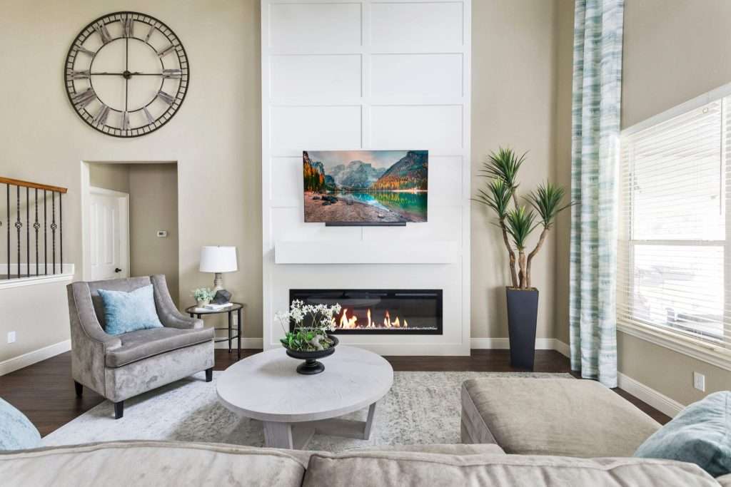
Storage and Renovation Moves That Help Your Home Breathe

Something happens to your home the minute you run out of storage: 

It stops feeling cozy and starts feeling like a lost-and-found office. When that happens, your first instinct is to wish for more square footage, right? 

But in reality, the biggest shift often comes from using the space you already have more intentionally.

Let’s look at the changes that reclaim space without expanding your footprint:

  • Built-ins That Turn Walls Into Hardworking Assets

Freestanding furniture eats up floor space and interrupts visual flow. Built-ins do the opposite. They turn the vertical surfaces into storage while keeping the space open and calm. Think floor-to-ceiling shelving, window seat storage, and recessed niches; they make use of areas that often sit idle.

  • Multifunction Zones That Make Every Square Foot Count

Rooms that serve a single purpose can leave valuable space unused, sugar. When areas support multiple activities, the home works harder without feeling crowded. Think in terms of zones instead of rooms, though. A dining table can double as a workspace, a guest room can serve as a reading retreat, and a living area can include a small desk tucked into a corner.

  • Removing Barriers to Open Up Movement and Light

Sometimes, the greatest sense of space comes from subtractions, not additions. Non-load-bearing walls, awkward partitions, and unnecessary visual barriers can interrupt the flow of light and restrict movement. And when you remove them, you change how the home feels. 

A home doesn’t need more square footage to feel more spacious. It needs good storage, flexible function, and clear visual flow.

When walls work harder, rooms serve multiple purposes, and barriers are removed, your house begins to feel lighter, calmer, and easier to live in. And that, honey, is the kind of spaciousness you feel every single day.

When storage works,  your house finally exhales. Design on a Dime specializes in built-ins, space-saving solutions, and layout improvements that help every inch serve a purpose without sacrificing beauty.

Why Price per Square Foot Can Lead You the Wrong Way
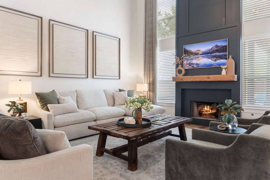
Why Price per Square Foot Can Lead You the Wrong Way

I know that number feels comforting.

Price per square foot looks neat. It feels objective and gives you something to compare when listings start to blur together.

But sweetheart, that tidy little formula leaves out half the story. It ignores the layout, the condition, and how the house actually lives. 

And when you lean too hard on it, you can miss the home that truly fits you.

The Cost Illusion Behind That Tidy Number

Price per square foot treats every inch of a home as equal. In real life, it simply is not. 

That number doesn’t tell you if the roof is nearing the end of its life, if the layout wastes space in hallways, if natural light reaches the back of the home, or if the finishes will need replacing soon. 

I mean, you could have two houses that both cost $200 per square foot, but one may still require $40,000 in updates, while the other is practically move-in ready. Plus, price per square foot ignores how that space is distributed.

How to Get the Full Picture

You need to shift your focus to the elements that shape everyday living.

Start with the floor plan.

Does the layout flow naturally? Are there sightlines that make the space feel open? Is that square footage allocated to usable rooms rather than oversized corridors?

A good layout can make a modest home feel generous, but poor planning? It can make a large home feel tight.

Next, pay attention to light and evaluate the existing systems and efficiency, ‘cause you know heating and cooling account for a large portion of energy use. 

You should check the structural elements and maintenance history, too; think roof age, plumbing condition, electrical updates, and foundation integrity. 

These aren’t too glamorous, sure, but they matter.

I guess what I’m trying to say is, price per square foot can be the starting point, but it shouldn’t be the final decision maker.

Homes aren’t spreadsheets, darlin’. They are environments where you wake up, cook dinner, host friends, and build memories. You need to see a house as a whole. That’s how you make a decision that feels wise long after the paperwork is signed.

A home feels its best when it supports how you truly live day to day. Design on a Dime works with you to shape spaces around real routines, creating rooms that feel comfortable, functional, and welcoming.

Frequently Asked Questions

Does ceiling height matter more than square footage?

Yes and no. Higher ceilings can make a room feel more open and airy, but comfort comes from proportion, light, and layout all working together.

Can a small home feel luxurious?

Yes, it can. Quality materials, thoughtful lighting, custom storage, and intentional styling tend to feel more luxurious than having all that extra space that remains unused.

What is the ideal square footage per person?

There’s no universal number. Comfort mainly depends on your lifestyle, storage needs, and how efficiently the space is planned, not some exact square-footage-per-person recommendations.

Is an open concept always better?

No, it’s not always better. Sure, open layouts suit social living, but defined zones can feel cozier and more functional for day-to-day life. It all depends on your routines.

Will adding more windows always improve spaciousness?

More natural light always helps, but placement matters, as well. Well-positioned windows that frame views and distribute light evenly make the biggest impact when it comes to spaciousness.

A Home That Finally Fits the Way You Live

At some point, bigger stops feeling better, darling, and just starts feeling like more to manage. A home that supports your routines, welcomes you, and lets every room breathe will always be a better option than one that simply adds square footage for the sake of it. 

Your house doesn’t need to be bigger, hun. It just needs to be better. When the flow feels natural, and your surroundings feel calm, everyday life gets lighter.

If your home feels tighter than it should, thoughtful design can uncover space you didn’t know you had. 

Design on a Dime can help you create spaces that feel open, functional, and beautifully balanced. If you’re ready for a home that truly fits your life, get in touch with our team today.

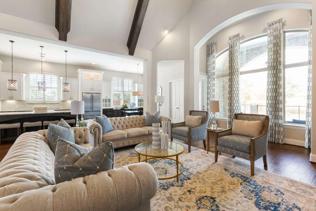
What Designers Notice Immediately When They Walk Into a Room

Have you ever wondered what designers notice immediately when they walk into a room

Well, honey, it has very little to do with throw pillows and everything to do with how your space feels at first glance. Before a single word is spoken, the room is already telling its story. You can sense whether it feels calm or chaotic, generous or tight, welcoming or a little “off.”

Interior designers are trained to read those signals fast, usually without consciously trying. It’s part instinct, part experience, and part knowing how people actually live in their homes. 

In a split second, those first impressions reveal what’s supporting daily life and what’s quietly getting in the way. And once you know what designers see first, you’ll start noticing it, too.

The Room’s Dimensions and Architectural Bones

traditional living room in Texas

Before you buy a single pillow, your room’s size, shape, and bones quietly decide what’ll actually work and what’ll look like a hot mess, no matter how pretty it seemed online.

One of the first things designers clock is how easily people can move through the space. Clear walking paths matter more than most folks realize, sugar, ‘cause when there’s not enough breathing room between furniture pieces, the whole room starts to feel tense. 

You want people moving naturally, without sidestepping chairs or squeezing past corners. That’s good flow in a nutshell.

I also look at how furniture fits the room’s scale. 

Oversized sofas tend to swallow a small living room, while undersized pieces can make a generous space feel oddly empty. 

Rugs tell a story, too. When they’re too small, everything “floats.” When they’re sized correctly, they quietly pull the whole room together and make it feel grounded.

Windows and ceiling height are part of the room’s bones, as well. Low ceilings, narrow windows, and odd angles aren’t flaws, but they do influence how your space should be arranged. I read these details quickly because they shape every decision that follows.

Good bones make everything else a lot easier. Our Jennifer Heights Project is proof of that. But when the proportions don’t work? No amount of styling can fully hide it.

So, if your room feels tricky no matter how many times you rearrange it, it’s usually not you. It’s the bones asking for a smarter plan. Design on a Dime can help you figure it out.

Natural Light and How It Moves Through the Room

brignt open space living room tips

Natural light is one of those things designers notice instantly, whether the space is flooded with it or quietly starved for it. Before I even look at your furniture and finishes, I’m watching how sunlight enters the space, how far it travels, and how it changes from morning to afternoon.

You see, window size and placement matter more than most people think. 

Bigger windows bring in more light, yes, but it’s also about where that light lands: 

A bright window that stops short of the seating area could leave the space feeling “uneven,” while light that reaches deep into the space makes everything feel more open and welcoming.

Orientation plays a role, too. North-facing light tends to stay soft and consistent, while south-facing rooms may shift dramatically throughout the day. Designers clock those changes right away because they tend to affect wall colors, fabric choices, and even how comfortable a room feels at different hours.

Oh, and let’s not forget shadows. They’re part of this conversation, as well. Harsh glare, deep corners, and heavy contrasts can make a room feel “jumpy.” On the flip side, balanced daylight creates a natural rhythm that simply makes your space better, both in real life and in listing photos.

Good natural light doesn’t just brighten a room. It shapes mood, highlights what works, and quietly reveals what needs help. When the light is right, everything else has a better chance to shine.

How Your Space Is Really Being Used

living room design

When I walk into your space, I’m stalking your daily routines and little rituals first, ‘cause your morning coffee shuffle and late-night Netflix flop tell me exactly what this room needs to do for you.

I’m not just lookin’ at furniture. I’m reading habits. That half-empty coffee mug on the side table, that throw blanket that never quite gets folded, and the shoes parked by the door. 

You get the idea.

One of the first things I notice is whether the room’s setup actually matches real life

A living room that’s clearly styled for company but used mostly for movie nights will always feel a little “off.” The same goes for dining rooms that double as homework stations and guest rooms that are pulling office duty, too. 

When function and reality don’t line up, the room starts working against you instead of with you.

I read how you truly live, not how you wish you lived, and where daily activities naturally land. Mail piles up where there’s no drop zone. Bags land on chairs when there’s no nearby storage. These patterns show up immediately, and they point to gaps in the layout rather than personal shortcomings.

And don’t you worry, sugar, I look at these clues with kindness. Most people don’t have hours to reset their homes every day, and they shouldn’t need to. The goal is to shape the room around your real routines, not an idealized version of them.

Traffic Flow and How Furniture Shapes the Space

open space livng room

The moment a designer steps into a room, we’re already moving through it in our minds. We notice where you enter, where your body naturally wants to go, and where the furniture tells you to stop short. 

Trust me, if a room feels awkward, nine times out of ten, it’s ‘cause the flow is fighting the layout.

Furniture is what creates the traffic flow, whether it’s doing that job well or not. Chairs that block walkways, sofas shoved into corners, and tables floating just a little too far out all interrupt movement. You can feel it right away, hun. 

People hesitate, sidestep, or take the long way around, and the room quietly loses its ease.

Designers also note how furniture defines zones

A living room might need to support conversations, TV watching, and everyday lounging, but those areas should feel intentional, not accidental. When the pieces drift into pathways or overlap too much, the room starts to feel crowded. Yes, even if it isn’t small.

One thing that always surprises people is how often pulling furniture slightly away from the walls improves flow. Floating the key pieces can open up clear paths and make the room feel more balanced. 

And when you’ve got good traffic flow, people can move comfortably without thinking about it. 

Furniture supports movement instead of blocking it, and your space feels calmer and easier to live in from the very first step inside.

If your furniture has you dodging corners and taking the long way around, a thoughtful layout can change everything. Sometimes, it just takes a fresh perspective to unlock that easy, natural movement. And that’s exactly what Design on a Dime brings to the table. 

The Visual Balance of Color and Contrast

marble fireplace

Color is one of the fastest reads in any room. Within seconds of walking in, I can tell whether a space feels calm, busy, heavy, or unfinished. 

And, honey, that reaction almost always comes from color and contrast.

I usually look at the dominant tones first. 

Are the walls, furniture, and flooring all speaking the same language, or are they quietly arguing with each other? 

Clashing undertones are a common culprit. 

A warm beige next to a cool gray can make a room feel unsettled, even if both colors are beautiful on their own.

Contrast matters just as much, darling. Every piece in the room carries visual weight, from a dark sofa to a bright piece of art and a shiny metal table. When everything is bold, the eye gets tired. When everything is pale, the room can feel flat and forgettable. 

Designers notice right away whether there’s a clear place for the eye to land.

Of course, we pay attention to what’s missing, too. A room without a focal point often feels scattered, while a room with too many focal points feels loud. You want to aim for that sweet spot; a calm foundation with a few intentional moments of contrast.

When color is balanced, the room feels settled and confident. Nothing has to shout. 

Your favorite pieces stand out naturally, and the space feels welcoming instead of overwhelming.

If your room feels a little loud or oddly flat, color is often the quiet culprit. A balanced palette doesn’t mean boring, though. Design on a Dime will help you choose something that lets your favorite pieces shine.

Clutter, Storage Gaps, and Missed Opportunities

storage organisation living room

Look, honey, I’m gonna notice the clutter the second I walk in. Not ‘cause I’m judging, but because clutter blocks a room from doing its job. 

You know that hallway chair where all your mail, backpacks, and three mystery chargers go to die, or that one closet that won’t close all the way? 

Yeah, most people have one of those.

The good news is, all that chaos is basically a giant neon sign pointing to one thing: 

Your space is asking for better support.

What I’m really seeing there are storage gaps. When everyday items don’t have a clear home, they’ll land wherever they can. Over time, those piles become part of the room’s landscape, making it feel smaller and more stressful than it needs to be.

I’d say unused vertical space is one of the biggest missed opportunities. I see it all the time: 

Walls that could handle shelving, tall cabinets, or hooks are often left bare, and floors end up carrying the burden. 

Designers clock this instantly ‘cause it’s the fastest way to reclaim space without changing the footprint.

Of course, furniture gets a closer look, too. Pieces that only serve one purpose usually take up more room than they deserve, hun. That’s why I’m all for storage ottomans, beds with drawers, and coffee tables with hidden compartments. They solve multiple problems at once.

Trust me, when clutter is addressed at the source, rooms open up. 

Material Quality and Finish Consistency

Material Quality and Finish Consistency

When you walk into any space, your eyes instantly judge the craftsmanship, even if you don’t know you’re doing it. 

My point? 

Those joints, seams, and edges need to look tight and intentional, because anything wobbly or loose feels more like a rushed weekend project. And that’s not the vibe you should be going for, baby.

Let me tell you, material quality shows up fast

Real wood just feels different than pressed board. Well-built drawers glide rather than stickin’. Upholstered pieces sit firm and supportive instead of sinking at the corners. All these details matter because they affect how a room looks, how it functions, and how it holds up over time.

Of course, finish consistency is just as important. Designers notice right away when a space has too many competing surfaces. 

A little brass here, a little chrome there, and suddenly, the room feels unsettled instead of layered.

Don’t get me wrong, mixed metals can work, but only when they’re repeated with intention

We’ll also read how finishes interact with light and textures. Glossy surfaces reflect energy, matte finishes calm things down, and wood tones add warmth. When all those elements feel connected, the space looks polished without trying too hard.

When the quality is there, and the finishes are cohesive, the space looks more expensive, custom, oh, and yes, totally “you.” 

Nothing looks accidental. The room simply shows it was designed with care.

Knowing where to invest and where to save can make a space feel improved without blowing your budget. Design on a Dime can help you choose materials and finishes that play well together.

Design Challenges and Creative Opportunities

Design Challenges and Creative Opportunities

I know that designing dreamy spaces sounds glamorous, but behind all the pretty pillows and perfect paint colors, there is a whole circus of challenges that you rarely see under the spotlight. But this is something a

designer can’t ignore. 

Within a few seconds of walking into a room, we know whether everything is working together or quietly competing for attention. 

You see, honey, this isn’t about perfection. It’s about harmony.

A cohesive space feels settled. 

The furniture relates to itself. The colors support each other. The finishes, lighting, and layouts all feel like they belong in the same conversation. Nothing is trying too hard, and nothing feels forgotten. Even simple spaces can feel complete when these pieces are aligned.

A fragmented room? Well, let’s just say it tells a different story

Styles clash instead of layering. New pieces fight older ones. Your eye doesn’t know where to rest. 

It doesn’t matter if every item is lovely on its own. That’s still gonna happen when the room has been built one purchase at a time, without a clear plan.

Now, for the good news: 

That cohesion rarely requires you to start over. More often than not, it comes from editing, repeating a few key elements, and making intentional choices. 

When a room finally feels pulled together, you feel it in your body, hun. You relax. And that’s the goal every time.

Frequently Asked Questions

Do designers notice personal collections like books, art, or memorabilia right away?

Yes, we notice, but not in a judgmental way. We’ll look at whether collections feel curated or scattered and whether they’re helping tell a story or just adding visual noise. We might need to edit, group, and spotlight your collections, though, so they feel intentional, not cluttered.

What do designers think when they see visible TVs, cords, and tech clutter?

We’ll see missed potential, but we’ll also see opportunity. Exposed wires and oversized screens signal that your layout and focal points could be better supported with smarter placement. We’re thinking about hiding the wires, framing the TV, balancing speakers, and letting architecture, art, and light lead again.

First off, designers don’t judge you for pets. They notice whether the space accounts for them thoughtfully with durable materials, discreet storage, and layouts that reduce mess and wear.

What do designers notice about safety when they enter a room?

When it comes to safety, they usually scan the space for tripping hazards, unstable furniture, poor lighting, and sharp corners that disrupt comfort and ease of movement. Our goal is to ensure you can move safely, protect kids and pets, and avoid potential accidents.

Can a room still feel “off” even if everything is new?

Yes, it can. New pieces without a clear plan can still feel disjointed when scale, style, or finishes don’t work together. Of course, you don’t want everything to match, either, but you do need cohesion.

Seeing Your Space a Little Differently Now

So, honey, now you’re seeing your space with designer eyes, not only “Does this couch spark joy?” vibes, and you may be realizing that your home has been giving you signals all along. Not in a dramatic way, but in small, everyday moments when something feels slightly off or surprisingly easy. 

That awareness is powerful, ‘cause once you notice it, you can’t unsee it. 

If you’re feeling inspired but unsure where to start, that’s completely normal. Sometimes, it helps to pause, take a few photos, and look at your space with fresh eyes.

That’s where Design on a Dime comes in. We’ll help you make sense of what your space is already telling you and turn that into practical, approachable design decisions.

If you’re ready for guidance that feels supportive instead of overwhelming, contact our team today.

Design Fatigue Is Real: Why Some Homes Feel Draining

Are you wondering why some homes feel draining?

Well, for one, you’re not imagining it, and it’s not just about you being tired.

Some spaces quietly wear you down the moment you walk through the door, even if they look fine on the surface. 

When your home asks your brain to process too much at once, your nervous system never gets a chance to settle. Instead of feeling like a place to land, it starts feelin’ like another thing you have to manage. 

If you’ve ever wondered why you feel tense, unfocused, or exhausted at home for no clear reason, there’s usually a design story underneath it. The good news? 

With a few smart tweaks, you can turn energy-sucking chaos into calm. Stick around to learn how!

What Design Fatigue Really Is (and Why It Matters)

What Design Fatigue Really Is

Design fatigue happens when your home asks too much of your brain and your senses, day after day. 

It’s not about bad taste or messy habits, though. It’s about sensory overload

Too many colors competing for attention, too many patterns talking at once, too many things needing to be noticed. Your eyes never get to rest, and neither does your mind.

Over time, that constant stimulation turns into quiet exhaustion, sugar. You might feel on edge, unfocused, or oddly irritated at home, without realizing why. That’s your nervous system trying to cope with the space that never lets it settle.

Chronic stress is linked to a higher risk of anxiety and depression, so that messy coffee table is not just “a phase,” babe.

There’s also a “thinking side” to design fatigue. 

When every corner of your house presents choices, your brain stays in decision mode. You’re stuck in that what to move, what to store, what to fix loop. Even small, repeated decisions add up. So, by the end of the day, the space feels less like a refuge and more like another job waiting for you.

That’s why design fatigue matters. Your home doesn’t just hold your stuff. It shapes how rested, clear, and supported you feel every single day.

Even understanding what design fatigue is can feel like a revelation, hun. If your home is asking too much of you every day, Design on a Dime can help you spot those hidden stress points and recommend ways to ease them, so your space actually supports your energy.

How Interior Design Shapes Your Mood and Energy

How Interior Design Shapes Your Mood and Energy

Your home isn’t just something you look at, darling. It’s something your body and brain respond to all day long. 

Every color, surface, and object sends signals, whether you notice them or not. When those signals stack up the wrong way, they end up pulling energy from you instead of giving it back.

But before we talk about “fixes” and changes, it helps to understand what is actually happening behind the scenes here. Once you see how some design choices can affect your nervous system and attention, those drained-at-home feelings stop feeling so mysterious.

Visual Overload and the Mental Weight of Clutter

When a room is full of visual noise, your brain never gets to relax. It keeps scanning, sorting, and reacting, even when you’re trying to sit down and rest. 

That pile of mail, the crowded shelves, the mix of bold patterns and busy contrasts? They’re all asking for attention at the same time, hun.

That’s the thing:

Clutter isn’t neutral. 

Every visible item registers as something unfinished. Your brain treats it like a silent to-do list, whether you agree with it or not. Over time, that constant background processing eats away at focus and patience

You may even notice yourself feeling snappy, distracted, or oddly restless in spaces that are meant to feel comfortable.

Strong contrasts and layered patterns add to the strain. They keep your eyes moving and your mind alert, which is great in short bursts, sure, but it gets pretty exhausting if it never stops. Instead of feeling settled, your body stays slightly on edge, like it’s waiting for the next thing to deal with.

That’s how visual overload turns into mental exhaustion. Not all at once, but steadily.

When people say their home feels draining, that’s often the reason. 

Their space is asking too much of their brain, and it never clocks out.

Layout, Movement, and the Hidden Energy Cost of Your Floor Plan

Layout, Movement, and the Hidden Energy Cost of Your Floor Plan

Your eyes are not the only thing working hard at home. Your body is putting in hours, too. Every time you squeeze past the furniture, zigzag around piles, or walk the long way just to grab something simple, your energy quietly leaks away.

When your layout fights you, your body notices before your mind does. Tight walkways, awkward furniture placement, and blocked paths force you to slow down, adjust, and stay alert. 

And trust me, that constant low-level effort adds up. It’s no wonder you feel worn out by the end of the day.

What I’m sayin’ is, flow matters more than most folks realize. Our Renee Project is proof of that. Spaces that are easy to move through help your nervous system relax. But spaces that require dodging, stopping, and rerouting? 

They keep your body in problem-solving mode. 

And even small frustrations, repeated all day long, take a toll.

At first glance, that open, breezy layout can feel like a design dream, but give it a few months, and it starts acting like a stage-five energy vampire. Yeah, you read that right. 

Without clear zones, your brain never fully settles.

As you agonize over where to put furniture, how to divide up zones, and whether the space actually works, that endless indecision about the layout drains your mental energy.

Poor layout choices keep piling on. I’m talkin’ bedrooms placed near busy areas and dark spaces with little to no natural light that confuse your internal clock. It all adds up, honey.

That’s why layout is never just about style and square footage. It shapes how your body moves, rests, and recovers inside your home. 

Lighting, Color, and the Science of Feeling Rested

If you ever feel wired at night but dragging all day, lighting is usually part of the story. 

You see, honey, your body runs on an internal clock, and light is what sets it. When the home sends mixed signals, your energy pays the price.

Bright, cool light tells your brain it’s time to be alert. That’s great in the morning and in spaces where focus matters. The problem starts when that same light sticks around too long. 

Evening exposure to harsh or blue-leaning lights can delay melatonin, making it harder to wind down even when your body is tired. 

You end up feeling exhausted, but not quite able to relax.

When it follows a natural rhythm, you’ll know you’ve got a well-lit home. Think brighter, cooler light during the day and softer, warmer light in the evening. 

Color plays a similar role, just a little quieter. 

Think of it as background music for your nervous system. 

Blues and greens tend to lower heart rate and reduce visual fatigue, which is why they feel so soothing in bedrooms and living spaces. Too much bold or high-energy color, especially on larger surfaces, can keep your brain alert when it should be resting.

I wouldn’t say that warm colors are the enemy, but they work best in small doses. A touch of warmth can add life and comfort without overwhelming the room. 

Remember:

This isn’t about perfect bulbs or trendy paint shades. It’s about creating an environment that supports your natural rhythm, so rest no longer feels like a fight at the end of the day.

Texture, Sound, and the Sensory Details That Set the Tone

Now, this is the layer of design people feel before they ever put words to it. Your senses run the show, and when they’re overloaded, you’re wiped out by breakfast.

What I’m sayin’ is, texture, sound, and scent all shape how safe and settled a space feels, often more than color and furniture ever could.

Uncontrolled noise and echoey rooms drain you fast. When sound bounces around with nowhere to land, your nervous system stays tuned in, waiting. The solution? 

Soft surfaces that can absorb that noise and signal “calm.” 

Think rugs underfoot, upholstered pieces, and natural fabrics, such as linen or cotton; these tell your body it can finally ease up.

Texture works the same way. Smooth, cold surfaces everywhere can feel stark and tiring over time. Mixing in warmer, tactile materials brings balance and comfort. It gives your senses something grounding instead of stimulating.

Scent plays a role here, too. I mean, who needs strong or lingering odors when they’re trying to rest? You need clean air and subtle, familiar scents, hun, not mystery smells.

When these sensory layers are balanced, your home stops demanding attention and starts offering relief. It becomes a place where your body can finally exhale.

Your home speaks to your brain and body in ways you might not even notice. Working with a design team that understands the science behind lighting, layout, and sensory flow can help your spaces send the right signals.

Signs Your Home Is Wearing You Down

Signs Your Home Is Wearing You Down

You don’t need a design degree to spot design fatigue, hun. Most of the time, your body figures it out first. The clues show up everywhere; in how you move, how you feel, and how much patience you have left by the end of the day.

Before you buy one more pillow or mood lamp, let’s hit pause and actually look at what your home’s telling you.

Here are some common signs your home may be draining you:

  • You avoid certain rooms.

If there are spaces you only enter when you have to, pay attention. Avoidance is often a response to discomfort, not laziness. The space may feel tense, chaotic, or simply unwelcoming, even if you can’t quite explain why.

  • You feel anxious before you walk through the door.

Your home should lower your shoulders, not raise them. If you feel a knot in your stomach before you step inside, your space may be overstimulating or unfinished in ways your brain never gets to ignore.

  • You can’t fully relax, even in a beautiful space.

This one confuses a lot of people. The room looks good, but you keep shifting, pacing, or scrolling. That restless feeling usually means your environment is keeping your nervous system alert instead of letting it settle.

  • You feel overwhelmed by small decisions.

If choosing where to put something or what to fix next feels exhausting, your home may be asking you to manage too many details at once. And when everything feels up for debate, the brain never gets a break.

You see, darling, design fatigue doesn’t always shout. More often than not, it whispers through habits and feelings you’ve learned to brush off. Once you can recognize those signs, though, it becomes much easier to understand what your space is asking for next.

If you see your own habits reflected in this list, it’s not you. It’s the space. Design on a Dime can help you pinpoint what’s draining your energy and make adjustments that let your home work with you, not against you.

Small Changes That Make Your Home Feel Restorative, Not Draining

Small Changes That Make Your Home Feel Restorative, Not Draining

Okay, babe, this is where things get hopeful. You don’t need a full-blown renovation or a brand-new look to feel better at home. Most of the time, true relief comes from editing, simplifying, and being more intentional with what stays and how it functions.

Here are a few practical ways to help your space give energy back instead of taking it.

Edit and Curate What You See

Restorative homes leave room for your eyes to rest. 

All I’m saying is, not every surface needs something on it.

Try removing a few items from the shelves, tables, and counters, and sitting with the space for a few days. Negative space isn’t necessarily empty or boring. Instead, think of it as breathing room: 

When fewer things compete for attention, your brain relaxes without you having to think about it.

Shift Your Declutter Mindset

Decluttering isn’t about perfection, honey. It’s about reducing mental load.

Start with what you see every day, ‘cause the truth is, if something has no clear home, it just adds stress. 

Simple storage that hides everyday items can make a huge difference here. Fewer visible decisions mean more mental energy left for actually living your life.

Add Sensory Comfort

Remember, sugar, comfort is multi-sensory

I’m talkin’ soft textures, layered fabrics, and quieter rooms that actually help your body settle.

Rugs, curtains, and upholstered pieces can soften sound and movement. Even small changes, like adding a throw or swapping hard accessories for warmer ones, can change how a space feels and how it impacts your nervous system.

Your home should reflect you, not a scrolling habit.

Choose pieces that tell your story or make you smile, and let trends play a supporting role if they fit. When your space feels personal and familiar, it becomes grounding. And that’s the whole point.

You see, restorative homes aren’t about doing more. They’re about doing less, but on purpose. When your space supports your body and your mind, rest stops feeling like work. 

You just breathe, move, and feel restored.

Even tiny tweaks can make a big difference here, hun. Design on a Dime knows how to edit, declutter, and personalize spaces so that every surface, color, and texture contributes to comfort and restored energy.

Frequently Asked Questions

Is design fatigue the same as decor fatigue?

No, not quite. Decor fatigue is usually boredom with how things look. Design fatigue goes a bit deeper and affects how your space makes you feel and function day to day.

Can a room really affect my mood that much?

Yes, it can. Your brain and nervous system respond to your environment all the time. Lighting, layouts, and sensory input can all influence your stress levels, focus, and emotional balance.

What is the first thing I should address if my home feels overwhelming?

If your home feels overwhelming, you should start with what you see the most. Reducing visual clutter in a high-traffic area often brings the most obvious and, not to mention, quickest sense of relief.

Do I need to redesign my whole home to fix design fatigue?

No, you don’t. Small, thoughtful changes often make a bigger impact than a full-blown overhaul, especially when they’re aimed toward reducing daily friction.

How long does it take to feel better after making changes?

It doesn’t take long. In fact, many people will notice a difference almost immediately. Deeper relief tends to build over a few weeks as new habits and rhythms settle in.

Ready for Your Home to Start Giving Energy Back?

So, here’s the deal, babe: 

Your home is either a charging dock or a slow battery drain, and every object, color, and corner is casting a vote in that.

At the end of the day, your home should meet you with ease. When a space does the opposite, that’s not a personal failure. It’s simply a signal that something in the design is working against you.

The good news is that this is fixable.

And no, you don’t need more stuff or a louder style. You need clarity, comfort, and flow that fits your life.

Design on a Dime can guide you through that process with intention and care. Sometimes, a professional perspective is all it takes to make your home feel like a true place of rest again. 

Reach out to Design on a Dime’s team today.

Why Matching Sets Make Rooms Feel Stale & How to Avoid a Showroom Look

Have you ever thought about why matching sets make rooms feel stale? 

It’s weird, isn’t it? It’s something most people feel before they can explain it. 

You walk into the room, everything technically works, yet something feels “off.” The space looks finished, but it doesn’t feel personal, comfortable, or alive. 

That’s ‘cause spaces designed around perfectly matching furniture often miss the subtle details that make a home feel welcoming. All that sameness kills visual rhythm, so your eyes have nowhere fun to land. And instead of telling a story, the room just sits there, all polite and forgettable.

Mix things up a bit, baby, and you’ll see how much more personality and energy your home can release.

Why Exact Matches Often Make Rooms Feel Stale

Here’s a little tough love for your living room: 

That perfectly matching furniture set you purchased in one swoop is stealing your personality, baby. When every piece is the same style, color, and vibe, your room stops feeling like you and starts feeling more like a store display. 

You end up living inside a catalog, not a home. 

What Matching Sets Really Communicate

When every major piece in a room matches perfectly, it sends a very specific message. Sadly, it’s not the one most folks intend.

You see, perfectly matching furniture tends to read as “bought all at once.” Instead of feeling curated and personal, the room takes on a showroom energy

Polished, yes. Memorable, not so much.

This kind of sameness leaves no room for your story. No visual hints of where you’ve been, what you love, how you actually live; all those delicious little details that make the space unforgettable for you. The space feels finished before it ever feels lived in, and it ends up coming across as stiff and impersonal.

Homes that feel inviting usually look like they were built over time, even when they weren’t. That sense of “evolution” is what matching sets quietly erase from your space.

The Issue of Everything Saying the Same Thing

Another issue with exact matches is visual monotony. 

When furniture shares the same shapes, finishes, and tones, your eyes have nowhere to pause, no story to follow, no surprise to enjoy. Nothing stands out as a focal point ‘cause everything is shouting, “Look at me!” in the exact same voice.

And when everything blends together, nothing stands out. Simple as that, honey.

Instead of guiding the eye through the room, the space becomes flat. There’s no rhythm, no movement, no moment that makes you want to look twice. 

That’s when even a lovely piece of furniture will lose its impact.

You don’t need chaos, you just need a little contrast; the visual “seasoning” that makes rooms feel layered, lived-in, and completely yours. And as you’ll see later, it can be as simple as varying silhouettes, mixing up finishes, and introducing one unexpected texture. 

Those small changes give the eye something to engage with, so your space has character, not copy-paste energy.

Why One-Note Materials Fall Flat

While it sounds safe and “designer-y,” a room where everything matches a little too perfectly could actually end up working against you.

When every wood tone, fabric, and finish is cloned, your space stops feeling alive. 

Coordinated? Yes. Custom? Not quite.

Using the same material repeatedly flattens your space. There’s no depth, no layering, and no sense of intention beyond staying “safe.” 

Mixing materials, even subtly, adds warmth and dimension. Think lighter wood paired with a deeper tone and metal finishes that complement instead of mirroring each other.

This kind of contrast acts like seasoning in a good meal. You don’t need a lot, but without it, everything is gonna taste the same.

I know that exact matches often feel like the easy answer, honey, but spaces with character usually come from thoughtful variations. That’s how you go from something that looks nice to something that feels good to be in. And that’s always the end goal.

If your space looks “put together” but doesn’t quite feel like home, that’s usually a sign it needs editing, not replacing. That’s where Design on a Dime’s trained eye can spot what’s missing and help your spaces feel personal again, without starting from scratch. That kind of thoughtful refinement is our sweet spot.

Visual Interest Matters More Than Exact Matching

living room design
Source: Sagrada Studio

When you want a room that actually feels alive, visual rhythm matters more than everything matching like twins at a family reunion. Visual rhythm is the pattern your eye follows, and it keeps the space from feelin’ like a furniture showroom.

But when that rhythm is missing? Even beautiful furniture can feel flat. The room might look finished, but it doesn’t feel complete. And that’s not the vibe we’re going for, baby.

How Visual Rhythm Actually Works

living room tips
Source: Susie Novak Interiors

Visual rhythm is created through repetition and variation working together.

You repeat certain elements, so the room feels connected. That might be a color that shows up in different materials, a curve echoed in several places throughout the room, or a finish that shows up more than once without being everywhere.

You get the idea.

But at the same time, you want to vary scale, texture, and shape so the room doesn’t feel predictable. This balance is what keeps the space interesting without making it feel chaotic.

When that rhythm is done well, the eyes naturally move from one area to the next. The room feels easy to understand and, more importantly, easy to live in, even if you can’t really explain why.

How Contrast Creates Visual Rhythm

How Contrast Creates Visual Rhythm
Source: Kellie Eserts Interiors

Visual rhythm might get your room dancing, but contrast gives it the drama and depth that make folks stop and stare.

Contrast helps your eyes understand what matters and where to go next. Without it? Yeah, you guessed it: 

Everything blends together, and the space starts feelin’ all flat.

Now, contrast shows up in a few key ways.

For one, light and dark help define a room, ‘cause when everything lives in the same value range, nothing actually stands out. 

Then, you’ve got scale. Pairing larger pieces with smaller ones adds balance and prevents the room from feeling heavy or monotonous. Otherwise, your eyes have no reason to linger.

Shape is another quiet hero, honey. Straight lines feel sharper when softened by a curve. Rounded forms stand out more when they’re not surrounded by copies of themselves. You get the idea.

That’s the difference between a room that looks nice and a room that actually feels good to be in.

When contrast and rhythm work together, the space feels curated instead of copied. Not loud. Not chaotic. Just wonderfully composed.

And once you understand that, darlin’, it’s much easier to let go of exact matching and start designing with intention.

Visual rhythm is one of those things you can feel instantly, even if you can’t name it. Creating that sense of ease and flow takes intention, not perfection. Design on a Dime’s team keeps the focus on how your home lives and feels, not just how it looks on paper.

Curating Pieces That Coordinate Without Copying

Furniture stores love a perfect matching set because it’s easy to sell. The problem is that it rarely leads to a room that feels like you. 

You’re more likely to end up with a room that looks like a model home, instead.

Real homes need coordination, not duplication

You want pieces that get along without looking like they showed up wearing the same outfit. That balance is what makes a space feel thoughtful instead of cookie-cutter.

Here’s how designers create cohesion without falling into the matchy trap:

Use a Cohesive Palette, Not Identical Pieces

living room color palette
Source: Ro House Studio

Color is your anchor, honey, not your handcuffs.

Start by choosing a clear color family, then let the shades vary. A room feels richer when it includes light, medium, and deeper tones of the same hue, instead of one exact color repeated everywhere.

The same idea applies to materials: 

Wood doesn’t all need to match. Metals don’t need to be twins. A painted finish can live happily next to a natural grain or a woven texture.

When the palette is consistent but the forms change, the room feels connected and layered instead of flat.

Mix Styles With Intention

Mix Styles With Intention
Source: Susana Goss Studio

Now, sugar, this is where your personality can really show its lovely face.

Combining things from different styles keeps a room from feeling like it came straight off a showroom floor.  A clean-lined sofa, for example, can look even better next to a vintage accent chair, while a modern dining table gains some warmth when paired with softer, more traditional seating.

The key is intention

You’re not throwing random pieces together. You are choosing contrast that feels balanced in scale, color, or material, so the room still feels cohesive. 

If you want to see what that balance looks like in real life, the Laura Project is a perfect example. We went with personal, not polished-to-death.

When done well, mixed styles make a space feel collected over time, even if it was pulled together quickly.

Let Texture Do the Heavy Lifting

living room interior tips

Texture is one of the easiest ways to add depth without touchin’ your color scheme.

Smoother surfaces tend to feel more inviting when paired with something tactile. Think linen against wood grain, leather next to a woven rug, or matte finishes balanced by a touch of sheen.

These layers give your eyes something to explore and make the room feel more comfortable and lived in.

Even small touches matter, sugar: 

Pillows, throws, greenery, and accent pieces can all shift the entire feel of a room without overwhelming it.

And when texture and contrast are working together? The space feels intentional, never repetitive.

Coordinating without copying is an art, darling. Knowing what to keep, what to layer in, and what to swap makes all the difference. Design on a Dime helps you find that kind of clarity and avoid that cookie-cutter vibe.

Frequently Asked Questions

Are matching furniture sets ever the right choice?

Matching furniture sets can work in very limited situations, like temporary spaces or short-term rentals, but most long-term homes benefit from some variation, so the space can grow and adapt over time.

How do I know if my room feels coordinated or just overmatched?

If every major piece shares the same finish, shape, and scale, a room is likely overmatched. Coordinated rooms usually repeat colors and materials, but you won’t catch them repeating the exact pieces.

What is the easiest way to update a room that already has a matching set?

The easiest way to update a room that already has a matching set is to start with the smallest swap. Think replacing a coffee table, nightstand, or lights; that usually makes a bigger impact than changing one larger piece of furniture.

Does mixing furniture styles make a room look messy?

No, it doesn’t, as long as it’s done with intention. A shared color palette, similar scale, or repeated material can keep mixed styles feeling cohesive, instead of chaotic and messy.

How many finishes or materials is too many?

Most rooms feel balanced with three to five finishes. Beyond that, the space might start to feel busy unless everything is carefully edited.

Designing a Home That Feels Like You

Now that you’ve seen how that matchy-matchy set can suck the soul straight out of a room, I know you’re ready to mix things up with confidence. 

Play with contrasts, layer textures, and let those pieces flirt instead of cloning each other. Trust me, a few thoughtful changes can completely shift how a space lives and breathes. 

Your home should feel collected, not copied, and absolutely unapologetic.

And if you would rather not figure it all out alone, Design on a Dime is here to help.

Get in touch whenever you’re ready, baby. I’ll help you turn “kind of cute” into jaw-dropping, stop-the-earth stunning in every room.

The Hidden Cost of Poor Layout Choices in Your Home

The hidden cost of poor layout choices shows up long before a bill ever does, honey. 

When your layout’s a hot mess, you pay for it every single day. It’s in the way your shoulders tense when rooms feel tight, how mornings feel harder than they should, and why your home never quite feels restful, no matter how much you tidy up.

And yes, even buyers can sense when a floor plan feels “off.”

Most folks tend to blame clutter, schedules, or aging finishes, without realizing the layout is doing the real damage. If your home feels harder to live in than it should, there’s a reason. 

Stick with me, and you’ll see how to stop that drain.

How Everyday Layout Decisions Shape Comfort and Stress

How Everyday Layout Decisions Shape Comfort and Stress

Even if you don’t touch a paintbrush or buy a single pillow, the way you arrange your rooms is still quietly cranking your comfort up or down every single day.

Here’s the thing, honey:

When your sofa blocks the walkways, and every corner feels cramped, your brain stays on high alert. You may not consciously think, “The layout is stressing me out,” but the nervous system is already responding. You move more carefully. You tense up. You stay alert in spaces that should feel easy. 

Over time, that daily friction adds up.

Spaces that feel open and breathable? They send a very different signal, honey. 

Your body relaxes. Your breathing slows. You feel safer without knowing exactly why.

Research agrees; there are clear links between cramped or cluttered environments and high stress levels.

And believe it or not, even small design details play a role. Softer shapes and gentler curves are easier on the nervous system than sharp angles, which helps explain why some rooms feel instantly more cozy than others.

I guess my point is: 

Our surroundings do more than hold furniture. They shape how at ease we feel inside our own four walls.

The Ripple Effect on Focus and Productivity

Poor space planning introduces mental fatigue by layering distractions on top of each other. Noise travels where it shouldn’t. Surfaces gather clutter because there’s nowhere else for it to go. You end up spending energy navigating the room instead of focusing on what you’re actually trying to do.

That constant low-level effort slows everything down, and productivity seems to drain away. 

Eventually, your brain just taps out. 

Studies consistently show that people perform better in spaces designed with airflow, light, and movement in mind. 

I mean, even the most motivated person will struggle to stay engaged in a space that feels uncomfortable or chaotic. Let me set the scene for you: 

A small, cluttered desk with cords everywhere and nowhere to even set a cup of coffee. 

Baby, you can’t tell me that’s not pure nightmare fuel.

That’s the hidden cost many people never factor in. A layout that looks fine on paper can quietly chip away at your energy, focus, and peace of mind, day after day.

Remodeling can open up pathways, soften transitions, and make spaces feel calmer without changing the soul of the home. That’s the kind of behind-the-scenes work Design on a Dime focuses on, so that comfort becomes something you feel the moment you walk in.

When Floor Plans Undermine Resale Value and Buyer Appeal

When Floor Plans Undermine Resale Value and Buyer Appeal

When the floor plan has awkward room flow, wasted corners, and “What were they thinking?” layout relics, buyers notice, baby, and not in a good way.

They may love your finishes, but what really drives the offers is how the home feels to walk through. When rooms connect easily and make sense, buyers relax. But when they don’t? 

Hesitation creeps in, and hesitation costs you money.

You might love your quirky hallway or tiny pass-through room, but stats say otherwise, with 70% of buyers now preferring open or partially open layouts that feel easy to move through. 

That demand translates into real money.

In the greater Houston region, where buyers expect the space to work hard for the price, layout issues can quietly push a home out of the “must-see” category. 

Here’s what you can tweak so buyers line up instead of walking out.

Awkward Room Flow

Buyers form opinions fast, often within the first few minutes of stepping inside. Choppy circulation kills that momentum, though.

The last thing you want is to make buyers feel like the house is fighting them.

If visitors have to squeeze past the furniture, backtrack through hallways, or cut through one room just to reach another, the experience feels frustrating. And that frustration often shows up later as lower offers or longer time on market.

Good flow, on the other hand? 

It helps buyers imagine living there. That’s what sells.

Realtors consistently report that homes with functional circulation sell faster and attract stronger interest. So, yes, small changes that improve flow can certainly pay off.

Wasted Space

Dead space is the silent money thief hiding in your floor plan, draining value while buyers walk around the extra-wide hallways, awkward landings, unused nooks, and oversized transitional areas, wondering, “So… what exactly is this area for?

When a room or corner lacks purpose, buyers mentally subtract dollars, not add them.

They’re not calculating square footage in their heads, but they’re asking themselves whether this house is actually worth the price. And space that doesn’t earn its keep? 

It weakens that perception, honey.

Remember that, in real estate, every square foot carries weight. Homes that clearly define how space can be lived in tend to feel larger and more desirable, even when the actual size stays the same.

Outdated Layout Features

An outdated layout is like showing up to a black-tie gala in your high school jeans. Technically acceptable, but absolutely not impressing anyone with a checkbook.

Buyers want flow, privacy, and light, sugar, not a labyrinth that drags them through a bedroom to reach the living room. They want connection where it makes sense and privacy where it matters. When a layout fails at either? 

It limits appeal.

And when that happens, many simply move on to the next listing.

You see, homes with functionally outdated layouts often sell for less than comparable properties with more modern planning, regardless of cosmetic updates. Awkward room sizes, poor bathroom access, and those “incurable” layout flaws lengthen the time on market and crush your ROI, period.

That’s why layout decisions matter, darlin’. 

A solid floor plan does more than support daily life. It protects resale value, strengthens buyer confidence, and keeps your home competitive in a market that increasingly rewards smart use of space.

Common Layout Mistakes That Quietly Drain Time and Money

Common Layout Mistakes That Quietly Drain Time and Money

Before blaming your packed schedule, it helps to look at something closer to home. You see, honey, many everyday frustrations come from layout choices that work against you instead of for you.

These mistakes rarely announce themselves, though. 

They usually show up as lost time, repeat purchases, and small inefficiencies that slowly add up. And over the years, all those little drains can cost far more than folks realize.

So, let’s talk about the most common layout troublemakers you need to side-eye right now.

Ignoring How Your Household Actually Lives

A layout that looks good on paper can fall apart, and fast, if it doesn’t match your actual routines.

When spaces are designed without considering how people move, gather, rest, and work in them, daily life becomes harder than it needs to be. 

You walk farther. You double back. You juggle tasks in spaces that were never meant for them.

This, in turn, might lead to “workarounds” like extra furniture, temporary storage, and constant rearranging. But the trust is, those fixes cost time, money, and energy, all because your layout didn’t start with how your home is truly used.

Overcrowded Paths and Poor Circulation

Blocked walkways and tight transitions? Baby, they quietly slow everything down

When the furniture crowds doorways and traffic paths cut through active areas, even simple tasks will take longer. 

Carrying groceries becomes a shuffle. Hosting guests feels awkward. Cleaning? It takes more effort than it should.

Trust me, I know; I tackled the same issues in the Laura Project.

And again, over time, people try to compensate by buying smaller furniture, rearranging rooms repeatedly, or, worst-case scenario, avoiding certain rooms in their home altogether. None of that is ideal, and it often just leads to replacing items sooner than planned.

Your home becomes a money pit, and that’s the last thing you want.

Not Enough Practical Storage Where You Need It

Clutter is rarely about owning too much. More often, it’s about storage being in the wrong place or missing altogether.

When storage is poorly planned, everyday items end up on counters, chairs, and floors. That visual noise makes your space feel smaller and more stressful. Plus, it steals time as you search for things that should be easy to find.

So, what do most folks end up doing? 

They buy more cabinets, baskets, or furniture that doesn’t quite fit, which creates new problems instead of solving the old ones. 

The real fix is storage that’s built into the layout. Yes, it’s a bit more work initially, but it helps your home function better without constant add-ons.

The thing is, these layout mistakes don’t usually feel dramatic in the moment. They feel manageable, even normal. But over time, they will drain resources and patience. Design on a Dime’s team helps you address and correct them early, making your daily life smoother.

Future-Proofing Your Conroe Home With Smarter Space Strategies

Future-Proofing Your Conroe Home With Smarter Space Strategies

Good planning helps you set a strong foundation. Future-proofing builds on it by preparing your home for other seasons of life that haven’t arrived yet. 

You design for right now, but you prep for teens, guests, or maybe a home business, too. That’s where the real magic happens, sugar.

You see, in a growing area like Conroe, buyers and homeowners alike are looking for spaces that can flex as needs change. What works perfectly right now might feel limiting five or ten years from now. That’s why a home that adapts easily tends to hold value and feel comfortable longer.

Here’s what I have in mind:

  • One of the smartest strategies is designing spaces that serve more than one purpose over time. A flex room could start as a playroom, shift into a homework zone, and later become a guest suite or home office.
  • Planning for remote work is another key consideration. Even if no one works from home right now, many buyers still expect a quiet, well-lit space that could support it. Spaces with lots of light, sound separation, and access to storage are easier to adapt as work habits change.
  • Aging in place also deserves attention here, even earlier than most people think. Wider pathways, fewer tight turns, and the option to convert a room into a bedroom or bath on the main level can all make a home more comfortable in the long run.
  • Indoor and outdoor flexibility matters, too. Think covered patios, large sliding doors, and a clear connection between inside and outside living spaces; they can extend how your home is used and support entertaining, family time, and resale value, all without requiring major changes.

Now, hun, future-proofing isn’t about predicting every change. It’s about creating a layout that can respond to them gracefully. When the space is planned with flexibility in mind, your house remains comfortable and valuable through many chapters of life.

Need help choosing the right layouts? Design on a Dime can help. Let’s chat about your gorgeous future, darling!

How Thoughtful Planning Prevents Costly Layout Compromises

How Thoughtful Planning Prevents Costly Layout Compromises

The easiest way to avoid layout regret? 

Just slow down before anything is purchased or demolished. 

You see, planning creates clarity early, which saves you time, money, and a whole lot of second-guessing later.

A strong layout plan looks at how space actually functions before focusing on finishes or furniture. Flow, storage, sightlines, and natural light are mapped out first, so decisions support daily life instead of fighting it. 

When this groundwork is done well, rooms feel intentional rather than pieced together. And that’s exactly what we’re going for here, hun.

At Design on a Dime Interiors, planning starts with how the home is lived in today and how it may need to work in the future. That big-picture view helps prevent common mistakes like buying furniture that never quite fits, adding storage after the fact, or realizing too late that a room doesn’t support its purpose.

Plus, good planning keeps projects grounded. Fewer surprises mean fewer costly changes along the way.

All I’m sayin’ is, plan your flow before the sofa, darling.

When layout decisions are guided by real habits, future goals, and smart use of space, compromises tend to shrink. What you gain instead is a home that works now and holds its value down the road.

When layout decisions come first, renovations have direction and the finished space feels intentional from day one. Design on a Dime brings a planning-first approach to remodeling, helping you update your home in ways that make sense now and continue to pay off later.

Frequently Asked Questions

If the walls are load-bearing, plumbing is fixed, or ceiling heights limit changes, you’ll know that your layout problems are structural. Many layout frustrations, however, actually come from poor space planning rather than construction limits.

What layout issues are most common in older Conroe homes specifically?

In older Conroe homes, you’ll often fight choppy room flow, tiny closed-off kitchens, awkward hall-to-living changes, low-function bathrooms, undersized closets, plus additions tacked on without planning that strain aging foundations, plumbing, and electrical systems. In most cases, the only solution is a remodel.

How much does a professional layout redesign typically cost for a three-bedroom home?

You’ll typically pay around $15,000 for a three-bedroom home layout redesign, plus $500–$3,000 for 3D renderings and extra revision fees; permits, contractor margins, and location can push total professional design costs significantly higher, though.

How long does a professional layout planning process usually take?

Initial planning typically takes a few weeks, depending on the scope and revisions. That upfront time often saves months of frustration during construction and furnishing, though.

Can smart furniture choices fix a bad layout without changing walls or plumbing?

Yes, smart furniture can fix a bad layout without changing walls and plumbing. You should go with modular pieces that can reconfigure for work, guests, and kids; those awkward corners will turn into MVP zones.

Ready to Rewrite Your Home’s Layout?

A home should support your life, not slow it down or quietly drain your energy. When the layout is working, you feel it in the ease of your routines, the way rooms flow without effort, and how the space adapts as life changes. 

Nothing feels forced. Nothing feels wasted.

If your home has good bones but still feels harder to live in than it should, Design on a Dime can help. 

Ready to explore what a better flow could look like and rethink your space with clarity and care?

Get in touch with our team today and see what your home is capable of becoming!

Why Neutral Rooms Fail and What Gives Them Staying Power

When you think about why neutral rooms fail, most people assume it’s about beige being boring. But in most cases, it’s about good intentions falling flat. 

You see, most people choose neutral colors hoping for calm, comfort, and timeless style, then end up with spaces that feel unfinished or oddly cold. 

I know that disconnect can be frustrating, especially when the room looks fine “on paper.”

The truth is, neutral rooms are quiet by nature. So, every small choice you make carries more weight. And when something is slightly off? 

You feel it right away.

If you’ve ever walked into a neutral space and thought, something’s missing, you’re in the right place, hun. 

The Hidden Psychology Behind “Boring” Neutral Rooms

neutral living room
Source: Paperwhite Interiors

Here’s the not‑so‑boring truth about “boring” neutral rooms: 

They’ll quietly work on your brain, helping you feel calmer, safer, and more grounded, without shouting for attention. And when you surround yourself with soft whites, grays, and beiges, you’re basically giving your nervous system a weighted blanket. 

Plus, neutrals act like total chameleons, letting bolder pieces shine without causing visual drama. Because they reduce sensory overload, your brain doesn’t waste energy sorting through all that chaos; it finally gets to exhale.

That’s also one of the reasons why neutral rooms tend to age better than trend-driven spaces: 

They feel stable even when your schedule doesn’t.

And that simple, quiet backdrop becomes the stage where you can focus, reset, and actually feel at home. Calm space, sharper mind, happier you.

Yet, somehow, neutral rooms get a bad reputation. 

The problem is rarely the colors themselves, though. It’s what happens around them.

Where things usually go wrong is when that quiet foundation is mistaken for “done.”

Neutrals aren’t meant to stand alone, darlin’. Without enough contrast, texture, and intentional lighting, you end up with a space that feels unfinished or flat. At that point, it’s no longer peaceful. 

It’s just underwhelming.

In other words, neutrals don’t fail because they’re boring. They fail because they’re incomplete.

When neutrals are meant to calm and ground you, the right paint choices matter more than most people realize. Design on a Dime’s team ensures that your walls actually support the mood you want, instead of quietly working against it.

How Undertones Shape a Calm, Neutral Palette

bedroom design
Source: The Residency Bureau

Here’s a little truth for you, sweetheart: 

Your “neutral” room isn’t actually neutral at all; it’s loaded with sneaky undertones that can make the space feel calm and cozy or… well, weird and “off.” 

You may not be able to name the issue right away, but honey, your brain can feel it.

You’ve got to learn how to spot if those colors lean warm or cool, because that gentle beige you loved on Pinterest can turn straight-up Band-Aid pink or icy blue on your walls. 

Undertones are especially important because neutrals are often used across large surfaces. Walls, floors, cabinetry, and upholstery all live close together. When their undertones work in harmony, your space feels cohesive and easy to settle into. But when they fight each other? 

That calm vibe disappears.

Understanding Warm and Cool Neutrals Without Overthinking It

Although both warm and cool neutrals look “safe” on the paint chip, their undertones create very different emotional responses once they’re on the actual walls.

Warm neutrals tend to carry soft yellow, cream, or red undertones. They make the spaces feel inviting and grounded, which is why they’re perfect in living rooms, bedrooms, and homes with lots of natural wood.

Cool neutrals lean into blue, green, and gray undertones. They can feel clean and modern, but if overused or paired incorrectly, they may read cold or sterile.

The key isn’t choosing one category over the other. It’s keeping them consistent within a space. 

Warm walls usually want warm flooring and finishes nearby. Cool walls, as you can imagine, call for cooler materials and metals.

Train your eye with a quick check:

  • Compare neutral swatches next to a true white.
  • Notice whether it flashes yellow, pink, blue, or green.
  • Place it beside wood floors, cabinets, or large pieces of furniture.
  • See if it loves brass or chrome more.

And most importantly, ask yourself, “Does this feel cozy or chilly?

Your reaction tells you more than the label on the paint can.

Light Changes Everything With Neutrals

Even the most thoughtful undertone choice can fall apart if lighting is ignored.

Natural light shifts throughout the day, and artificial lighting adds a whole different layer. Morning light can make a neutral feel soft and fresh, while evening light might pull out undertones you never noticed before.

And that, honey, is why testing is non-negotiable.

Paint large samples or create sample boards and move them around the space. Be sure to look at them in the morning, midday, and at night, under the actual bulbs you plan to use. 

When you find one that feels calm in each of these lighting conditions, you’ve found the neutral that’ll age well.

Undertones can be tricky to spot on your own, especially when lighting comes into play. Design on a Dime can guide those choices, make sure your neutral palette feels cohesive from the start, and save you from costly repaints.

The Critical Role of Contrast in Defining Neutral Spaces

The Critical Role of Contrast in Defining Neutral Spaces
Source: Alissa Johnson Interiors

If your neutral room looks a little “meh,” it’s probably starving for contrast, not begging for more beige.

Honey, what you need is that flirty balance of light and dark, like creamy walls with a few inky accents, so your space actually has a heartbeat. Then, you mix in different textures and tones, from knobby pillows to smooth wood and cozy throws, and suddenly, your quiet room starts whispering, “Hey there, I’m fabulous.

You see, contrast isn’t about adding bold color. It’s about variation.

Light against dark. Soft next to solid. Smooth balanced with textured. Without that interplay, neutral spaces can start to blur together and lose their sense of structure.

Finding the Right Balance Between Light and Dark

Trust me, darlin’, contrast is the secret spice that keeps your neutral room from looking like a bowl of plain oatmeal. And yes, your space deserves better.

You use light and dark like salt and pepper. It’s that simple. 

Lighter neutrals help a room feel airy and expansive, especially on walls and large surfaces. Darker tones add weight and warmth, which keeps the space from floating away.

Here’s how you keep that balance working for you:

  • Light walls combined with a deeper sofa add depth without heaviness.
  • A dark rug under lighter furniture grounds the seating area.
  • Darker floors with lighter walls can make ceilings feel higher.
  • One darker accent wall creates definition without closing the room in.
  • Dark doors or trim act as clean outlines that sharpen the entire space.

The goal isn’t drama. It’s clarity. 

When that contrast is handled well, neutral rooms feel intentional and comfortable, and that’s exactly what keeps them from ever feeling bland.

Texture Is the Secret Ingredient That Makes Neutral Rooms Work

Texture Is the Secret Ingredient That Makes Neutral Rooms Work
Source: Sarahliz Lawson Design

Let me tell you, honey: 

When color takes a step back, texture has to step forward.

Think of texture as the element that gives your eyes something to explore. It brings dimension without adding noise. It’s the secret sauce that saves a neutral room from looking like a waiting room. Without it, even the most beautiful palette can feel flat or unfinished.

Mixing Textures and Tones

You’ve got your light and dark working like a charm, but without texture and tone, your neutral room still risks looking like a beige pancake, hun. 

Start with a calm base of whites, beiges, or soft grays. From there, the goal is to bring in contrast through materials, not color. 

You want to layer at least three textures, so you have a variety of surfaces that behave differently in the light and to the touch.

  • Soft textures like linen, wool, and velvet bring warmth and comfort.
  • Natural textures such as wood grain, rattan, and jute add character and grounding.
  • Smoother finishes like metal, glass, and stone create balance and keep the room from feeling too heavy.

Intentionally combining smooth, rough, soft, and hard surfaces creates a textural contrast that gives even the simplest neutral palette depth and interest. Plus, adding soft textures like plush pillows and throws can significantly increase the cozy factor by inviting tactile exploration.

What matters is variety: 

When everything is smooth, the space feels cold. When everything is soft, it can feel dull. 

Layering Texture to Turn a Flat Room Into an Inviting One

Now, sugar, texture layering is where neutral rooms really come to life.

Instead of relying on one statement piece, you build that interest gradually. Soft meets structured. Organic meets refined. Each layer adds depth without overwhelming the space.

Here are a few simple strategies that go a long way:

  • Anchor the room with a textured rug, such as jute or wool.
  • Layer pillows in different fabrics on a neutral sofa.
  • Drape a knit or woven throw over a smooth chair.
  • Bring in baskets, ceramics, or woven shades for subtle variation.
  • Use one textured wall treatment, like grasscloth or brick, to create a focal point.

The goal isn’t clutter, sugar. It’s comfort and balance.

Easy Neutral Room Fixes That Make an Immediate Difference

interior design living room ideas
Source: Clare Kennedy Interiors

Light and shadow can work all kinds of magic, but if the bones of your neutral room are wrong, no amount of perfect lighting will save it from looking tired. 

The good news is that you don’t need to start over to make your neutral room feel better. In most cases, a few thoughtful adjustments can completely change how your space feels without repainting every wall and replacing major furniture.

These are the kinds of fixes you should reach for when a room needs life, not a full makeover:

  • Add One Patterned Element to Wake the Room Up

If everything in the room is solid and smooth, the space can start to feel “sleepy.” One well-chosen pattern gives your eyes something to engage with. This doesn’t mean loud or busy. A subtle stripe, a soft geometric, a layered rug, a pair of accent pillows, or a piece of artwork with movement. One pattern is often enough to shift the entire energy of the space.

  • Bring in Something Sculptural or Curved

Neutral rooms often lean heavily on clean lines. When everything is straight and boxy, your space can feel stiff. So, you want to introduce one element with shape. A rounded chair, a curved mirror, a sculptural lamp, or even a soft arched silhouette in art can make a space feel more relaxed and welcoming, all without adding color.

  • Use Dark or Metallic Accents as Visual Punctuation

A neutral room may benefit from a few deeper notes to ground it. Think black picture frames, aged brass hardware, bronze lighting, or darker wood accessories; these elements help define a space. They’re a bit like punctuation marks. They give the space structure, without overpowering the calm palette.

  • Layer in Greenery or Organic Elements

Plants are one of the fastest ways to soften a neutral space. They introduce color, texture, and life all at once. If live plants feel intimidating, high-quality faux options can still add visual warmth. You can also bring in organic elements, such as branches, stone bowls, or ceramic pieces with natural variation. These touches break up uniform finishes and make the room feel more lived in.

  • Swap One Flat Surface for Something Textured

You don’t need texture everywhere. One intentional change is enough to make a big impact. Think woven lampshades instead of smooth ones, or a chunky throw over a sleek sofa. Add in a textured basket, a woven bench, or a tactile wall piece, and you’ll take the room from feeling bare to feeling complete.

Trust me, all you need are small, high-impact changes.

Sometimes the biggest transformation comes from updating just one surface. Professionally painted walls, a trim refresh, or finish upgrade can instantly upgrade the entire room without a full redesign. Design on a Dime’s team can make it happen.

Designing Neutral Rooms That Evolve With Your Home

Curious how to keep your neutral rooms from feeling stuck in time while your life keeps changing? 

You treat them like a wardrobe, not a museum. 

Think of neutrals as the bones of your home; a steady foundation that can shift as your routines, hobbies, and people change around you. 

When the walls, large furniture, and flooring stay calm and cohesive, everything else gets more freedom. You can let your “wild side” live in pillows, art, and rugs. When your taste shifts, those are the pieces you’ll swap. The room stays grounded, but it never feels stuck, and you’re not starting from scratch.

‘Cause, honey, homes are meant to be lived in, not preserved.

You can see this approach in action in our Ellerden Forest Project, where warm neutrals, natural textures, and thoughtful paint choices create a home that feels calm, cohesive, and truly lived in.

When you pick your neutrals with intention, they become a long-term partner instead of a short-term trend. They support bold choices when you want them, and calm when you need it. That’s what makes a neutral room feel timeless, personal, and ready for whatever comes next.

Starting with a strong, well-executed neutral base gives your home room to grow. Design on a Dime lays that foundation, so that all future updates feel easy and intentional.

Frequently Asked Questions

How many neutral tones should I mix in one room?

You can mix up to three to five related neutral tones in one room. This includes your walls, major furniture, and accents, not just paint colors.

How do neutral rooms impact home resale value in Texas markets?

When it comes to home resale value, neutral rooms typically perform well in Texas markets because they signal move-in readiness and broad appeal. Buyers in Texas markets tend to respond positively to spaces that feel clean, cohesive, and easy to personalize.

How can renters use neutrals without painting or renovating?

Renters can use neutrals with rugs, curtains, removable wallpaper, lights, and neutral-toned furniture; they all create impact without requiring any permanent changes. Texture can do most of the work when paint is off-limits.

Do neutral rooms require more maintenance than colorful ones?

No, they won’t necessarily require more maintenance, but finishes do matter here. Mid-tone neutrals and layered textures tend to hide wear better than stark whites and ultra-light fabrics.

How often should neutral-heavy spaces be updated to avoid feeling dated?

You should refresh neutral-heavy rooms seasonally by adding new accents, then do a deeper style update every three to five years. That’s usually enough to keep neutral spaces feeling current.

When Neutrals Finally Feel Like Home

So, here’s the tea, honey: 

Your neutral room doesn’t have to look like a sad waiting room with better pillows. 

When you play with undertones, contrast, and textures, you’re not just decorating. You’re setting the mood every single day. 

Think of neutrals like the background music to your life. They support how you live, how you rest, and how your home shows up for you over time. 

Give them depth, give them warmth, and watch your home glow like it finally found its spotlight.

At Design on a Dime Interiors, neutral spaces are built to feel layered, livable, and flexible enough to grow with you. 

Ready for a change? Get in touch with our team today.
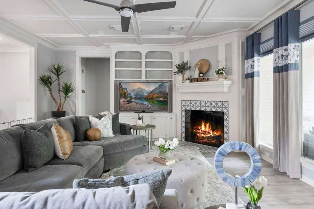
Designing for the Way You Actually Live, Not the Way Homes Are Styled Online

Designing for the way you actually live means designing a home that supports your real days, not just your Instagram-worthy ones. 

If your life includes rushed mornings, sticky fingers, pets underfoot, and work calls squeezed in between it all, your home should be helping, not fighting you.

Too many homes are styled to impress instead of function. Sure, they all look beautiful online, but they fall apart the moment real life shows up. 

Comfort and beauty don’t have to compete, though. 

It’s all about letting go of perfection and choosing design that feels good to live in. The kind that welcomes you home and works hard right alongside you.

If you’re curious how to pull that off, you’re where you should be.

When Picture-Perfect Homes Meet Real Life

modern living room interior

Scroll through your feed, and it looks like everyone else has it figured out. Pantries are color-coded. Sofas are white and somehow still spotless. Countertops stay clear, even during dinner prep.

But real life usually looks a whole lot more… lived in.

Most homes are juggling kids, pets, late nights, early mornings, and that one chair where laundry goes to “rest” before it gets folded. Life happens fast, and homes that are designed only to look good online often fall apart the moment they have to support real routines.

That disconnect creates tension. 

But let me tell you something, sugar: 

Online rooms might never show the piles, but I’m willin’ to bet they’re there.

Clean, organized homes can support mental and physical well-being; research agrees on it. It’s no wonder that many people feel discouraged when their space never quite lives up to what they see online. Throw in the growing awareness of how materials and energy use affect daily comfort, and it’s evident that design is about much more than appearances.

You crave calm, but not at the cost of comfort. I get it, honey. You want beauty, but not if it means tiptoeing through your own living room.

That’s the goal of good design: 

It should meet you where you are and support your routines, your messes, your pauses, and all your little, everyday wins, without making you feel like you’re doing it wrong.

Our Painters Ridge Project is the perfect example of that.

If your house feels like it’s working harder to look good than to support you, that’s often a design problem, not a you problem. Design on a Dime can turn those daily stress points into spaces that finally feel easy to live in.

Designing a Home Around the Life You’re Living

texas homes living room

One thing you need to know about good design is that it begins with honesty. Not aspirational honesty, but real honesty about how your days unfold. When your home is planned around your actual routines and not an imagined version of yourself, daily life gets easier in quiet but meaningful ways.

Let Your Daily Routines Lead the Layout

Your floor plan should support your rhythm, not force you to work around it. A simple way to ensure that is the case is to spy on yourself for a day. I know it sounds silly, but hear me out:

Track how you actually move through your home on a regular day, where you typically bump into furniture, where everyone naturally gathers, and which rooms stay empty.

That tells you all you need to know about your home’s layout.

If your mornings involve kids getting ready while one person packs lunches, and the other looks for shoes, those paths need space to overlap without stress. If the evenings revolve around cooking while homework happens nearby, sightlines between the kitchen and living areas matter more than having perfectly defined rooms.

You get the idea.

And since we spend so much of our time indoors, the way spaces connect and flow has a real impact on comfort and well-being. Plus, designing around routines also means thinking long-term, and making sure your home still functions as your needs change over time.

Rooms That Flex With Your Life

I’ll let you in on a little secret: 

You don’t need a giant house to live large. You just need rooms that know how to multitask the same way you do.

Life shifts by the hour, the season, and the year, and homes need to keep up. 

That said, flexible spaces aren’t about cramming more into a room. They’re about letting one space serve different purposes without things getting chaotic.

Many households now need rooms that can change roles throughout the day. A dining area might become a homework station in the afternoon. A guest room may double as an office most of the year. That’s where intentional planning makes all the difference.

We call these kinds of adaptable layouts multi-functional spaces. A single room is planned to shift between the different roles with the help of modular furniture, smart storage, and flexible lighting. No wasted square footage here, hun.

Besides, clear “work” and “play” zones keep your brain sane and your space cute. Even in an open layout, visual cues like rugs, lighting, and furniture orientation can signal when it’s time to focus and when it’s time to unwind. 

Flexible spaces don’t come from adding more rooms. They come from planning smarter ones. Design on a Dime can help your home shift roles without feeling cluttered or overworked. 

Materials and Finishes That Can Keep Up With Real Life

marble fireplace

A beautiful home shouldn’t feel fragile. If your days include sticky hands, shedding pups, dropped phones, and the occasional spill that comes out of nowhere, you’ve got to pick materials that can take a hit and still look fabulous.

Designing for real life starts with choosing surfaces, fabrics, and finishes that can handle everyday wear without a full cleaning marathon. 

The goal isn’t to make your home indestructible, sweetheart, ‘cause there’s no such thing. But we do want to make it more forgiving. 

Here’s what you need to know.

Kid- and Pet-Proof Materials

Let’s start from the ground up. 

Floors take on the brunt of daily life, especially in homes with kids and pets

Porcelain tile and luxury vinyl flooring are strong performers because they resist scratches, moisture, and stains. They’re easy to clean and hold up well in high-traffic areas, such as kitchens, hallways, and family rooms.

If you prefer a softer feel, though, bamboo and cork offer a bit more warmth underfoot, while still standing up to busy households. Plus, these materials absorb sound better than hard tiles, which may help reduce noise when those little feet and paws are always on the move.

Of course, furniture matters, too. Solid wood pieces with sturdy joinery tend to outlast lighter, trend-driven furniture. I recommend looking for certifications that indicate low chemical emissions so the air inside your home stays healthier, especially in spaces where children spend a lot of time.

Stain-Resistant Fabrics That Last

If you think about it, upholstery really does work overtime. Between the movie nights, homework sessions, and afternoon naps, seating gets constant use. 

And that’s why I always say that fabric choice matters as much, if not more, than colors and patterns. You can check out our Huntsville Project for inspiration. 

My advice?

Go with tightly woven fabrics that can keep your furniture looking decent, even when life gets messy. Think microfiber, polyester blends, olefin, and performance-treated textiles. 

They resist stains, clean up easily, and hold their shape longer than many natural fibers. 

Leather is another strong option, hun. It naturally resists spills and tends to develop a richer look over time instead of wearing out.

Be sure to consider where these fabrics will live. Sunny rooms might benefit from fade-resistant materials, while family sofas tend to do best with fabrics designed for durability rather than delicacy.

Durable, Low-Maintenance Finishes

[image]

Sooner or later, real life will pick a fight with your finishes, so let’s make sure your home wins.

You want surfaces that laugh at chaos, not cry about it. That goes for your walls, cabinetry, and trim. After all, you’re not trying to add yet another item to your to-do list, are you, hun? 

I’m talkin’ washable paints with higher-quality finishes that make touch-ups easier and reduce the need for frequent repainting, and engineered wood that offers the look of natural materials, with better resistance to moisture and temperature changes. 

And in kitchens and bathrooms, moisture-resistant surfaces can help prevent long-term damage and keep maintenance simple.

Real-life materials do more than survive, darlin’. They make your home feel more livable, comfortable, and ready for whatever the day brings. You finally get to enjoy your space, instead of constantly worrying about keeping it perfect.

Smart Storage That Matches Real Life at Home

kitchen cabinets ideas

Before you buy another basket or a matching container set, pause and take a look at how your household actually functions. Storage works best when it reflects your real habits, not whatever Instagram thinks they should be. 

The goal isn’t to just look organized, honey. It’s to stay organized without extra effort.

You can start by noticing patterns. How often do you shop? Do groceries come home weekly or twice a month? Are backpacks dropped by the door or carried straight to bedrooms? 

The thing is, when storage lines up with behavior, clutter starts to shrink on its own.

In kitchens, storage should support how food is bought and used. If you stock up, you need deeper pantry shelves and more freezer space. If you cook nightly, you need everyday tools within arm’s reach. Vertical storage helps make better use of space, but only when frequently used items are easy to grab.

Throughout the home, multifunctional pieces pull extra weight. Benches with hidden storage, coffee tables with drawers, and beds with built-in compartments can all reduce clutter without adding furniture. The key? 

Making sure stored items are easy to access and just as easy to put away.

Here’s a quick way to check if your storage is working for you:

  • Everyday items live where they’re actually used
  • Storage height matches those who use it the most
  • Frequently used items are visible or at least within reach
  • Seasonal or rarely used items are stored higher or farther away

When storage follows real routines, homes feel calmer and more spacious. You spend less time searching and more time living, which is exactly how good design should feel.

Designing for Today Without Shortchanging Tomorrow

living room design

One of the biggest concerns homeowners have is whether designing for real life can potentially hurt resale value later. 

The good news is that thoughtful, livable design often does the opposite.

Homes that support everyday family life tend to perform well in the market, especially as more buyers look for spaces that feel functional and comfortable from day one. And homes designed with real living in mind are not a liability, hun. They’re an advantage.

As with most things, the key is balance. 

You need to make choices that serve your household now, while staying flexible enough for future buyers. That usually means investing in quality rather than excess. Think durable materials, smart layouts, and well-planned storage. 

That appeals to a wide range of people, even if your current needs are very specific.

You should know that buyers these days are drawn to smaller houses with better materials and thoughtful details, ‘cause those features translate to lower maintenance and everyday ease. Flexibility is another big resale win, by the way.

When design choices are rooted in function and adaptability, your home stays valuable without sacrificing how it feels to live in it right now. And that’s exactly the balance Design on a Dime can help you achieve.

How Design on a Dime Translates Lived Experience Into Texas-Focused Design

traditional living room interior

At Design on a Dime Interiors, every project starts with listening. Not just to what a space should look like, but to how it needs to work for the people living in it

Our team will take time to understand the daily routines, long-term goals, and the little habits that shape a household, from morning coffee rituals to how weekends are spent at home.

That lived-in insight shows up in the design decisions

Layouts are planned for real-life movement, storage is placed where it is actually used, and materials are chosen for comfort, durability, and ease. 

One family might need an open gathering area that keeps kids and adults connected, while another needs quiet corners that support working from home without taking over the entire house.

Design on a Dime’s work is rooted in the way Texans live today. Homes are designed to handle heat, busy schedules, and full houses, without ever feelin’ too heavy or “overdone.” Clean lines, layered textures, and practical furnishings come together in a way that’s welcoming and personal.
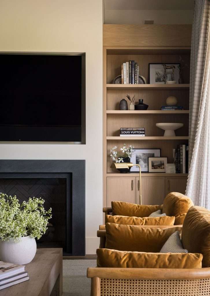
The result isn’t a showpiece home that needs protecting. It’s a space that supports real life beautifully, day after day.
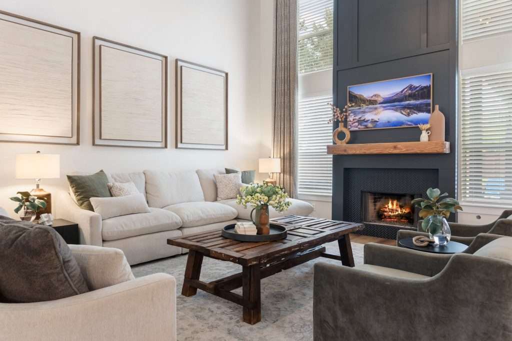
We can translate everyday habits into spaces that feel natural, durable, and unmistakably “you,” designed to support real life for years to come. Let’s make it happen.

Frequently Asked Questions

How do I make practical design choices without locking myself into one lifestyle?

Focus on flexibility. Choose layouts, furnishings, and finishes that can shift as the routines change, instead of designs that serve only one phase of life.

What should I prioritize first if my home feels overwhelming to live in?

You should prioritize the spaces you use every day. Improving flow, storage, and comfort in one high-traffic area often creates relief throughout the rest of the home.
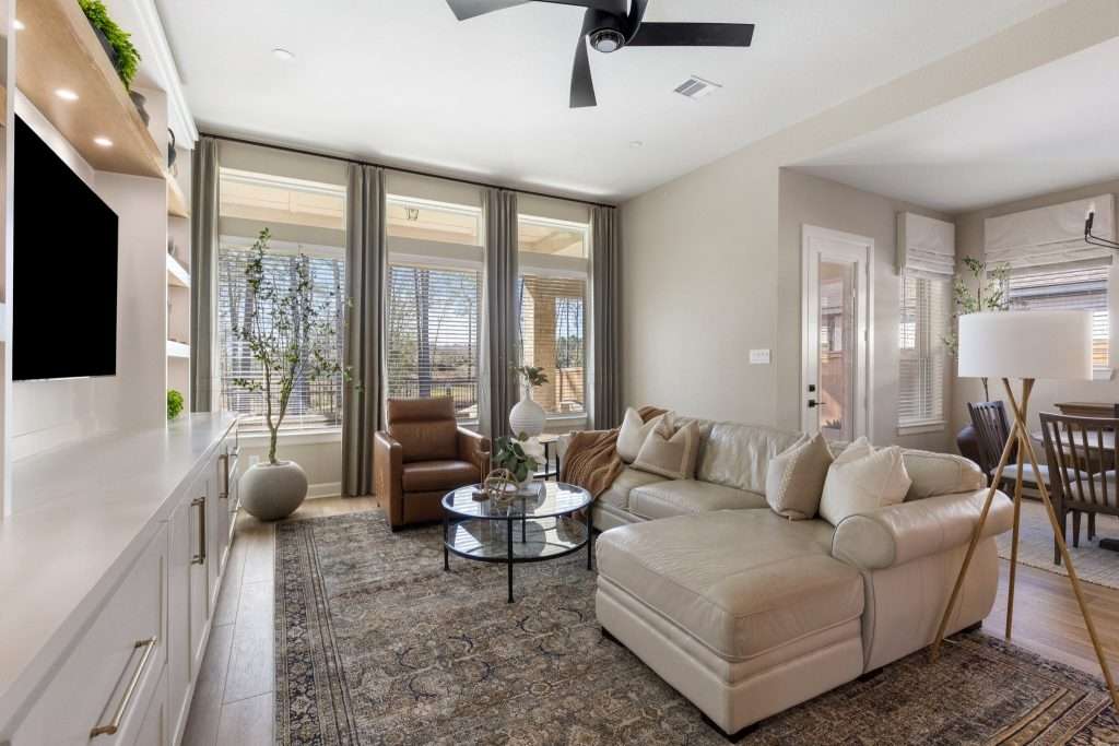
How can I personalize my home without making it feel dated later?

You can personalize your home by keeping the permanent things neutral and expressing your personality through pieces that are easier to swap out, like art, lighting, textiles, and furniture.

How do I design for multiple people with different habits in the same home?

You should give everyone a few dedicated zones, even if they’re small. Clear ownership of space reduces daily friction and helps shared areas work better.

What if my home needs to support both work and rest without feeling chaotic?

If a home needs to support both work and rest, define subtle boundaries using furniture placement, lights, and storage, so that each activity has a clear start and stop within the same space.

A Home That Works as Hard as You Do

At the end of the day, hun, a good home doesn’t ask you to perform. It supports your routines, holds your people, and gives you space to breathe when life gets full. When design decisions are rooted in how you actually live, your home becomes easier to care for and far more enjoyable to be in.

That kind of comfort doesn’t come from chasing trends and perfection. It comes from thoughtful planning and honest conversations about what matters most in your everyday life.

If you’re ready to ditch the pressure and create a home that feels natural, personal, and built for real living, Design on a Dime is here to help. A chat with our team is often the first step toward a space that truly feels like home.

What Your Entryway Says Before You Do: First Impressions That Speak Volumes

What your entryway says before you do is often louder than the words you offer once the door opens, babe. Before the hug, before anyone sits down, your home has already made its introduction.

That first stretch of space sets expectations. It hints at how you live, how you unwind, and how welcome people really are. Sometimes, it feels warm and confident. Other times, it feels rushed, unfinished, and a little overwhelmed, even when the rest of the house is lovely.
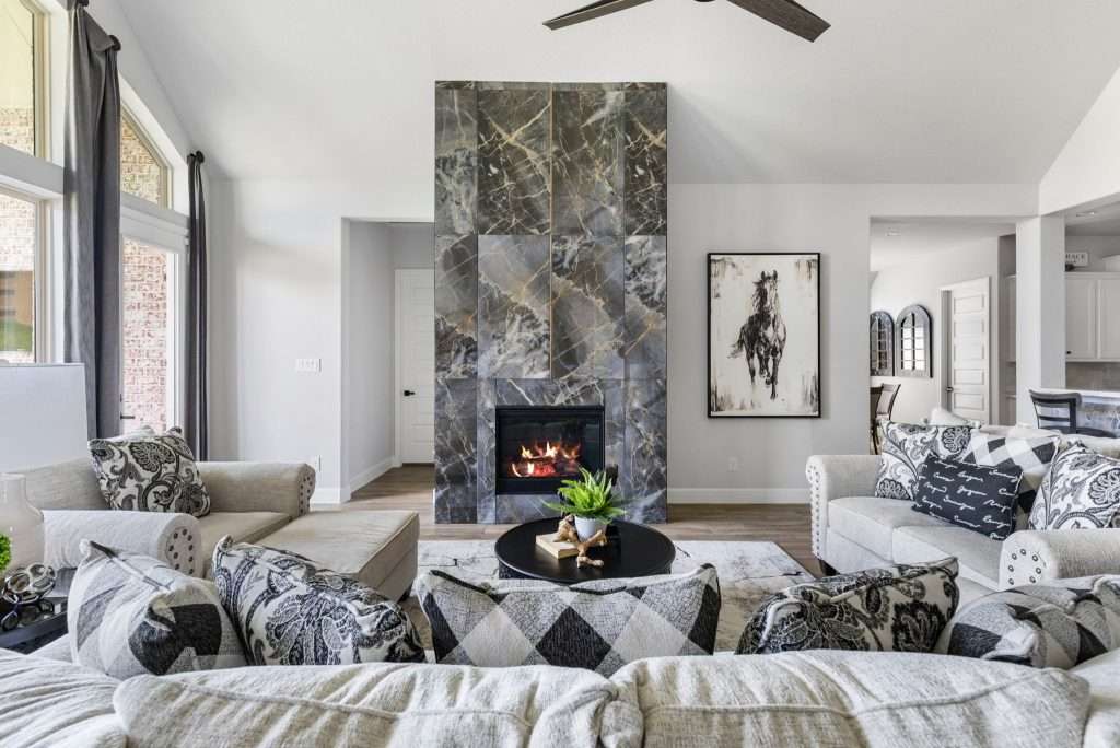
The good news? 

This isn’t about perfection or expensive upgrades. It’s about awareness. 
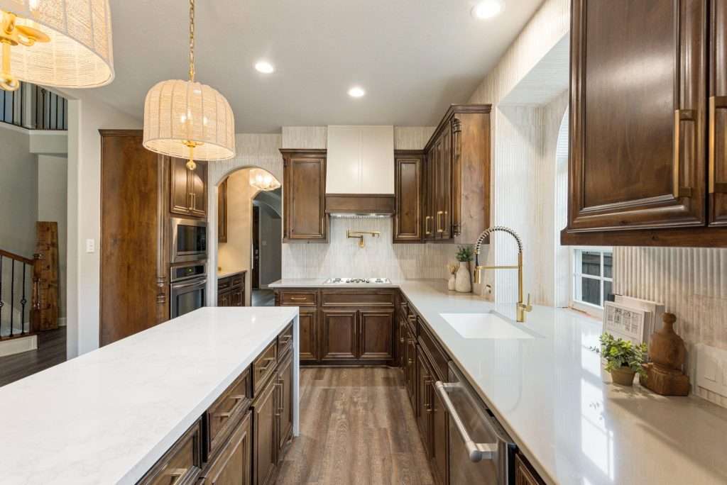
So, stick around, hun. You’re about to see exactly what your entry is sayin’ about you. 

What Your Front Door Reveals at First Glance

entryway design

Before guests notice your furniture, your art, or your family photos, they clock your front door color. It sets expectations instantly. 

Color shapes emotion faster than words ever could: 

A bold hue can spark excitement, while a cooler one can slow the room down before someone even steps inside. 

Since your door is already talkin’ long before anyone knocks, let’s make sure it’s saying something you’re proud of, okay?

Red Doors, Bold Welcomes

If you’ve ever pulled up to a home with a bright red front door and went, “Oh, these folks have personality,” you’re absolutely right. 

A red front door doesn’t whisper. It smiles wide and waves from the porch. 

It tells people you’re bold, friendly, and ready for company.

This color signals warmth and energy, which is why it’s been used across cultures to represent prosperity, protection, and hospitality. From those historic Southern homes to ancient traditions abroad, red has long marked a place of refuge and abundance.

Psychologically, red raises energy levels and grabs attention first. It makes a home feel lively and inviting before a single word is exchanged. 

Of course, different shades of red can fine-tune the message even more: 

  • Cherry red reads as playful.
  • Brick red gives off cozy vibes.
  • Burgundy feels polished and lux.

A red door tells guests they are stepping into a home where energy lives and connection matters.

Black Doors, Timeless Poise

black entryway doors
Source: Olly & Em

A black front door doesn’t need to announce itself. It already knows its worth.

Choose black, and you instantly give your entry that calm, confident, “CEO-of-the-street” kind of vibe, like your house knows exactly who it is and doesn’t need to shout. A black door tells people you are polished, intentional, and just a tiny bit mysterious, in the best way. 

It frames your home with clarity, grounding the architecture and making surrounding materials feel richer and more refined. 

Brick looks deeper. Stone feels stronger. Trim appears sharper.

Emotionally, black communicates boundaries and calm authority. Guests often view these homes as organized, composed, and thoughtfully maintained. 

There’s a quiet assurance in a black door that says, “This space is cared for and purposeful.

Market data supports that perception, too. 

A black door creates a strong first impression without asking for attention. It allows the rest of your home to speak confidently once the door opens.

Blue Doors, Calm Stability

Where red energizes and black anchors, blue keeps everyone calm, grounded, and glad to be home.

A blue front door signals emotional steadiness and approachability. It quietly tells guests that this home is a safe place to land, a space where stress doesn’t get to run the show. 

You’re basically hanging a sign that says, “This house is a stress-free zone, enter and exhale.

Blue has long been associated with trust, loyalty, and reliability, making it a particularly powerful choice for an entry point.

Color psychology shows that blue lowers mental noise and encourages relaxation. People often feel more at ease without realizing why. That feeling starts before they even cross the threshold.

Different blues shape the message in subtle ways:

  • Light blue suggests relaxed weekends and hopeful new chapters.
  • Medium blue reads as dependable and grounded.
  • Deep navy communicates responsibility and quiet confidence.

A blue door tells visitors they can exhale here. Whatever the day has been, this home offers calm, baby.

Texture, Materials, and the Unspoken Sense of Welcome

You can feel an entryway before you really see it. The moment you step through the door, your body takes note. 

Is it warm or stiff? Inviting or a little cold? 

That reaction has everything to do with the texture and materials working behind the scenes. They’re what turns your “just a hallway” moment into a rich, welcoming experience that works for real life. Check out our Painters Ridge Project to see how intentional design choices can truly change the emotional language of a space.

Textiles and Soft Layers That Invite You In

hallway design
Source: Sprague Interiors

Textiles that beg to be touched are your secret weapon here. They soften hard floors, lower visual tension, and signal that this is a space meant to be used, not tiptoed through. 

That’s exactly what you want an entryway to feel like, hun.

A natural fiber rug or runner immediately grounds the room and absorbs sound, making your space feel calmer. Plus, materials like sisal and jute stand up to daily traffic while still adding texture that feels organic and lived-in.

Velvet pillows and bench cushions practically grab hands. Throw in a linen pillow or two for that relaxed, slightly crinkly texture that whispers, “Yes, you can sit here.” Wool can bring warmth without looking heavy, which is especially helpful when you want the entry to feel cozy but still polished.

Earth-toned textiles help in another subtle way: 

They soften light and reduce visual sharpness, making guests feel more comfortable without knowing why. 

And that, sugar, is how you get an entry that feels intentional, not styled for show.

Hard Surfaces, Natural Materials, and the Right Balance

hallway design
Source: Blake & Dane

Warmth at the front door isn’t just about softness. It’s about balance.

Think of your entry like a handshake you feel, not see, and let those surfaces do the talking.

Hard surfaces give an entryway structure and durability. Wood adds warmth and familiarity. Stone and tile provide strength and longevity. Metal details bring contrast and definition. And when all these materials are layered thoughtfully? 

You get a space that feels solid and welcoming at the same time.

Layering also plays a practical role: 

A scraper mat outside, combined with a softer rug inside, helps protect the floors and keeps the rest of the home cleaner. 

Layered rugs quietly handle real life while keeping your entry comfortable. A win-win, if you ask me.

Good looks aren’t the only benefit of natural materials, by the way. They help reduce stress and make your space feel calmer and more grounded. Even small touches of biophilic design, such as woven baskets, a wooden console, or curved furniture edges, can soften the experience of entering the home.

When the entryway feels good, it’s rarely an accident. It is the result of thoughtful material choices layered with real life in mind. That’s the kind of detail-driven approach Design on a Dime brings to every space we work on, making sure comfort, durability, and personality all get equal say.

Lighting the Welcomes and Sets the Mood

entyway lightining
Source: Georgia & Hunt Design House

Although most folks might blame clutter or paint color for a bad first impression, lighting is usually the real mood-setter. It works fast, too. 

Within seconds of walking inside, your brain decides whether the space feels good or… well, not.

Brightness literally turns emotional volume up or down. Too much light can feel harsh and overstimulating, especially at night, while too little can feel gloomy and unwelcoming. Believe me, if your foyer feels like an interrogation room, guests can feel it, too.

The sweet spot? 

Light that feels intentional and human, not clinical.

Natural light carries the strongest emotional signal during the day. An entry that lets daylight spill in feels open and optimistic, even when your space is small. 

Now, as evening settles in, artificial light takes over, and color temperature matters more than most folks realize: 

Warm light that mirrors sunset cues can encourage relaxation and social connections. It tells your nervous system that it’s safe to slow down and settle in. Cool, bluish light at night, on the other hand, may increase tension and make a space feel “sharper” than it needs to be.

The goal is not brightness for brightness’s sake. It is about creating a gentle transition from outside energy to inside calm. So, hun, use dimmers and layered fixtures, and let natural light in to keep the vibe soft and flattering. 

They might not comment on it, but your guests will feel it immediately.

Lighting is one of those things you don’t notice when it’s right, but you feel it immediately when it’s wrong. Designing that balance between warmth, function, and atmosphere takes more than a few fixture swaps. It’s something Design on a Dime considers from the very beginning, making sure your home always feels calm and intentional at every hour.

Clutter, Calm, and What Organization Says About You

entryway organisation
Source: Jessica Nelson Design

When you walk through the front door and feel your shoulders tense up, that’s not in your head, baby. That entryway of yours sends emotional signals. And it’s a well-known fact that disorganized spaces can have a negative impact on your stress levels and mental health in general.

Here’s the thing:

Those first few feet of your home tell your nervous system whether it gets to relax or needs to stay on high alert. 

When that space feels chaotic, your body reads it as unfinished business waiting to happen. When it feels clear and intentional, you exhale without even realizing it.

Your entryway is a mirror, reflecting your habits, rhythms, and the kind of support your home provides you day to day.

What Clutter Signals Emotionally

Clutter at the door does more than look messy. It sends your brain straight into fight-or-flight mode. Here’s what happens, hun:

You step into your entryway, and your stress level walks in beside you.

It’s not just about higher cortisol levels, though. Disorganized environments can drag down your focus, too. People in cluttered homes carry that tension around with them longer than they realize, not just in the moment they walk in. 

And the entryway is especially powerful because it’s where transitions happen. 

Work to home. Outside noise to inside quiet. 

When clutter blocks that transition, your body stays stuck in go mode.

That pile of shoes, bags, and mail isn’t just inconvenient, hun. It quietly trains your nervous system to stay on edge. And over time, even small messes at the door can turn “Welcome home, dear” into “What should I deal with first?

Systems That Soothe Without Trying Too Hard

An organized entryway doesn’t need to feel rigid or overdesigned. It just needs a bit of clarity, that’s all.

Simple systems help your brain relax because they remove decision-making. Think one spot for keys. One spot for shoes. One surface for what truly belongs there. 

Hooks, baskets, benches, and consoles work best when each one has a clear purpose and nothing extra is competing for attention.

I can’t recommend closed storage enough, darlin’. It allows life to happen without advertising every single detail. 

And when visual noise is reduced, the space immediately feels calmer and more generous

Folks pick up on these cues instantly. They may not name them, but trust me, they feel them.

Lights and mirrors quietly support these systems; I’ll get to that in a moment. For now, just remember that when everything works together, the entryway stops demanding energy and starts giving it back.

Minimalism, Scale, and Statement Pieces That Set the Tone

Statement Pieces That Set the Tone
Source: Alissa Johnson Interiors

At the front door, simplicity speaks loudly. 

A well-edited entryway can feel calmer, larger, and more refined within seconds, not because it is empty, but because everything in it earns its place.

Minimalism That Feels Intentional, Not Empty

Good minimalism never feels bare. It feels considered.

An entryway that leans simple works best when it supports daily life without advertising it. It’s easy to see why many homeowners gravitate toward uncluttered entry designs:

Clear walking paths help your guests move comfortably instead of dodging bags and shoes. Neutral tones reflect light and keep the space feeling open. Hidden storage, like benches, consoles, and cabinets, tucks things away and allows the space to stay visually calm while still handling real routines. 

Again, the goal isn’t to remove personality. It’s to remove friction.

Intentional negative space matters, too. When there’s room to breathe, the things you do keep often feel more important. And that restraint reads as confidence and care.

Statement Pieces That Anchor the Space

Minimal doesn’t mean forgettable.

A single strong piece can ground an entryway and tell a clear story the moment someone walks in. 

A bold rug defines the zone and brings in pattern and warmth. A sculptural console or rounded table turns everyday things into part of the experience. Art at the entry creates an immediate emotional hook, helping guests feel oriented and welcomed.

Plus, it all signals your creativity and openness.

And remember, hun:

Scale does more work than quantity ever will.

Oversized mirrors and focused gallery moments work especially well here. People form first impressions quickly, and these visual anchors give the eye somewhere to land right away. When chosen thoughtfully, they elevate the entire space without adding clutter.

Statement pieces also communicate confidence. They say this home knows what it is doing and doesn’t need to overexplain itself.

An entry that feels confident instead of cluttered comes down to “editing” and scale, not just empty space. With Design on a Dime, the goal is never “less for the sake of less,” but clarity that lets your house speak clearly.

Curb-to-Console Flow and Small Entryway Impact

A small entryway can still make a big impression, sugar. What matters most is not square footage, though. It’s how well the space carries you from outside energy to inside calm.

When an entry feels awkward or cramped, it’s usually a design issue, not a size issue. 

Clear paths, storage, and good light can make even the most compact of spaces feel intentional, and folks pick up on it fast: 

An entry that flows well just feels valuable, regardless of its dimensions.

Now, one thing you need to keep in mind is that the experience of your entryway begins before your doors ever open.

From the curb to the console, guests are picking up cues. 

Landscaping, the front path, the door color, and the first interior view work together to tell one story. When those elements feel connected, your home immediately reads as thoughtful and cohesive.

You choreograph that expedition with curves, light, and color that whisper one story from sidewalk to table:

Repeating colors and materials guide the eye naturally from outside to inside. Curves soften the transition. Plants add life and reassurance. Warm lighting creates a gentle glow that feels inviting.

Think of this as a quiet rhythm: 

Green at the curb, light at the door, texture at the console. Each step prepares the next. 

When the story flows from sidewalk to front door to console table, the whole home feels more valuable, no matter the square footage. That kind of visual continuity doesn’t happen by chance. It’s the result of seeing the full picture. That’s how Design on a Dime approaches entryway design: 

As part of a bigger, beautifully connected whole.

Frequently Asked Questions

Does my entryway matter if guests rarely use the front door?

Yes. Even if the front door doesn’t get used daily, it still shapes first impressions for anyone who visits your home and has a direct impact on how your home presents itself from the street.

What is the biggest mistake people make with entryway design?

The biggest mistake people make with entryway design is trying to do too much. Overfilling a small space or mixing too many ideas often creates stress and clutter instead of a welcoming vibe.

Can renters improve their entryway without permanent changes?

Yes, they absolutely can. Rugs, lights, mirrors, storage furniture, and wall hooks can all make a noticeable difference without calling for permanent changes, making them perfect for renters.

How do I know if my entryway feels intentional or just unfinished?

If the space has a clear purpose, defined drop zones, and room to move comfortably, it probably reads as intentional. However, if your things are just there without a plan, it usually feels unfinished.

Is it better to match my entryway style to the rest of the house or let it stand out?

The entryway should feel connected to the rest of your home, but it doesn’t have to match it exactly. It can still have its own moment. Think harmony, not duplication.

Your Home’s Opening Line

Your entryway isn’t trying to impress everyone, hun. It is simply telling the truth about how your home lives and how it welcomes people in. When that story feels aligned, folks relax faster, and you feel more at ease the moment you walk through that door.

Sometimes, all it takes is a fresh set of eyes to see what your space is already saying and how to guide it in a direction that feels more supportive, more polished, or, simply, more you. Every knob, color, and lamp is a little symbol whispering, “This is who lives here.

That’s where thoughtful design can make a quiet but powerful difference.

If you’re ready to refine the first impression your home is making, Design on a Dime Interiors would love to help. You can reach out today and we’ll translate your lifestyle into an entryway that truly fits.

Color Memories: Designing With Hues That Tell Your Story

“Color memories” aren’t just pretty shades on a wall, hun. They’re the hues your heart never forgot. 

Maybe it’s that soft peach of your mama’s Sunday dresses or the dusty blue of the skies on a road trip that felt like freedom. Lord knows, some colors just stay with us. 

And when you bring those shades into the home, something shifts. The room no longer just looks styled. It feels familiar, warm, and a little bit like coming home to yourself.

I am here to show you how those personal little sparks of color can shape your space with more soul than any trend ever could. So, pull up a chair, honey, and let’s wander through the hues that have been waiting to tell your story.

Finding the Colors of Your Favorite Memories

kitchen color
Source: Studio Plumb

Ever notice how certain moments come back to you in full color while others show up looking a bit washed out and blurry around the edges? 

That’s your mind doing what it does best, honey. 

You see, our brains latch onto color in a powerful way, and research shows that colorful scenes tend to be remembered more accurately than black-and-white ones. It’s one of the main reasons why a familiar hue can pull you right back into a moment you haven’t thought about in years.

Think about the places that shaped you. Maybe your childhood home, that beach trip you still smile about, or the first apartment you decorated all by yourself. 

Go ahead and picture one. 

You probably didn’t see just a vague room. You saw the exact shade of the cabinets, the red pot, the warm light on the tile, and the color of the sweater you were wearing. 

Those hues are tied to how your memory filed that moment away. 

That’s why this part of the design process starts with reflection. 

So, gather old photos, scroll through your camera roll, or jot down a few memories that always make your heart warm, and look for the colors that keep showing up. Build a small mood board if you like. 

You’ll be surprised by how quickly a pattern appears.

That’s ‘cause these colors aren’t just visuals. They’re emotional anchors that help your home feel familiar, personal, and beautifully yours.

Turning Your Memories Into a Personal Interior Palette

bedroom

Once you’ve got all those memory colors in front of you, the next step is shaping them into a palette that actually works in your home. 

Think of it like choosing the lead singer, the backup vocals, and the soft hum that holds it all together. This palette will need a dominant hue, a few supporting colors, and a set of neutrals that will let the whole story breathe.

Let’s start with the color that carries the strongest feeling

Maybe it’s the buttery yellow hue from your grandmother’s kitchen or the deep green from a forest trail you loved. That becomes your anchor. 

From there, you can pull two or three quieter hues that live in the same memory. It may be the warm wood tones, the soft cream trim, or the muted sky that you didn’t notice until now.

Now, look at how those colors behave in real life

Some memory shades are bold and full of personality. If that’s the case, use saturation and texture to keep them balanced. A vivid blue might work better as a velvet pillow than a full wall. A soft, nostalgic pink could shine as a rug or a piece of artwork instead of taking over the whole room.

And neutrals? They’re your peacekeepers, hun. They help your memory colors stand out without shouting. 

Oh, and don’t forget to sample your palette in natural light, evening light, and lamp light. You’ll see how each shade settles into the space.

When you build your palette this way, you’re not picking colors just because a trend report likes them. You are choosing hues that have lived with you, traveled with you, and stayed in your heart all along.

If you ever find yourself loving your colors but struggling to make them play nicely together, that is exactly where a trained eye can help. Design on a Dime specializes in shaping meaningful color palettes that feel balanced, livable, and true to you, not trendy for trend’s sake.

Balancing Nostalgia With Beautiful, Lasting Design

modern living room
Source: HKB Interior Design

Bringing memory colors into your home doesn’t mean turning your living room into a scrapbook, darlin’. 

The goal is to let those meaningful tones shine while still giving your space a polished, grown-up feel. And that’s where balance comes in

Light, room size, and existing furniture all play a part in how far your memory colors can go.

Like I said earlier, you first need to check how your chosen tones look in real light. A soft blue that reminds you of summer mornings might feel airy in a bright space, but turn chilly in a shaded hallway. A warm coral from a favorite vacation can glow beautifully in small accents, but feel too intense on every wall. 

Let your lighting guide how much of each memory color you use.

It also helps to think of your nostalgic shades in different volumes. Some colors deserve a whisper, some can handle a sentence, and a rare few earn the whole paragraph. 

Maybe your brightest memory shade works best in pillows, art, or a patterned throw. Your softer tones can move into larger pieces like drapery or rugs. Neutrals will do the grounding, helping the sentimental colors feel intentional instead of overwhelming.

Be careful not to recreate the memory too literally, though. You don’t need to rebuild Grandma’s kitchen tile by tile to honor the feeling it gave you. Instead, “borrow” the warmth, the softness, and the comfort that memory carries. 

You’ve got all these textures, wood tones, metal finishes, and natural materials you can use to elevate the nostalgic hues, but you want them to read timeless, not theme-driven.

When your colors are chosen with care and placed with balance, your home ends up feeling personal and inviting, and, most importantly, beautifully current. Remember: 

It’s not a museum of your memories. It’s a living story that still has room to grow with you.

We took a similar approach with the Renee Project, where decades of cherished pieces were thoughtfully layered into a lighter, refreshed design that still honored the home’s original story.

Finding that sweet spot between sentimental and stylish can be tricky, especially when light, furniture, and layout come into play. That’s the kind of thoughtful balancing act Design on a Dime brings to every project, helping memory-filled spaces feel polished, timeless, and easy to live in.

Ideas and Real-Life Examples of Color Memories in Action

traditional living room

Sometimes it helps to see how memory colors come together in an actual room. 

When you look at a space through the lens of a particular moment you treasure, the palette, textures, and finishes all start to tell the story in a quiet, beautiful way.

Picture a beach memory. Maybe it was a calm morning when the water looked like soft aqua and the sand felt warm under your feet. That could inspire your living room design, for example. 

Think pale blue walls, sandy beige upholstery, and a woven jute rug. Add a driftwood bowl or a piece of art with soft wave patterns, and suddenly the whole room feels like a breath of coastal air without slipping into a theme.

Now, think of your childhood home that always felt gentle and safe. Perhaps the walls were a muted pastel hue, or the kitchen smelled like vanilla and warm wood. A space that is inspired by that memory might use blush or buttercream in small accents, paired with oak furniture, quilted textures, and soft light. 

The feeling is far from childish, honey. It’s stable, warm, and quietly nostalgic.

Travel memories are often the boldest. 

If you fell in love with a market full of saturated jewel tones, you can bring them in through pillows, pottery, textiles, or a patterned rug. Then balance them with natural textures, like rattan, stone, or aged brass. The room becomes lively and layered, just like travel itself, without overwhelming the eye.

If you enjoy visualizing ideas, gather a few photos from moments that still tug at your heart and turn them into a small mood board. Look for repeating colors, textures, and shapes. That could help you see which memories are guiding you, and how they might grow into a space that feels beautifully personal.

If these examples sparked ideas but you’re not sure how your own memories would translate into finishes, textures, and furnishings, you are not alone. Design on a Dime can help turn abstract inspiration into clear, cohesive design plans that still feel deeply personal.

Bringing Your Memory-Inspired Room to Life

Once you’ve gathered all your colors and the feelings behind them, it is time to start shaping a space that reflects your story. You don’t have to repaint a whole room on day one, hun. Start small, stay curious, and let your home grow with you.

Here’s a quick checklist to get you moving in the right direction:

  • Pull three or four colors from a memory that still feels meaningful.
  • Test those colors in natural and evening light to see how they behave.
  • Look for textures and patterns from the same moment, like woven baskets, soft linens, and natural wood.
  • Try small pieces first. Pillows, throws, candles, artwork, or a single decor object can help you test a hue without commitment.
  • Add one change at a time so the room unfolds gently instead of all at once.
  • Sit with the space for a few days and notice how it makes you feel.

If you enjoy experimenting, you can go a step further and make a little workbook for yourself. Print a few photos, tape down fabric or paint samples, write a sentence about the memory, and note which colors feel right. 

This makes the process fun instead of overwhelming.

Remember that a memory-inspired home is not meant to be “permanent” in every detail. Your tastes might shift, and your life will keep giving you new moments to draw from. Treat your palette like a living thing that can grow and change

What I’m trying to say is: 

Your home doesn’t have to lock in a single chapter. It can celebrate all the beautiful ones still to come.

Taking those first steps can feel exciting and a bit overwhelming all at once. Whether you want help testing colors, layering textures, or pulling it all together, Design on a Dime is here to support the process, so your space grows thoughtfully and with confidence.

Frequently Asked Questions

Can memory-inspired colors work in a modern or minimalist home?

Yes, they can work in modern or minimalist homes because memory colors don’t have to be bold or literal. In modern spaces, in particular, they often show up through subtle tones, textures, or just one meaningful accent.

What if my favorite memory colors feel too bold for everyday living?

That’s a common problem. The good news is that you can soften up your favorite memory colors by using muted versions, limiting them to smaller elements, or combining them with calm neutrals.

How do I know when a memory color no longer fits my space?

If your space starts to feel heavy or disconnected from how you live today, that might be your sign that it’s time to adjust. Remember that memory-inspired design is meant to evolve with you, not stay frozen.

Are memory colors better used in certain rooms?

They often shine in bedrooms, living rooms, and entryways where emotion matters most, but they can still work anywhere in your home, as long as you find the right balance.

Can a designer help translate memories into colors without taking over the vision?

Yes, they can. A good designer will always listen first. Then, they can help shape those personal ideas into a palette that works beautifully in real life.

Your Home Deserves a Story Only You Can Tell

Every room in your home has a chance to hold a little bit of who you are, darling. When you choose colors that carry memories and meaning, you are not just decorating. You are creating a space that feels honest, grounded, and deeply familiar in the best way. 

And a home built with that kind of intention has a warmth you simply cannot buy off a shelf.

If you ever feel unsure about how to pull those personal hues together, Design on a Dime is always happy to guide you. We love helping people shape homes that reflect their real lives and the moments that made them. 

When you’re ready to explore your own color story, reach out and let us guide you through the next step.

Why Some Rooms Feel “Off” and How Designers Fix the Balance

If you’re wondering why some rooms feel “off,” the answer is not bad taste or broken design rules. It is your brain picking up on that imbalance before you ever find the words for it. 

You walk in, pause to look around, and something just does not settle. The room feels awkward, heavy, or oddly unfinished, even if everything in it seems perfect.

Designers are trained to read those signals instantly. They pick up what your eyes are tripping over, where the space feels tense, and why it’s not giving you that easy and relaxed vibe it should. But once you figure out what’s throwing things off, the fix feels a lot more doable. 

Keep reading, darlin’, because this is where that vague discomfort finally starts to make sense.

The Real Reason Behind a Room Feeling “Off”

marble fireplace

Bottom line up front, sugar: 

Visual weight is what makes some pieces in your room quietly support the space, while others demand all the attention. How that weight is spread out is what affects whether a space feels calm and comfortable or a little uneasy.

Once you understand visual weight, you stop guessing and start making intentional choices. 

Bigger furniture, darker colors, bold patterns, and thicker textures naturally feel heavier to the eye. A deep charcoal sofa, a chunky bookcase, and a busy rug will always carry more presence than pale walls, slim furniture legs, glass, and open materials. 

That doesn’t make those heavier elements wrong, hun, but it does mean they need balance.

Lighter elements do a lot of quiet work in the room. Soft wall colors, lighter ceilings, and open finishes help the space feel more breathable and relaxed. Even vertical choices matter. When the eye is encouraged to travel up through tall furniture, art placement, and subtle contrasts, the space feels more evenly grounded. 

I mean, who wants a room that feels bottom-heavy, anyway?

Texture and placement play a role, too. 

A few objects grouped tightly together pull attention much faster than those same items spread out across the room. When everything visually crowds one side, your eyes keep snapping back there, and your brain never quite gets to rest

Designers pay close attention to this because our minds are wired to prefer balance. Studies consistently show that cluttered, visually overloaded spaces increase stress and mental fatigue, even when we cannot quite explain why.

This is where the psychology of space comes in: 

Balanced rooms feel easier to be in because the eyes move through them without effort. Nothing is yelling for attention, and, at the same time, nothing feels forgotten. When visual weight is evenly distributed, the room feels settled, welcoming, and naturally comfortable. 

It’s the kind of space where you exhale without realizing it.

If reading this made you look around your room and think, “Well… that explains a lot,” you’re not alone. At Design on a Dime, we help clients move from guesswork to clarity by identifying where visual weight might be working against their space and reshaping it so the room finally feels easy to be in.

The Three Types of Balance Designers Rely On

bright modern living room
Source: The Residency Bureau

Think of balance as your shortcut to a room that feels settled instead of slightly off. Designers rely on three main types of balance to get there, and once you recognize them, you start seeing why certain spaces feel so good and others never quite land.

Here’s the thing, sugar:

Balance matters because our brains crave order, even when we love personality and creativity. 

When the visual weight in a space feels evenly distributed, everything feels calmer, more comfortable, and easier to live in. But when it’s not? 

Your eyes keep searching for a place to rest.

  • Symmetrical balance is the most familiar. It is the classic twin look; I’m talkin’ matching lamps on both sides of the bed or identical chairs flanking a fireplace. This type of balance feels orderly and reassuring, which is why it works great in bedrooms, living rooms, and rooms meant for rest. That symmetry tells your brain everything is under control.
  • Asymmetrical balance is where things get more interesting. Instead of matching pieces, you use different items that still carry similar visual weight. Think a sofa balanced by two lighter chairs, or a tall floor lamp offset by layered artwork. The pieces might not be the same, but the space still feels stable. This approach feels modern, relaxed, and intentional when done well. It’s also where many rooms go wrong when the visual weight isn’t carefully considered.
  • Radial balance pulls everything toward one central point. Imagine a round dining table with chairs arranged evenly around it, or a seating area underneath a chandelier. This kind of balance creates a strong sense of connection and flow, especially in social spaces where people naturally gather.

You might not even realize it, but layout plays a major role in how comfortable a space feels. That reaction is not accidental. When balance is working, the space feels calm, curated, and complete without trying too hard.

Once you understand which type of balance a room is leaning toward, the fixes become much clearer. You are no longer decorating blindly. You’re choosing twins, contrasts, or centered layouts on purpose, and the intention behind those choices is what makes a space finally feel right.

Once you can spot which type of balance a room is leaning toward, decorating stops feeling random. This is the lens Design on a Dime relies on to help you make confident decisions that feel cohesive, even when mixing styles, eras, and furniture you already love.

Visual Weight Mistakes That Make a Room Feel Wrong

living room interior
Source: Kellie Eserts Interiors

You know the feelin’. You walk into a room, and nothing is technically wrong, but something just doesn’t sit right. 

In most cases, that reaction comes down to visual weight and scale working against each other.

  • Visual weight is the perceived heaviness of what you see, and your eye is incredibly quick to pick up on it when it’s uneven. Think too many dark colors on one wall, a massive sectional paired with a coffee table that feels like it wandered in by mistake, or a handful of small decor pieces scattered around with nothing substantial to ground them. When the weight is concentrated in only one area or mismatched in size, your brain reads it as “imbalance” before you even have the words for it.
  • Scale and proportion make that imbalance louder. Furniture that’s too large overwhelms the room and shrinks the space around it, and furniture that is too small makes the room feel underfurnished and awkward, like it never quite grew into itself. When pieces are scaled correctly to the space and the people using them, movement feels easier, and the space instantly calms down.

Color and texture play into this more than most people realize. When all the bold colors or heavy textures live on one side of the room, your eye keeps getting pulled there. The same thing happens when the lights are uneven or when one area feels crowded while another feels empty. 

A room needs moments to breathe, honey, and negative space is just as important as what fills it.

If your room feels off, it’s not being dramatic. It is responding to mixed signals. The good news? Once you learn to spot these weight and scale issues, fixing them becomes much more straightforward.

If any of these mistakes sounded familiar, that doesn’t mean your room is beyond saving. It usually means the space needs a second set of trained eyes to spot what is quietly throwing things off. Design on a Dime specializes in fine-tuning scale, layout, and visual flow, without starting from scratch.

How Designers Fix the Balance

Once you can see what’s throwing a room off, the fix is rarely complicated. It’s mainly about giving the eye a place to land, spreading visual weight with intention, and letting your space breathe rather than crowding every inch. 

And darlin’, that’s where rooms stop feeling accidental and start feeling composed. 

You can check out our Jennifer Heights Project for a real-life example of these principles in action.

Create a Focal Point That Grounds the Room

Create a Focal Point That Grounds the Room
Source: Megan Glenn Architecture

When a space feels underwhelming and scattered, it’s often because nothing is clearly in charge. A strong focal point acts like the anchor of the room. It quietly tells your eye where to go first and helps everything else fall into place.

Your focal point might already be there. A fireplace, a large window, a statement light fixture, or a piece of art with presence can all do the job. The key? 

Choosing one and letting it take the lead. 

When everything tries to be important, nothing actually is.

Once you have that anchor, furniture and decor should support it instead of competing with it. 

Sofas face it. Rugs and seating relate to it. Even lights work in its favor, drawing attention where you want it instead of letting the room feel aimless. 

In bedrooms, the bed usually does all the heavy lifting. In living rooms, it might be the fireplace or the view. Either way, once the focal point is clear, the room starts to feel intentional, not accidental.

Now, a quick gut check helps here. 

What do you notice within the first few seconds of walking in? 

That first impression tells you exactly where your anchor is, or whether the room still needs one.

Balance Visual Weight With Color, Texture, and Scale

bold texture living room decor
Source: Freestone & Smith

This is where many rooms quietly lose their footing. 

You see, honey, visual weight is not just about size. Color, pattern, texture, and height all carry weight, too, and designers use them like tools

The goal? 

Make sure no single area feels overloaded.

Dark colors and bold patterns feel heavier than light, quiet ones. Rich textures, like velvet, leather, and heavy wood, pull more attention than smooth and airy finishes. But if all of that weight gathers on one side of the room, the space starts to feel lopsided, even if you can’t really explain why.

Instead of stacking them all in one corner, designers spread them throughout the room.

Accent colors show up in more than one place. Patterns are repeated enough to feel cohesive. Repetition creates rhythm, and rhythm creates calm.

Scale matters here, too. A large sofa needs chairs that can hold their own. Small pieces of art floating over a king bed will always feel lost. Remember: 

Designers rely on proportion, not instinct.

Let Negative Space and Sightlines Do Their Job

Negative Space interior
Source: Design State

One of the biggest differences between a designer room and a crowded one is what gets left out. 

Negative space is not wasted space, and you should stop treating it as such. Because dear, it’s what gives the room rhythm and relief.

Pay close attention to sightlines. From the doorway, from the sofa, from the kitchen pass-through. 

Clear paths and open views let your eyes travel through the room without bumping into obstacles, which helps the space feel calmer and more spacious, even when it’s not particularly large.

Furniture height plays into that balance. Lower pieces can stretch a tight room and keep windows feeling open. Taller pieces, on the other hand, help ground rooms with higher ceilings. 

Mixing heights keeps the space from feeling flat, but remember: 

Too much of one height could actually make the room feel boxed in.

A balanced space usually includes at least one area that stays intentionally quiet. A blank wall. An open corner. A clear path to a window or focal point. 

That pause is what allows everything else to shine.

This is the part where many folks stall, not because the ideas are hard, but because it is tough to see your own space clearly. Design on a Dime helps translate these principles into real-life layouts that will work for how you live, so your home feels composed, comfortable, and fully settled.

Frequently Asked Questions

How do I know if my room needs professional help or just a small adjustment?

If moving a few pieces around and editing decor improves things quickly, you’re likely close. But if a space still feels unsettled, even after several tries, a professional eye could spot what you might be missing.

Can a room feel off even if everything matches?

Yes, it certainly can. Remember that matching does not guarantee balance. Spaces might still feel flat and “heavy” when scale, spacing, and visual flow are working against the layout.

Does ceiling height affect how balanced a room feels?

Yes, ceiling height does affect how balanced a room feels. Low ceilings often need lighter, lower furniture, while higher ceilings benefit from taller elements that visually ground the space.

Is it possible to overcorrect balance and make a room feel stiff?

Yes, it absolutely is. Overcorrecting (think too much symmetry or too many rules) can drain personality out of the room. Balance should always feel natural, not forced.

What is the biggest mistake people make when trying to fix a room themselves?

The biggest mistake people make is adding more instead of editing what’s already there. Most rooms feel better once all the unnecessary pieces are simply removed or repositioned, not necessarily replaced.

When a Room Finally Clicks

That uneasy feeling you get in a room is not random, honey, and it’s not a personal failure, either. 

It’s simply your space asking for a little clarity. 

See, when a space is balanced, it stops demanding attention and starts supporting your life. It feels easier to move through, easier to relax in, and easier to love.

If you’ve adjusted, edited, and shifted things around, and the room still won’t settle and “click,” that is often the moment where a trained eye makes all the difference. At Design on a Dime, we help homeowners spot what is quietly working against their space and guide it back into balance without starting from scratch. 

If you are ready for that sense of ease, you can reach out to our team. Sometimes, all a room needs is the right nudge to fall into place.

Contact us to schedule your consultation!